0
Table of Contents
10 web design trends to explore in 2026
We have prepared a list of trends for the upcoming year that will help us keep up with the speeding train called Innovation.
A website can be restrained and still have character. It can also be colorful, a little odd, and perfectly clear about what it offers. The interesting part of web design trends in 2026 is deciding which direction feels right for your site, then giving it enough attention to work beyond the first screen.
Our selection covers custom illustrations, negative space, AI, minimalism, light and dark themes, micro-interactions, expressive fonts, playful animation, anti-design, and embedded video. Some are longstanding techniques with room for fresh interpretation. Treat this as a collection of ideas to explore, rather than a claim that every website is heading in the same direction.
Figma’s 2026 overview includes bold typography, dark mode, motion, and anti-design. Those topics give us plenty to work with without declaring last year’s website obsolete.
The visual references below are retained from our original collection. They illustrate design treatments, not newly captured 2026 websites or measured results.
Web design trends 2025: Our selection
1. Custom illustrations
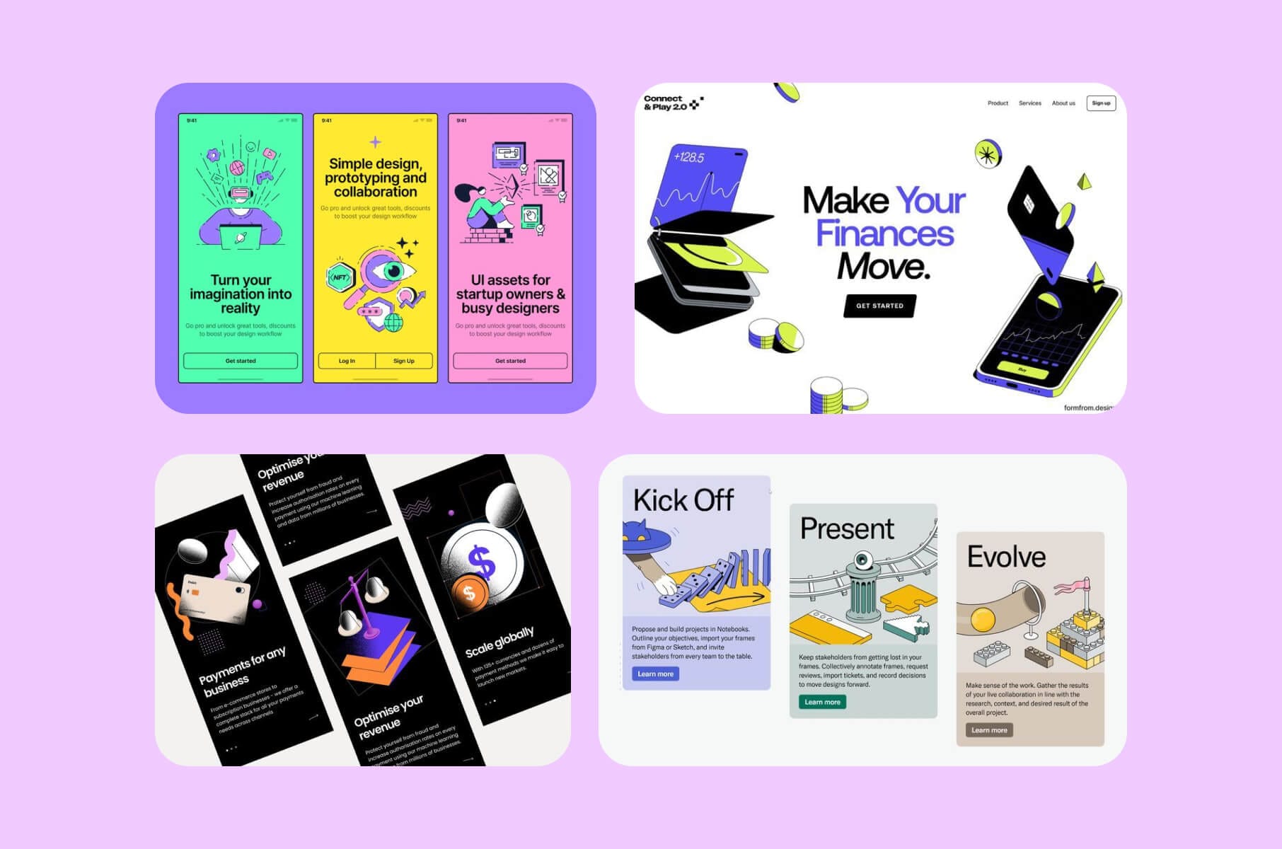
Custom illustration gives you control over what an image says and how it says it. You can draw a process that has no useful photograph, give an abstract product a visual form, or introduce a character that belongs to your brand.
There is plenty of room within the category. The references above range from bright, flat drawings to shaded objects that appear to have depth. A line illustration can sit quietly beside a technical explanation; a larger scene can become the main feature of a landing page. Neither needs to imitate the other.
Start with the content you want to illustrate. If the image could accompany almost any software company’s headline, make it more specific to yours. A drawing of your actual workflow may give you more to say than another collection of floating shapes.
For a current example, look at Rootly’s homepage. Its purple-and-peach landscape surrounds a white on-call calendar, giving the software a more expressive setting while keeping the interface recognizable. Notice the division of work: the artwork frames the interface, and the calendar shows the product. If you try this pairing, leave enough quiet space behind the interface to read it; detailed artwork can sit farther out toward the edges.
For a larger site, decide which colors and drawing details should carry across the collection. You want the next illustration to look related to the first, even when a different person makes it.
2. White and negative space
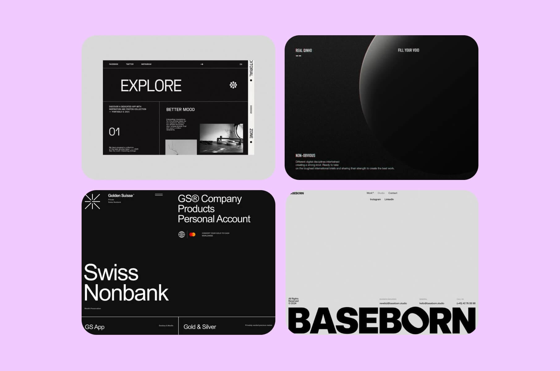
Don't be afraid of the empty parts of a page. Space between elements is part of the composition, just as the elements themselves are. You can use a generous margin to set a headline apart or keep related details close enough to read as a group.
The references above show how much variety this allows. One composition leaves a broad open field; another divides a denser layout with fine rules. The question is where the page needs separation and where the reader needs to see a connection.
Try adjusting spacing before adding another box, background color, or divider. You may find that the hierarchy already works once the elements have room around them.
Then check the smaller-screen version. Desktop spacing copied directly onto a phone can leave the visitor scrolling past large gaps to reach the next useful detail. Keep the relationships between elements; adapt the distances.
3. AI, beyond the gimmick
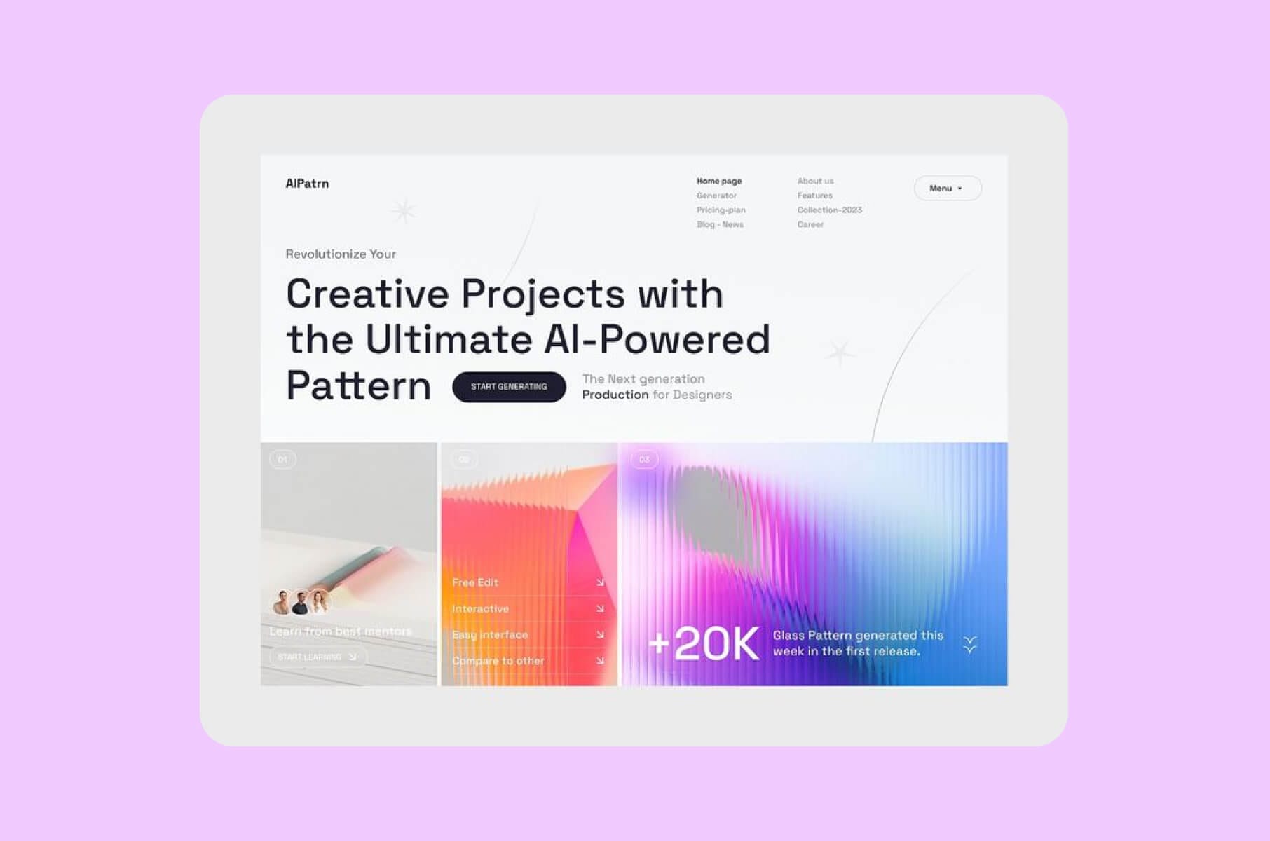
AI in web design can mean two quite different things: tools used to make the site and features people use once they arrive. Separating them makes this topic much less vague.
On the production side, Framer’s current AI offering describes generating editable pages, sections, copy, and visuals inside a project. That gives you material to work with. You still need to check what the page says and whether its design fits the actual content.
For a visitor-facing feature, begin with the action it should support. If you are considering a conversational search interface, for example, define what information it can use and what happens when it cannot answer. A chat box has to do more than announce that your company has discovered AI.
Keep the two decisions separate in your brief. “Use AI to explore layouts” describes a production choice. “Let visitors ask questions about the product” describes a feature that needs its own design and testing.
4. A clean and minimal vibe
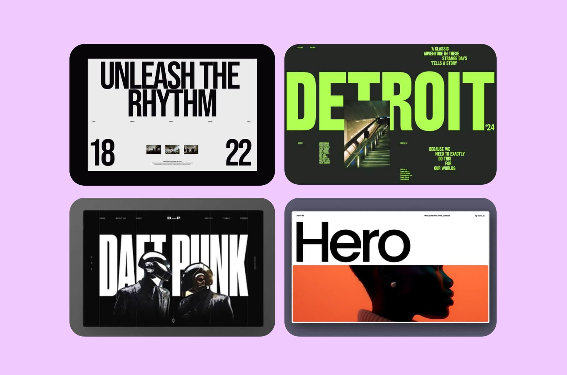
Minimal does not have to mean pale gray text on a white background. The examples above use large lettering and emphatic imagery while keeping the number of competing elements fairly small. There is character here, just less decoration around it.
This is where minimalism differs from negative space. Spacing is about the relationship between elements. Minimalism asks how many visual ideas the page needs in the first place.
Choose what should carry the composition. That might be the typography, with photography playing a supporting role, or a product image with a quiet surrounding layout. Give the page an emphasis you can explain.
Be careful when the edit reaches the copy. A short headline may look excellent in the mockup and still leave the product unexplained. Keep the information a visitor needs to understand the offer, even if it takes another paragraph. Visual restraint can accommodate a useful explanation.
5. Light and dark mode options
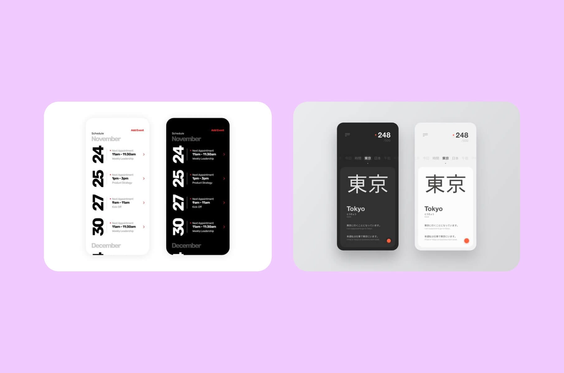
Offering both themes is a design choice worth considering when it suits your site and the preferences you want to support. It also means designing two coherent palettes.
Look at the paired examples above. The content stays recognizable across the versions, while backgrounds, text, and accents change together. In your own designs, pay attention to the less prominent elements as well: a faint border or secondary label can disappear when the background changes.
Work through the actual page content in both themes. Include photographs, charts if you have them, and form states. A dark homepage mockup alone will not show how the rest of the site behaves.
Check the assets inside those palettes as well. A dark logo on a transparent background may need a light version; a product screenshot with a white background may work better inside a deliberate frame. Decide which assets should change with the theme and which should keep their original colors.
And you can choose one theme. A toggle brings additional design and implementation work; it should be a deliberate part of the scope, rather than something added simply because another site has one.
6. Micro-interactions
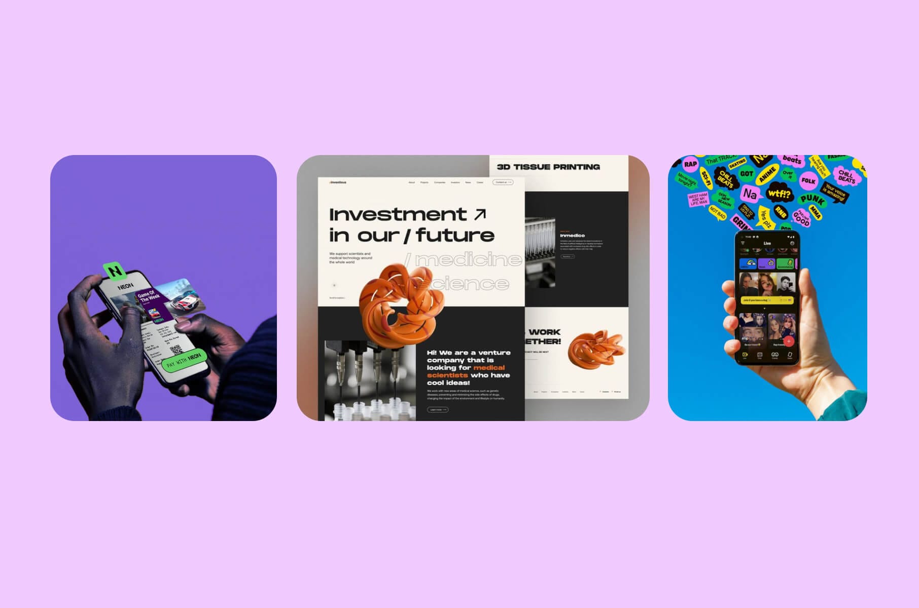
Think of the small response after someone does something: a button changes state, a field points out an error, or a saved item receives a confirmation. These details give a designer room to make the interface feel considered without turning the whole page into an animation.
The useful starting point is the action. After a visitor submits a form, what should they see while it is being sent? What should happen if it fails? Work out those states before deciding whether the button should bounce.
You can still have fun with the treatment. A subtle shift in shape or a carefully timed transition may fit the brand. Keep the message understandable without relying on the movement alone, and make sure a hover effect has an appropriate counterpart where hover is unavailable.
Micro-interactions are easy to overlook in a static design file. Ask to see the response, not just the resting state.
7. Quirky and bold fonts
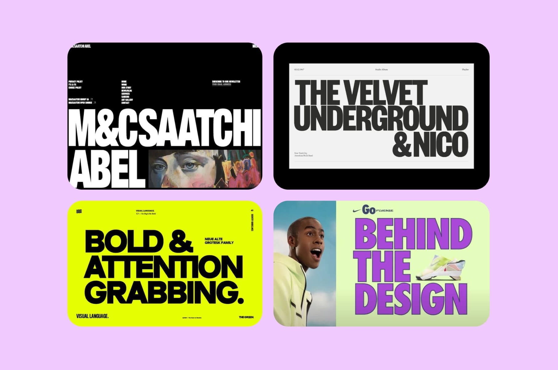
Typography can carry much of a page’s personality before you add a single illustration. In the references above, some headlines occupy most of the composition. Their scale is part of the design, not merely a larger version of body text.
There are different ways to explore this. Try an unusually condensed headline, a custom letterform, or a contrast between expressive display type and straightforward supporting copy. Webflow’s 2026 roundup includes dynamic text treatments, so there is room to consider movement as well as the shape of the letters.
Use your real headline while experimenting. A typeface that looks great spelling a short brand name may become awkward with a longer product explanation. Check the line breaks on a phone and the characters needed for your content.
Habito Studio’s homepage gives you a current example to study: an oversized, stacked headline is located opposite a small showreel, with a shorter explanation below. The headline carries the visual weight, while the nearby copy explains how to get started. You can borrow that relationship without copying the font. Try your longest likely headline in the same layout before committing to the proportions.
Give the supporting text a quieter job. If the headline is already doing the visual work, the labels and paragraphs can concentrate on being comfortable to read.
8. Playful animations
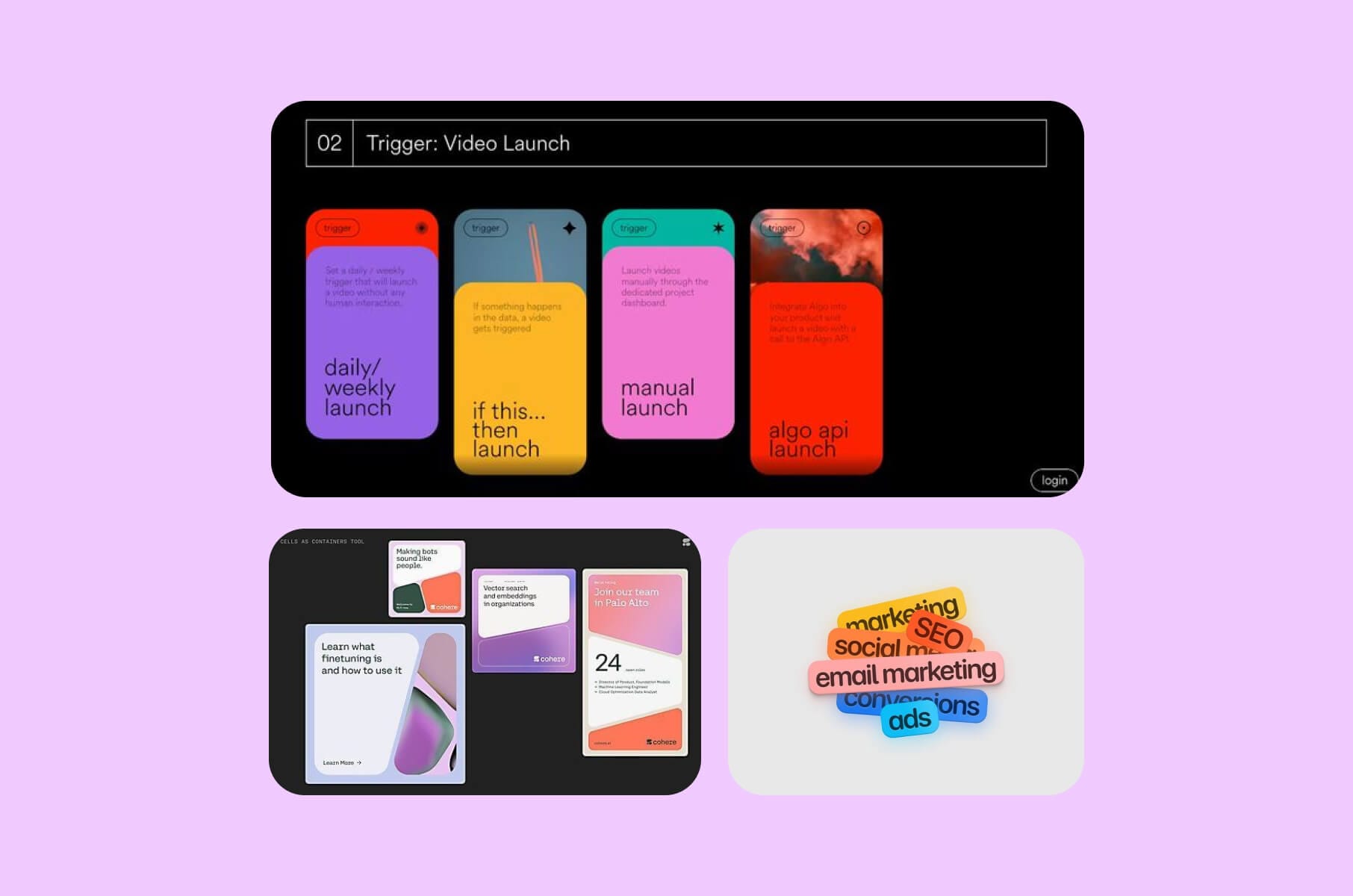
Some motion exists to confirm an action. Other motion is there to give the page a little spirit: an illustrated object shifts, a card unfolds, or a product component moves into place. That expressive role deserves room of its own.
Start with something in the design that would benefit from movement. An assembly sequence might show how parts fit together; an illustration might have one playful detail. You do not need every element to join in.
Decide what starts the animation and what ends it. Someone reading a long explanation should be able to concentrate on the words without a decorative loop continually competing beside them.
For animated text, sketch the still version alongside the moving one. If words arrive in stages, the reduced-motion version should show the complete message in a readable order. This gives the designer and developer a concrete alternative to work from, rather than leaving them to guess what “less animation” means.
Build a reduced-motion version into the work. W3C’s explanation of SC 2.3.3 says interaction-triggered motion can be disabled unless essential. This is one Level AAA criterion, not a complete accessibility review. Keep the page’s meaning and actions available when decorative movement is removed.
9. Anti-trends and human focus
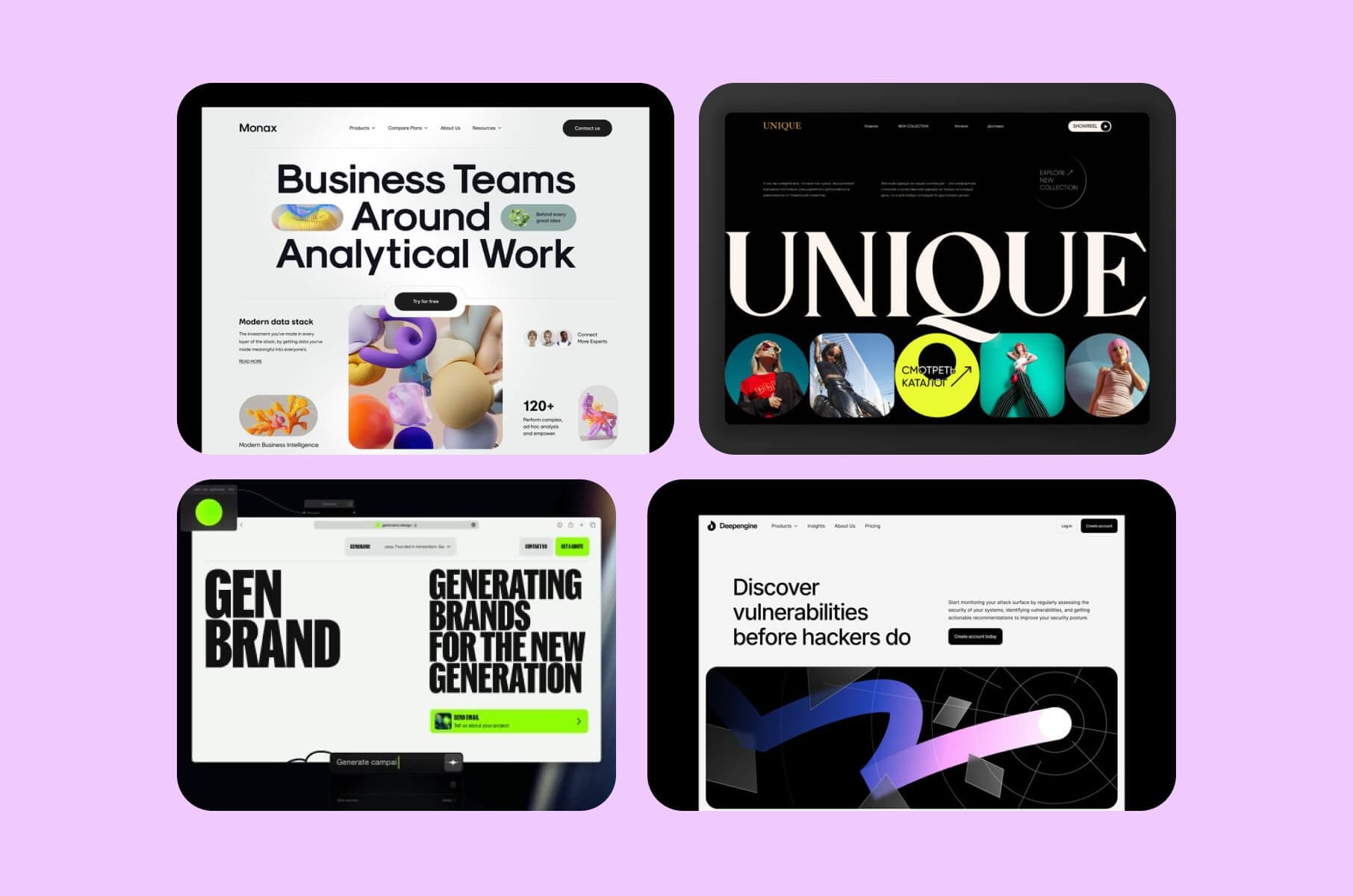
A site can depart from polished symmetry without becoming difficult to use. Hand-drawn marks, an unexpected crop, or lettering with an uneven edge can change the tone of a page. You can let the design look a little less rehearsed.
Anti-design takes that departure further through deliberately raw or unconventional composition. Figma includes neo-brutalism and anti-design in its 2026 selection. That is a useful reference point, although a handmade illustration and a brutalist layout are not interchangeable styles.
Pick the part of your design where that looseness makes sense. You might keep a clear grid and let the artwork be unruly, or pair a deliberately blunt headline with a restrained product explanation. The variation should come from a choice you want to make, not from making every component inconsistent.
Leave practical controls recognizable. A visitor looking for contact details should not have to solve the composition first. Character and clear navigation can still share a page.
10. Thoughtfully embedded videos
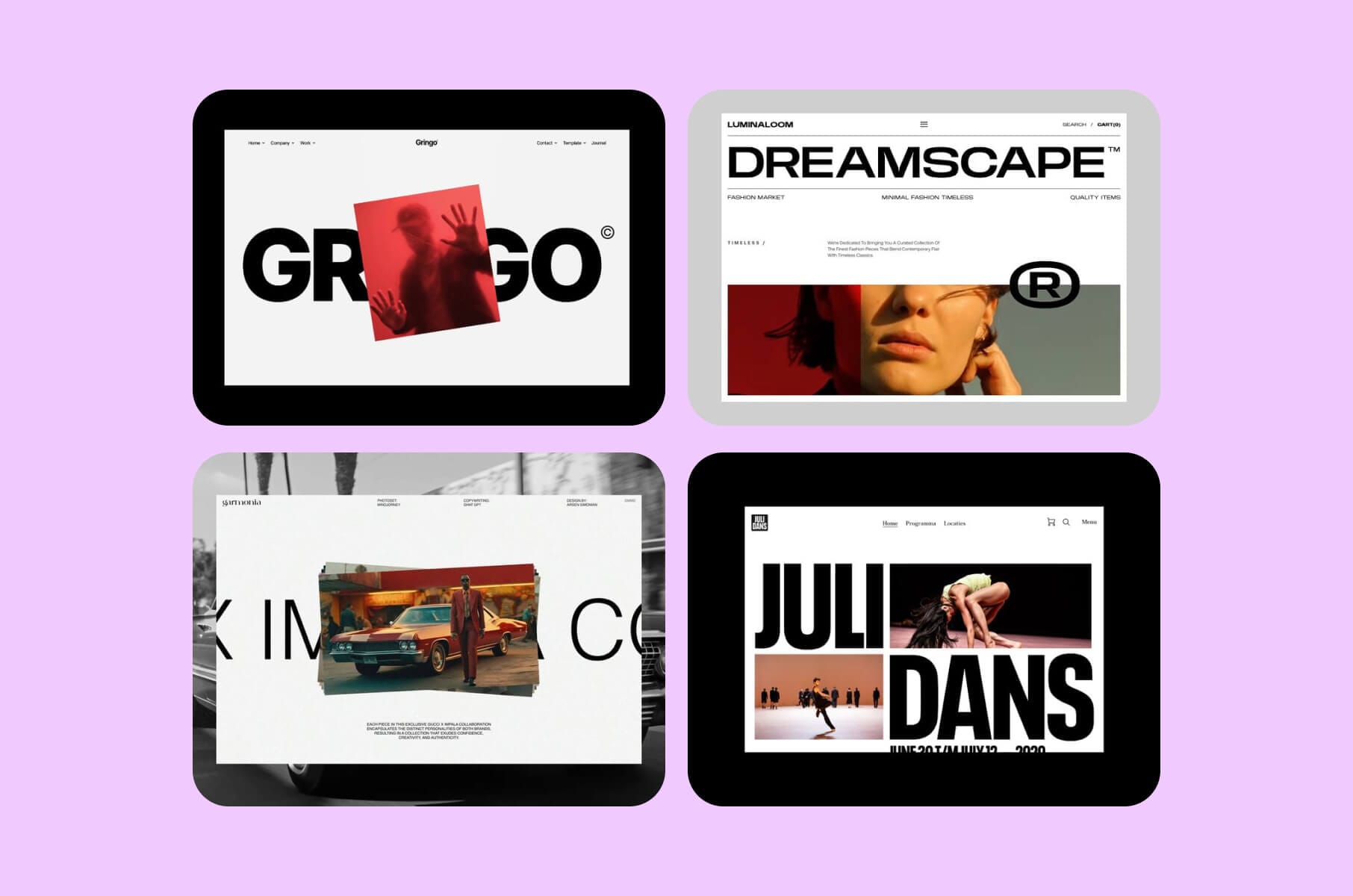
Video is a trusty option worth keeping in the conversation. A product demonstration can show a sequence of actions; a behind-the-scenes clip can show the people or work that photographs leave out. Choose the subject before choosing the size of the player.
A background loop and a tutorial have different jobs. The first fits the page's atmosphere, while the second asks someone to stop and follow an explanation. Design their placement and controls accordingly.
For an explanatory video, give visitors a useful preview and a clear reason to press play. Include captions when speech carries the message, and keep the main product explanation available in text. Some people will want to watch; others will want to read and move on.
Check the page with the video paused or unavailable, too. The heading and next action should still make sense. A large video area is a substantial part of your layout, so decide what belongs there before filling it with a clip.
How to use these ideas on your own website
Choose the direction you are most interested in and try it on a page with real content. A visual reference becomes much easier to discuss once you can see your own headline, product, and navigation inside it.
You can combine ideas. Generous negative space can give bold typography room, while a custom illustration may work with a restrained layout. Let one treatment lead before adding another; a page does not need to demonstrate the entire list.
Before committing, review the smaller-screen version and any interactive states. If motion is involved, include the reduced-motion version. Ask someone unfamiliar with the design to find the information or complete the action the page is meant to support. Their response can help you decide what needs adjusting.
If the direction calls for broader work on your content, layouts, and implementation, our Website Design services can be scoped around that project. Bring the references you like and explain what interests you about them. That is a useful place to begin.
Web design trends FAQ
What are the current web design trends for 2026?
Bold typography, expressive illustration, playful motion, and light/dark themes are good directions. Figma’s 2026 roundup also covers anti-design and immersive 3D. These styles can coexist: a restrained page can use an oversized headline or an unusual illustration without becoming visually busy. Pick the treatment that gives your content something useful, and leave room for your own interpretation. A trend list is a starting point, not a requirement to redesign everything.
Is minimalist web design still relevant in 2026?
Yes. Minimalism remains a valid direction alongside more expressive styles; Figma’s 2026 overview discusses both minimalism and maximalism. A limited palette and a clear layout can still accommodate distinctive lettering or custom artwork. The useful question is what you can simplify without making the offer harder to understand. Keep the product explanation and recognizable navigation, even if they interrupt an otherwise very tidy composition.
How is AI changing web design?
AI can now help produce editable layouts and draft content inside a design tool. Framer, for example, describes generating pages and visuals that you can continue editing on its canvas. That makes AI a practical option for exploring a direction, while you decide what belongs in the finished site. Review generated copy against your actual product and replace invented details. Using AI during production also leaves you free to publish a site with no visitor-facing AI feature at all.
How do web design trends affect SEO?
The way a design is built matters more than whether its style is fashionable. Google says Core Web Vitals are used by its ranking systems, while good scores alone do not guarantee top rankings. When adding large visuals or motion, check the finished page’s loading behavior and whether elements shift as it loads. Keep the content readable on mobile, too. Treat a new visual direction as something to evaluate on the working page, since its appearance only in a trend roundup tells you nothing about its SEO results.