From a polishing request to a full marketing website redesign


About the project
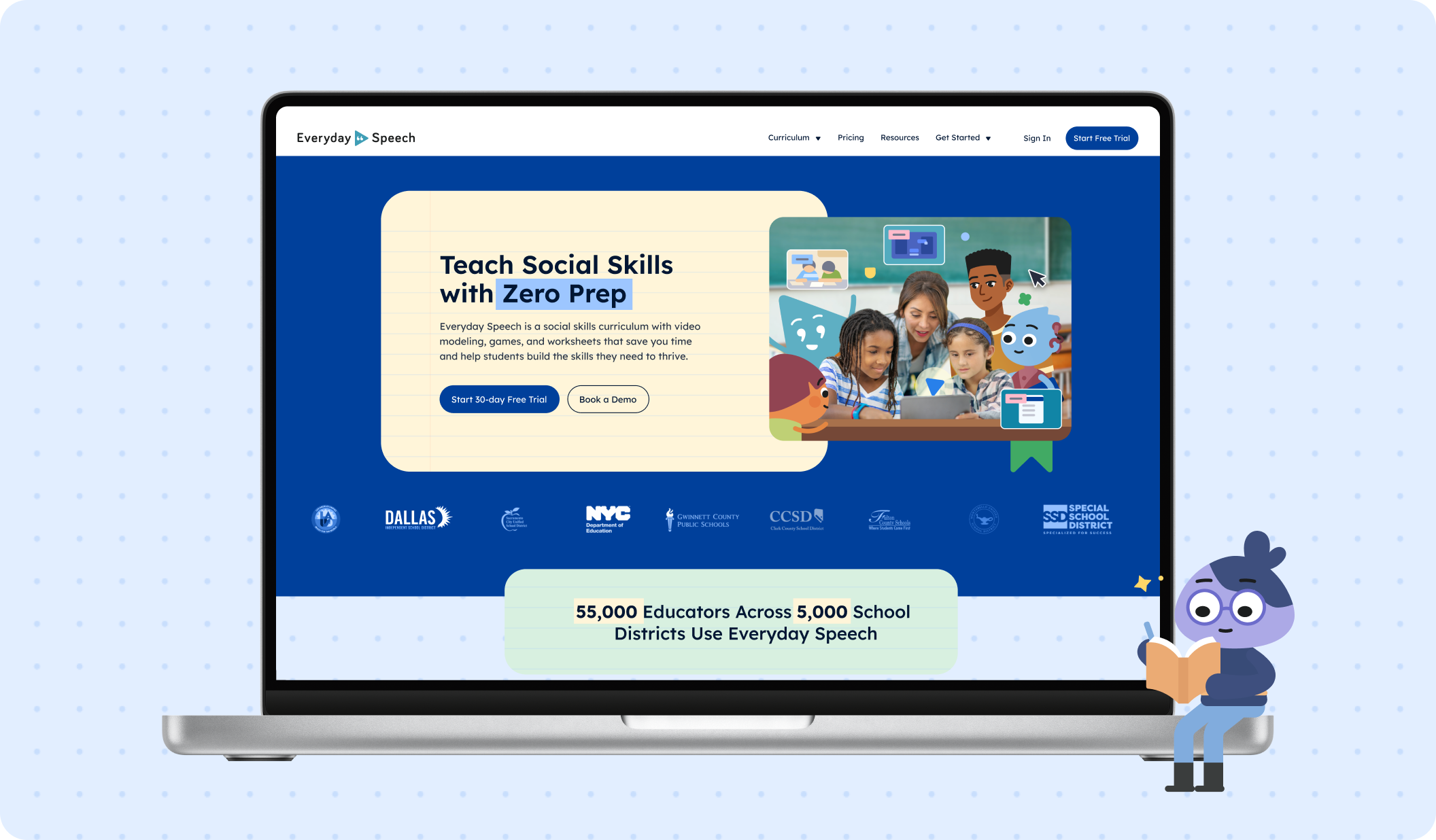
About Everyday Speech
Everyday Speech helps educators teach social-emotional learning and communication skills with evidence-based videos, interactive games, and printable resources aligned with CASEL.
Visit Everyday SpeechChallenge
Everyday Speech came to Merge for a light UI tune-up on its marketing site. The website looked dated, loaded slowly, and didn’t clearly explain the product, so it wasn’t generating leads. The goals were to make the value obvious to educators and school decision-makers, lift conversion, and fix performance and UX issues. As the engagement unfolded and the client’s rebrand evolved, our scope grew into a full redesign delivered in small, low-risk iterations.
What Merge delivered
We helped redesign and develop Everyday Speech’s marketing website in iterative releases. Our team then clarified the value proposition, overhauled information architecture, created new pages, and implemented the approved brand direction. We launched the highest-impact pages first, then kept shipping improvements in sprints.
Home page - Before
Home page - After
Work process
The engagement started via referral and a request for a UI polish. We aligned on business goals: clearer value, better conversion, healthier performance. We agreed to move in baby steps due to an evolving brand and a live marketing calendar already in motion.

“The scope shifted along the way, and the team was always flexible and adaptive. I'm just really happy with how it turned out. The collaboration was phenomenal.”
Winston Chenery
Senior Director of Marketing at Everyday Speech


Working with a moving brand
The brand system evolved right while we were designing. Rather than wait, we focused on information architecture and wireframes that could accept updated visuals without rework. Client’s brand files in Figma guided color, illustration, and tone. We proposed web-specific adaptations like spacing, grids, states, and components, so the identity could stay intact while pages remained readable and accessible.
Matching the school-year clock
Schools restart in September, so we had a phased release planned, first focusing on pages critical for launch, followed by additional pages later. That meant tight scope, reuse of proven modules, and a deliberate focus on the value proposition, feature clarity, and calls to action like pilots, pricing, and the 30-day trial. Post-launch, we kept adding pages and polishing on a rolling basis.


Fulfilling precise art direction
The client’s designer reviewed details down to specific illustrations and placements (flowers here, stripes there, exact image choices, etc). We embraced the direction and ensured it worked inside a durable web system. We balanced expressiveness with consistent components, accessible typography, and layouts that scale from mobile to desktop. Where a print-style idea conflicted with usability, we offered web-friendly alternatives that preserved the intent.


In conclusion
Outcome
Merge helped transform Everyday Speech’s marketing website from a dated, underperforming experience into a clear, educator-focused presence that supports lead generation. The result is a site that keeps the client’s playful, educator-appropriate personality, but with the structure needed for clear storytelling and conversion paths.
The Everyday Speech team shared that the site now communicates their product more clearly and better supports ongoing marketing. They appreciated our ability to work within an evolving brand, translate their detailed art direction to the web, and deliver under a tight timeline.
Final words
Special thanks to the Everyday Speech team for a close and constructive collaboration.
You may also like
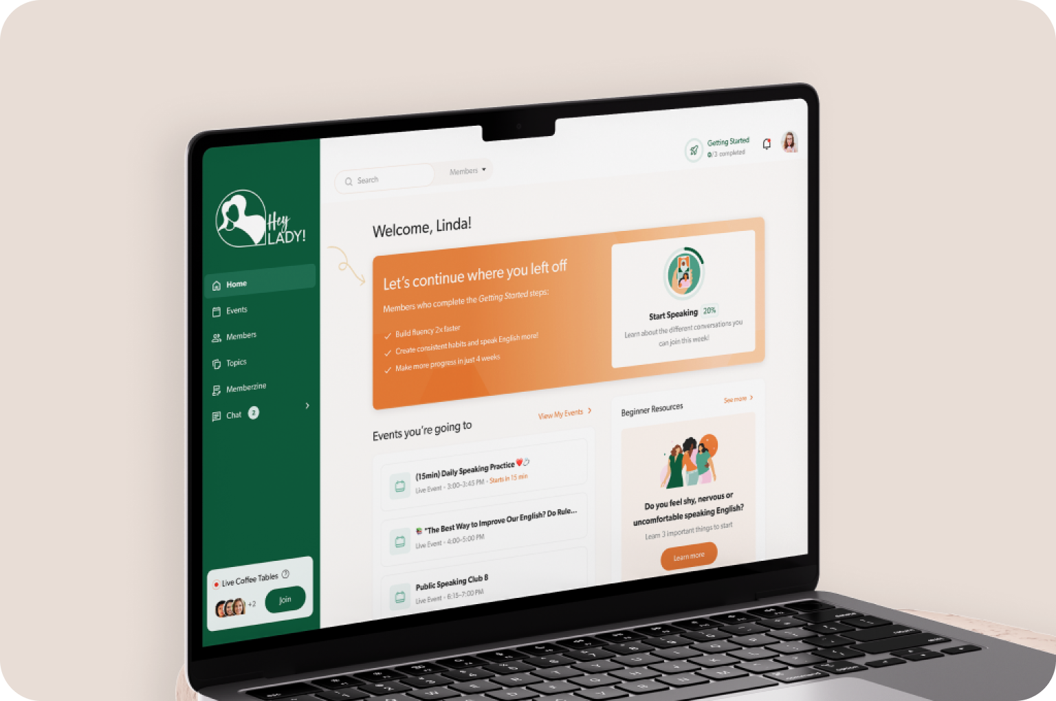
HeyLady!
HeyLady, a women-only English conversation community, worked with Merge to add a design system, improve chat and events, and speed onboarding.
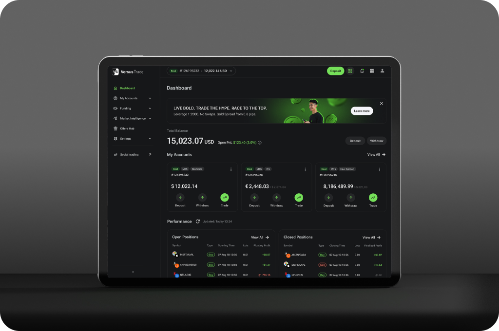
Versus Trade. Product
Versus Trade, a trading platform, needed UX for the client dashboard, partner portal, and two sites. We delivered more than 3,000 screens and a scalable design system.