UX Stepper: 7 Game-Changing Progressive Disclosure Patterns That Convert 3X Better
Guiding users through multi-step processes can make or break their experience on your website. Whether someone is completing a checkout, filling out a registration form, or configuring a product, clarity matters. A UX stepper provides that clarity by breaking complex tasks into manageable chunks and showing users exactly where they are in the process.
When designed well, a UX stepper reduces abandonment rates and helps users feel confident about completing their tasks. This article explores how to create effective steppers that serve both your users and your business goals.
What Makes a UX Stepper Effective
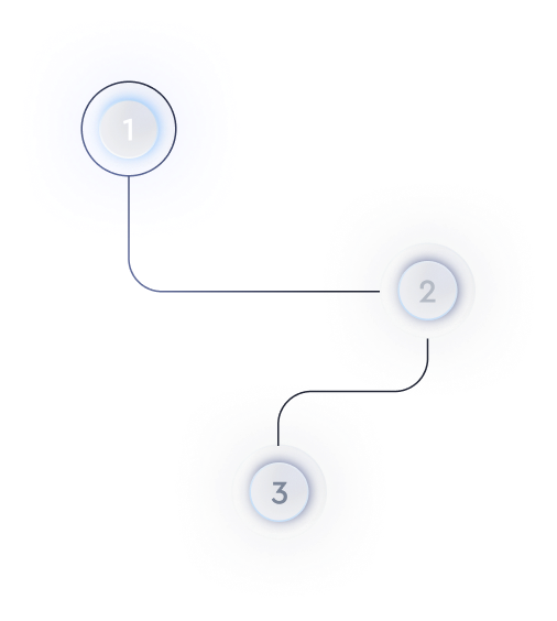
A stepper is more than just numbered circles connected by lines. It communicates progress, sets expectations, and provides orientation throughout a process. The best stepper design elements share common traits that make them intuitive.
First, effective steppers clearly indicate the current step, completed steps, and upcoming steps. Users should instantly understand where they are without reading lengthy instructions. Visual hierarchy plays a major role here through color contrast, icons, and typography weight.
Second, good steppers provide context about what each step involves. Labels like "Shipping" or "Payment" tell users what to expect, reducing anxiety about hidden requirements. Avoid vague labels like "Step 2" that force users to guess what comes next.
Choosing Between Horizontal and Vertical Stepper UI
The orientation of your stepper depends on several factors including screen size, step count, and content complexity. Horizontal steppers work well for simple processes with three to five steps where labels can fit comfortably across the screen.
A vertical stepper UI becomes the better choice when you have more steps or when each step requires detailed descriptions. Vertical layouts accommodate longer text without forcing truncation and adapt better to mobile screens where horizontal space is limited.
| Stepper Type | Best Use Case | Considerations |
|---|---|---|
| Horizontal | Short flows with 3-5 steps | Limited space for long labels |
| Vertical | Complex flows or mobile-first designs | Takes more vertical space |
| Compact | Mobile apps with minimal UI | May hide step details |
Consider your audience and their devices when making this decision. If most of your traffic comes from mobile users, a vertical or compact approach will likely serve them better.
Key Principles for Stepper UI Design
Strong stepper UI design follows principles that keep users oriented and motivated. Start by making the active step visually prominent. Use color, size, or animation to draw attention to where the user currently is in the flow.
Allow users to navigate back to previous steps when possible. Mistakes happen, and forcing users to start over creates frustration. Clickable completed steps let users review or edit their previous inputs without losing progress.
Keep your stepper design consistent with your overall brand and interface patterns. If your buttons use rounded corners and blue accents, your stepper should follow the same visual language. Consistency builds trust and reduces cognitive load.
Implementing Progress Stepper UI That Motivates Users
A progress stepper UI serves a psychological function beyond navigation. Seeing completed steps creates a sense of accomplishment that encourages users to finish what they started. This is sometimes called the "endowed progress effect."
Consider adding subtle animations when users complete a step. A checkmark appearing or a bar filling up provides positive feedback that reinforces their progress. Keep these animations brief so they do not slow down users who want to move quickly.
For longer processes, grouping steps into categories can make the journey feel more manageable. Instead of showing twelve individual steps, you might organize them into three phases with four steps each. This technique works especially well in progress steps UI design for account setup or onboarding flows.
Common Mistakes in Progress Steps UI Design
Even experienced designers make errors when building steppers. Avoiding these pitfalls will help you create better experiences.
- Too many steps: If your process has more than seven steps, look for opportunities to combine related actions or split the flow into separate tasks.
- Unclear step labels: Generic names confuse users. Be specific about what each step accomplishes.
- No error indication: When validation fails, show users which step contains the problem so they can fix it quickly.
- Ignoring mobile: Test your stepper on small screens where horizontal space is tight and touch targets need to be larger.
Understanding your user flow design before building helps you avoid structural problems that are harder to fix later.
Applying UI Design Process Steps to Your Stepper
Building an effective stepper follows the same ui design process steps you would use for any interface element. Start by mapping out the complete user journey and identifying natural breaking points where steps should begin and end.
Next, create wireframes showing how the stepper will look at each stage. Test these with real users to catch usability issues early. Pay attention to whether users understand the labels and can predict what comes next.
Finally, refine the visual design and add interaction details like hover states, transitions, and error handling. Build the component to be reusable so you can apply consistent patterns across different flows in your application.
Summary
A well-designed UX stepper transforms frustrating multi-step processes into clear, manageable experiences. Focus on visual clarity, meaningful labels, and flexible navigation to serve your users effectively. Whether you choose a horizontal layout or a vertical stepper UI, consistency and user feedback should guide your decisions.
Test your stepper designs with real users before launching, and be prepared to iterate based on what you learn. The time you invest in getting this pattern right will pay off through higher completion rates and happier users.