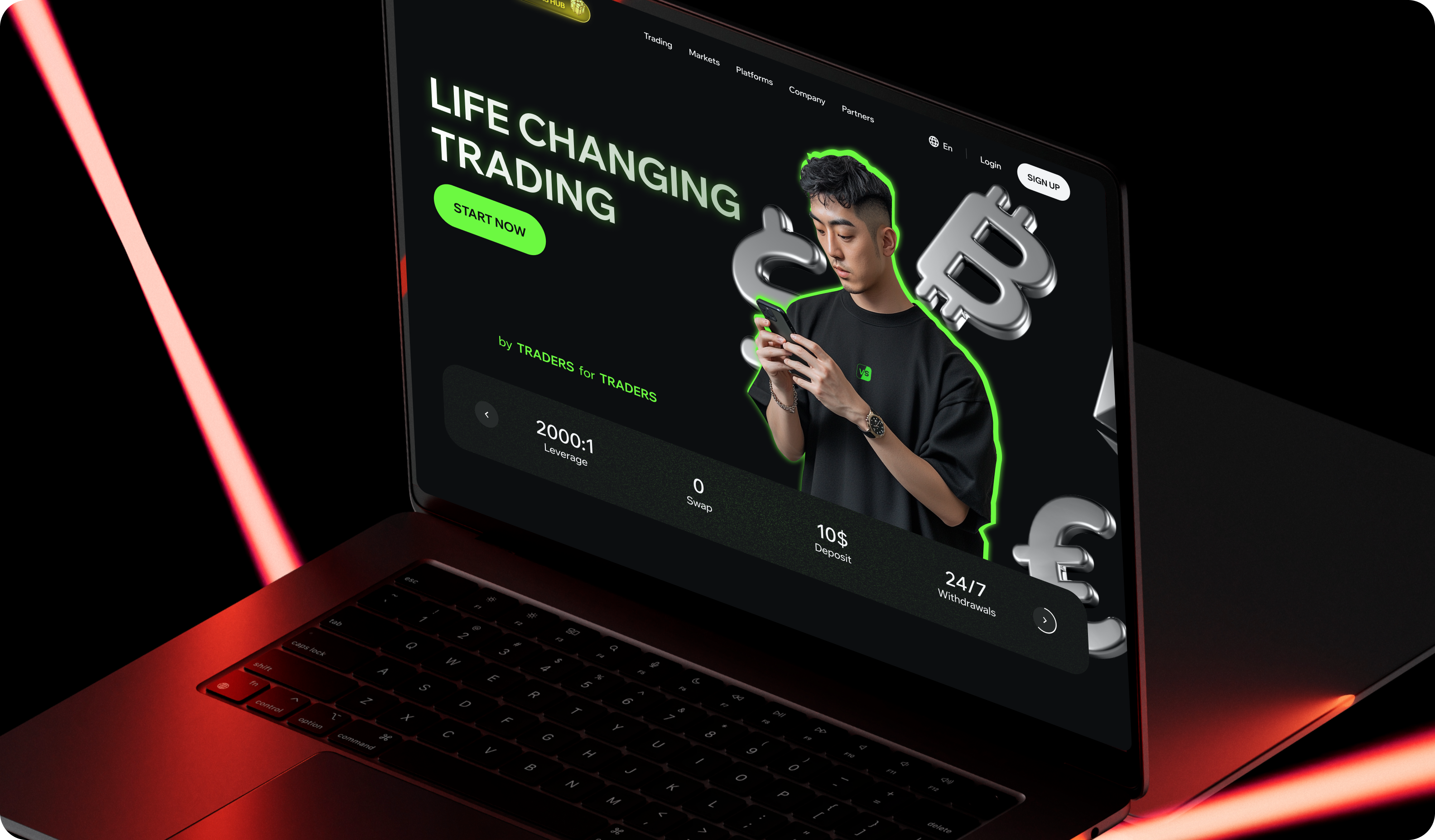
Branding design for competitive trading in Asia
About the project
About Versus Trade
Versus Trade is a new CFD broker that lets people trade asset‑versus‑asset pairs. It is aimed at young traders in fast‑growing Asian markets.
Visit Versus TradeChallenge
We needed to start from a blank page and shape a brand that feels bold and social while still trustworthy enough for real‑money trading. The goal was to help design an MVP and all the branding and marketing assets that will later help with brand awareness. The identity had to speak to Gen Z, respect Asian culture, and stand out among many look‑alike brokers.
What Merge delivered
We built a complete brand kit (our most comprehensive branding package). Our work covered the logo, color system, typography, icon set, motion rules, and extensive usage guidelines. We also produced templates for social banners, video covers, email headers, App Store and Google Play graphics, and event collateral.
Tech stack
Figma.
Work process
Reviewed regional brokers and youth finance brands to map gaps and visual tropes. We also based our choices on cultural research across eight target languages.
Hype vs. trust
We had to design for two audiences. The first is retail traders, focused on earning through straightforward CFD and Versus pairs. The second audience is influencer partners—content creators who stream their trades and bring communities onto the platform in exchange for revenue‑sharing.
The brief asked for a look that feels like a gaming lounge, yet still earns confidence. Just like Versus Trade, we bet hype against trust with the idea of incorporating both. For that, we blended bold gradients with grids and restrained typography. The hype visuals stay on campaigns while the trading dashboard keeps calm greys and plenty of white space.
Design localization
Other interesting challenges were Asia-specific. First, we needed to signal ambition and wealth across cultures while avoiding taboo colors.
Then, left-to-right support meant more than just flipping layouts. Our team carefully flipped and redesigned some elements, while numbers and the “VS” logo stayed left‑to‑right to maintain recognition. To localise one brand into eight languages, we created interchangeable accent layers so the same layout swaps a hero hue or image in seconds.
In conclusion
Outcome
After our delivery, Versus Trade entered the market with a memorable branding that speaks directly to Gen Z traders.
We prepared the unified assets that let internal and external teams launch two websites, social feeds, and event booths. We also delivered a ready‑to‑run marketing toolkit that supports quick content production for separate trader and partner audiences.
Early traction includes 400 active users and growing partner interest across Asia and MENA.
Final words
Special thanks to the Versus Trade team for close collaboration and rapid feedback.
You may also like
Quantango Technologies
Quantango Technologies innovates trading mechanics. We built a website to help them better communicate their story and attract talent.
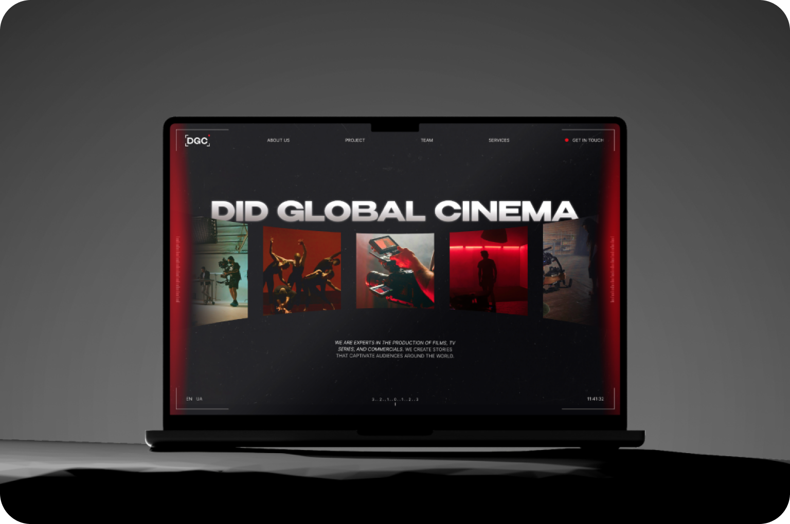
DGC Production
DGC Production, a new film studio creating original movies, partnered with Merge to build a complete brand identity that reflects their creative vision.


