Wizard UI: The Ultimate Guide to When Multi-Step Forms Win (And Fail)
When you ask users to complete a complex process in one long form, most of them leave. That is where wizard UI comes in. This design approach breaks down lengthy tasks into smaller, manageable steps that guide users from start to finish. Whether you are building an account setup flow, a checkout process, or a product configuration tool, the wizard format reduces cognitive load and increases completion rates.
The main value of this pattern is simple: it turns overwhelming tasks into approachable ones. Users see exactly where they are, what comes next, and how much is left. This transparency builds confidence and keeps people moving forward instead of abandoning the process entirely.
What Is the Wizard Pattern and When to Use It
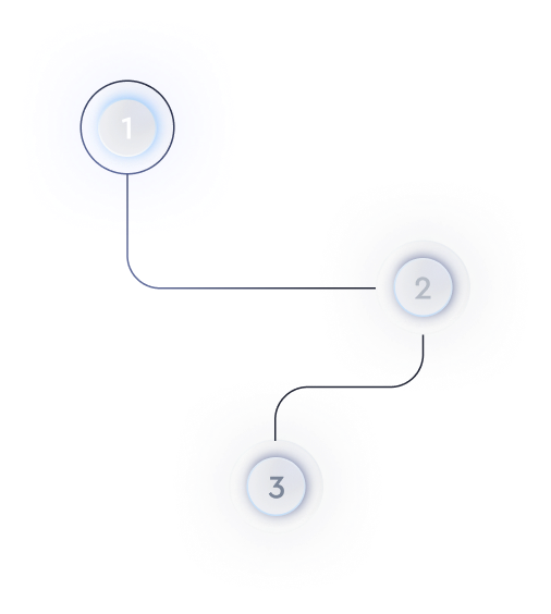
The wizard pattern is a user interface design that divides a single task into a sequence of screens or sections. Each step collects specific information or requires a particular action before the user can proceed. Progress indicators typically show how many steps remain.
This approach works best when the process has natural divisions. Think of situations where users need to make dependent choices or where showing everything at once would feel chaotic. A multi-step workflow makes sense for account registration, payment processing, booking systems, and product customization tools.
However, not every form benefits from this treatment. If your task has only three or four fields, splitting it into steps adds unnecessary friction. The wizard pattern shines when the alternative is a wall of inputs that intimidates users before they even start.
Core Principles of Effective Wizard UI Design
Good wizard UI design balances guidance with efficiency. Users should feel supported without feeling slowed down. Here are the principles that separate effective wizards from frustrating ones.
- Clear progress indication: Show users their current position and remaining steps. Numbered steps, progress bars, or breadcrumb trails all work well.
- Logical step grouping: Each screen should focus on one topic or decision. Mixing unrelated fields breaks the mental model.
- Easy navigation: Let users go back to previous steps without losing their data. Preventing backward movement creates anxiety.
- Smart validation: Check inputs as users complete each step rather than waiting until the end. Immediate feedback prevents wasted effort.
- Visible summary: Before final submission, show users what they entered so they can review and correct mistakes.
The wizard design pattern also requires careful attention to button labels. Generic text like "Next" works in most cases, but context-specific labels like "Continue to Payment" or "Review Your Order" tell users exactly what happens when they click.
Website Wizard Examples That Get It Right
Looking at real website wizard examples helps clarify what works in practice. Many successful SaaS products use this pattern for onboarding, where first impressions determine whether users stick around.
Mailchimp guides new users through account setup and first campaign creation with a clean, step-based interface. Each screen focuses on one decision, and users can see their progress throughout. The onboarding wizard approach keeps new customers engaged during the critical activation period.
Typeform uses a wizard for form creation, walking users through question types, design choices, and publishing options. The steps feel natural because they mirror how people think about building a form.
E-commerce checkout flows provide another category of wizard examples. Amazon, Shopify stores, and most major retailers break purchasing into shipping, payment, and confirmation steps. This structure has become so standard that users expect it.
Building a Modern Wizard UI for Your Product
A modern wizard UI goes beyond basic step sequencing. Today's users expect smooth transitions, mobile-friendly layouts, and intelligent defaults that reduce manual input.
| Feature | Purpose | Implementation Tip |
|---|---|---|
| Conditional logic | Show only relevant steps based on earlier answers | Skip steps that do not apply to the user's selection |
| Auto-save | Preserve progress if users leave and return | Save data after each step completion |
| Inline help | Answer questions without leaving the flow | Use tooltips or expandable sections for guidance |
| Mobile optimization | Support touch interactions on smaller screens | Use larger tap targets and vertical layouts |
Working with a team that specializes in wizard interface design can help you avoid common pitfalls. Professional designers know how to balance visual appeal with functional clarity.
Animation plays a supporting role in modern implementations. Subtle transitions between steps reinforce the sense of progress without distracting from the task. Avoid flashy effects that slow down users who want to move quickly.
Common Mistakes to Avoid
Even well-intentioned wizard implementations can frustrate users. One frequent error is creating too many steps. If each screen contains only one or two fields, the clicking becomes tedious. Group related inputs together to keep the step count reasonable.
Another mistake is hiding the total step count. When users cannot see how long the process takes, they feel uncertain about committing their time. Always show the full journey upfront.
Forcing linear progression causes problems too. Some users want to jump ahead to see what information they need to gather. Others want to revisit earlier decisions. Rigid step enforcement treats users like they cannot be trusted with their own workflow.
Finally, failing to handle errors gracefully derails the experience. When validation messages appear without clear explanation, users get stuck. Specific, actionable error text keeps things moving.
Bringing It All Together
The wizard UI pattern remains one of the most effective ways to guide users through complex tasks. By breaking processes into logical steps, providing clear progress indicators, and allowing flexible navigation, you create experiences that feel manageable rather than overwhelming.
Start by identifying where your users currently struggle with long forms or complicated workflows. Then design a stepped approach that groups related inputs, validates as users go, and provides a final review before submission. Test with real users to find friction points, and refine based on what you learn.
When implemented thoughtfully, a well-designed wizard increases completion rates, reduces support requests, and leaves users feeling capable rather than confused. That is the outcome worth designing for.