0
Table of Contents
Best new SaaS product page designs that convert - 2026 teardown
So what actually makes a SaaS product page convert today?
Have you noticed how the SaaS landing pages everyone keeps sharing on X this year all kind of look the same - and yet a handful of them seem to be quietly running away with the conversion numbers?
The hero-mockup-and-logo-wall formula that was around most of 2023 and 2024 is still around, sure.
But the pages that actually work (we mean the ones with hard, public conversion claims, the ones founders keep posting screenshots of ) are doing something rather different.
They're letting the product do the selling.
We've been designing and shipping these kinds of pages for SaaS startups for a while now, so this teardown is partly a fan letter and partly a working notebook. If you're a founder, a product marketer, or a head of growth trying to figure out what your own product page should look like in 2026, this article is for you. We'll cover what separates a great product page from a forgettable one this year, walk through 13 fresh product page examples we keep coming back to, and pull out the best patterns.
If you've ever wondered what we would do with your page, our SaaS design and development services basically cover exactly this: product, marketing site, and the connective tissue between them.
- The 5 mistakes we keep seeing on SaaS landing pages.
- SaaS website design examples worth copying.
- And the onboarding flows of Dia, Superhuman & more.
So feel free to keep those open in a second tab.
What separates a great product page from a forgettable one in 2026
So what actually makes a SaaS product page convert today? Before we get to the product pages examples, it helps to name what we're really grading on. A high-converting SaaS product webpage does six jobs, basically all at once - and the best ones do them in roughly this order: pain, promise, product, proof, path, and objections.
- It tells the right buyer, "This is for me."
- It makes the value obvious in one read.
- It proves the product actually works.
- It shows how the product works, not just what it does.
- It removes buying anxiety before the visitor invents it.
- It gives a clear, specific next step.
In practice, there’s a pretty repeatable structure: a value-led hero, product proof above the fold (a real screenshot, an embedded demo, a generated output), an outcome-focused feature breakdown, a visible 3-to-5-step workflow, social proof with context (logos plus a number, ideally), friction-reducer micro-copy (no credit card, 5-minute setup, SOC 2, etc.), and CTAs that match the buyer's mood at each scroll depth.
The best pages of 2026 also tend not to use one specific category trap - vague AI category language. For example, "AI for work" is too fuzzy. "Draft replies in your voice" is better. Be as specific as your niche allows you to.
One more thing. We're not grading raw aesthetics. Some of these great product websites are exceptionally pretty, others are simpler looking. What they share is a commercial intent that made its way into design decisions.
13 best SaaS product pages examples we found
We picked these by combining three filters: clear positioning, visible product story, and at least one design move that solves a real buyer objection. Some come from big mature companies (ClickUp, Basecamp), most from newer 2025/2026 launches.
First up on our list of cool product pages that earned a teardown is….
1. Guideflow
The page that sells by doing
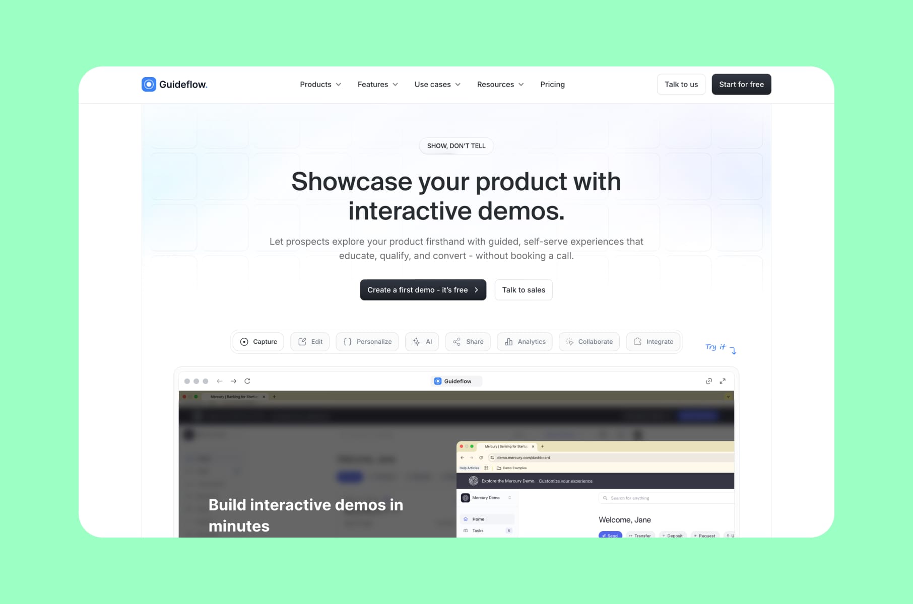
Guideflow has that rare product page that publishes its own conversion numbers:
- "+20% signup."
- "x3 closing rate."
- "x5 velocity to sign deals."
- Plus a testimonial claiming "+200% qualified leads" after a customer embedded a Guideflow demo.
Believe it or not, that kind of public proof is still uncommon in SaaS.
The best decision on the page is the meta-pattern: Guideflow sells interactive demos by using said interactive demos. You scroll, you click, you experience the product mid-scroll. The CTA ladder is also smart - a low-friction "Try for free" is located next to a heavier "Book a demo," which lets PLG-curious and sales-led visitors both pick the path that fits their mood.
The lesson for your own product web design: if your product is something a visitor can experience in 30 seconds, build the product page around that experience.
2. Sponsy
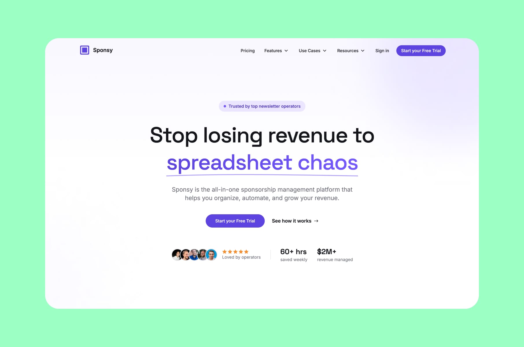
The meanest pain headline in SaaS
Sponsy's hero reads "Stop losing revenue to spreadsheet chaos." That's it. Just a very specific and direct shot at the workflow Sponsy is replacing. The page backs it up with "60+ hours saved weekly" and "$2M+ revenue managed" to have you already moving from agreeing with the pain to running the numbers in your head.
What makes this one of the coolest product pages of the year is the before/after framing. Most SaaS pages skip the "before" because it feels negative. Sponsy leans into it, then resolves the tension with operator logos, a customer portal walkthrough, and a CTA shaped like "scale revenue without scaling headcount."
If your category competes against a spreadsheet (and a surprising number of SaaS categories still do ), this is the product page template to copy. Name the pain, but don't soften it.
3. ClickUp Brain
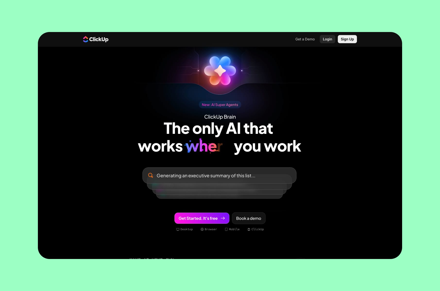
Numbers in the hero, every single time
ClickUp Brain is what a mature SaaS company does when it gets aggressive. The page also leads with hard metrics:
- "100% win rate vs. ChatGPT and Claude" in a blind evaluation.
- "1.1 days saved per employee per week."
- "86% cost savings vs. standalone AI tools."
- "3x faster task completion."
Whether you believe every claim or not, the page commits to them.
The other thing ClickUp gets right is the "your company's Brain" framing. Instead of a generic AI assistant copy, the page shows AI pulling from your tasks, your docs, your inbox, and your meetings. The model comparison and security sections then handle the two predictable enterprise objections.
If you're at the scale where your product page has to convert across PLG, mid-market, and enterprise in one URL, this is the level of product page density we recommend.
4. Creatify
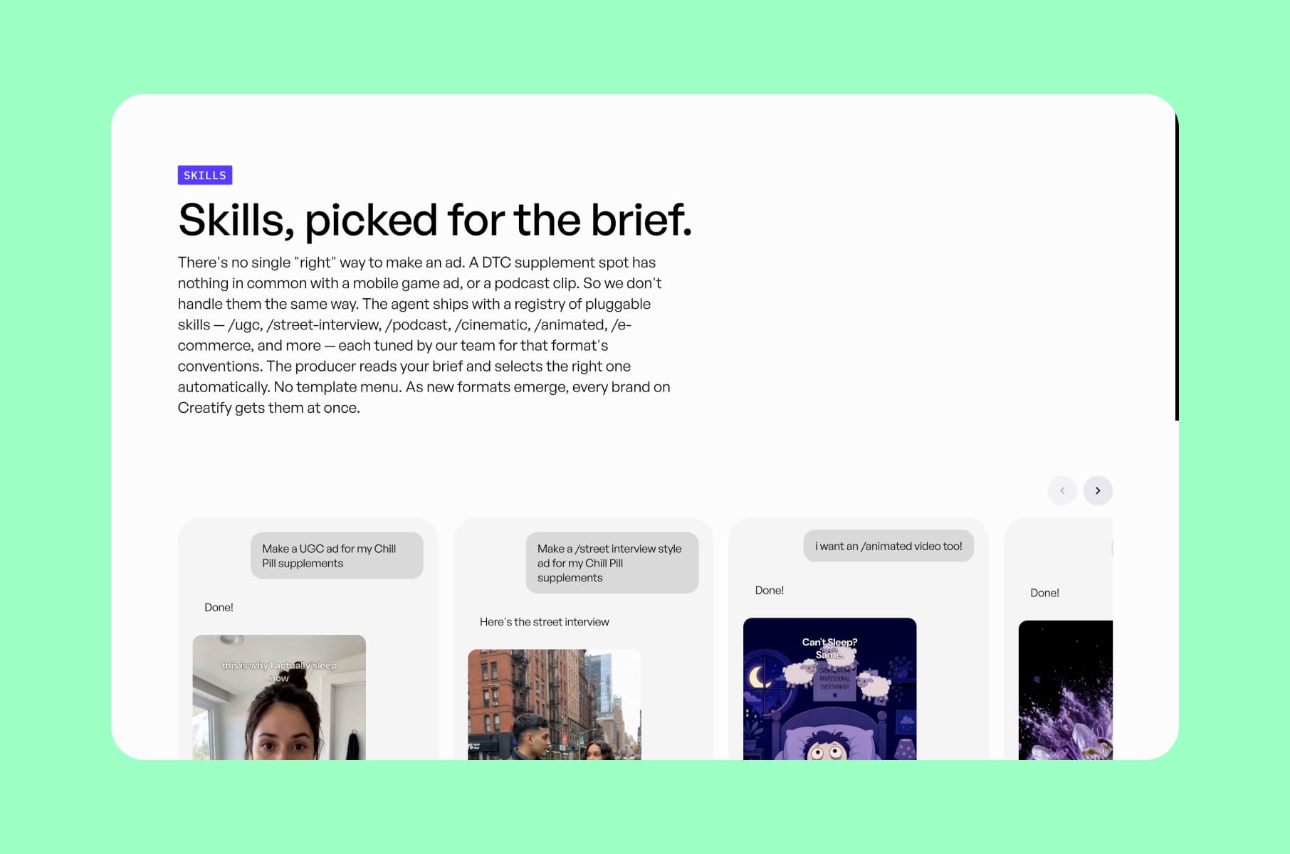
The output-first AI page
Have you ever opened an AI tool's homepage and realized you still had no idea what it actually produces? That's the gap Creatify closes. The page shows what you'll make before explaining how it works. The hero promise is "AI Ads that win," with a sub-line that scales the ambition - "10 ads a month to 10,000." Right under it: a free CTA, "no credit card," and a wall of generated video ads.
What we like here is that Creatify treats the page itself as the product demo. You don't have to guess at the output because it's literally playing on the screen as you scroll.
Then you see the G2 rating, usage metrics, competitor/ad-intelligence framing, and visible creation modes (script-to-video, URL-to-video, etc.).
If your product makes something (ads, decks, designs, code, audio), the question to ask yourself about your own product page is pretty simple: how soon on the page does the visitor see one of those things? If the answer is "after they click," you're losing money.
5. Persona
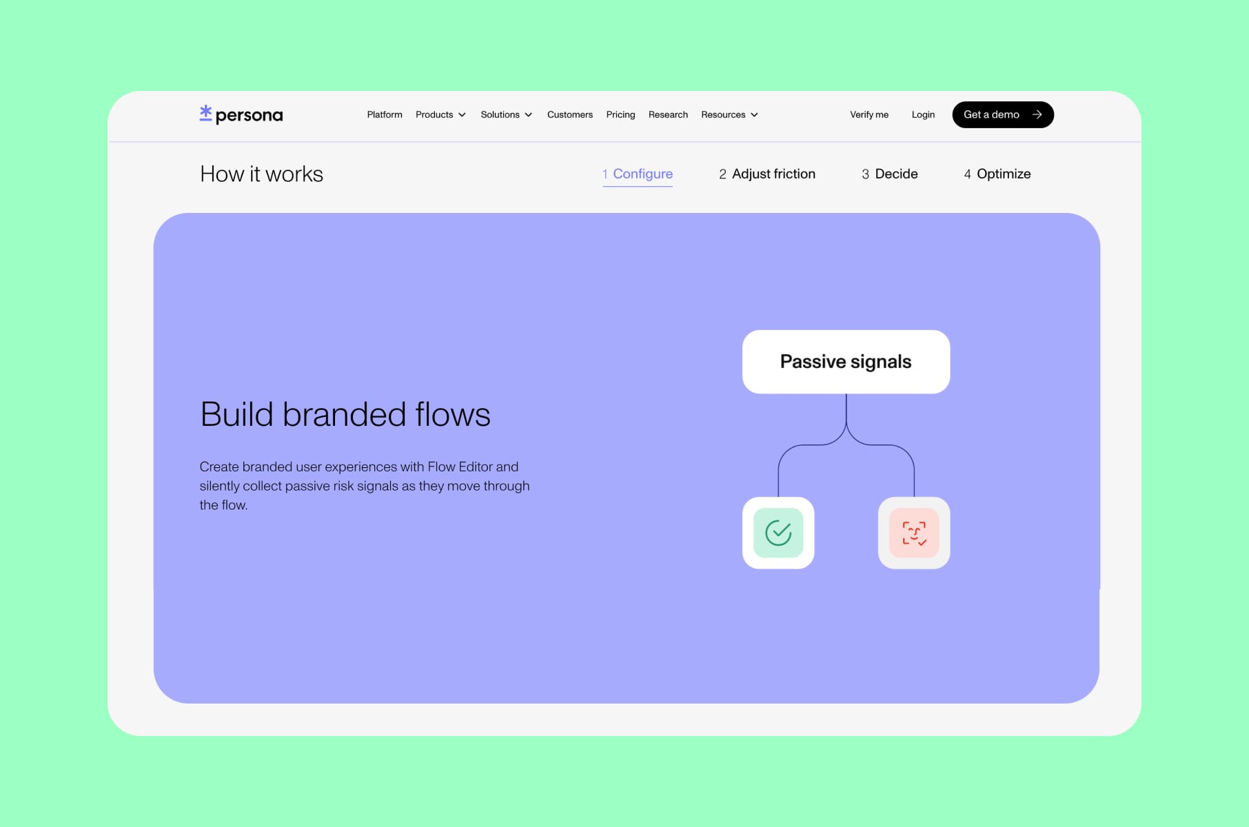
Enterprise design that names the buyer's tension
Persona's platform page is the best product page we've seen this year at handling the central tension of identity verification: every extra verification step costs you signups, but skipping verification costs you fraud losses.
The rest of the design serves that one tension:
- Modular building blocks let buyers mentally assemble their own flow.
- Use-case cards segment the page by industry.
- Logo proof and security badges reduce risk perception.
- Configurable demos let teams self-qualify.
It's one of those textbook product layout examples every complex enterprise infrastructure product should study, because the buyer's mental model here is "this could either save us or break us."
The takeaway for product web design in regulated industries: name the dilemma on your product page before the buyer does.
6. Fyxer
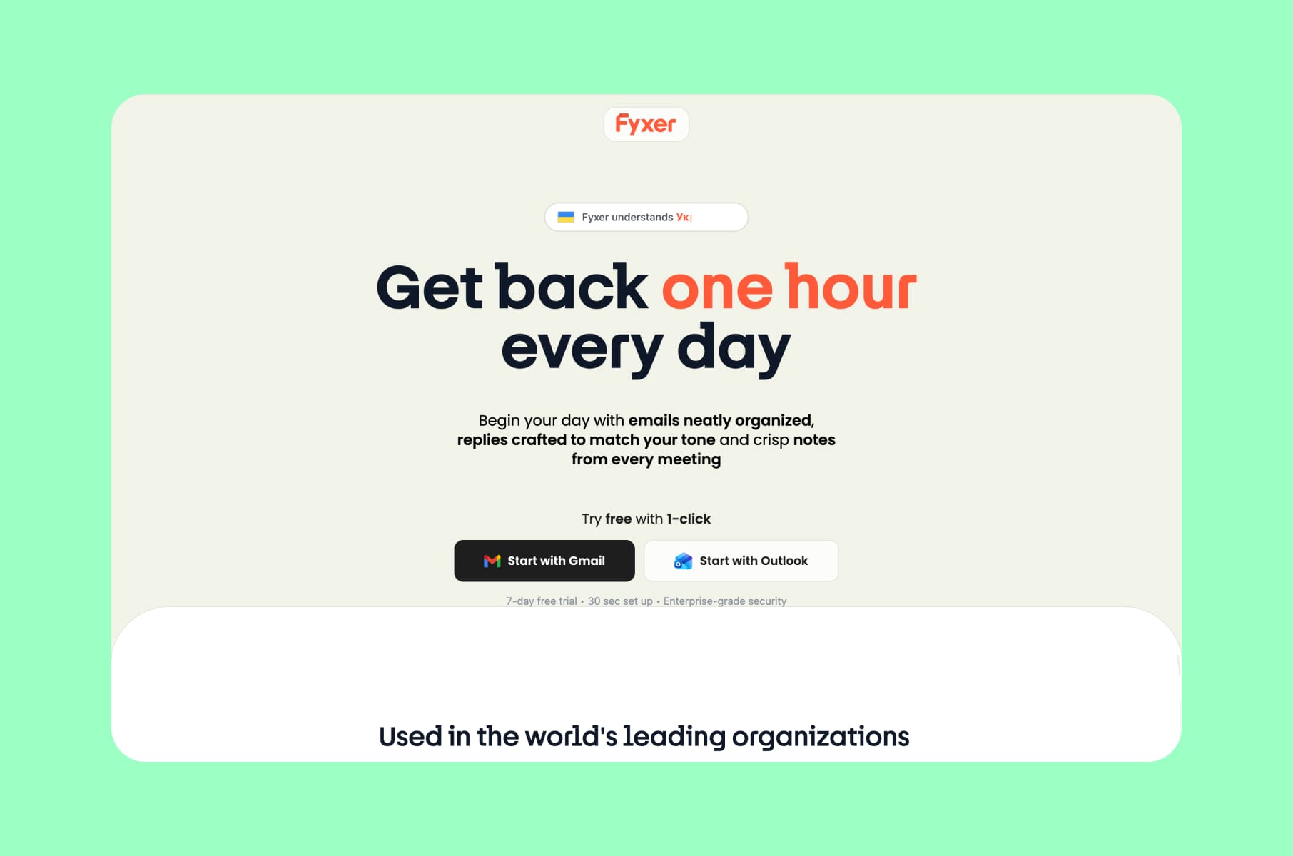
The "give you your time back" positioning, done right
Fyxer's homepage is a great example of concrete time-back copy. "Sort your inbox, draft replies in your voice, take meeting notes." You get three jobs with three results.
The page then adds 100,000+ professionals as proof, a free trial with cancel-anytime, transparent pricing, security copy, and a wall of testimonial "fan mail" that reduces signup anxiety.
The most copyable move is the way Fyxer talks about your voice, your meetings, your inbox - the product is described entirely in terms of your artifacts.
When generic productivity tools talk about themselves. Your product should talk about users’ lives.
For founders building anything in the AI productivity category, this is the product page you should learn from since the combo of specificity, ownership language, and friction-reducer micro-copy at every CTA is what makes a productivity page convert.
7. Amie
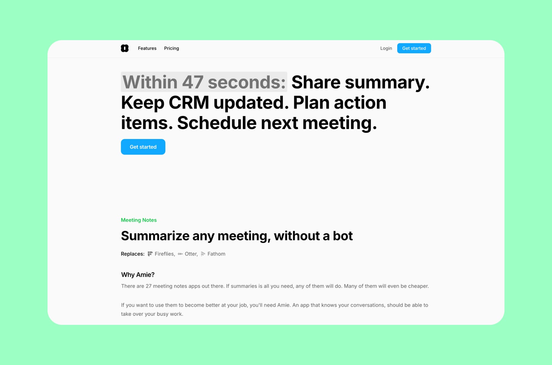
One phrase, one wedge
So what do you do when your category is genuinely crowded? Amie leads with "AI Note Taker without a bot." Five words, but in a category crowded with meeting bots that pop into your calls, Amie is different. The page then names exactly what you replace: it shows logos of competing tools you can stop using.
We also like the "within 47 seconds" workflow line because, in our opinion, specific numbers are always better than fuzzy promises like "fast onboarding." The 7-day onboarding path, integration list, and human testimonials make the page feel like it actually wants you to adopt it.
Amie is on this list of great product pages because of the headline discipline. Every paragraph below the fold reinforces that one phrase. If you can't compress your wedge into a sub-15-word headline, your product page is doing too much work to make up for it.
8. Basedash
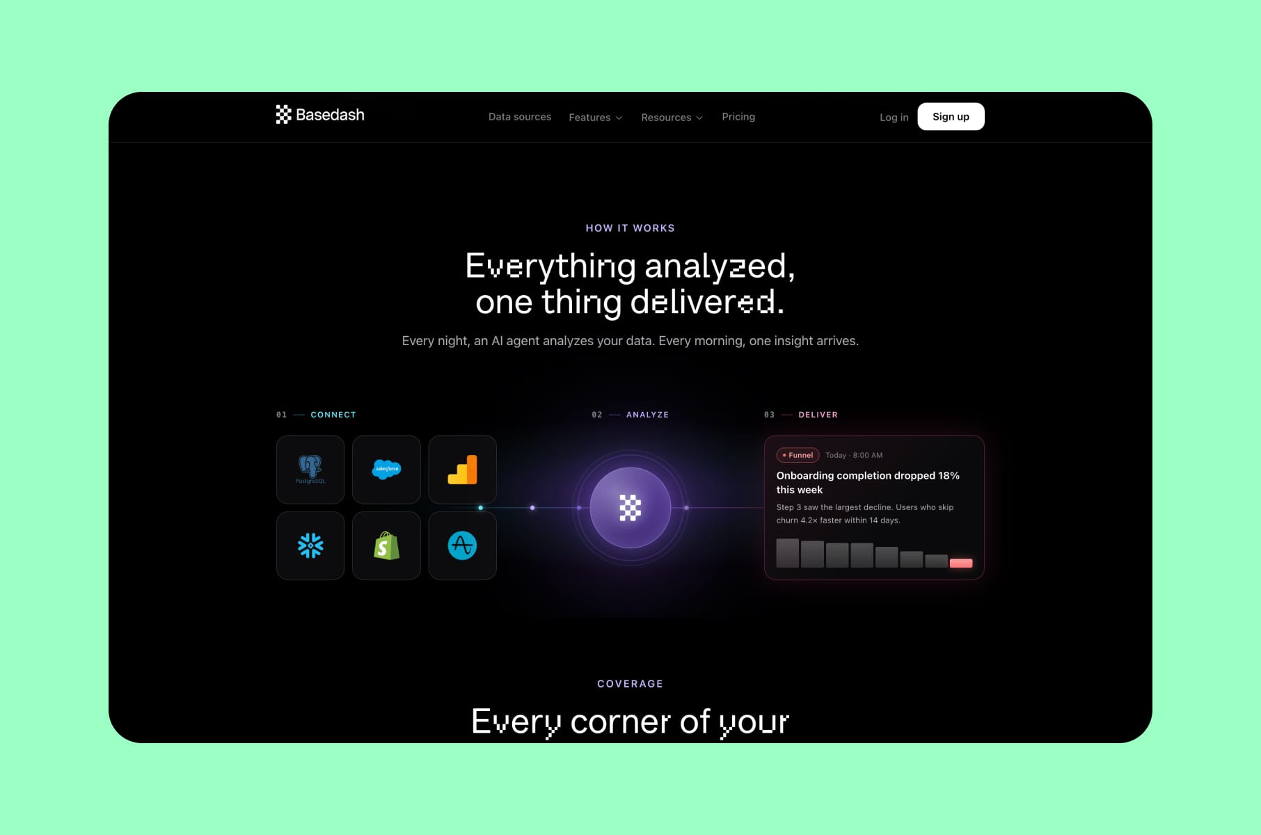
AI-native BI without the setup anxiety
BI tools usually lose deals because the setup feels brutal. Basedash, on the other hand, opens with "AI-native Business Intelligence" and then immediately shows dashboards being generated from a single prompt.
The supporting design moves are quite smart:
- Team-specific question examples (what marketing asks vs. what ops asks).
- 100+ teams of social proof and testimonials are placed near the workflow walkthrough.
- 750+ integrations to handle the "will it work with my stack" objection.
- And a CTA pair of "Start free" and "Book demo" for both buying modes.
By the time you reach pricing, the page has already pre-resolved the setup fear that kills most BI demos.
If you're selling into a category where the buyer has been burned before - BI, CRM, analytics, data infrastructure - this is the product page template to mimic. Show the easiest first 30 seconds of using the product. Everything else can wait.
9. Harvey
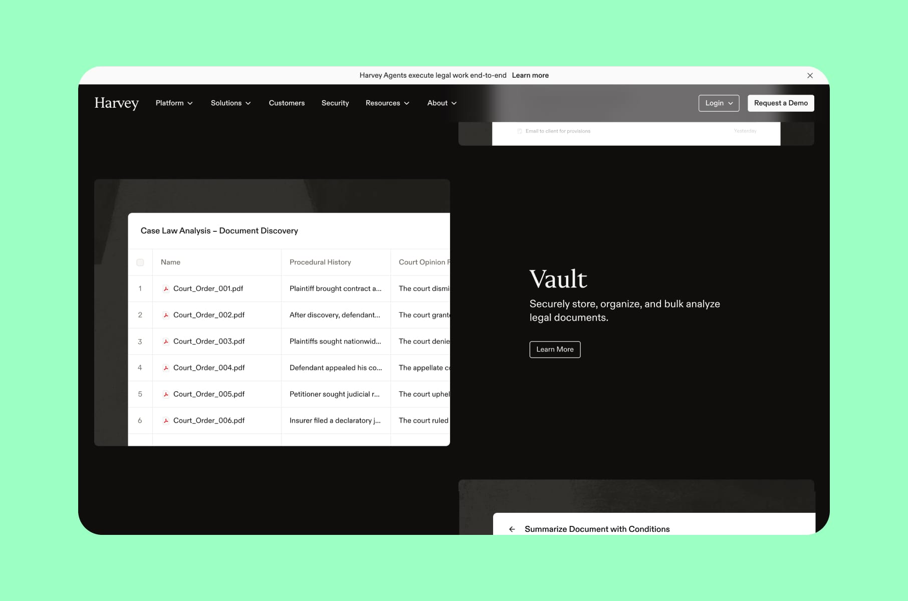
Enterprise trust before anything else
Harvey's platform page is the calmest product page on this list, and that's the point. Legal-enterprise buyers don't want hero animations and big claims. They actually just want the AI vendor that won't get them fired. That’s why Harvey leads with calm copy, heavy logo proof from elite law firms, segmented professional-services use cases, and customer testimonials with named partners.
What's working: the page reduces perceived risk for a high-ACV product by under-claiming visually. You don't see "revolutionary AI" anywhere. You see Allen & Overy, PwC, Bridgewater.
According to Basement Studio's case write-up, the same brand/website work helped Harvey scale from seed to unicorn. Sure, it’s not a direct conversion metric, but a useful signal that the trust-led aesthetic is doing real commercial work.
For founders selling into law, finance, healthcare, or government, basically the categories where "too AI" is a deal-killer, Harvey should be the reference product page.
10. Loops
Category compression done right
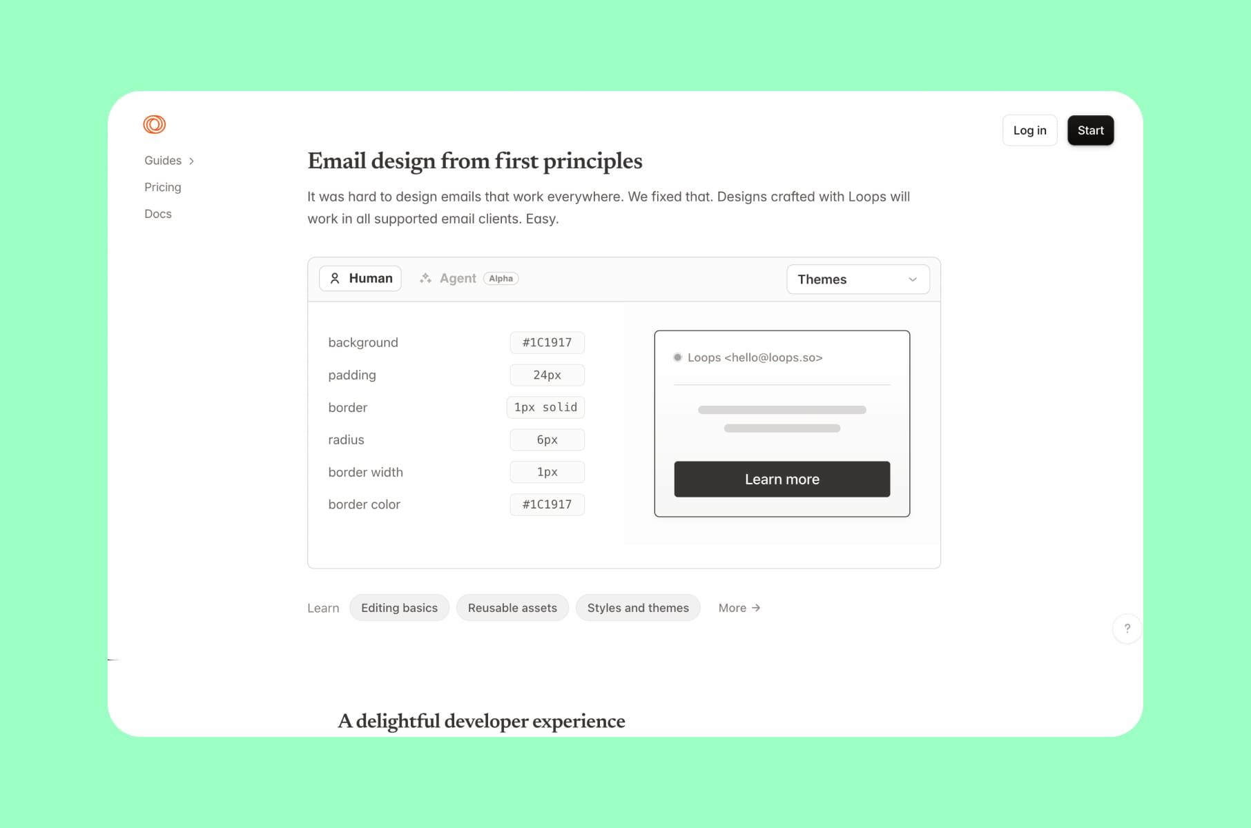
Now, Loops sells email for software companies, and its homepage runs on a single tight line: "One platform, every email." That's pretty much pure category compression since transactional, marketing, and lifecycle are all collapsed into one promise.
The page then earns the claim with software-company logos, developer-friendly API copy, lifecycle workflow visuals, revenue and conversion tracking blocks, and "free to start, no credit card" micro-copy.
Loops is also one of the cleanest product webpage layouts on this list, visually. They have generous whitespace, minimal decoration, and product screenshots that do the job. It's a great example of restraint.
If your product replaces three or four older tools, the category-compression headline is your friend. Pick the smallest possible noun ("every email," "every contract," "every signal") and let the rest of the product page argue for it.
11. Cora
The emotional + economic double anchor
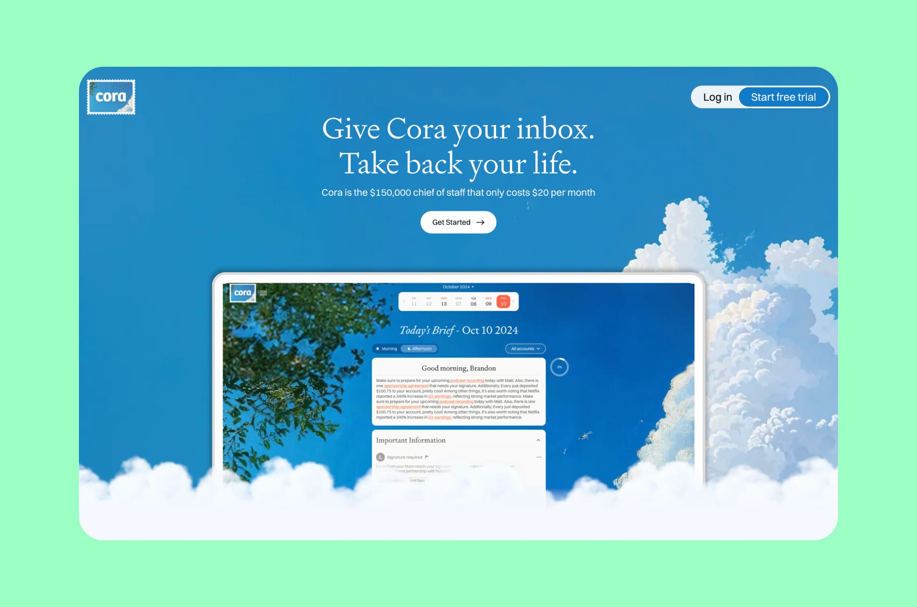
Cora by Every has two of the best lines on the page: "Give Cora your inbox. Take back your life" and "$150,000 chief of staff for $20/month". Together, they do something most SaaS pages never manage - they go for both the emotional trigger and the economic one.
The page also includes a long wall of recognizable testimonials, clear feature sections, draft examples, and a free-trial CTA.
The product itself is a prosumer (a.k.a., both consumes and produces) email AI, but the page looks almost like consumer copy in the way that it understands that someone burned out by their inbox doesn't want a feature list. Instead, they want permission to hope.
For prosumer or low-ACV SaaS, this is a good product page framing. Economic anchoring ("the human version of this costs Xx more") plus emotional payoff ("take back your life") is what gets people to add their card.
12. Spellbook
Vertical specificity wins
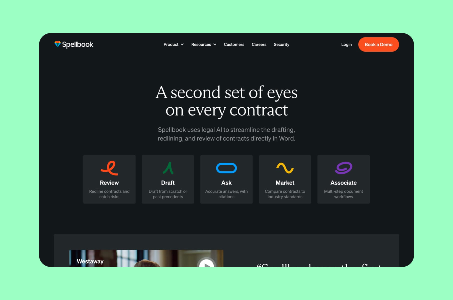
Spellbook describes itself as "Legal AI for Contracts," and the page does follow that description. The product runs inside Microsoft Word, which means the page doesn't have to convince transactional lawyers to picture a new workflow. That single positioning choice removes a lot of friction. More than, for example, three additional feature blocks ever could.
The rest of the page stacks credibility on top of that: 4,000+ teams, 10M+ contracts accelerated, security copy, qualification fields, and clear trial/demo CTAs. It's a textbook example of how vertical SaaS pages convert better than horizontal ones - they don't have to explain the whole world, just one specific job.
If you're building vertical SaaS, this is your reference product page. Don't get tempted by "we can also do X" copy - pick the workflow, name the environment it lives in, and let the specificity do the persuasion.
13. Basecamp
The classic that still holds up
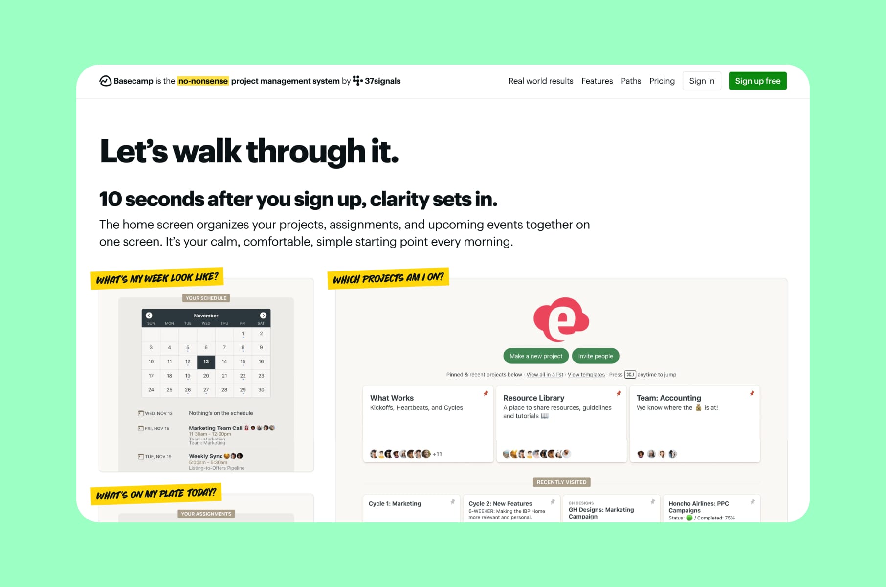
And last, but not least, we sort of wanted to include Basecamp here, even though it's not the most recent launch, simply because it's the product page that pretty much every founder-voice SaaS site eventually borrows from. It has that founder voice, as well as:
- Problem-first copy ("it doesn't have to be this hard").
- Product walkthroughs.
- FAQ-style objection handling.
- And trust signals built on longevity - launched in 2004, 75,000+ organizations, 99.99% historical uptime.
What still works in 2026 is the register. Basecamp doesn't shout. It also doesn't try to sound like a robot. It sounds like a person who has built this thing for 20 years and is genuinely a little annoyed about how complicated everyone else has made project management. That voice is the page's main conversion lever.
For early-stage founders, Basecamp is also a useful reminder. A product page doesn't need to be the slickest design on Awwwards to convert. It just needs to make the reader feel understood.
What we actually copy from these great product websites
Looking at all 13 of these product layout examples side by side, a few patterns repeat enough to be worth calling out.
- Above-the-fold proof. Almost every page on the list shows the product (or its output) inside the first scroll. Hero-copy-plus-mockup is the floor, not the ceiling.
- Pain-first headlines, not feature-first. Sponsy, Cora, Fyxer, Basecamp - the strongest headlines name the bad current state before they name the solution. That's a cheap, scalable copy lever most pages skip.
- Two-mode CTAs. PLG and sales-led often live in the same audience. "Start free" + "Book demo" side-by-side lets both moods convert without rewriting the page.
- Friction reducers at every CTA. "No credit card," "5-minute setup," "cancel anytime," "SOC 2." These aren't features - they're permission slips. The pages that win sprinkle them right next to every conversion button.
- Vertical or workflow specificity over horizontal claims. Spellbook (in Word), Harvey (for legal), Loops (for software companies), and Persona (per industry) all benefit from refusing to be the SaaS for everyone.
- Numbers, not adjectives. "1.1 days saved per employee," "100,000+ professionals," "$2M+ revenue managed," "10M+ contracts accelerated." Pages that quantify outperform pages that hedge.
There's also one anti-pattern that we mentioned earlier: vague AI category copy. "AI for productivity," "AI for revenue," "AI for growth." Every single page on this list refuses to write that sentence, and we'd argue that's the single biggest product web design decision a SaaS founder makes in 2026.
How we think about product page design at Merge
This whole article is also partially a window for you, the reader, into how our team thinks about this stuff. In our product design services, we also treat the product page, the in-product onboarding, and the empty-states as one to help conversion.
When we sit down with a SaaS founder, we usually ask:
- Who is the visitor and what mood are they in?
- What is the smallest credible promise we can put in the hero?
- What is the cheapest possible proof we can show in scroll one?
We've shipped this approach across different categories. Here are some examples.
Our Lox SaaS redesign tied a converting landing page (with a pricing calculator) to a backend tool overhaul and helped reduce churn by 90%.
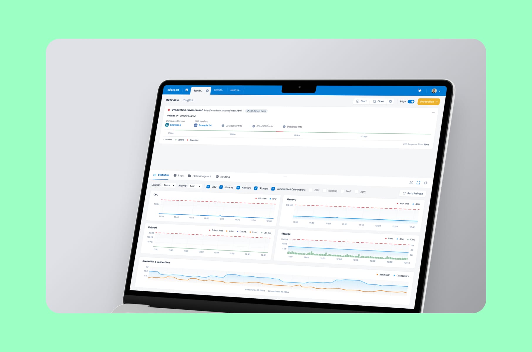
Our work with Edgeport on a B2B SaaS hosting management platform is another good example - the product page had to convey "next-gen IT infrastructure" without scaring off admins still using legacy tooling.
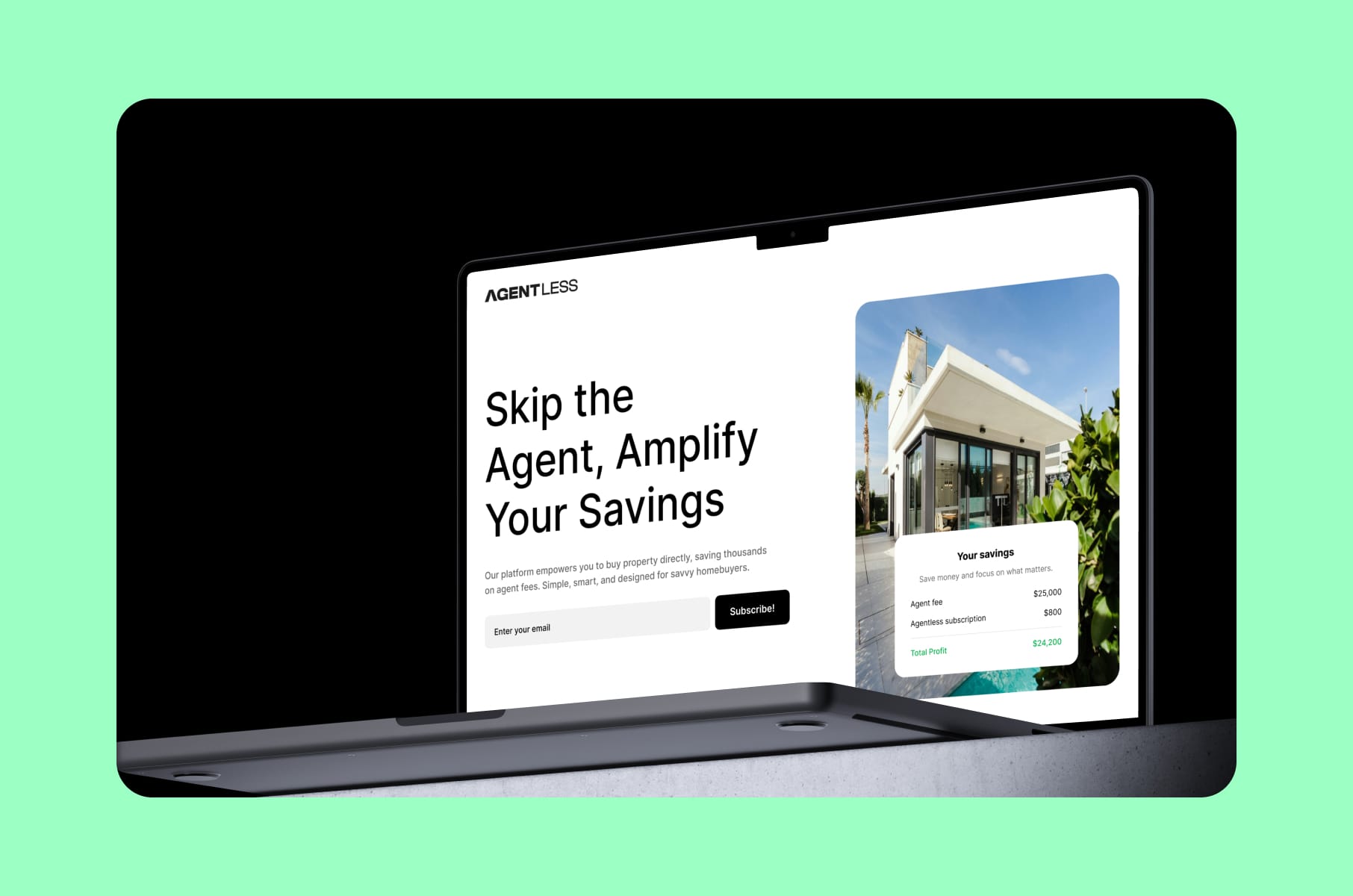
And on Agentless, we designed an AI-assisted home-buying flow where the marketing page and the in-product wizard share the same trust language. A coherent layer of SaaS user onboarding design on top of a converting product page is almost always the move that ships real conversion lift.
If your roadmap has a redesign in it, our SaaS product landing page design service is a good starting conversation, and our broader SaaS product design services cover the dashboard, onboarding, and post-signup states that decide whether the page's promise actually holds up. A two-week design sprint is usually enough to start with.
More tips for designing a product page that converts in 2026
A few practical things we'd hand a founder if they had to ship a new product webpage in the next 30 days:
- Pick one buyer. If your page tries to speak to engineers, ops, and CMOs equally, it speaks to none of them. Pick the persona that closes fastest, write the page for them, and segment the rest into use-case sub-pages later.
- Write the headline last. Most founders start with the hero headline and get stuck for a week. We've had better luck mapping out the page's six jobs first, then circling back to write the hero once the rest of the page knows what it wants to say.
- Show the smallest unit of value. What's the simplest screen, output, or interaction your product produces that a stranger can understand in three seconds? Put that on the page first. Save the dashboard tour for the second scroll.
- Don't bury pricing if your product is self-serve. Hiding prices is a tax on PLG conversion. If you sell into enterprise, "Talk to sales" works, but pretending you don't have a price is the most expensive friction you can add.
- Rewrite your CTAs. "Get started" converts worse than "Create your first AI ad," "Book a fraud-prevention demo," "Analyze your LinkedIn profile." The CTA should describe the very next concrete thing the user will do, not a generic verb.
- Test your hero on mobile. Most SaaS designers still draft on a 1440px canvas. Roughly half your traffic isn't seeing that view. Open the page on your phone before you ship.
A lot of this is in our SaaS landing page mistakes post, so be sure to also check that one out.
Wrap-up: what makes a product page convert in 2026
Overall, we didn’t put these product pages on our list because they're prettier than their competitors. That would’ve been a very subjective decision. Our goal was to list those that convert. And we did. These products are great because each layout decision answers questions like who this is for, what it does, will it work for me, what's the next step, etc., before the visitor invents a reason to leave.
If you take one thing from this teardown, let it be this: in 2026, vague positioning is bad, generic copy is bad, and burying the product behind hero animation is actually very expensive. The pages that convert show the thing, name the pain, prove the result, and ask for the next step.
At Merge, we believe your product page shouldn’t feel like a brochure. We want it to look like the first 60 seconds of using your product. That's the bar we hold our own SaaS website design agency work to, and it's the bar we'd encourage every SaaS founder reading this to set as well. Use this list as a starting point. Whatever you decide, Merge can help you with it!
FAQ
What is a SaaS product page exactly?
A SaaS product page is the page on your marketing site where a visitor decides whether to try, demo, or buy your software. It's distinct from a generic homepage or a feature page - the product page has to do the full pain-to-promise-to-proof-to-action arc in one URL. For most SaaS companies, it's either the homepage itself (for single-product startups) or a dedicated /product or /platform URL (for multi-product companies).
How long should a SaaS product page be?
There's no universal answer, but most of the product page examples in this teardown sit between 5 and 12 scroll-screens on desktop. Enterprise pages tend to be longer because they have more objections to handle. PLG pages tend to be shorter because the buyer just needs to get to "Try free." A useful rule: every section should answer one buyer question. If a section doesn't, cut it.
What's the difference between a homepage and a product page?
A homepage often serves multiple audiences - prospects, existing customers, investors, and recruits. A product page serves exactly one: the buyer. That focus is why we usually recommend SaaS founders treat the product page as a separate URL with its own conversion goal, even if it currently shares space with the homepage.
Are interactive demos worth adding to a product page?
For most SaaS, yes - especially product-led ones. Guideflow's own metrics suggest meaningful conversion lift after embedding an interactive demo, and we've seen similar patterns in our own client work. The catch: the demo only helps if your product's "wow" moment can be experienced in under 60 seconds. If your product needs ten clicks to make sense, a short video or annotated screenshot will outperform a half-baked demo.
How do I make my product page rank in AI search and SERPs?
Two practical moves. First, write your hero and first scroll so they answer the question a buyer would type into ChatGPT or Google: "What is the best [your category] tool for [your ICP]?" Second, include an honest FAQ at the bottom that uses the language buyers actually use. AI search and traditional SEO both reward pages that answer the question early and clearly. We covered more of this in our SaaS websites 2026 deep dive.
What kind of agency builds the best SaaS product pages?
The honest answer: one that designs the product page and the in-product experience together. A page designed in isolation almost always over-promises something the product can't deliver in the first session. That's why our SaaS design agency work usually covers both the marketing surface and the product itself - the conversion isn't done when someone clicks "Sign up," it's done when they come back on day three.