0
Table of Contents
Product design ≠ pretty screens. Here’s how SaaS users actually adopt features
Learn what product design actually means when you frame it around revenue.
Let's get one thing out of the way. You did not raise a round to ship Figma files. You raised it to acquire users, keep them paying, and grow your revenue. So when we say product design, we mean the thing that decides whether the feature you just spent weeks building gets used by more than 6% of your customers. The visual layer is actually the smallest part of that.
That is not a hypothetical number.
Across SaaS, only 6.4% of features drive 80% of the click volume in the average product. The other 94% are basically furniture. A "good" feature adoption rate in B2B SaaS is around 28%. Top performers get 15.6% on newly launched features, which is 2.5x the average and still under one in six users.
If your last release flopped, don’t worry - you are not failing as a founder.
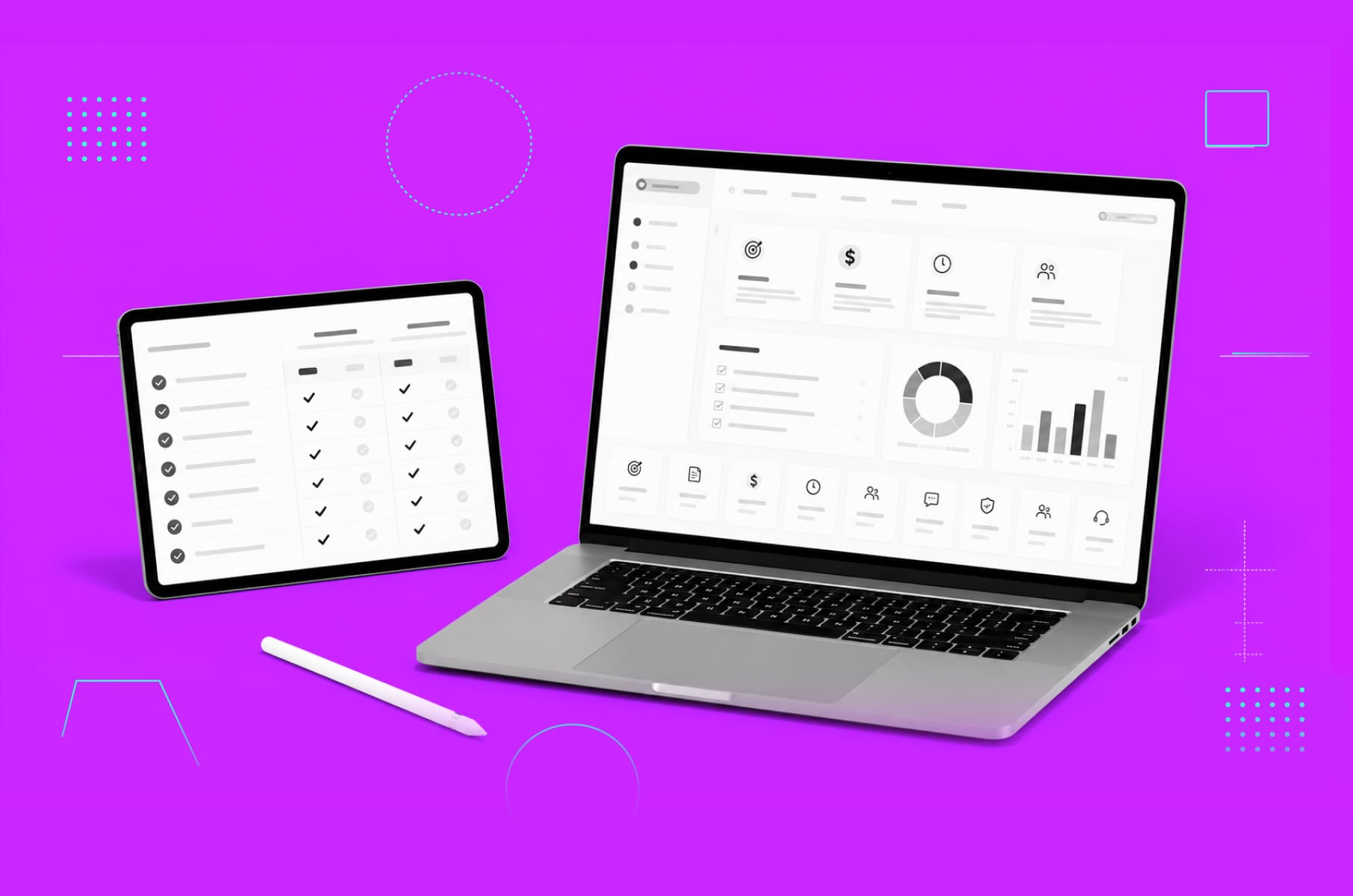
At Merge, we have been doing SaaS product design and front-end work for B2B teams for a while - trading dashboards, telecom platforms, AI workflows, healthcare portals, etc. We know from experience that users do not adopt features they cannot find, cannot trust, or cannot fit into the job they were already trying to do.
So, read on to learn what product design actually means when you frame it around revenue.
What is product design?
Product design turns engineering output into recurring revenue. It shapes how your product behaves the first time a user lands and the tenth time they come back, with every edge case in between. Calling it UI polish plays it down by a lot, since this is actually the layer that determines your trial-to-paid conversion rate.
The product design meaning that is in agency decks usually leaves this part out for simplicity, but then founders hear "designing a product" and picture wireframes plus a colour palette.
In practice, how to design a product that actually pays back involves five moving parts:
- The flow a user takes.
- The edges where it breaks.
- The empty screens before there is any data.
- The permissions that gate every B2B feature
- The design system that keeps you shipping at the same speed later.
Here is the working definition we use at our SaaS design agency:
Product design is the practice of turning a job your user is already trying to do into a flow they can finish confidently, repeatedly, and without thinking about it.
If a feature does not help someone finish a job they were going to do anyway, they will not adopt it. No matter how good it looks.
What features actually cost when they fail
Founders think about features in dollars. Engineers think about them in hours. Designers think about them in screens. What to do then?
Here is the founder's eye view of how a "the feature just isn't getting used" problem relates to real costs:
What breaks in the product | What your user does | What it costs you |
Feature buried two clicks deep | Never finds it | 6-8 weeks of engineering and a missed upsell tier |
Broken empty state on first run | Bounces in session one | Activation drops 30-40%, CAC payback stretches |
Confusing error or "Access denied" | Quietly stops logging in | Support tickets up, NPS down, no signal to product |
Onboarding never mentions the feature | Stays on the cheaper plan | Trial-to-paid stuck at 8%, not 15% |
Same UI component built three times | Engineering slowed by tech debt | Release cycle gets 40% slower over time |
Edge case not handled | Hits a 500 page mid-task | Trust gone, refunds requested |
Public cloud companies spend roughly $29.5 billion on features that may rarely or never get used. You are paying engineers to build that quietly invisible 94%. Most founders reading this article have probably spent 20-40% of their last burn on it.
Your brand and your marketing can both be doing their jobs while this happens, because your leak is in product design. Let's unpack where exactly.
1. User flows
The biggest revenue lever you are not pulling
A user flow is the path someone takes to do things like signing up, inviting a teammate, running a first report, configuring an alert, etc. Most flows in B2B SaaS were built when the product had maybe five features, and oftentimes they were never revisited. No wonder users hit friction and drop.
74% of users abandon a product if they hit friction during onboarding. More than half of all churn happens in the first week.
Chargebee, for example, changed one early question in their flow ("Are you SaaS, services, or ecommerce?") and pre-populated test data based on the answer. Their trial-to-paid conversion went from 8% to 15%. Just one question and almost double the conversion.
The process of product design that we run at Merge starts by mapping the user flow first, before even touching the visuals. We sketch each flow and mark the decisions. After overlaying the analytics, the reasons for drop-offs are usually obvious pretty soon.
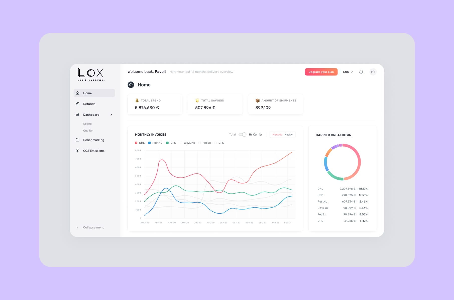
For example, we did this on LOX, a shipping logistics SaaS. The original flow asked users to upload invoices before they had any idea what the tool would do with them. We restructured so the value (AI-driven invoice analysis, cost transparency) showed up before the upload, not after. The redesign cut their churn by 90%.
What we lean on for every new product:
- Map flows at the level of decisions and not screens. A single screen can hold three decisions.
- Cut every step that is not a decision. If your user has nothing to choose, do not ask them to click.
- Make the next step the most obvious thing on the page. The next action should be findable in under three seconds.
- Instead of the first visit, optimize for the second. That initial sign-up might just be a one-off.
A note on tour-style onboarding
Product tours feel productive, but they are not the same as fixing the flow. Appcues found that four-step tours get completed about 40.5% of the time. Add one step, and completion drops to 21%. Before you race off to build shorter tours, consider what those numbers imply: a tour is what you build when the flow itself does not teach.
Fix the flow first!
2. Edge cases and error states
The trust your users do not give back
When something breaks, your user stops thinking about the feature and starts wondering whether your product can be trusted with their work at all. You almost never see error screens in design reviews, but your users do see them, and often.
If your product cannot handle a 200MB upload, a stale session, a revoked permission, or a half-finished form, chances are your engineers do not know how to handle it either. The result just has default browser errors and a Sentry log, and users usually don't raise tickets about these.
The product design steps we use to cover edge cases:
- Inventory every async action. Every save, fetch, upload, sync, webhook. Each one needs a loading, success, partial-success, and error state.
- Write the error copy first. If you cannot describe the failure in one clear sentence, the underlying logic is probably tangled.
- Give the user an action. "Retry," "Refresh," "Contact admin," "Switch workspace." Anything is better than "Something went wrong."
- Treat the offline state as a real state.
This is the cheapest layer of work to do well and the most expensive one to skip. It is also where permissions start to matter.
3. Permissions and roles
The silent friction tax on B2B
B2B SaaS runs on roles like admin, member, viewer, owner, billing, and guest. Permissions are simple in theory and a nightmare in practice. The edge cases also multiply quickly. However, what happens when an admin gets demoted mid-session? Or when a user loses access to a doc? How about when a viewer tries to invite someone or when the workspace owner leaves the company?
Most teams handle permissions in the database layer and then forget to design them. A growth feature behind an admin-only toggle that nobody knows about will not get adopted, no matter how good it is.
A useful frame from the Department of Product article on SaaS permissions is that effective permission systems work at three layers:
- Page-level (what you can see).
- Operation-level (what you can do).
- Data-level (which records you can touch).
Product design for permissions means making each of those three layers obvious to the user.
What we do instead:
- Hide what cannot be used. A disabled button with a hover tooltip is worse than a clean UI without the button.
- Show why something is gated. If a feature is admin-only, say so on the spot. "Ask your admin to enable this" is better than a silent "Access denied."
- Design the role-switch path. If your product has multi-workspace logins (every B2B tool eventually does), the workspace switcher is one of the highest-traffic patterns in the app. Treat it like a feature, not a dropdown.
- Test the demotion scenarios. A user being demoted mid-session is not exotic. It happens in real companies.
4. Empty states
The cheapest activation lift you can buy
Empty states, unfortunately, get treated like decoration, even though they might be the most expensive screen in your product, because you have a brand new user, paying nothing yet, deciding whether your tool is worth ten more minutes of their day.
Did you know that guided empty states reportedly lift activation by 30-40%? Most churn happens before activation. 80% of users drop in the first week if they fail to activate.
Notion, Linear, Asana, and Airtable all worked a good amount on their empty states. Notion, for example, drops you straight into a template gallery while Asana runs a small line-art creature that cheers when your task list is clear. Linear gives you a primary CTA, a secondary CTA, and a one-sentence explanation of what to do next.
Four things every good SaaS empty state has:
- A one-sentence explanation of why the screen is blank.
- A primary action that takes the user toward the first value.
- A secondary action for users who want to learn or import, not start from scratch.
- A visual that fits the brand without screaming "stock illustration."
We ran this experiment on TelQ, a SaaS for SMS testing. We redesigned the data tables and the first-run empty states based on user feedback. The platform became materially easier to use without changing a single feature because the feature was there all along.
5. Onboarding
The shortest path to your first revenue signal
If you have to pick one obstacle for SaaS feature adoption, it is the first session. The research is pretty consistent on this:
- Users who hit their aha moment within five minutes show 40% higher 30-day retention than users who need 15+ minutes.
- Users who reach the aha moment within three days are 90% more likely to become active.
So the real onboarding question becomes: what is the shortest possible path from sign-up to the moment your user thinks "yes, this is worth paying for"? What the welcome modal says comes later.
A few principles we apply to onboarding-heavy projects, drawn from years of doing user onboarding design for B2B SaaS:
- Personalise on intent, not on persona. Ask one or two questions that route the user toward the right first action. Chargebee's "SaaS, services, or ecommerce?" question is the canonical example, and the revenue lift is real.
- Skip the tour. Replace it with in-context nudges on the actual screen, when the user needs them.
- Make the first action a real action. Importing data, sending a test message, running a real query. Not a fake "tutorial click."
- Defer the rest. The other 80% of features should reveal themselves as the user grows into them.
By the way, our team has a deeper take on the SaaS onboarding process step-by-step and a breakdown of how Dia, Superhuman, Duolingo, and Figma onboard new users.
6. Design systems
The cost-saving layer founders underestimate
You might hear "design system" and think "nice-to-have, we will do it later," but the math says otherwise.
Teams with a mature design system reportedly ship features 2-3x faster than teams without one. For example, one SaaS company reported a 40% faster release cycle after rolling theirs out.
Organisations of 100+ employees also report a 46% reduction in design and development costs after implementation. One estimate puts the annual cost of design inconsistency at $1.5M per mid-market SaaS.
The reason is that, without a shared library, every new feature gets rebuilt from scratch by slightly different people with slightly different opinions. Design reviews turn into arguments about buttons, engineering ends up carrying three button components and two modal patterns at the same time, and what happens next? Correct, your product no longer looks right, and your team is slower.
A design system fixes that by making the patterns the default. We have built systems for B2B SaaS clients across a few industries. On HeyLady!, we built the design system that became the standard across chat, events, and onboarding. Less rework and faster delivery.
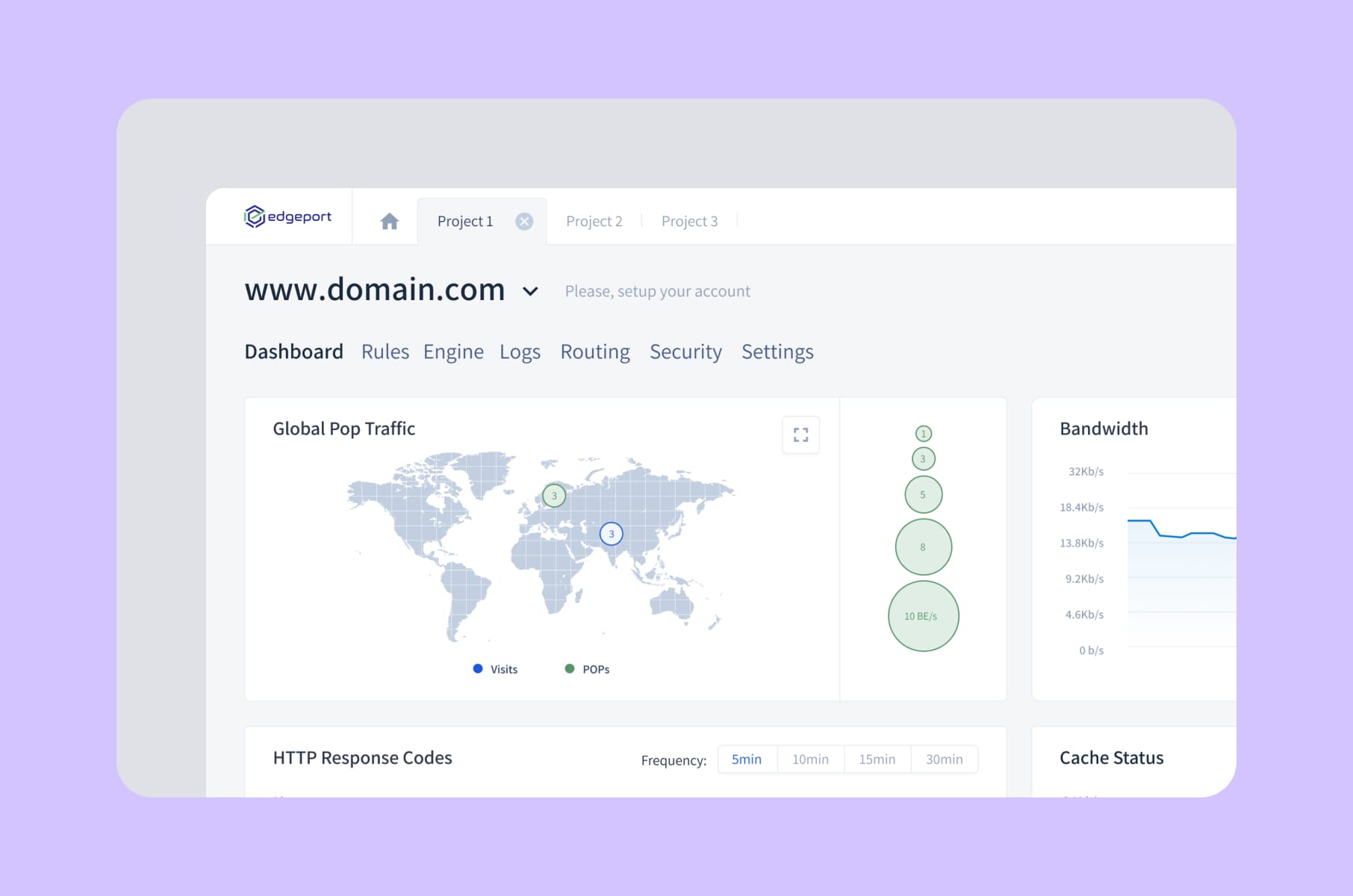
On Edgeport, a B2B SaaS for cloud-based IT infrastructure, we delivered end-to-end UX/UI plus the MVP front-end. Hosting management is a notoriously dense interface, and a consistent component library is what lets admins and end-users move through it without training.
If you are still asking, "Do we need a design system yet?", think:
- Does your team have more than three designers?
- Does your product have more than 20 screens?
Then yes, you do need it.
Our design system service is one of the things B2B founders come to us for most often.
Our product design process
The product design stages, with founder outcomes
Most agency decks describe the process of product design as "discovery, design, iteration." It’s fine for a slide but useless for a CEO planning a roadmap. Here is a better version, together with what each step gives you on the other side.
Product design stages | What we do | What it gives the founder |
1. Discovery and user research | Interviews, analytics audits, jobs-to-be-done mapping | A clear list of which jobs your product wins on and which it loses |
2. Flow mapping | Diagram existing flows, mark drop-offs, redesign the bad ones | Activation lift before any pixel work begins |
3. Concept and wireframes | Low-fidelity layouts focused on decisions, not visuals | Cheap validation that kills bad ideas in days, not months |
4. Visual design and the design system | Component library, patterns, brand application | Faster shipping for every release after this |
5. Edge case and state design | Empty, error, loading, permission, expired-trial states | A trust layer that stops the quiet churn |
6. Prototyping and usability testing | Clickable prototypes tested with real users | Friction killed before engineering touches it |
7. Hand-off and front-end build | Storybook, design tokens, parity between design and code | Engineering velocity, no design-vs-dev mismatches |
8. Post-launch iteration | Adoption tracking, feedback, optimisation | Real numbers, not opinions, driving the roadmap |
That is the version that scales from MVP to a mature platform. If you are at the very start of designing a new product, our SaaS design and development services cover everything from idea validation through to a working MVP.
And if you are improving an existing platform, our SaaS product redesign work picks up at step 4.
The product design steps stay the same. The pace changes with the scope and the budget.
More tips for designing products that get adopted
A short list of things that have consistently moved the needle on our SaaS projects, in no particular order.
- Cut features before adding them. If 80%+ of features go unused, the unit economics of "ship more" are pretty bad. Trimming is almost always cheaper than building.
- Use progressive disclosure for power features. Hide complexity behind expandable sections, tabs, or advanced toggles. NN/G has written about this pattern for decades, and it still works.
- Treat the dashboard as a feature. The dashboard is where your users spend most of their session. Our dashboard design service briefs obsess over information density, scannability, and the next action.
- Write microcopy in the design file. If a button says "Submit," your design is not done. Microcopy carries half the weight of any flow.
- Instrument adoption from day one. Pendo, Mixpanel, Amplitude. You cannot improve what you cannot see, and adoption is a metric that moves quietly.
- Look at real products before you draw. We wrote a piece on UX best practices from productivity apps like Notion that is full of patterns worth borrowing.
- Avoid the 5 design mistakes that quietly kill retention. Our team has a breakdown of the 5 SaaS design mistakes that kill user retention that is worth a read before your next sprint.
A quick FAQ
What is product design for SaaS in one sentence?
Product design for SaaS is the layer that decides whether the feature you paid to build gets used and adopted. It covers UX, UI, interaction, microcopy, edge cases, error states, empty states, and the design system holding it all together.
What are the main product design stages?
The typical product design stages are discovery and user research, flow mapping, wireframing, visual design and the design system, edge-case design, prototyping, usability testing, hand-off, and post-launch iteration. The table above is our version, mapped to founder outcomes.
How long does designing a product take?
A first MVP usually takes 6-12 weeks of design and front-end work. A full product design process for a more mature platform runs over a few quarters and runs in parallel with engineering. A focused redesign of an existing product can be scoped down to a 2-3 week design sprint.
How do you measure whether designing products is paying off?
The honest answer is feature adoption, activation rate, and time to first value. According to Pendo, B2B SaaS averages around 28% feature adoption. Top performers hit 15.6% on newly launched features, 2.5x the average. If your numbers are below that, the product design layer is where the gains are.
What is the difference between UI/UX design and product design?
UI/UX design is one part of product design. The umbrella is broader and includes the strategic, behavioural, and state-level work that pure UI/UX usually skips. Our UI/UX design services page goes deeper on how the two map together.
Wrap-up
Pretty screens are a part of product design that founders pay most attention to in design reviews. Yet adoption itself is actually in the flow, the empty state, the error, the permission, the onboarding, and the design system.
The right products get out of the way and let users do what they came here to do.
If you want a partner who treats product design as a revenue lever and not as a Dribbble shoot, Merge designs and builds SaaS products end to end with a clear eye on activation, adoption, and renewal from day one.
Whether you are starting from scratch or rescuing a product that ships features no one uses, our SaaS product design services and broader product design services can help.
P.S. Check out our comprehensive guide to SaaS product design as well for more insightful information on this topic.