0
Table of Contents
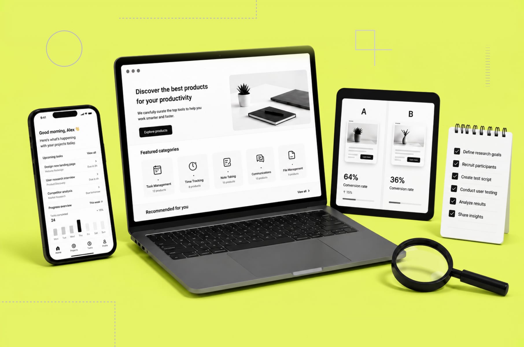
We analysed the onboarding experience of Dia, Superhuman & more. Here's what makes users stay
Useful breakdowns of how Dia, Superhuman, Duolingo, and Figma onboard new users.
Most products lose the majority of their signups within the first session. The user downloads, opens, looks around for a few seconds, and leaves. Not because the product is bad. Because the onboarding experience failed to make them care fast enough.
What makes users stay after onboarding? Across every product we studied, the answer comes down to delivering a meaningful first action before asking for any commitment - and teaching the product's core interaction through the product itself, not through a separate tutorial.
As a product design agency for startups, we spend a lot of time at Merge designing first-run flows for our clients ourselves. We see what works and what doesn’t. So we decided to go even deeper and analyse the best onboarding experiences shipping right now and document what makes each one effective.
Every section, we’ll walk through a real product flow, tell you what the team got right, and end with a pattern you can apply to your own product immediately.
Why the first 60 seconds decide everything
An onboarding experience is the full sequence of screens, prompts, and interactions a product delivers during a user's first session - from initial signup through the first meaningful action.
The window between "I signed up" and "I get it" is getting shorter every year. Users have been trained by apps like Duolingo and Superhuman to expect value within the first minute. If your first-run experience asks for too much before giving anything back, you will lose that user for good.
That first impression does two things at once. It teaches the product's core interaction model. It also communicates the product's personality and quality bar. The best user onboarding experiences manage to do both without feeling like a tutorial. They feel like the product itself.
Let's look at how the best teams pull this off.
Onboarding experience of Dia Browser
All about first impressions
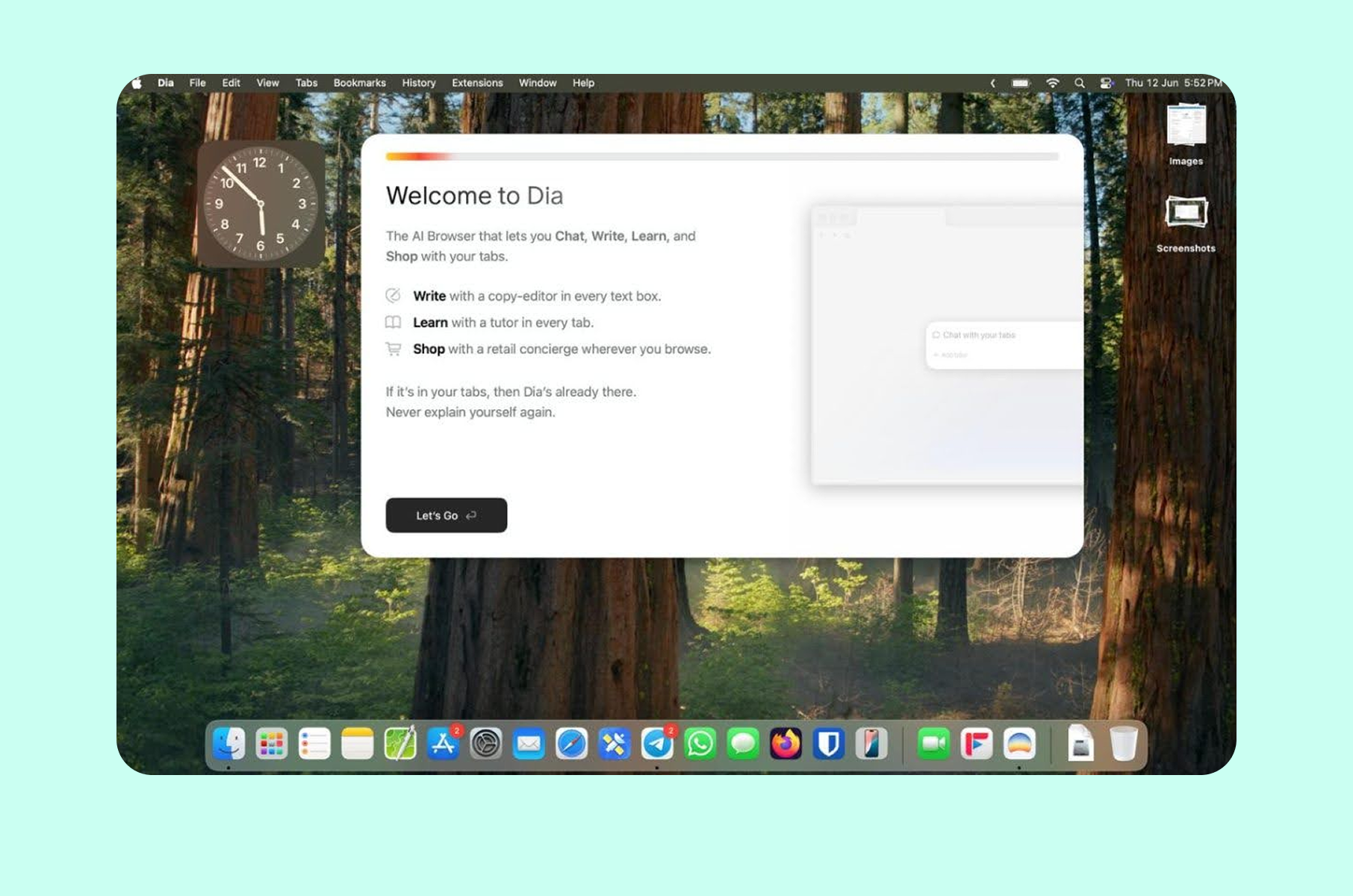
When The Browser Company launched Dia in beta in June 2025, the reaction on Reddit was immediate (and a little polarising). The first-run experience definitely didn’t feel like setting up a typical browser.
The "Tuesday morning" principle
Dia's design team, which includes Charlie Deets (who spent five years as a Human Interface Designer at Apple working on Safari and Privacy), built the entire first-run flow around a single constraint. As the team outlined in their design strategy post, any person should be able to switch to Dia at 10 am on a Tuesday morning and get their work done without friction. They call this the "Tuesday morning" test, and it governs every design decision in the first-run experience.
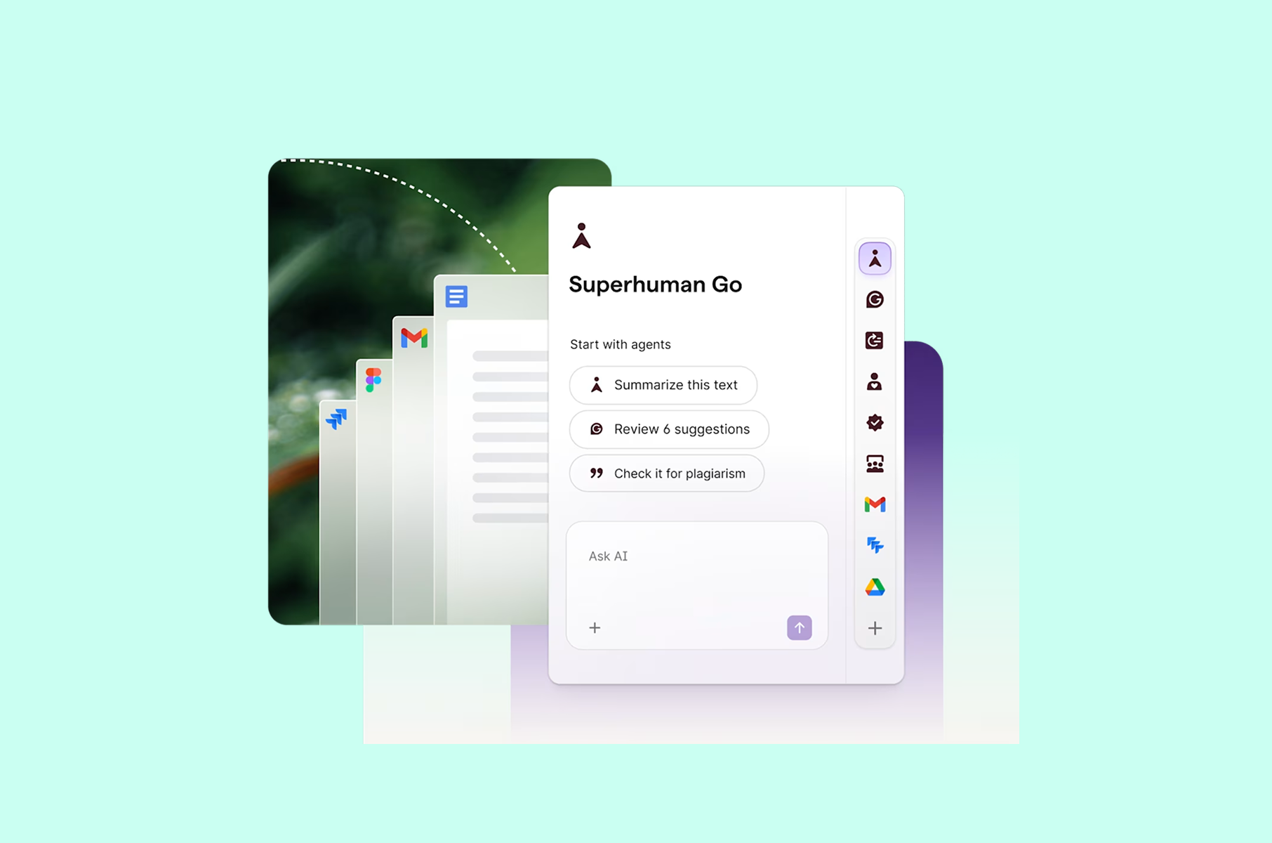
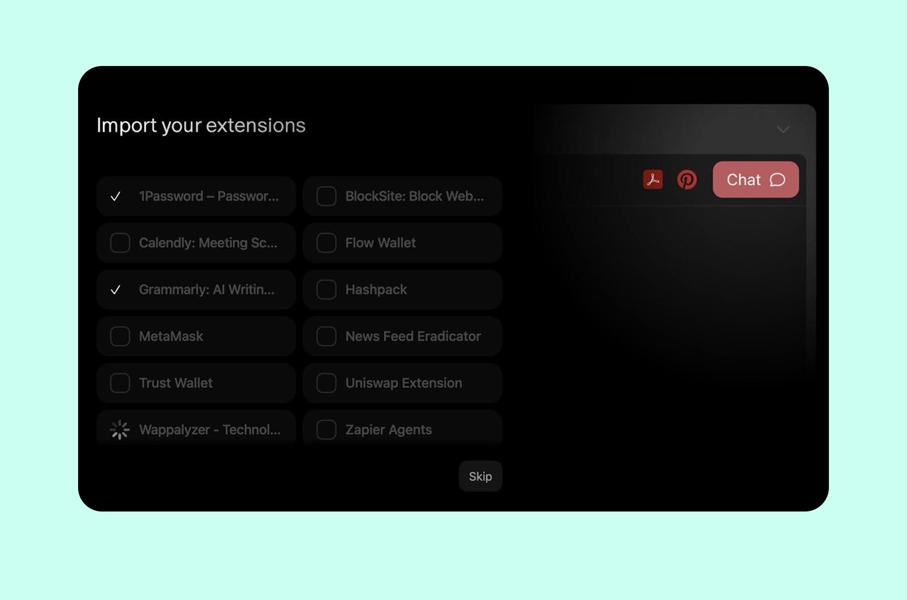
That means Step 1 focuses entirely on familiarity. When you first open Dia, it looks like a browser. Tabs at the top, address bar where you expect it, bookmarks importable in one click. For Arc users, Dia pulls in bookmarks, cookies, site preferences, and browsing data automatically. For Chrome or Safari users, the import covers passwords and history, plus your installed extensions.
Progressive disclosure of AI
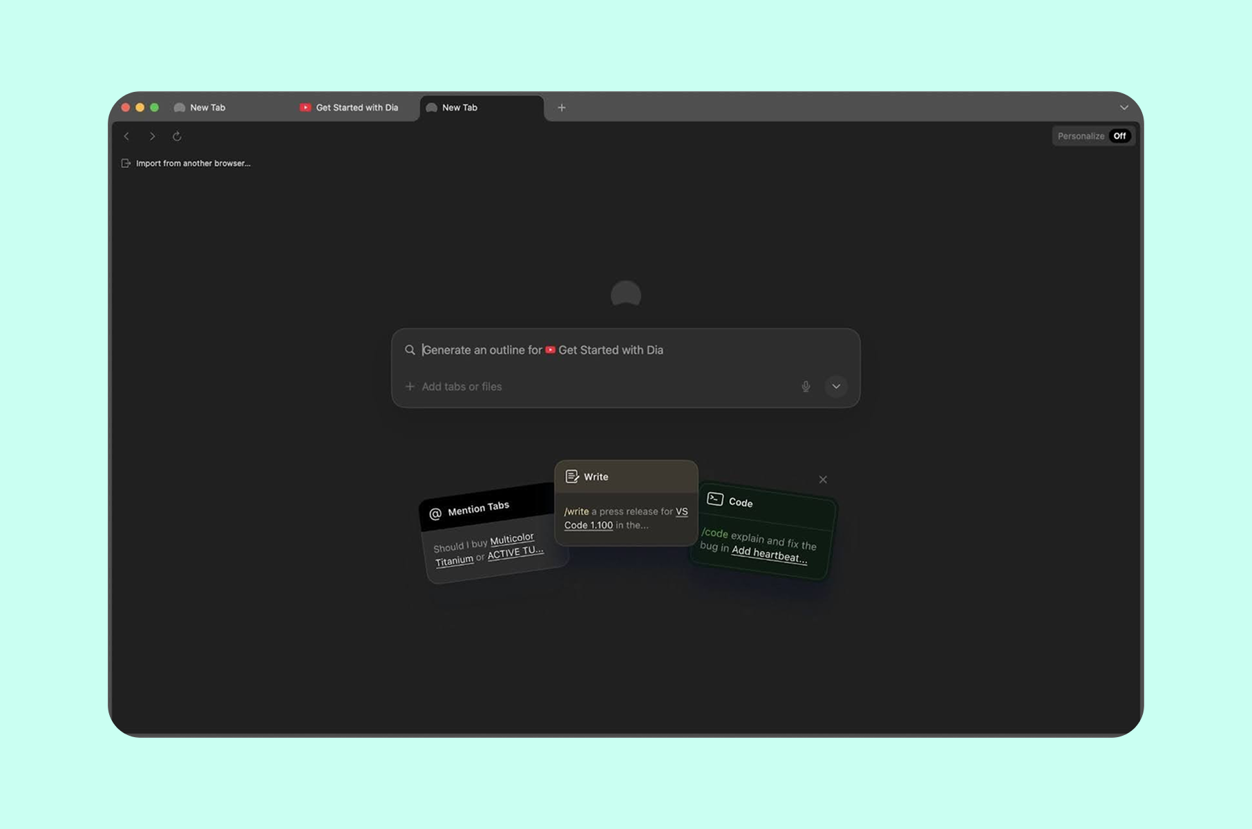
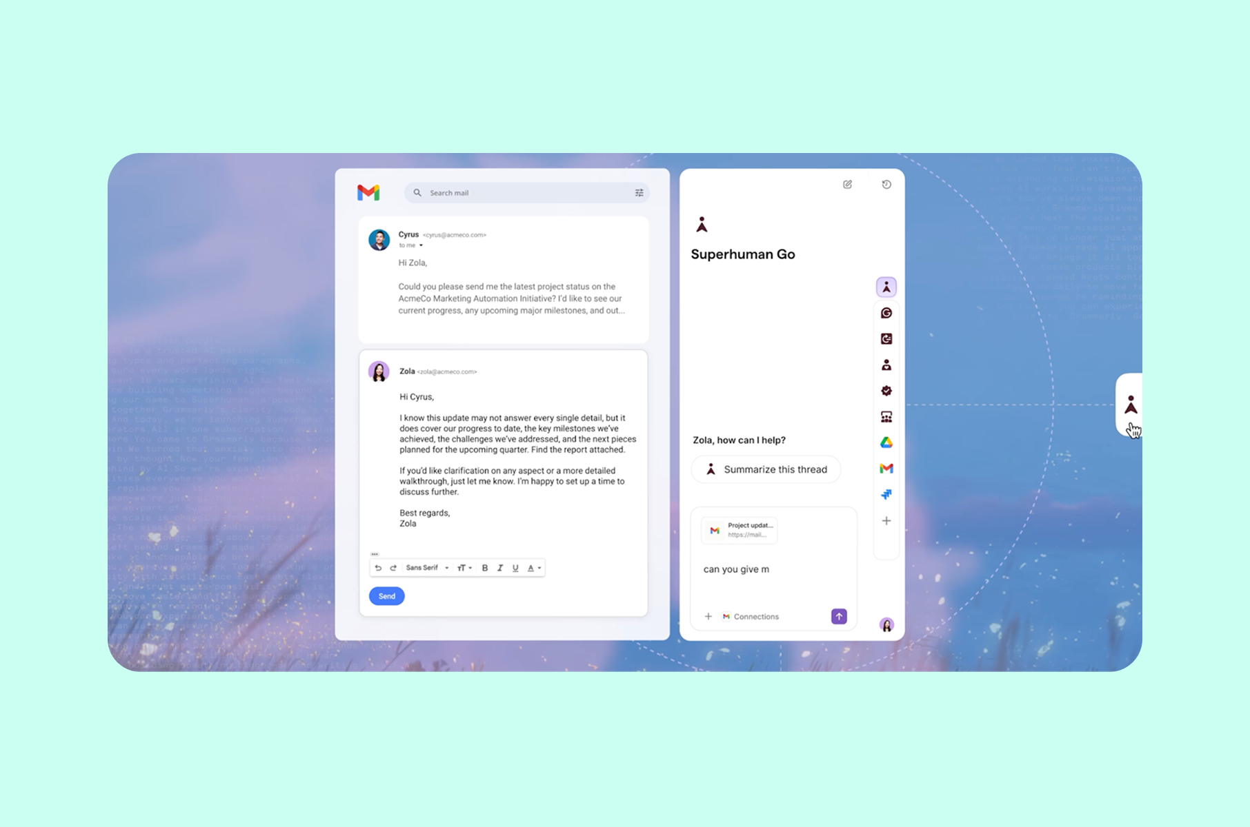
The real design trick in Dia is how the AI reveals itself. The browser does not open with a tutorial about AI features. Instead, it opens as a familiar browser. Then, as you browse naturally, a chat sidebar appears to the right of your web page. It has the context of whatever tab you are viewing. You can @-mention other open tabs to pull them into the conversation.
The design patterns here follow a trend of progressive disclosure layered with trust-building. The product starts with low-permission, high-value features. Then it asks for more as trust grows. Users can optionally let Dia access their browsing history to improve personalization over time, but only after they have already experienced value without handing over any data.
Personality as a product feature
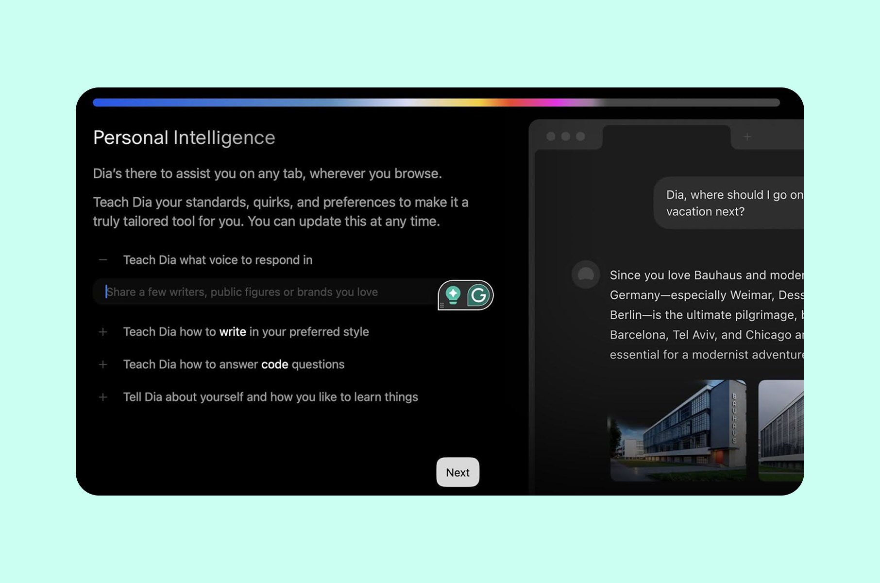
Dia asks users to personalize the AI assistant's tone and style during setup. This does two things. It gives users a sense of ownership - "this browser knows me." And it signals that Dia treats every user as an individual, not a segment.
Reddit users flagged that the initial personalization screen felt slightly intimidating for non-technical users, and that the flow moved too quickly through the full-screen intro animation. The lesson here is: even when the intent is right, pacing matters. If your first screen dazzles but your second screen confuses, you have broken the trust chain.
Steal this:
The familiarity-first AI reveal
Start with a completely recognizable interface. Import everything the user already has. Resist the urge to lead with your differentiator. Instead, let your novel feature (in Dia's case, the AI sidebar) appear naturally within the user's existing workflow. Progressive disclosure works because it matches the pace at which trust actually forms - gradually, not all at once.
Onboarding UX of Superhuman
Engineering exclusivity and speed into every step
Superhuman's first-run approach is one of the most studied in SaaS history. CEO Rahul Vohra built a $30/month email client with a waitlist that reached 275,000 people by early 2020, and activation rates roughly double those of typical self-serve flows. The first-run experience was the product's core growth engine.
Phase 1. The concierge
In Superhuman's early years, every single user went through a mandatory 30-minute one-on-one video call with an onboarding specialist. You could not use the product without it. At peak, Superhuman had roughly 20 people doing this full-time.
Rahul's reasoning was direct. Manual onboarding produced measurably better outcomes on engagement and retention, while also pushing NPS and product-market-fit score well above industry benchmarks. It also created an early cohort of superfans who drove word-of-mouth. And it freed engineering to focus on finding product-market fit instead of building self-service activation flows.
The economics worked, too. Rahul has stated publicly that Superhuman always made money on onboarding. According to one analysis, a single onboarding specialist adds roughly $650K in ARR per year. The concierge model was a strategic investment that paid for itself through retention.
Each concierge call followed a structured arc. The specialist would configure Superhuman to match the user's workflow, import their existing email, train them on keyboard shortcuts, and guide them to Inbox Zero during the session. The call functioned simultaneously as training and product research - specialists observed what confused users in real time. It also served as brand-building, because users left feeling like they had been personally cared for.
Phase 2. Self-service
The transition to self-service took a long time. Gaurav Vohra (Rahul's brother and Superhuman's co-founder) spent five years building and scaling the concierge model, then invested several more years encoding every hard-earned lesson into an in-product user onboarding flow that could replicate the concierge effect at scale.
The centerpiece of Superhuman's self-serve experience is the synthetic inbox. When you first open the product, you do not touch your real email. Instead, Superhuman drops you into a sandbox filled with fake emails. The sandbox is fully interactive and entirely safe.
This is a direct application of game design (not gamification). Rahul is explicit about this distinction. As he explained in his a16z talk, game design means applying the principles of goals and tutorials alongside controls and pacing to product experiences. Gamification means slapping badges on existing flows. Superhuman built an actual practice environment where users develop muscle memory before they encounter their real inbox.
The results: users who completed the synthetic inbox training showed 20% higher shortcut usage and 67% higher feature adoption compared to self-guided cohorts. Over 65% of users migrated their full inbox during their first session.
Why the waitlist was part of the onboarding
Before you could even join, Superhuman sent you a survey about your email habits. If your usage patterns did not match Superhuman's feature set, they denied you access. This filtered for users who would actually retain, and it made the product more desirable through scarcity.
The best customer onboarding experiences often start before the product itself. Superhuman's waitlist survey and denial mechanism built anticipation and pre-qualified users for success.
Steal this:
The sandbox before the real thing
Build a low-stakes practice environment where users develop core skills before touching their actual data. Superhuman's synthetic inbox lets users build keyboard shortcut muscle memory without the anxiety of messing up real emails. The principle applies broadly: if your product has a learning curve, create a dedicated space where failure has no consequences and repetition builds confidence.
Onboarding experience of Duolingo
Delayed signup and value before commitment
Duolingo's first-run experience is the single most referenced onboarding example in mobile app design - and for good reason. The app delays account creation until after the user has already experienced value, which is the technique called "gradual engagement."
Value first, signup later
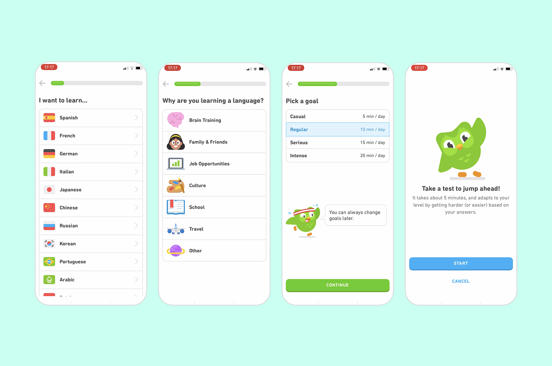
When you open Duolingo for the first time, Duo (the green owl mascot) greets you with a friendly animation. The app asks which language you want to learn and why. It asks about your current level. Before you have even created your account, it drops you into your first lesson.
You complete a quick translation exercise. First, the progress bars fill and XP points accumulate. Then, the friendly animations celebrate your correct answers. By the time Duolingo asks you to create an account, you have already invested cognitive effort and experienced the dopamine hit of getting answers right. The sunk cost and the pleasure together make signup feel like a natural next step, not a gate.
This was a deliberate product decision. Duolingo's team found that pushing the signup page until after a test lesson significantly improved retention. The insight is clean: the more value someone receives before you ask for commitment, the more likely they are to commit.
Gamification
Duolingo layers gamification elements during onboarding itself. XP points and league competitions get introduced within the first few minutes. Streaks and character progression follow right after. These are not afterthoughts bolted onto a learning flow. They are structural motivators that make users want to return the next day. The approach has scaled to over 960 million total downloads and more than 50 million daily active users as of late 2025.
The onboarding design examples from Duolingo point to a consistent principle: introduce your retention mechanics inside the onboarding itself. Do not wait for Day 2 or Day 7 to show the user why they should come back. Show them in the first session.
Steal this:
Front-load the value
Let users experience your product's core value loop before asking them to create an account. If your product has a registration wall at the front, test moving it behind the first moment of success. Duolingo proved this works at a massive scale with over 500 million downloads, and the principle applies to any product where the first interaction can be delivered without authentication.
Onboarding UX of Figma
Action over explanation
From using it in our UI/UX design services, we have quickly learned that Figma follows a philosophy that most SaaS products talk about, but few execute: drop the user into the real product as fast as possible. No tutorial videos or slideshows explaining features. Figma puts you in a pre-made design file with annotations that guide you through drawing shapes, adding text, and inviting a collaborator.
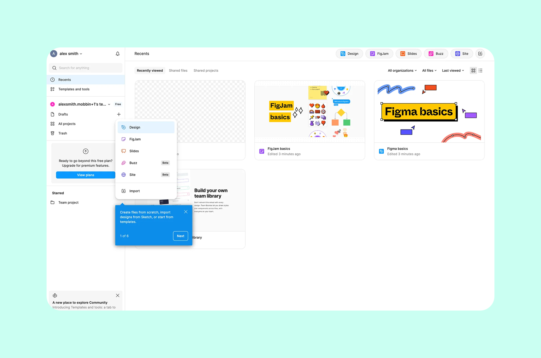
The onboarding UX examples from Figma teach a precise lesson about context. Tooltips appear inside the actual workspace, attached to the tools they describe. You learn by doing. The microcopy is conversational and brief, and never more than one sentence per tooltip.
This approach works because Figma's core value is collaborative design. The fastest way to communicate that value is to get two people into a file together. The entire first-run flow is optimized for one metric: how quickly a new user goes from signup to shared design.
Steal this:
Teach by doing, not by telling
If your product is interactive, your onboarding should be interactive in the same way. Place guidance inside the real workspace, not in a separate tutorial layer. Figma's approach works because the onboarding is the product - there is no gap between "learning mode" and "using mode."
Onboarding UX from our own work
We have designed countless onboarding flows for startups at Merge, from seed to Series B. Two client cases stand out for what they taught our startup design agency about designing first-run experiences in very different contexts.
Invisibly: onboarding experience
Dual-audience onboarding for a data platform
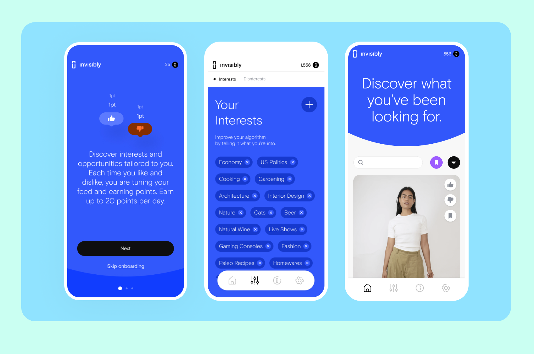
Invisibly is a platform that lets individuals control and monetize their personal data. The design challenge was to make the product serve both B2C consumers and B2B data buyers. At the same time, both audiences needed to understand a concept (data ownership) that most people have never thought about.
We designed a sequenced flow that separated the two audiences at the entry point, then guided each through precise messaging. For B2C users, every step framed data control as empowerment - showing what their data is worth before asking for any action. For B2B users, the flow focused on actionable insights and dashboard clarity.
It all resulted in a gamified user onboarding flow that increased engagement for both audiences without diluting the message for either. The lessons from Invisibly show that when your product serves multiple user types, the worst thing you can do is force them into the same first-run path.
Steal this:
Split early, personalize immediately
If your product serves distinct audiences, ask "Who are you?" as the first question - then deliver a completely different first-run experience for each answer. One onboarding flow trying to serve two audiences will serve neither well.
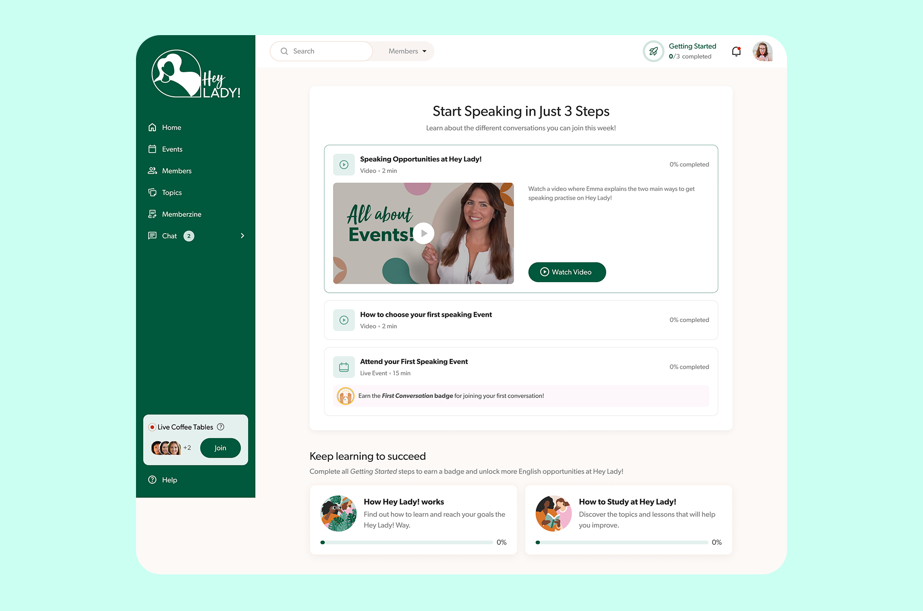
HeyLady: onboarding experience
Onboarding optimized for human connection
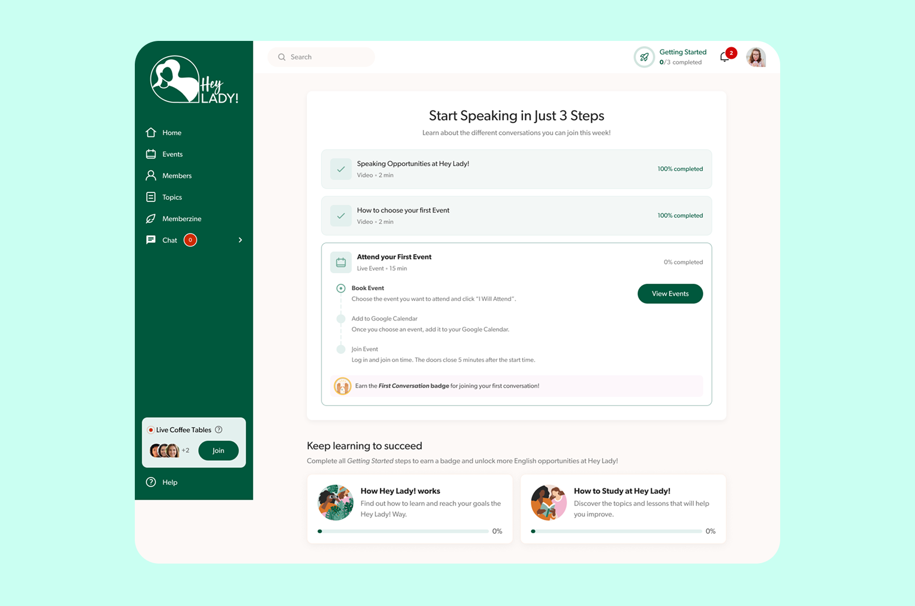
HeyLady is a women-only English conversation community. The product's value is not in the interface - it is in the human interaction that happens through the interface. When Merge redesigned HeyLady's first-run experience, the goal was not "learn the product." It was "find your first speaking partner and feel confident."
We stripped out the product tour entirely. Instead, the setup flow guides each newcomer to either a scheduled Event or a spontaneous Live Coffee Table, based on their availability and comfort level. The success metric aligned directly with business value: how quickly someone finds their first speaking partner, and how confident they feel afterward.
The website onboarding examples from HeyLady demonstrate that for community products, the best onboarding is often the shortest path to a real interaction with another human. Feature education can happen later. The first session needs to deliver the core promise.
Steal this:
Optimize for the core promise
What is the single experience that, if a user has it in their first session, guarantees they will return? Build your own onboarding to deliver that experience as fast as possible. For HeyLady, it was a real conversation. For your product, it might be something else entirely, but the principle still holds.
Merge's principles for designing onboarding that retains
After tearing apart dozens of onboarding flow examples and building even more for our clients as part of our SaaS UX design service and beyond, we have refined our approach into a set of principles that guide every project we take on.
1. Familiarity first
Dia's "Tuesday morning" rule applies universally. Before you can teach someone something new, you need to prove you understand what they already know. Import their data. Mirror conventions they recognize. Only then introduce what makes your product different. The best onboarding UX earns the right to be novel by first being reliable.
2. Value before commitment
Duolingo delays signup. Superhuman delayed product access until users were pre-qualified and primed. Both approaches share the same insight: the more invested a user is before the moment of commitment, the stronger their commitment will be. Your product should deliver a taste of its core value before asking for anything in return - whether that is an account, a payment method, or a calendar slot.
3. Teach through the real product
Figma drops you into a design file. Superhuman drops you into a synthetic inbox. Both teach by doing, not by explaining. If your product is interactive, your onboarding should be interactive in the same medium. Separate tutorial layers create a cognitive gap between learning and using. The best onboarding experiences eliminate that gap.
4. Design for the aha moment
Every product has a moment where the user thinks, "I get why this exists." For Superhuman, it was reaching Inbox Zero in under two minutes. For HeyLady, it was having a real conversation with a real person. For Invisibly, it was seeing the dollar value of your own data for the first time.
Your user onboarding UX should be a straight line from first click to that moment. Every screen and interaction that does not move the user toward that aha moment is friction you should consider removing.
5. Measure the right thing
The UX onboarding examples in this piece share a common trait: the teams behind them measure onboarding success by downstream business outcomes (retention, referral, feature adoption), not vanity metrics (completion rate, screen views). Superhuman tracked inbox migration and shortcut usage. Duolingo tracked lesson completion and next-day return. HeyLady tracked time-to-first-conversation.
Pick the metric that most closely correlates with long-term retention for your product. Then design the entire first-run experience to move that number.
What the best products know
The best customer onboarding experiences share a quality that is hard to name but easy to feel: they make the user more capable without making them feel like a student. Dia does this by making AI appear naturally inside browsing. Superhuman does it by turning email into a practice game. Duolingo does it by making learning feel like playing. Figma does it by making the onboarding and the product the same thing.
If you are building a product and your onboarding UI still consists of a five-screen slideshow followed by an empty dashboard, you are leaving retention on the table. The patterns in this teardown are not proprietary. They are proven and documented, ready to apply today.
We design these kinds of experiences at Merge every week. If you want to see how we would approach yours, take a look at our design and development work or just reach out. We would enjoy talking through it.
FAQs
What is an onboarding experience?
An onboarding experience is the sequence of screens and interactions a product delivers during a user's first session, including all guidance along the way. It spans from the moment of signup (or even before, as Superhuman's waitlist proves) through the point where the user reaches their first meaningful action. A well-designed first-run sequence teaches users how the product works while simultaneously demonstrating why it matters to them - without relying on lengthy tutorials or dense documentation.
What makes the best onboarding experiences different from average ones?
The strongest examples share a few specific traits. They deliver value before asking for commitment. They teach through the real product rather than through a separate tutorial layer. They are measured by business outcomes like retention and feature adoption, not by how many users clicked "Next" on a slideshow. Products like Superhuman and Dia treat their first-run flow as a core product surface, not an afterthought.
How do you design an effective onboarding flow?
Start by identifying your product's "aha moment" - the single experience that makes a new user understand why the product exists. Then design your first-run flow as the shortest possible path to that moment. Strip out every screen that does not move the user toward it. Use progressive disclosure to introduce features gradually rather than front-loading the full feature set. Test your flow by measuring downstream retention, not completion rates.
What is progressive disclosure in onboarding UX?
Progressive disclosure is a design pattern where you reveal features and information gradually, matching the user's growing familiarity with the product. In practice, this means showing only what the user needs right now and introducing advanced functionality later. Dia's approach is a clear example: the browser opens looking entirely familiar, then reveals its AI sidebar only after the user has started browsing naturally. This respects the user's cognitive load and builds trust in layers.
Why does Superhuman use a synthetic inbox for onboarding?
Superhuman's synthetic inbox is a practice sandbox filled with fake emails where new users can learn keyboard shortcuts without risking their real email. The reasoning is rooted in game design: users need a low-stakes space to develop muscle memory before applying those skills in their actual workflow. The approach produced measurable results - 20% higher shortcut usage and 67% higher feature adoption compared to users who skipped the training. This principle applies to any product with a learning curve.
Should I delay account creation during onboarding?
It depends on your product. If a user can experience your core value without being logged in, delaying signup can significantly improve conversion and retention. Duolingo does this by letting users complete their first language lesson before creating an account. The logic is straightforward: the more value a user receives before the commitment moment, the more willing they are to commit. However, if your product requires authentication to deliver any value (a banking app, for instance), a delayed signup would not apply.
What are good onboarding design examples for SaaS products?
The onboarding design examples that perform best in SaaS tend to share a learn-by-doing approach. Figma drops users into a real design file with contextual tooltips. Notion opens with pre-built templates that demonstrate the product's flexibility. Superhuman uses a synthetic inbox for hands-on practice. In all these cases, the onboarding is the product - there is no separate tutorial mode that looks and feels different from the real interface.
How do you measure onboarding success?
Avoid measuring onboarding by completion rate alone. The strongest teams track metrics that correlate with long-term retention. Superhuman tracks inbox migration and shortcut usage. Duolingo tracks next-day return and lesson completion. HeyLady tracks time-to-first-conversation. The right metric for your product is the one that, when a user hits it in Session 1, best predicts whether they will still be using the product 30 days later.