0
Table of Contents
We reviewed dozens of SaaS landing pages. Here are the 5 mistakes we keep seeing
Most landing pages fail because of the same five mistakes. Here's how to never make them.

When auditing SaaS websites, we try to encounter the page the same way a first-time visitor does - we are fast, impatient, a little skeptical, and have several other tabs open.
We never start with the design critique. What we check first is comprehension. If the page cannot hold attention long enough for someone to understand the offer, everything else on the page turns into a decoration.
Our UX audit is simple: what is the product, can we trust it, what stands out first, and where does conversion friction appear? We use one practical benchmark in workshops:
Can a visitor tell what you sell and who it is for after a brief look?
If you are a founder, product lead, or professional tasked with redesigning a SaaS landing page, this article is for you. Most landing pages fail because of the same five mistakes. Here's how to never make them using our principles as a SaaS design agency.
Top 5 SaaS landing page mistakes we keep seeing today
What actually surprised us is how predictable these problems are. Some come from design choices, some from copy hidden behind visuals, and some from strategy problems.
These patterns come from real projects, so if you're redesigning a website or trying to understand why it's underperforming, these five issues are the place to start.
Logic-heavy but emotionally flat
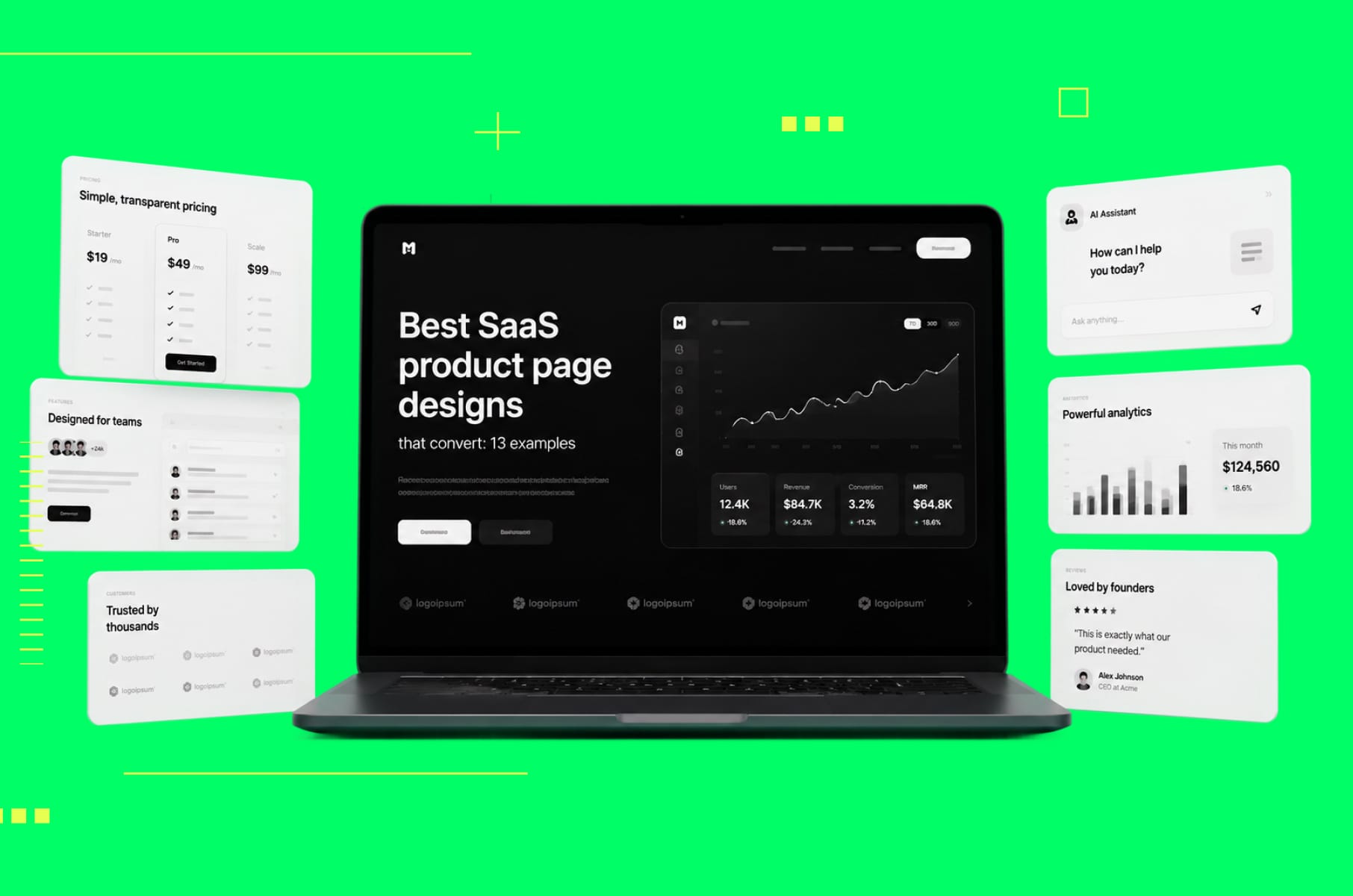
The most common problem we encounter is a hero section that reads like a product specification instead of connecting emotionally with the visitor.
Why it’s a problem:
The headline describes what the tool does functionally, the subheading adds technical details or mentions integrations, and a dashboard screenshot fills the space below. It's all accurate but forgettable. B2B buyers are still just people making decisions based on emotion first, then using logic to justify them.
What works instead:
The emotional hook needs to arrive before the feature list, and in B2B contexts, that means naming a specific frustration your buyer faces regularly. It could be something like "Still exporting CSVs every Friday afternoon?" or "Your team wastes 6 hours a week on status updates nobody reads." When readers see their own situation reflected back at them, that keeps their interest.
The SaaS products with the strongest landing pages establish relevance first, then layer in the rational evidence. Once someone already cares, the feature sets and metrics actually matter.
So, instead of leading with generic capabilities, start with a pain-point statement your target buyer would immediately recognize as their own problem, pair it with a single clear line about what the product does, and push the feature details lower on the page. If your headline could work for five competitors without changing a word, it's too generic to create any emotional pull.
Selling features instead of the transformation
The next mistake is selling features instead of transformation. A feature grid lists capabilities one by one, be that automated workflows, real-time dashboards, custom integrations, or role-based access, but this approach misses what actually matters to the buyer.
Why it’s a problem:
Most visitors won't mentally translate "automated workflows" into "I could stop doing that annoying thing on Tuesdays" on their own. The best landing pages frame the product as a before-and-after story instead.
Before: you spend Monday mornings pulling data from three separate tools to assemble a report that your manager glances at for ninety seconds. After: the report compiles itself overnight and lands in Slack before you even sit down.
What works instead:
The fix is simple: take each feature and ask, "So what does this mean for the user's week?" Keep asking until you land on something concrete about time saved, effort removed, or frustration eliminated. Use that as your primary copy and relegate the feature label to secondary detail.
If your features section could be swapped onto a competitor's site without anyone noticing, you're describing the category instead of your product. That's the red flag.
No clear ROI
Now we’re looking at another major issue: most SaaS landing pages never mention money, time savings, or resource allocation at all.
Why it’s a problem:
The value gets described in vague terms like "save time," "reduce errors," or "work smarter" without a single concrete number. This creates a page that feels interesting but not urgent. Visitors think "this looks useful" and leave intending to come back, but they rarely do. Without an economic context, there's nothing to anchor a purchase conversation internally.
What works instead:
The strongest examples we've seen all include some version of an economic argument:
- A time-savings calculator where visitors input their team size to see hours recovered.
- A cost comparison showing manual process versus using the product.
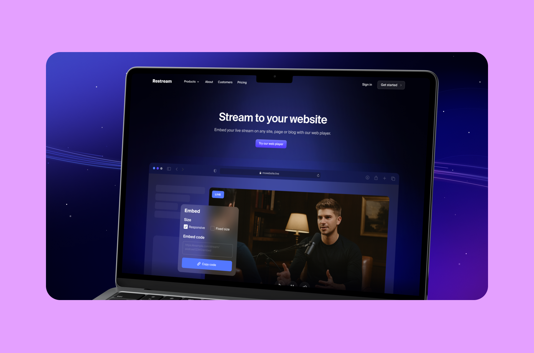
- A case study headline like "Reduced QA cycle by 3 days, saving $14,000/month." See our Restream case study for a real example.
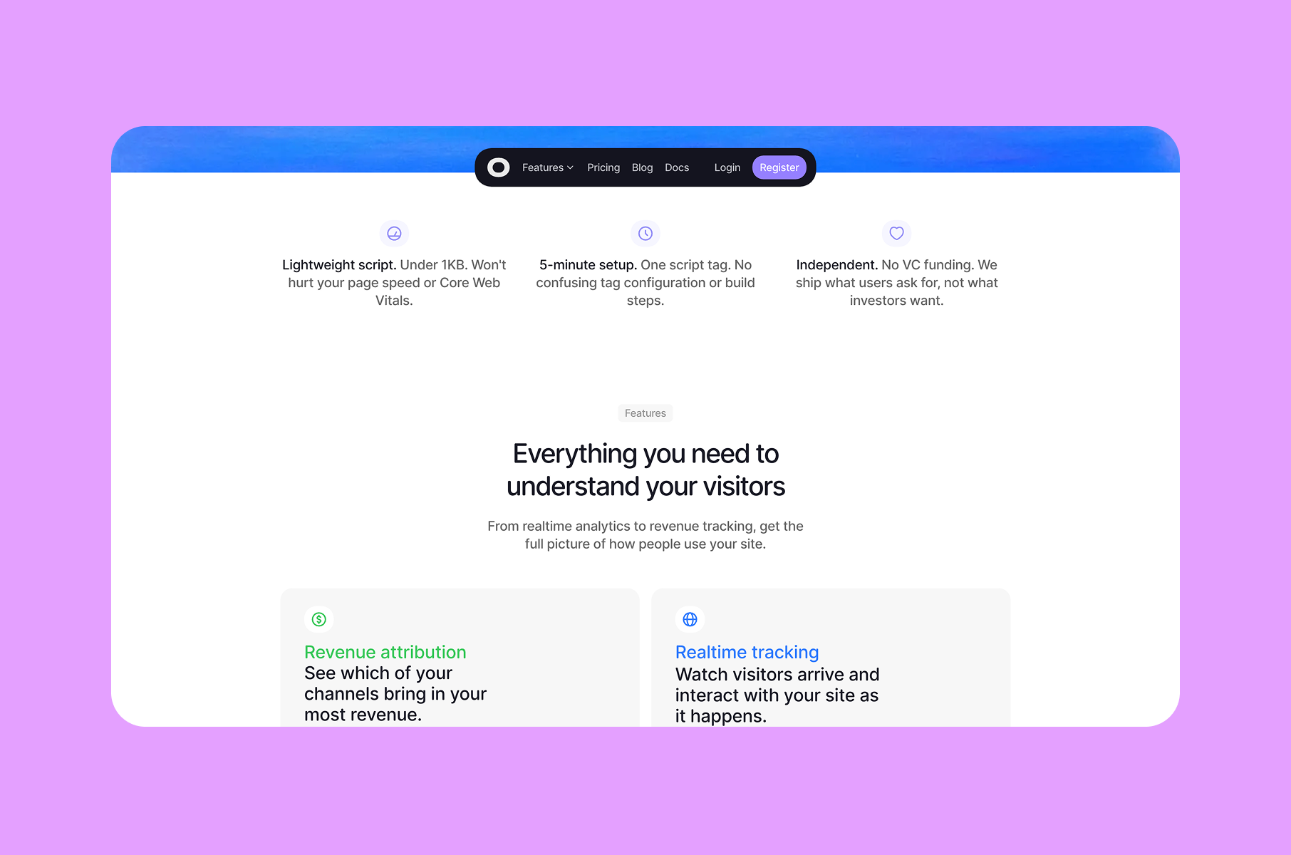
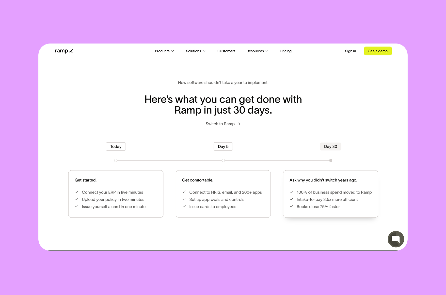
Even one specific number shifts perception from "nice to have" to "we should evaluate this during planning." Numbers give the conversation something concrete to hold onto. Looking at companies like Gong, Ramp, and Rippling, they all state the economic argument directly on the landing page.
The fix is to simply include at least one section with quantified impact, using real customer data when available, or building estimates from industry benchmarks, and to be transparent about the methodology. If numbers only appear on the pricing page, you've essentially left the ROI conversation entirely to the buyer's guesswork.
Pseudo-minimalism
Another pattern is pseudo-minimalism that actually strips away meaning.
Why it’s a problem:
The trap is that it does often look like a good design. The page is clean, whitespace is generous, typography is considered, the color palette is restrained. Everything feels intentional, yet after scrolling through, a visitor still can't articulate what the product does or who should use it. This happens when visual refinement gets prioritized over actual communication.
There's a real difference between simplicity that clarifies and emptiness that confuses. We see this praised constantly on design platforms like Dribbble and Behance.
Still, visitors bounce because the context gets stripped away, especially problematic for products with multiple personas, distinct use cases, or longer sales cycles.
What works instead:
The landing pages that actually work balance whitespace with real information. They show actual product screenshots with annotations, add micro-copy explaining UI elements, and reference specific roles and scenarios instead of vague language about "teams" and "efficiency."
In our UI/UX design services, for example, we always try to focus on clarity first, aesthetics second.
The key is running each section through one question: would a first-time visitor learn something concrete here? If it's visually clean but communicates nothing, it needs a use-case example, an annotated screenshot, or a brief explanation. Keep the breathing room, but make every section justify its existence with meaning.
Asking for too much too soon
Another common mistake is the high-commitment CTA appearing too early. Most SaaS landing pages follow the same pattern: headline, subheading, then a prominent "Start Free Trial" or "Book a Demo" button above the fold.
Why it’s a problem:
The logic seems clear, which is to put the conversion point where it's most visible. But it ignores where the visitor actually is mentally. Someone who just arrived from a search result or ad hasn't built enough understanding or trust to commit to a trial or a sales call. Asking for that commitment this early creates friction instead of reducing it.
What works instead:
The solution is to let visitors build confidence first and layer your CTAs throughout the page. Keep the primary CTA visible, but pair it with a lower-commitment option that lets visitors learn before they commit. It could be a two-minute demo video, an interactive product preview, a sample workspace to explore, an ROI calculator. These let people engage with the product on their own terms before making a bigger decision.
High-converting SaaS pages like Loom, Figma, and Airtable all use this structure: the hero pairs a lightweight option like "Watch Overview" with the main CTA, then reintroduce higher-commitment asks further down as confidence builds.
The key is matching each CTA to where the visitor is in their awareness journey.
Examples we reference
We’re often asked for SaaS landing page inspiration in the form of gallery screenshots. We prefer to point people to pages that clearly show positioning and proof. They also offer good CTAs.
Here are a few popular SaaS landing page examples we repeatedly reference for structure rather than style:
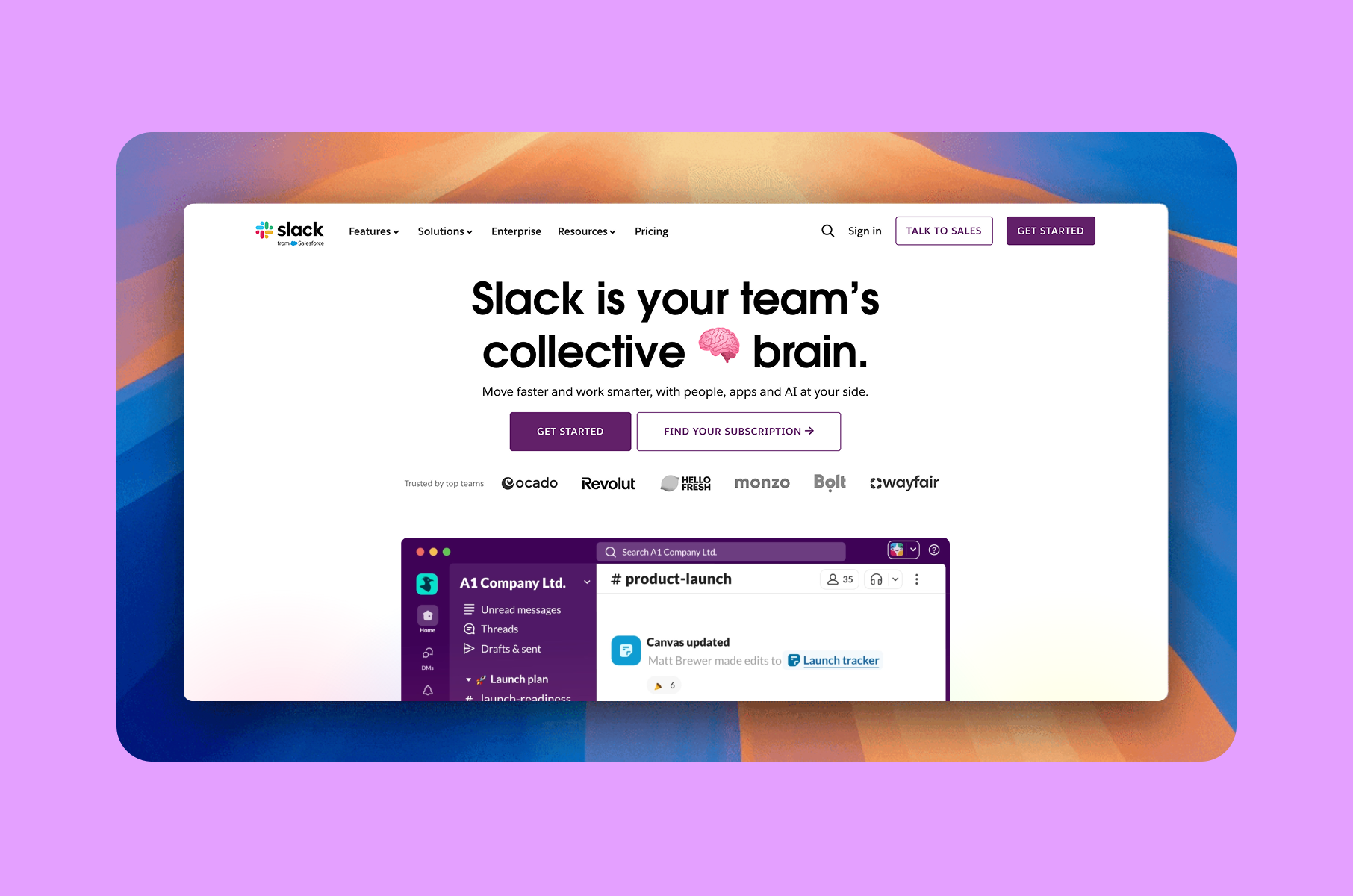
Slack’s homepage makes a direct claim about what it is, then pairs it with obvious next steps such as “Get started” and “Find your subscription”. It also places recognisable logos close to the hero, which is a classic credibility pattern.
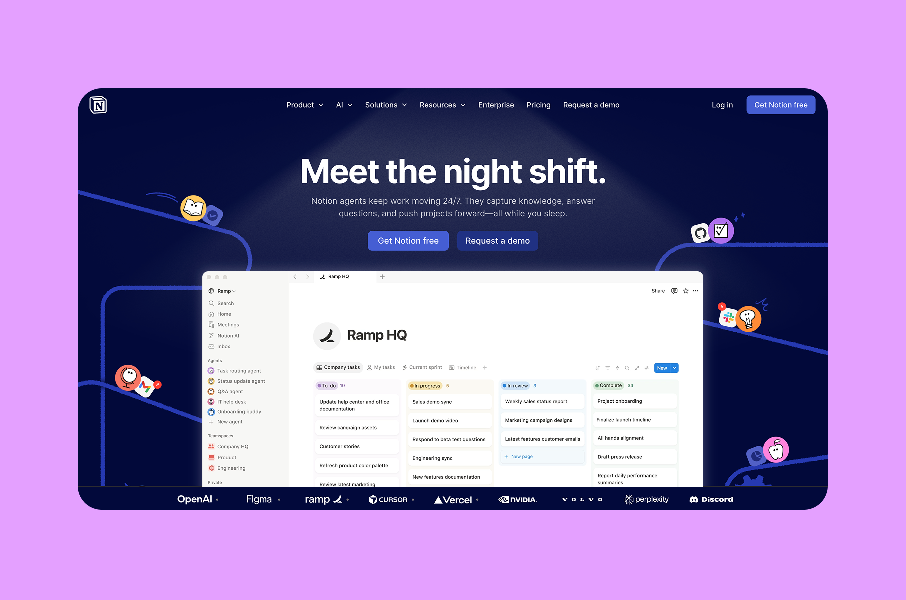
Notion also uses a strong outcome-focused line and supports it with a specific “keep work moving 24/7” type of result framing. It also offers two CTAs that map to different commitment levels, which reduces friction for visitors who are early in evaluation.
Stripe’s Checkout page is an example of a product page that mixes benefit language with a “Try the demo” path, which is an intermediate CTA many SaaS teams skip. It also explicitly frames conversion optimisation as a product benefit, which is the economic context in plain sight.
Webflow keeps its primary positioning short, then expands with concrete sub-blocks like collaboration and system consistency. That structure supports scanning and reduces cognitive load by chunking information into digestible sections.
How to design a high-converting landing page?
Let’s think about the actual design process itself, taken from our own product design methodology.
Start with your hero message
Rather than jumping straight into visuals, draft multiple versions of the hero headline and test them with people who match your buyer profile.
The version that resonates most should shape the rest of the page. Too many SaaS redesigns begin with a mood board or a component library. The message should come first because everything else like hierarchy, layout, imagery, etc. flows from it.
Structure the page around objections
List every reason a qualified visitor might leave your page without converting. "I can't tell what this product does." "I'm not sure this fits my situation." "This seems overpriced." "I've never heard of this company."
Each section on the page should counter one of these objections directly. The best-performing pages read as a sequence of doubt-removal steps, not a cascade of feature announcements.
Use real content from day one
Placeholder text and stock photos during the design phase create layouts that fall apart the moment actual content is added. We've seen this play out on multiple projects.
Working with genuine product screenshots, actual customer testimonials, and concrete metrics from the beginning makes sure the design holds up through development.
Layer your social proof
Trust signals work better when distributed across the page in different formats, such as logos establish immediate credibility at the top, mid-page testimonials address specific concerns, and detailed case studies near the bottom serve visitors who need more convincing before they commit. This approach meets people at different levels of skepticism, similar to our user onboarding design principles.
Design for how people actually scan
Most visitors don't read linearly, so I need to use clear headers, short paragraphs, and visual anchors like annotated screenshots and highlighted metrics to guide them through the argument. Modern SaaS homepages succeed when they communicate their core value even at a glance (also a key focus in efficient SaaS branding).
A simple framework to review your own page
When researching landing page examples for a redesign, we prioritize pages with proven conversion data over ones that simply look polished in design portfolios, since these groups rarely overlap.
The strongest pages we've seen follow a consistent pattern: each section answers a question the visitor is already asking, in the order they'd naturally ask it.
The quick framework below works for both SaaS landing page design and broader SaaS web design, because it matches how people decide under limited attention.
1. Can I understand it fast?
A few tips here:
- The hero should communicate the category.
- Name the audience.
- Promise an outcome with minimal interpretation.
2. Do I believe it?
Belief comes from specifics:
- Use recognisable customer logos when you can.
- Use short case-study proof with numbers.
- Add up-front disclosure.
- Mention pricing early.
- Mention the setup time early as well.
3. Do I see how it works?
Show the workflow before the visitor signs up:
- An interactive tour can reduce uncertainty without raising commitment.
- Annotated screenshots can do the same job when video is overkill.
- Optimise visual stability and responsiveness, because layout shifts and slow interactions kill trust in subtle ways.
4. Do I know what to do next?
The next step should be obvious and low-friction.
After a primary CTA, add a secondary “learn without signup” path. Then reinforce that path with microcopy that sets expectations.
High-growth SaaS companies repeat this question-answer sequence across different visual styles and tones, but the underlying logic remains the same.
The lesson here is that when a page answers the right question at the right scroll depth with precise language and well-timed CTAs, conversions improve. And it's not from any single tactic, but from systematically eliminating every objection a qualified buyer might have.