0
Table of Contents
Reasons why your SaaS design has failed (and how to fix it)
If you want to know which design decision is the one causing the mess, welcome aboard.
Most founders we get on a call with already know something is off with their SaaS design. Problems with activation and churn, or the demo conversion has stopped moving…
The thing is - a few years ago, a clean dashboard, a tour tooltip, and a working sign-up form were pretty much enough to call your SaaS UI "good."
Times change, pretty fast, and today, your product is being compared to big names in your industry and a long tail of YC-backed startups.
However, what our potential clients cannot tell us straight away is which design decision is the one causing the mess. Our Merge team has been doing SaaS product design since 2018, and almost every time we run an audit, we find several culprits of bad SaaS UI/UX design. Today, we’ll go through the most common ones, so you know how to fix them.
What "failed SaaS design" actually means
Before we name the eight reasons, we need a shared definition.
SaaS design has failed when the design is the reason a user did not activate, did not stick around, did not upgrade, did not refer a teammate, etc.
In other words, the design is failing every time a metric is dragging, and you can point at a screen and say, "Yeah, that screen is the problem."
For most early- and mid-stage SaaS products we audit, the symptoms tend to be similar, for example:
- Sign-ups are healthy, but retention is poor.
- Power-user behavior exists, but only for a thin slice of users who got lucky on day one.
Product blames marketing, marketing blames product, and the SaaS UI design sits there quietly absorbing the blame. Unfortunately, SaaS UX problems rarely announce themselves on a dashboard.
The reality is that according to SaaS Factor's onboarding research, up to 75% of new users abandon a SaaS within their first week, and 68% of churned users cite poor onboarding as the main reason they walked away. That is not a marketing problem. That is a SaaS UX problem with a design owner.
To make those numbers easier to keep next to you while you audit, here is the same data condensed into a single reference table:
Metric | What the research shows | Source |
New users abandoning in week 1 | Up to 75% | SaaS Factor |
Users citing poor onboarding as their reason for leaving | 68% | SaaS Factor |
Average B2B SaaS activation rate | 36 - 37.5% | Userpilot / Appcues |
Product tour completion rate | ~5% | Userpilot / Appcues |
Users abandoning blank states with no contextual help | 84% in first session | SaaS Factor |
Day-3 churn risk for users who have not activated | +90% | SaaS Factor |
Activation lift from personalized onboarding | 30 - 50% | SaaS Factor |
Support ticket reduction from progressive disclosure | ~35% | SaaS Factor |
8 reasons your SaaS design has failed (and how to fix them)
So with that frame in mind, here are the eight reasons we see SaaS UI/UX projects fail most often, in roughly the order they hurt the most.
1. The onboarding abandons your users
Onboarding is by far the highest-impact moment in the entire SaaS product design, and it is also where a lot of teams under-focus. Almost every audit we run starts here, and we often find that the user signs up, lands inside the app, and is then asked to "create your first project" or "connect your data source" with zero context, zero starter content, and zero hand-holding. Cue the abandonment.
A few numbers for the fuller picture:
The average B2B SaaS activation rate is at around 36-37.5%, and product tour completion rates as low as 5%. What’s even worse, up to 84% of users who hit a blank state without contextual help abandon ship during their first session, and users who have not activated by day three are around 90% more likely to churn than users who have.
If you think just adding more tooltips would help, nope.
The better design fix is to redesign the first session as a guided path to one specific moment of value with the help of the following moves:
- A clear primary action on every blank state, written in plain language, paired with a sample data set or template that users can interact with right away.
- Progressive disclosure, where advanced settings only appear once the user has earned them, is associated with around 35% fewer support tickets during onboarding.
- Personalized onboarding paths driven by a one-screen "tell us what you do" question, which can lift activation by 30 to 50% versus a generic flow.
- And one well-placed celebratory moment, the first time the user actually sees the product working for them.
If you want to see what world-class onboarding feels like in practice, we tore apart the onboarding flows of Dia, Superhuman, and a few others in a separate piece. That article is the perfect companion to this section.
2. The information architecture nobody can navigate
Next up is the boring but absolutely devastating failure - bad information architecture.
SaaS UX UI design and development fundamentally centers on helping a user find the right tool at the right moment.
When the navigation, sidebar, settings panel, and search are all poorly organized, every task in the product becomes more expensive, and every new feature you ship makes it worse.
Nielsen Norman Group's review of the most common application design mistakes puts it cleanly - "even icons that might seem universal (such as the hamburger menu) are not as familiar to users as most UX practitioners would expect." Even though that observation is now nearly 20 years old, we still see SaaS sidebars that are basically a row of unlabeled icons, taking up the entire navigation.
The fix is designing proper IA before any visuals. First, card-sort your existing navigation with five to eight real users and group features the way your users group them. Then redesign the shell (global nav, side nav, contextual sub-nav, and search) as one system. Two practical rules we use:
- If a primary action takes more than two clicks from any screen, the IA is wrong.
- If a new hire on your team cannot describe your nav from memory after one week, your users definitely cannot.
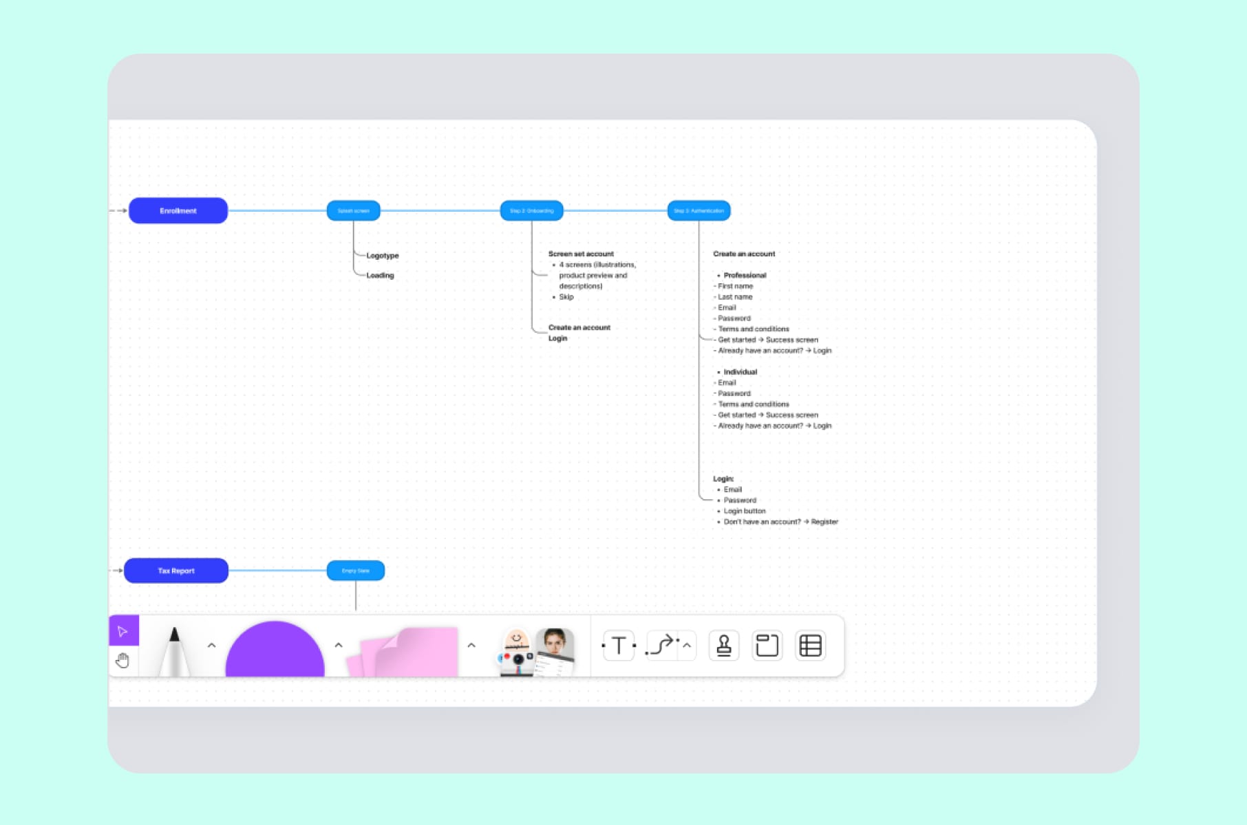
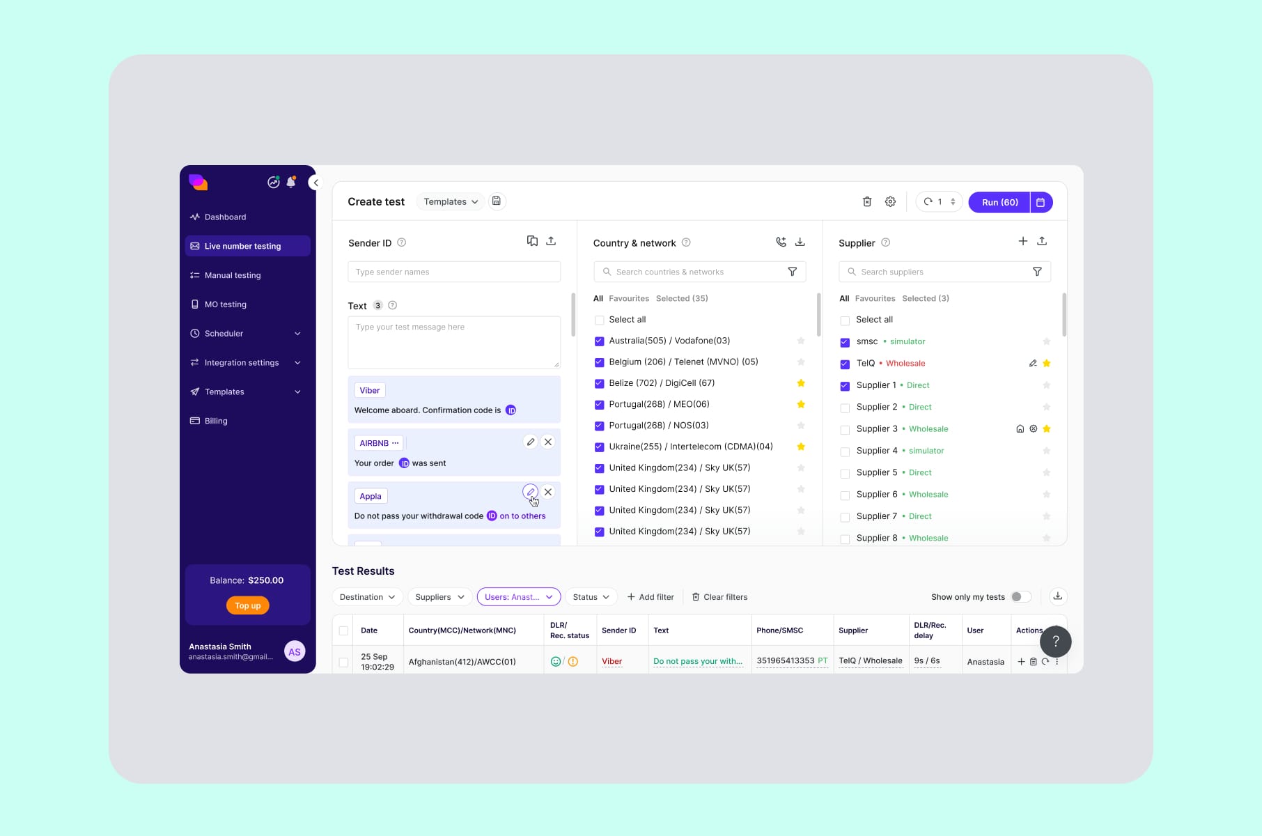
We applied exactly this kind of restructuring on our redesign of TelQ, an SMS testing SaaS, where the original product had a confusing test creation workflow and a data table buried under multiple filters. Untangling those two flows was almost the entire SaaS UX interface rebuild - and the platform came out the other side feeling modern without losing its power-user functionality.
3. Dashboards that dump lots of data at you
Dashboards are where most SaaS UI design projects fail very quietly. A SaaS dashboard should exist as an answer to a question your user has. And most of the dashboards we audit answer about fifteen questions at the same time, with the result that they answer none of them well.
Baymard Institute's SaaS UX research, based on 253+ moderated user sessions and over 1,440 hours of testing, discovered that users do not want a wall of metrics. What they want is a clear visual hierarchy and a path to the underlying data. Yet most B2B dashboards still default to "show everything, let the user filter."
The fix is to design dashboards around three layers, on purpose:
- The headline. One row of three to five top-line numbers that answer the single most important question for that user role.
- The narrative. Two to four supporting cards that explain how the headline got to where it is - trends, comparisons, anomalies.
- The drill-down. Tables, filters, and exports that live below the fold, for the 20% of users who actually want raw data.
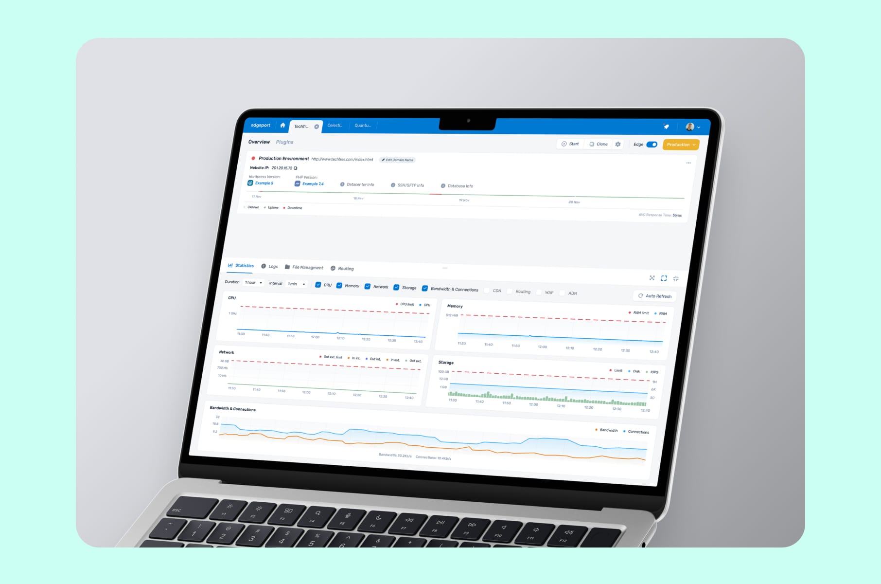
Most dashboards we redesign get calmer and more decisive. Surface the question the dashboard exists to answer, then everything else lines up behind it. With Edgeport, for example, which is a hosting management SaaS, the original UI was giving both administrators and end users too many settings and inconsistent surfaces. Our SaaS interface design brief was simply "make the same screen feel like the same product, no matter who is logged in." That alone produced a clear jump in clarity for both user roles.
4. The visual design that looks five years old
This one is uncomfortable to say out loud, but visual decay is real. Everything moves so fast, and it becomes more and more difficult to keep the momentum. A SaaS UI that looked good in 2021 (i.e., heavy gradients, drop shadows, off-brand stock illustrations, etc.) now is perceived as legacy software, even if the product underneath is excellent. And in a category as crowded as SaaS in 2026, "looks legacy" is enough to lose a deal during the demo.
Unfortunately, visual decay does not show up in your analytics. You will never see a chart drop because the typography is two years out of date. What you will see is fewer people converting on the pricing page, or newer customers leaving because they just compared you to a more modern-looking competitor.
The design fix is a proper visual refresh inside your design system - typography scale, spacing tokens, color roles, elevation, motion.
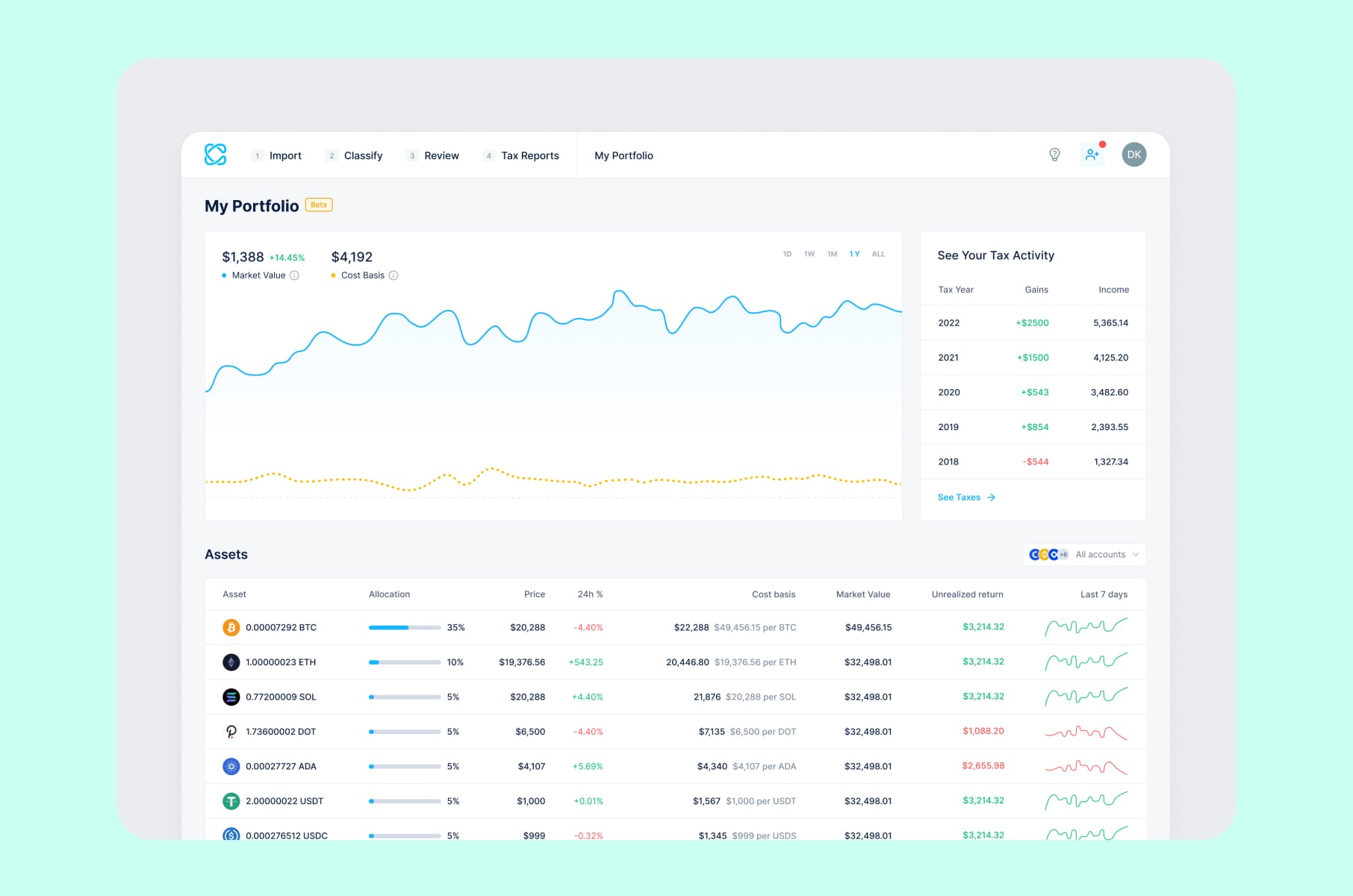
This is exactly what our team did for CoinLedger, a crypto tax SaaS that came to us with an outdated application and growing user concerns about usability. That outcome was brought by a top-to-bottom rebuild of the design language so that every screen, from sign-up to tax report export, felt like it belonged to the same product.
5. An interface that is inconsistent with itself
Inconsistency is the silent killer of SaaS UI UX design. Do you have:
- Two different button styles for the same action?
- A modal pattern that changes between sections?
- A primary color that shows up as five slightly different blues across the product?
None of these problems will ever be flagged by a single user - but together, they make your product feel cheap, untrustworthy, and difficult to learn.
The cause is almost always organizational. Different designers, different sprints, different developers, different references in Figma. The fix is a design system with tokenized colors, a typography scale, a documented component library, and Storybook (or similar) tied directly to the codebase so that the design and the build are always speaking the same language. Done well, a design system does three things at once - it speeds up shipping, reduces visual debt, and makes onboarding new designers and developers dramatically faster.
This is also the part of SaaS UX UI design and development where design and engineering have to actually share a backlog. We tend to scope our design system work as a parallel track to feature work, with weekly sync points so that components do not drift from week one. If your team is shipping features without a system underneath, you are basically rebuilding the SaaS interface design every quarter, in slow motion.
6. A landing page that sells only features and not outcomes
The marketing site is part of your SaaS design, whether you like it or not. The common design failure here is that you have built a beautiful landing page that lists every feature your engineers are proud of, and zero outcomes that your prospects can actually feel.
The design fix is to restructure the landing page around the buyer's three real questions:
- What is this? A one-line definition with a real visual of the product working - not an abstract hero illustration.
- What does it do for me? Three outcome-led blocks, each backed by a specific result, a customer name, or a number - in other words, the real proof.
- Why you, not them? A pricing matrix that earns its 40 lines by being scannable, with a "compare" view that does not punish the user for being curious.
If you want a longer breakdown of where most SaaS marketing pages fall down, we wrote about the five SaaS landing page mistakes we keep seeing on review calls in a dedicated piece. Read it before your next homepage review.
7. Mobile and responsiveness are left behind or for later
Plenty of B2B SaaS founders still believe their product is "desktop-only." That belief was already questionable two years ago. In 2026, with operators reviewing dashboards from a phone in the back of an Uber and approving deploys from a tablet on a Sunday, it is just wrong. And the design failure shows up in subtle ways, for example:
- Dashboard that breaks below 1024px.
- Modals that scroll off the screen.
- Settings that need horizontal swiping
- Charts that turn into useless squiggles on a small viewport.
Making the desktop site shrink, however, is definitely not recommended.
What you need to fix this is to design responsive variants for the three or four screens that matter most on mobile (it could be the inbox, the alert, the approval, or the quick read) and accept that the rest of the product can stay desktop-first.
The SaaS UI/UX process here can start with a one-pager that lists which user jobs actually happen on mobile, and which do not.
A small note - if your stack limits your mobile design freedom, consider checking out the best WordPress alternative for SaaS in 2026. Tooling and design quality go hand in hand.
8. A team designing without ever talking to users
The last reason is the most fixable, and the most ignored. Your SaaS UI/UX has failed because it was designed while never actually watching your users use your product. We see this all the time - thousands of users, no recorded sessions, no monthly research cadence, and design decisions made entirely on opinion. The result is a product that reflects the founder's mental model, not the user's.
What works here is fixing your process. Every SaaS team, no matter the stage, should have:
- Five recorded user sessions per month, watched by at least one designer and one PM together.
- A single research backlog where insights are tagged to specific surfaces in the product, not lost in a Notion doc.
- A monthly "kill or keep" review where the team decides which design assumptions held up under research, and which need to be redone.
When we engage with a new client, this is what we often do as part of our SaaS design company discovery phase. It is the cheapest, fastest SaaS UX improvement available to you, and it has nothing to do with your visual style.
For an even harsher reality check on what happens when famous teams skip this work, our roundup of bad UX examples from multi-billion dollar products is a good companion read. Turns out, even WhatsApp, Instagram, and LinkedIn are not immune.
Before we move into the Merge process, here is the same eight-failure list, but you can use it as an audit checklist:
The failure | Where it shows up in your data | The design fix in one line |
1. Onboarding drop-off | Day-3 / Day-7 retention falling off a cliff | Guided path to one "aha" moment with templates and progressive disclosure |
2. Bad information architecture | Multi-click navigation, rising support tickets | Card-sort with real users, then redesign the global, side, and contextual nav as one system |
3. Dashboard overload | Users export everything to Excel | Three layers: headline numbers, a narrative row, drill-down tables below the fold |
4. Visual decay | Sales demos lose to younger competitors | Tokenized design system refresh, not a skin pass |
5. Inconsistent UI | Misclicks across sections, low trust feel | Component library, design tokens, Storybook tied to the codebase |
6. Feature-led landing page | Stalled signup or trial conversion | Restructure around what / outcomes / proof, with a scannable plan matrix |
7. Mobile as an afterthought | Mobile bounce, no review-from-phone behavior | Responsive variants for the top three or four mobile jobs only |
8. No user research | Decisions made on opinion, surprises in usability tests | Five recorded sessions per month, tagged research backlog, monthly "kill or keep" review |
How we approach SaaS design fixes at Merge
So, where do you actually start when two or three of these reasons are showing up at once? A quick note on how our team addresses these failures, because we know and see how they tend to add up and how fixing just one rarely fixes everything:
Our SaaS UI UX design and development services start with a Product UX Discovery phase, where we audit the product, talk to actual users, and produce a written prioritization memo before any pixel is moved. From there, we move into self-serve onboarding redesign, a UX-first rebuild of the core flows with attention to data visualization and user comfort, and finally into a scalable visual system and componentized handoff so that the work survives the next twelve months of feature shipping.
You have already met three of the SaaS products we shipped this way:
- CoinLedger - a crypto tax SaaS where the visual and functional refresh turned an outdated application into the category's go-to.
- Edgeport - a hosting infrastructure SaaS where consistency across dashboards and configuration tools was the central design fix.
- TelQ - an SMS testing SaaS where user feedback drove the redesign of test creation and data table flows.
If you are wondering what the right team shape looks like for a project like this, our 2026 buyer's guide on hiring a startup UI UX design agency walks through team composition, scope, pricing ranges, and red flags. And if you are still pre-product, our MVP development for startups guide is the better starting point.
A quick mention - we also recently published deep dives on:
- Common SaaS landing page mistakes we keep seeing
- Onboarding flows of Dia, Superhuman, and other category leaders
- UX lessons learned from productivity apps like Notion
Definitely worth a read after or alongside this one.
SaaS design failure - a quick FAQ
A few questions that come up almost every week on our intro calls.
How do I know if my SaaS design has actually failed, or if it is just my marketing?
Look at activation, not sign-ups. If sign-ups are healthy and day-7 or day-30 retention is below your category benchmark, the SaaS UX is the most likely cause. UserTesting's research on SaaS churn and Userpilot's data both put average B2B activation around 36-37.5%, so a steep drop below that is a strong design signal.
How long does a real SaaS redesign take?
For a single-product redesign covering four to six core flows, eight weeks is realistic. Larger products with multiple personas and dashboards usually take 10 to 12 weeks. Anything promised in two weeks is a paint job, not a redesign.
Do I need a full rebuild, or can I patch?
Patch only if your IA, design system, and visual language are still defensible and only one or two flows are broken. If two or more of the eight failures above show up in your audit, you are looking at a system-level redesign, not a patch. The quick way to decide:
Indicator | Patch is enough | Full SaaS redesign needed |
Failures from the list of 8 present | 1 of 8 | 2 or more of 8 |
Design system | Tokenized and consistent | Multiple sources, drifting weekly |
Visual language | Current, on-brand | Two or more years out of date |
Information architecture | Logical and scannable | Confusing, feature-org-chart-driven |
Realistic timeline | 2 - 4 weeks | 8 - 12 weeks |
Budget shape | Sprint-sized | Full project, with a system component |
Will a better SaaS design actually move our business metrics?
Yes, but indirectly. Better SaaS UI design lifts activation, retention, and conversion by removing friction at specific moments in the funnel. SaaS design does not sell your product. It removes the reasons people stop buying it.
Should we work with a SaaS-only design company?
Generalists can build a nice site, but a dedicated SaaS design company brings pattern recognition - the same dashboard, onboarding, and pricing-page problems repeat across products, and SaaS product design moves faster when your partner has solved them ten times before.
Wrap-up
Overall, as we have established, SaaS design rarely fails for one big reason. It fails because you either have a weak onboarding or an overloaded dashboard, followed by an inconsistent component set, a feature-led landing page, etc. Fix those, and the product feels like a different company shipped it.
If your SaaS UI has been quietly under-performing and you cannot put your finger on why, our team would be happy to help you run a proper audit, prioritize the design failures by impact, and then actually fix them. Use the eight checks in this article as your first pass today, and if you want a partner for the rest of the work, that is what our SaaS UX UI design and development team is here for.