0
Table of Contents
Best SaaS websites 2026 when it comes to design (and what to copy)
Nope, it's not just a vague headline in a gradient background, followed by a floating mockup and a wall of logos.
The best design for SaaS you can do right now is to provide your visitors with enough visual and structural information to understand your product before they ever sign up.
The problem is that most SaaS websites in 2026 still lean on the same formula: “a vague headline in a gradient background, followed by a floating mockup and a wall of logos”. That formula can look visually refined, but it rarely communicates anything specific about the product underneath.
The best SaaS websites in the market right now do the opposite. They presell the product experience through their visuals, primarily with the layout, interaction patterns, and interface previews.
This is the biggest pattern across the best designed SaaS websites this year. We break down 13 examples and explain the specific design decisions that make each one effective.
No matter if you're investing in a B2B SaaS design service or working internally, you'll find these principles useful. Merge is a UX design agency that has both improved and designed from scratch many SaaS websites, especially for Fintech and AI startups, so our team easily spots when something is done really well.
How we evaluated these SaaS website examples
This list is based on design criteria only. We are not evaluating pricing strategy, conversion rate optimization, or growth metrics. For that, check out our previous article about SaaS landing page mistakes.
Here, our team looked at each site through five lenses:
- Visual hierarchy. Is there an obvious starting point on the page? Can a visitor scan from top to bottom and understand the product's shape?
- Product legibility. Does the interface appear early and in enough detail to communicate what the software actually looks like?
- System consistency. Do sections feel designed as one product family, or does the page drift between styles?
- Interaction design. Does motion or interactivity clarify the product, or does it just add spectacle?
- Category fit. Does the site look right for the product's domain and audience?
N.B.
We reviewed the public marketing sites (not in-app UX). All screens and observations reflect how these sites look in March 2026, at the time of writing this article.
We were also not aiming to pick the "most minimal" or "most trendy" style. You’ll see - some of our examples lean calm and restrained, some are mood-driven and atmospheric, while others can be quite energetic and card-heavy.
Trends are nice. The chosen style, however, should support the product it represents. That distinction is what separates great SaaS websites from ones that just follow what’s viral right now.
The 13 best SaaS website designs of 2026
This is a design-only collection of SaaS website examples. It is not a popularity contest. Use it as a reference set for modern SaaS websites, especially if you want some solid B2B SaaS website design inspiration.
1. Reflect
Restraint as a product feature
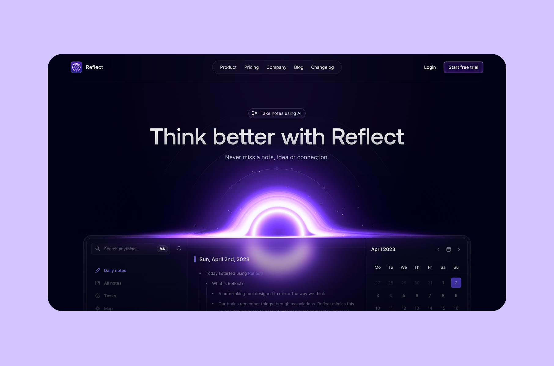
Reflect's homepage opens with four words: "Think better with Reflect." There is no animated demo reel, no cluttered feature grid, and no dense comparison table either. The hero gives you a headline, a visible product screenshot, and enough whitespace to let both breathe a little.
That restraint is a product-aligned design decision. Reflect is a networked notes tool built for speed and focus. If the website felt busy or overloaded, it would contradict the product's core promise before a user ever opened the app. Instead, the site's signal-to-noise ratio is exceptionally high, and every element on the page earns its space.
The testimonial wall is worth noting, too. Customer quotes repeatedly praise speed, simplicity, and attention to detail. Placing those quotes in a clean, scannable layout turns social proof into a design argument: the people who use this product value the same qualities the website demonstrates.
This is the aesthetic-usability effect in action. When a product looks lightweight and focused, users perceive it as faster and easier to use, even before they test it. Reflect's site is designed for that perception. The whitespace works as a cognitive buffer, giving visitors fewer things to process per scroll, which makes the product feel calm.
What SaaS teams can borrow:
If your product's core value is speed or simplicity, reduce the page to match. Don't add sections to "look complete." Let the restraint itself carry the message. This approach helps users perceive the product as faster and easier to use, a principle that drives effective SaaS design decisions.
Among the best B2B SaaS websites, Reflect is proof that “less” page can mean more confidence.
2. Granola
Calm, but with energy underneath
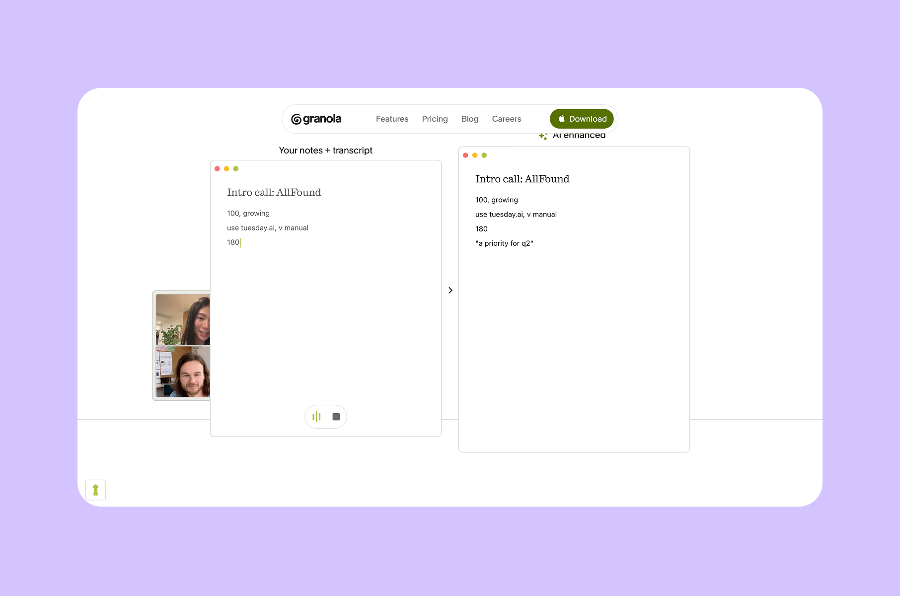
Granola's redesign is one of the most instructive SaaS website examples of the year, partly because the team wrote publicly about why they did it. Their design blog explains that the previous brand looked like "any other SaaS company," and the redesign was built to fix that.
The challenge, in their own words, was balancing a calm product experience with the fast-paced lives of the people using it. The result is what they describe as "calm, but with energy underneath."
That phrase shows up in the actual design choices. The new logo is deliberately hand-drawn and slightly imperfect, which breaks from the hyper-polished geometric marks most AI tools use. The display face also carries warmth and character.
On the homepage, the product is still framed as minimal, fast, and steady. The layout does not try to overwhelm with features. It uses brand congruence, where the visual identity and the product identity reinforce the same emotional register.
This is a strong example of "warm utility" in AI product design. Many AI tools default to cold, techy aesthetics. Granola instead uses deliberate imperfection as a differentiation tool, making the product feel approachable without sacrificing professionalism.
What SaaS teams can borrow:
Think of a brand as a system, not a logo. When your typography, illustration style, and layout rhythm all point in the same emotional direction, visitors feel the product's personality before they read a word. An effective SaaS branding service treats the brand strategically this way.
3. incident.io
Operational clarity
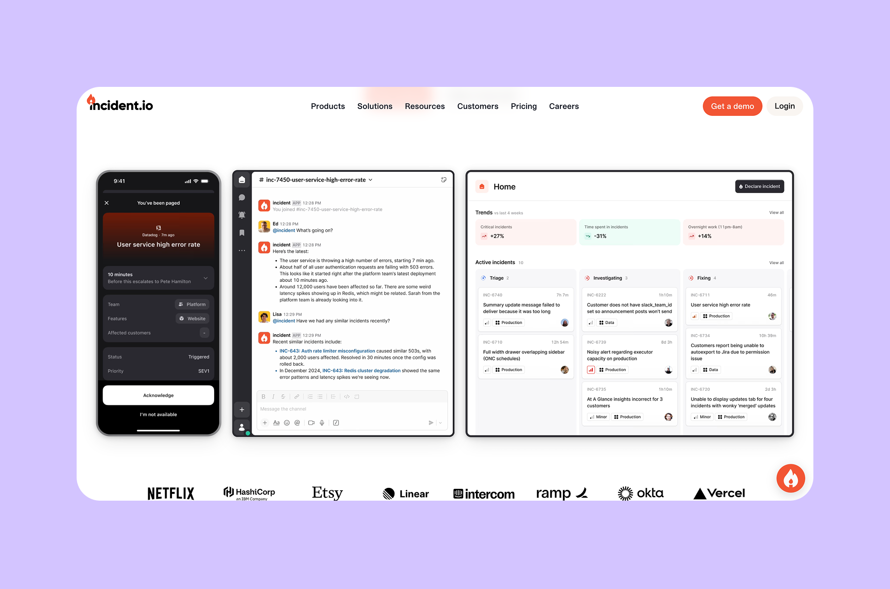
incident.io opens its homepage with a line that does real work: "Move fast when you break things." It is blunt, memorable, and category-specific. From there, the page shifts quickly into social proof badges, modular product sections, and structured content blocks. There is very little decorative filler.
What makes this one of the top SaaS websites for enterprise design is how the site treats information density. The page is packed with specifics - integrations, workflows, on-call features, status pages - but the scan path stays clean because every section follows the same modular template:
- Headers are concise.
- Blocks repeat at consistent widths.
- Visual weight stays balanced from section to section.
The design principle at work here is functional hierarchy - giving dense information a clean, repeatable structure that never feels cluttered.
What SaaS teams can borrow:
For enterprise and B2B SaaS websites, "boring" is not the goal. They need to be operationally legible. The fastest way to get there is to build modular sections that can scale with content without fragmenting the page's rhythm. Teams focused on B2B SaaS design services understand this trade-off well.
4. Iru
One platform, one visual logic
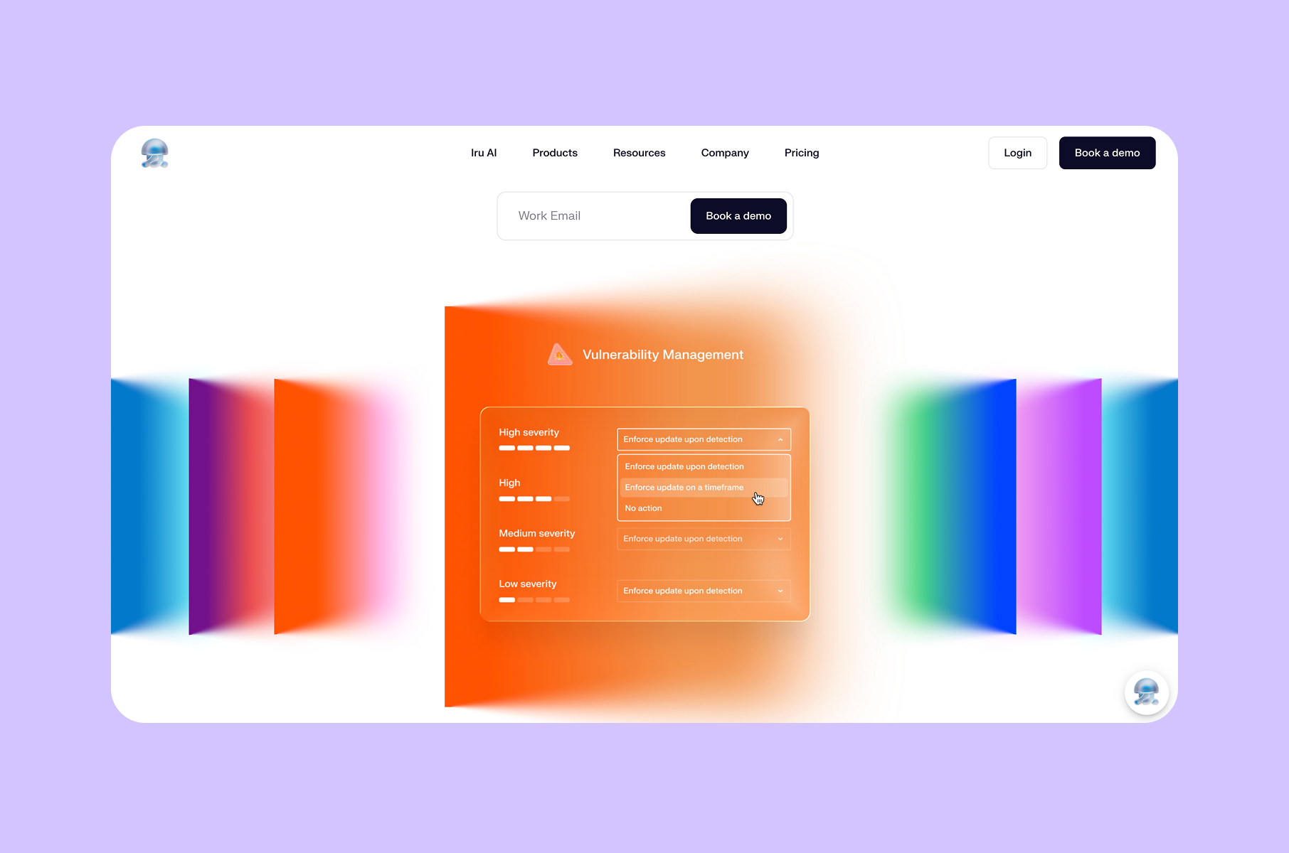
With Iru being a multi-product cybersecurity platform covering identity, endpoint, and compliance, the design challenge was “how do you make a product suite feel unified rather than stitched together?”
The answer on this site is structural mirroring. Each product pillar gets the same section template - the same header treatment, the same content block width, the same visual density. The company even uses the line "Unified by design."
This parent/child architecture is one of the smartest structural moves among the SaaS website examples on this list. Instead of trying to simplify a complex product into one hero image, Iru uses visual taxonomy: a system of parallel sections that teaches visitors how the platform is organized. The consistent treatment tells you, visually, that these products belong together.
That consistency doubles as a trust-building device. In cybersecurity, a fragmented design can read as fragmented engineering. When every section of the page uses the same grid, spacing, and type hierarchy, it suggests the product underneath is equally well-organized.
What SaaS teams can borrow:
If your product covers multiple SKUs or surfaces, design a repeatable section template before you design individual sections. Consistency communicates control. A strong design system service can establish this foundation at scale, which matters especially for B2B SaaS website design in high-trust categories.
5. Softr
Show breadth without noise
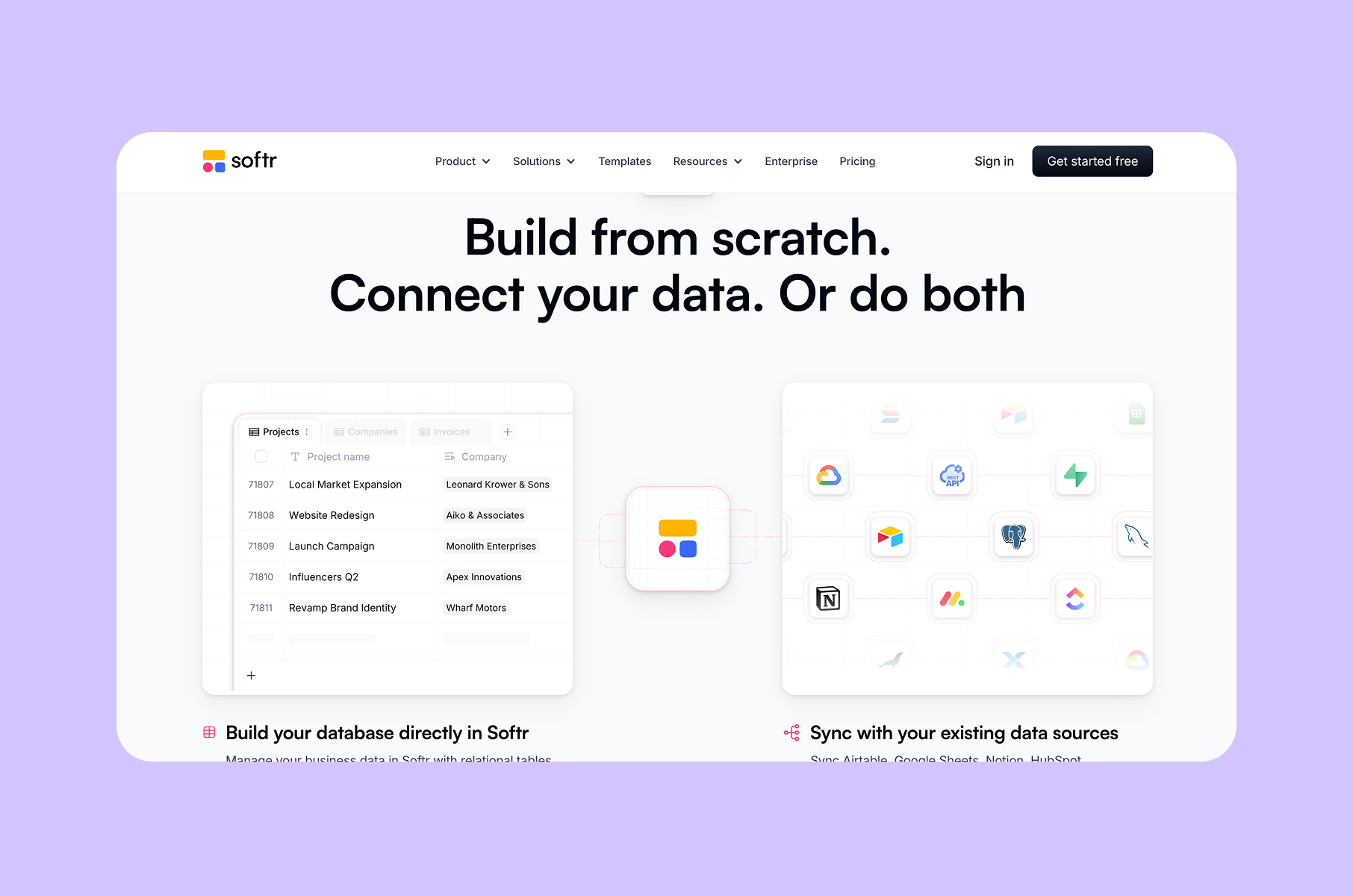
Softr's homepage has a lot of ground to cover. The product builds internal tools, portals, databases, workflows, and AI-generated apps. A product that broad can easily produce a marketing site that feels chaotic with too many feature blocks, too many use cases, too many screenshots competing for attention.
Softr avoids that trap through modular grid thinking. The hero shows a desktop dashboard alongside a mobile view, which immediately communicates cross-platform capability. Below that, the page uses repeated visual modules like UI imagery at consistent sizes, structured capability blocks, and parallel section layouts to present breadth without visual noise.
The design principle here is breadth-first visual storytelling. Rather than leading with one feature and drilling down, Softr leads with scope and uses a consistent rhythm to keep the expanded view readable. Every section block follows the same proportional logic, so adding more sections does not make the page feel heavier.
This is one of the best SaaS website designs for products that do many things. The key is the repeatable component rhythm, because once the grid module is set, the page can scale without breaking.
What SaaS teams can borrow:
When your product spans multiple use cases, invest in one strong grid module and repeat it. Controlled repetition scales better than variety. Professional SaaS web design, for example, relies on this modular thinking to remain scannable at any scale. That is what separates cluttered pages from great SaaS websites that also happen to be feature-rich.
6. Tandem
One interaction idea, repeated
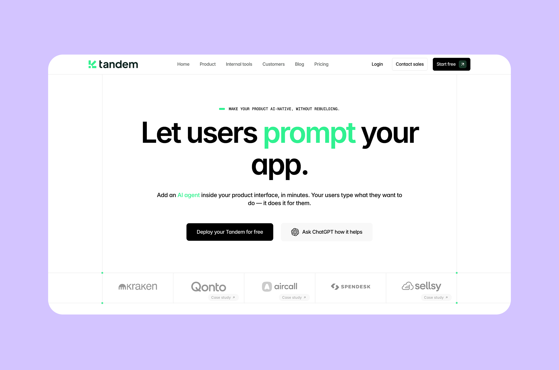
Tandem's entire site is organized around a single concept: "Let users prompt your app." That focus is the page's strongest design decision. From the hero onward, every section translates that one idea into a different in-product scenario - activation flows, self-serve features, in-context help, analytics views, and deployment states.
The effect is cumulative. By the time you reach the bottom of the page, you do not just understand what the product does - you understand the interaction model behind it. That is a much stronger outcome than listing ten features in a grid and hoping visitors connect the dots themselves.
This is what single-concept interface storytelling looks like in practice. Instead of introducing new visual metaphors in every section, Tandem keeps re-showing the same mental model in different contexts. The embedded assistant pattern stays visually consistent across sections, which creates a sense of object permanence - the product looks like the same thing no matter where you encounter it on the page.
The site effectively functions as a demo. You do not need to sign up or watch a video to understand how the interaction works. The page teaches you through repetition, which is a form of task-first demonstration over abstract product claims.
What SaaS teams can borrow:
If your product introduces a new interaction pattern, do not bury it behind a feature list. Build the page around that one idea and show it five or six different ways. Strong UI/UX design services understand that interaction design is the primary vehicle for storytelling.
Among the best designed SaaS websites this year, Tandem makes the strongest case for focus as a storytelling device.
7. Basalt
Editorial design for technical products
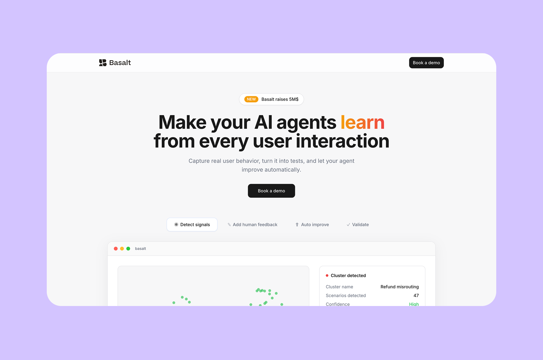
Basalt faces a design problem that most AI infrastructure products share: the subject matter is dense, multi-layered, and aimed at technical decision-makers who have little patience for vague marketing language. The site solves this with editorial hierarchy - by having bold statement blocks, clearly labeled section phases, and a process-driven structure organized around stages like "experiment," "evaluate," and "monitor."
The key line on the page is: "Building a POC is easy. Production-grade AI is another story." That sentence sets up the rest of the page as a design solution for complexity, and every section that follows answers a different part of that complexity problem.
What makes Basalt stand out among SaaS website examples in the AI category is how it uses typographic pacing:
- Section headers are large and direct.
- Supporting text is smaller and tightly scoped.
- The visual rhythm mimics editorial design, as if it were a magazine feature about building production AI.
Each stage block also addresses a specific role or workflow concern, which makes the page effective for multi-stakeholder buying processes where different readers care about different sections.
What SaaS teams can borrow:
For technical products, treat the page like an editorial piece - use bold statements to create rhythm and labeled stages to create structure. This is one of the best B2B SaaS websites for showing how editorial pacing makes dense content scannable, and it avoids the generic "dark mode plus glowing gradient" trap that most AI infrastructure sites fall into.
8. Passionfroot
High-energy UX
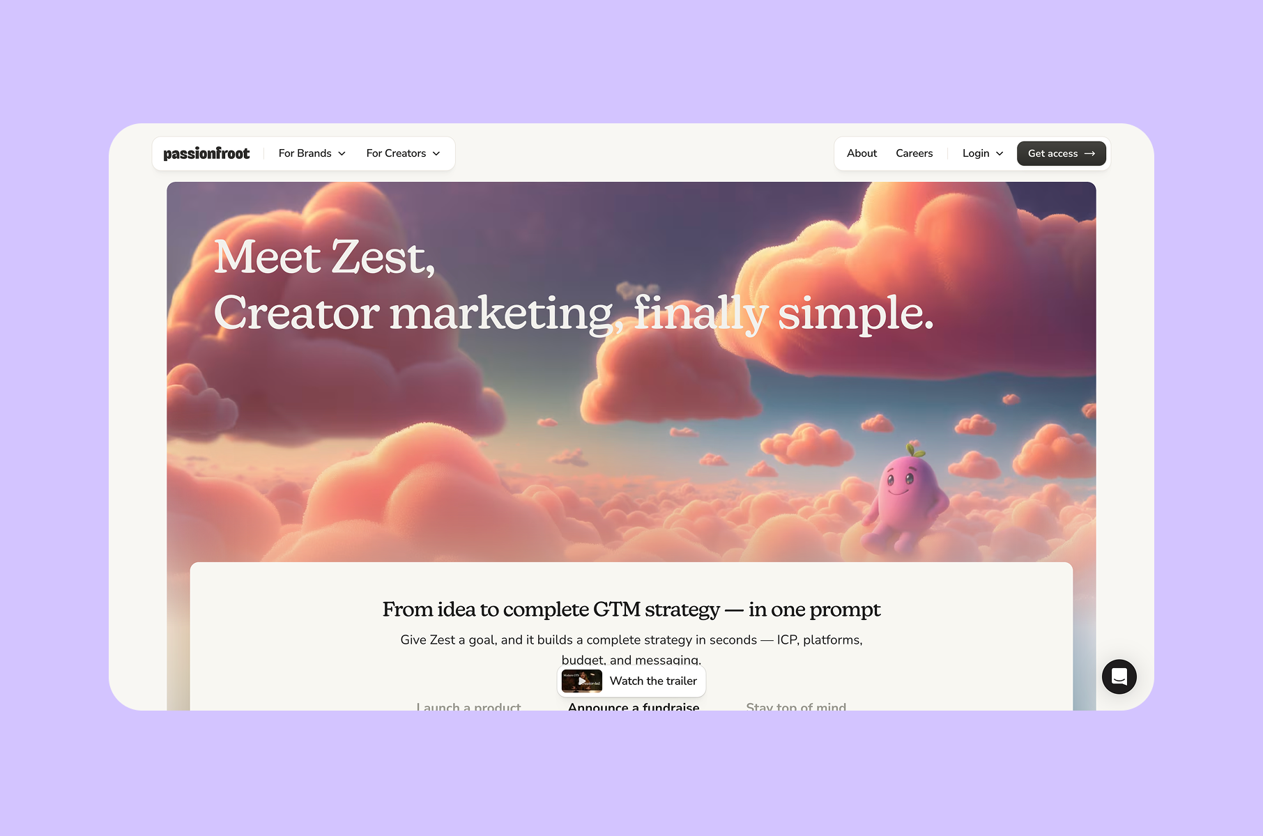
Passionfroot's homepage has a lot going on. Apart from the quirky and cute illustrations, we have creator cards, brand logos, campaign previews, payment state indicators, and testimonial blocks, all appearing on the same page.
For a creator-brand marketplace, that density is appropriate, since the product connects multiple parties across multiple workflows, and the site needs to communicate that.
What keeps the page from collapsing into visual chaos is a single anchoring interaction: the AI agent "Zest." The "Ask Zest anything…" prompt pattern appears consistently and gives visitors one clear entry point into an otherwise layered ecosystem.
They are basically using “density zoning” to designate high- and low-information areas within the same page, and using consistent card interfaces to keep the dense zones readable. Social proof on this page is integrated as product content - creator quotes and brand logos appear inside the same visual system as the product previews, which makes everything feel like part of one operating model.
Passionfroot site’s energy level is notably higher than most SaaS websites in this list, yet it is appropriate. A marketplace for creators and brands should feel active and populated. The design choice is not to reduce that energy but to channel it through a structured card system.
What SaaS teams can borrow:
If your product is an ecosystem or marketplace, do not try to simplify the page down to one app screen. Instead, build a card system and an anchoring interaction that holds everything together. These kinds of SaaS website ideas work well for multi-sided platforms.
9. EigenPal
Boutique enterprise design
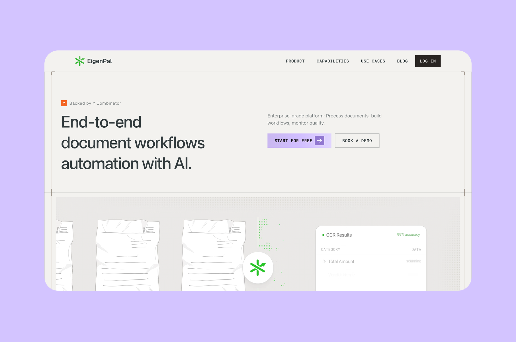
EigenPal is one of the cleanest enterprise-facing examples in this list. The hero is paired with slash-style section labels, tight capability blocks, and concise illustration groupings. It feels precise in a way that most enterprise AI sites do not.
What makes it work is typography. The display type is large and spaced in a way that creates visual pull. Below that, section labels use a smaller, more functional font. The contrast between the two creates a natural reading cadence: bold claim, then structured detail.
We also see authority cues appearing early - Y Combinator backing, enterprise-grade framing, security standards. Each cue, however, gets a compact, well-placed mention rather than a dedicated section. That restraint keeps the page feeling boutique and intentional.
The layout is sparse but structured. Nothing about the page suggests it ran out of content. Instead, the spacing reads as deliberate. For a product that handles end-to-end enterprise workflows, that precision in presentation builds confidence.
This is one of the best B2B SaaS websites for showing how small typographic and layout choices can elevate a page from generic to premium. Micro-label wayfinding is especially useful: section labels that are too small to dominate but clear enough to orient visitors as they scroll.
What SaaS teams can borrow:
Use typography to create pace, not decoration. A well-chosen contrast between display and functional type can make an enterprise B2B SaaS website design feel considered and precise.
10. Relace
Atmosphere as differentiation
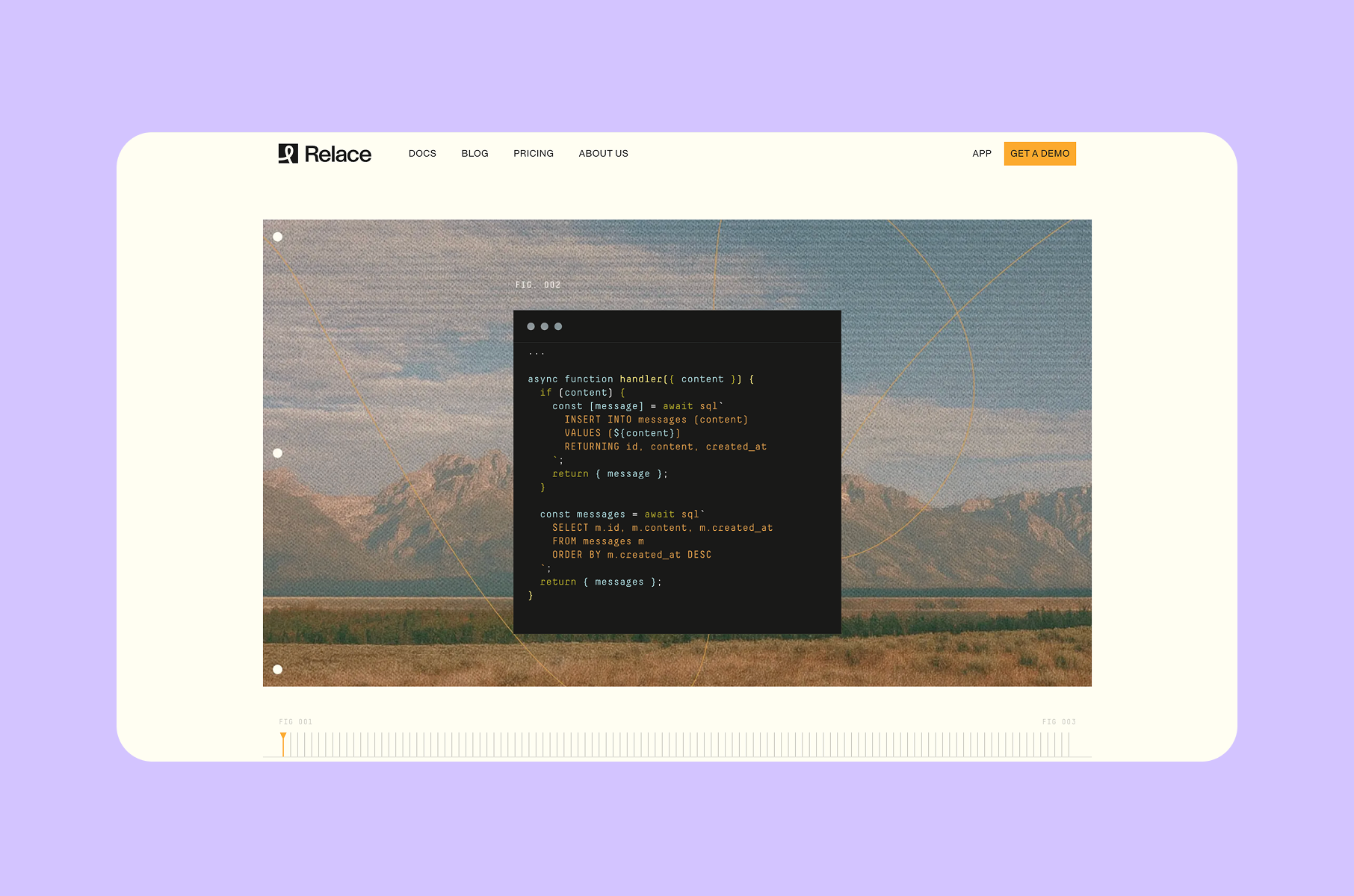
Relace refuses the default developer-tool aesthetic. Where most coding infrastructure sites use dark backgrounds with neon syntax highlighting and terminal screenshots, Relace mixes technical language with large-format landscape photography and subtle geometric overlays. The result is a site that feels expansive.
That visual direction is unusual, too. The contrast between hard-edged technical claims and soft, atmospheric imagery creates a tonal identity that stands out. Developer tooling sites tend to look alike. Relace does not.
The photography and ambient overlays are not decorative. They help with positioning. By wrapping infrastructure-level technical content in organic, open imagery, the site communicates ambition and scale. The visual message is that this tool operates at a level above line-by-line code editing.
Not every team should try this approach. Atmospheric branding works when it reinforces the product's strategic position - in this case, a product that claims to work differently from traditional code editors. If the product were a straightforward linter or CI/CD tool, the same imagery might feel out of place. Here, it fits because the product's identity is built around a different kind of developer experience.
What SaaS teams can borrow:
If you need to stand out in a visually homogeneous category, consider what emotional register your competitors use - and then deliberately choose a different one. The best SaaS websites do not always follow category conventions. Sometimes the strongest design move is contrast-driven identity.
11. Prime UI
Site as a live demo
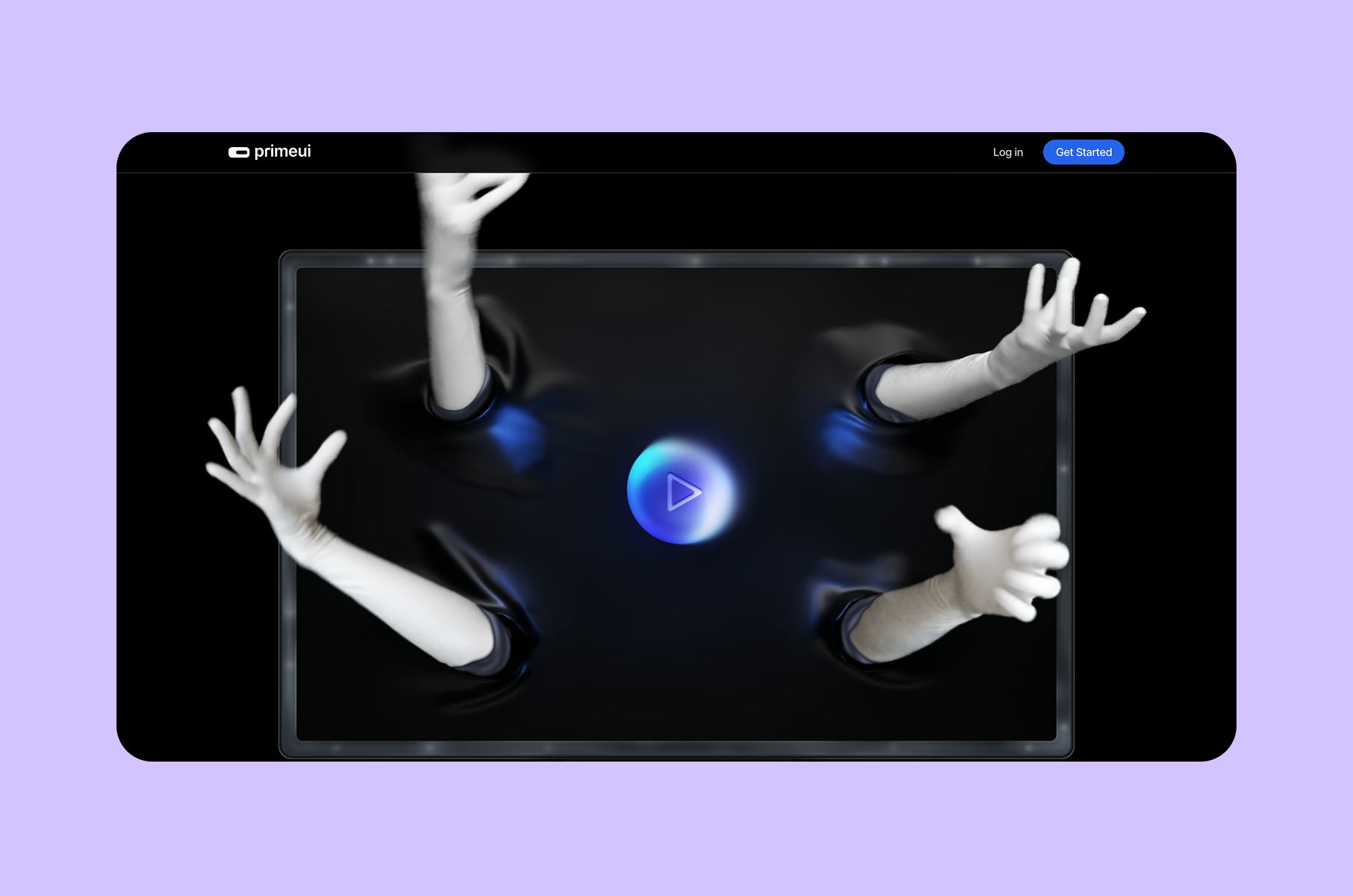
Prime UI is the most self-referential site in this list, and that is a compliment. The product helps people build websites and interfaces. The marketing site itself is built like a structured walkthrough of that process: step markers, sitemap-to-wireframe progressions, infinite canvas previews, component language demonstrations, micro-interactions, performance metrics, and export-ready claims.
This is dogfooding applied to marketing design. Every section of the page demonstrates a capability while explaining it. You do not read about the component system and then imagine what it looks like. You see the component system in the page itself.
The interaction affordances are worth noting, too:
- Small hover states, transition animations, and scroll-triggered reveals show you the kind of polish the product enables.
- Performance data appears alongside visual design elements, which reinforces the idea that design quality and technical quality are of the same concern.
This is one of the best SaaS website designs of the year because it collapses the distance between marketing and product. When a visitor finishes scrolling, they have already experienced the product's design philosophy - not through a demo video, but through the site itself.
What SaaS teams can borrow:
If your product is a design or development tool, your marketing site should feel like it was built with your own tool. The credibility gain is immediate. This approach makes Prime UI one of the top SaaS websites for product-led design.
When you invest in website redesign service, consider whether dogfooding might strengthen your positioning.
12. Opennote
Instructional AI
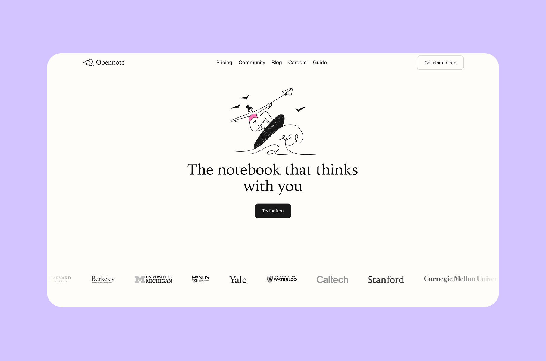
Opennote takes a different approach from most AI-powered products. Instead of leading with technical capability or model specifications, the site leads with a learning-oriented posture: "The notebook that thinks with you." Sections like "AI that helps you understand, not just answer" and "Built for how you learn" frame the product as an educational partner rather than a productivity engine.
That framing shows up in the design decisions. Video surfaces are embedded at study-relevant moments. The layout guides visitors through the product's use cases in a sequential, almost tutorial-like flow. The visual hierarchy is supportive - meaning it does not compete with the content for attention. Instead, it directs focus calmly from section to section.
Opennote also uses instructional UX cues and reassurance design - visual choices that make the product feel helpful rather than overwhelming:
- Typography is warm but legible.
- Spacing is generous without feeling empty.
- The color palette avoids the high-contrast, stimulation-heavy palettes that many AI tools use.
Category fit is especially strong here. The site feels like a study tool. Not a generic AI startup page, not a flashy product-hunt launch, but something that belongs in the daily workflow of someone trying to learn. That alignment between product purpose and design tone is what makes Opennote one of the stronger SaaS website examples in this list.
What SaaS teams can borrow:
Match the design's emotional temperature to the product's use context. An AI learning tool should feel supportive. A monitoring tool should feel alert. The best B2B SaaS website design choices are driven by context, not trends.
13. Nudge
Domain-native design
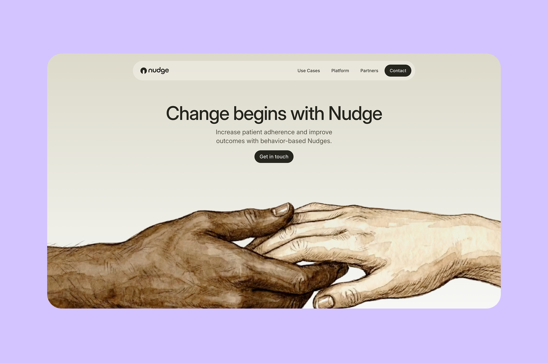
Nudge is the clearest contrast case in this list. The page is structured around behavioral science, personalized nudges, clinical workflows, and outcome insights. Sections are straightforward and labeled with functional precision. There is also no ambient photography, no experimental typography, no playful card interfaces.
In healthcare SaaS, flashy design can actually ruin credibility. Nudge's site is built for clarity. Each section explains how the system works in language and layout that a clinical stakeholder can scan quickly and trust immediately.
The workflow visualization is the most effective element. Rather than showing abstract product screenshots, the page walks through the nudge-delivery process step by step - from patient identification to intervention to outcome measurement. That process-based layout does something screenshots alone cannot: it shows the logic of the product, not just its interface.
The functional tone extends to every layer:
- Colors are muted.
- Type is neutral.
- Spacing is tight enough to feel efficient, loose enough to feel readable.
Nothing on the page stands out, which is exactly the right choice for a product that needs to feel clinical and outcomes-sensitive.
What SaaS teams can borrow:
Not every product should look playful or experimental. If your audience works in healthcare, finance, legal, or other high-trust fields, let domain expectations shape your design language. Professional SaaS design and development requires this contextual awareness.
Among the best SaaS websites for regulated industries, Nudge shows that discipline is a design feature.
What the best SaaS websites of 2026 get right in design
After reviewing all 13 sites, a few structural habits connect the strongest SaaS website examples in this list, regardless of whether the site is calm, energetic, technical, or atmospheric.
They show the product early
Most of these pages move quickly into product UI, workflow states, or system previews rather than relying on abstract hero images:
- Softr places a composite app view in the hero.
- Tandem builds the entire page around the product's core interaction.
- Basalt organizes the page around product stages.
- Opennote embeds video at contextually relevant moments.
The pattern here is rather simple - great SaaS websites let the interface do the talking.
They use a full visual system, not just a strong hero
A well-designed hero section means nothing if the rest of the page drifts into inconsistency.
- Granola's redesign blog explicitly describes building a complete visual system - typefaces, logo, color, and illustration rules.
- incident.io publishes brand guidelines in its header navigation.
- Iru's platform sections are designed as a coherent product family.
The takeaway is that B2B SaaS website design that holds up across the full page requires system-level thinking, not section-level polishing.
They match the site’s tone to the product’s context
Emotional alignment between the site and the product is a consistent marker across the best designed SaaS websites:
- Reflect and Granola feel calm because the products are built for focus and note-taking.
- Relace feels expansive because the product is trying to redefine how developers interact with code.
- Nudge feels restrained because the product operates in clinical settings.
They handle complexity with structure, not oversimplification
None of the following pages is simple - they are well-organized. That distinction matters for any B2B SaaS websites with complex product stories:
- Basalt uses editorial staging to break down AI infrastructure. Iru uses mirrored content blocks to present a multi-product suite.
- Softr uses repeatable grid modules to show breadth.
- Passionfroot uses card systems to organize a marketplace ecosystem.
They make the website feel like a preview of the product experience
This is the strongest shared trait:
- Prime UI is the clearest example - its marketing site functions as a live walkthrough of its own design system.
- Tandem turns the page into a demo of the embedded assistant pattern.
- Opennote's layout mirrors the instructional feel of the product itself.
When marketing design and product design come from the same logic, the result is one of the defining characteristics of the top SaaS websites in 2026.
What SaaS founders should borrow from these websites
If you are redesigning a SaaS website this year, these are the design-level decisions worth prioritizing. These are not intended as a checklist of features, but rather as a set of principles drawn from what the best SaaS website designs actually demonstrate.
- Make the first screen visually explain the product type. Visitors should understand what category of software they are looking at before they scroll.
- Use one dominant interaction idea per page section. When each section introduces a new visual metaphor, the page becomes harder to scan.
- Show real interface states, not decorative mockups. Floating laptop frames with blurred screenshots do not build confidence. Product UI with real data and real labels communicates more than any illustration.
- Build a repeatable component rhythm before adding visual flair. Softr and Iru, for example, both prove that strong modular systems can carry an entire page. Get the grid right first.
- Use typography to create pace.
- Match the design temperature to the category. The wrong emotional register can undermine even well-executed visual design.
- Let the brand support usability. That balance between brand expression and functional clarity is what separates strong SaaS website ideas from purely decorative redesigns.
The design standard for the best SaaS websites going forward
The current wave of SaaS redesigns is converging on a clearer idea of what “good” looks like.
The 13 sites on this list represent different categories, audiences, and visual styles. What connects them is a shared commitment to making design serve the product, not the other way around.
The best SaaS websites in 2026 are actually not the ones with the most animations or the trendiest color palettes. They are the ones where every visual choice makes the product easier to understand.
For teams evaluating their own sites, we recommend reviewing our website UX audit checklist as a structured starting point.
That standard is worth measuring against, whether you are building for healthcare, AI infrastructure, developer tooling, or creator marketplaces. Good SaaS website design does not follow one template. It follows the product.