0
Table of Contents
Bad UX examples from multi-billion dollar products (like WhatsApp, Instagram, LinkedIn, etc.)
Read our honest take on what went wrong and what we would have shipped instead.

Bad UX hides in the products you use every single day. The companies behind them might have billions in revenue, thousands of designers on staff, and near-unlimited research budgets. Yet they still ship interfaces that confuse, frustrate, and sometimes even disrespect the people using them.
What follows are the worst bad UX examples our Merge design team has spotted or heard about over the past year or so, pulled from apps and products with a combined user base of over 5 billion people.
Each one comes with our honest take on what went wrong and what we would have shipped instead.
If you lead product or design at a startup and you are trying to figure out which UX mistakes to avoid as you scale, this article is your shortcut.
What is bad UX design?
And why do giant companies keep shipping it?
Bad UX design is any interaction where the product works against the person using it.
That can mean hiding a button someone needs, burying a setting under four menus, sending 30 notifications a day nobody asked for, or changing an interface overnight without warning. The result is always the same: users waste time, lose trust, or leave entirely.
So why do companies worth $100 billion or more keep making these mistakes?
Organizational gravity. It's that thing where companies regress to old habits that worked for them in the past.
Large product teams also constantly optimize for lots of engagement metrics that often conflict with user satisfaction. Revenue-driven decisions override design sense. And when you have 500 people working on a single product, consistency suffers. The irony is that organizational complexity (the kind that comes with scale) often produces the worst bad UX designs precisely because no single person owns the full experience anymore.
The bad UX design examples below follow the same pattern: our hot take, the UX analysis of what went wrong, and what we would ship instead.
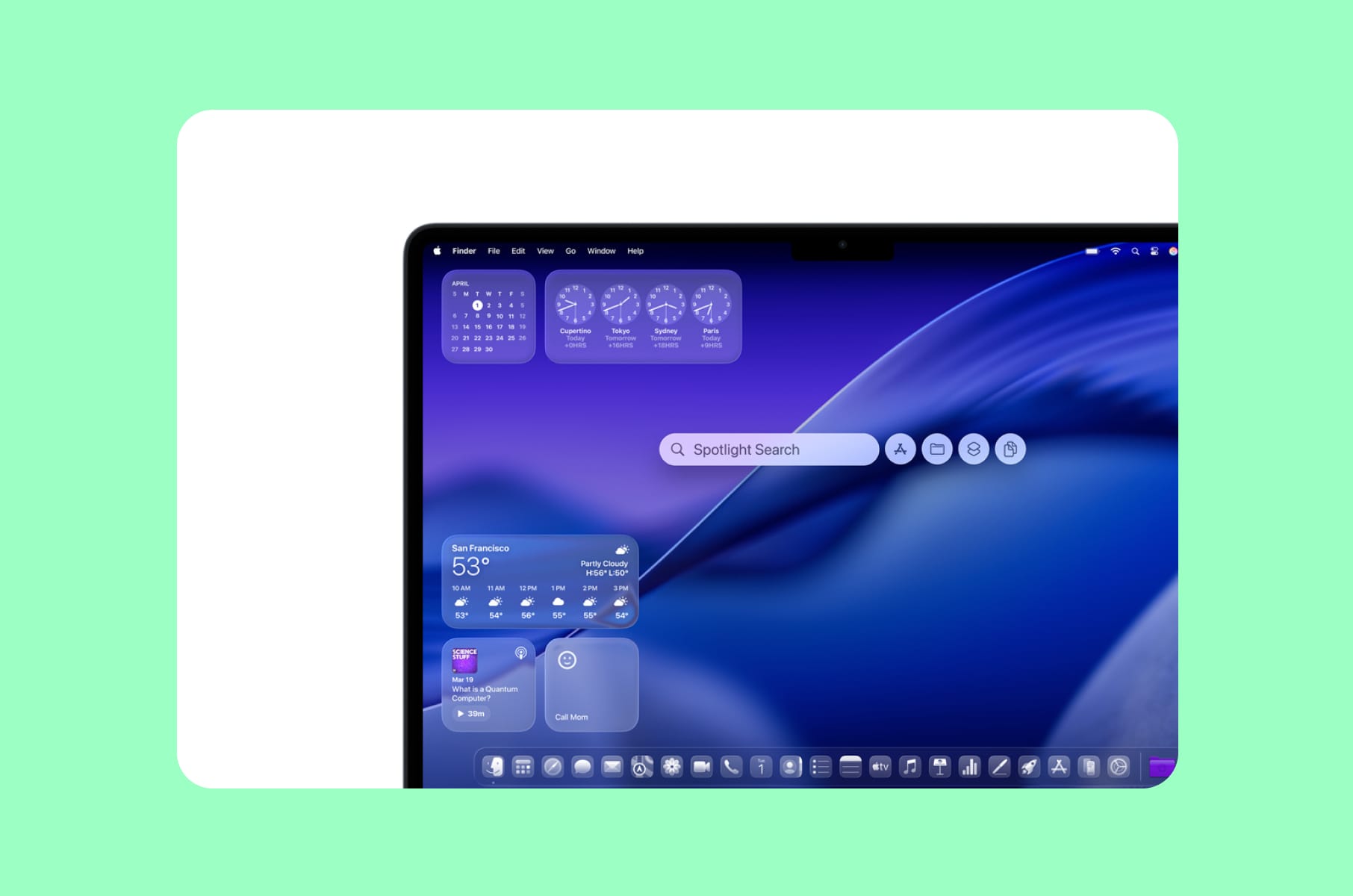
Instagram UI changes

Grid overhaul and constant UI reshuffling
Our hot take:
Instagram treats its interface like a mood board, constantly rearranging it. The problem is that a billion people rely on that "mood board" for their livelihood.
In early 2025, Instagram replaced its decade-old square grid with a 3:4 rectangular layout. Adam Mosseri called the change "long overdue," arguing that most uploads are vertical now. But for creators who had spent years designing grid mosaics, carefully curating how their profiles looked at a glance, the update destroyed their work overnight. Comment sections were filled with complaints. Users threatened to leave.
And the grid was only part of it. Throughout 2025, Instagram shuffled its navigation bar, swapped the positions of DMs and the Create Post button, introduced a "Discover Feed" that surfaces content from accounts you do not follow, and tested a Reels-first layout that opens directly to short-form video in certain markets. Each change forced users to relearn the muscle memory they had built over months.
The UX principle violated:
Consistency and user control - the second and third of Jakob Nielsen's 10 usability heuristics. When you change a navigation pattern that someone uses dozens of times a day, you are taxing their cognitive load for your strategic priorities.
What we'd ship instead:
- Progressive rollouts with opt-in periods.
- Migration tools for creators whose grid layouts broke.
- A/B testing with longer observation windows that measure satisfaction, not just session time.
If a product design agency like us is advising a client on a redesign this large, the first question should always be: what does the user lose?
Apple's Liquid Glass
When aesthetic ambition undermines usability
Our hot take:
Apple used to be the company other designers pointed to when explaining good UX vs bad UX. In 2025, they shipped an OS-level redesign that made their own apps harder to read.
Liquid Glass, introduced at WWDC 2025, was supposed to bring "joy and delight" across every Apple platform. What it actually delivered was translucent layers that reduced text contrast, animations that distracted more than they guided, blurred iconography that stripped visual clarity, and an overall visual language that prioritized style over function.
The Nielsen Norman Group reviewed it and concluded: "At first glance, the system looks fluid and modern. But try to use it, and soon those shimmering surfaces and animated controls start to get in the way."
Social media was flooded with complaints about blurry icons, poor contrast, distracting color shifts, and battery drain from effects too subtle to justify the performance cost. By December 2025, Apple's VP of Human Interface Design, Alan Dye, left the company for Meta. Two months after the official launch, Apple released an update that let users disable Liquid Glass transparency entirely - a rare admission that the flagship design language had failed its primary audience.
The UX principle violated:
Visibility of system status and accessibility. When your interface looks modern, but users cannot read the text on screen, you have traded usability for aesthetics.
What we'd ship instead:
A phased approach:
- Ship the visual refresh to a subset of users.
- Run accessibility audits before the full rollout, not after.
- And provide a "classic" display mode from day one, rather than adding it as a damage-control patch.
WhatsApp multi-device syncing
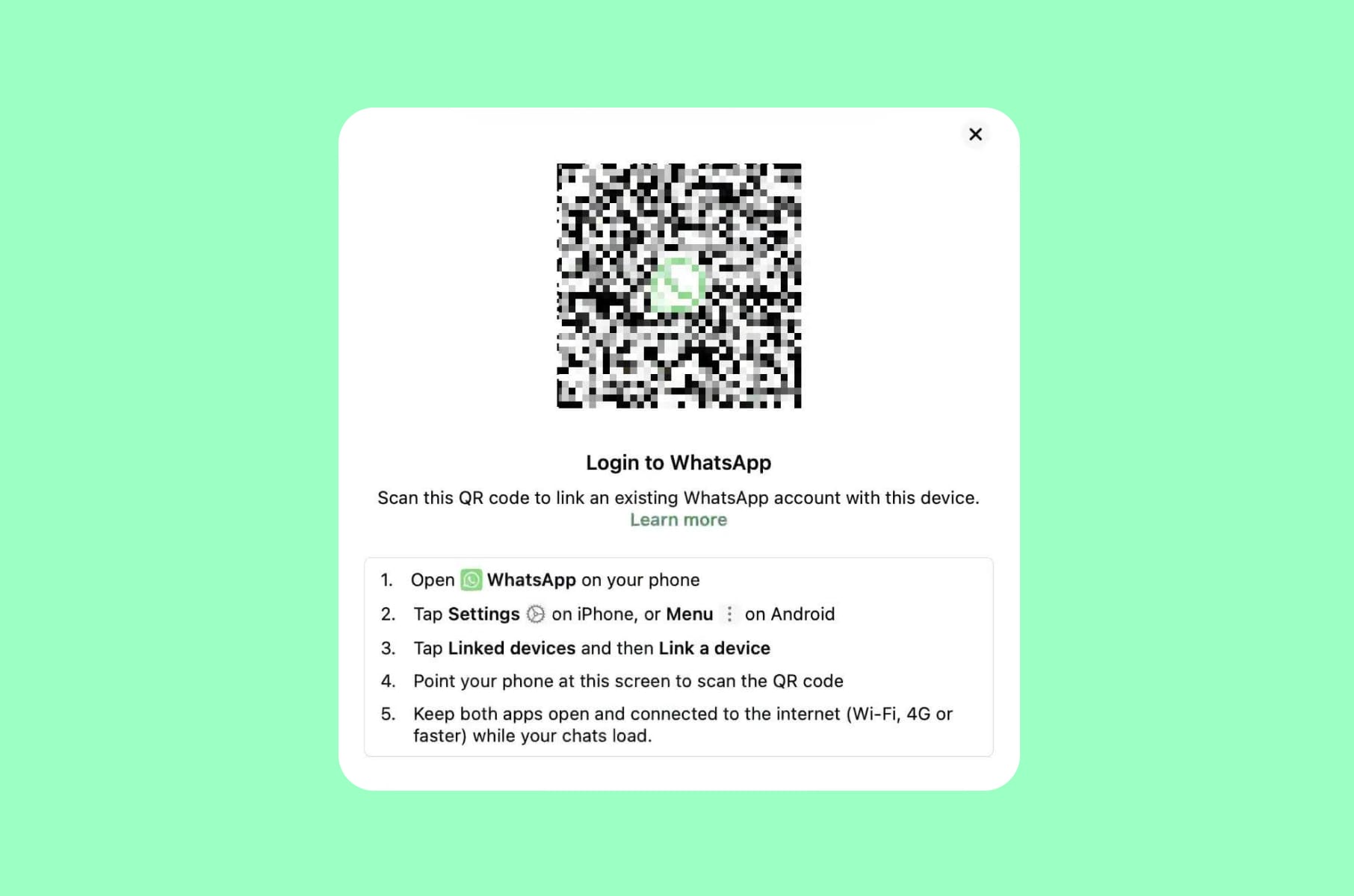
A feature that loses all your messages
Our hot take:
WhatsApp promised multi-device support. What it delivered was a system where switching phones, restoring backups, or simply linking a new device can silently erase months of conversation history.
WhatsApp's approach to syncing across devices remains one of the most frustrating bad UX design examples in any messaging app with two billion users. The backup system is tied to a specific phone number and a specific cloud account - Google Drive on Android, iCloud on iPhone. Switch your number, change your cloud account, or move from Android to iOS, and your backup becomes inaccessible.
Google Drive automatically deletes WhatsApp backups that have not been updated in five months, with no warning to the user before it happens. Your phone also needs at least twice the backup size in free storage for the process to work at all, a requirement that WhatsApp does not communicate clearly until the backup has already failed.
The linked-devices feature, which lets users access WhatsApp on a laptop or tablet, worsens the problem. Message history on linked devices only goes back a limited window. Messages sent while your primary phone is offline may not sync correctly. Users report losing messages during routine backup-and-restore cycles, even with continuous backups enabled - the system simply drops conversations without explanation.
The UX principle violated:
Error prevention and system reliability. A messaging app that loses messages has failed at its single most important job.
What we'd ship instead:
- Fix the sync infrastructure before monetizing. Implement cross-platform backup migration (Android to iOS and back) as a first-class feature.
- Add clear, proactive warnings before any backup is at risk of deletion.
LinkedIn's notification chaos
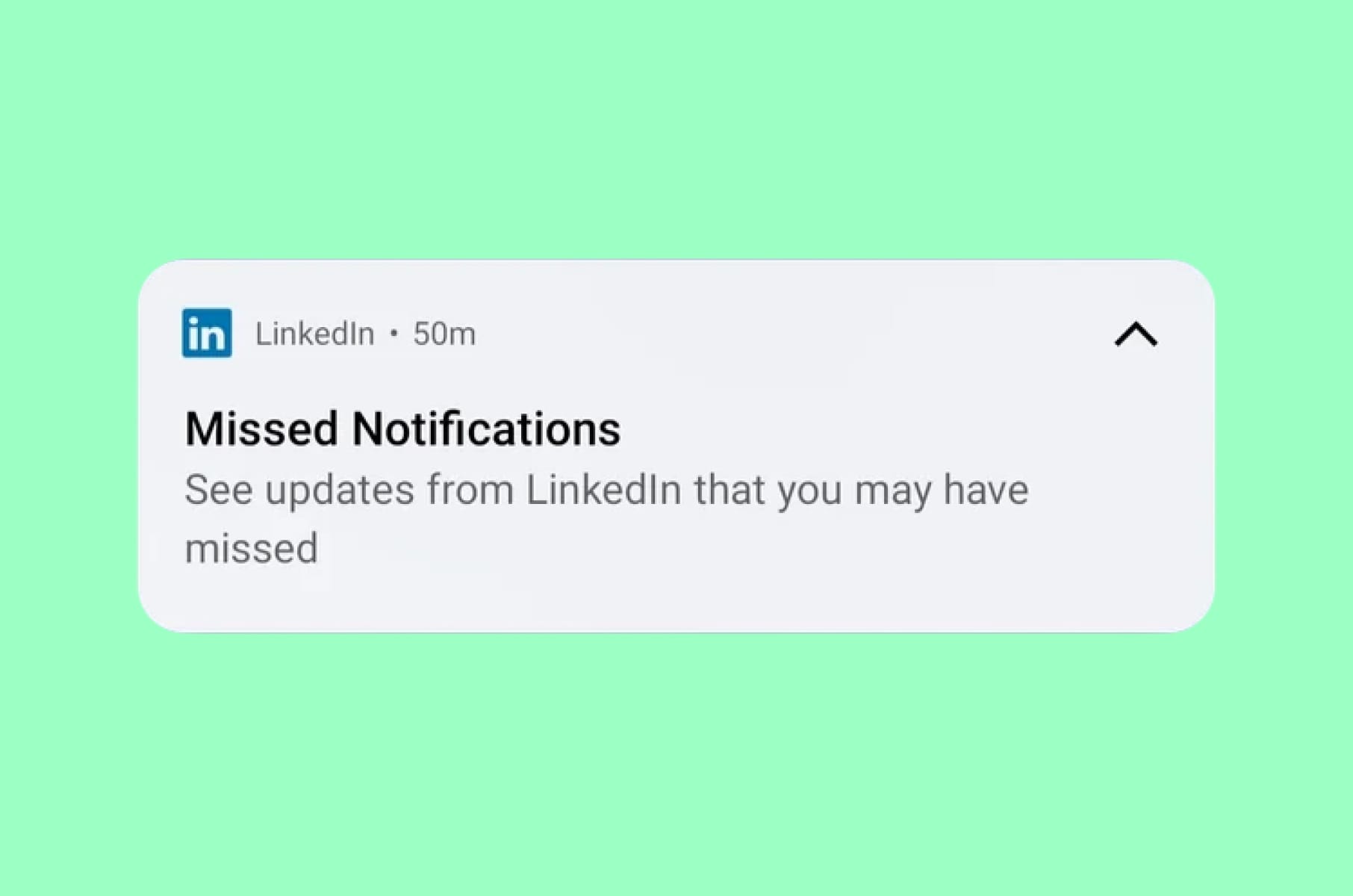
Congrats on your work anniversary!
Our hot take: LinkedIn is the only professional network where important messages get buried under an avalanche of useless notifications from people you have never met.
According to Clean Email's 2025 report, LinkedIn is the most unsubscribed email service, with over 10,000 users marking it as spam. LinkedIn sends notifications from at least 13 different streams, each with its own sub-categories. Connection requests, job alerts, "people you may know" updates, endorsement prompts, newsletter suggestions, event invitations, and recruiter messages all compete for the same notification space.
The result is a system where a critical message from a hiring manager sits next to a notification that someone you worked with eight years ago posted an article.
What makes this a textbook bad user experience is the effort required to fix it. Adjusting LinkedIn's notification settings means navigating through dozens of individual toggles, spread across multiple categories, with no "quiet mode" option and no intelligent prioritization. Even after turning everything off, users report that emails keep arriving - LinkedIn uses multiple sender addresses, making it nearly impossible to fully unsubscribe through your email client.
The UX principle violated:
User control and freedom. The system overwhelms the user and then makes the path to relief unnecessarily difficult.
What we'd ship instead:
- Smart notification priorities, similar to how Slack separates mentions from channel activity.
- A notification digest mode enabled by default for non-urgent updates. One-click "quiet mode."
- And most critically, a single settings page with clear categories rather than a maze of nested toggles.
Any team building a product with heavy notification needs should work with a UI/UX design services company that has dealt with notification architecture at scale.
Google Search and AI overviews
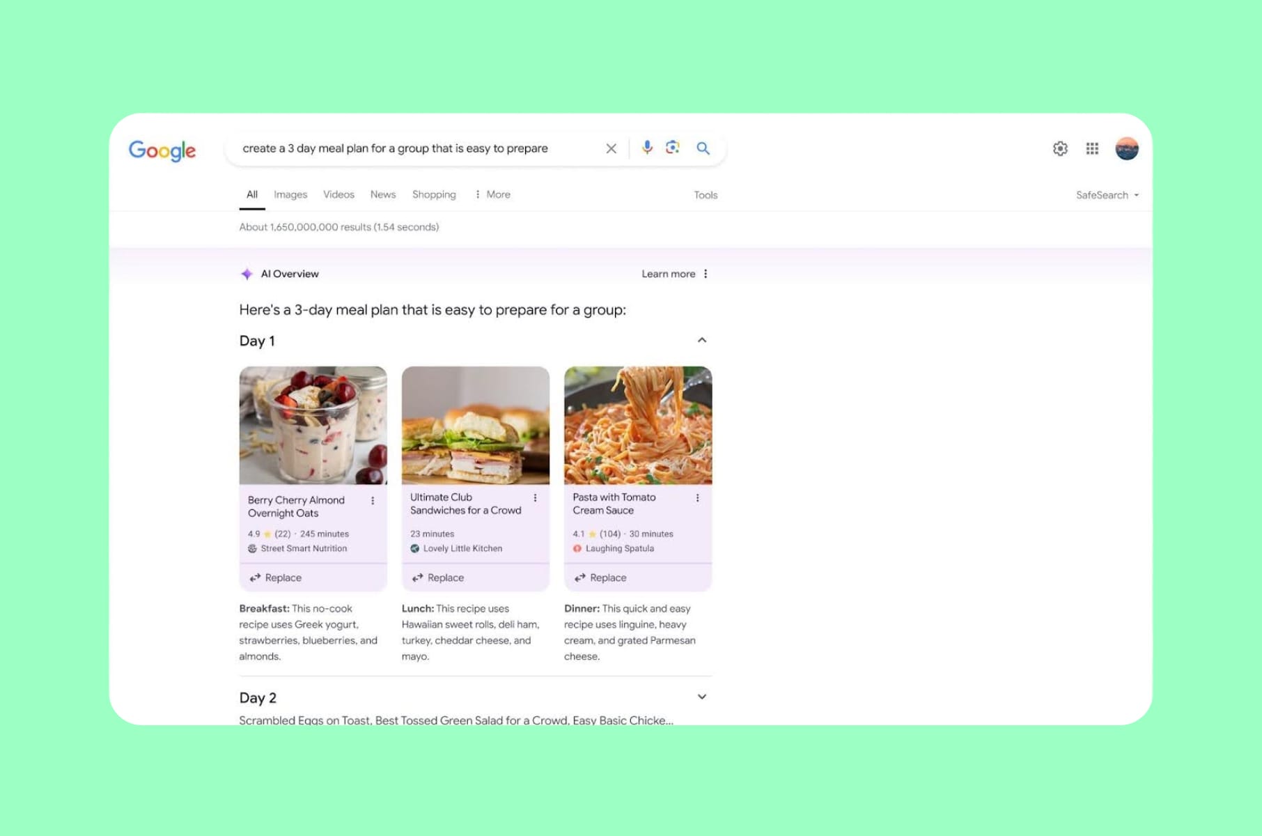
When the Search Engine doesn't help you search
Our hot take:
Google, the company that defined what good search UX looks like, now requires you to scroll past ads, AI summaries, "People also ask" boxes, and yet more ads before you reach the results you came for.
In 2025, Google aggressively expanded AI Overviews - AI-generated summaries placed above organic results. A Seer Interactive study found that organic click-through rates dropped 61% on queries where AI Overviews appeared.
A Pew Research study tracking 68,000 queries found users clicked on results only 8% of the time with AI summaries present, compared to 15% without them. Zero-click searches climbed from 56% to 69% between May 2024 and May 2025.
Then came the ads. Google confirmed at Marketing Live 2025 that AI Overviews and the new AI Mode would include Search and Shopping ads. The result: a feature that already pushed organic results down the page now also sells back the space those results used to occupy. For users, the practical outcome is that a query for "best running shoes" returns sponsored products, an AI summary, a "People also ask" block, more sponsored products, and then - maybe - the independent review you were looking for.
The UX principle violated:
Recognition rather than recall, and user efficiency. The user's task (find relevant information quickly) is now subordinated to the platform's revenue goals.
What we'd ship instead:
- A clear visual hierarchy that separates sponsored content from organic and AI-generated results.
- Transparent labeling.
- And a user preference toggle that lets people choose whether they want AI summaries for every query or only when they ask for them.
Amazon's search results

Sponsored everything
Our hot take: Amazon was once the gold standard for e-commerce search. Now, finding what you actually searched for feels like scrolling through a sponsored product catalog.
A Profitero study found that the first page of Amazon search results includes an average of nine sponsored listings - twice as many as Walmart and four times as many as Target. The FTC alleged that Amazon knowingly flooded search results with irrelevant sponsored products, and that senior executives were aware the practice degraded the shopping experience but continued because, in their words, "we'd be crazy not to" increase ad revenue.
"Sponsored" labels are inconsistently placed, sometimes in the lower-right corner, sometimes in tiny type above the product name. The Washington Post ran an investigation a couple of years ago showing how Amazon's ads are "disguised as real results," making it difficult for shoppers to distinguish paid placements from organic recommendations.
This is a bad user experience that directly eats at trust. When a customer searches for a specific product and the first five results are paid placements for competing items, the search experience stops serving the user entirely.
The UX principle violated:
Aesthetic and minimalist design, and, similar to WhatsApp, the match between the system and the real world. A "search" that returns primarily advertisements is a search in name only.
What we'd ship instead:
- Clear, consistent sponsorship labels with a distinct visual treatment - not just a small "Sponsored" tag in variable-weight gray text.
- A cap on sponsored results per page.
- And a toggle that lets users filter to organic results only.
Netflix’s mobile content
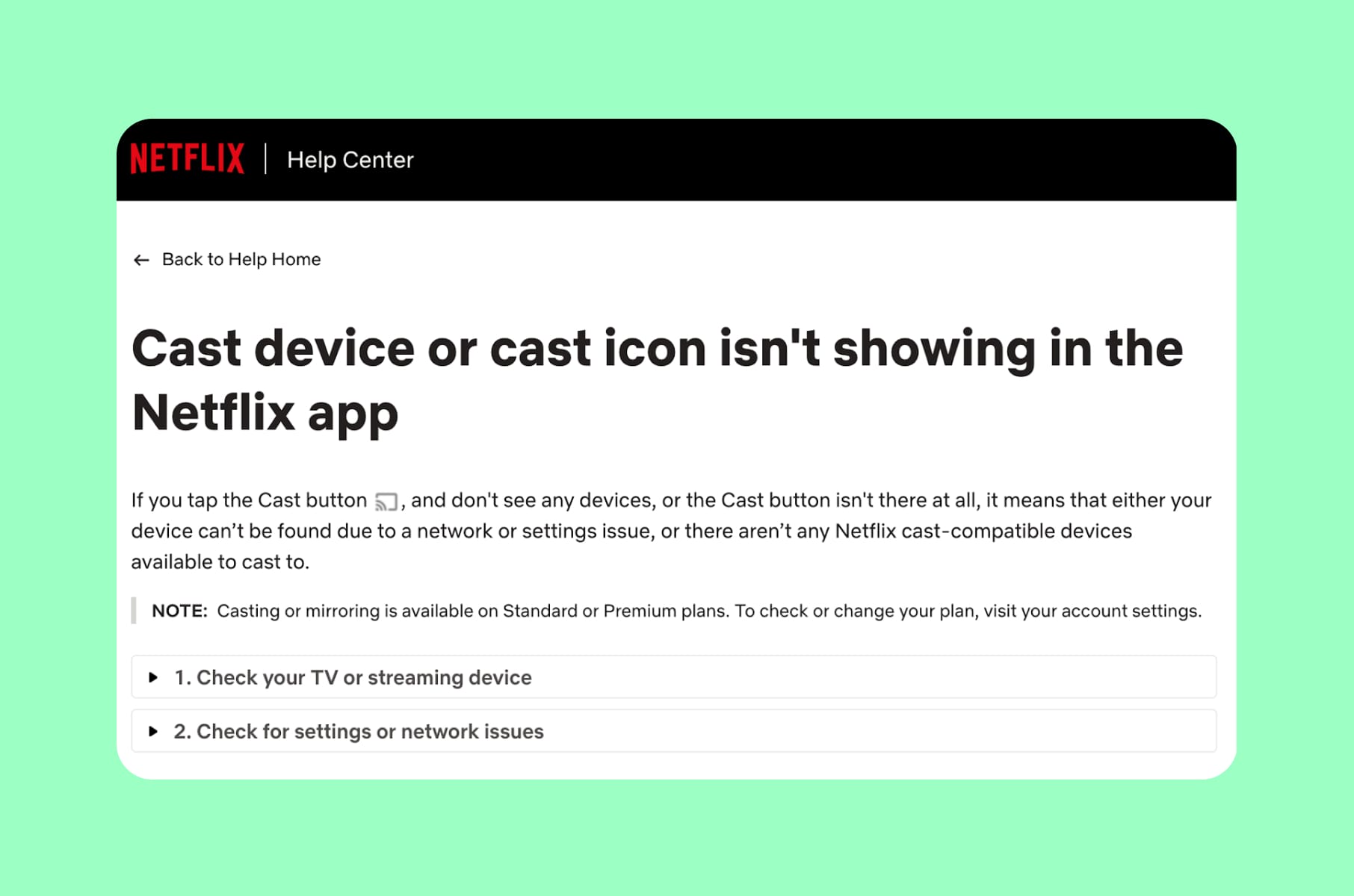
Quietly kills mobile casting
Our hot take: Netflix removed a feature millions of people used, gave no advance warning, and then told customer service reps to say it was done "to improve the customer experience."
In November 2025, Netflix removed the ability to cast content from its mobile apps to most modern TVs and streaming devices, including newer Chromecast models and the Google TV Streamer. User complaints surged dramatically week-over-week on Reddit's r/Netflix community. Netflix cited "low usage" and the rise of smart TVs, but the timing - right alongside a push to get users onto the native TV app, where Netflix has more control over the ad experience - told a different story.
The removal disproportionately affected travelers, Airbnb guests, and anyone who preferred using their phone as a remote. One user summarized the frustration: "Chromecasting is the main way I watch streaming. Searching for stuff is so much easier on my phone." Amazon Prime and Disney+ still support Chromecast.
The UX principle violated:
User control and freedom. Removing a feature without notice, especially one integrated into daily routines, violates the principle that users should feel in control of their experience.
What we'd ship instead:
- If usage data supports deprecation, communicate the change months in advance.
- Offer a transition period.
- Provide clear documentation on alternative setups.
- Do not remove a feature and rebrand it as an improvement.
Spotify's AI Music
And royalty dilution
Our hot take:
Spotify's UX problem runs deeper than the interface. It is structural. By allowing AI-generated tracks to flood the platform and bundling audiobook subscriptions to reclassify how royalties are paid, the product actively works against the creators who make it worth using.
Over the past 12 months, Spotify removed more than 75 million spam tracks tied to AI-generated content. But unlike YouTube, Meta, and TikTok, Spotify does not label AI-generated content for users. The company says it does not "police the creative tools artists use," but critics argue that listeners deserve to know what they are consuming. Meanwhile, songwriters receive roughly 68% of the 14% that goes to the publishing side - and that figure gets split among multiple writers on a single track. A 2024 Duetti report found that Apple Music pays $6.20 per 1,000 streams compared to Spotify's $3.
From a UX perspective, this is a trust issue. When a user plays a playlist and half the tracks are from anonymous AI-generated "artists," the product is no longer delivering what the user came for: music made by humans they chose to listen to.
The UX principle violated:
Trust and transparency. A platform that obscures the origin of its content undermines the relationship between users and creators.
What we'd ship instead:
- Clear AI-generated content labels.
- Transparent royalty information accessible to artists within the creator dashboard.
- A user preference that allows listeners to filter out AI-generated music from their playlists and recommendations.
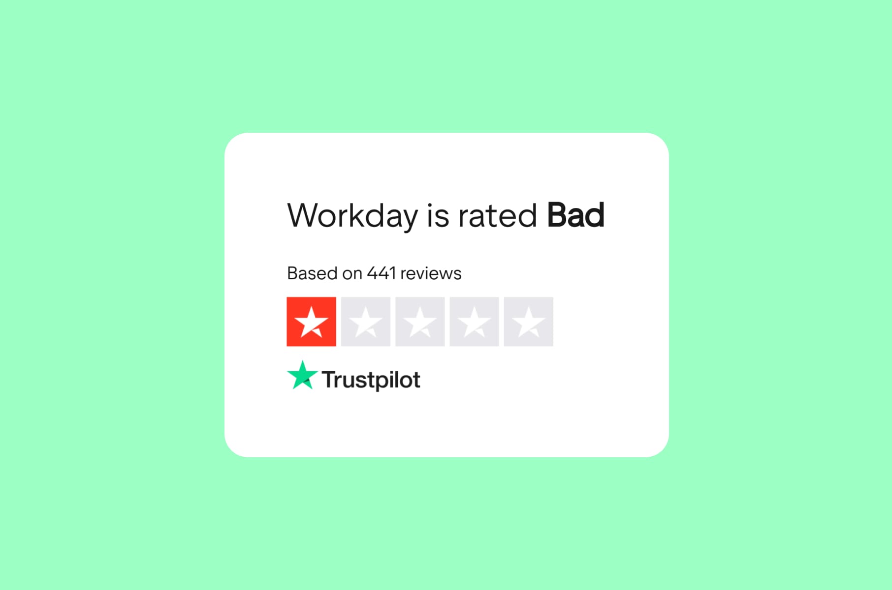
Workday's job application process
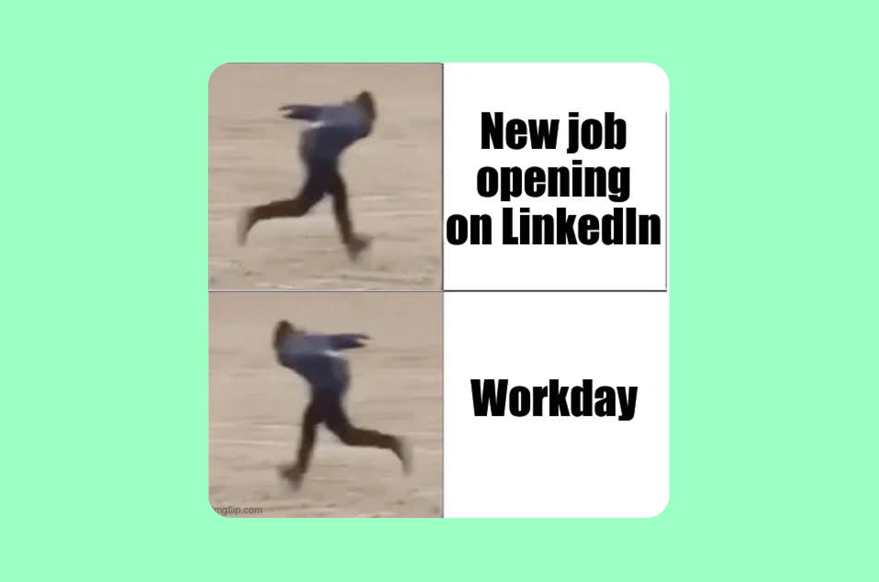
As if applying for a job isn’t stressful enough
Our hot take:
Workday has been the poster child for bad usability examples for years, and nothing has changed. Applying for a job through Workday still feels like filling out a tax form in a language you do not speak.
The complaints are well-documented and consistent. Users upload a resume, Workday's parser scatters the information across incorrect fields, and applicants spend 20 to 30 minutes correcting everything manually. You have to create a unique account for each company's Workday instance, even if you are applying to four roles at the same place.
The interface also provides almost no feedback - users cannot tell whether their application was submitted correctly or whether they missed a required field three screens back.
These are UX design examples in real life that every product designer should study, not because the mistakes are subtle, but because they have persisted for years despite universal criticism. Workday prioritized enterprise sales functionality over candidate experience, and the result is a product that works for HR departments purchasing the software but fails the millions of people who actually have to use it.
The UX principle violated:
Error prevention and recognition rather than recall. Users should not have to re-enter information the system already has, and the interface should prevent errors before they happen rather than failing silently.
What we'd ship instead:
A one-click apply option that pulls from a standardized profile. Clear progress indicators. Inline validation on every field. And a universal Workday profile that carries across company instances.
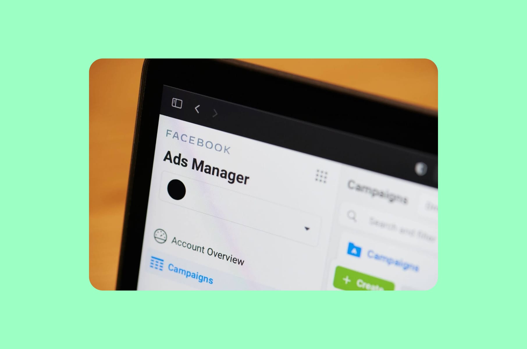
Meta Ads Manager
The interface that serves no one well
Our hot take:
Meta Ads Manager tries to be everything to everyone and ends up being intuitive to no one. A solo entrepreneur launching their first $50 campaign uses the same interface as an enterprise team managing an eight-figure annual budget.
The top menu bar throws terms like "Campaign," "Ad Set," and "Ad" at users without explaining the relationship between them. Bid strategies like lowest cost, cost cap, bid cap, and ROAS goal each require different approaches, but the platform offers no guidance on which one matches a user's goals. The reporting section is good but presents so many metrics that non-expert users cannot figure out which ones matter. After more than a decade of iterations, users in 2026 describe the platform as "more confusing than ever."
This is one of the most frustrating examples of bad UX because the underlying ad platform handles targeting, attribution, and budget allocation with real depth. The problem is that depth without clarity produces a product that intimidates beginners and wastes experts' time with unnecessary clicks.
The UX principle violated:
Flexibility and efficiency of use. The interface should serve both novice and expert users, offering shortcuts for power users while guiding newcomers through clear defaults.
What we'd ship instead:
A tiered interface. A "Simple Mode" for small-budget campaigns with guided setup, recommended settings, and plain-language explanations. An "Advanced Mode" for enterprise users who need the full control panel. This is something any SaaS design and development team should consider when building tools that serve multiple user tiers.
Microsoft Teams
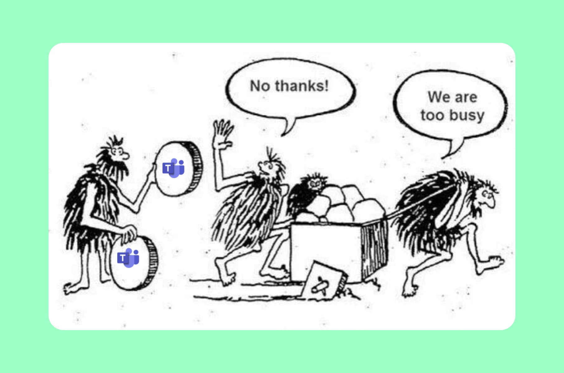
Where conversations go to get lost
Our hot take:
Microsoft Teams built a messaging app where the most common question users ask is: "Wait, did I send that in a Chat or a Channel?"
For years, the distinction between Chats and Channels confused even daily users. Channel posts looked like chat messages but behaved like threads. Microsoft acknowledged this was "a consistent source of customer confusion" - and then, in their 2025 update, they merged Chats and Channels into a unified view that many users found even more disorienting. New filtering options and customizable sections were supposed to help, but the update emphasized chats over channels in a way that broke established workflows for organizations that relied on channel-based collaboration.
Notifications compound the problem. Messages arrive in different places depending on whether they were sent in a Chat, a Channel, a reply to a thread within a Channel, or a meeting-linked conversation. Files shared in conversations are stored in different locations depending on the context. Finding a specific conversation from two weeks ago often requires remembering whether it happened in a group chat, a channel post, a thread reply, or a meeting recap.
The UX principle violated:
Consistency and standards. When the same action (sending a message) produces different behaviors depending on context, and users cannot predict which context they are in, the product has a fundamental information architecture problem.
What we'd ship instead:
A unified search that surfaces messages regardless of where they live. Clear visual differentiation between chat and channel contexts. And a notification system that consolidates related updates rather than scattering them across multiple entry points.
What we learned: Merge's design principles for avoiding bad UX
After reviewing these bad user experience examples, four principles stand out that guide our work at Merge - a product design agency:
Respect what users have already learned.
Every time you move a button, change a navigation pattern, or redesign a layout, you are asking millions of people to relearn something that was already working for them. The cost of that relearning should be justified by a proportional improvement in their experience - not just in your engagement metrics.
Make the default experience quiet.
Notifications, prompts, upsells, and AI suggestions should require opting in, not opting out. The products that respect attention the most are the ones users trust the most.
Label honestly.
If a "delete" button does not delete, call it something else. If a "search" result is a paid ad, make that visually obvious. Users forgive limitations. They do not forgive deception.
Design for your least powerful user.
The job applicant filling out a Workday form has no leverage. The traveler who lost mobile casting has no alternative Netflix gave them. The creator whose Instagram grid broke had no migration tool. The measure of your UX design is how it treats the people with the least ability to push back.
These principles are central to how we approach UI/UX design services at Merge. When we audit products or design new ones, the first question is always: who gets hurt if we get this wrong?
FAQ
What is bad UX design?
Bad UX design refers to any aspect of a product's interface or interaction flow that creates unnecessary friction, confusion, or frustration for users. It includes poor navigation, misleading labels, notification overload, forced UI changes, dark patterns, and interfaces that prioritize business metrics over the person using the product.
What are some common bad UX examples in popular apps?
Some of the most frequently cited bad UX examples include Instagram's forced grid layout changes that broke creator profiles, LinkedIn's overwhelming notification system, WhatsApp's "delete for everyone" feature that leaves a visible trace, Amazon's search results dominated by sponsored products, and Workday's notoriously painful job application process.
What is the difference between good UX and bad UX?
Good UX vs bad UX comes down to whether the product helps or hinders the user in achieving their goal. Good UX is intuitive, transparent, and respects the user's time and attention. Bad UX forces the user to work around the product rather than with it - think of Google Search pushing organic results below ads and AI summaries, or Meta Ads Manager exposing enterprise-level complexity to first-time advertisers.
How can companies avoid bad UX design?
Avoiding bad UX design requires putting user research ahead of assumptions, testing changes with real people before full rollouts, treating notification and communication design as first-class concerns, and maintaining honest labeling across the product. Working with an experienced product design agency can help teams audit their existing experience and catch bad usability examples before they reach production.