0
Table of Contents
7 best designed Edtech platforms we've seen so far
Discover the best examples of current online Edtech tools and websites that hit the mark.
Updated: April 2026
Found yourself in a situation of needing inspiration for your next Edtech platform or a redesign of a current one?
Before you hire an Edtech product design agency (that’s the next step), you need to check out what is popular right now in the Edtech market and why.
We’re talking about online learning platforms, student engagement software, behavior management tools, course marketplaces, and gamified language learning apps – the kinds of Edtech products that are winning on UX/UI design, brand trust, accessibility, and conversion right now.
We’ve been designing Edtech platforms at Merge for years now and have carefully chosen seven examples of online Edtech tools and websites that hit the mark not only from our designer perspective but also from their users’ standpoint, which means they are popular for a reason.
The global education technology market is expected to reach USD 437.54 billion by 2033, driven by demand for personalized learning, data-driven progress tracking, and AI-assisted tutoring.
In a crowd like that, your visual design, onboarding flow, and clarity of value proposition can directly influence sign-ups, retention, and even learning outcomes.
Scroll down to see our selection of the best online education tools and learn what makes their attempts at proper Edtech design so successful.
TL;DR – best designed Edtech platforms in 2026 and what each one does best
LiveSchool – best for K-12 classroom culture, PBIS points, and behavior tracking dashboards. Its design speaks to school admins and teachers who need clarity fast.
MasterClass – best for premium, cinematic course presentation. The interface feels like a streaming service and leans on celebrity instructors and high-production video.
Coursera – best for structured upskilling and professional certificates at scale. Coursera reports more than 210 million registered learners as of early 2026, which is one of the largest learner bases in online education.
Udacity – best for job-ready tech and AI skills through Nanodegree programs with real projects, mentor feedback, and a personalized progress dashboard.
Skillshare – best for creative, community-driven learning with short lessons and hands-on student projects. The UI encourages you to learn something fast and publish a result.
HeyLady - best for real spoken English practice and confidence building for women, in a moderated, women-only community designed around live conversation, social connection, and support from English coaches. HeyLady’s mission is to spark one billion meaningful conversations between women of different cultures, and the product experience is built around that mission.
Duolingo – best for gamified language learning UX, streaks, notifications, and character-led motivation. Duolingo passed 120M monthly active users last year, and its interface is built to keep you practicing daily.
Short answer: if you’re building a new Edtech product or doing a product redesign of your existing teaching platform, you can borrow:
- Onboarding clarity from LiveSchool.
- Cinematic storytelling from MasterClass
- Transparent outcomes and progress tracking from Coursera and Udacity.
- Community loops from Skillshare.
- Confidence-boosting English practice from HeyLady.
- Gamification from Duolingo.
Methodology – how we picked these 7 Edtech platforms
We reviewed dozens of education technology products and online learning platforms in 2026 across education, professional upskilling, creative skills, and language learning. We focused on seven products that repeatedly show up in conversations about effective Edtech UI design, high engagement, or clear student outcomes.
Our evaluation criteria were:
- Onboarding clarity – Can a new learner, parent, or teacher understand the value within the first 3 to 5 seconds on the marketing site or dashboard? Studies show users form an opinion about credibility in under 50 milliseconds, and that 94 percent of first impressions are design-related.
- Information hierarchy – Does the interface highlight core actions like Start lesson, Track behavior, or Resume course without extra clicks?
- Engagement loop – Do gamification elements, milestones, or rewards encourage regular learning, such as streaks or points? Duolingo’s streak and notification system is a famous example, and it connects directly to its massive active user base.
- Personalization and progress tracking – Does the platform adapt to a learner or classroom, and show measurable impact? Coursera reports that 91 percent of surveyed learners achieved a positive career outcome, like a new job or a promotion, which is a strong trust signal for the interface.
- Brand credibility and consistency – Do typography, colors, components, and tone stay consistent across marketing pages, dashboards, and mobile apps? Consistency and recognizable UI patterns build trust and reduce cognitive load, which is something we help startups formalize through design systems.
See our post on why you need consistent UI design systems.
One more thing worth stating for SEO clarity: this is not a paid ranking. It’s a design-led shortlist for founders, product owners, and Edtech marketers who care about UX, conversion, and learning outcomes.
Why design matters?
Why Edtech platforms need good UX and UI design in 2026 (and why it matters for conversions)?
Good design needs to be one of the top priorities for Edtech tools because it directly affects how your primary audience perceives and interacts with your product.
First impressions matter, and frankly, a lot.
In fact, did you know that 94% of first impressions are based on design and design alone?
Users judge credibility in a fraction of a second, often before they read a single line of copy. Studies show visitors form an opinion about a site’s trustworthiness in roughly 50 milliseconds, and that up to 75 percent of perceived credibility comes from visual design choices like layout, typography, and color system.
If your Edtech tool looks unprofessional or is hard to navigate, well... The students, parents, and educators might leave before ever giving it a chance.
A well-designed tool grabs attention and keeps users engaged.
It builds trust by showing that you're credible and serious about quality. Consistent branding, which usually comes down to using the same logos, colors, and fonts, is one of the best initial tweaks that make your tool memorable and boost brand awareness.
This level of consistency is exactly why design systems are such a big deal for scaling Edtech startups. A consistent design system keeps every button, banner, and form field predictable, which helps students and teachers feel confident using your platform across devices.
You can read how we approach that in our detailed walkthrough on why you need a consistent UI design system and our write-up on accessibility best practices in modern UI/UX.
Good design also makes it easier for users to find what they need, which can lead to more sign-ups and conversions. It helps generate qualified leads by providing clear calls to action and relevant content.
So, it isn't just about your platform looking nice. In the Edtech market, good design is valued a lot because it can easily help create a more positive user experience and grow your startup the way you want it to.
This is especially important now that Edtech spend keeps growing. The education technology market is driven by demand for personalized learning and AI-driven tutoring.
If your onboarding is confusing or your dashboard feels outdated, you are risking churn in a sector where parents, district buyers, and adult learners have plenty of alternatives.
How AI tutors changed Edtech UX in 2026
Now, this is one trend we really couldn't skip in a 2026 refresh. The past 18 months pretty much rewrote what learners expect from an Edtech product. Khan Academy's Khanmigo, Duolingo Max, Coursera Coach, and a wave of conversational tutors - Speak, Praktika, ELSA, plus HeyLady's own coach features - have made it normal to chat with a tutor at 2am, ask for a hint mid-exercise, or roleplay a job interview without ever leaving the app. That's basically a godsend for learners, but it changes the design brief for pretty much every product team building in this space.
So, what does that actually mean if you're shipping (or redesigning) an Edtech product right now? We're seeing three concrete shifts:
- Conversational interfaces are becoming the default - the chat box is no longer a tucked-away widget, it's a primary surface that sits right alongside the lesson player and often replaces the search bar entirely;
- The "Coach" or "Tutor" button has earned a permanent spot in the main navigation - right alongside Home, Library, and Profile, persisting across every screen so it's always one tap away from a lesson, dashboard, or paywall;
- Trust and safety UI is finally getting the design love it deserves - parental dashboards, hallucination disclaimers, "verify with your teacher" nudges, source citations, and clear opt-outs for under-13 learners are all moving from compliance afterthoughts to first-class components.
So, if your product still treats AI as a side feature, you're going to feel it in retention pretty fast. Adult learners and parents both expect a tutor that actually answers - and they expect it to be obvious where it lives.
Best designed Edtech platforms in 2026 – top UI/UX examples
The Edtech industry offers lots of tools for teachers, students, freelance educators, and self-learners. But which ones have good design? Well, let’s see.
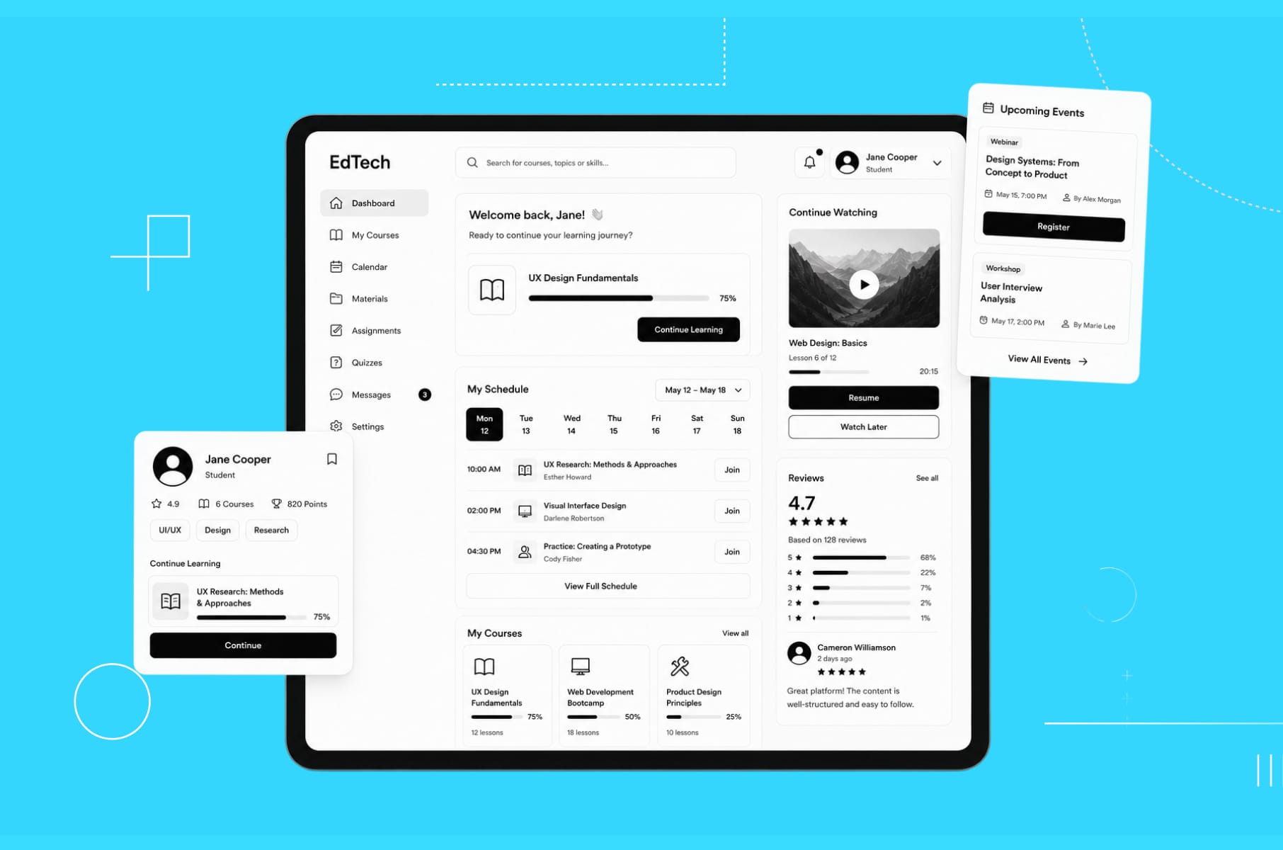
1. LiveSchool
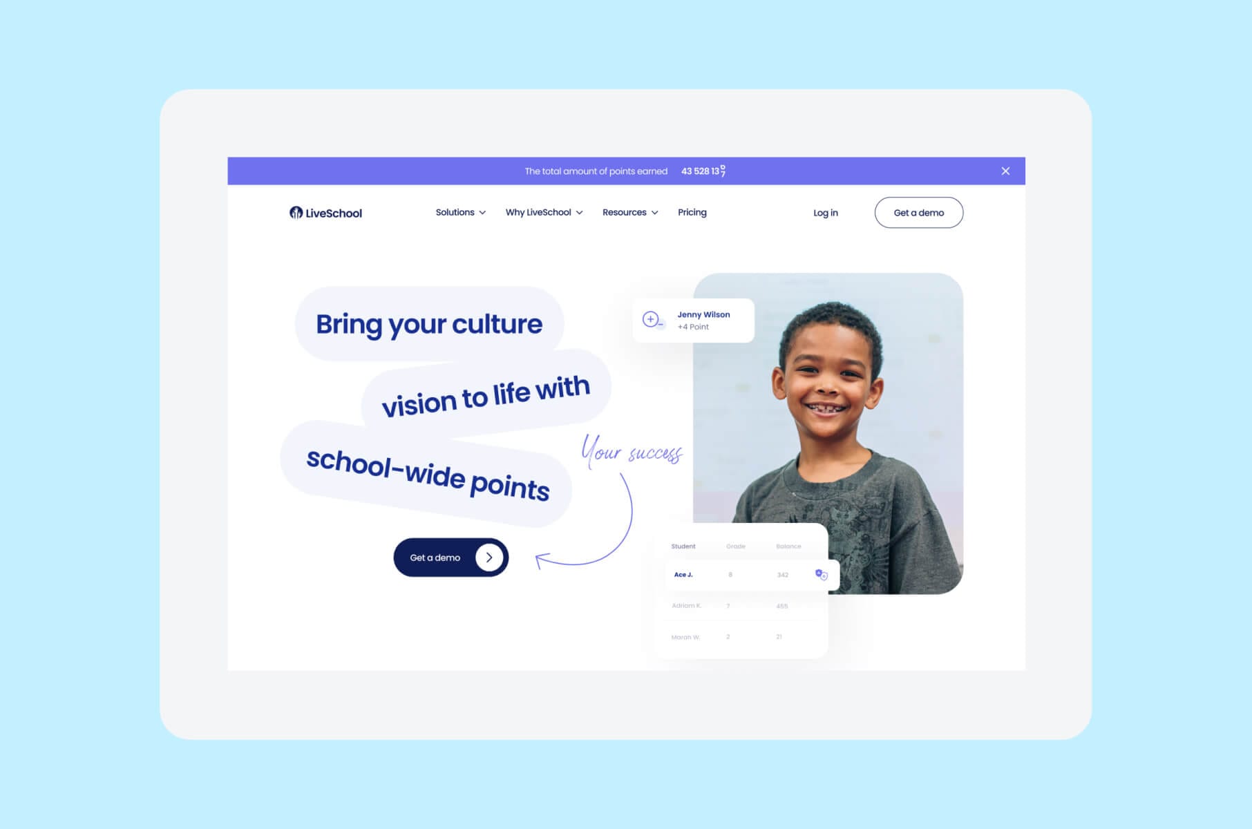
LiveSchool is a school culture and behavior management platform that helps educators and schools manage student behavior and improve academic performance.
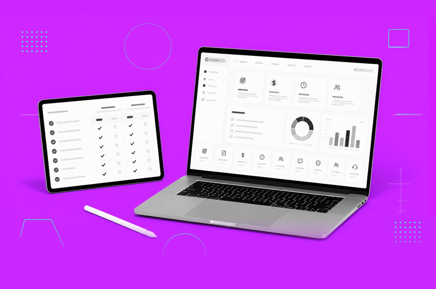
Their website redesign is what prompted us to add it to the list - LiveSchool has improved its digital presence and made it so much easier for users to explore its features and benefits.
The platform's use of visual appeal and user-friendly interface creates a seamless website experience for its users.
What we are noticing in 2026 is how LiveSchool positions itself around PBIS and positive school culture using very plain language, school-friendly visuals, and a points-based rewards store called Rewards360.
Students can “shop” for rewards with the points they’ve earned, which turns expected school behavior into something visible and trackable without spreadsheets or paper tickets.
The product UI makes that reward loop feel like a small in-school economy, which is extremely motivating for middle school and high school learners.
Best for: K-12 admins and deans who need a school-wide behavior dashboard, fast culture wins, and a consistent PBIS system.
Good design choices from Edtech's perspective:
- Visual storytelling. LiveSchool's website features engaging visuals that showcase its brand and goals.
- Motion and animations. Dynamic elements bring the website to life, making interactions more engaging and memorable.
- Consistent branding. The website's distinctive visual identity creates a consistent brand image and makes navigation easy.
- Behavior tracking UI. Clear data views for teachers and principals help them spot patterns, celebrate wins, and act fast when something is off.
Mini-conclusion: LiveSchool shows how “school ops” tools win when they feel modern, visual, and fast to understand for busy teachers.
2. Masterclass
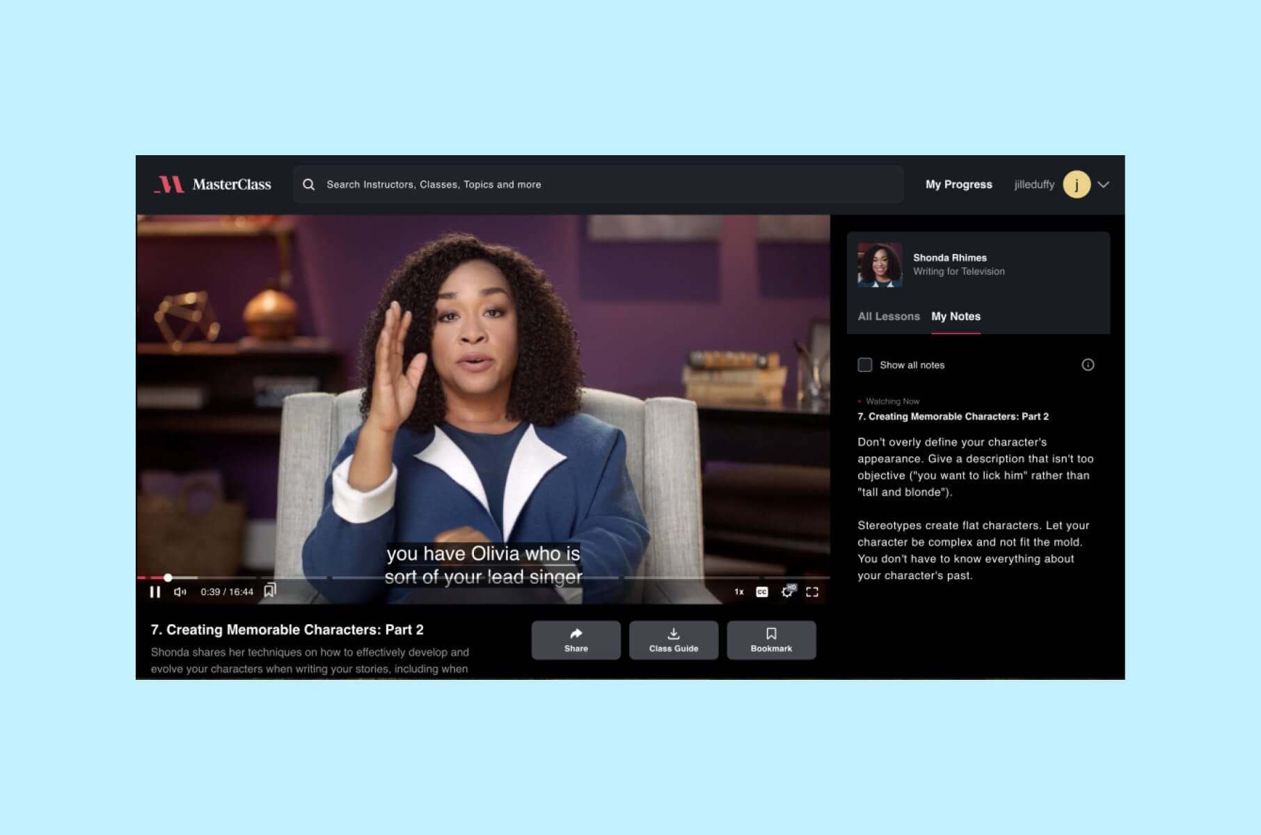
Masterclass is an online learning platform that offers bite-sized videos led by field experts. At first glance, it has a premium and rather cinematic design.
The platform’s media includes high-definition videos and professional production quality that give users a feeling akin to watching a high-end documentary or film.
The use of rich visuals, minimalist layouts, and a dark theme accentuates the content, and the instructors - who are often celebrities and industry leaders - are usually placed in the center.
In 2026, MasterClass pushes a streaming-style layout with rows of content by goal, like “become a better leader” or “grow your creative practice.” The promise is simple: unlimited access to hundreds of video lessons taught by recognizable names. That level of social proof builds trust fast.
As of 2026 their pricing entry point is the MasterClass At Work / Standard / Plus / Premium tiers and the cheapest annual sit closer to $10–$15/month equivalent depending on promo.
Best for: learners who respond to storytelling and want inspiration from high-profile experts, not just curriculum outlines.
Worth also noting that MasterClass Sessions - their cohort-based, live-workshop product - has quietly become a bigger part of the experience in 2026, which means the UI now juggles scheduled events, assignments, and small-group interaction alongside the on-demand catalog. That's a different design problem than streaming, and it's a good reminder that even the most cinematic Edtech platforms eventually need a bit of community plumbing.
Good design choices from Edtech’s perspective:
- Navigation. The interface is clean and straightforward, so users can easily browse courses through categories or search functions.
- Course structure. Courses are broken down into short video lessons that make the content more digestible.
- Progress tracking. Users can seamlessly track their progress and pick up where they left off.
- Cinematic trust signals. The site and app feel like a premium streaming service, which lowers the “Will this be worth paying for?” friction.
Mini-conclusion: MasterClass proves that production quality and instructor credibility can act as UX elements on their own.
3. Coursera
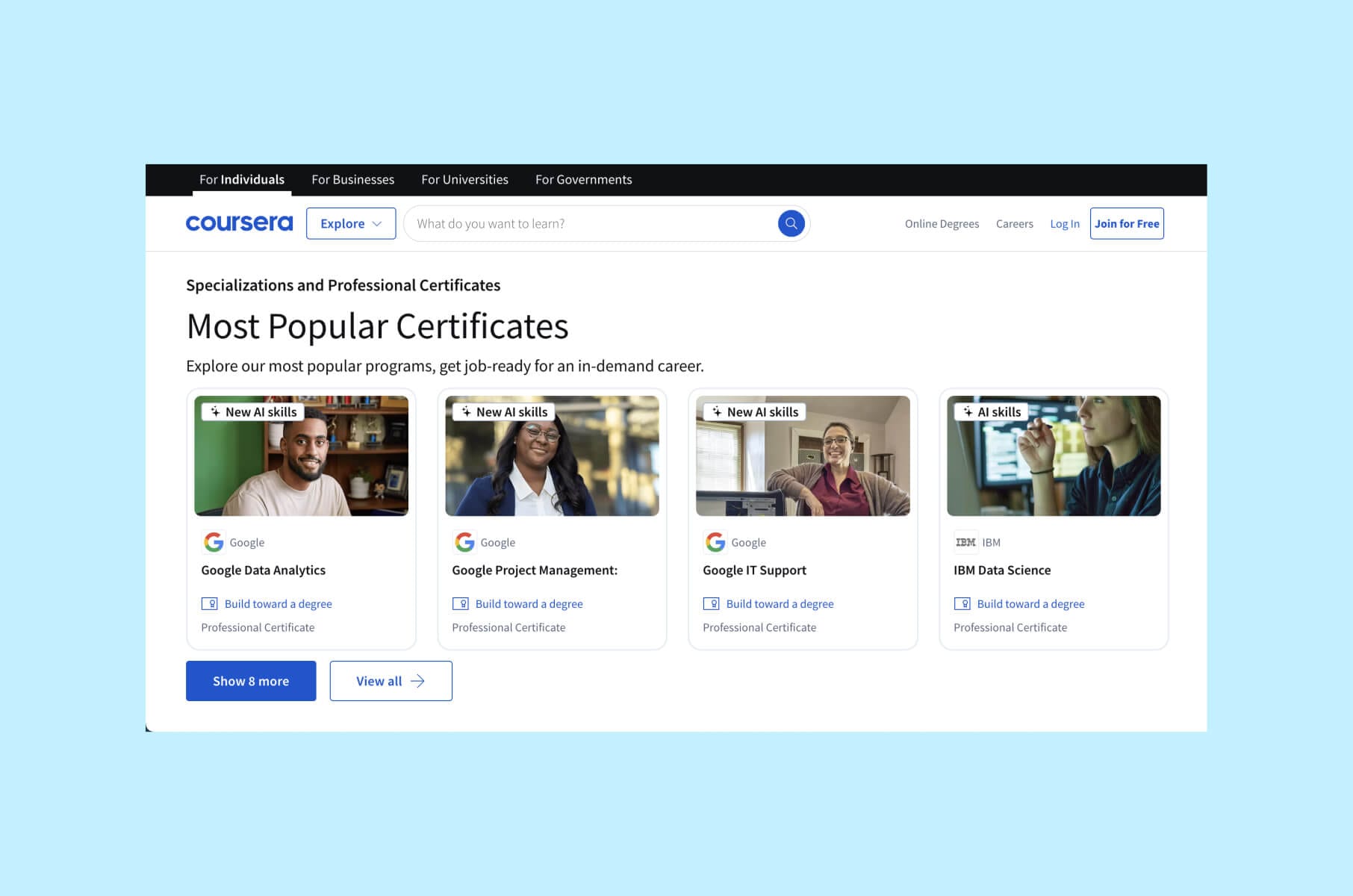
Coursera is an online learning platform that offers courses in various subjects. It has structured learning paths and the ease with which users can access university-level courses.
When it comes to design, it features a clean, professional look that reflects its academic partnerships with universities worldwide.
The platform uses a light color palette with blue accents, providing a neutral backdrop that keeps the focus on the course content.
Coursera Coach now sits inside the lesson player, which means a learner can ask a clarifying question without bouncing to a separate tool. That kind of in-context help is going to be table stakes for serious upskilling platforms in 2026.
Best for: professionals and career switchers who want to see a clear path from lesson to credential to promotion.
Good design choices from Edtech’s perspective:
- Course Catalog. Coursera's organized catalog, with filters and search options, helps users find courses by subject, language, or institution.
- Dashboard. Personalized dashboards display enrolled courses, deadlines, and recommendations.
- Interactive elements. Quizzes, peer-graded assignments, and discussion forums are integrated smoothly into the course flow.
- Career proof upfront. Outcome stats, partner logos, and certificate previews are integrated into landing pages instead of being buried in FAQs.
Mini-conclusion: Coursera shows how credibility, structure, and career outcomes can be part of the visual design and not just a footer note.
4. Udacity
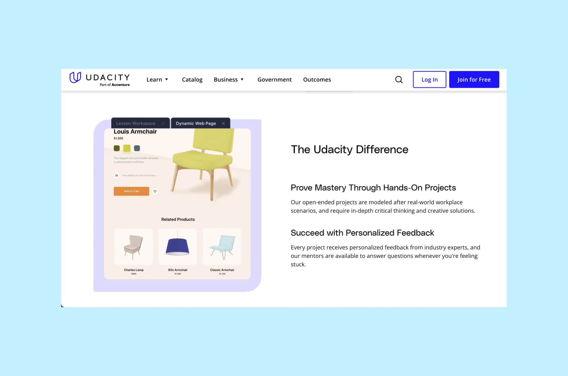
Udacity is an online learning platform that offers Nanodegrees in various subjects.
Its design is quite modern and sleek, and includes tech-focused aesthetics and real-world projects to match its emphasis on programming and vocational skills.
The use of simple graphics and icons also aids in maintaining a professional yet approachable interface.
Udacity leans heavily into employability. The dashboard highlights current progress, upcoming tasks, mentor feedback, and AI-powered recommendations on what to learn next, so you always know what to do today to move toward a job outcome.
Best for: learners who want a structured “from zero to job-ready” path in tech fields with real deliverables and mentor touch points.
Since Udacity joined Accenture's LearnVantage, the dashboard has leaned even harder into employer-aligned tracks and AI Nanodegrees, which is a useful signal of where job-ready Edtech is going.
Good design choices from Edtech’s perspective:
- Nanodegree programs. Clear pathways guide users through comprehensive programs with a logical progression of courses.
- Interactive content. Code editors, quizzes, and projects are embedded within the platform for hands-on learning.
- Progress indicators. Visual progress bars and checkpoints help users stay motivated and on track.
- Career framing. The interface constantly reminds you what job title you’re getting closer to, which keeps motivation high.
Mini-conclusion: Udacity shows how to design for adult learners who care about employability, not just course completion.
5. Skillshare
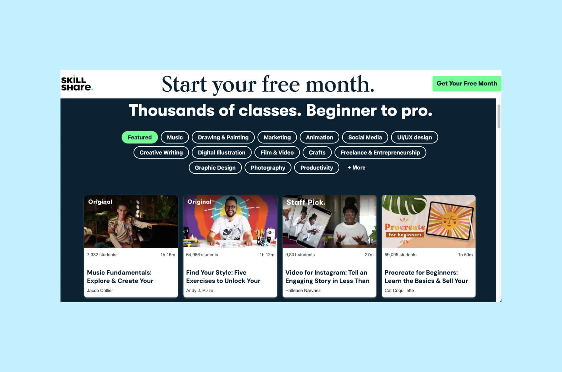
Skillshare also embraces a creative and vibrant design, which aligns rather nicely with its focus on the arts, design, and entrepreneurship. Engaging imagery and a light, airy layout also make the platform very inviting.
We’d like to highlight the project-based classes and community interaction as key benefits that enhance its usability and engagement.
In 2026, Skillshare keeps lessons intentionally short and mobile-friendly, and it pushes ongoing class picks every month. That rhythm helps returning users find something new without scrolling through a giant catalog.
Best for: creatives, freelancers, and early-stage entrepreneurs who want “learn it now, publish it today” style guidance.
Good design choices from Edtech’s perspective:
- Ease of navigation. Categories and personalized recommendations make it easy to discover new classes.
- Short lessons. Bite-sized video lessons cater to users looking for quick, practical skills.
- Offline access. The mobile app allows users to download classes for offline viewing.
- Project-first mindset. Every course nudges you to make and share, which increases accountability and community feedback.
Mini-conclusion: Skillshare is a strong model for Edtech platforms built around user-generated work and peer feedback loops.
6. HeyLady
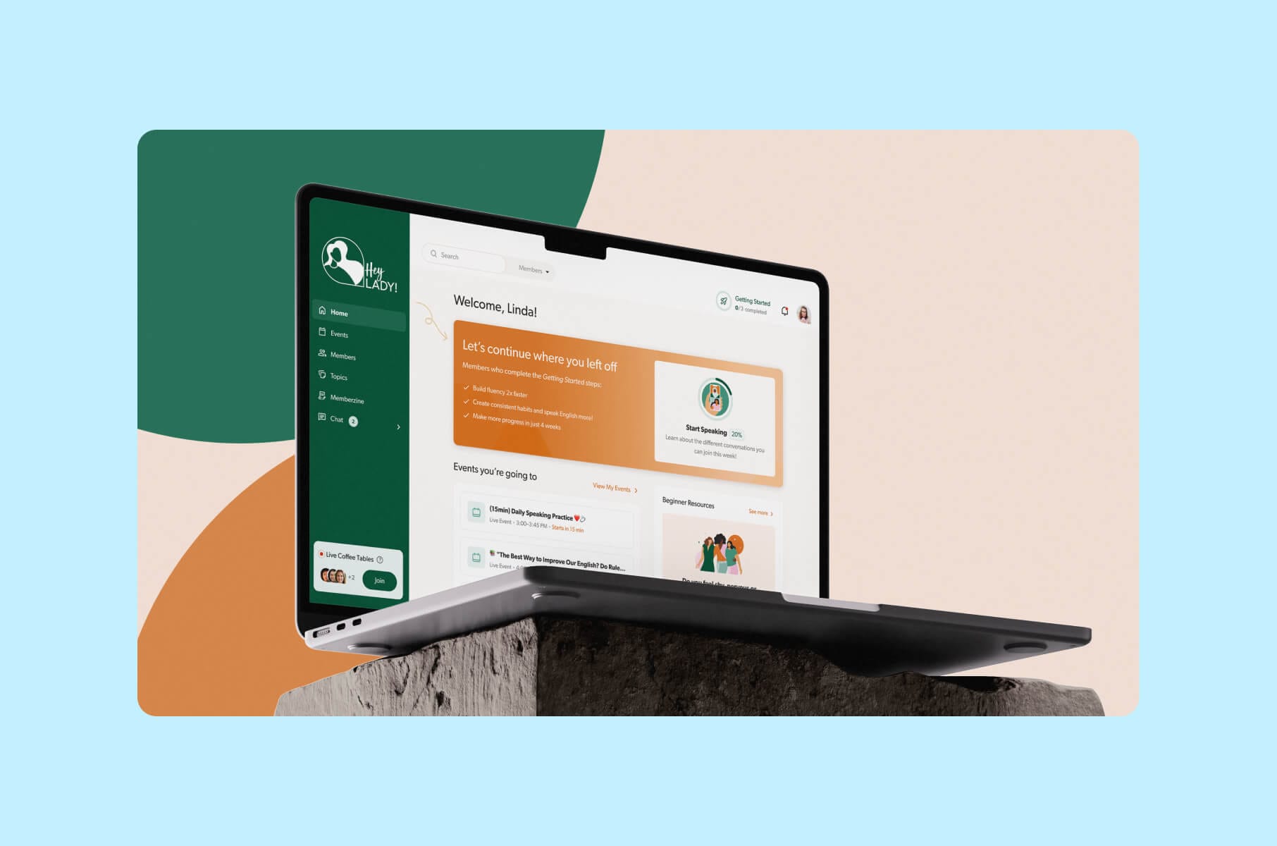
Next up is HeyLady. HeyLady is a women-only online community where members practice spoken English in real time.
The mission is very direct: spark one billion meaningful conversations between women from different cultures.
HeyLady focuses on live conversation, not just lessons. Members are matched with speaking partners and can join community Events like daily practice sessions or longer themed talks.
The product encourages women to talk on video in small groups, host their own sessions, and get guidance from English coaches. This is especially helpful for women who already know English grammar but still struggle to speak confidently in real situations.
From a design standpoint, HeyLady is all about psychological safety and fast time-to-value. Merge worked with HeyLady to redesign onboarding so new members move into a real conversation faster, instead of sitting through a long product tour.
The updated flow guides each newcomer to either a scheduled Event or a spontaneous Live Coffee Table based on availability and comfort. The success metric is simple and aligned with business value: how quickly someone finds their first speaking partner and how confident they feel afterward.
Best for: women who want a safe, supportive space to build spoken English confidence through live conversation, structured events, and ongoing peer accountability instead of passive video watching.
Good design choices from Edtech's perspective:
- Safety-first onboarding. The onboarding flow moves a newcomer into a real, live conversation quickly, framed around comfort and availability, instead of dropping them into an empty dashboard.
- Community-led practice. Instead of passive video watching, HeyLady centers on live speaking, peer connection, and group sessions with experienced coaches.
- Conversation discovery. Events and Coffee Tables are easy to browse and join, with filters and clearer prompts to help members pick a good first session.
- Design system and consistency. A shared design system with tokens, components, and patterns helped align product, community success, and engineering, which sped up delivery and kept the experience consistent across chat, events, and onboarding.
Mini-conclusion: HeyLady shows how inclusive community design and fast access to real human conversation can be a growth engine on its own. This matters if your Edtech product depends on confidence, accountability, and social belonging, not just curriculum.
7. Duolingo
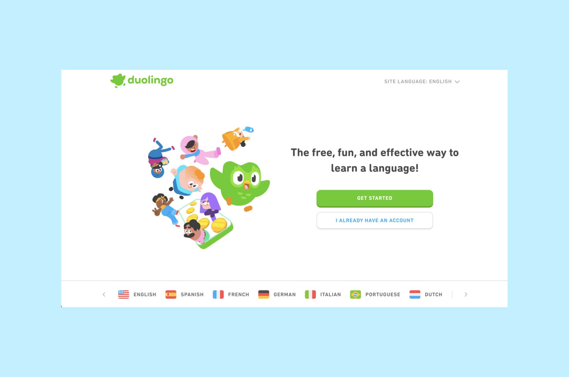
This next Edtech platform is extremely popular for its gamified design and engaging visuals. Duolingo's use of a blue and green color scheme, along with ample white space, creates a clean and minimalistic design that is easy on the eyes.
Bright colors, friendly characters (like Duo, the Owl), and interactive animations make the language-learning process fun and less intimidating.
Well, the Owl does take part in some “intimidating” activities - if you have seen the memes or tried Duolingo yourself, you know what we mean.
Duolingo is one of the best real-world cases of UX gamification driving long-term retention and continues to expand beyond languages into math, music, and even chess.
That level of daily engagement is tied directly to streaks, in-app rewards, and playful push notifications that nudge you back before you break your streak.
Best for: language learners who stay motivated by streaks, leaderboards, and character-led reminders instead of formal lesson plans.
Good design choices from Edtech’s perspective:
- Gamification. Features like streaks, leaderboards, and in-app rewards motivate users to continue learning.
- Consistent branding. The use of Duo for every subheading on the homepage creates a consistent brand identity and makes the content light and easy to read.
- Adaptive learning. The platform adjusts to the user's proficiency level, providing personalized challenges.
- Retention-first UX. Duolingo leans into behavioral design and social pressure in a way that keeps learners practicing daily, which is rare for language apps.
Mini-conclusion: Duolingo proves that thoughtful gamification and playful character design can translate directly into usage numbers on a global scale.
What to do if you need a good design for your Edtech platform?
Launching an EdTech platform is an exciting journey - we know it all too well. But making it successful requires more than good content. It also needs great design.
A user-friendly platform can make learning enjoyable and keep your students and teachers engaged. When users find your platform easy to navigate, they're more likely to use it regularly and recommend it to others.
Imagine a classroom where the materials are hard to find and the instructions are confusing. Students would quickly lose interest. The same goes for digital platforms. Good Edtech design turns complicated technology into something accessible and fun.
By working with a design team that focuses on user experience, you can transform your platform into a space where learning is not a chore.
Merge has experience designing educational tools that are very enjoyable to use. Our goal is to help you create a platform that makes a real difference in education.
If you are planning an Edtech MVP, a UX/UI redesign, or a design system rollout, we can help with product discovery, accessibility, and visual identity consistency. We’ve shipped design systems, onboarding flows, and dashboards for education startups and K-12 communities.
Take a look at our Edtech design and development focus area as well.
You can also read our posts on how design adds value to your business and accessibility best practices in modern UI/UX, because accessibility and clarity are no longer “nice to have” in Edtech. They are buying criteria for districts and for parents deciding whether to enroll.
For a deeper look at how we apply this thinking in practice, read our HeyLady case study: Product design for a women-only English practice community.
In that project, we introduced a design system, rebuilt Events discovery, reworked chat to support groups and channels, and redesigned onboarding around fast, confidence-building conversation.
If you’d like us to review your student dashboard, onboarding flow, or mobile learning experience, reach out. Make sure your Edtech UI feels intuitive, credible, and inclusive before you scale paid acquisition.
Edtech product design FAQ
What is an Edtech platform?
An Edtech platform is any digital product that delivers or supports learning online. That includes online course marketplaces, K-12 virtual schools, behavior tracking tools for classrooms, language learning apps, live cohort learning portals, or assessment dashboards for teachers.
What makes an Edtech platform “well designed”?
A well designed Edtech platform makes the core learning action obvious right away, keeps navigation simple, supports accessibility needs, shows progress in a way that feels encouraging, and proves value fast with outcomes, certificates, rewards, or visible skill growth.
Good Edtech design also respects different audiences. Parents want clarity. Teachers want time back. Adult learners want career ROI. Younger learners want something that feels fun and fair.
Why does UI consistency matter so much in education apps?
Consistent components and layouts lower cognitive load. Students do not waste energy guessing which button submits homework this time. Admins can trust screenshots in training materials.
Consistency also makes your product look more credible, which is important because 94 percent of first impressions are driven by design choices, not text.
Which Edtech platform is best for gamification ideas?
Duolingo is the strongest reference for gamified learning UX. Daily streaks, small achievable lessons, and playful push messages keep people practicing. This is a great reference if you want to raise retention and reduce churn in language learning, math drills, or test prep.
Which Edtech platform is best for demonstrating outcomes to adults or corporate learners?
Coursera is a good starting point. The site and product surfaces real career outcomes, partner badges, and credential types directly in the UI, along with structured learning paths. Adult learners see how the program leads to a job title or pay raise instead of guessing.
Which Edtech platform is best for K-12 school culture and PBIS?
LiveSchool is a strong model. The interface turns classroom behavior into transparent points and reward cycles that students understand, plus school-wide dashboards that help principals see trends early.
Which Edtech platform is best if you want confident spoken English, not just grammar lessons?
HeyLady is a strong reference here. The entire UX is designed around getting women into real English conversation quickly and safely, pairing them with compatible speaking partners, and providing coach-led events that build confidence. It is not only about grammar content. It is about speaking in real life with support.
How do I start improving my own Edtech UI today?
Start with clarity and trust. Make sure the landing page says who the product is for, what result they’ll get, and how fast they’ll see it. Add a progress view or dashboard screenshot above the fold, not buried below a signup wall.
Then, audit your consistency using a design system, and fix any accessibility blockers like contrast, touch targets, or missing alt text. You can reference our internal guide on why you need consistent UI design systems.