0
Table of Contents
Why do you need consistent UI design systems
Would you like a product where every button, screen, and interaction feels familiar and on-brand?

Imagine a product where every button, screen, and interaction feels familiar and on-brand, whether a customer is using your mobile app, website, or any other platform. This level of uniformity builds user trust and confidence in your product.
In startups, where teams are quickly adding features and expanding to new platforms, maintaining a coherent look and feel can be challenging. This is where a design system comes in handy.
Let’s break down why design consistency is so critical and how a systematic approach to UI design helps achieve it.
Why consistent design matters for startups
In the early stages of a startup, it’s easy to push design consistency aside while chasing product-market fit.
However, since consistent design directly impacts user experience, brand perception, and even your team’s efficiency, ignoring is no longer an option.
Experts have long noted that when interfaces stick to familiar patterns and standards, users know what to expect, learnability goes up, and confusion goes down.
In other words, a consistent app or site feels “easy” because people don’t have to relearn the interface on each page or update. This familiarity breeds trust. The same goes for accessibility, for example.
Especially in sensitive sectors like finance or health, users need to feel secure, and a chaotic, inconsistent interface can quickly undermine confidence.
From a branding perspective, every interaction in a consistent UI reinforces your startup’s identity. Uniformly used colors, typography, and tone across your platform make your brand instantly recognizable and credible.
For example, healthcare UX experts note that consistent design language across platforms not only reinforces trust but also reduces cognitive load for users when dealing with personal health data.
The same holds in fintech. If every screen of your app follows the same logic and style, customers are less likely to make mistakes and are more likely to trust you with their money.
Finally, consistency has internal benefits too.
It streamlines design and development work. When your team isn’t reinventing the wheel for each new feature’s interface, they can move faster. A consistent set of components and guidelines (i.e., a design system) means designers and developers don’t have to debate the color of every button or the spacing on every screen – those decisions are made once.
How a UI design system delivers consistency
By now, you might be wondering what exactly a “UI design system” is in practical terms.
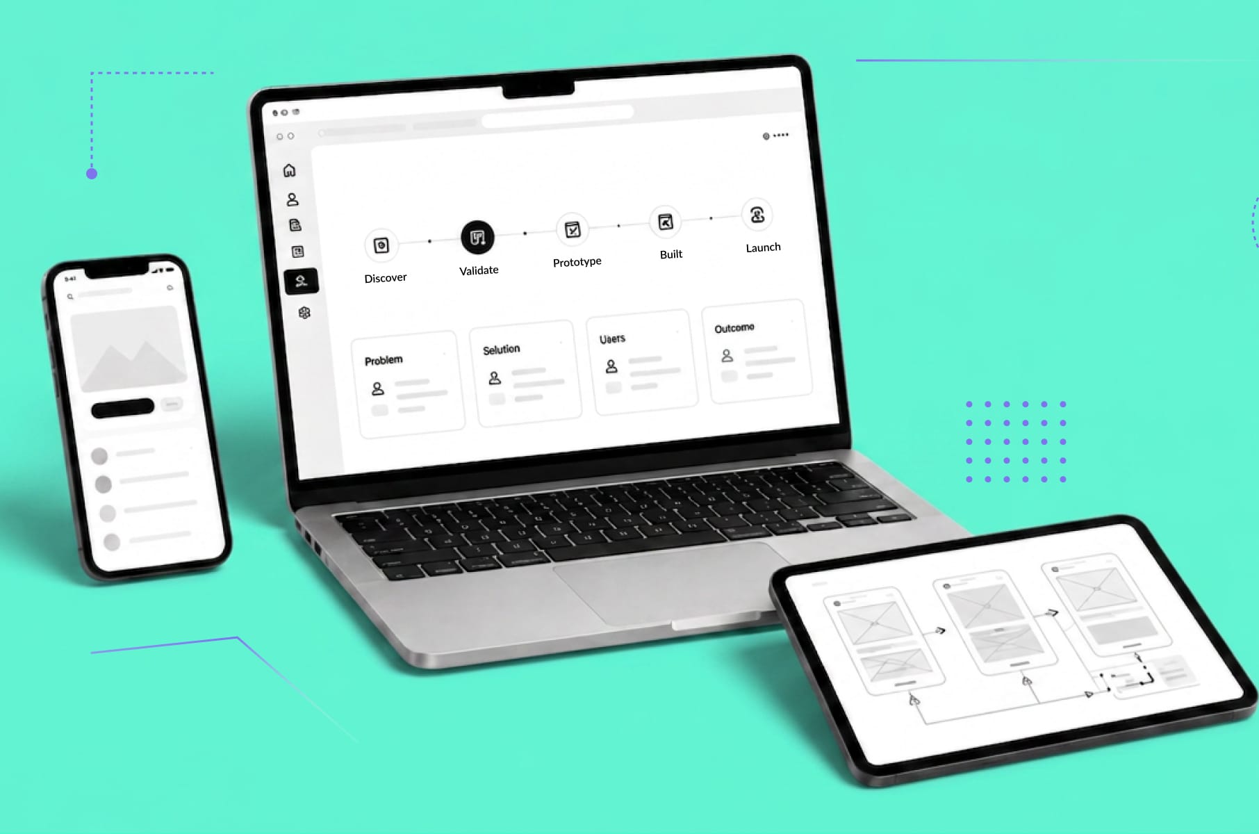
Simply put, a design system is a collection of reusable UI elements, components, and guidelines that teams use to build a consistent user experience across all parts of a product.
A design system typically includes things like a style guide (colors, typography, spacing rules), a library of UI components (buttons, form fields, switches, navigation bars, etc.), design patterns for common scenarios, and documentation on how and when to use each element. It often extends to coding as well, with a corresponding coded component library or front-end framework that developers use.
Think of a UI design system as the “master toolkit” for your product’s interface. Instead of designing every screen from scratch, your designers pull from this toolkit so everything matches. And, instead of your developers coding bespoke buttons or menus each time, they use pre-built components from the system’s library. The result is the same button or form behaves and looks identical everywhere, whether it’s on your web app’s dashboard or in your mobile app’s settings screen.
To illustrate how a design system enforces consistency, imagine a scenario without one: each designer on your team might use a slightly different shade of blue for links or a different button style in their part of the app. Each developer might hand-code components that look and behave a bit differently.
Over time, the product turns into a patchwork of styles – confusing users and making maintenance a nightmare. Now contrast that with a design system in place: the color palette is defined once (e.g., your brand blue is a specific hex value) and stored as a design token, so everyone uses that exact color.
The button component is designed once with specific states (default, hover, disabled, etc.), and every instance of a button in the product references that single source. If a change is needed (say, update the brand color or tweak the button corner radius), you update the system, and it propagates everywhere.
Consistency at scale becomes achievable. When that happens, you can maintain the way your product looks and feels over time as you grow bigger and better as a company.
Best practices for building and maintaining a UI design system
Establishing a design system doesn’t have to be a massive, months-long project to start seeing benefits. Here are some best practices drawn from our team’s expertise:
- Start small and prioritize basics
You don’t need a huge, perfect system from day one. Begin with the core elements that your product uses frequently – for example, define your basic color palette, typography scales, and a handful of common components (buttons, headers, forms).
A founding designer at one startup noted that in just a couple of days, they set up basic building blocks (fonts, colors, buttons, inputs, etc.), which immediately had “a large impact on the team.” You can always expand later; the key is to create a single source of truth for these fundamentals now.
- Build scalability with a modular structure
Think ahead and organize your design system for growth. Define a clear hierarchy for components (from basic UI elements up to complex patterns) so new components can slot in logically. Choose tools that support scaling – for instance, using a dedicated design system platform or a tool like Storybook for the component library.
Scalability means your system can handle more developers, more designers, and more features down the line without breaking.
- Balance consistency with flexibility
Encourage your team to propose improvements or new patterns when something isn’t working or when the brand’s style changes.
For example, if a designer finds a better way to present information, there should be a process to update the system. As one guide puts it, your system shouldn’t become a straightjacket – designers and devs should be able to suggest changes as better solutions emerge.
- Treat the design system as a product
Just like your main product, your design system needs care and feeding. Assign a responsible owner or small team (even if it’s part-time) to manage updates, review new component requests, and fix inconsistencies.
Set up a lightweight governance process: How do team members request a new component or report a flaw? How are changes reviewed and approved? This might sound formal, but even a simple checklist or monthly review meeting can prevent chaos.
- Document everything
A design system is only useful if people understand how to use it. Invest time in documentation. For each component, provide usage guidelines (when to use this component, any do’s and don’ts), interactive examples if possible, and even code snippets for developers.
For instance, some of the best systems (like Audi’s or E*Trade’s) show visual examples of correct vs. incorrect usage of a component to educate users of the system.
- Include guidelines for content
Lastly, consistency should also extend to the words and tone used in your product. Many robust design systems include a content style guide – instructions for copywriting, terminology, and the personality of the brand’s voice. This is especially important if your product involves microcopy (like form instructions, error messages, or in-app notifications).
For example, Atlassian’s design system famously includes content guidelines covering voice and tone and even inclusive language.
Trends and considerations - voice interfaces
User interfaces are not static. They evolve with technology and user expectations.
In recent years, one of the emerging considerations for UX is the rise of voice-driven and conversational interfaces. While you might be focused on web and mobile screens today, voice interfaces (think smart speakers, voice assistants, or voice-controlled app features) are becoming increasingly common.
How does design consistency apply when there’s no visual UI or when voice is part of your product’s experience? It turns out many principles still hold, and a modern UI design system can extend to these new modalities as well.
Firstly, consider voice interaction as another channel of your user experience that should reflect your brand’s identity. If your SaaS app or fintech product offers voice commands or a chatbot, the way that assistant speaks is effectively part of your UI.
The phrasing, tone, and even the personality it conveys should be consistent with the rest of your product.
For example, if your brand voice (as defined in your content guidelines) is friendly and approachable, your voice UI should use friendly language too. A design system can capture these guidelines.
In fact, experts now say a truly comprehensive design system should cover content style, including voice and tone – especially as voice UI and conversation design are growing fast. It’s jarring for a user if your app’s text content is formal, but the voice assistant suddenly cracks jokes, or vice versa. Consistency here means defining the vocabulary and style of any voice interactions in line with your brand.
Another consideration with voice interfaces is consistency between the voice and visual parts of your product. Often, voice features are combined with screens (e.g., a voice command that also brings up a visual confirmation). A consistent experience might mean that the terminology used by voice is the same as on screen.
For instance, if your healthtech app uses the word “medication” in the UI, the voice assistant shouldn’t suddenly refer to it as “drug” or “pill.” Consistency in terms makes sure users aren’t confused by different words for the same concept.
Maintaining a central glossary of terms in your design system can help with this consistency across all interaction types.
Wrap up
It’s easy to think of design consistency and UI design systems as concerns for “the design team. ” Hopefully, this guide illustrates that they are much more than that.
They are strategic tools for your business.
A consistent UI design system can be what holds your user experience together as you grow, making your product feel professional, trustworthy, and easy to use. It streamlines development, saves time (and money), and helps avoid the UX pitfalls that frustrate users.
Just as importantly, it frees your teams to focus on solving new problems instead of reinventing basic UI elements or repeatedly debating color choices.