0
Table of Contents
Accessibility best practices in modern UI/UX
Discover how building products that are usable by people of all abilities leads to better experiences and business success.

Designing digital products that everyone can use shouldn’t be an afterthought. It’s not about being altruistic, either. Of course, it goes without saying that we all need to strive to be better human beings.
However, accessibility is also a very smart investment that yields better products.
How?
Read on and discover how building products that are usable by people of all abilities leads to better user experiences, improved innovation, and even drives business success.

Why accessibility matters overall
Many startups still ask why is accessibility important for their product’s success. The short answer is that accessibility opens your product to a huge audience and improves the experience for everyone. Over one billion people – about 16% of the world’s population – experience some form of disability.
That’s a lot of potential customers you don’t want to exclude. An accessible app or website can be used by people with visual, hearing, motor, or cognitive impairments, but it also tends to be easier to use for all users, regardless of ability.
As one person in the design community noted, making things accessible essentially means “better access to anything is good for everyone.”
In other words, improvements that help users with disabilities (like clearer navigation or captions on videos) often end up benefiting every user in some way.
Business case, or why is accessibility important for your success
There are practical business reasons as well.
Accessible digital products can reach older users with age-related impairments and others in temporary situations (imagine a person with a broken arm or someone in a loud environment who can’t play audio). This wider reach can translate to a larger user base and customer loyalty.
Additionally, many countries in 2025 have laws and regulations requiring digital accessibility.
For example, the European Accessibility Act is coming into force this year, meaning certain apps and sites must meet accessibility standards or face legal consequences.
In the U.S., for instance, lawsuits over inaccessible websites have also been rising, putting pressure on businesses to comply. Beyond avoiding legal risk, having an inclusive product is great for public relations – it shows your brand values all users.
Equally important, focusing on accessibility drives innovation. Designing within constraints (such as making an app usable without a screen or without sound) often pushes teams to invent new, better solutions.
Tech giants have realized this: many features we all use today were originally created for accessibility.
Voice assistants, for instance, were first developed to help people who couldn’t use traditional interfaces, and now millions of people use Siri or Alexa for convenience.
UX accessibility and accessible UI design best practices
What do we actually mean by UX accessibility and accessible UI design? In simple terms, it means designing your user experience and user interface so that people with varying abilities can use them without barriers.
A simple acronym, "POUR," sums it up:
- Perceivable — information must be visible (or audible);
- Operable — users must be able to navigate with a keyboard or assistive device;
- Understandable — clear, predictable, no hidden 20-step onboarding;
- Robust — it should work on most devices.
Keeping these principles in mind, let’s dive into concrete examples. Several key UX accessibility best practices can guide the creation of more inclusive digital experiences.
Alt text
Images should have descriptive alt text (or accessible labels in apps) so that users who can’t see them still get the information. If you have a chart or infographic, consider providing a summary or data table as an alternative.
Offer transcripts for audio content. For video, provide closed captions and, ideally, audio descriptions of important visuals.
No one will miss out on your content this way. As a bonus, searchable text alternatives also improve SEO.
Contrast
One of the simplest aspects of accessible design is using readable color contrasts. Text should strongly contrast with its background (for example, dark text on a light background or vice versa) so that people with low vision or color blindness can read it.
In 2025, dark mode has become ubiquitous, and it’s not just a trendy aesthetic choice. If implemented thoughtfully, dark themes can be a gateway to more inclusive experiences.
When indicating information with color, also include a secondary cue. For instance, don’t rely on a red outline to signify a form error — pair it with an icon or text message so color-blind users or those using screen readers get the message.
Navigation
A truly accessible interface can be navigated without a traditional pointer (mouse or touch). This is crucial for users who rely on keyboard controls or assistive switches.
Make sure all interactive elements (links, buttons, form fields, menus) can be reached by pressing the Tab key or equivalent and that the order of navigation is logical.
Also, provide visible focus indicators (for example, a highlighted outline on the element currently focused) so users can see where they are on the page.
Layouts
There are a few simple UI decisions that can greatly affect accessibility:
- Use legible font sizes (and allow text to be resized without breaking the layout — many users in 2025 expect apps and sites to respond to their device’s text size settings).
- Choose clean, easy-to-read fonts.
- For interactive elements, make sure touch targets are large enough; tiny buttons or closely spaced links are frustrating for anyone with larger fingers, motor difficulties, or who is operating a phone one-handed. Provide sufficient spacing.
- Group related form fields together and use clear labels and instructions.
- When an error occurs (like a form validation error), provide a clear message that describes the problem and how to fix it, and if possible, focus the user’s cursor on the error to catch their attention.
Animations
Motion can add delight, but it can also cause problems for people with vestibular disorders (motion sensitivity) or be distracting for users with attention-related conditions.
In modern UX, best to just avoid overly flashy animations altogether, especially anything that blinks rapidly (which can even trigger seizures in rare cases). If your design uses motion (parallax scrolling, animated transitions, etc.), provide a setting to reduce or disable it.
Both iOS and Android, as well as modern browsers, support a “reduce motion” preference, so make your app or site respect that setting and tone down animations accordingly.
Also, avoid auto-playing content (like carousels or videos) without user consent, or at least provide an easy way to pause or stop it.
Inclusive design and inclusive UX in practice
Accessibility is sometimes viewed narrowly as a checklist of do’s and don’ts. Inclusive design, on the other hand, is a broader approach – it’s about designing from the start with a diverse range of people in mind.
When practicing inclusive product design, teams consider the needs of users with different abilities, backgrounds, and contexts as a core part of the design process, not an afterthought.
Let’s look at a few concrete inclusive design examples that illustrate how designing for edge cases ends up benefiting a broad audience:
Closed captions and transcripts
Captions were created for deaf and hard-of-hearing viewers, but they’re now used by a huge number of people. Think about watching a Facebook or Twitter video on mute in a public place or following along with a video in a non-native language – captions are invaluable.
In fact, a large portion of people who turn on subtitles are not hearing-impaired at all; they might be commuters, language learners, or just viewers who prefer reading along.
Voice interfaces and assistants
Speaking to machines was once an assistive technology dream (early voice recognition helped those who couldn’t use their hands to type), and now it’s mainstream.
Voice user interfaces – from smart speakers to voice search on mobile – are used by people cooking in the kitchen with messy hands, drivers keeping their eyes on the road, or anyone who finds it quicker to talk than type. T
This is a prime example of inclusive UX: an experience designed for accessibility that turned out to be a beloved convenience feature for the general population. The same goes for dictation features (voice-to-text) that make apps usable in new contexts.
Dark modes and high-contrast themes
High-contrast color schemes and dark backgrounds were initially favored by users with low vision or light sensitivity (too much bright white can be painful for some).
Now, “dark mode” is a highly requested feature by the general user base because it can be easier on the eyes at night and can save battery on OLED screens.
But not all dark modes are created equal – an inclusive design of dark mode means not just inverting colors, but choosing color combinations that preserve contrast and legibility.
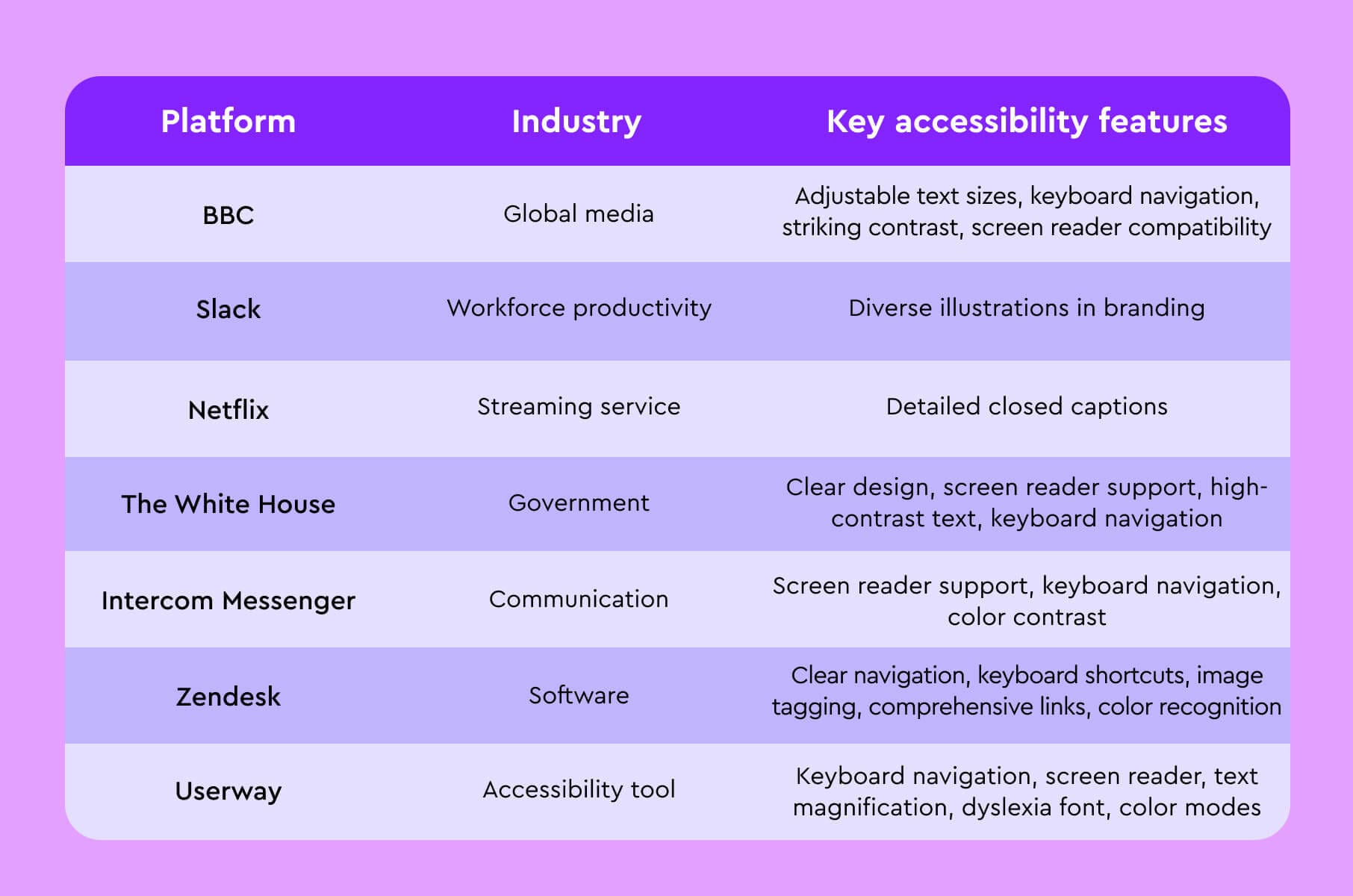
Examples of inclusive design in modern digital products
Many modern websites and applications effectively implement inclusive design principles, offering valuable, inclusive design examples for businesses to learn from.
The BBC website, for instance, provides adjustable text sizes and ensures full keyboard navigation, making its content accessible to a wider audience.
Slack, a popular communication platform, uses diverse illustrations in its branding, promoting a sense of inclusivity among its users.
Netflix has gained recognition for its detailed closed captions, which not only transcribe dialogue but also describe important ambient sounds and background music, creating a more immersive experience for users with hearing impairments.
Speaking of immersive design - check out our next piece on VR and AI in UX/UI design.
Back to inclusive design. Here’s a quick table of examples.
Bottom line
Basically, in 2025, the question is no longer whether to prioritize accessibility but how to do it effectively.
By following the best practices in this guide, you’re taking the right steps toward making modern websites and applications usable and welcoming for all.
An accessible product is, quite simply, a better product – and your users, your team, and your bottom line will all thank you for it.