0
Table of Contents
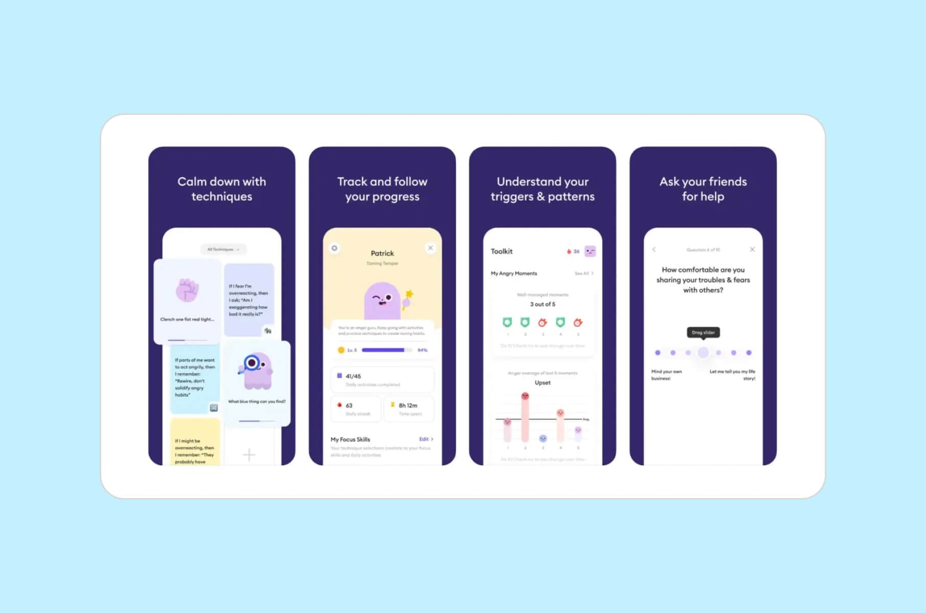
8 best designed Health apps we've seen so far
Health apps have moved to a daily habit. Which ones are better than others?
Last updated: March 2026
Health apps are everywhere — but only a small number feel genuinely easy to use day after day.
In this curated list, we highlight 8 health apps with standout UX: clear navigation, low-friction daily actions, thoughtful onboarding, and design choices that support habit-building (without overwhelming the user).
We’re not ranking “the best app” overall. Instead, we’re focusing on design patterns worth stealing — the ones that make tracking, learning, and staying consistent feel natural.
As a UX design agency for startups, our team at Merge has designed and shipped quite a few successful Healthtech projects that gave us an immense understanding of what matters in this industry. So, dive in to discover the apps that are setting new standards in Healthtech.
2026 update: best Health app UI, UX, and retention
Health apps have moved from “nice to have” to a daily habit — and expectations keep rising as health becomes more digital, more personalized, and more connected across devices.
At the same time, retention is still hard. Most products don’t lose users because the idea is wrong — they lose users because the experience asks for too much effort, doesn’t earn trust fast enough, or fails to make the next step obvious.
That's why design is retention: trust, clarity, and empathy.
In 2026, two shifts matter more than ever: consumer-grade digital experiences are becoming the baseline for health organizations consumer health with digital experiences and technology, and wearable-driven journeys are pushing apps to deliver value in seconds, not sessions wearable integration and adoption.
We’ve refreshed this article with practical UX examples, real engagement patterns, and a simple evaluation method—so you can see where each app wins and apply the same ideas to your own Healthtech product.
This update also adds:
- A clear TL;DR for quick scanning.
- Selection criteria and methodology.
- UX takeaways.
- Mini conclusions for each app.
- Internal links to related reads on Healthtech product design, accessibility, AI in healthcare, and design systems from the Merge blog.
TL;DR – best designed health apps in 2026
If you just need fast answers for “best health app design” or “Healthtech UX examples”, here are the standout picks by use case:
Best for AI-guided symptom understanding:
- Ada Health – Conversational AI that turns complex medical questioning into a calm, chat-like flow with a 91% assessment completion rate.
Best for stress and sleep support:
- Calm – Strong content hierarchy and a calm, low-friction “press play” experience that reduces decision fatigue.
Best for full-spectrum mental health:
- Headspace – Clear microcopy, a distinctive illustration system, and guided programs that make progress feel measurable and repeatable.
Best for people who want tailored guidance, not generic content:
- Balance – Personalization flows that adapt without overwhelming onboarding. A good example of “lightweight inputs → relevant output.”
Best for habit stickiness and playful accountability:
- Waterllama – Fast logging surfaces (widgets/watch-first thinking) + playful rewards that keep tracking from feeling like work.
Best for sustainable training and rest awareness:
- Gentler Streak – Recovery-first framing, gentle nudges, and a tone that encourages consistency over intensity.
Best for emotional self-regulation and EQ skill building:
- Ahead: Emotions Coach – Small, finishable lessons with a coaching-style flow that turns insight into action.
Best for long-term weight and health management:
- Noom – Behavior-change UX built around daily routines (tracking + coaching patterns) that’s designed to work over months, not days.
We explain how we scored them in the Methodology section below.
Specifics of Healthtech software design
Healthtech software design is basically the process of creating user-centered and intuitive digital product design for healthcare applications.
As a Healthtech design agency, we strive to make this process as streamlined as possible; however, we also know that the healthcare environment is quite unique in its complexity.
You need to fulfill the needs of various stakeholders — users, providers, and administrators — while designing for different ability levels, different ages, and sometimes different levels of health stress.
Older adults are increasingly comfortable with mobile health tools – 71% of adults 50+ use smartphones or tablets and are open to using health and wellness apps – but they still worry about user experience.
This means accessibility, plain language, readable typography, and transparency are core parts of UX, not afterthoughts.
On top of that, AI is now inside most serious health apps. More than one in three Americans say they already use AI for meal planning, emotional support, or researching symptoms. So, healthtech design in 2026 also means designing safe AI touchpoints that feel supportive, not invasive.
Why good design matters in Healthcare
Good healthcare apps put users first. They focus on making the app easy to use and building trust, which is the primary UX concern for health app users.
These apps simplify complex tasks, reducing frustration and mistakes in important healthcare situations. When apps are designed with users in mind, they feel more confident and loyal.
In UX design services, easy-to-use menus, simple words, and features that respond to user needs are all helping to make people feel more comfortable. This is especially important in healthcare, where keeping information accurate and the experience intuitive are top priorities.
Poor clarity can lead to skipped medication, missed follow-ups, or wrong self-reporting. Strong UX can do the opposite – it can increase adherence.
For example, apps that send relevant reminders and explain treatment steps in everyday language have shown that users engage more and track treatment more consistently.
Benefits of design in Healthcare
Did you know that easy-to-use apps with clear layouts tend to keep users longer? Here’s what you can expect if your app has a good design:
- Better user engagement. A user-friendly app design keeps people coming back. In healthcare, regular use can improve health outcomes and build customer loyalty.
Engagement is not automatic. Most apps lose almost everyone within the first month. Only about 7% of users still open a typical mobile health app after 30 days, which means retention features like check-ins, reminders, streaks, and gentle coaching are not “nice to have.”
- Stronger brand reputation. A well-designed app looks professional and trustworthy. Simple language and predictable navigation signal that you respect users' needs.
This matters in care settings where people are tired, anxious, or in pain. When users trust an app, they're more likely to recommend it, helping the brand grow.
- Contrast and accessibility. High-contrast interfaces, proper text sizing, and consistent color usage aren't optional in health apps — they're foundational. Many users interact with health apps while tired, stressed, or in low-light conditions.
Following WCAG guidelines for contrast ratios ensures readability across all conditions and devices, and signals professionalism to accessibility-conscious partners and regulators.
- Competitor advantage. Apps that focus on user needs and look good are more likely to be chosen over those that only care about features.
The winning Healthtech products in this list are usually the ones that hide complexity until the user is actually ready for it — progressive disclosure instead of dumping every metric upfront.
- Lower support costs. When an app is easy to use, users make fewer mistakes and need less help. This means fewer customer support calls, which saves money.
You also cut the clinical support load. If people can self-report symptoms correctly and follow instructions without calling, your care team gets time back.
- Faster updates and iteration. A well-designed health app is often easier and quicker to update. Quick updates help avoid delays or fines. Good UX/UI design practices also make it easier to make changes without disrupting the user experience.
Reusable design systems and clear component libraries make updates faster. If you document UI patterns, your reviews also get faster, because the core flows repeat instead of changing every release.
We break this down in more detail in our post on why consistent UI design systems matter for digital products, including healthcare: Consistent UI design systems build trust and reduce UX drift.
- Insights and personalization. A well-designed health app drives engagement — and engagement is what generates meaningful analytics. When users interact regularly with your product, your app analytics capture behavioral patterns that inform product decisions: which features drive retention, where users drop off, and what content resonates.
This data helps you iterate faster and invest in the right areas. Good design also makes personalization more effective. When users trust the interface enough to log meals, complete check-ins, or follow programs consistently, the data behind those actions becomes richer and more reliable — which means your recommendation engine, coaching logic, or content surfacing can improve without feeling intrusive.
- More revenue opportunities. When users enjoy an app, they use it more often. This can lead to more sales of premium features or subscriptions. Also, healthcare providers are more likely to partner with or use an app that users like and trust.
Paid coaching tiers, condition-specific education modules, and premium analytics dashboards are now standard in wellness and chronic care management apps. You can already see this in mental health coaching (Headspace) and medically supported weight programs with optional GLP-1 plans (Noom).
If you plan to monetize through paywalled care, design has to justify that upgrade by looking reliable and medically aligned before you ever mention price.
Healthcare app UI design best practices
Health apps for smartphones provide tools that users can interact with regularly. These might include features for tracking health data, talking directly with healthcare providers, and getting personalized health advice. These apps are designed for frequent use and have easy-to-follow steps for users.
Apps need to keep people coming back every day, which is much harder than getting a pageview. This is where UX patterns for streaks, emotional support, "gentle nudge" reminders, and personalization start paying off. See Gentler Streak, Waterllama, and Balance below for good real-world examples of daily stickiness without shame or pressure.
If you're building a Healthtech app that needs recurring engagement — telehealth, symptom tracking, mental health support, medication adherence — study these retention loops first.
Onboarding that earns trust early
First impressions decide whether a user stays or uninstalls. The best health apps keep onboarding short, show value before asking for personal details, and use progressive profiling — collecting only what's needed now and asking for more later. Balance does this well: it opens with a few focused questions about how you feel and what you need, then immediately delivers a personalized session. The goal is to prove the app is worth the user's time within the first 60 seconds, not to front-load a registration form.
One core daily action, clearly surfaced
Apps that retain users almost always center the home screen around a single repeatable action: log a drink (Waterllama), start today's meditation (Balance), check in on your mood (Ahead). When the primary action is obvious and takes under 10 seconds, users build a habit loop faster. Burying the main action behind tabs or menus is one of the most common reasons health apps lose daily engagement.
Reminders that respect attention
Push notifications in health apps walk a fine line. Too aggressive, and users mute them or uninstall. Too passive, and they forget. The strongest pattern is contextual reminders — only triggered when a user falls behind their own goal, not on a fixed schedule. Waterllama's "smart reminders" and Gentler Streak's recovery nudges both follow this model: they stay quiet when you're on track, and speak up when it matters.
Emotional tone and microcopy
Health is personal, and the words an app uses shape how safe users feel. Clinical jargon creates distance; overly casual copy can feel dismissive in serious contexts. The best apps find a middle register — warm, clear, and respectful. Headspace's microcopy is a good benchmark: it simplifies mental health concepts without dumbing them down. Ahead does something similar with emotional vocabulary, helping users name what they're feeling without judgment.
Progressive disclosure of complexity
Health data can be overwhelming. Heart rate zones, macronutrient breakdowns, sleep stage charts — all useful, but not all at once. The best-designed apps reveal complexity gradually as users become more engaged. Noom starts with simple color-coded food logging before introducing psychological lessons. Gentler Streak shows a simple activity summary first, with detailed training load data available one tap deeper. This approach keeps beginners comfortable and gives power users the depth they want.
For more on how clinical tools and AI assistants can be introduced safely in health-facing apps and dashboards, see our breakdown of NLP uses in healthcare interfaces: NLP in healthcare and how it shows up in digital products.
And for a deeper look at how AI assistants and symptom checkers work in public-facing health sites, see our healthcare-focused AI article: AI in healthcare: benefits, limits, and design challenges.
Methodology – how we picked the 8 best designed health apps
We looked at dozens of mobile healthcare, wellness, and behavior change products across iOS and Android.
Then we scored them based on 5 design criteria that matter in 2026 for Healthtech UX and business growth:
1. Clarity and accessibility. Is the interface readable, calm, and predictable for stressed or tired users (including older adults and neurodiverse users)?
2. Personalization that actually adapts. Does the app react to mood, ability, diagnosis, or progress instead of pushing the same routine on everyone?
3. Habit-building and daily engagement. Does the app help users build and maintain daily health habits over time — through streaks, reminders, coaching, or progressive goals — without creating guilt or shame?
4. Visual and interaction design quality. Do layout, color, animation, and navigation help the experience feel supportive instead of overwhelming? Is the interface safe for the end-user — meaning intuitive, forgiving of mistakes, and designed to prevent errors in sensitive health contexts?
5. Trust and clinical credibility. Is medical or psychological guidance presented in a responsible way? Is data handling communicated clearly to the user?
We also took into account:
- Public recognition, such as Apple Design Awards, App Store Awards, or category leadership on iOS / Android.
- How well each app communicates value to first-time users during onboarding.
- How easily a product team could scale and maintain the design system, which matters a lot in regulated spaces.
This is not medical advice. We’re focusing on UX and product usability.
Best health app design: top 8 applications
Below, you’ll discover our selection of the best health app designs.
Each mini-review includes “Best for” and “Key UX highlights” so you can benchmark quickly.
1. Ada Health
Ada Health is an AI-powered symptom assessment app that helps users understand what might be behind their symptoms — before they visit a doctor. Instead of static checklists or generic search results, Ada uses a conversational AI interface that asks targeted follow-up questions, narrows down possibilities, and delivers a personalized health report.
What makes Ada stand out from a design perspective is how it handles complexity. Medical symptom assessment involves hundreds of branching variables, but Ada's interface presents this as a calm, one-question-at-a-time chat flow. Users never see the decision tree — they just answer natural questions and get a clear result.
Best for:
- People who want to understand symptoms before a doctor visit and prefer guided AI conversation over search-and-scroll.
Key UX highlights:
- Conversational assessment flow that breaks complex medical logic into a calm, step-by-step chat — reducing cognitive load and keeping users engaged.
- Progressive disclosure in results: the report starts with likely conditions in plain language, then lets users tap deeper into medical detail only if they want it.
- Multi-profile support for families and caregivers, extending the app's value beyond individual use without complicating the core interface.
Mini-conclusion:
Ada is one of the clearest examples of AI doing real work behind a simple interface. For Healthtech teams building any kind of triage, intake, or assessment flow, Ada's conversational UX is a benchmark for how to ask complex questions without overwhelming the user.
Related read:
If you’re thinking about AI assistants in care workflows, we cover AI’s role in user support and provider load in our article on AI in healthcare and its challenges: AI in healthcare: benefits, limits, and design challenges.
2. Calm
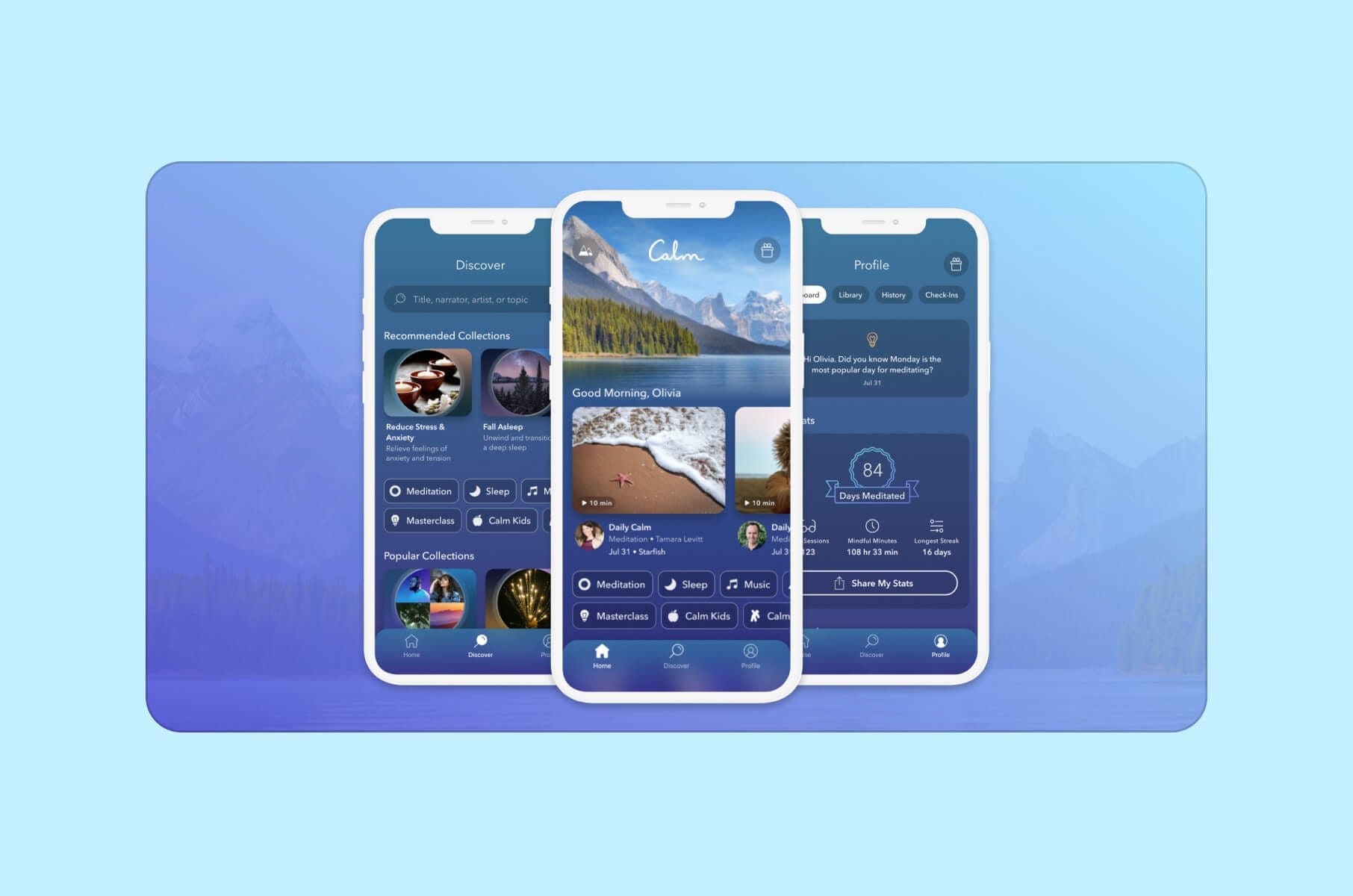
Calm is a meditation and relaxation app designed to help users manage stress, improve sleep quality, and enhance overall well-being. It offers guided meditations, sleep stories, breathing exercises, and soothing music.
The app has a serene user interface with soothing sounds and natural landscapes like birds chirping and rain falling, all to create a tranquil environment.
The guided meditations, sleep stories, and relaxation music are accessible through an intuitive navigation system. Users can also customize their experience by selecting themes and adjusting settings.
Best for:
- People who mainly want better sleep, less stress, and “press play” relief without needing to build their own routine.
Key UX highlights:
- Strong audio-first storytelling with Sleep Stories voiced by recognizable narrators.
- Calm visual system and nature soundscapes that set user expectations the second the app opens.
- A growing “lifestyle” hub with daily rituals, commute meditations, and travel soundscapes, which makes Calm feel present throughout the day, not only at bedtime.
Mini-conclusion:
Calm treats stress and sleep support like a media experience, not a medical dashboard. That’s why it still leads the sleep-and-stress space.
3. Headspace
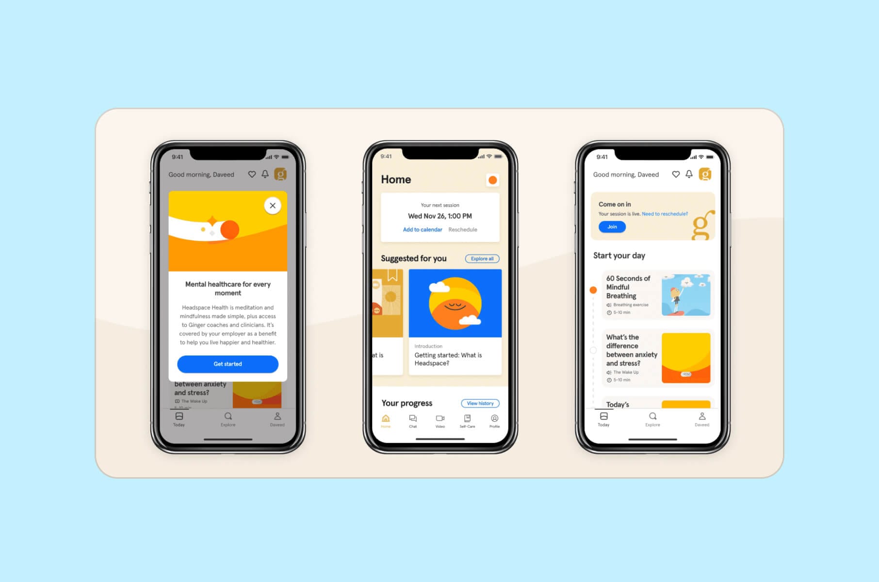
Headspace is a mindfulness and meditation app that provides guided sessions to improve mental health. It also offers courses on stress management, sleep improvement, focus enhancement, and physical health. The app also includes sleep casts, music, and mindful movement exercises.
Headspace has a playful and minimalist design and uses vibrant colors and simple animations to make meditation more approachable. The app’s interface allows easy access to various meditation programs, sleep aids, and movement exercises.
Today, Headspace positions itself as an everyday mental health companion. That includes breathing exercises, CBT-style techniques, mental health coaching, affordable therapy access, and even an AI assistant called Ebb for on-demand support.
Best for:
- Users who want more than meditation – they want emotional support, sleep help, coaching, and structure without navigating the healthcare system on their own.
Key UX highlights:
- Playful illustration and approachable microcopy that lower the barrier for anxious first-time users.
- Simple card-style navigation that slices mental health into small, doable steps instead of medical-sounding protocols.
- Built-in progress tracking and reminders, which help users stay consistent across sleep, movement, and stress work.
Mini-conclusion:
Headspace shows how mental health apps are moving toward “360° support” – sleep, therapy, and daily check-ins – while keeping the tone friendly instead of clinical.
4. Balance
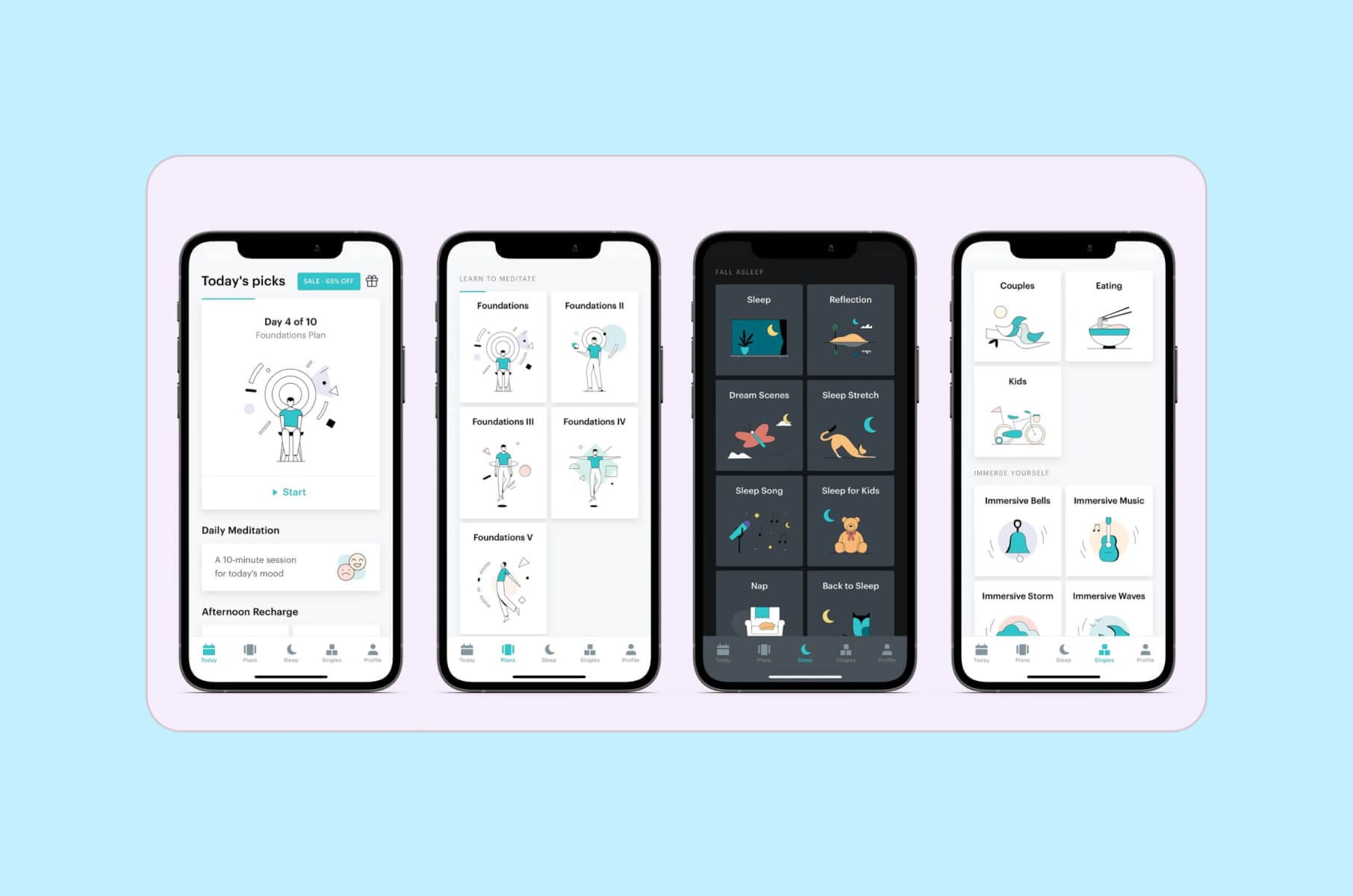
Balance is a personalized meditation app that adapts to individual user preferences and goals. It asks daily questions about the meditation experience and objectives to later create customized meditation plans.
The intuitive design of the app adapts to individual user feedback and progress. Balance also personalizes meditation sessions based on daily inputs. Both interface and content are designed in a way that best enhances user engagement and effectiveness.
Balance treats meditation like coaching. Each day, you’re asked how you feel and what you need, then you get a tailored session assembled from thousands of audio building blocks.
Best for:
- People who never really “clicked” with generic meditation libraries and want a coach that talks to them, not at them.
Key UX highlights:
- Daily check-in questions drive personalization and make the app feel alive, which directly supports long-term habit building.
- Calm visual pacing and short sessions that reduce friction for busy or stressed users.
- Gentle streak mentality that rewards consistency without punishing you for missing a day.
Mini-conclusion:
Balance is a great pattern for Healthtech teams that want to integrate dynamic guidance without hiring full-time human coaches for every user.
5. Waterllama
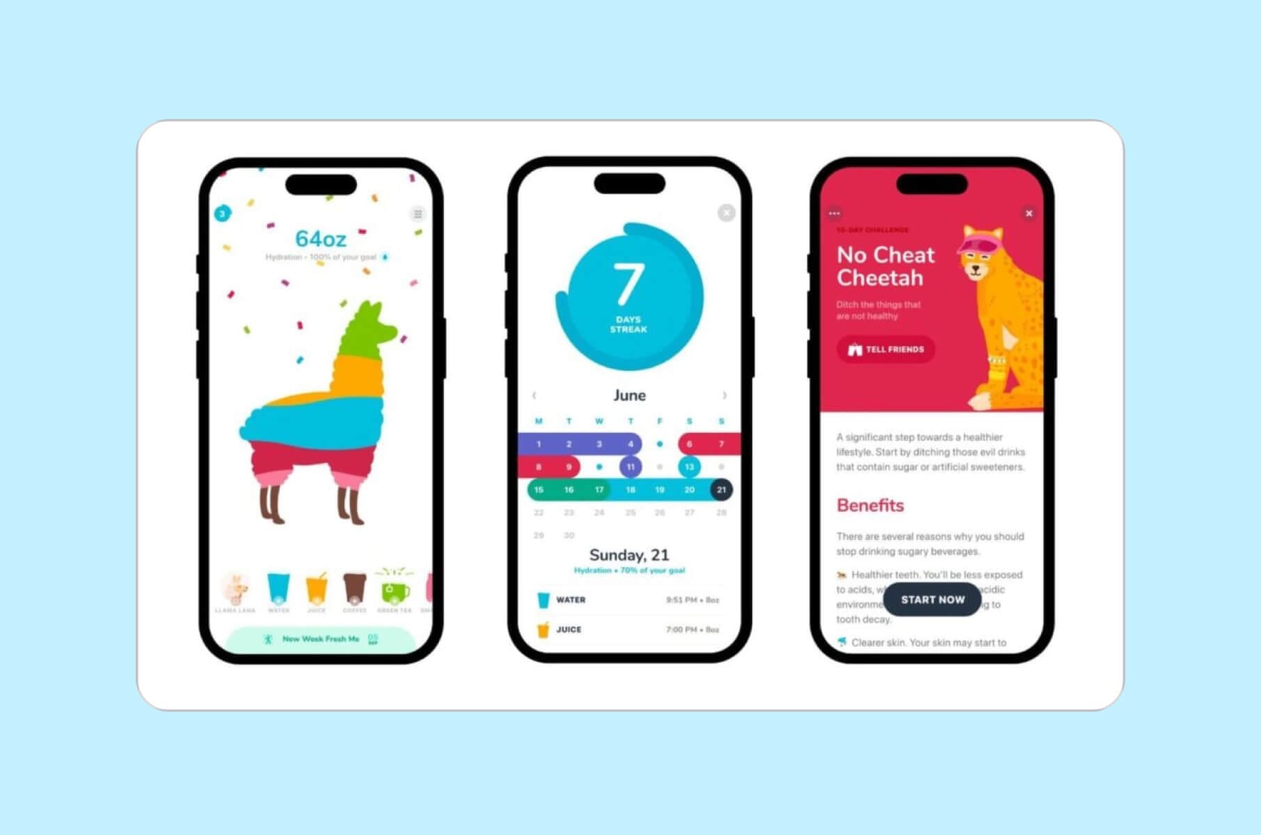
Waterllama is a hydration-tracking app designed to help users maintain optimal water intake. It has all the essentials of a very engaging app - the entertaining type of visuals, including cute animal characters, and offers challenges to motivate users.
Waterllama utilizes a clear and intuitive design with engaging visuals, including 45 cute animal characters, to motivate users to maintain healthy hydration habits.
As of 2026, Waterllama leans fully into playful accountability. You collect and “fill up” more than 100 animal characters, track 40+ drink types, and get smart reminders only when you’re actually falling behind on your hydration goal.
The Apple Watch app and iOS widgets let you log drinks without even opening the main app.
Best for:
- Anyone trying to build one small health habit (hydration) and actually stick to it in a friendly way, not a guilt-based way.
Key UX highlights:
- Charming character system and streaks that feel fun instead of “you failed.”
- Quick logging from watch and widgets, which removes friction and supports daily use.
- Light education cards that explain why hydration matters, not just “drink more.”
Mini-conclusion:
Waterllama is a retention clinic in disguise. It proves that playful UI can drive real behavior change when you pair it with reminders that respect user attention.
6. Gentler Streak Fitness Tracker
Gentler Streak is a fitness-tracking app that promotes a balanced approach to exercise and emphasizes the importance of rest and recovery alongside physical activity. It offers real-time training feedback and heart rate monitoring and supports over 100 workout types.
The app's design includes real-time training effects, heart rate training zones, and metric charts for various activities. Its Apple Watch integration offers on-the-go fitness tracking, which makes it a very useful tool for monitoring workouts.
Gentler Streak is different from most fitness trackers because it tells you when to slow down, not just when to “push harder.” The app visualizes your current training load and surfaces recovery, mobility, and light movement as valid wins instead of failure.
Best for:
- Active people who keep burning out or getting injured because every other tracker only celebrates intensity.
Key UX highlights:
- “Activity Path” view that shows when you’re close to overreaching so you can back off before you strain or get hurt.
- Built-in Apple Watch experience that works in real time during workouts, not just after.
- Award-winning execution. Gentler Streak was Apple Watch App of the Year and later picked up an Apple Design Award for Social Impact.
Mini-conclusion:
Gentler Streak is what sustainable fitness UX looks like in 2026 – you get informed coaching that keeps you active long term, not just a dashboard shouting for more reps.
7. Ahead: Emotions Coach
Ahead is an emotional intelligence coaching app with a very clean and calming interface. It helps users understand and manage their emotions through personalized journeys, science-based techniques, and progress tracking.
The app offers personalized journeys to help users manage emotions, understand behavioral patterns, and track progress. Its design focuses on accessibility and user engagement through science-proven techniques.
Ahead calls itself a “pocket therapist,” built around 5-minute lessons, behavior change techniques, mood tracking, and specific tracks like anger, anxiety, or procrastination.
Best for:
- People working on emotional regulation, stress reactions, or communication who want support without jumping straight into live therapy.
Key UX highlights:
- Bite-size daily lessons that feel achievable, which supports habit building even on bad days.
- Progress tracking and reflection prompts that help you see patterns behind triggers, not just the symptoms.
- Friendly tone and emotional labeling guidance that make tough topics feel safe to explore.
Mini-conclusion:
Ahead shows how “mental health” UX is expanding beyond meditation and into emotional skill training, which can also support workplace performance, relationships, and conflict management.
8. Noom
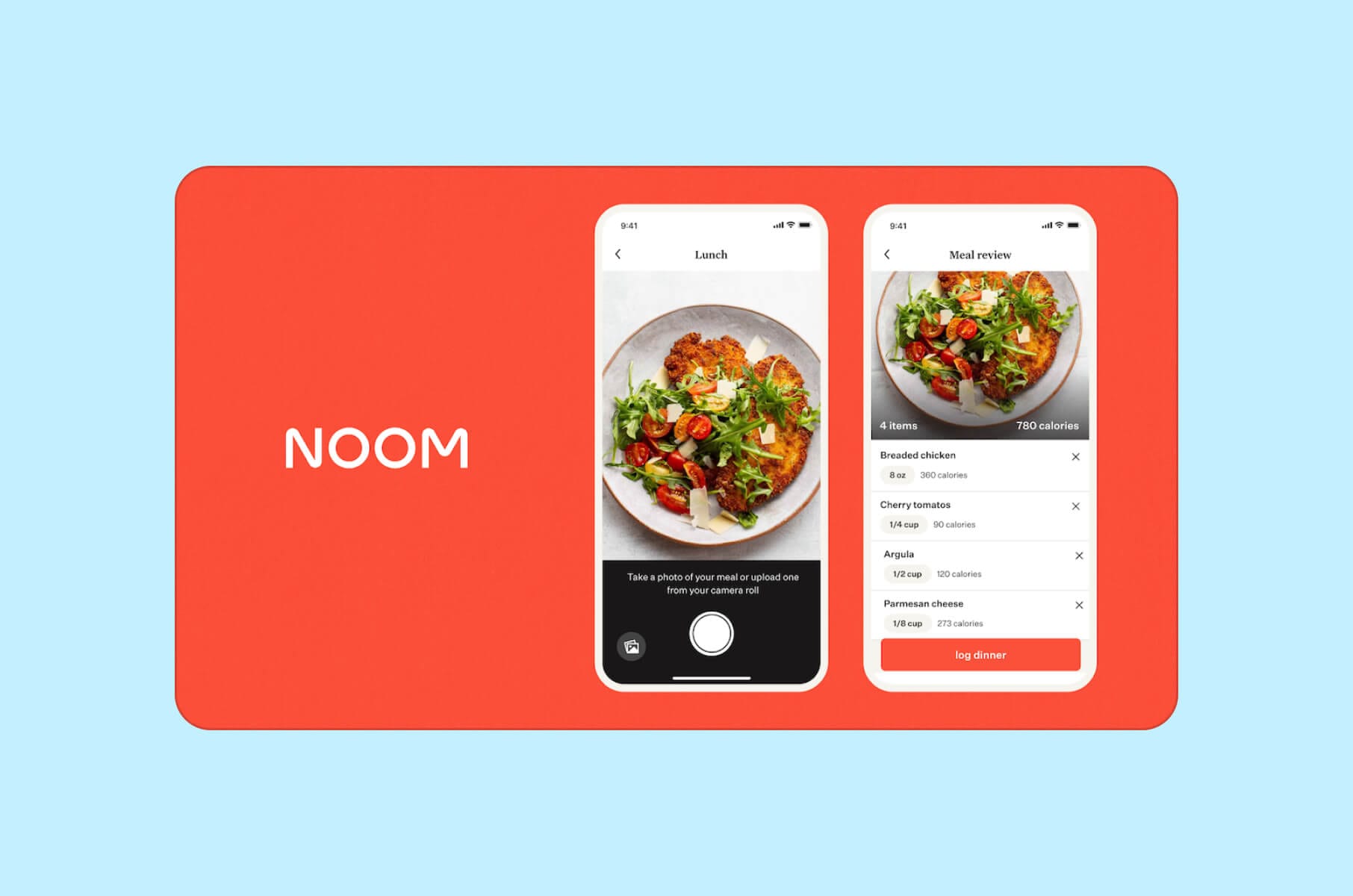
Noom is a weight loss and health management app that combines psychology, technology, and human coaching to help users achieve sustainable weight loss.
The app offers personalized plans, expert coaching, and tools to track progress. Its design emphasizes behavior change and sustainable habits, providing users with educational content and interactive features to support their weight loss journey.
In 2026, Noom has expanded from weight tracking into a full habit-change platform. You log meals, track steps, and get daily short lessons that explain why you’re making certain food choices.
It now also offers optional programs like GLP-1 coaching and lower-dose GLP-1 plans with 1:1 support, plus AI body scanning for instant health insights.
Best for:
- People who want structured behavior change with continual feedback and the option to layer in clinical support later, not first thing.
Key UX highlights:
- Short, psychology-based lessons that build health literacy and self-awareness instead of strict diet rules.
- Color-coded meal logging and habit tracking that help users notice patterns without shame.
- Optional paid tiers with coaching, hormone support, or GLP-1 guidance that sit on top of the same familiar interface, which keeps the experience consistent as needs get more medical.
Mini-conclusion:
Noom is a good example of how to scale from wellness to more clinical territory. The UI stays approachable even when the product crosses into medical weight management.
FAQ – best Health app design, engagement, usability
What specific UX patterns drive the highest retention in health apps?
The apps in this list share three patterns: one repeatable daily action (logging, check-in, or a short lesson), immediate feedback on that action, and a gentle reminder system that activates only when the user falls behind. Waterllama does this with hydration, Gentler Streak with activity, and Balance with meditation.
How do you design a Healthtech app that people actually keep using?
Start with one repeatable, high-value action per day. Give users feedback on that action right away. Reduce shame. Give helpful reminders only when they fall behind. This formula shows up in Waterllama (hydration), Gentler Streak (activity and recovery), and Balance (meditation).
How important is accessibility and plain language in healthcare UX?
Critical. Many people using a health app are stressed, tired, distracted, older, or in pain. If they cannot read the screen, they will churn or mis-report a symptom. Older adults are open to digital health and wellness apps, but they need clarity and trust.
Why does privacy-first UX matter so much in health apps?
People are sharing medication history, mental health notes, body scans, or weight data. If privacy controls feel hidden or unclear, users will not engage. Studies of health apps for older adults found that many still fail to clearly describe compliance with HIPAA or GDPR, or what happens in a breach.
Are AI companions in health apps safe for the end-user?
AI companions can improve perceived support and reduce drop-off, especially for chronic care, mental health, and habit coaching.
The risk is tone and safety. You need escalation paths, clear disclaimers, and content approved by clinicians or behavioral experts.
What to do if you want to have the best Health app design?
If you want to create a health app that meets your functional requirements but also provides a supreme user experience, our Merge team is here to help.
Not to pat ourselves on the back, but we do have the necessary expertise in designing healthcare apps and websites that users feel good about using and coming back to.
So, if it’s something you strive for, don’t hesitate and reach out to us to start your journey toward a top-tier health app design.
To see how we actually work with complex health products – including AI-powered assistants, clinical dashboards, and regulated data flows – check our case studies and guides:
- Our UX and interface work for complex life science and biotech tooling: Owkin K case study – AI interface for biologists and drug discovery
- Why consistent UI systems matter for long-term trust in regulated products: Design systems for consistent, reliable healthcare UX
- SaaS product design guide, including onboarding patterns you can reuse in Healthtech apps: SaaS product design: a comprehensive guide
- How VR/AR experiences are already being used in care, rehab, and medical training: VR/AR UX design for healthcare and wellness
If you’re planning a user-facing app or a clinician-facing dashboard and you want high retention, regulatory awareness, and a design system that can actually scale, talk to us.