0
Table of Contents
Financial dashboard design, or how to make data look pretty
In fintech dashboard design, aesthetics should never come at the expense of clarity or accuracy.

Fintech applications are full of data and its various visualization forms. You could be building a personal finance app or a trading platform - either way, you need to present complex numbers in a clear (and insightful) way.
Instead of overwhelming people with spreadsheets and statements, make your fintech dashboards pretty. Your users need to understand what’s happening with their money or business without going through dense reports.
In financial dashboard design, aesthetics should never come at the expense of clarity or accuracy.
This guide explores how to achieve that balance by focusing on a) finance data visualization techniques, b) important dashboard design user experience considerations, and c) those chart examples that work best in financial contexts.
4 types of fintech dashboards you need and what they show
Fintech dashboards come in various flavors depending on their purpose. It helps to first identify what type of financial information you need to visualize, since each has its own design priorities. These patterns inform business dashboard design and guide business dashboard development. Here are a few common categories of financial dashboards and their focus:
Financial performance dashboards
These provide an overview of revenue, expenses, and profit over time (e.g., monthly or yearly). They explain why a business made or lost money and highlight ways to reduce costs or boost profit. Common KPIs are gross profit margin, net profit, cost breakdowns, etc.
Good dashboard design clarifies. Great dashboard design motivates action.
For example, your financial dashboard might show total income vs. expenditures, with charts for each major expense category and trend lines for profit over the last few quarters.
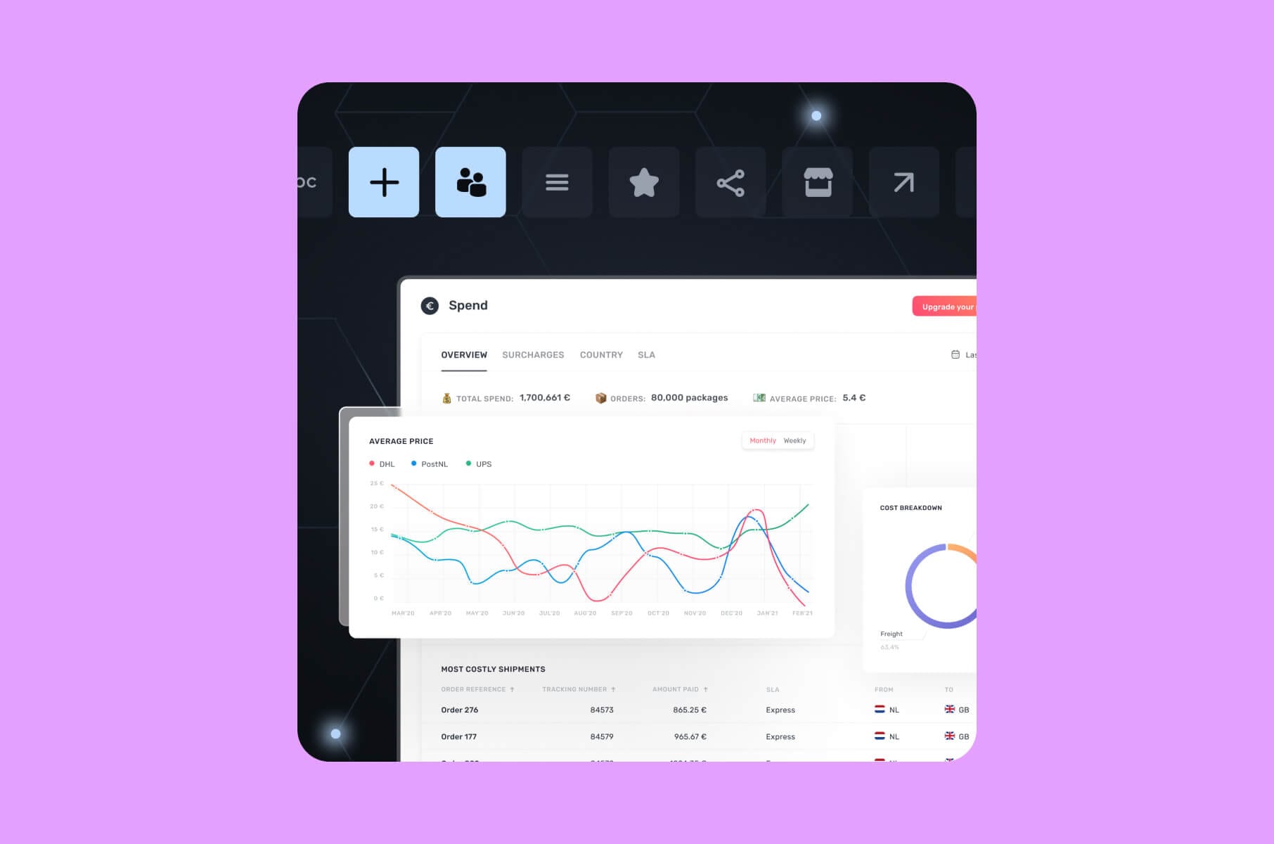
Expense tracking dashboards
These monitor spending against budgets or benchmarks. A business expense dashboard can track accounts payable and receivable, including metrics like turnover ratios.
A personal finance dashboard similarly shows an individual’s spending by category (rent, food, entertainment, etc.) and alerts the user to areas where they might be overspending relative to a budget or industry benchmark.
The emphasis here is often on clear categorization (e.g., using color-coded pie or bar charts for each spending category) and maybe timelines to see how expenses change month-to-month.
Here's what makes a good dashboard in this context:
- quick categorization;
- clear alerts;
- obvious next steps.
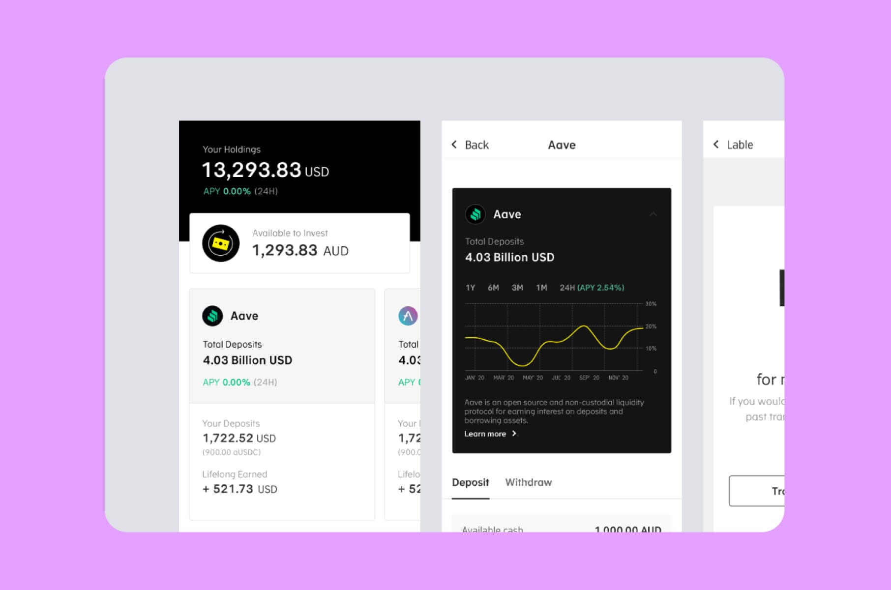
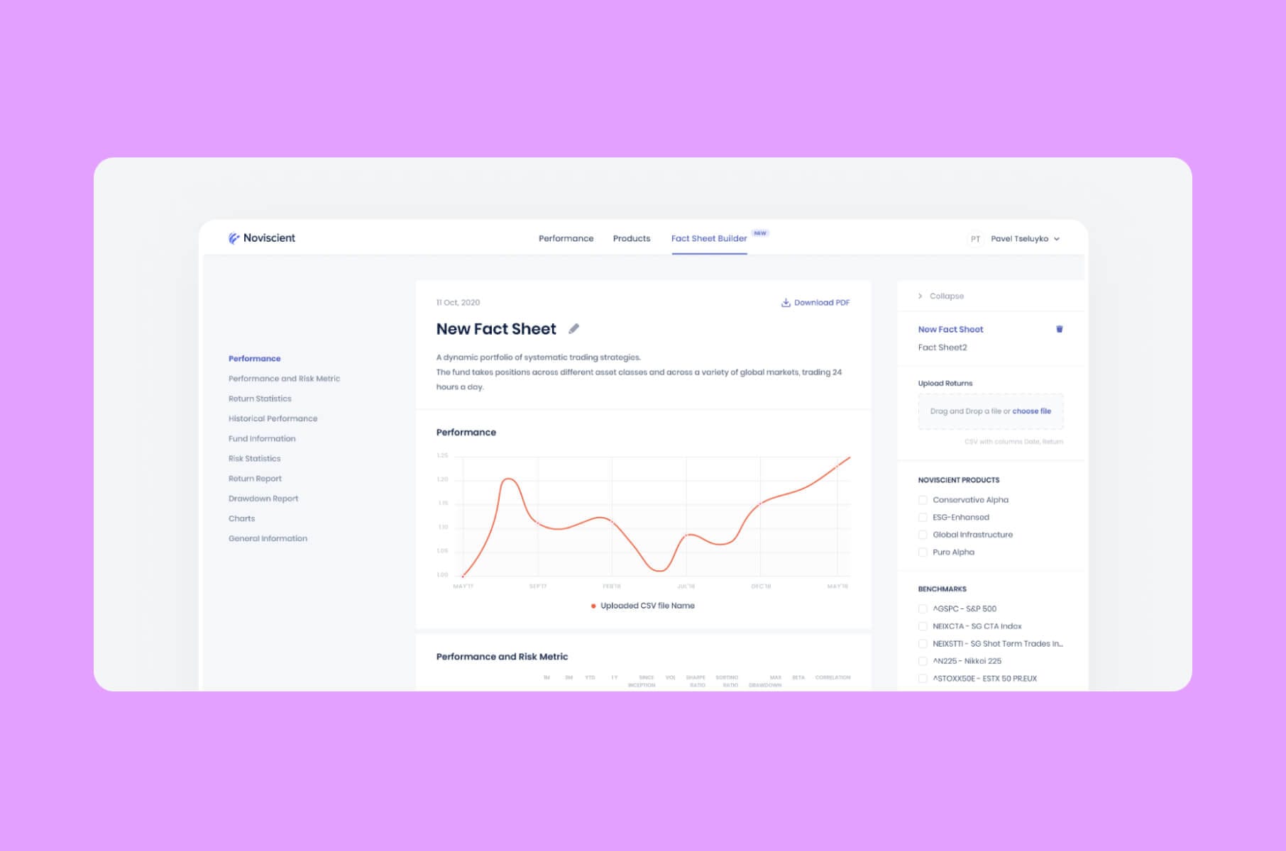
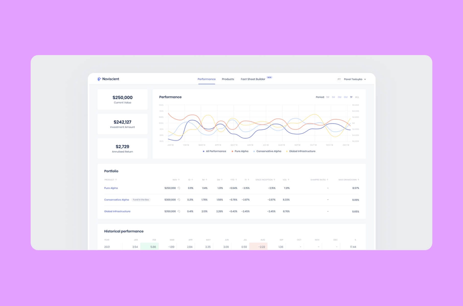
Investment and wealth management dashboards
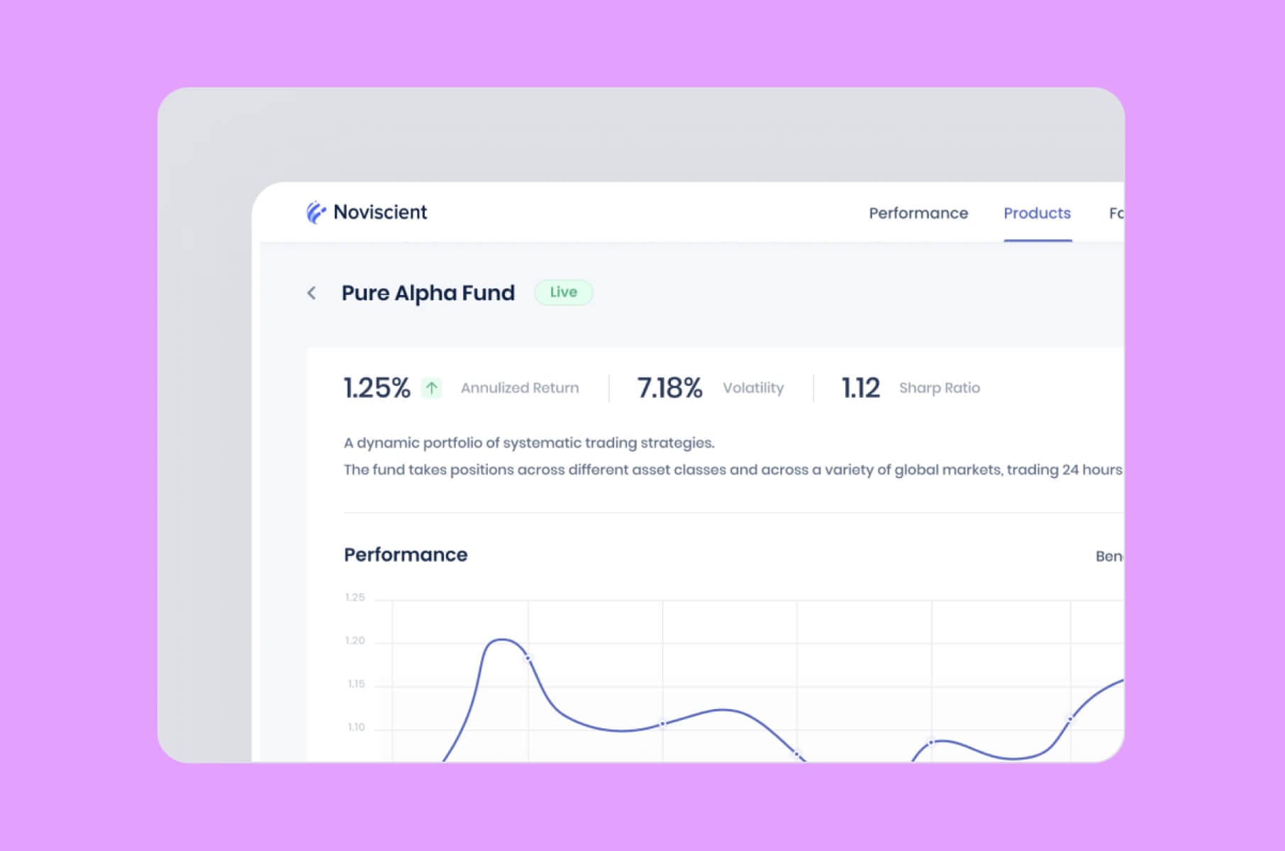
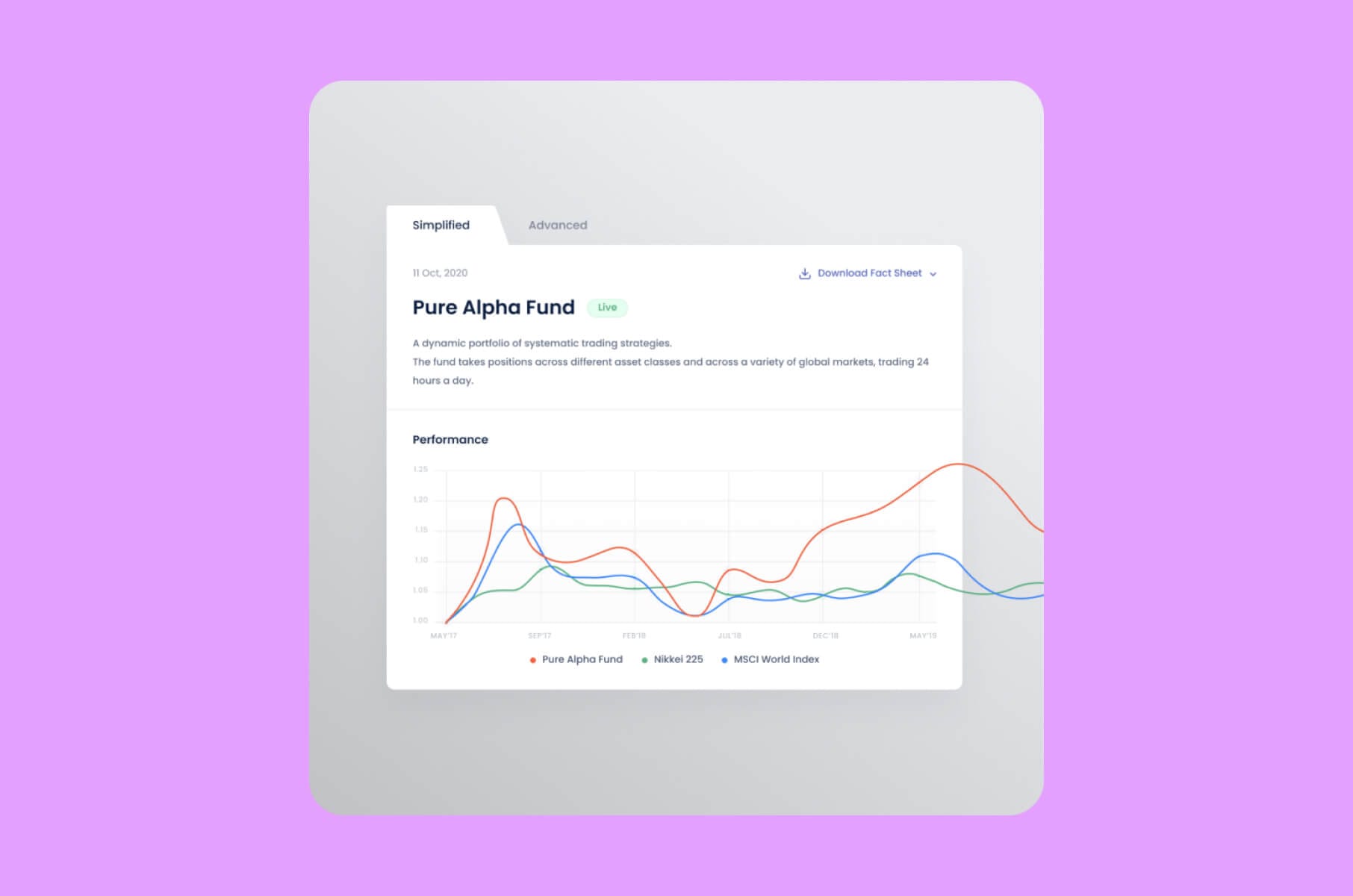
These report on portfolio performance, asset allocation, and market movements. For instance, a wealth management dashboard could display how different stocks or funds in a portfolio are performing, the portfolio’s overall return, and the distribution of assets (e.g., 50% equities, 30% bonds, 20% others).
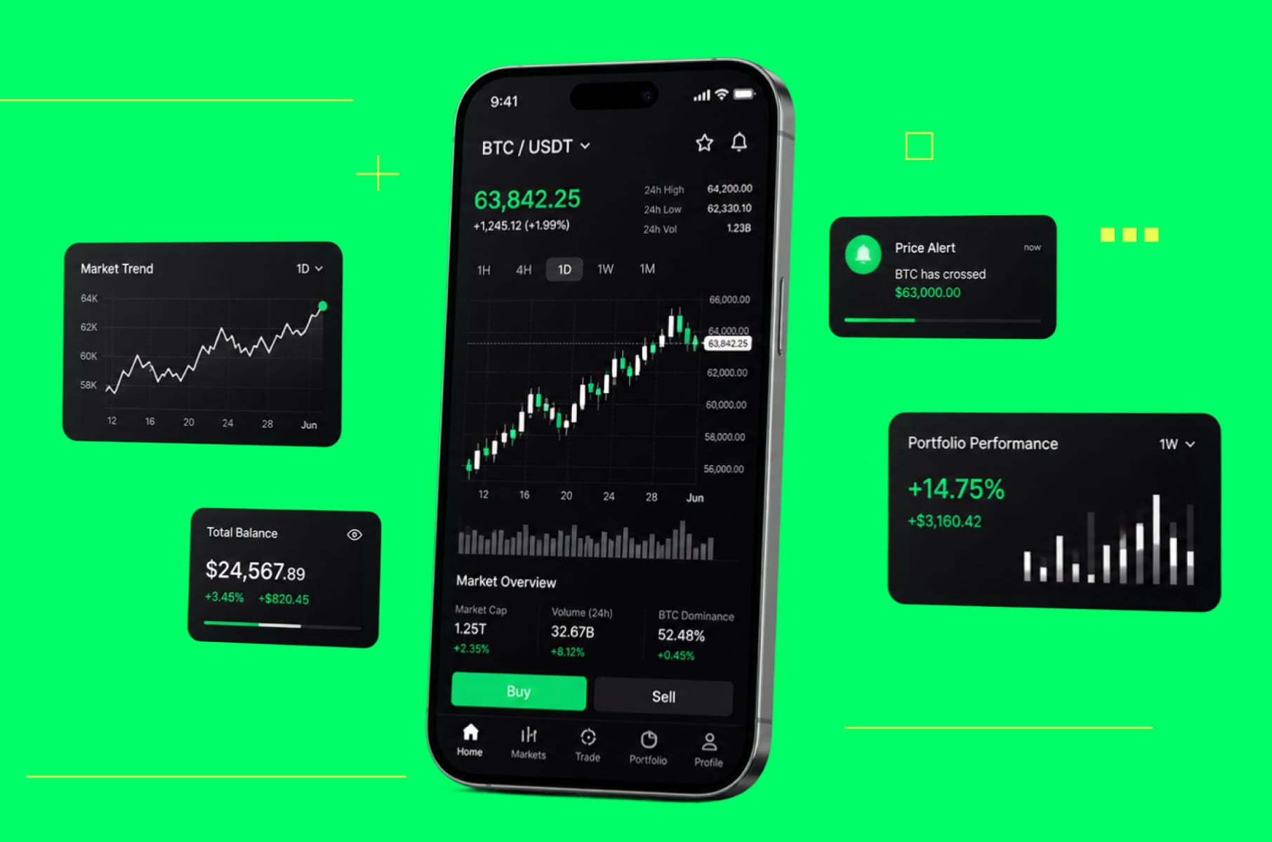
In trading or investment apps, you’ll frequently see financial charts in UX, such as candlestick charts for stock prices, line charts for portfolio value over time, and perhaps tables of holdings with gain/loss indicators.
In data dashboard design, pair these with plain-language summaries to speed interpretation.
The goal is to let investors or managers quickly evaluate performance and make informed decisions about rebalancing or new investments.
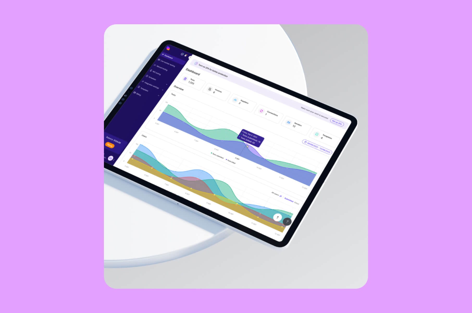
Operational finance dashboards
For fintech products that have an internal or operational focus (for example, a dashboard for a company’s finance team or an executive overview), the content might mix various metrics – revenue, expenses, user growth, risk indicators – relevant to business health. These often combine elements of the above dashboards.
This is classic business dashboard design territory and a prime use case for business dashboard development.
For example, a SaaS startup’s financial dashboard could show MRR (Monthly Recurring Revenue) trending upward in a line chart, a bar chart of new vs. churned customers, and a KPI card for current runway (cash left) with a projected date.
Each type of financial dashboard may require a slightly different approach in design. However, all of them share a need for clarity, accuracy, and usability.
Next, we’ll dive into best practices for dashboard design that ensure your fintech dashboard design hits those marks.
Best practices for financial dashboard design
How do you tell a great fintech dashboard apart from a mediocre one?
Great dashboard design highlights insights, not just data.
They are created to meet the end-user’s needs, present information in an intuitive visual format, and avoid the clutter or confusion that plagues many poorly designed dashboards.
Below are the key principles and best practices that you can apply to your own financial dashboard projects.
Cater to the goals of your end users
Every effective dashboard starts with a deep understanding of who will use it and what they need from it. When designing a dashboard, write those needs down first.
Are your users financial analysts who love granular data and complex charts? Or are they busy executives or everyday consumers who need a simple, at-a-glance view? The level of detail and the terminology you use should match your audience’s expertise.
First, what are the core use cases for your dashboard?
This is how to design a dashboard that maps directly to user questions:
For example, if you’re designing a budgeting app’s dashboard for consumers, the primary question users have is likely “How am I spending my money?” That calls for clear visual answers (like a spending pie chart and a big number for remaining budget).
On the other hand, a fintech app for professional traders might have users asking, “What’s the latest market trend I can act on right now?”, which might require price charts and news or alert elements.
Tip: List the top 3 questions your user needs the dashboard to answer. Then make sure your layout dedicates the most space and prominence to answering those questions.
Highlight the most important data
A dashboard is most effective when it keeps what matters most in the spotlight, which means you must ruthlessly prioritize which metrics and visuals to include. Rather than showing everything you could possibly track, show the metrics that indicate performance relative to goals.
That prioritization is what makes a good dashboard.
A useful guideline borrowed from journalism is the inverted pyramid principle: present the most crucial information first, and then the finer details.
In fintech design terms, make sure the top left (or, in mobile, the first screenful) of your dashboard showcases the primary insights (e.g., total profit this month vs. last or current portfolio value vs. start of year). Less critical data can be lower down or hidden behind tabs/filters.
To keep things actionable, metrics on a dashboard should ideally be “SMART”: Specific, Measurable, Achievable, Relevant, Time-bound.
For example, showing “Savings Rate: 20% (goal: 25%)” is more informative than just “Savings Rate: 20%” because it provides context and a target to frame the number.
Always connect data to the user's goal (e.g., saving more money, increasing revenue, reducing risk).
Choose the right visuals
You also need to choose the appropriate chart or graphic in finance data visualization. In data dashboard design, chart choice is half the job.
Each chart type has strengths and limitations, so match the data to the visualization that best reveals the insight. Here are some go-to chart types for financial dashboards and when to use them:
1. Line charts
Ideal for showing trends over time. Finance is full of time series data (stock prices, monthly revenue, daily active users with revenue impact, etc.), and line graphs excel at illustrating how a metric evolves. They make growth, dips, or seasonality easy to spot.
Tip: Annotate line charts with key events (product launches, market news, policy changes) to provide context for spikes or drops.
2. Bar and column charts
Best for comparing categories or discrete items. In a fintech app, use a bar chart to compare expenses by category (e.g., rent vs. food vs. travel spending in a month) or compare the performance of different portfolios or departments. Bar charts provide a quick sense of which category is larger or smaller.
Tip: Use horizontal bars if category names are long, or vertical columns if comparing over time periods (though for time, lines are usually better).
3. Pie and donut charts
Use sparingly to show parts of a whole. A pie chart might show how a budget is divided among spending categories or how a portfolio is allocated across asset classes. They’re intuitive for a quick sense of proportion, but they become hard to read with too many slices or values that are close in size.
Tip: Always label slices directly with values or percentages to avoid forcing the user to guess or do mental math.
4. Area and stacked area charts
Useful to show cumulative totals or composition over time. For example, a stacked area chart could display how different revenue streams contribute to total revenue each month. This way, you see both the total trend and the part-to-whole breakdown across time.
5. Waterfall charts
A favorite in finance for explaining how you got from one total to another. Waterfall charts display positive and negative contributions to a total. For instance, in a P&L dashboard, a waterfall chart might start with beginning cash, then add inflows (sales, investments) and subtract outflows (expenses, taxes) to end at ending cash.
6. Heatmaps
Handy for showing intensity or correlation in financial data. A common example is a calendar heatmap for expenses or trading activity (darker colors on days with higher spend or volume). Heatmaps can also display correlations between variables (though those are more often seen in analysis tools than in executive dashboards).
7. Maps
If geography matters (e.g., a global fintech platform or a payment network spread across regions), a map visualization can show data per country or state. This can highlight regional patterns, like which countries have the highest transaction volumes or which regions are driving revenue.
Tip: Use color gradients on a map for density or bubbles for magnitude on each region.
8. Scatter plots
Good for finding relationships between two financial variables. In a fintech context, scatter plots might be used internally to see, say, the relationship between customer account age and their account balance, or risk score vs. default rate for loan customers.
They’re more analysis-oriented; if you include one, make sure your users are likely to interpret it.
Keep the design simple
Effective dashboard design reveals only what’s needed. Even though finance data never looks simple, your dashboard design has to make it look like that anyway. Your user needs to be able to understand it. What do you do then? Here are the tips from our designers:
- White space is your friend. Rather than cramming every pixel with a chart or text, give your content room to breathe. Limit a primary dashboard to 4-5 key visualizations or metrics.
- Use layout and visual cues to signal importance. Typically, the most important metrics go at the top or upper-left (since users read left-to-right, top-to-bottom).
- If designing for web or desktop, consider a grid or card layout where each chart sits in a "card". This helps organize content and is also responsive-friendly (cards can stack on mobile).
- If designing for mobile, you might use a scrolling stacked approach, but still ensure the first view is the summary.
- Label charts and metrics in plain language (unless your audience are finance pros who expect the precise terms).
- Always include axis labels on charts, and if a chart’s meaning isn’t obvious, a short descriptive subtitle (e.g., “Monthly Revenue (in USD)” beneath a chart) can help.
- Use a consistent color scheme and intentional color-coding. For finance, a common convention is that green represents good (profits, increases) and red represents bad (losses, decreases).
- Consistent iconography (e.g., a dollar sign icon always meaning revenue, a piggy bank icon meaning savings) can also reinforce understanding without words.
- Typography should be limited to 1-2 fonts (a clear sans-serif is often best for UI), and use font weight/boldness to highlight headings or key figures.
Once you design a draft of your dashboard, perform a five-second test: Show it to someone (ideally resembling your target user), and after five seconds, ask them what the main point of the dashboard is. If they can’t answer quickly, you might need to simplify or highlight the information better.
Be accurate
Users make real decisions – sometimes with big money on the line – based on what they see in a dashboard. So we must design visualizations that are truthful and avoid any distortion or misinterpretation of the data.
A few guidelines for fintech dashboard accuracy - treat these as dashboard design principles:
Start axes at zero (most of the time)
One classic mistake is truncating the Y-axis of a bar or line chart to exaggerate small differences. For example, if a revenue chart’s Y-axis starts at $90k instead of $0, a change from $100k to $105k will look like a huge jump visually when it’s actually a 5% increase. Generally, bar charts should have a zero baseline so that bar lengths are proportional.
Avoid misleading visual effects
Don’t use 3D chart effects, odd angles, or other chart junk that can skew perception. In finance dashboards, simplicity rules – a flat 2D chart is usually clearest. Also, be careful with cumulative graphs vs. non-cumulative, percentage vs. absolute – label them correctly. If you show a pie chart, ensure it sums to 100% (or explain if it doesn’t due to some reason).
Provide context to numbers
A number by itself can be misinterpreted if the viewer doesn’t know if it’s good or bad. Always try to include context like comparisons to a previous period or a target. You can provide context through color coding (green/red as mentioned), up/down icons, or explicit text.
Regularly update and validate data
Dashboards should have the most recent data available, or at least timely updates, otherwise they lose relevance. In financial dashboard design, freshness is part of trust.
If your fintech app is showing stale information (like last quarter’s numbers without indicating that), users could make poor decisions. Ideally, automate data refreshes or show a “last updated” timestamp.
Add interactive elements
One advantage of digital dashboards over static reports is interactivity. Providing ways to interact with the data can greatly enhance the experience, especially for power users or complex fintech platforms.
For example, when designing dashboards, you can have:
- Filters. Allow users to filter the data by relevant dimensions like date range, account, region, etc.
- Drill-down and details on demand. A good practice is to design summary cards or charts as entry points – if the user clicks a visualization, it could expand or navigate to a more detailed breakdown.
- Tooltips and hover info. When a chart has a lot of data points (like daily data), showing labels for all can clutter it. Instead, implement tooltips – the user hovers or taps a point/bar and gets the exact value and perhaps additional info.
- Tabs or toggle views. If you truly have multiple distinct perspectives to present, consider using tabs within the dashboard interface. The user can switch between, say, an “Overview” tab, a “Detailed Analytics” tab, maybe an “Forecast” tab, etc.
Tip: Make sure your interactive elements are actually performant. It’s super frustrating if your financial dashboard is laggy when applying a filter or loading a drill-down.
Conclusion
Design is always iterative. Don’t worry if your fintech dashboard isn’t perfect right from the beginning. Keep gathering feedback and refining it to better serve its audience.
You need to guide your users through financial data in a way that is not only pretty but also genuinely useful.
If you need expert guidance or additional resources to create a top-notch financial dashboard, consider partnering with professionals.
Our Merge team offers fintech design and development services to help startups and businesses create intuitive, impactful dashboards and apps.
The important thing is to remember you’re not alone in this. Use the tips from this guide, leverage the experience of the community, and don’t hesitate to reach out for support when needed to make your fintech data truly shine.