0
Table of Contents
Fintech UX best practices for designing finance apps
At its heart, fintech UX should feel more like a helpful friend than a financial tool.

Fintech apps compete in a market where fintech UX is more than just a gimmick. In fact, 73% of users would switch banks for a better fintech user experience.
To inform you more on this topic, we’ll explore UX best practices for fintech apps—i.e., UX fintech patterns that work. Let's help you, your startups, and financial product teams design apps that users love to use.
As a sneak peek, we’ll talk about themes like building trust through fintech design, simplifying financial tasks, personalized UX within financial UX design, and making sure every interaction is seamless and secure.
Understanding Fintech UX design (definition and importance)
Fintech UX is the process of creating a financial app UX that is more intuitive, adequately engaging, and even enjoyable for users.
In practice, fintech UX design is just simplifying complicated and sometimes financial processes so that tasks like transferring funds, checking accounts, or investing can be done quicker and smoother - and the supporting fintech UI choices should make that clarity more effortless.
Why does UX matter so much in banking app design and other fintech product design? For one, users need to feel their money and data are safe. Also, fintech apps face heavy competition, so providing a superior experience is a major differentiator.
Key principles of successful fintech UX design include:
- Build trust through security and transparency. Incorporate strong security features (encryption, authentication), but keep them mostly in the background to avoid unnecessary friction from a UX design for fintech perspective.
- Simplify and clarify every step. Break down banking app design workflows into simple, clear steps.
- Personalize the experience. AI and user data can help adjust content, tips, and features to each user’s needs (for example, surface relevant insights or custom dashboards based on their behavior) in the context of financial ux design.
- Make it accessible. When designing for fintech, make sure it's done for all users, regardless of age or ability.
- Provide smooth performance. As usual, users expect quick load times, real-time updates (for balances, transactions, stock prices, etc.), and error-free operations.
These principles are the backbone of ux design for fintech teams who are designing for fintech at any scale.
Fintech UX onboarding best practices
You need to create a friction-free fintech onboarding UX.
Fintech apps often face mandatory KYC UX design steps (Know Your Customer identity checks) and other compliance hoops in typical ux fintech scenarios.
The challenge is to meet these requirements without driving users away. Let’s break down some fintech onboarding best practices.
During onboarding, try to match your flows with fintech UI patterns and consistent fintech design so users instantly recognize controls and trust the process.
Focus on one task at a time
For example, a digital bank might request one piece of info per screen (name, then ID, then selfie) with clear reasons why each detail is needed. Breaking KYC into more manageable pieces will make the process less intimidating.
Make creating an account and/or logging in as simple as possible
Request only essential information initially (often just name and email) to reduce friction. Extra details for financial app authentication (like address or income) can be gathered later once the user is engaged.
For the logging-in feature, enable biometric login UX options (fingerprint, face ID) to eliminate password fatigue. These fintech UI patterns reduce hassle without compromising security. From a UX perspective, biometrics are the fastest, simplest way to log into a financial app.
Show progress and guidance
Let users know how far along they are in the sign-up process.
Simple progress bars or step indicators motivate users to finish onboarding. You can also add in-app guidance, like tooltips or an interactive demo, to explain features as users sign up — a small but powerful fintech design detail.
Give security without extra friction
Users expect strong security measures, but these should happen mostly in the background.
For example, instead of forcing users to answer a security question every time they log in, send a one-time code or use device-based trust.
What you can do is better communicate security checks (e.g., a brief “verifying your identity…” message) so users know why you ask for certain info — another best practice in UX design for fintech.
How to minimize drop-offs?
Even with the improvements above, a lengthy or confusing sign-up can still cause users to give up. Over half of consumers (about 68%) have abandoned fintech applications during the onboarding process.
What you can do is allow users to save their progress if an application form is long, or postpone non-critical steps. For example, let users start exploring the app with basic functionality while their identity verification (KYC) is still processing.
Giving users the option to pause and resume helps reduce the risk of drop-offs and improves the overall fintech user experience. The goal is to meet necessary KYC UX design and compliance requirements in such a smooth way that people complete registration rather than bail out.
Personal finance and budgeting app UX
Designing a personal finance app UX means helping everyday people manage money with ease, and maybe even a bit of fun. Popular budgeting, saving, and expense tracker apps include Mint, YNAB, and Revolut. What they do best is turn complex finance into engaging experiences.
If you’re working on a budgeting app design or a savings tool, your best bets are on clarity, encouragement, and personalization rooted in financial UX design.
Make your interface friendly and insights easily discoverable
Unfortunately, money can be stressful. Let’s try not to make it even more stressful with finance apps. The app’s tone and visuals should ease anxiety.
- Conversational copywriting,
- Clear labels (e.g., “Spending this month” vs. “Debit Transactions”),
- Gentle color schemes.
These can make a financial app design feel more approachable to users who aren’t finance experts.
Users should instantly see what matters most: their account balances, budget status, upcoming bills, etc. A good expense tracker UX shows key information through visual cues like charts or progress bars. For example, a budgeting app might show a monthly spending bar filling up as the user spends — a more than straightforward fintech UI aid, if you ask us.
Sprinkle some personalization and gamification
Fintech users appreciate it when an app acts like a smart assistant. Leverage AI personalization to analyze spending habits and tailor the experience. Many personal finance apps now offer personalized UX features such as custom budget categories, alerts for unusual spending, or AI-generated tips on saving.
A modern personalized UX might notice a user spends more on weekends and suggest a weekend budget, or automatically adjust expense categories using machine learning.
The same is true for gamification.
Turning financial management into a rewarding game is a proven best practice in fintech UX.
Elements like challenges, points, or rewards for good behavior can dramatically improve engagement and loyalty.
Read more about gamification in Fintech in our next article.
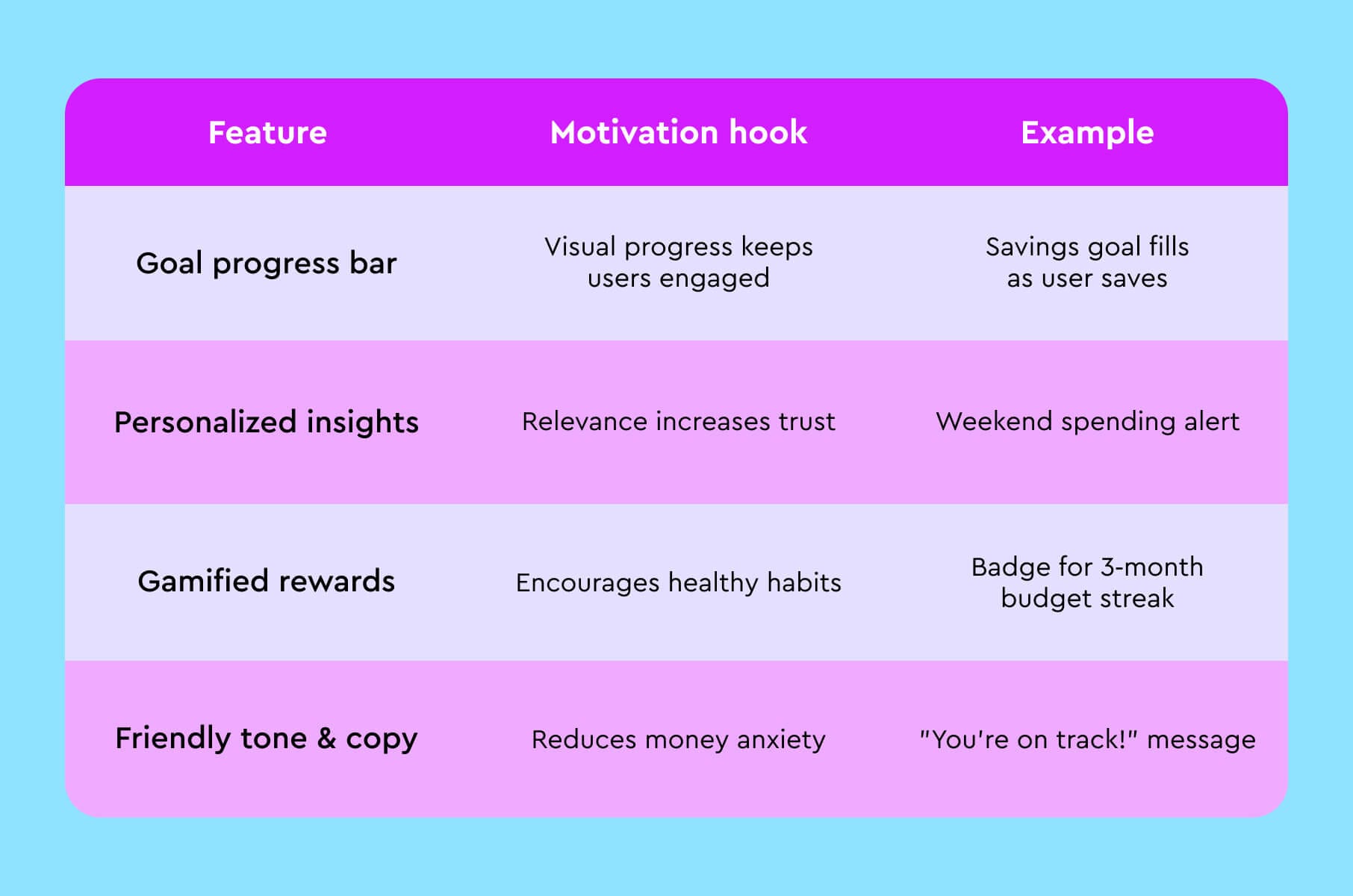
Personal finance app motivators
A great fintech UX taps into user motivation by rewarding positive actions and offering encouragement. For instance, the app might congratulate users when they reach a savings milestone or pay off a debt. Small celebrations (like confetti animations or achievement badges) can make managing money feel rewarding instead of stressful. Apps also use gentle nudges and timely reminders to keep users on track – for example, a budgeting app could pop up a friendly note saying, “You’re 90% toward your monthly savings goal, keep going!”
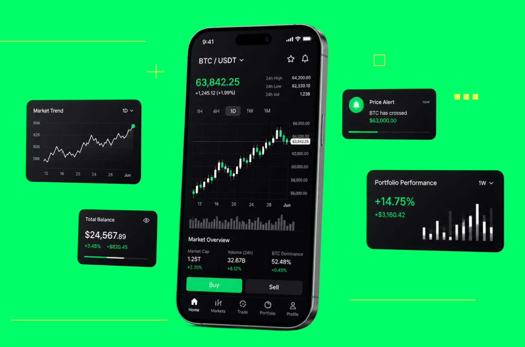
Banking app UX design best practices
A banking app typically serves as the primary channel for customers to manage their money, so the UX must instill confidence and make everyday banking easy. Here's what to do about designing a digital banking app with UX design for fintech in mind:
- Offer an overview.
On the home screen, highlight key info like account balances, recent transactions, and any important alerts. Users should instantly see their financial status without digging through menus.
- Improve the most common tasks.
Frequent actions, such as checking a transaction, transferring funds, paying a bill, or depositing a check, should be done in a few intuitive steps. For example, use clear labels and guide users with microcopy so they know exactly how to complete a transfer or payment.
- Provide spending insights and goals.
Many modern banking apps include personal finance features to help users budget and save. Automatically categorizing expenses and showing spending summaries or trends can help people make informed financial decisions.
Payments and transfers
Smooth payment flows are basically the core of fintech UX. It could be a peer-to-peer transfer, mobile wallet payment, or international remittance.
Regardless of what it is, users expect sending money to be as easy as sending a text. If your payment app design ain’t it, users will quickly find an alternative.
Here’s how to remove friction from money transfer app UX:
- Identify the most frequent user goals (e.g., sending money to a friend, paying a bill) and streamline those paths above all.
- Use positive friction to prevent errors. For example, you could add confirmation steps, such as “Are you sure?”
- Give feedback and status updates.
- Keep the payment flow focused by hiding or disabling unrelated options.
- If your fintech handles multiple payment types (P2P, bills, international, QR code payments, etc.), design for the simplest use case first, then gracefully scale up complexity, which is a classic fintech UI guidance.
We also cover more of payment UX in our upcoming article, continuing our Fintech theme, so be sure to check that one out, too!
Investment app UX practices
Investment and trading apps (including stock trading platforms, robo-advisors, and crypto exchanges) are a fast-growing segment of fintech. Designing a great investment app UX means the following.
Making data simpler and using visuals
Good investing apps use visual design to simplify complexity.
For example, instead of drowning a new user in charts and technical indicators, an app might first show a clean line chart of their portfolio value over time with key milestones annotated (deposits, withdrawals).
Another approach that fits fintech UX design well is to use tooltips or an optional “learn more” mode to explain terms like APY, expense ratio, or P/E ratio in plain language. The principle of progressive disclosure is helpful because you present basic info by default and let users drill down into details if they want.
Personalizing the experience based on skill level
Not all investors are alike. A first-time investor might sometimes need hand-holding, while a pro trader would want efficiency.
How about onboarding users with a quick questionnaire about their experience or goals, and then adapting the UI accordingly?
For instance, a stock trading app ux could offer a “Beginner mode” that highlights essential features (like one-click portfolio view, simple buy/sell options) and hides advanced features under an “Expert mode” toggle.
Or a robo-advisor using very conversational language and reassuring confirmations for a novice (“Great, your investment is set! We’ll take it from here.”). At the same time, it can show more analytics to an advanced user.
Offering transparency and guidance
If you want your users to trust you, it pays off to be very clear about fees, risks, and how the technology works.
Provide trust signals in fintech contexts: for example, show security badges, regulatory membership info (like SIPC or FDIC coverage for U.S. apps), and use reassuring copy (“Your assets are securely held by our custodian bank”).
However, don’t annoy the user with legalese on every screen - instead, make critical information accessible when the user seeks it (e.g., a “Learn about our investment approach” link).
Another way to improve fintech app retention with UX is by continuously adding value beyond the core function.
Investing apps can differentiate by integrating education into the UX. This could be as simple as contextual tips or as involved as offering in-app courses or quizzes about investing basics.
Building fast and error-free interactions
The main rule here is that users should be able to execute transactions quickly and see confirmations instantly.
Any lag or uncertainty (e.g., an order that seems stuck “pending”) can destroy trust. Optimize your app’s performance and show updates for things like portfolio balances and market prices. Also, pay attention to error states specific to investing – for instance, if a trade fails due to market closure or insufficient funds, craft an informative message and an alternative suggestion.
The best fintech UX design in wealth-tech turns something traditionally intimidating into a guided, user-friendly workflow.
Conversational UX in Fintech
An increasing number of fintech apps are integrating chat-based and voice-based interactions to improve user experience. Conversational UX means users can interact with the app through a chat interface or voice commands, rather than tapping through menus. This can make complex tasks feel simpler – you just ask a question or type a request, and the app handles it.
Modern fintech UI/UX often includes AI-driven chatbots that serve as virtual assistants. These can answer FAQs, help with tasks (like “What’s my account balance?” or “Please transfer $50 to Anna”), and guide users through processes 24/7. Not only does this convenience users, it also boosts efficiency: fintech businesses have saved over $7.3 billion in operational costs by implementing chatbots (and saved customers hundreds of millions of hours of waiting).
Make your chatbot helpful
Your chatbot should handle common user requests such as balance inquiries, recent transactions, password resets, or simple budgeting tips. The best fintech chatbots seamlessly hand off to human support if they detect the question is beyond their scope, ensuring users always get help.
Use natural language and guidance
Design chatbot conversations to be friendly and clear. Include suggested questions or quick-reply buttons to guide users. For voice assistants, use simple voice commands and confirm actions back to the user.
Offer an option, not the only way
While many users enjoy chat-based help, some still prefer manual navigation or speaking to a human. Provide conversational tools as an optional enhancement. A good design lets users fall back to regular UI or live support easily if they need to.
Last but not least, accessibility
Did you think we would forget about accessibility and inclusive design in Fintech UX? Last we checked, they are still mandatory for making your apps usable by everyone, including people with disabilities or impairments.
Honestly, even if some accessibility efforts you observe from other companies come off as virtue-signaling, as long as what they produce improves how people use their product, it's still a win for the "usability committee".
So, here's what you can do for your financial app UX as part of financial UX design:
- Use clear and readable content. Simple language and legible typography are the best options. Provide text alternatives for any important graphics or charts (so screen readers can describe them). Avoid using jargon without explanation.
- Support assistive technologies. Your app has to work well with screen readers and voice-over tools. For it to happen, label buttons and fields properly so that users who rely on audio cues or voice commands can navigate easily.
- High contrast and flexible UI. Use color schemes and font sizes that are easy to distinguish. Offer a high-contrast mode and allow users to adjust text size or zoom. Don’t rely on color alone to convey meaning – use text labels or symbols as well, so color-blind users aren’t left out.
- Design for different inputs. Some users can’t use multi-touch gestures or small tap targets. Make sure controls are large enough and consider keyboard navigation or voice input options. For example, an app could allow keypress alternatives or spoken commands for important actions.
To learn more, check out our recent big article on accessibility in all kinds of apps and sites.
Wrap-up
At its heart, fintech UX should feel more like a helpful friend than a financial tool. You might only be simplifying onboarding hurdles, making payments intuitive, or designing engaging investment experiences, but remember that behind each interaction is someone (YOUR user) seeking ease, clarity, and confidence.
So, as you design or refine your fintech product, ask yourself: Does every feature reassure the user? Does every interaction build trust?
Speaking from experience, the most successful apps in fintech product design are the ones people genuinely enjoy using.
Wanna know what to read next to be a Fintech expert? We got you:
- Shock content. Some dashboards can actually look pretty!
- Why adding game-like rewards, points systems, and playful challenges to your apps is actually a super smart idea?
- How do you get yourself the best Fintech development tech stack?
- Pesky AI has permeated Fintech as well. You definitely want to learn how.
- Even a sprinkle of automation is going to free you loads of time.
- An updated article from 2022 about how many Fintech startups there are. Added new data:)