0
Table of Contents
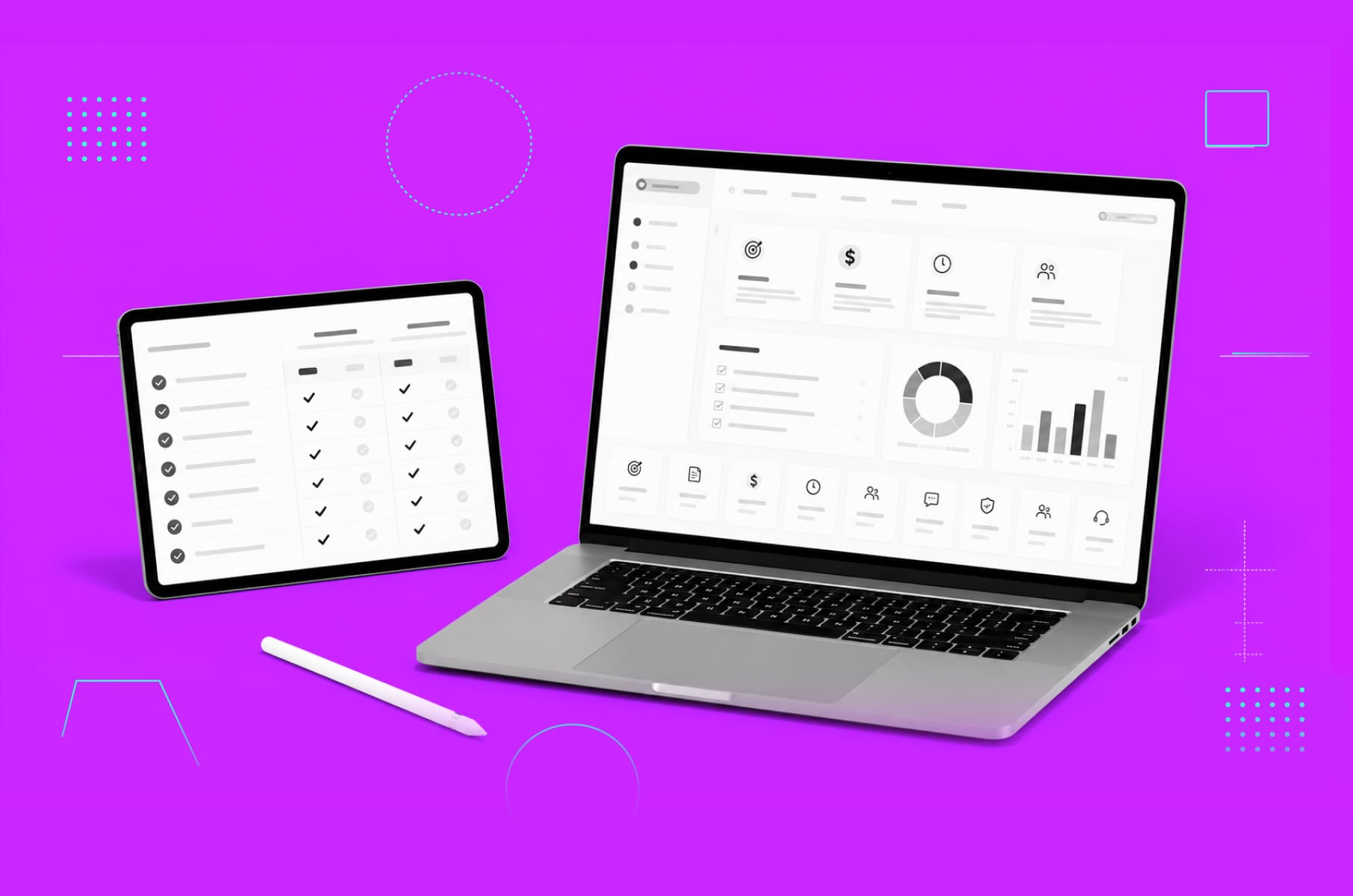
UX best practices we've learned from productivity apps like Notion
UX best practices we've learned from studying 7 productivity apps that grew on product alone.
If you want your product to make it big, you’ve got to spend big on ads, right? Sometimes. But not always. Today, let’s look at productivity apps.
Some of these companies barely advertise at all.
Linear reached a $1.25 billion valuation with roughly 178 employees and zero ad spend.
Superhuman had 180,000 people on a waitlist to pay $30 per month for an email client.
Figma went from a college dorm project to a public company on the NYSE - powered almost entirely by product-led growth.
The common thread across all of them is UX/UI best practices executed so well that the product becomes the marketing.
This article breaks down what each of these products does differently, backed by specific numbers and sourced claims. Every section connects design best practices to measurable business outcomes - adoption, retention, word-of-mouth, and revenue.
As a product design studio that is obsessed with perfecting user experiences, this was a very exciting deep dive into big names in the digital product industry.
What are UX best practices?
They are the repeatable design decisions that improve how people experience software - from first interaction to long-term retention.
The most useful UX best practices come from studying what already works at scale: products where design quality drove adoption, reduced churn, and turned users into recruiters.
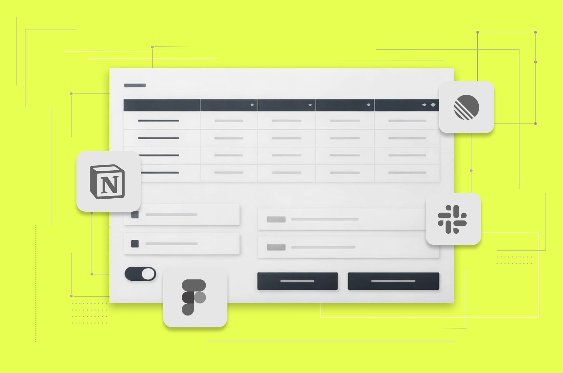
In the productivity app market, that list includes Notion, Linear, Superhuman, Todoist, Figma, Raycast, and Slack - seven products that grew to billions in valuation largely without traditional marketing. Let’s see what kind of design decisions got them there.
1. Notion
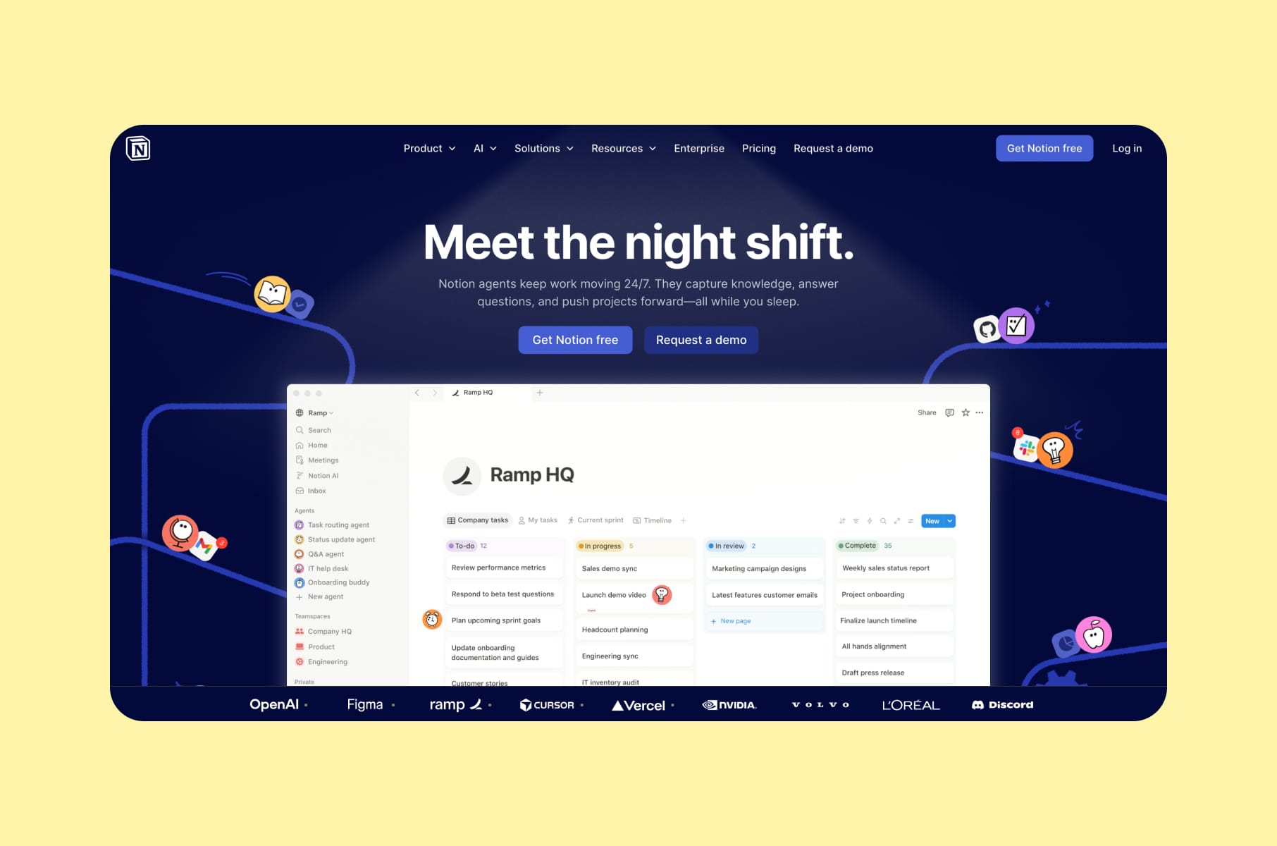
How turning users into builders creates evangelists
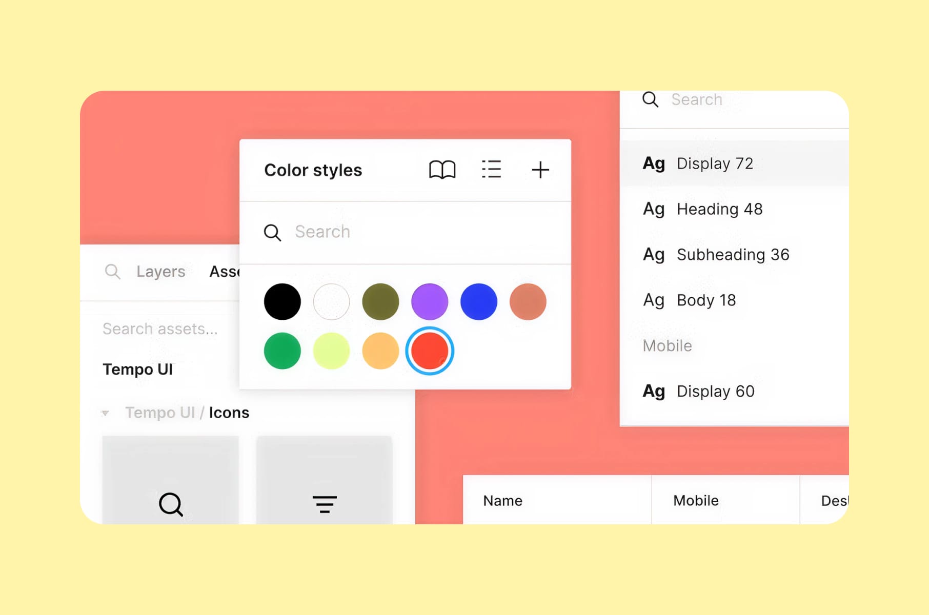
Notion overview
Notion reached over 100 million users and an $11 billion valuation - largely through organic adoption. The product barely advertises. So how did they do it then?
The "Ikea Effect" in product design
Notion studied which building blocks people use the most and made those the core primitives: text, databases, boards, calendars, and toggles. Users who assemble their own systems from these building blocks develop emotional ownership. They stay longer because they've invested time and thought into creating something personal.
This is one of the most underappreciated best practices for UX design: let users build with your product instead of just consuming it. When someone builds a CRM, a project tracker, or a personal wiki inside Notion, they have a reason to return every day.
But flexibility comes with a cost.
"Blank canvas syndrome", the anxiety of staring at an empty workspace with too many options, threatened to kill onboarding. Notion's approach was to add templates, starter setups, and progressive disclosure.
What is progressive disclosure? It's the practice of showing only the features a user needs at their current skill level, then revealing more advanced capabilities as they grow.
Notion's template gallery became a community-driven growth engine on its own. Users create templates, share them publicly, and attract new users organically.
Four user archetypes
Notion also designs for four distinct user archetypes:
- "Residents" make up roughly 60% of users and want simplicity.
- "Gardeners" represent about 20% and like to customize.
- "Builders" and "Architects" account for the remaining 20% and go deep with formulas and databases.
The UX best practice here is that a single interface can serve all four groups if you layer complexity correctly - showing the simple surface first and letting advanced features emerge naturally. Our own CEO has pointed out that Notion is one of the rare products that works equally well for both power users and casual adopters, which shows how well the layered-complexity principle can be executed.
Growth outcome
Notion's flexibility-plus-guidance model helped it reach over $600 million in ARR by late 2025, with more than 4 million paying customers worldwide - the kind of results that validate investing in product design services from day one.
2. Linear
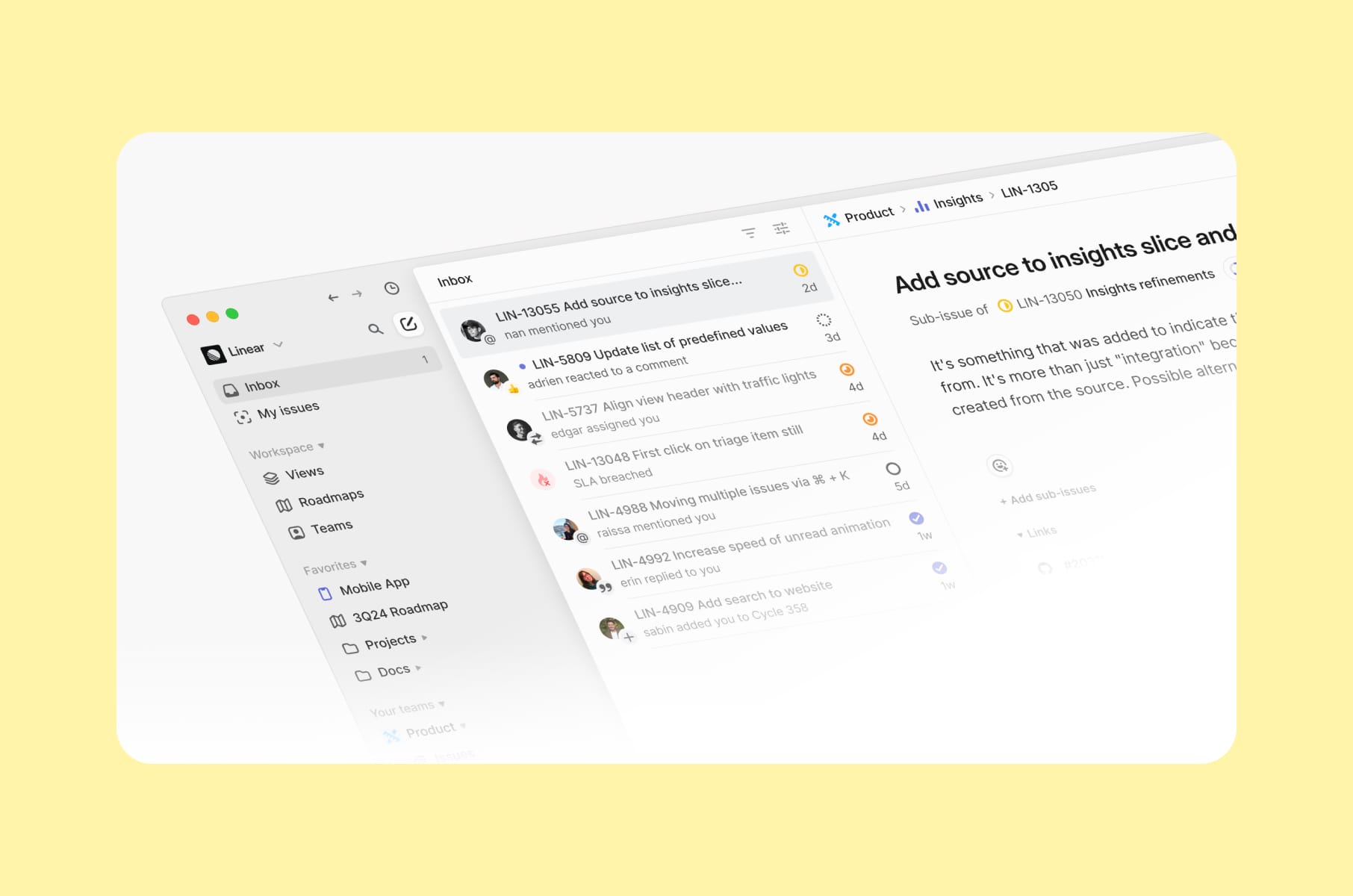
When performance becomes the product
Linear overview
Linear hit $100 million in revenue and a $1.25 billion valuation in June 2025, with a team of roughly 178 people. The company operates profitably and remotely, with no A/B tests, no SEO hacks, and no growth tricks. Every dollar of growth came from product quality.
Linear method
Linear's founders built the tool on an opinionated software philosophy. Their core belief: flexible software lets everyone invent their own workflows, which eventually creates chaos as teams scale. So Linear prescribes one good way of doing things. Fewer choices means faster onboarding, less confusion, and a product that feels intentional from the first click. Figma's editorial team documented this approach, calling it the "Linear Method."
This connects to a broader user experience best practice around terminology. Rather than inventing new jargon, Linear landed on straightforward units of work such as projects, teams, issues, and milestones, which are universal and immediately understandable. Familiar language reduces cognitive load, which is itself a form of speed.
Linear's approach is a case study in how the UI design process directly shapes product outcomes. The design and engineering process at Linear mirrors this philosophy. The team runs a daily pipeline where engineers build in paired groups each afternoon while designers iterate on other parts. The result is a product where design and code feel like one continuous effort.
The redesign
When Linear redesigned its UI in 2024, the team insisted on treating it as an evolution. The redesign had to feel familiar enough that loyal users stayed comfortable, while being different enough that the product felt fresh. This is an important UX best practice in mature products: ship improvements without breaking the workflows your existing users depend on.
Business impact
Linear reports a net revenue retention above 145%, and users recruit teammates on their own - because once you experience Linear's speed, using anything else feels slow by comparison.
3. Superhuman Mail
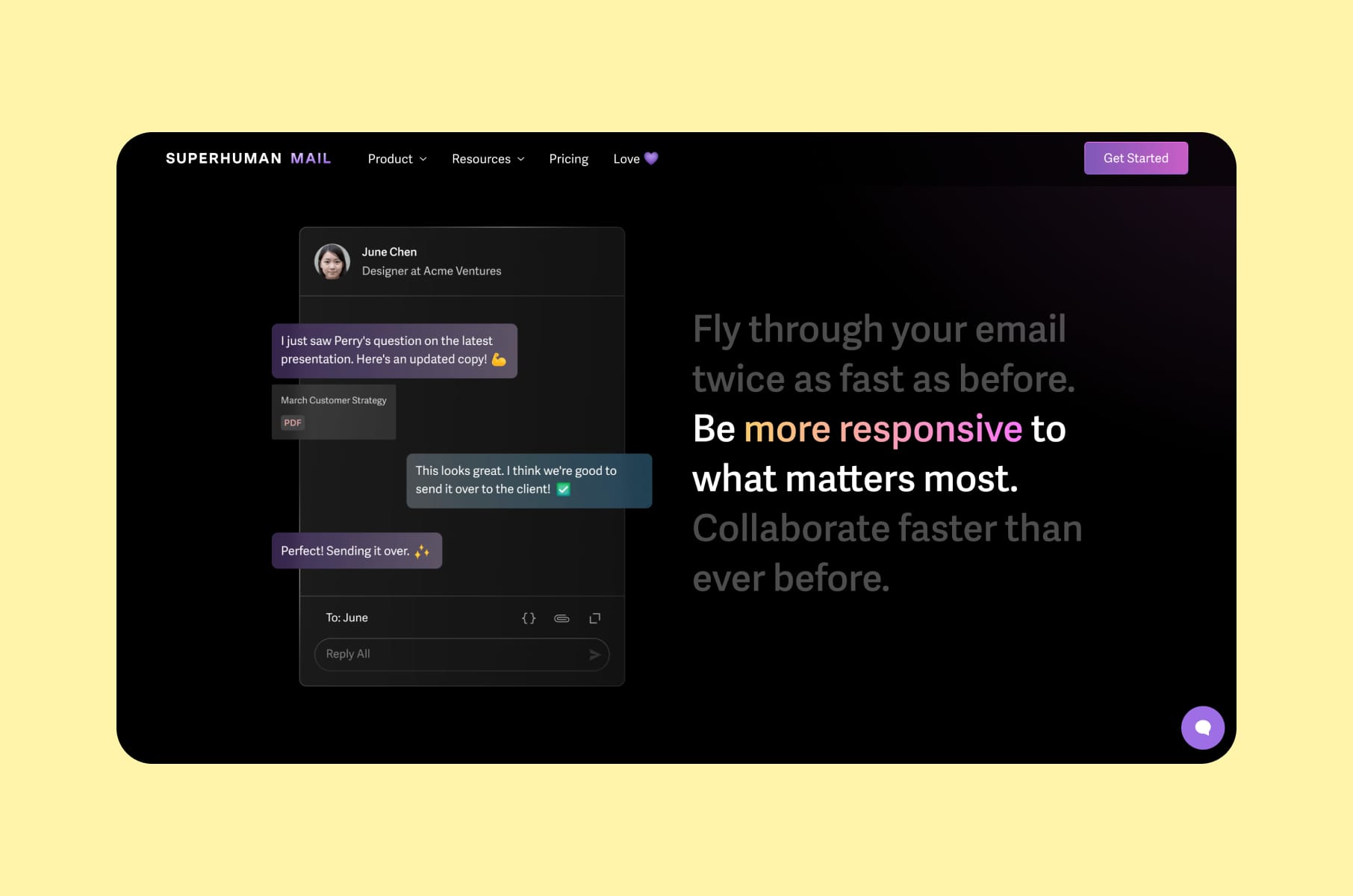
How scarcity and delight drove an $825M acquisition
We wrote about Superhuman and their onboarding experience in one of our previous articles. Now, let’s look at their broader user experience, particularly their Mail tool.
Superhuman overview
So, Grammarly acquired Superhuman in July 2025. At the time, Superhuman was generating roughly $35 million in annual recurring revenue and had doubled its growth rate year over year. The parent company was subsequently rebranded to Superhuman - a signal of how much brand equity the email product had built through UX/UI best practices alone.
100ms rule
The foundation of Superhuman's UX is what they call the 100ms rule. Every interaction in the app - opening the inbox, switching views, composing a message, sending a reply - must respond in under 100 milliseconds. That's the threshold where an interface feels instantaneous to the human brain. Most email clients fall well short of this benchmark.
Keyboard-first design is Superhuman's other defining choice. The team's core belief is that keyboard shortcuts are fundamentally faster than mouse-based interfaces. The Cmd+K command palette acts as the universal accelerator. This opinionated approach attracts exactly the right power users and filters out everyone else - and that selectivity is intentional.
“Flow state”
Superhuman also explicitly designed for "flow state" - the mental state of full involvement and energized focus. The composer fades away the distracting UI elements. The interface minimizes visual noise at every turn. These are UI/UX best practices that prioritize how the user feels during use, which matters more for retention than feature count.
Instead of tooltips or product tours, Superhuman invested in personalized onboarding calls. A real human walked every new user through the product, ensuring they extracted value immediately and could justify the $30/month premium. This investment in user onboarding design paid off dramatically at the company level.
Proof of the UX strategy
Grammarly's CEO had been a Superhuman user since 2017, hitting inbox zero every week for 144 weeks straight. The product literally sold itself to its eventual buyer.
4. Todoist
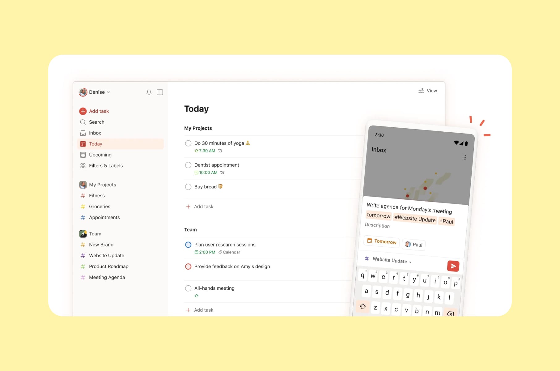
Simplicity as a retention strategy
Todoist overview
Todoist has processed over 2 billion tasks and serves more than 50 million users. It's built by Doist, a fully remote, bootstrapped company of about 100 people distributed across 40 countries.
The core philosophy
Todoist does one thing - task management - and does it better than almost any competitor. The company calls this approach "calm productivity," and it shows in every design decision. The product never tries to be more than it needs to be. There are no unnecessary features competing for attention, no bloated sidebars, no feature-of-the-week distractions.
Natural language input is one of the clearest examples of invisible UX in any productivity app. Type "call dentist every Tuesday at 3 pm," and Todoist automatically parses the due date, recurrence, and task name. The details are entirely hidden behind simplicity.
This is a lesson from the so-called best practices in UX design textbook that too many SaaS products ignore: your most advanced features should feel effortless to the people using them.
Onboarding
Todoist's onboarding approach is another case study in design best practices. The product uses its own to-do checklist for user onboarding - the product teaches itself by being itself. Minimal steps, no tutorial overload, no separate onboarding layer that feels disconnected from the actual experience. This kind of self-referential onboarding is a strong example of SaaS product design done with restraint.
Consistency
Cross-platform consistency rounds out Todoist's retention strategy. The experience feels identical on web, mobile, and desktop. Users can switch devices mid-task without relearning anything. This reduces friction across every context and creates platform lock-in through reliability.
The growth lesson
Todoist's free plan is genuinely usable and does not artificially cripple core features. The Pro upgrade feels like a natural and frictionless step, which is a best UX practices principle that too many SaaS products get wrong by gating essential functionality behind paywalls.
5. Figma
How multiplayer collaboration became a growth engine
We also mentioned Figma and its action over explanation onboarding style in our recent piece on the best onboarding UX.
Figma overview
Figma's revenue surged from $4 million in 2018 to over $1 billion in full-year 2025 guidance. The company IPO'd on the NYSE in July 2025 after Adobe's $20 billion acquisition attempt was blocked by regulators. Figma now counts 13 million monthly active users and is used by 95% of the Fortune 500.
Collaboration as value
The key UX best practices decision that drove all of this? Making collaboration free. Designers could invite developers, PMs, marketers, and executives without hitting a paywall. As more people joined a project, the value of Figma grew for everyone. The product spreads itself because every invite adds value to the person who sent it.
Browser-first
Going browser-first was a deliberate UX decision, too. No installs, no file versioning, no "which version is the latest?" confusion. By removing every possible barrier to entry, Figma made it trivially easy for the first person on a team to pull everyone else in. This is how UX UI best practices translate directly into acquisition numbers.
Community
The Figma Community - templates, plugins, design systems, and UI kits - turned users into contributors. When someone found a useful resource in the community, they would often start using Figma themselves. Creators got visibility, new users got value, and Figma got growth without spending on acquisition. This community flywheel is one of the reasons Figma appears on lists of best-designed SaaS products.
Progressive disclosure
Progressive disclosure ties Figma's UX together. The tool starts simple for a solo designer sketching wireframes, then reveals design systems, Dev Mode, and enterprise features as the user and their team grow. Net Dollar Retention stands at 132%, meaning existing accounts keep expanding year after year.
6. Raycast
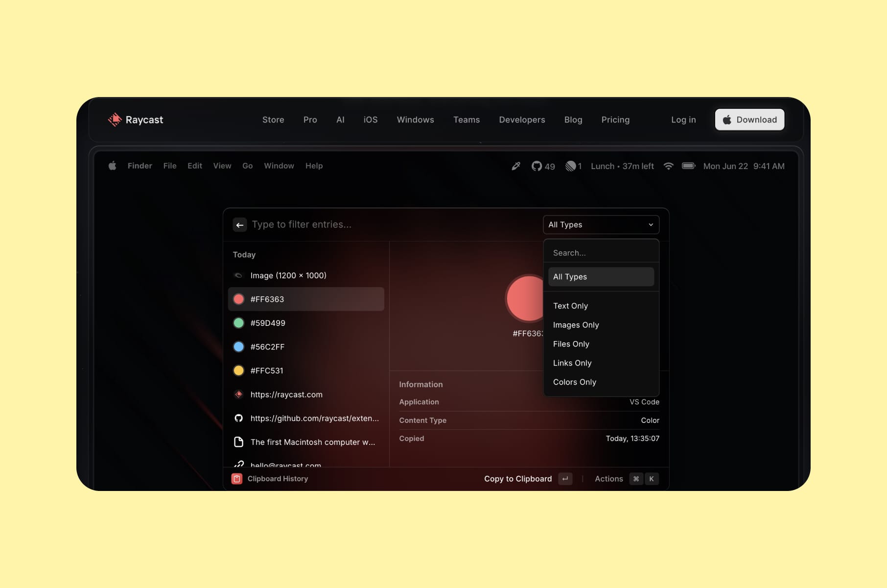
An extension ecosystem that turns users into co-creators
Raycast overview
Raycast is a keyboard-first productivity launcher for macOS that replaces Spotlight with a command bar integrating with GitHub, Slack, Notion, Linear, and Jira.
The product reports hundreds of thousands of daily active users, a community of more than 20,000 developers building extensions, and over 1,000 third-party integrations. Raycast has raised $47.8 million total, including a $30 million Series B led by Atomico in 2024.
Speed as value
Speed is the core UX value here - similar to what we saw with Superhuman and Linear.
Raycast is built as a native Mac application with heavy emphasis on responsive UI and precise interactions. The founders, two former Meta engineers, left Facebook to solve a pain point they encountered daily: constant context-switching between tools. They built Raycast for themselves first, then opened it up.
Raycast extensions
The extension ecosystem is what makes Raycast's growth story unique. Community members build and distribute extensions that expand the product's value for every user. This creates an ecosystem moat: the more extensions exist, the more indispensable Raycast becomes. This UX best practice of turning users into co-creators mirrors the same pattern we see in Notion's template gallery and Figma's community - and it generates product development at zero marginal cost.
7. Slack
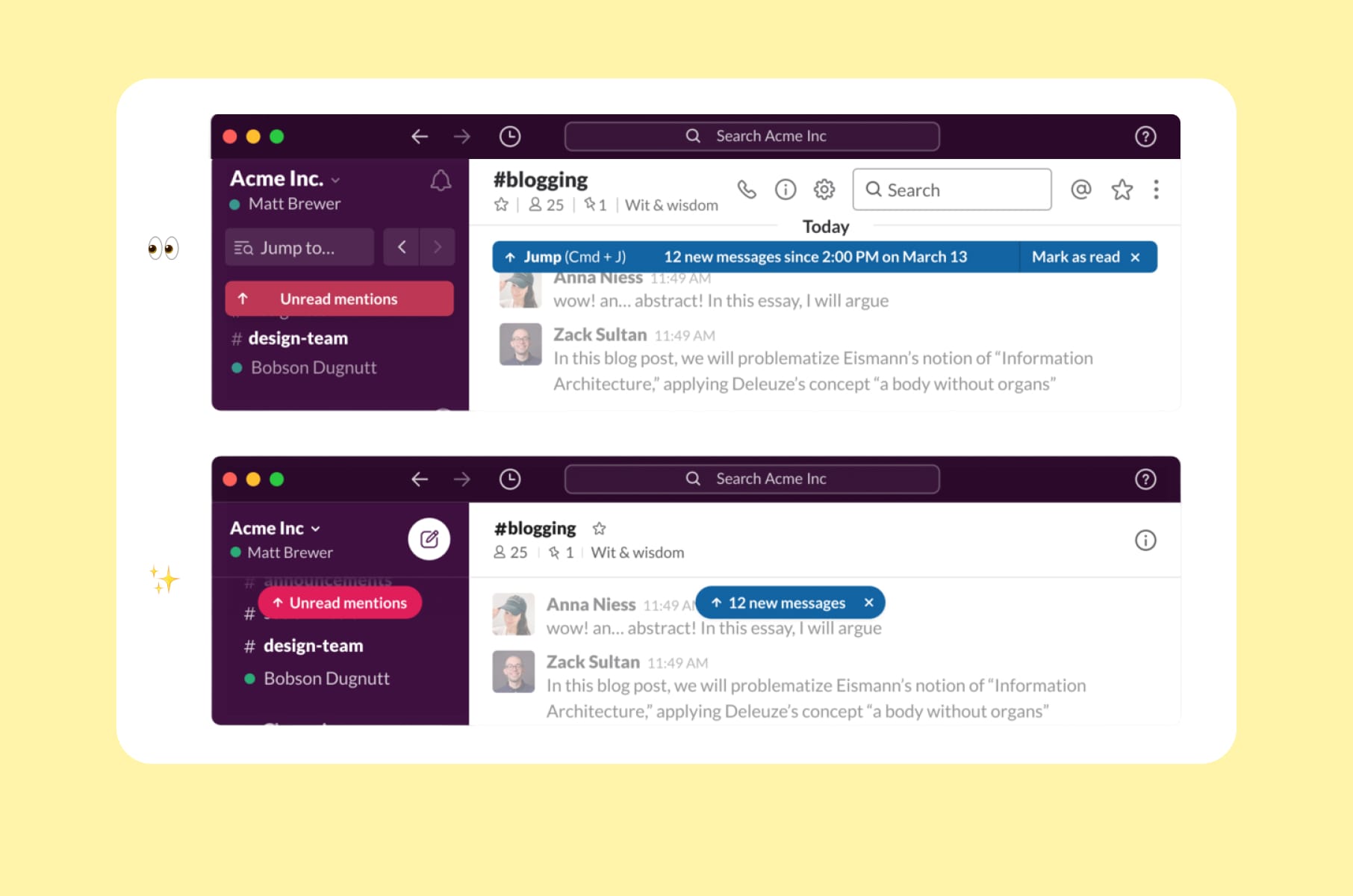
Designing habits with UX best practices
Slack overview
Slack imposed a structure on workplace communication - channels, threads, reactions, and integrations - that trained entirely new organizational behaviors. Channel-based messaging was initially controversial, but it created the kind of network effects that make a product irreplaceable once adopted. By the time Salesforce acquired Slack for $27.7 billion in 2021, the app had become the default communication layer for tech companies worldwide.
Micro-interactions
The micro-interactions ("micro-delights") in Slack are worth studying as UI/UX best practices in action. Custom emoji, playful Slackbot responses, loading messages like "You look nice today," and witty onboarding copy turn a work tool into something that feels human. These details build emotional attachment that drives retention much better than a comparison table ever can.
The network effect
The network effect loop is designed into the UX. The more people in your organization use Slack, the more valuable it becomes for each individual. Slack's onboarding makes inviting teammates frictionless, and the value of adding each new person is immediately obvious. This kind of UX-driven growth loop is a pattern every B2B SaaS product should study.
Integrations
Integration as a UX strategy deserves its own mention. By positioning itself as the hub connecting Google Drive, Jira, GitHub, Salesforce, and dozens of other tools, Slack became the place where work happens. This is a top UX design practice that increases switching costs with every new integration a team adds.
Growth lesson
Design for habit formation. When your product becomes the first thing people open in the morning, no competitor can dislodge it. The companies that understand this invest heavily in UI/UX design services that go beyond functionality and into behavioral design.
What these UX best practices mean for your SaaS product
The patterns from these seven products nicely form a clear playbook for SaaS founders and product leaders.
Layer your complexity the way Notion does. Serve beginners and power users with the same interface by progressively disclosing features.
- Start simple.
- Let depth emerge as users grow.
Notion's four user archetypes prove that a single product can satisfy very different needs if the layers are well designed.
Be opinionated about your defaults. Linear and Superhuman both prove that prescriptive design reduces onboarding friction and creates a distinctive product identity. Fewer choices can mean a better product when each remaining choice is the right one.
Obsess over performance. Superhuman's 100ms rule, Linear's engineering cadence, and Raycast's native-first architecture all point to the same conclusion: perceived speed is an emotional experience. The product feels alive when everything responds instantly.
Do one thing exceptionally well. Todoist's disciplined focus on task management without feature bloat and without chasing trends, and it has kept it relevant for over a decade. Depth of execution beats lots of features for long-term retention.
Make collaboration the product itself. Figma and Slack both demonstrate that when your product gets more valuable with each new user, growth becomes self-sustaining. Free collaboration tiers lower the barrier to entry and let the product spread within organizations.
Turn users into co-creators. Raycast's extension ecosystem, Figma's community, Notion's template gallery, and Todoist's shared project lists all generate product development at zero marginal cost while creating an organic acquisition channel.
Focus on what feels good. Across all seven products, the interactions that users remember and talk about are the ones that feel considered, fluid, and intentional. Speed, simplicity, micro-interactions, and visual polish all contribute to a product people want to use and recommend. This is the connective thread behind every UX best practice in this article: prioritize how the product feels, not just what it does.
If you're building a SaaS product and want these best practices in UX design applied to your own product, working with an experienced SaaS design and development team can compress years of iteration into focused, research-driven design sprints. The products in this article prove that investing in UI/UX design services is one of the highest-ROI decisions a SaaS company can make.
FAQ
What are UX best practices?
UX best practices are repeatable design principles and patterns that improve how users interact with a product. They cover information architecture, onboarding flows, interaction speed, accessibility, and visual hierarchy. The best UX practices are grounded in user research, validated by real-world product performance, and adapted to specific audiences and use cases.
What is the difference between UX and UI best practices?
UI UX best practices overlap significantly, but UX focuses on the overall experience - task flows, information architecture, usability, and research - while UI focuses on the visual and interactive layer: typography, color, spacing, button states, and motion design. The strongest products, like the ones covered in this article, treat UI/UX best practices as inseparable because how something looks directly affects how it feels to use.
How do UX best practices affect business growth?
Every company in this article grew primarily through product quality. Linear reached $1.25 billion with zero ad spend. Figma hit over $1 billion in revenue through product-led growth. Superhuman's UX quality drove an acquisition by Grammarly. Applying UX best practices reduces churn, increases word-of-mouth referrals, and drives organic adoption - all of which directly impact revenue and valuation.
Where should I start applying UX best practices to my SaaS product?
Start with onboarding and core task speed. These two areas have the largest measurable impact on activation and retention. Then move to progressive disclosure and collaboration features. If you need help implementing design best practices across your product, a specialized product design agency can audit your current experience and identify the highest-leverage improvements.
Why do productivity apps have the best UX?
Productivity apps compete in a space where the product is the entire value proposition. There is no content library, no social graph, no data lock-in to fall back on. If the UX is bad, users leave - often within the first session. This competitive pressure forces productivity apps to apply UX/UI best practices with more rigor than almost any other software category. That's what makes them such useful case studies for any SaaS design and development effort.