0
Table of Contents
Secrets of the investor-ready pitch deck design
Is your deck investor-ready? Just know that most investors decide its fate in about four minutes.
Is your deck investor-ready? Just know, most investors decide its fate within about four minutes.
Why do you think truly good companies lose rounds they should have won? Is it because the business was actually weak? No, quite often it's because the pitch deck design didn’t clearly show the proof or muddled the story, and it signaled "first-timer" in small but meaningful ways.
This guide is for SaaS and fintech founders raising from a seed round to Series B, and even for the product owners who might inherit the deck two days before a partner meeting.
As a UX design agency, we've been crafting products, brands, and investor materials at Merge for years. We know the moves that will make a deck read as fundable. We also see many consistent patterns and the same mistakes.
Below, you’ll learn what "investor-ready" actually means, along with the best design moves and, of course, the red flags.
If you've read our take on why product design isn't just pretty screens, you already know our bias that design is a decision-making tool.
What "investor-ready" actually means
"Investor-ready" really is a checklist, and investors run it whether they say so or not.
We know there are eight signals VCs look for:
- A capable team.
- Clear problem-solution fit.
- Defensible tech.
- Early traction.
- A route to market.
- A realistic market.
- A credible business model.
- And a coherent fundraising story.
"Investors are looking for a credible story, not perfection".
You don't need a million in revenue or a full exec team to be fundable. You need progress, honesty, and a deck that makes both obvious fast.
On the deck itself, the bar is more of a set of 12 sections VCs expect to see, roughly in this order: company purpose, problem, solution, market size, why now, product, competition, traction, team, business model, financials, and the ask.
Here's the table explaining which section has which job.
Slide | The one job it has to do |
Company purpose | Say what you do in one line a stranger gets on the first read |
Problem | Make the pain feel real and expensive |
Solution | Show how you remove that pain, not every feature you've built |
Market size | Prove the prize is big and that you did the math |
Why now | Explain the shift that makes you inevitable today, not five years ago |
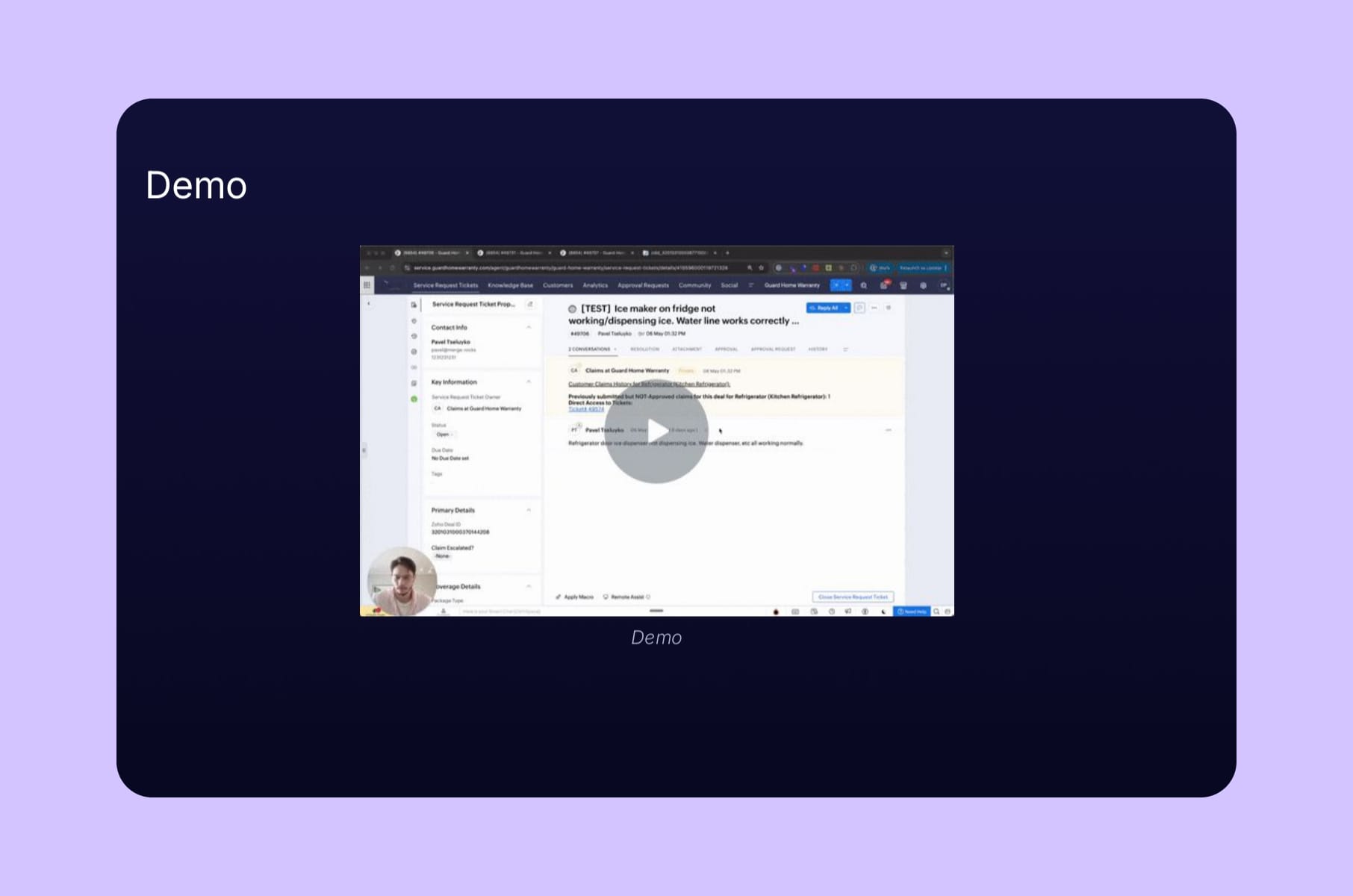
Product | Show the thing working (screens, not adjectives) |
Competition | Position honestly, don't pretend you have none |
Traction | Lead with your single strongest number |
Team | Explain why this team wins this specific race |
Business model | Make the money logic obvious |
Financials | Show you understand your own unit economics |
The ask | Name the amount, the use, and the milestones it buys |
The best startup pitch decks just cleanly execute every row. Here’s how you do that.
Design for the four-minute skim
According to DocSend, the average investor spends 3 minutes and 44 seconds on a deck, and only 58% of decks get viewed all the way to the end.
Basically, nearly half of investors never reach your closing ask.
Four minutes across fifteen-plus slides is a skim, not a read (call it ten to fifteen seconds a slide). Investor-ready design means every slide makes the intended impact in that window.
You can even see where each second goes, which tells you exactly which slides deserve the most attention from you.
Deck section | Time investors spend | What to do about it |
Business model | 64 seconds | Longest look. Make the money logic dead simple. |
Product | 59 seconds | Show it working. This is where real screens earn their place. |
Traction | 40 seconds | Skimmed fast, judged hard. One headline metric, not a table. |
Team | 38 seconds | Less dwell than founders expect. Keep it tight. |
Financials | 37 seconds | More scrutiny than the time suggests. Credibility over optimism. |
The ask | 32 seconds | Don't waste it - name a number and what it buys. |
We noticed that business model and product get the longest looks. That’s because investors want to read how you make money and what you've built. So give those two slides room to breathe and don't crowd them out.
One more interesting finding. Apparently, investors spend 80% more time evaluating the traction of companies that didn't raise. When your traction slide makes them squint and re-read, that extra attention is a warning sign.
Clarity is what you need.
The best pitch decks are built to survive a skim and reward a closer read.
Make every slide title a takeaway
Stop titling slides with categories. Title them with the point instead. That will instantly separate an investor-ready deck from an amateur one.
Ben Yoskovitz, who reviewed 50 real decks, said on his Focused Chaos Substack:
"A strong headline isn't a label, it's a point of view."
So instead of a slide called "Product Overview," say, for example, "We cut fraud review time by 90%." Instead of "Market," name it "A $4B market that nobody has built for mobile-first."
Linear's deck is a good example of this. Every slide runs a small section label, then one assertive claim as a full sentence:
- "Your current issue tracker feels like a chore to use."
- "A tool that nobody likes using is not a useful tool."
- "A tool your team will actually enjoy using."
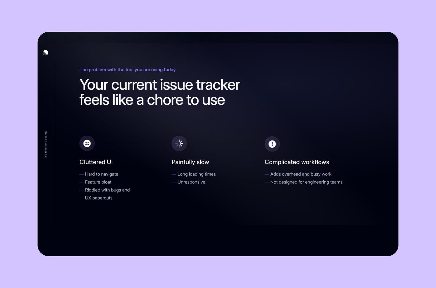
A skimming investor who reads only your slide titles should still get the whole argument.
This is also where narrative does its work. A great pitch has a spine, a reason each slide follows the last, and takeaway titles are how you make that spine visible in a skim.
There’s a good framework: name a big change in the world, show there'll be winners and losers, tease the promised land, then present your product as the way to get there. The reasoning behind it is that "when you highlight a shift in the world, you get prospects to open up". So, lead with that shift (a new behavior or a new piece of tech), not with "we do X."
We’d like you to use this contrast - the tension between where your customer is stuck now and where they could be. Good pitch deck design creates that tension visually, and a good title names the payoff.
Front-load your traction
The old advice to save traction for last slides is no longer relevant.
If you've got proof, bring it forward because now investor-ready decks lead with evidence.
Traction should open with a single headline metric (ARR, GMV, active users, whatever best captures momentum) and two or three supporting proofs underneath. What investors are buying is the trajectory. It’s much better to show a chart with a clear axis than a table of raw numbers.
Market sizing is where it’s really easy to lose credibility.
This red-flags post suggests avoiding the cliché diagram of two or three intersecting circles or throwing in statistics you haven't researched. A small, defensible number is better than an inflated one. What happens if you can't back up when the questions start?
Financials get a lot of scrutiny. Investors want a model that shows you understand your own unit economics, such as what a customer costs to acquire and how the money actually flows.
For example, this is the kind of clarity we like to focus on in our dashboard design services. Turning messy numbers into a chart a non-financial person reads in five seconds is the whole job.
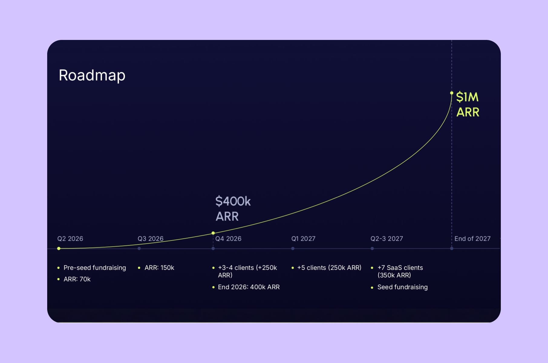
And don't forget the roadmap slide. Investors read it as "what does my money buy." Keep it to a clean timeline and tie milestones directly to the round. Three or four dated milestones tied to real outcomes (ship this, hit that number, reach the next segment) tell an investor you know what "done" looks like. We have a very similar prioritized thinking during product design discovery.
Show the product
As you saw, the product section gets the second-longest look from investors, so it might be the easiest place to build belief. Or lose it, too. The mistake we see most often is founders describing their product in bullet points with just features when they could just show it.
You can have real screenshots and clean mockups - for example, A three-frame sequence of: user lands here, does this, gets that result.
DocSend's 2026 guidance recommends a step further for AI and data products - a screen recording of your outputs or accuracy is far more convincing. Just don't use messy screenshots. If the actual product screen is too complicated to quickly read, design a simplified version.
This is where that "one idea per slide" is actually nice, especially for SaaS teams, because the product slides double as a preview of your actual product work. An investor looking at a clean product visual is already forming an opinion about whether your real interface is any good.
In our SaaS design agency experience, the best-looking pitch decks aren't crammed with information - each slide has one obvious job, and the product looks like it came from the same company as the deck. Because it did.
Nail the ask slide
The ask slide is the one most founders fumble, and investors notice.
TechCrunch said:
"Having a poor 'ask and use of funds' slide is a huge red flag to many investors."
And we agree. If it gets about 32 seconds of attention, it has to do a lot of work in a small space.
Get four things right:
- Name a specific dollar amount, not a range.
- Show a high-level use of funds (product, hiring, go-to-market).
- Tie the money to milestones instead of runway.
- Leave your valuation off unless you already have a lead.
To size it, figure out what you need to prove to raise the next round, cost it out, then add a 30-70% buffer.
For instance, you can put the total you're raising in bold at the center of the slide so it's the first thing investors see, and round it. The current market norm is 18 to 24 months of runway, and every dollar should map to a milestone on the path to Series A.
Keep it consistent
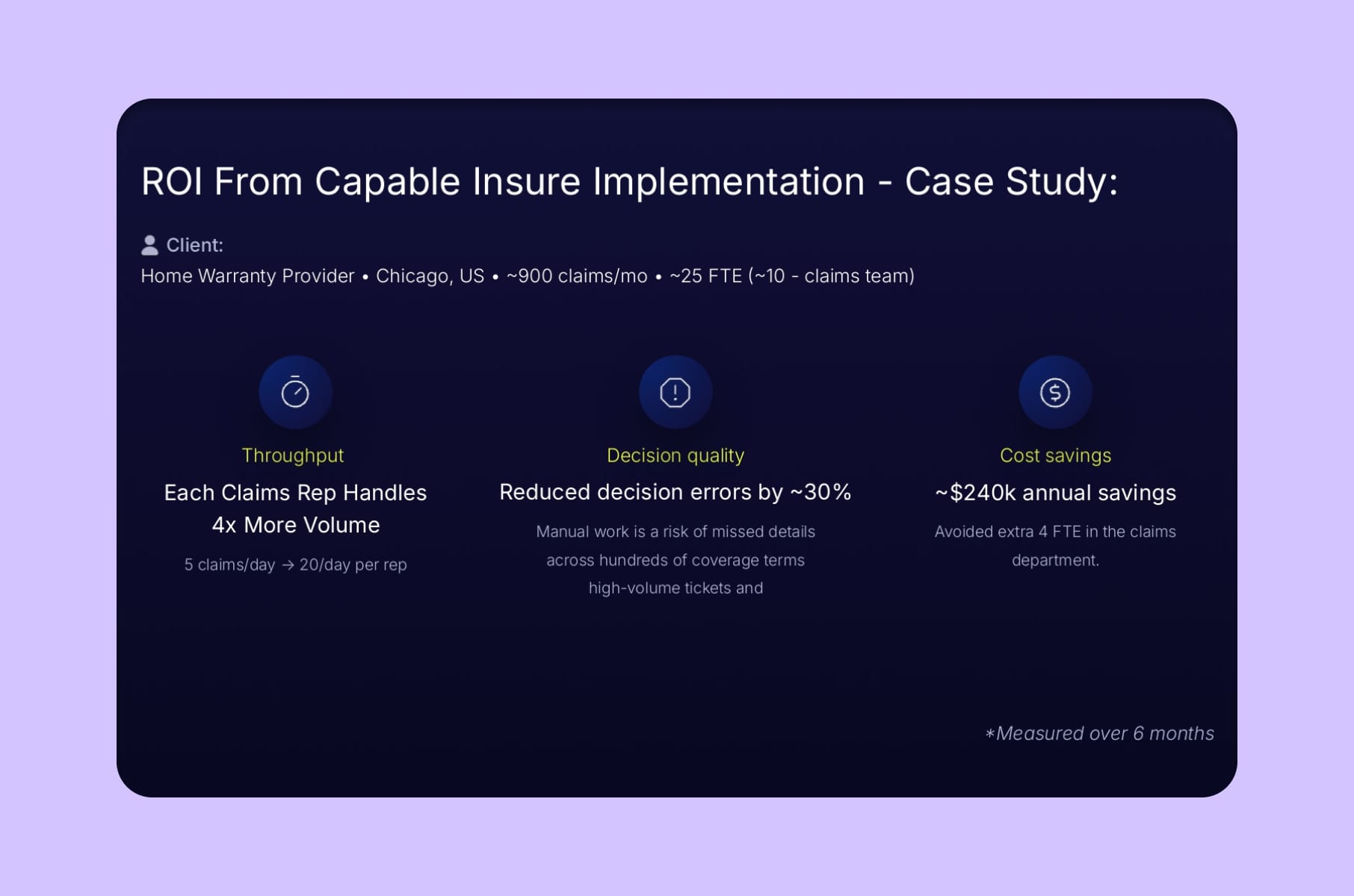
Consistency is the most underrated lever in pitch deck design. Same fonts, same color palette, same spacing, same chart style across every slide (basically, one visual language).
When a deck is visually consistent, the investor's brain stops noticing the design and starts absorbing the content. When it's inconsistent, attention gets pulled to it instead of the story.
A coherent deck also suggests a team that operates coherently, which is the same principle we write about in our guide to brand identity design for startups - a brand is the accumulated evidence that you're deliberate.
For fintech founders, this is especially true. Trust is the entire product in financial services, and a sloppy deck undercuts a trust pitch before you've said a word. A deck that feels precise and considered does real work on investor confidence, which is exactly what we bring to fintech app design and development.
If you want to see where fintech design goes wrong, our piece on fintech UX anti-trends covers the patterns to avoid.
And for an example, check out our case study for Test Ettir, a home health-test startup that needed to validate their idea for investors. We built their brand identity and site from the ground up so everything an investor might touch told one consistent and credible story.
The red flags
So what actually gets you rejected? Often it's not the business. Our team has collected a handful of tells that show an amateur rather than a confident founder.
Amateur tell | Why it hurts | The fix |
Buzzword soup ("disruptive," "revolutionary," AI everywhere) | Overusing "AI/ML," "cloud," "blockchain" is a red flag | Say plainly what you do and what it replaces |
Claiming AI or other feature you don't have | It will come out later, most likely in the verification process (due diligence), and kill the fundraise. | Only claim what survives a technical review |
A vague or missing ask | TechCrunch calls a poor ask slide "a huge red flag" | Specific amount, use of funds, milestones |
No "why now" | Yoskovitz found 75% of decks skipped it | One slide on the shift that makes you timely |
Phoned-in go-to-market | ~40% of decks skipped or faked GTM, and a bare list of channels "is not a strategy" | Name channels with numbers and sequencing |
Typos | More than a third of decks had them - reads as careless | Proofread, then have someone else proofread |
Selling to five personas at once | "You don't get extra credit for optionality. You get funded for focus." | Pick your sharpest wedge and lead with it |
Every one of these makes an investor trust you a little less, and trust is the currency you're raising on. A cluttered or embellished deck just says that you don't care about the details.
Proof this works: Charta Health raised $8.1M into an AI-saturated market with a deck that used no generic AI language at all - it framed the product as newly possible because of LLMs rather than newly branded, and kept every slide scannable. Its founders had also spent a year earning medical-coding certifications before building.
Borrow a proven structure, and keep it short
Lastly, structure. Everybody seems to love to reinvent the deck structure. We would advise against it.
The templates VCs recognize exist because they match how investors read, and fighting that just adds friction. Pick one of the three most trusted ones and move on.
Framework | The rule | Best for |
10 story beats: purpose, problem, solution, why now, market, competition, model, team, financials, vision | Founders who want a narrative order investors already know | |
10 slides, 20 minutes, no font under 30 points | Anyone who over-stuffs slides and needs hard discipline | |
Legibility, simplicity, obviousness - readable from the back of the room | Seed founders who need a clean reading deck |
Interestingly, in the 10/20/30 rule, for example, their "no font smaller than thirty points" advice is quite useful, because if your text has to be 30-point, you physically can't cram a lot of copy onto a slide.
A few insider moves from Merge
Most deck advice stops at "keep it simple." Fair enough, but a handful of moves from our pitch deck design services separate repeat founders from first-timers (the stuff you learn by having raised before). Here's what we would recommend:
- Build two decks, not one. The deck you email and the deck you present are different. The send deck stands alone and carries more text because you're not there to narrate it. The live deck is a visual sidekick. Here’s an explanation of why you need both, and why mixing them up makes many emailed decks feel either bare or bloated.
- Use the appendix as your Q&A safety net. Put detailed cohort data, deeper financials, and edge-case answers in appendix slides after the ask. Your main deck stays lean, and when a partner asks a sharp question, you flip to a slide that already answers it.
- Run the "so what" test on every slide. If a title could sit on any company's deck, it's wasted space. Rewrite it as the takeaway.
- Redact sensitive metrics in the outreach deck. For cold outreach, it's fine to blur your most sensitive numbers and save the full data for the room. It protects you and creates a natural reason for the follow-up.
- Consider a dark-mode deck if it fits your brand, but don't chase the trend just because. High contrast can read as tech-forward for the right company. It can also worsen legibility if you get the contrast wrong.
All of these are strategy rather than decoration because the best startup pitch decks treat every layout choice as strategic.
We think about investor-facing materials the same way we approached the analytics work for Noviscient, an investment-management fintech where the entire point was making complex performance data instantly believable to the people writing checks.
A few famous pitch deck examples and what they did right
Frameworks are easier to trust once you've seen them executed. Here are a few real ones.
Deck | Raised | What they did right |
Airbnb seed | $600K, closed April 2009 | One claim per slide, capped at three points. Business model in one line: a 10% commission. |
Buffer seed | $500K, 2011 | Traction near the front: 55,000 users, $150K ARR, 97% margins, 40% MoM growth. |
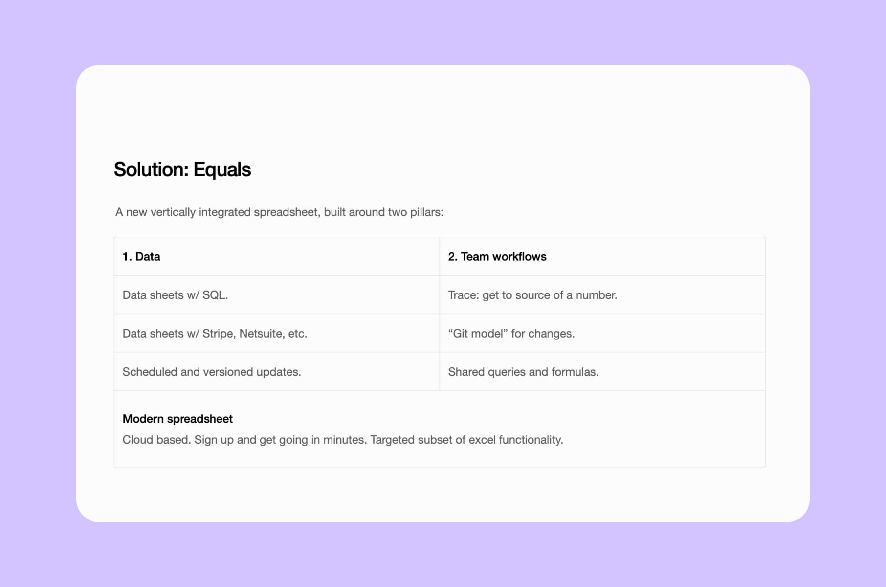
Equals seed | $6.6M, 2022 | A competition slide titled "No one solves these problems," and a founder slide that's pure receipts. |
Charta Health seed | $8.1M, 2025 | An AI deck with no AI buzzwords. Eleven scannable slides. |
Wrap up
At the end of the day, an investor-ready deck is the first working prototype an investor sees - not of your product, but of your thinking.
Every choice in your best pitch deck design effort (the story order, the takeaway titles, the ask slide, whether your fonts even match) is showing whether you, as a founder, can take something complicated and make it clear.
A perfect deck never carried a weak business, though. Every deck worth studying had real traction or a real market. The design makes the case legible - it doesn't invent one.
The good part is none of this needs a huge budget or a famous designer. It needs discipline. That discipline is what separates the best pitch deck design from the merely decorated. If you'd rather not do it alone, that's what we do.
Merge has helped 100-plus SaaS and fintech startups from seed to Series B turn dense products and rough decks into something investors actually finish reading. Whether you're building from scratch or fixing a deck that isn't converting, we can help you make the strategy behind it impossible to miss.
Frequently asked questions about pitch deck design
What makes a pitch deck "investor-ready"?
A deck is investor-ready when it hits the sections VCs expect (purpose, problem, solution, market, why now, product, competition, traction, team, model, financials, ask), communicates each in seconds, and is backed by a data room that substantiates every claim. As SETsquared puts it, investors want a credible story, not perfection.
How many slides should a pitch deck have?
Around 10 to 15. If you're past 30, you're hiding a lack of focus behind volume. Put the extra detail in an appendix.
What do investors look at first?
Business model and product get the longest looks (about 64 and 59 seconds), not the team slide. Investors read how you make money and what you've built before they care about bios, so make those slides the clearest in the deck.
What's the biggest red flag on a pitch deck?
A vague or missing ask slide is one investors call out directly, alongside buzzword soup, unresearched market numbers, and typos. Each one chips away at trust, and trust is what you're raising on.
Should I hire an agency to design my pitch deck?
If your deck is going in front of investors and doesn't yet look like it came from a company worth funding, it's worth getting help. A good pitch deck design service sharpens the story, clarifies the data, and makes the whole company look more credible. That's the work we do at Merge every day.
What are the best pitch deck examples to study?
Match them to your round and category. Airbnb for problem-first structure, Equals or Front for SaaS, Mistral or Charta Health for AI, Brex for fintech. Open three to five at your stage and borrow the logic, not the words.