0
Table of Contents
Fintech UX anti-trends of 2026
Some of these anti-trends are old habits that should have been abandoned in 2022. Learn better fintech UX decisions instead.
If you spend even a few weeks a year reading what users actually say about their banking apps, crypto wallets, and trading terminals on Reddit and social media, the picture you get is rather different from the one most fintech UX presentations like to paint. The polish on the marketing site rarely matches the lived experience inside the app.
We've been doing Fintech UX design at Merge for a while now, and our team keeps running into the same choices that stakeholders are convinced are best practices but that users (and other reviewers) treat as red flags.
Some of these anti-trends are old habits that should have been abandoned in 2022. Others are brand-new mistakes that the AI hype cycle has handed the industry on a silver platter. Either way, they're the kinds of patterns we now actively talk our clients out of when they show up in a design review.
This piece is for product leaders, founders, and design heads at fintech companies (banks, neobanks, crypto, DeFi, payments, insurance, trading) who are trying to decide what not to build next year. Below are the 13 fintech UX anti-trends our team is watching - what created each one, why it's an anti-trend now, and the fintech design version we'd ship instead.
Before we get into the list, a small reminder. If you're new to our blog, we've previously written about bad UX examples from multi-billion dollar products and a teardown of the onboarding experience of Dia, Superhuman & more - both worth a skim if you want our wider take on product UX before zooming into the financial services flavor of it.
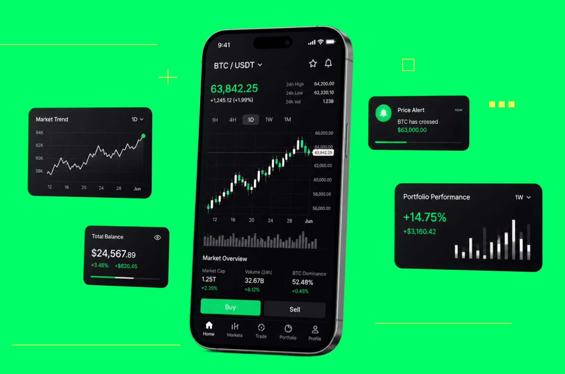
1. Confetti, streaks, and the gamification of investing
Our first anti-trend is also the most expensive one to defend. Robinhood's confetti animation became the symbol of an entire decade of "make trading feel like a game" thinking. The company eventually removed it in 2021 after intense scrutiny, then later agreed to a $7.5 million settlement with Massachusetts regulators over the same tactics.
The underlying instinct never went away. We still see streak counters on portfolios, dopamine swipes for buying options, and "milestone" badges for first trades being designed into otherwise serious investing apps. Behavioral economists have been very clear that this kind of design encourages overtrading and net financial losses for the user, especially among inexperienced investors aged 19-34.
Why is it an anti-trend now?
Because we all (regulators included) stopped treating it as a UI quirk. Massachusetts called it "aggressive tactics to attract new, often inexperienced, investors." The reputational and regulatory risk now diminishes any retention boost. The people who stick around are not the ones chasing confetti.
What we'd do instead at Merge:
We would add design feedback states that reinforce thoughtful behavior as opposed to just frequency:
- A confirmation screen that summarises what just happened in plain language.
- A soft delay before high-risk orders.
- A portfolio view that shows long-term performance rather than today's.
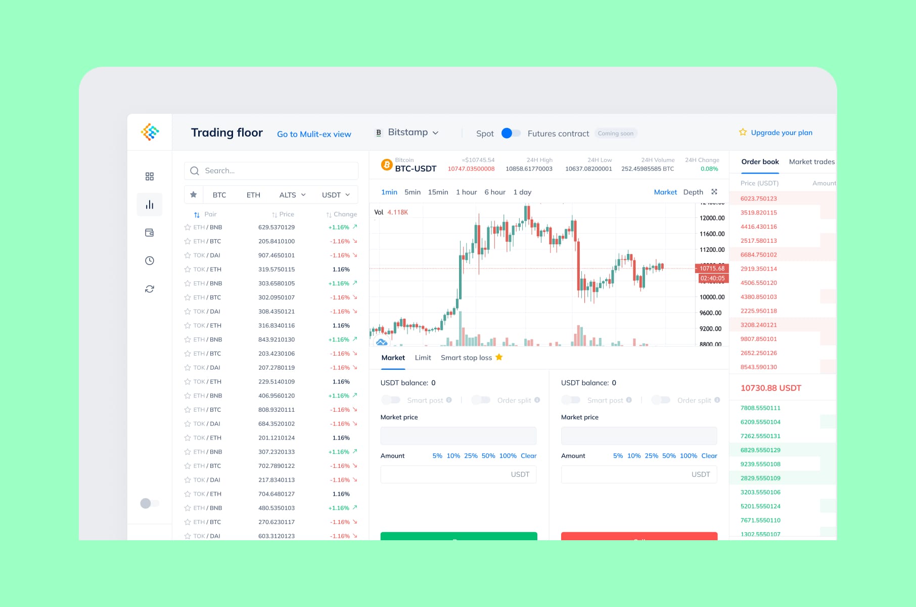
When we worked on the crypto trading terminal called Token Place, the brief was the opposite of casino UX, so we added high-density data, fast keyboard navigation, and no overly celebratory motion.
2. KYC before any value is shown (the onboarding fintech UX trap)
The second anti-trend is the one most founders defend with "compliance made us do it." We sympathize. But look at the data, though. Fintech UX design that hides the entire product behind a multi-screen KYC flow now loses up to 60-68% of applicants to friction, with 70% of financial institutions reporting they've lost prospective clients due to slow or complex onboarding - a number that's risen every year since 2023. The average time before abandonment has dropped from 26 minutes in 2020 to under 19 minutes today.
And that's just the headlines. A meaningful chunk of those people drop off not because they don't want to verify - 38% leave because they don't have the documents handy at that exact moment, and 21% leave because the process simply takes too long.
We understand that KYC is not really an anti-trend - it's a legal requirement, but the UX design choice of wrapping the whole product in it from screen one is the anti-trend.
Here's the drop-off picture in one place:
KYC drop-off stats
KYC onboarding metric | Figure |
Applicants lost to KYC friction | 60–68% |
Financial institutions reporting client loss from slow onboarding | 70% |
Drop-offs because documents weren't handy | 38% |
Drop-offs because the process simply took too long | 21% |
Average time before abandonment (2020 → today) | 26 min → under 19 min |
Why is it an anti-trend now?
Because progressive verification is mature enough that there's no excuse. Open-banking-driven identity, document-free flows, and tiered KYC (where small balances are usable instantly and full verification kicks in only when you actually need it) are widely deployed. Users have seen it work elsewhere, so when your app forces a hard wall on screen two, they assume you're behind.
What we'd do instead:
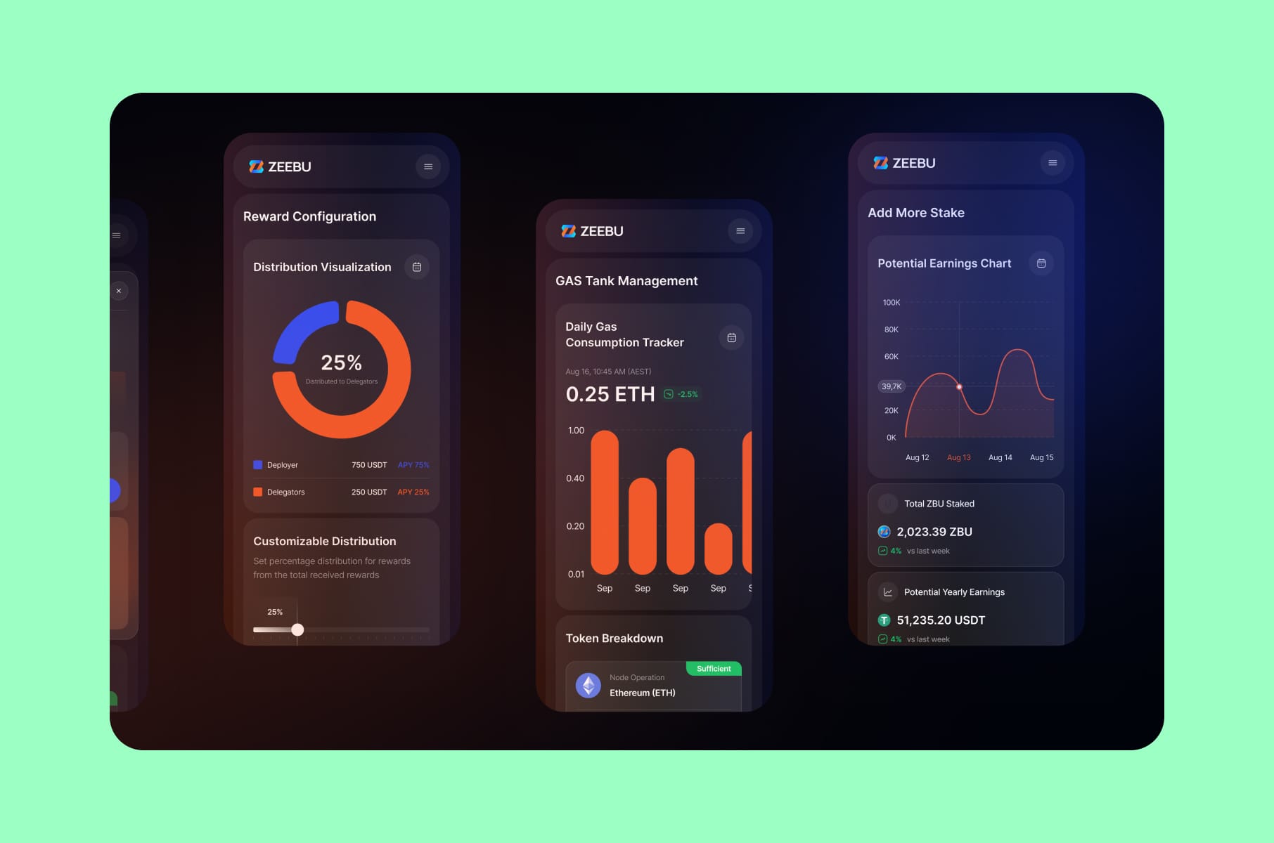
We would let the user see, configure, and even simulate the product before we ask for a passport. For our work on Block Earner's blockchain-based fintech app, and again with the DeFi staking redesign at Zeebu, the principle was the same: show value first, layer in compliance only when the user is about to do something that actually requires it. That one thing can up your first-day activation by 20-30%.
3. Pushing seed phrase responsibility onto first-time users
Third on our list is the one we'd argue is the single biggest reason crypto adoption is stalled at the consumer level. A March 2026 UX analysis found that 65% of users drop off after their first interaction with a DeFi app and that 70% never return after even one transaction. 35% never back up their seed phrases at all, meaning a huge chunk of new wallets are walking-dead.
The convention of handing a non-technical user a 12-word phrase and saying, "If you lose this, your money is gone forever, also don't store it digitally," was always odd. In 2026, it's an outright anti-trend. Embedded wallets, account abstraction, and passkey-based custody have made it trivial to ship a Web3 onboarding that doesn't even mention the word "seed phrase" until the user opts in.
Why now?
Because the alternatives finally work. Account abstraction wallets can sponsor gas, automate execution, and recover via email or social. The agencies still defaulting to "write down your phrase" are essentially building products only their own team will use.
What we'd do instead:
We would design the wallet experience around the user. For example, hide the chain entirely for the first 90 days. The user logs in with an email address, sends and receives in a familiar currency view, and earns yield without ever touching gas. Self-custody mode is offered as an upgrade once they're committed. UX design for fintech in 2026 should treat crypto-native primitives the way Stripe treats card networks - real, but invisible to most users.
4. Drip pricing as a financial UX design choice
Drip pricing, which is the trick of revealing fees one at a time across multiple screens, is now formally a regulated dark pattern in many jurisdictions, and it's quite possibly the most surveyed-against anti-trend in financial UX design today. It's the kind of fintech UX mistake that costs reputations rather than just metrics. A LocalCircles survey found that 64% of online banking users had experienced hidden charges on transactions, drip-fed in after the user had already committed.
Crypto and DeFi are arguably worse. By 2026, most swap interfaces no longer show a single obvious fee - costs are fragmented across gas, protocol fees, routing fees, priority fees, relayer fees, and price impact. A common DeFi support complaint is "the swap worked, but I got far less than expected."
In many cases, the interface technically disclosed everything, but only behind expandable menus or screens users rarely inspect. Cross-chain bridges are particularly bad about this - they show a flat bridge fee up front and then surface validator fees, destination gas, and relayer premiums at the very last step.
Why is it an anti-trend now?
The Reserve Bank of India now requires all banks to eliminate dark patterns by July 2026, with mandatory user-testing and periodic audits. The FTC, EU, and Australian regulators have all moved in the same direction. Drip pricing is no longer a "we'll deal with it if it becomes a problem" item - it's a compliance liability with real fines attached.
What we'd do instead:
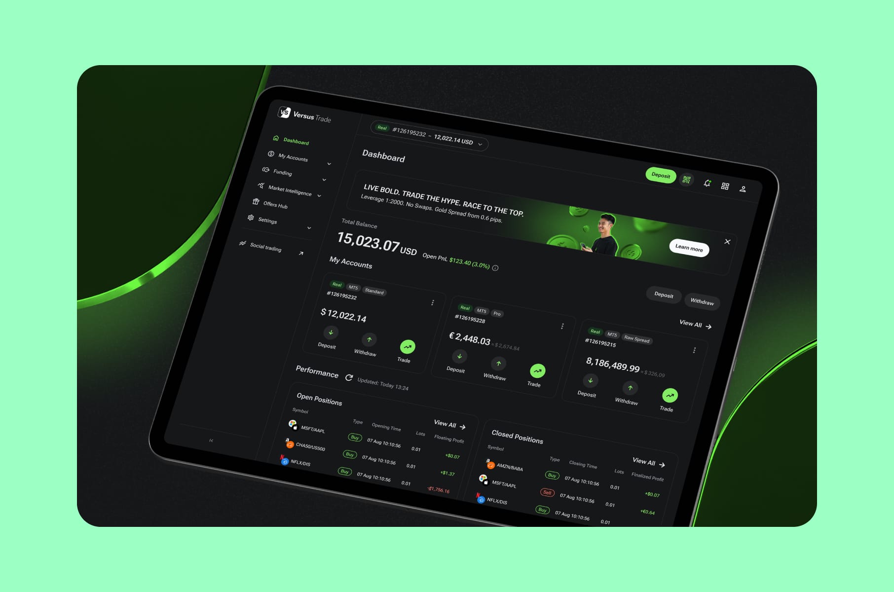
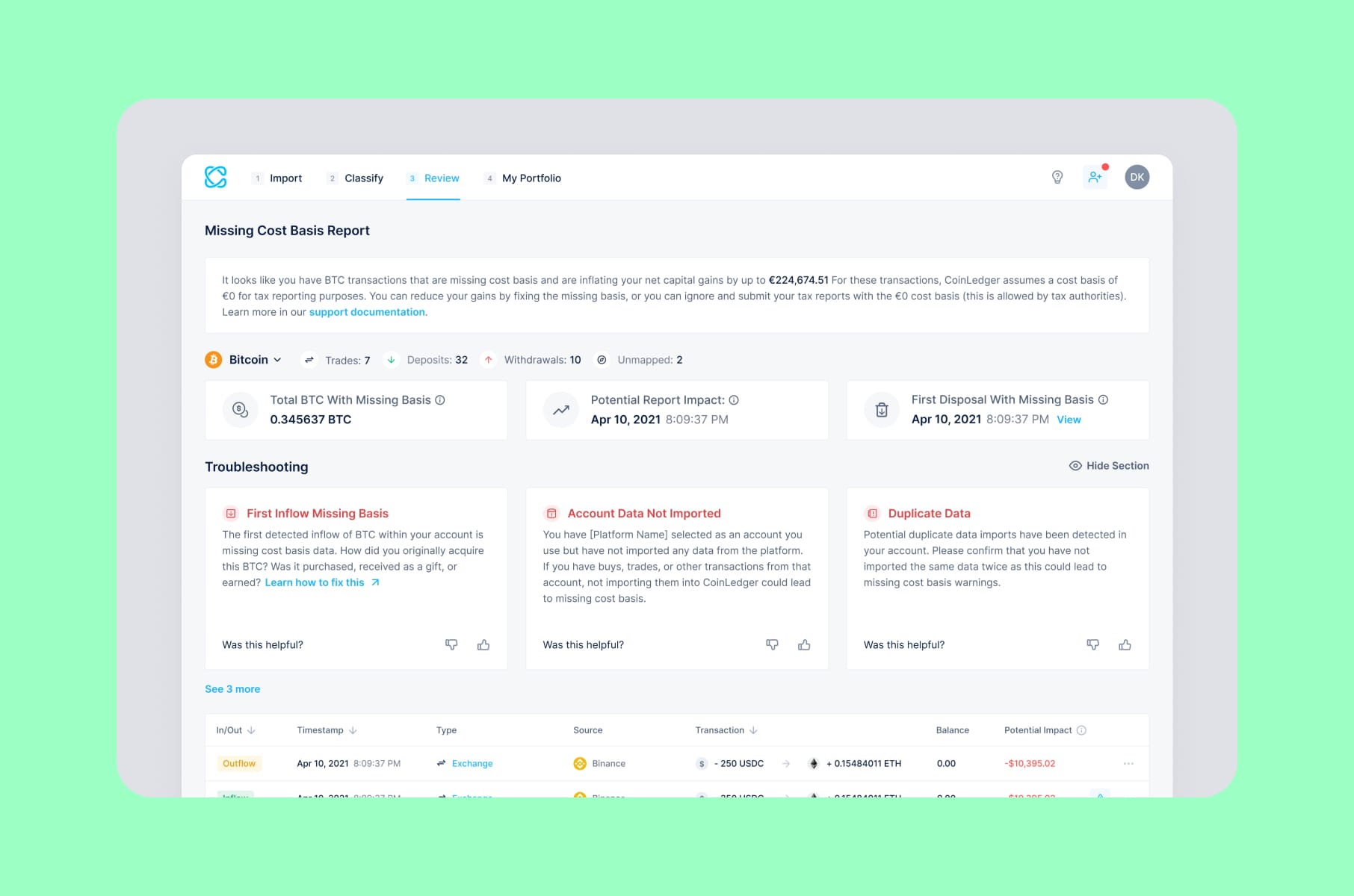
Our Merge team would show the user the all-in number first, then let them expand to see the breakdown. The default state is honesty, the optional state is detail. We use the same principle whether we're working on a DeFi protocol, a CFD broker like our Versus Trade product redesign, or a tax tool like CoinLedger. The user should never finish a transaction and feel like they were lied to by interface design.
5. Subscription “roach motels”
Anti-trend five is the one that regulators are about to make extremely expensive. Subscription traps where signing up takes three taps and canceling requires phone calls, multiple menus, or a "we're sad to see you go" labyrinth, have been called out by the FTC, the RBI, and the EU's Digital Services Act enforcement teams. Fintech apps are particularly exposed because their "subscriptions" are often premium tiers, insurance add-ons, or cross-sold loan products that users barely remember enrolling in.
The standard pattern in many neobanks today is a 30-second sign-up and a 30-minute cancellation. Some apps hide the cancel flow inside support chat, where the bot won't surface it without the right keyword. Substack analyses of deceptive patterns in Indian fintech apps catalog the same playbook across dozens of consumer products: forced action, interface interference, confirmshaming, and obstruction.
Why is it an anti-trend now?
Beyond regulatory risk, this is the single thing most likely to torch your NPS. Users churn anyway, and they remember exactly how the cancel flow felt. "It took me 40 minutes to cancel" is the kind of review that travels.
What we'd do instead:
Cancellation has to be at least as easy as sign-up. We would design a "polite door" consisting of a clear cancel button in account settings and a one-tap downgrade path. We’d also add an honest acknowledgment when the user leaves.
6. AI chatbots
Sixth is the one that exploded in 2024-2025 and is now actively backfiring. Banks and fintechs rushed to put AI chatbots between the user and the support team to cut headcount costs. Two years on, the data is in:
- 80% of consumers who interacted with a chatbot left more frustrated.
- 78% needed to connect with a human anyway.
- 61% of bank customers reach for a human agent specifically because they're unhappy with the bot.
Bank chatbot frustration:
Bank chatbot interaction | Share of users |
Left more frustrated after a chatbot interaction | 80% |
Needed to connect with a human anyway | 78% |
Reach for a human agent specifically because they're unhappy with the bot | 61% |
The interesting part is that the underlying tech is fine. Modern conversational models can accurately answer most balance, transfer, and statement questions. The problem is design. The escalation path to a human is buried, the bot loops you back to the same script three times before admitting defeat, and it never tells you when a human is on the way.
This is not an AI’s fault, though. Turns out, it's a UX failure that was initially a cost optimization.
Why is it an anti-trend now?
Because the Consumer Financial Protection Bureau has taken interest, and the industry framing has moved away from "bots vs. bankers" toward "bots with bankers." If your roadmap still says "replace human support with AI," it's already out of date.
What we'd do instead:
We would design the chatbot with a permanently visible "talk to a person" affordance and a transparent state indicator (i.e., you're talking to a bot / you're talking to a person / a person is reading your transcript right now).
7. Push notification saturation
Anti-trend seven is the one gnawing quietly at your activation metrics. The default behavior in much of today's fintech design is to enroll new users into every notification channel - marketing, transactions, security, balance updates, savings tips, "you got paid!" messages - all on a single binary opt-in.
Reuters Institute research found that 43% of users turn off alerts entirely because they're "excessive or irrelevant." In the financial sector, the average user already gets 13-16 notifications per month from their banking app. Stack a few apps together, and you're basically in “Focus-mode-disable-everything” territory.
Why is it an anti-trend now?
Because iOS and Android both make it trivial to silence an app from the lock screen without ever opening it. Once a user does that, you've lost an extremely valuable engagement channel - permanently, in many cases. A binary opt-in in 2026 is a recipe for users muting you on day three.
What we'd do instead:
A granular preference center that lets the user choose what they want, by category and channel, with:
- Transactional alerts on by default.
- Marketing alerts off by default.
- A weekly digest option for the in-between stuff.
8. "Everything on one screen" dashboards
The eighth anti-trend in modern fintech UI design is the one most banks are guilty of, and most don't realize it. The default home screen for many neobanks and trading apps tries to surface every feature at once. You got balance, the last 14 days of transactions, three CTAs, a chart, a savings nudge, a credit-score widget, an investment teaser, etc. The dashboard is pretty much a feature-list demo for the design review meeting and, unfortunately, a wall of text for the actual user.
The pattern is so common that it's now basically a genre of its own. And it produces choice paralysis. Faced with too many options, users just hesitate or quit without acting.
Why is it an anti-trend now?
Because the bar set by best-in-class consumer apps - the Notions, the Linear, the Superhuman of the world - has made minimalism into a baseline expectation, not a luxury. We wrote a longer breakdown of this in UX best practices we've learned from productivity apps like Notion. Cluttered dashboards now feel old, even if every widget is technically useful.
What we'd do instead:
We would pick one primary action per screen, layer the rest behind a clean information hierarchy, and let advanced users surface density on demand.
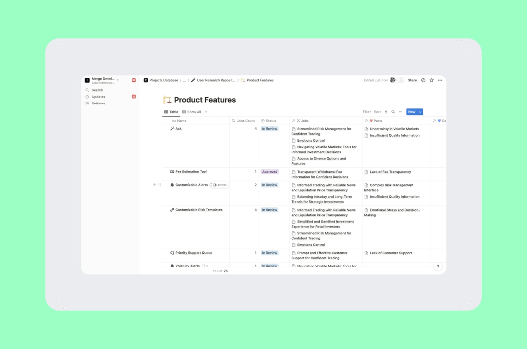
Our work on the user research for a multi-asset trading platform was an example - we explicitly tested what users actually do in the first 30 seconds of opening the app, and stripped everything else off the home view. Financial UX design is one of the few categories where less truly buys you more retention.
9. Glassmorphism and neumorphism dressed as functionality
Anti-trend nine is the visual one. Glassmorphism (translucent layered cards, backdrop blur) and neumorphism (soft shadows, low-contrast embossed elements) had a moment in 2020-2022, and have lingered just long enough in fintech UI design to overstay their welcome.
Both have real problems. Early neumorphic designs frequently failed WCAG 2.2 contrast requirements, and glassmorphism still suffers from text legibility over busy backgrounds. The financial sector is especially vulnerable because it deals with small numbers and dates, which are exactly the kinds of fine detail that demand strong contrast.
Why is it an anti-trend now?
Because purely aesthetic styles fade once they stop solving problems, plus the European Accessibility Act has put even more enforcement behind WCAG compliance for digital products. 71% of users with disabilities report abandoning inaccessible websites - up from 57% in 2017.
What we'd do instead:
We’d treat soft visual treatments as accents, not foundations. Our advice would be to:
- Use glassmorphism for non-critical overlays.
- Use neumorphism for toggles or sliders where the tactile metaphor actually adds something.
- Keep the primary content layer flat, high-contrast, and accessible.
10. AI-generated personalization that crosses into uncanny
The tenth anti-trend is brand new in 2026. The temptation is so high right now in UX design financial services to use AI to personalize almost everything - dashboard layout, marketing copy, product recommendations, even the avatar greeting users by name. While the intent may be fine, the execution often isn't.
Recent research found that 71% of consumers feel "aversion" to generative AI ads, and 88% prefer human models over AI ones. 94% (pretty much everyone, it seems) want mandatory labeling of AI content everywhere.
The uncanny valley is a real problem because users detect when something is almost but not quite right, and the discomfort is not so subtle. Add the privacy dimension (a recommendation that's too accurate signals surveillance), and over-personalization becomes a net negative for any type of trust.
Why is it an anti-trend now?
Because the same labeling rules that govern AI imagery in advertising are coming for in-app personalization. We've written about this in "Why using AI for website copy ruins your brand strategy" - the failure mode is identical within the product.
What we'd do instead:
How about using AI for the boring, invisible things like transaction categorization, anomaly detection, fraud prevention, or smart routing, and keep the visible layer human-written and human-designed? If you use AI to personalize the surface, label it. The user trusting you to handle their money is also trusting you not to manipulate the interface in real time without telling them.
11. The Western "super app" everything-in-one
Anti-trend eleven is more of a strategic one. The idea that a US or European fintech can replicate WeChat or Alipay in a single app has been an industry obsession since 2019. By 2026, the evidence that it doesn't translate is hard to ignore.
The reasons are part regulatory, part cultural. Western users prefer specialized apps for specialized tasks. The data privacy is hostile to the kind of cross-domain data sharing that WeChat is known for. And from a UX perspective, single-purpose apps are faster and easier to navigate than super apps. Bundling a dozen services into one product creates real challenges around hierarchy and brand coherence.
Why is it an anti-trend now?
Well, because multiple well-funded Western fintechs have tried the strategy and have consistently underperformed. The end of the super app dream is being written right now, even by some of the original believers.
What we'd do instead:
We would pick one job, do it remarkably well, and integrate (not absorb) adjacent services through API partnerships. A payments product that surfaces tax data is more useful than a payments product that tries to also be a tax product. Specialization is still the winning move for UX design for fintech in non-Asian markets.
12. Local biometrics treated as identity binding
The twelfth anti-trend is one most product teams don't even realize they're committing. Many banking apps use device-level Face ID or fingerprint as the only check before approving a transaction - treating local biometric authentication as if it proves the original account holder is at the device.
It doesn't. Local biometrics only check against the face or fingerprint stored on that specific phone. They don't compare to the face captured during the bank's KYC. If someone with malicious intent gets the phone and the PIN, they can re-enroll their own face and authenticate a payment. Gartner has flagged the same risk for shared devices.
Why is it an anti-trend now?
Because the threat model is no longer hypothetical. Phone theft with a PIN is a real and growing fraud vector in cities across the US and Europe. Banks that built their entire transaction-authorization UX on local biometrics are now trying to add server-side identity binding.
What we'd do instead:
We’d treat local biometrics as a convenience layer, because UX financial services thinking has to extend to the threat model, not just the happy path.
First, bind identity server-side using either bank-grade biometric matching against the original KYC sample or a passkey tied to a verified identity provider. Then use friction with intent; for example, make low-risk transactions go through silently, while anomalous ones trigger a real check.
13. Finfluencer-style social proof inside serious investing apps
The last anti-trend is the one most likely to be a category killer in 2026. Some trading and crypto apps have started embedding "social proof" widgets - copy-trader leaderboards, scrolling testimonials, follower counts on portfolios, in-app reels of finfluencers explaining their picks. The intent is to drive engagement. The effect is to launder bad financial advice through a UI that looks authoritative.
Some numbers:
- ASIC's 2026 enforcement campaign involved 17 regulators globally.
- India's SEBI flagged 133,000 misleading social media posts in a single fiscal year and is now working with Google to label verified trading apps.
- Yahoo Finance found that people who make decisions based on finfluencer advice are 12.2 times more likely to have been scammed on social media.
Why is it an anti-trend now?
Because the regulations are finally doing something. If your fintech app surfaces influencer-style content, you are increasingly considered a publisher of investment advice - with all the licensing implications that entails.
What we'd do instead:
Replace influencer reels with disclosed, regulated, sourced research. If you want community signal, surface it in aggregate (e.g., "65% of users on this strategy hold longer than 90 days") rather than as personality-driven recommendations. Fintech UI design that borrows the visual grammar of TikTok pays for it in regulatory letters within a year.
A few smaller anti-trends in fintech UX we want to mention
A handful of smaller patterns in fintech UX are starting to age badly. Worth a brief mention in your next review:
- Cookie banners that block the screen with a full-page modal before any content loads. 97% of top sites still use at least one dark pattern in their consent flow, and fintech UX flows are no exception.
- PFM (personal finance management) widgets that show users their data without recommending an action. PFM engagement plateaued at 10-12% for exactly this reason - a classic financial UX design failure.
- Loan and lending apps that drop unexpected charges or "tip" requests mid-flow. The CFPB has actively sued over patterns like these. Honest fintech UI design would never ship this.
- Marketing-heavy "first run" experiences that upsell premium tiers before the user has touched the free product. Almost no first-time users convert off a paywall on screen two, and good UX design for fintech knows it.
Before turning all of this into our own principles list, here's the full set of 13 anti-trends side by side with the design move we'd choose instead:
Master summary: 13 anti-trends vs. what to do instead
# | Anti-trend | What we'd do instead |
1 | Confetti, streaks, gamified investing | Calm confirmation states, plain-language summaries, soft delays before high-risk orders |
2 | Hard KYC wall before any value is shown | Tiered KYC, simulate-before-verify, compliance layered in only when needed |
3 | Seed phrase shoved at first-time users | Embedded wallets with email/passkey login, hide the chain for the first 90 days |
4 | Drip pricing across multiple screens | All-in number first, breakdown on expand |
5 | Easy-on, hard-off subscriptions | Cancellation that is as easy as signing up, one-tap downgrade, and an honest exit |
6 | AI chatbot moats around human support | Always-visible "talk to a person", confidence-based handoff, transparent state |
7 | Push notification carpet-bombing | Granular preference center by category and channel; transactional on, marketing off |
8 | Feature-cram dashboards | One primary action per screen, density on demand for advanced users |
9 | Glassmorphism / neumorphism as foundation | Soft styles as accents only, flat high-contrast primary content layer |
10 | AI personalization crossing into the uncanny | Use AI invisibly for plumbing, keep the visible layer human-designed and labeled |
11 | Western "super app" everything-in-one bloat | Pick one job, integrate adjacent services through API partnerships |
12 | Local biometrics treated as identity binding | Server-side identity binding, friction surgically applied to anomalies |
13 | Finfluencer-style social proof inside investing apps | Disclosed regulated research, aggregate community signal instead of personalities |
How we approach fintech UX design at Merge, summarised
Based on all those previously mentioned dark patterns, our team has composed a short principles list for UX design for fintech:
- Show value before asking for compliance. Tiered KYC and progressive disclosure are mature enough that there's no excuse to wall the product behind a 12-screen onboarding.
- Be honest about money up front. All-in pricing and a single clear total are no longer optional. Regulators have moved, and users moved years before that.
- Treat AI as plumbing, not paint. Use it for fraud detection, categorization, anomaly flags, and routing. Keep the visible layer human-designed and clearly labeled when AI is involved.
- Cancellation has to be at least as easy as sign-up. No exceptions. The retention you save with a roach motel is destroyed by the LTV you lose to chargebacks and 1-star reviews.
- Give users granular control of their inbox and their dashboard. Notification preference centers, not binary opt-ins. One primary action per home screen and density on demand.
- Build accessibility in at the design system level. WCAG 2.2 contrast, keyboard navigation, screen reader labels - all defaulted on, all tested.
- Pick a job and own it. Specialization outperforms super-app sprawl in every Western market we've worked in.
For a deeper read on the studio approach we use to build products around these principles, our fintech design agency service page walks through the discovery, concept, design, and delivery stages we use on every engagement, from neobanks to DeFi protocols.
FAQ
What counts as a fintech UX anti-trend?
A fintech UX anti-trend is a design pattern that was once considered best practice (or at least normal), but that has aged into a liability - either because user expectations changed, because regulators caught up, or because better alternatives became standard. The 13 patterns above all qualify. The common thread is that each one optimizes for a metric (retention, signup rate, support cost) at the expense of trust, which is the only metric that compounds over time in financial UX design.
Are these anti-trends specific to crypto and DeFi, or do they apply to traditional banking?
Both. Some patterns - seed phrase responsibility, drip pricing in swaps, finfluencer-style social proof - are more concentrated in crypto. Others - chatbots, KYC walls, push notification spam, dashboard clutter - apply equally across neobanks, traditional banking, payments, insurance, and trading. UX design for fintech as a discipline across these categories, and the anti-trends spread across category lines faster than the best practices do.
What's the highest-impact fintech UX anti-trend to fix first?
If we had to pick one to fix in the next sprint, it would be the KYC and onboarding wall. The conversion lift from progressive verification, document-free flows, and tiered access is large, immediate, and measurable. The drop-off curve in the first three minutes of any fintech UX design engagement is the single most leveraged thing a product team can move.
Where can I see examples of fintech UI design without these anti-trends?
A handful of our recent case studies are good starting points. The crypto trading terminal UX Token Place, the Block Earner blockchain fintech app, and the DeFi staking redesign at Zeebu each solves a different version of the same fintech UX problem: how to deliver complex financial products without falling into the anti-patterns above.
Our breakdown of the 5 mistakes we keep seeing on SaaS landing pages is the next useful piece.
Wrap-up
Overall, the fintech UX anti-trends of 2026 were all born from a real business pressure (retention, compliance, cost-to-serve, growth), and they all stopped working when the trade-offs became visible to users and regulators at the same time. None of them are technically hard to fix.
Whatever stage you're at, be that early-stage neobank, mature crypto exchange, payments infrastructure, or insurance MVP, the best move in 2026 is to honestly and thoroughly audit your product for these patterns. Pick the two or three that are, in your opinion, the worst, and ship the alternative. Measure what changes. And believe us, the changes will be noticeable, especially in the trust your users have in you.
We at Merge believe this is the most consequential year for fintech UI design since the post-2008 mobile-first rebuild. If you're considering a redesign or building something new, our fintech UX design service is the right place to start. Stay tuned!