0
Table of Contents
The dos and don'ts of brand identity design for startups
Design brand identity as a coordinated system, not a collection of one-off assets.
You need a brand identity from the moment anyone outside your team encounters your company.
For example, did you know that startups with a coherent visual identity are 1.5 times more likely to secure investment? In our opinion, investors don’t really care about your color palette, though. They read consistency as a proxy for how carefully you think about execution.
Our Merge crew has been designing brands and brand identities for years. Our verdict?
Design brand identity as a coordinated system and not as a collection of one-off assets.
Of course, there are nuances.
A pre-seed startup, for example, doesn't need the same deliverables as a Series B company, but both need the same strategic foundation.
So, if you are a startup founder or product leader, or simply in charge of deciding how to approach branding and identity design for your company, this article is for you. As a continuation of our branding article series, we’ll now describe the specific dos and don'ts that separate branding identities built to scale from ones you'll have to redo in a year or two.
What is brand identity?
Four practitioners define what is brand identity differently. We think that these disagreements actually reveal what startups should focus on.
Marty Neumeier, author of The Brand Gap, defines a brand as "a person's gut feeling about a product, service, or company."
Identity is the system of signals you design to shape that gut feeling. You don't own your brand. Your audience does. You own the identity – the inputs.
Alina Wheeler, whose Designing Brand Identity is the standard practitioner reference, frames brand identity design as four questions: "Who are you? Who needs to know? Why should they care? How will they find out?"
For startups, those questions force clarity about audience and positioning before any visual work starts.
Jean-Noel Kapferer, the academic behind the Brand Identity Prism, says: "The brand is not the product. It's the product's meaning."
His model maps identity across six facets: physique, personality, culture, relationship, reflection, and self-image. In his framework, strong brands address all six coherently.
Seth Godin’s version is the most pragmatic: "A brand is the set of expectations, memories, stories, and relationships that, taken together, account for a consumer's decision to choose one product over another."
The common thread: brand identity is a system of visual, verbal, and strategic choices that shapes what people think and feel about your company.
What is brand identity design? Making those choices deliberately.
Why are brand identity mistakes worse for startups?
Large companies absorb branding mistakes across dozens of products, markets, and years of built-up equity. Startups don't have that cushion. A poorly executed brand identity design at the early stage costs more than the design fee - it creates problems that multiply with every new hire, product screen, and marketing asset.
Research from the Institute for Color Research shows consumers form initial judgments within 90 seconds of seeing a product, and 62-90% of that assessment is based on color alone. This means visual first impressions form quickly and carry weight, especially when you're a startup with no name recognition to back up what people see.
Then look at the Lucidpress study - they found that consistent brand presentation correlates with revenue increases of up to 33%. Makes sense, growing companies tend to invest in consistency, so the relationship runs both ways. For a startup, the gap between a pitch deck that builds confidence and one that raises questions is not that abstract.
The stakes are also a bit asymmetric. A Fortune 500 company survived Tropicana's 2009 packaging redesign despite $137 million in lost sales over two months - they reverted the design and recovered. A startup with the same error rate might not get a second attempt.
What makes a strong brand identity?
The most effective brands constrain themselves. Jennifer Aaker's research at Stanford identified five dimensions that capture how consumers perceive brand personalities: sincerity, excitement, competence, sophistication, and ruggedness.
Our takeaway is that brands that try to occupy all five dimensions communicate nothing specific. The constraint is the strategy.
A strong brand identity design meets six tests:
Distinct
Swap your logo onto a competitor's website. If nobody notices, your identity isn't distinct enough. A strong brand looks and feels different from others in the same space.
Consistent
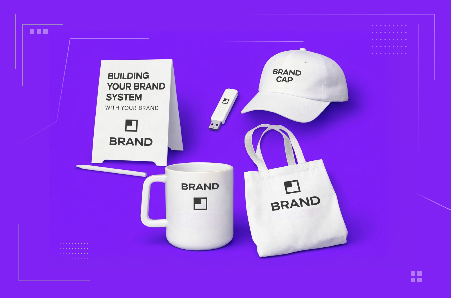
Website, product, pitch deck, email signature, social profile, all look like they belong to the same company.
Flexible
The system works at 16px (a favicon) and on a conference banner. It works in dark mode and on paper. It accommodates new product lines without a full redesign.
Aligned
An enterprise compliance tool should feel different from a consumer social app. The visual tone should reinforce the product experience and audience expectations.
Documented
Rules exist for how every element is used. Those rules are accessible enough that team members follow them without asking the founder for approval on every asset.
Emotionally Resonant
One study reports 52% of consumers pay more for products from brands that communicate clear values. Another finds 59% stay loyal to brands they feel emotionally connected to. Basically, identity that triggers a specific emotional response outperforms identity that just looks polished.
The don'ts: where you get the brand identity wrong
A little reminder, if you need the full walkthrough of how to design a brand identity - components, process, and definitions - our branding design guide covers that step by step.
Here, we focus on the specific decisions where startups go wrong and what gets them right. Let’s begin.
Don’t start with the logo and skip the strategy
The most predictable mistake we’ve seen.
“We just want the logo, and it’ll sort itself out. Logo is what people recognize, right?”
A founder hires a designer on Monday, asks for a logo, gets three options by Friday, picks the one that "feels right," and calls the brand done.
EU-Startups' analysis of early-stage branding failures identifies skipping brand strategy as the single most damaging startup mistake. What is brand identity design without strategy? A collection of unrelated visuals.
Fixing it can take longer than you might think, but we are after quality here.
Before any design work begins, write down who your audience is, what single quality they should associate with your brand, and how that differs from competitors. Even a one-page brief prevents the "our brand doesn't feel like us" conversation that derails teams later.
Your branding design process should always start with discovery. If you're working with a branding service for startups, for example, the discovery phase typically takes one to two weeks and produces a strategic brief that you reference in every subsequent decision.
Don't let your visual identity contradict your brand promise
Situation: An enterprise security startup uses illustrations that are too playful and a friendly font. The product protects sensitive financial data, but the brand looks like a consumer wellness app. Customers feel a disconnect they can't articulate. They just don't trust it.
One industry analysis claims 94% of initial brand judgments are design-related. Yet, we’ve seen it over and over again that visual signals that contradict the product reality ruin people’s confidence in you.
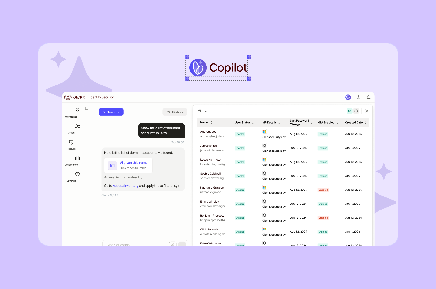
We worked through a similar situation on the Oleria Copilot brand identity project. Oleria is an AI-powered identity security tool. The visual identity for their AI feature needed to feel forward-looking: butterfly wing logo, custom gradient, animated motion design. But it couldn't undermine the seriousness that their security audience expects.
The solution for us was to pair innovation and reliability. How? With bold visual elements and a restrained color palette complementary to their existing platform.
Don't copy your competitors' aesthetic
If three competitors in your space use blue palettes, minimalist sans-serif type, and abstract geometric imagery, matching them makes you visually indistinguishable at the moment you most need to stand out.
Competitor analysis is a step in the brand identity development process, but the purpose is differentiation, not imitation. When Twitch chose purple in a streaming category dominated by reds and blues, the color itself became an immediate recognition asset.
We recommend that you explore and study what exists in your domain, then move slightly away from it.
Don't chase design trends over brand fit
So, we have this design trend test that is quite popular and plays off of people’s desire to categorize/label themselves and, in this case, their product. At the end, you get a trend that fits you best and the advice to act on it, if you wish.
However, glassmorphism, neobrutalism, whatever the current aesthetic trend happens to be… These are tools, not strategies. A brand identity built on a trend will look dated precisely when your company is gaining traction and needs to look established.
Consider the practical mismatch: a B2B fintech serving compliance teams needs to communicate reliability and precision. Applying a consumer-facing design trend optimized for social media engagement won't do that, regardless of how many likes the Dribbble shot gets. Your fintech brand design should serve the audience that pays you, not the audience that follows design trends.
Don't ignore localization when designing for global markets
A brand system designed for English-speaking Western audiences will break the moment you need right-to-left layouts, East Asian character support, or culturally appropriate imagery for MENA markets. Logo orientation, text layout, color connotations, and imagery expectations all shift across cultures. If your startup targets multiple regions, the identity system needs to account for this from day one.
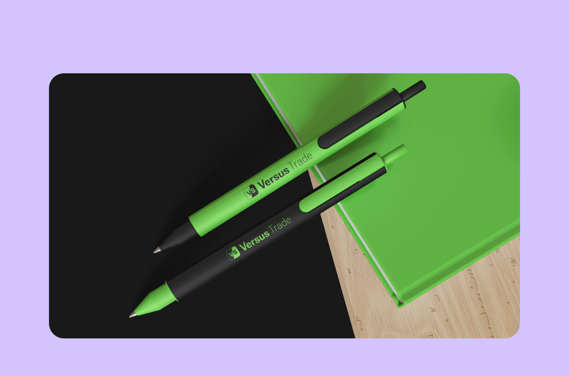
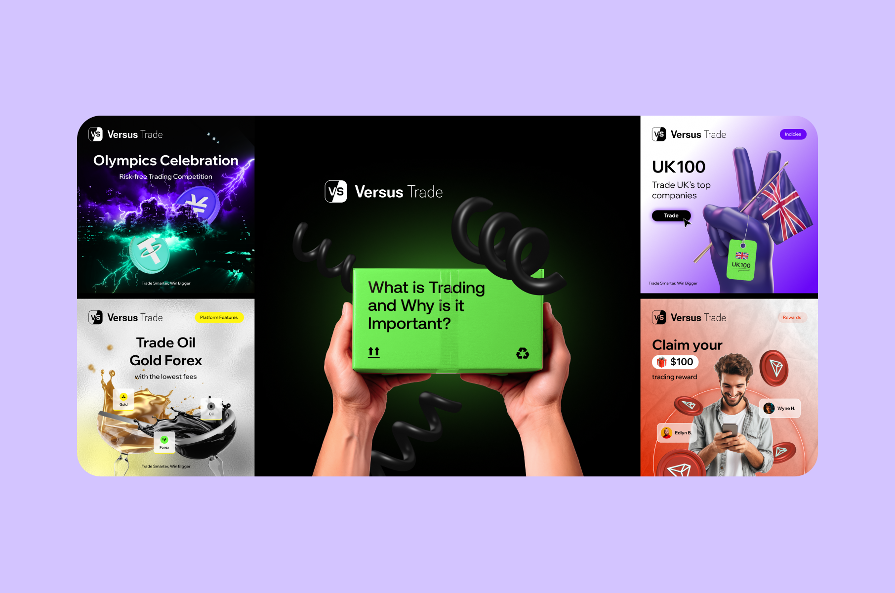
This was a core challenge in our work on the Versus Trade brand identity – a CFD trading platform targeting young traders across Asia and MENA. The brand needed to work in eight languages with RTL variants. The "VS" logo maintained its orientation. Other brand elements required interchangeable accent layers for rapid localization.
The solution was to create a modular identity with a neon-green primary palette and gold/silver accents that carried across cultures. Flexible templates covered social media, app stores, and event collateral in each market. Without integrating localization into the brand identity design from day one, the team would have had to redesign assets for every new market launch.
Don't skip documentation
An undocumented identity is a suggestion. When a new marketer joins and creates assets by eyeballing the website, every piece drifts away ever so slightly. Over six months, your brand might end up accumulating five unintentional versions.
The fix we would suggest is to create digital, searchable guidelines that live where your team already works. Static PDFs get filed away. A living document - or better, a design system - integrated into your design and development workflow gets referenced daily.
The Dos: what works for startup brand identity design
Products change. Features get copied. The brand's personality (if defined clearly, of course) outlasts any specific product iteration. Here’s our advice on how to make that happen.
Do connect identity directly to the product
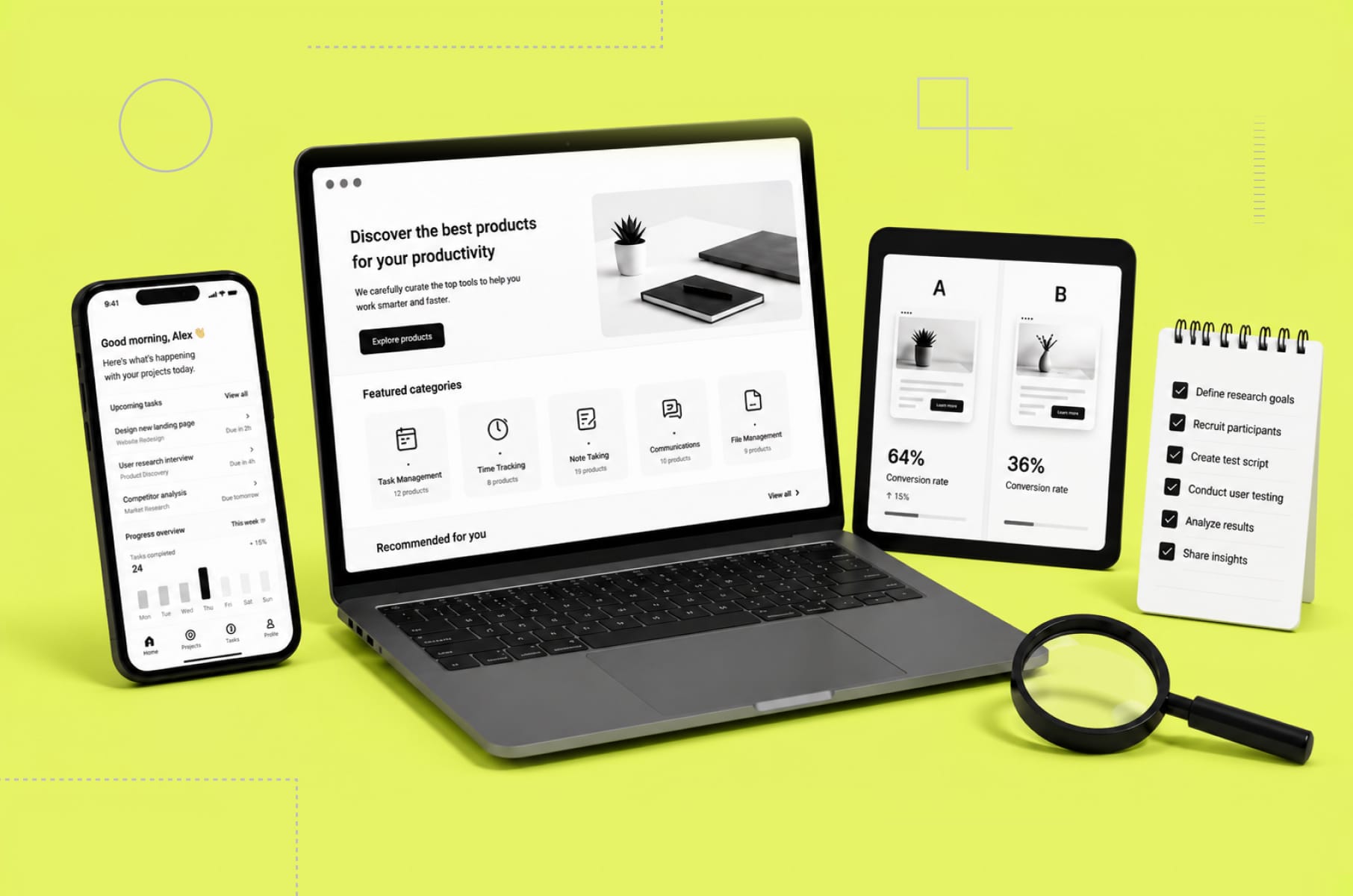
Your brand identity design shouldn't live in a PDF that nobody opens after the first week. Colors, typography, spacing, and interaction patterns should flow from brand guidelines into your UI/UX design system.
When identity and product design align, users experience one coherent brand. When they don't, you get a polished marketing site that opens into a product that looks like it was built by a different company.
Your onboarding screens, dashboards, empty states, and error messages are brand touchpoints. Treat them that way.
Do Test With Real Users, Not Just Your Team
The founding team that chose a color palette during a late-night sprint can't objectively evaluate whether it communicates what they intended to customers.
Test with people who match your actual customer profile:
- Show them the logo in small sizes - on a phone screen, for example.
- Ask them to describe the personality they associate with the color palette.
- Watch them navigate a branded interface.
Their reactions reveal gaps that internal reviews consistently miss. Consumers form design judgments in roughly 50 milliseconds - and your internal context or design rationale doesn't shape those judgments.
Do Plan for Digital-First Applications
Most startup brands live on screens. Your corporate branding design should prioritize digital performance: how the logo renders at 16px, how colors appear on different displays, how type reads on mobile, and how the system adapts to dark mode. If you're building a website, the brand system should account for responsive behavior or interactive elements.
Printed business cards still matter at conferences, but optimize for where the vast majority of your audience encounters you first.
Do Build a Lightweight Design System Early
A design system translates your brand identity components into reusable code and design components. It closes the gap between what the brand should look like and what actually ships.
You don't need a full component library on day one. Start with color tokens, type scale, spacing units, and button styles. Even a minimal system eliminates the "which blue was it again?" conversations that eat design hours and create drift. Startups that build this foundation alongside their brand identity design work maintain consistency with far less effort as they scale.
Match investment to company stage
Brand investment should match your maturity and what your identity needs to support right now.
Pre-seed / Bootstrapping: A clean logo, a defined color palette, and basic type guidelines. Enough to keep a product landing page, pitch deck, and early product consistent. Budget: $2,000-$5,000 for a logo and core identity. Research suggests allocating 5-10% of your startup budget to brand foundations at this stage.
Seed / Series A: The full system. Comprehensive guidelines, an imagery library, voice documentation, and application templates. Your identity now needs to work across SaaS product interfaces, marketing materials, sales collateral, and hiring pages. Budget: $7,500-$15,000 for a complete business identity design package.
Growth / Series B+: Brand architecture, sub-brand systems, and governance processes. The challenge shifts from creating the identity to maintaining it across a growing organization. Budget 8-15% of your marketing spend on brand consistency and evolution.
What’s the best time for brand identity design?

Elaborating a bit more on our previous point on matching investment to your stage, getting the timing wrong in either direction is expensive. Here's a practical framework tied to company milestones.
Before your first public launch:
You need at a minimum a logo, color palette, and type choices applied consistently to your website and pitch deck. No investor or early customer should encounter a different visual identity depending on which touchpoint they hit first.
Before raising Series A:
Your identity needs to support marketing and sales materials, a multi-page website, and a product with multiple screens. If your identity was a quick logo project at pre-seed, this is the right time for a comprehensive branding and identity design engagement that produces a full system with guidelines.
Before scaling past 15-20 people:
New hires are now creating brand assets without the institutional knowledge of why things look the way they do. Guidelines and a design system shift from "nice to have" to operational infrastructure. A well-timed corporate brand identity design investment pays for itself here because every new asset stays on-brand without requiring the founders to review it personally.
The pattern across all three milestones is the same: identity work done at the right stage prevents rework at the next one. Startups that sequence this well spend less on branding overall, because each investment builds on the previous one rather than replacing it.
FAQ
What is brand identity design?
What is brand identity design? It's the process of creating a coordinated system of visual and verbal elements - logo, color palette, typography, imagery, voice guidelines, and documentation - that represents a company's values and positioning across all touchpoints.
How much should a startup spend on brand identity design?
It depends on the stage. Pre-seed startups should budget $2,000-$5,000 for a logo and core palette. Seed-to-Series A companies typically invest $7,500-$15,000 for a full corporate identity design system with strategy, guidelines, and application templates. An experienced branding service helps match the investment to your actual needs.
When should a startup design brand identity from scratch versus iterate?
If your current identity was built without a strategic foundation - a quick logo from a freelancer with no guidelines - starting fresh with a proper brand identity development process typically costs less than building a system around arbitrary initial choices. If you have a strategic foundation but the visuals feel dated, iterate. Evolution costs less than revolution.
How do brand identity components work together as a system?
Each component reinforces the others. The color palette sets emotional tone. Typography carries that tone into text. Imagery extends it visually. Voice extends it verbally. The logo compresses it all into one mark. Guidelines document how each element works independently and together. Remove one, and the others lose context. Our step-by-step branding design guide covers each component in detail.
Should a startup hire an agency or design brand identity in-house?
If nobody on your founding team has brand design experience, working with a product design and branding agency produces more coherent results faster. Agencies bring corporate brand design frameworks, competitive analysis, and strategic processes that first-time founders rarely have in-house.