0
Table of Contents
A step-by-step guide to branding design
Translate your brand into visual elements your audience can see, recognize, and remember.
What if your product works just fine, but you notice that every time you send a pitch deck or post on social media, something feels off?
The colors don't match, the logo looks different on mobile, and your marketing materials could belong to three different companies. This is a branding design problem, and it's more common than most founders realize.
Branding design produces the full set of visual and strategic decisions that shape how your audience perceives your company across your website, your product UI, your pitch deck, and your social media.
If you are a founder or product leader deciding how to approach branding and design for your company, this guide will walk you through the full lifecycle of branding design and give you a sneak peek of our own process, since Merge is a brand design agency that is passionate about how people perceive the companies we work with.
What is branding design?
A quick definition before we move on. What is branding design, exactly?
Brand design definition: the process of translating a company's strategy, values, and positioning into a visual identity system (logo, color palette, typography, brand graphics, and usage guidelines) that people recognize and remember.
These three related terms sometimes create confusion:
- Branding is the strategic work of defining what your company stands for, who it serves, and how it positions itself in the market.
- Brand identity is the full set of visual and verbal elements that express that strategy.
- And brand designing is the hands-on process of creating those visual elements.
Ultimately, all three layers work together. Now you know the distinction, though.
Branding design ROI
Early-stage founders often deprioritize design and branding in favor of shipping features. The logic sort of makes sense. You get the product right first and worry about visuals later.
Professional branding design is an investment, and the return is measurable.
Companies that maintain consistent branding see revenue increases between 23% and 33%, according to research from Lucidpress and Demand Metric. 68% of companies report that brand consistency adds 10-20% to revenue growth.
The ROI builds over time. Professional branding delivers an average ROI of 2,000-3,500% over three years through higher revenue, the ability to charge premium prices (10-30% higher), lower customer acquisition costs (15-30% decrease), and improved customer lifetime value (20-40% increase).
But the longer you wait, the more expensive the fix becomes. A full rebrand for a growing company costs $50,000 to $500,000, not counting the internal time spent updating everything. Starting with even a basic visual identity saves you from that bill.
Branding in design also affects how investors, partners, and early customers perceive your credibility.
A brand that looks inconsistent (for example, different colors on the website than the pitch deck, a logo that renders poorly on mobile, typography that changes between pages) signals to customers and investors that the company lacks attention to detail.
Did you know that first impressions form in 50 milliseconds based on visuals, and 94% of those impressions are based on design, not text?
The nine steps of branding design
Every branding design process follows a similar arc, whether you're working with a startup branding design agency or an in-house team. Here's what happens at each step and why each step matters.
Step 1: Discovery
Define the problem before you design anything
Every branding design project starts with discovery. The goal is not to generate visual ideas yet. The goal is to gather enough information about your business, your audience, and your competitive environment to make design decisions that hold up over time.
Discovery typically includes three activities.
- Client briefing
A structured interview (or written questionnaire) covering your company's mission, target audience, product positioning, and competitive context. At Merge's branding studio, this brief is developed collaboratively between a lead designer and a graphic designer, then completed together with the client on a call. The brief answers questions like: Who are your three closest competitors? What do you want your brand to feel like? What existing brands do you admire and why?
- Competitive analysis
For larger branding design projects, the design team audits competitors' visual identities – their logos, color choices, brand graphics, iconography, and social media presence. The audit identifies what is overused in your market (so you can differentiate) and what signals your audience already trusts.
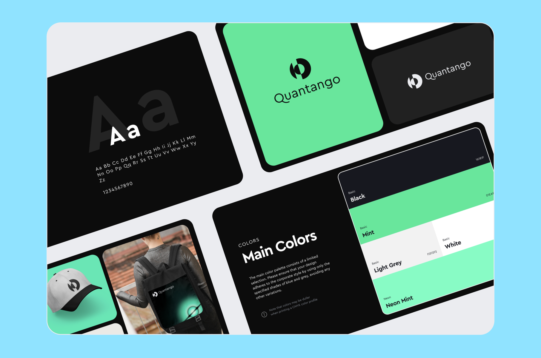
For example, when Merge built the brand identity for Quantango, a fintech company innovating in trading mechanics, the discovery phase mapped the visual codes of the trading industry to find whitespace for a distinctive direction.
Audience research matters here, too. Different demographics respond differently to color, typography, and visual complexity. A fintech product targeting investors requires different visuals than a consumer health app targeting millennials. Your B2B SaaS design strategy should reflect who you're actually selling to.
- Stakeholder alignment
If multiple founders or department leads have different visions for the brand, discovery is where those differences surface. Aligning early on positioning, tone, and visual direction saves rounds of revision later.
The output of discovery is a shared understanding of what the brand needs to communicate and to whom. Every subsequent branding design decision traces back to answers gathered here. Teams that rush through discovery spend twice as long in revision cycles because they lack a shared reference point to evaluate design options against.
A good product UX discovery process, for example, follows the same principle of understanding the problem before designing the solution.
Step 2: Moodboarding
Set the visual direction
Moodboarding translates the insights from discovery into visuals. A moodboard converts the strategic decisions from discovery into a visual reference point. It is a curated collection of images, textures, typography samples, and color territories that represent the tone and personality the brand should project.
Why do moodboards matter in branding design?
Before a designer draws a single logo sketch, the client and the design team need to agree on direction. Words like "modern" or "premium" mean different things to different people. A moodboard makes those interpretations visible so disagreements happen before production work begins, not after.
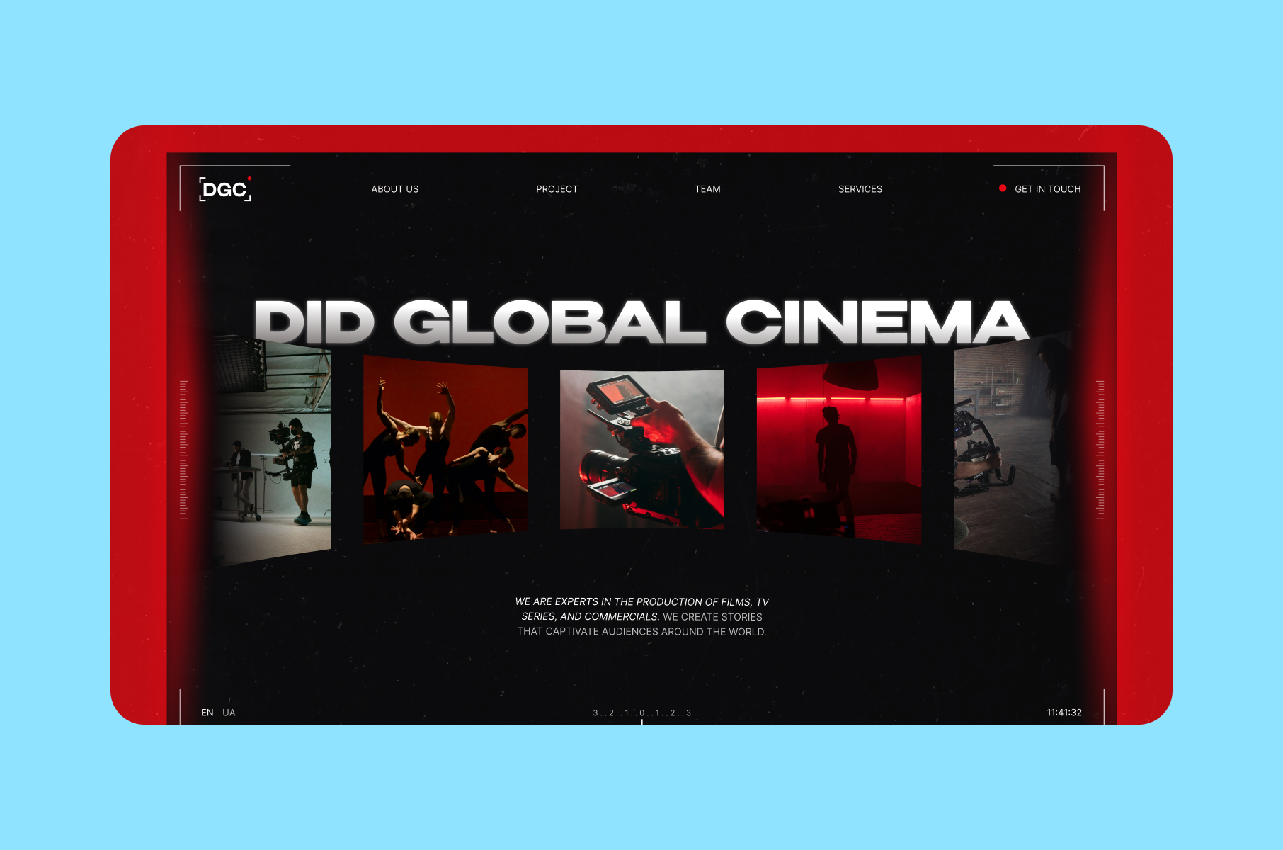
For example, when Merge worked on the brand for DGC Production, standard questionnaires were quite insufficient. The creative founders communicated more precisely through emotions and imagery than specifications.
Our team used associative moodboards instead. These abstract visual collages, built from images of sky, water, and organic textures, helped decide the visual direction that eventually led to their camera-lens-and-recording-dot logo concept. This approach shortened feedback cycles because both sides were working from the same visual vocabulary from day one.
Step 3: Brand strategy
Position your brand in the market
Since you now have discovery insights and an approved visual direction, the next step is going to determine how those visuals connect to your market.
What is branding in graphic design without strategy? Right, just decoration.
Strategy is what brings business goals and visual decisions together because it answers:
- What space does your brand occupy in the market?
- What should customers associate with your name?
- How does your visual identity support your pricing, your audience, and your growth stage?
If you skip this step and jump from a moodboard straight to logo sketches, you’ll get a visual identity that looks fine on its own but does not connect to your company's market position or audience.
Don’t worry. For startups, brand strategy does not need to be a 60-page document. It needs to be clear on three things:
Positioning. Where you sit relative to competitors. Are you the affordable option, the premium choice, or the specialist? Your visual identity needs to match this position. A premium fintech product using a free-font logo and stock photography sends mixed signals.
Audience expectations. 93% of consumers base their purchasing decisions on appearance, and 85% identify color as a primary reason for choosing one brand over another. Your visual choices need to match what your specific audience associates with credibility, quality, and trust in your market.
Brand personality. Define 3-5 attributes that describe how your brand should feel. And not just aspirational adjectives but rather concrete descriptors that inform design choices.
Step 4: Logo design
The most visible brand asset
With the strategy defined, the first visible output is the logo. 75% of people recognize a brand primarily by its logo, and you have roughly 10 seconds to make that logo memorable.
How does professional logo design work in a branding design process?
A design team typically produces 2-3 distinct logo concepts based on the approved moodboard direction and strategy. Each concept explores a different visual approach to the same strategic brief. The client selects a direction, and the team refines it through up to three rounds of structured feedback.
What makes a logo effective?
It needs to work at multiple sizes – from a 16px favicon to a billboard. It needs to reproduce clearly in one color (for printing, embroidery, or dark-mode UIs). It needs to be distinct enough that people can recall it from memory.
Merge's Logofolio shows how these principles play out across industries:
- For Quantango, the logo used neon mint against black with a geometric typeface to signal innovation in the trading space.
- For StenoHealth, the design integrated a plus sign with recording and heart-monitor elements – a single mark carrying three layers of meaning relevant to AI-powered healthcare.
- For AgentLess, a real estate platform, the less-than symbol doubles as the letter "A," creating a visual-verbal wordplay.
Each of these logos reflects strategic positioning – the branding design process ensures they are not just attractive but accurate.
Types of logos and when each works best
Logo type | Examples | Best for | Watch out |
Wordmark (logotype) – brand name in a distinctive typeface | Google, Coca-Cola, FedEx | Companies with short, distinctive names that benefit from name recognition over symbolic association | Loses readability at very small sizes (favicons, app icons) |
Symbol (brandmark) – icon or graphic without text | Apple, Nike | Companies with decades of brand recognition already built | Rarely effective for startups because audiences need the name first |
Combination logo – text paired with a symbol | Adidas, Spotify | Most startups – offers the best versatility because text and icon can be used together or separately | Requires clear rules for when to use each lockup |
Step 5: Color palette
Build recognition through color
Your logo gives people a mark to identify. Color gives them an emotion to associate with it. Color is how people remember you before they remember your name. Research shows that a consistent color palette increases brand recognition by up to 80%, and 55% of first impressions are based on visuals alone.
A branding design color palette usually includes:
Layer | Count | Role | Where it appears |
Primary colors | 1–2 | Main brand identifiers | Logo, headers, CTAs, key brand touchpoints |
Secondary colors | 2–3 | Supporting tones | Backgrounds, accents, secondary UI elements, illustrations |
Neutral colors | 2–4 | Structural foundation | Body text, backgrounds, borders, dividers |
Color choices should follow from strategy, not personal preference. Blue communicates trust and is dominant in financial services for that reason. Red signals energy and urgency. Green is associated with health and growth.
But fit to your specific brand and audience matters more than general color associations. Color psychology research confirms that effectiveness depends on whether the color fits what the brand sells – not on the color itself.
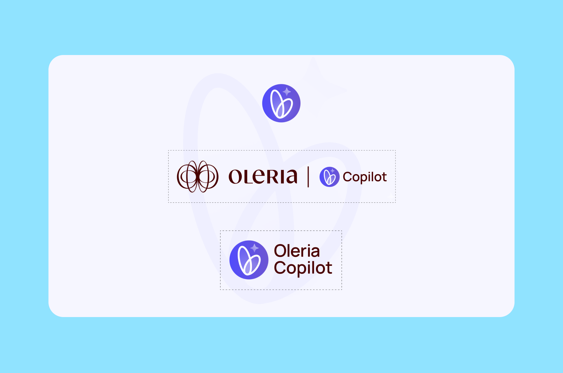
When Merge designed the brand identity for Oleria Copilot, an AI-powered identity security assistant, the team created a dedicated hero color and custom gradient specifically for the Copilot feature. The challenge was making the AI assistant feel visually distinct – noticeable as a new feature – while still fitting within Oleria's existing platform aesthetic. A poorly chosen color would either blend in too much (users miss it) or clash (users distrust it). The selected palette patched that gap.
Each color in your palette needs documented hex, RGB, and CMYK values so it reproduces consistently across screens, print, and merchandise. Without documented values, your brand blue on the website becomes a slightly different blue in the pitch deck and yet another blue on the business card. Advertisements in color are read 42% more often than black-and-white versions – but that advantage only compounds when the color is the same every time.
Step 6: Typography
The voice of your visual identity
Color sets the emotional tone. Typography determines how your brand speaks on the page. Typography carries personality. Two companies selling the same product will feel entirely different based on their typeface choices. A serif font suggests tradition and authority, while a geometric sans-serif signals modernity and clarity instead.
A standard branding design typography system includes:
- Primary typeface for headlines, hero sections, and brand-forward applications.
- Secondary typeface for body copy, product UI text, and long-form reading.
- Web-safe fallback for email clients and environments where custom fonts do not load.
2-3 typefaces is enough. More than that creates visual noise and makes your brand harder to apply consistently across teams and platforms.
First, define the hierarchy, such as which font at which size for H1, H2, H3, body text, captions, and UI elements. Then, specify the weights (regular, medium, bold) and when each applies.
Typography also needs to account for technical constraints:
- Will your product support multiple languages?
- Does the typeface include the character sets you need?
- Are web licenses included, or will you pay per-pageview?
These practical questions shape which fonts your branding design system can realistically include.
Step 7: Brand graphics
Patterns, icons, and supporting elements
Logo, color, and type form the recognizable identity. Brand graphics in the form of patterns, custom icons, illustrations, and photography guidelines make that identity flexible.
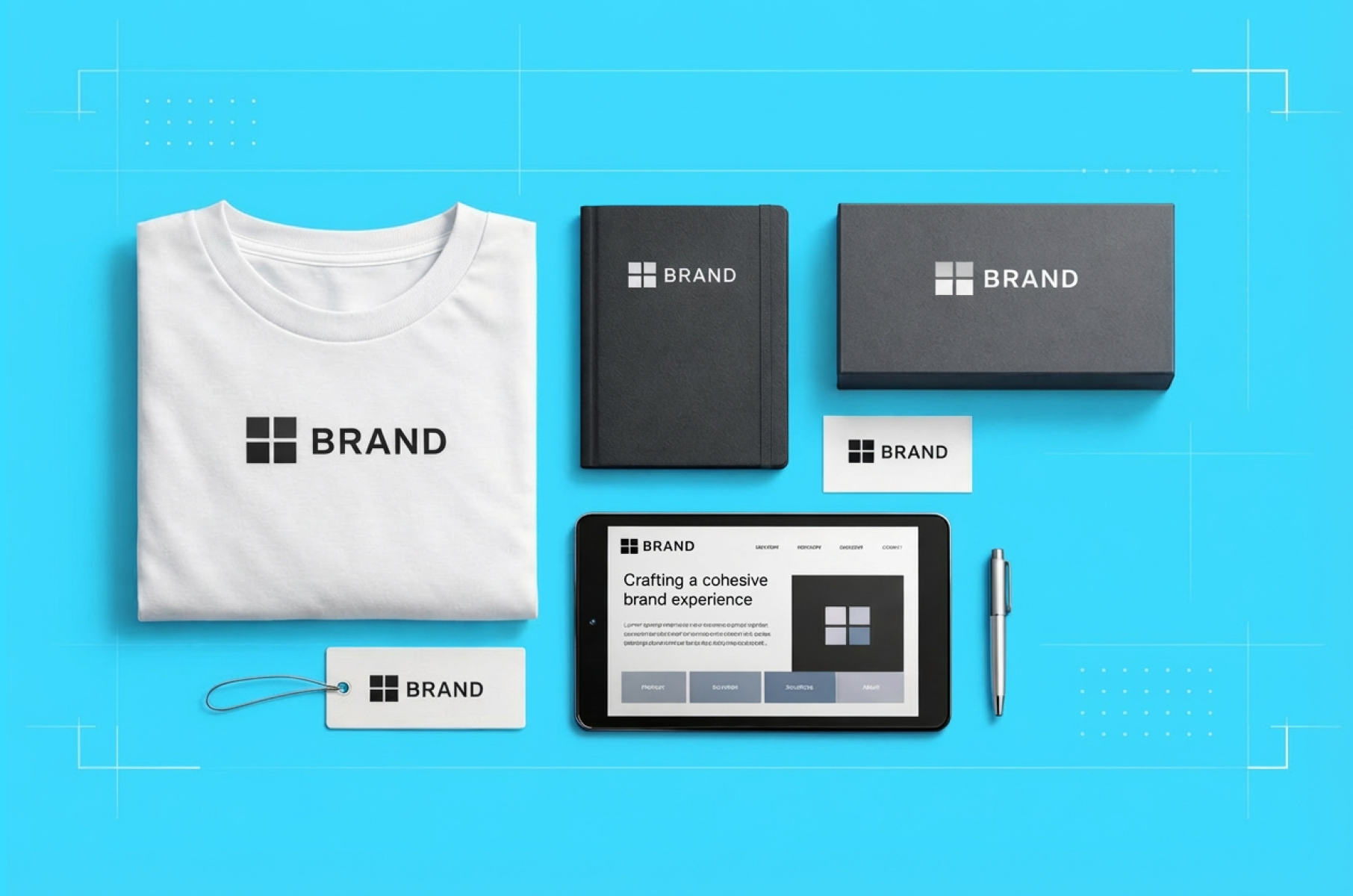
Branding in design goes beyond the logo file. A complete identity system includes:
- Patterns and textures that reinforce your visual language in backgrounds and section dividers.
- Icon sets (typically 6-12 custom icons) matching your brand's line weight, corner radius, and style conventions.
- Illustration guidelines or custom illustrations for complex concepts your product needs to communicate.
- Photography direction defining what style, lighting, and composition feel on-brand.
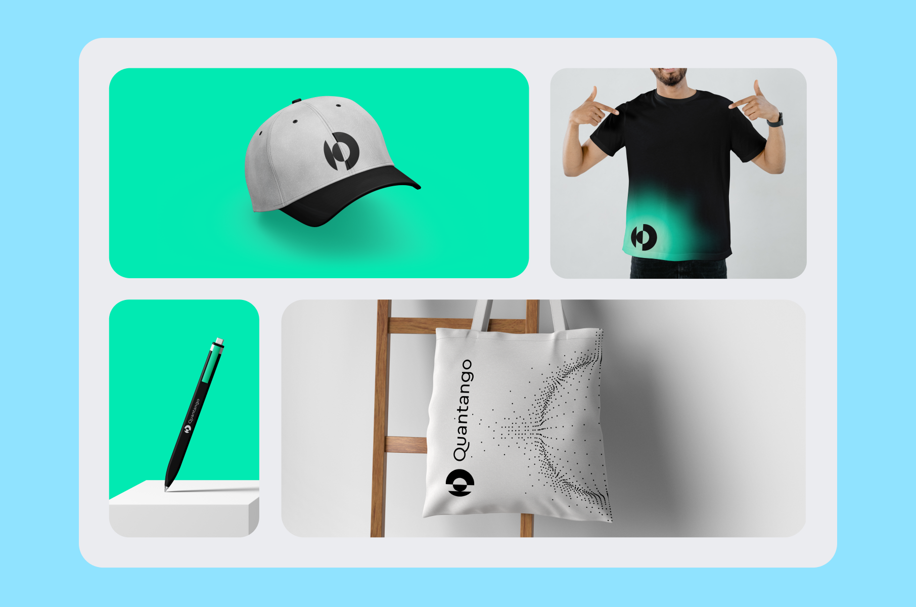
The Quantango brand identity demonstrates why this matters. Beyond the logo, Merge created a complete graphic language – neon effects, minimalistic icons, upward-oriented graphics symbolizing progress – that gave the website, social media, and marketing materials a unified feel.
The graphics were intentionally designed to avoid static elements, creating a sense of continuous forward momentum through motion design and dynamic visuals.
CEO Vitalii Bulynin noted that stakeholders and industry peers praised the site's uniqueness precisely because of this cohesive graphic system.
Step 8: Brand book
Document everything for consistent use
You now have a complete visual system. The brand book ensures everyone who touches it produces consistent results. It is the most underestimated deliverable in the branding design process. Without it, every new hire, every new agency partner, and every new marketing campaign reinterprets your brand from scratch.
Why brand books matter.
95% of organizations have brand guidelines, but only 25-30% actively use them. The gap between having guidelines and following them is where brands lose consistency.
The companies that enforce their guidelines see 41% better brand consistency scores. Good branding design documentation is specific enough to prevent misuse but flexible enough that people actually reference it.
A brand book typically covers:
- Logo usage rules: minimum sizes, clear space requirements, approved color variations, and examples of incorrect usage.
- Color specifications: exact values in hex, RGB, CMYK, and Pantone for every brand color.
- Typography rules: typeface names, weights, sizing hierarchies, and line-spacing specifications.
- Brand graphics: pattern usage, icon grid specifications, and illustration style references.
- Application examples: how these elements come together on a business card, a social media post, a website header, and other common formats.
Consistency is what makes design in branding effective.
For the DGC Production brand, Merge delivered a complete brand book alongside the logo, an animated studio intro, on-set merchandise samples, and a responsive marketing website. The brand book documented every element so the film studio could maintain visual consistency across productions, social channels, and festival materials – contexts the original design team would not control.
This is also the principle that drove Grammarly's 2025 rebrand to Superhuman.
After acquiring Superhuman Mail and Coda, the company needed a visual identity system that could unify three distinct products under one brand. The agency Smith & Diction developed a five-layer visual system with a human layer, idea layer, technical layer, tonal layer, and output layer. All of them add depth while maintaining coherence across all applications.
Step 9: Application and rollout
Put your brand to work
The brand book documents the system. Application is where that system meets your audience. A brand identity in a Figma file has no impact until it reaches the real world. The final step of the branding design process is applying the identity across your actual touchpoints.
Common applications include:
- Website and product UI: Translating the brand system into a live website design or product interface with coded design system tokens.
- Social media kit: Templates formatted for each platform's dimensions, using your brand colors, typography, and graphic elements.
- Merchandise: Business cards, branded apparel, stickers, and event materials.
- Pitch decks and investor materials: Presentations that carry your brand identity into fundraising conversations.
- Marketing materials: Landing pages, ad creatives, and email templates following the brand system.
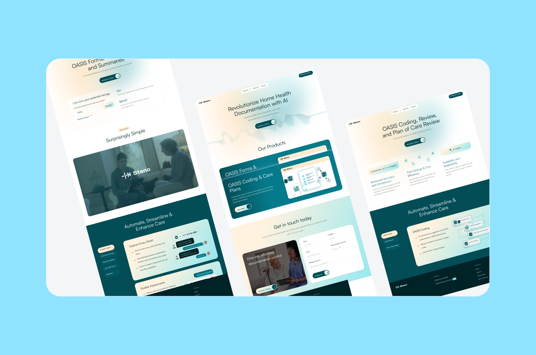
For Oleria Copilot, for example, the branding design work extended into a full UI/UX design for the chatbot interface. The logo animation alone required approximately 40 hours of refinement. Our team adjusted motion timing and easing to capture natural butterfly-wing movement while maintaining performance through Lottie-based 2D animation. This level of detail in application is what carries a brand from a static guidelines document into a living product experience.
The premium tier of a branding design engagement (like Merge's Concept design package) includes realistic mockups of branded merchandise, ready-to-post social media kits, and high-fidelity concepts for websites or apps. This means you leave the project with assets you can use straight away.
Application is where your branding design investment either pays off or stalls. A brand system applied consistently across 10 touchpoints in the first month builds more recognition than one applied haphazardly across 50 touchpoints over a year. Prioritize the channels where your audience encounters you first – usually your website, your LinkedIn presence, and your product – and expand from there.
Common branding design mistakes that cost startups time and money
Before choosing your scope, understand where branding design projects go wrong.
Starting with the logo.
The most common mistake. Founders ask for a logo before defining their positioning, audience, or competitive context. The result is a mark that looks appealing in the Figma file but fails when applied to a real product or website because it was designed without constraints or strategy.
Skipping the brand book.
Imagine you invest in a quality identity, then hand it off without documentation? Some months later, your marketing team might use slightly different colors, your developer could pick a different font for the app, and your pitch deck ends up using a stretched version of the logo. That investment is now useless because nobody documented how to maintain it.
Chasing trends over fit.
A startup in enterprise security does not need the same visual language as a consumer lifestyle brand. Trend-driven design branding choices – ultra-minimal logos, trendy gradients, decorative serif fonts – look dated within two years if they do not connect to your actual positioning. Branding design decisions should outlast design trends.
Treating branding as a one-time task.
A brand identity is a living system. As your company adds products, enters new markets, or shifts positioning, the identity needs to extend. The branding design process should produce a system flexible enough to grow with you – not a fixed set of static files.
How to choose the right branding design package
Not every company needs the same depth of branding and design work. The right scope depends on your stage, your budget, and where your brand will live.
Not every company needs the same depth of branding and design work. The right scope depends on your stage, your budget, and where your brand will live.
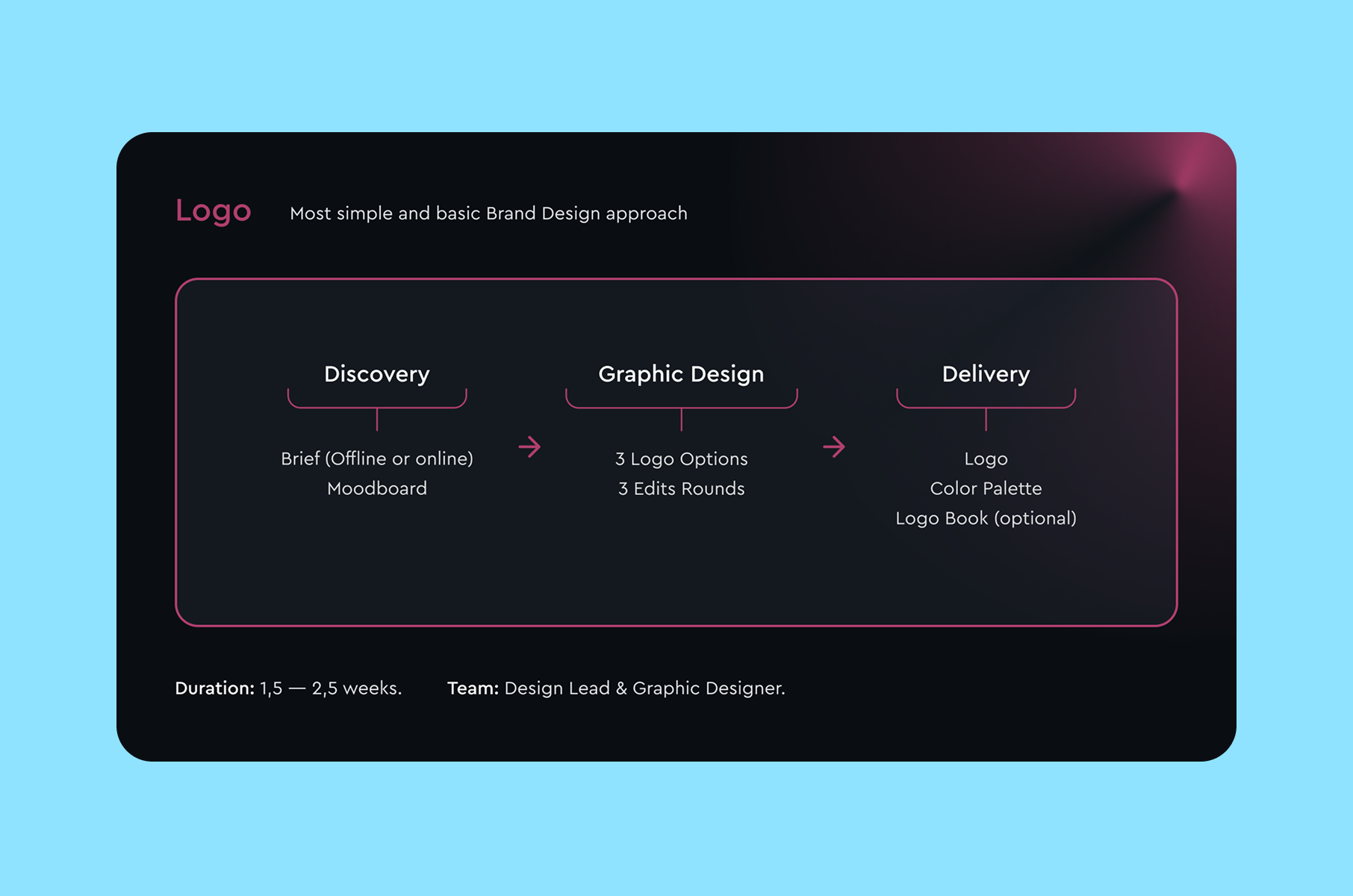
Logo-level branding fits early-stage startups that need a quality logo, color palette, and logo book to launch an MVP or landing page.
Timeline: 1.5-2.5 weeks.
This is enough to look professional at launch without overinvesting before product-market fit.
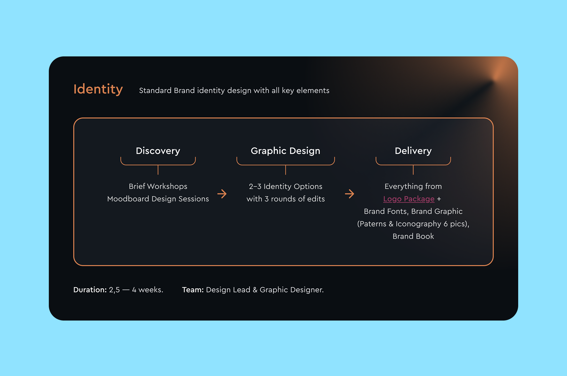
Identity-level branding fits companies in active growth that need a complete visual system – logo, colors, typography, brand graphics (patterns and icons), and a full brand book with usage guidelines.
Timeline: 2.5-4 weeks.
This is the standard scope for a startup preparing a public launch or entering a new market.
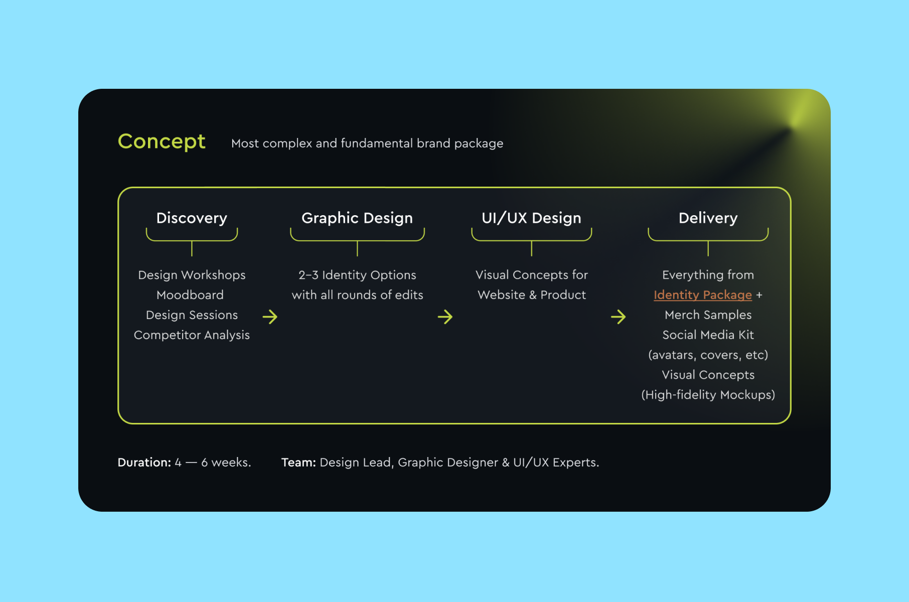
Concept-level branding fits companies preparing for a major launch or full rebrand. It includes everything in the identity tier plus custom illustrations, merchandise samples, social media kits, and high-fidelity UI/UX concepts for your website or app.
Timeline: 4-6 weeks.
This is the right branding design investment when your brand needs to work across many channels from day one.
Merge offers all three tiers through their branding service for startups and growing companies, starting at $5,000 for logo-level work and scaling to $11,500 for the full concept package.
FAQ
What is brand design?
What is brand design in practice? It's the process of creating a visual identity system - logo, colors, typography, graphics, and guidelines - that represents your company consistently across every touchpoint. It translates your brand strategy into visual elements your audience can see, recognize, and remember.
How much does branding design cost for a startup?
Costs vary based on scope. A logo-focused package can range from $2,000 to $10,000. A full brand identity typically costs $10,000 to $50,000. A comprehensive brand concept with strategic positioning can reach $50,000 to $150,000. The right investment depends on your stage, your market, and how many touchpoints you need to control.
What is the difference between branding and brand design?
Branding is the strategic work of defining your company's positioning, values, and messaging. Brand designing is the process of translating that strategy into visual elements. Branding tells you what to say. Design branding shows you how to look and feel. Both are essential, and the best results come when strategy and designing brand elements work in sequence.
What is the difference between branding design and brand strategy?
Brand strategy defines positioning, audience, messaging, and competitive differentiation. Branding design translates that strategy into visual form. This is the logo, colors, typography, and guidelines that people see. Strategy without design stays theoretical. Design without strategy produces visuals that look good but do not support business goals. The most effective approach treats them as sequential: strategy first, then design.
How long does the branding design process take?
Timelines vary based on scope. A logo-focused project takes 1.5-2.5 weeks. A full identity system takes 2.5-4 weeks. A concept-level engagement with UI/UX applications takes 4-6 weeks. These timelines assume active client participation in feedback rounds, so delays in feedback can extend the schedule accordingly.
Can I do branding design myself as a founder?
You can build a basic visual identity using tools like Canva or Figma templates. But to design branding that holds up across a growing company, such as multiple products, multiple channels, and multiple team members applying the brand, requires the strategic process outlined in this guide. The discovery, competitive analysis, and systematic thinking are what separate a brand that scales from one that needs replacing within a year.
Do I need a brand book?
Yes. A brand book documents every visual decision and provides rules for consistent application. Without one, your brand drifts as different team members and external partners interpret your identity differently. It's the single most important deliverable for maintaining brand consistency over time.
Do I need to rebrand, or can I evolve my existing branding design?
If your current identity was built through the strategic process described here – discovery, strategy, moodboard, systematic design – it can usually evolve. Add new colors, extend the icon set, update the typography hierarchy. If your current brand was assembled in a make-do situation, without a system behind it, a structured branding design engagement will be more efficient than patching what already exists. The test: can you hand someone your brand book and have them produce on-brand materials without asking you questions? If not, the system needs to be rebuilt.
When should a startup invest in professional branding design?
Preferably before a public launch. Also, before investor conversations, since first impressions matter. Before hiring, too, because consistent, professionally executed branding and design signals that a company is serious and well-organized. The earlier you establish a consistent visual identity, the less rework you pay for later when your brand lives on a dozen different platforms and documents.