0
Table of Contents
UX audit: what you get, what it costs, and when you need one
A UX audit is one of the highest-leverage research investments.
When a product stops growing the way it used to, the first instinct is usually to ship more features, add another tab, push a new dashboard, or maybe rebrand. Most of the time, the product itself is fine - what’s broken is how people experience it. Which is where a UX audit comes in.
Before we get into the actual breakdown, a quick reminder: our UX design team at Merge has been doing UX UI audits and product redesigns for SaaS founders, fintech teams, and other digital platforms for years now. We’ve seen both what a useful audit looks like and what a useless one looks like. We also know how to squeeze the last bit of insight out of it.
If you want a more hands-on companion to this article, we’ve also published a UX audit checklist and a longer website UX audit guide you can download for free.
Now back to the UX audit itself.
What is a UX audit, exactly?
A UX audit is an expert-led review of a digital product, usually a website or a SaaS app, that surfaces usability problems and gives you a prioritized list of fixes. In this case, there are no focus groups, no survey panels, and no tester recruitment.
Nielsen Norman Group puts it like this: "A user experience specialist audits your website, intranet, or other design to identify issues and provide recommendations."
That's pretty much the whole story.
Quick "what is a UX audit" check before we keep going - this is not actually the same thing as usability audits done with real users, and it's not user research either. We'll come back to that distinction in a bit, because it trips a lot of founders up when they're scoping their first UX site audit.
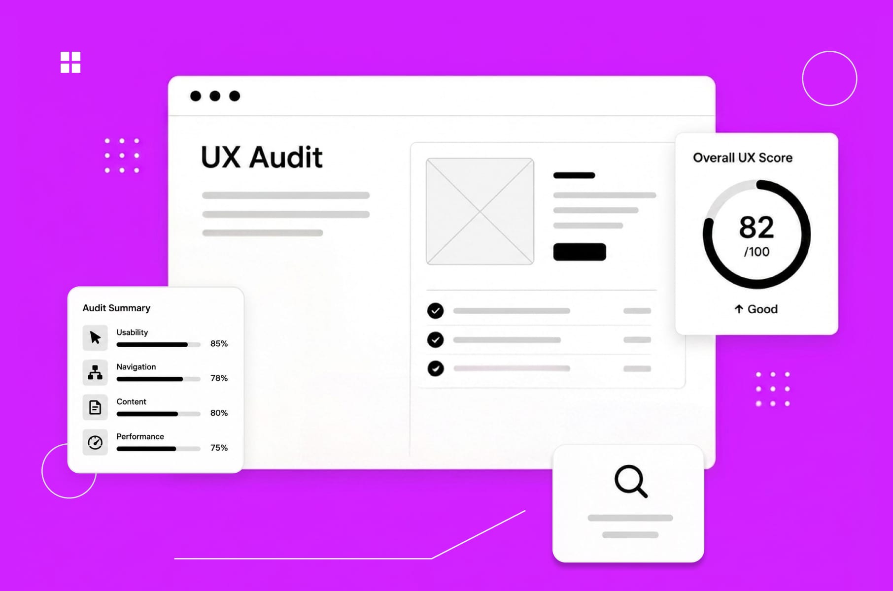
A good UX design audit combines three methods (more on those in a sec). The deliverable lands somewhere between a 30-page PDF and a 70-page Notion doc, depending on the auditor and the scope. And it should leave you with a clear roadmap and not just a list of random complaints.
What you actually get from a UX audit
This is where you might get surprised. What if you sign off on a website user experience audit expecting a polite design critique, only to get a document with severity ratings, annotated screenshots, conversion math, and a list of fixes ranked by business impact a few weeks later?
But that's what happens, actually. Sure, the depth will vary wildly between providers, but a good UX audit report is going to usually include:
- Severity-rated issue list: critical, medium, and low. Each item is one usability problem, mapped to which user flow it affects.
- Annotated screenshots and walkthroughs: visual evidence so the team isn't arguing about what "the broken bit" actually is.
- Analytics and behavioral data: heatmaps, drop-off rates, funnel data, and session recordings where available.
- Industry benchmarks: how the product stacks up against competitors.
- Prioritized recommendations: not "this could be improved" but "here's what to change, here's why, and here's what it might lift."
- An action plan or roadmap: a sensible order to fix things in, so engineering doesn't have to guess.
Some UX auditors deliver dense Excel sheets. Others ship a Figma file with sticky notes on the screens. The format matters less than whether it's actionable.
Speaking from experience and to make sure others uphold the industry standards, what you should not accept is a UX audit that ends in vague observations like "the navigation could be clearer" without a specific recommendation or an example of what better looks like. That’s just the designer’s opinion, not an actual audit.
Inside the UX audit process
The UX audit process is mostly just applied skepticism plus a structured framework. Here's how we walk through it on most projects.
Step 1 - Define the scope and the questions
Before anyone opens Figma (or Hotjar), we agree on what the UX audit is actually going to answer:
- Is the goal to figure out why activation dropped after the last release?
- Is it pre-redesign baseline work?
- Is it a sales-conversion UX audit website review for the marketing site?
The shape of the answer determines the scope.
Step 2 - Heuristic evaluation
This is the bit that sounds academic, but it really is just us comparing the interface against Nielsen's 10 usability heuristics with things like visibility of system status, error prevention, recognition over recall, and flagging every place the product violates them.
For example, three independent evaluators tend to catch around 60% of usability issues that a much larger study would surface, at a fraction of the cost. That's why the heuristic pass is an important part of any user experience audit.
Step 3 - Behavioral and analytics review
First, heuristics tell you what's technically wrong. Then, analytics tell you where users are actually falling off.
Most of our audits use data from Google Analytics, Mixpanel, Hotjar, Microsoft Clarity, or whatever the team is already running. Hotjar's own CRO audit framework is a useful template here since they have heatmaps, recordings, surveys, funnel data, etc. For example, a flow can look fine on paper but show a 40% drop in session recordings. That would mean marking it as the priority.
Step 4 - Documentation and prioritization
The next step is logging every issue with a severity score, a screenshot, the user impact, and a recommended fix, then ranking everything by user pain plus business impact.
Example: A misaligned button might not be so urgent, but a checkout step that hides the total from mobile users is. There's a difference, and a useful UX audit never lets you forget it.
Step 5 - Recommendations and a roadmap
Last bit, and the most important: the report comes back with:
- Quick wins (the things you can fix in a sprint).
- Structural changes (the ones that need a small redesign).
- Strategic shifts (the ones that should feed the next product cycle).
If you want to run this process yourself, our website UX audit guide walks through it step by step.
When do you actually need a UX audit?
Now to the real question: when does it stop being a "nice to have"? In our experience, there are several recognizable triggers. If two or more apply, an audit UX project usually pays for itself within a quarter or two.
Activation and retention are low
Early confusion is the #1 churn driver in SaaS, and onboarding flow quality is the fastest predictor of month-three retention.
If users are dropping out in the first session, skip adding another feature for now. What you need is a UX audit of the onboarding.
Conversion is below benchmark
Bounce rates above 70%, low CTA engagement, abandoned forms, mobile conversion lagging desktop by 2x or more - all of these point to friction that a website UX audit will surface in days.
We saw a pattern like this with MO Widgets, the Shopify navigation app, where a tighter onboarding flow lifted store engagement and conversion without disrupting brand identity.
You're about to redesign
Don't redesign without an audit. Seriously. A redesign without a baseline is just an expensive style change.
We always start every product redesign service with a UX site audit so we know which parts of the existing experience are actually broken and which parts users have learned to love.
The Clockwork case study is a good example, where the audit told us which financial-app patterns were genuinely confusing for non-finance users and which ones power users relied on.
You're about to launch
A pre-launch UX audit is the cheapest insurance you'll buy for an MVP. The 1-10-100 rule from software engineering says fixing a problem during design costs 1x, during development 10x, and post-release 100x. A few thousand dollars now, or a quarter of rework after launch.
You're about to raise
Investors care about activation, retention, and unit economics, and all three are tied to the state of your user experience. A UX audit before a fundraise gives you concrete answers to "why is your activation only 22%" - "because of these four specific friction points, and here's our 90-day plan."
Truth be told, we recommend running a brief UX audit every 12 to 18 months, even when nothing's obviously broken. However, you might think that’s just design agency talk. Could be, but what we also see day to day is how design debt accumulates the same way technical debt does. So, your call.
Pulled together, the triggers and the shape of the audit they usually point to:
Trigger | Where the audit usually focuses |
Activation and retention slipping | Onboarding flow and first-session friction |
Conversion below benchmark | CTA engagement, forms, same experience across both desktop and mobile |
About to redesign | Baseline of what's broken vs. what users rely on |
About to launch | Pre-launch quality pass on the MVP |
About to raise | Concrete answers to investor activation questions |
What a UX audit costs in 2026
Pricing is genuinely all over the place, and it's usually the first question every founder asks. We collected some honest ranges, based on what's published across agency and freelance platforms:
Freelance UX consultants. Hourly rates run $50 to $200, depending on experience. Fixed-scope freelance audits are between $3,000 and $8,000 for a small product, with mid-range work commonly costing $5,000 to $10,000.
Agencies. Hourly rates land anywhere from $100 to $400. Project pricing depends entirely on scope - a basic single-page UX SEO audit can be a few hundred dollars, a full SaaS audit could be around $10,000 to $25,000 because of multiple roles, integrations, and 100 to 200 hours of expert time.
AI-driven audit tools. New entrants like Krux and Wevo Pulse offer subscription-based audits for $7.99 to $12.99 a month. Useful for first-pass checks, but much less useful as a standalone deliverable. We'll get to why in the AI section.
Here’s the same stuff, but in a table, if you are in a rush:
Provider type | Hourly rate | Typical project cost |
Freelance UX consultants | $50 – $200 | $3K – $10K (mid-range commonly $5K – $10K) |
Agencies | $100 – $400 | $10K – $25K for a full SaaS audit |
AI-driven audit tools | Subscription | $7.99 – $12.99 / month |
The factors that actually affect the price:
- Product complexity (a SaaS dashboard with five user roles is a different beast than a six-page marketing site).
- The number of user flows in scope.
- The timeline (rush jobs are taxed).
- Whether the audit includes accessibility testing, which is mostly manual: 84% of accessibility issues need human testers, with only 16% catchable by automated tools.
And then there are the hidden costs of not doing the audit. Which is the next bit.
The ROI case for a UX audit
We’ve got you the numbers, in roughly increasing order of fame:
- IBM and Karat published the most-cited UX ROI claim: every $1 invested in ease of use returns $10 to $100. It's debated, sometimes overstated, but the order of magnitude holds across multiple replications.
- McKinsey's Business Value of Design Index found that companies in the top quartile for design had 32% higher revenue growth and 56% higher total returns to shareholders over five years. Not a small effect.
- Baymard's most famous example: an ecommerce client changed a single onboarding step - swapping a "Register" button for a "Continue as guest" option - and netted $300M in additional annual revenue. That's the upper bound, but it shows what one finding from a UX audit can be worth.
- The 1-10-100 rule from Robert Pressman's Software Engineering is the math that matters at a small scale: a $5,000 audit that catches a navigation issue before launch saves roughly $50,000 in mid-development rework and $500,000 if you find it after.
So when you ask us if a UX audit is worth it, the honest answer is: it depends on how broken your product currently is, but the historical odds are heavily in your favor.
Can AI just do the UX audit?
This question comes up in every sales call now, so we should address it head-on.
Long story short: AI can assist, AI can't replace. As with everything these days, really, but that’s a rant for another day and time.
Data time:
What we know is that general-purpose AI still has a trust problem in UX evaluation. Baymard’s original GPT-4 test found only 19.9% accuracy in UX audit suggestions, with an 80.1% false-positive rate.
By 2025–2026, public tests of generative AI UX/CRO analysis tools had improved to roughly 50–75% accuracy. That's a real jump, but 75% accuracy means one in four findings is wrong, and you don't know which one.
User sentiment has also shifted from “some value” to “cautious adoption”: in the 2025 State of User Research report, 80% of researchers said they use AI, but 91% worry about accuracy and hallucinations, and sentiment was split, with 41% seeing AI’s current effect on UXR negatively versus 32% positively.
So, here’s where AI helps in our UX audit process and could help you, too:
- summarizing customer feedback at scale,
- pattern-detecting across hundreds of session recordings,
- generating first-draft annotations on screenshots,
- writing the boring parts of the report.
And where we would advise you not to use it:
- business context (a "broken" pattern in one product is the right pattern in another),
- accessibility nuance (manual testing remains the gold standard),
- prioritization (AI doesn't know your roadmap),
- confidence-calibrated severity scoring.
A comparison view:
Where AI helps in a UX audit | Where AI is meh |
Summarizing customer feedback at scale | Business context (the right pattern in one product is the wrong one in another) |
Pattern-detecting across hundreds of session recordings | Accessibility nuance (manual testing remains the gold standard) |
Generating first-draft annotations on screenshots | Prioritization (AI doesn't know your roadmap) |
Writing the boring parts of the report | Confidence-calibrated severity scoring |
For more info, you can check out Jakob Nielsen's UX Roundup on Substack, which tracks the AI-in-UX conversation, or a really practical Substack piece on running fast UX audits with Claude in Chrome and FigJam AI if you want a hands-on look at how the workflows are evolving.
Our take: use AI for the grunt work, keep humans on judgment calls. That's pretty much the consensus across the field right now anyway.
A few audits we've actually shipped
To make this less abstract, here are some examples of work we've done. None of these were marketed as only audits. They were the front end of a larger redesign or discovery engagement.
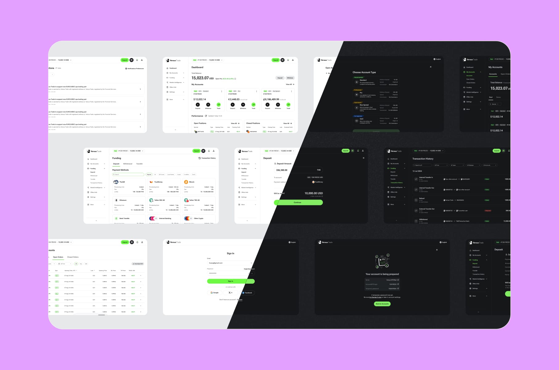
- Versus Trade. We audited two parallel platforms (a public client site and a partner marketing site) before designing more than 3,000 responsive screens across both. Without an audit-driven scoping pass, the project would have been chaos.
- Clockwork. The audit found that the financial app was dense and feature-rich but suffered badly on discoverability for non-financial users. The fix wasn't a rebuild. It was a targeted UX UI audit plus selective restructuring. The Clockwork case study shows how the audit shaped the brief.
- Alta. A modernization-focused audit on an investment platform that needed clearer navigation and a more current visual language. The Alta engagement ended up as a comprehensive Webflow design and development project, but the audit set the priorities.
- RapidDev. A no-code platform that had outgrown its dated look. Our audit untangled two distinct user buying paths and informed the new layouts, animations, and conversion-focused homepage.
- MO Widgets. A Shopify navigation app. The audit zeroed in on onboarding friction and shipped a story-style flow that improved engagement and conversion without breaking brand identity.
- Everyday Speech. An EdTech site with a hard back-to-school deadline. The audit identified must-have pages versus nice-to-have, which let us scope into low-risk iterations and hit launch.
Different products, same starting move: a UX audit.
More tips before you get your UX audit
A few things to ask any UX expert (us or otherwise) before you sign anything:
- What's the deliverable format? Demand specifics. Is it a Figma file, a PDF, a Notion doc, all three?
- How are issues prioritized? "By gut feel" is not an answer. The right answer involves user impact and business impact, scored.
- How many evaluators? Single-evaluator heuristic reviews catch fewer issues than three-to-five evaluator passes.
- Does it include accessibility? If WCAG conformance matters to your business (and it does for most regulated industries), confirm scope.
- Does it include analytics review? A heuristic-only audit is half an audit.
- Will you get a roadmap or just a list? A list of problems without sequencing isn't actionable.
Want to dig into the patterns that separate a great experience from a frustrating one?
Our article on UX best practices we've learned from productivity apps like Notion is a good read. It's the inverse of an audit, basically.
Want to see how even billion-dollar companies still ship rough edges?
The bad UX examples from products like WhatsApp and LinkedIn post is a useful counterweight to "big = good design."
Want a partner?
Once the audit is done and you have a roadmap, the natural next move is either internal implementation or a partnered redesign. For founders considering the latter, our website redesign agency work and product UX discovery service typically pick up where the audit ends.
FAQ
How long does a UX audit take?
Most full audits run 2 to 4 weeks. A quick UX audit health check can be completed in 5 to 7 days. Larger platforms with five-plus user flows typically need 3 to 5 weeks. Specno's research shows 80% of findings surface within the first 2 to 3 weeks regardless of total length.
What's the difference between a UX audit and usability audits with real users?
A UX audit is expert-led, doesn't involve real users, and focuses on what experienced auditors can see by inspection. Usability audits with participants (often called usability testing) put the product in front of real users and observe them completing tasks. They're complementary - audits are faster and cheaper, testing is closer to ground truth. Survicate has a useful breakdown on the distinction.
Can I do a UX audit myself?
Sometimes. If you're the founder, you'll catch some of the obvious issues. Believe it or not, familiarity blinds you to the friction your users feel - your eye stops registering the workarounds you've trained yourself into. A second set of expert eyes is hard to replicate from inside the company. Our free UX review checklist is a sensible starting point if you want to take a first pass yourself.
Do I need a UX SEO audit too?
If your UX audit website is also a high-traffic acquisition channel, a combined UX SEO audit can be worthwhile. UX issues like slow pages, hidden CTAs, and broken mobile flows hurt rankings and conversions both. Most agencies will scope these together when there's overlap.
Is a UX audit the same as a UX design audit?
Pretty much, yes. The terms get used interchangeably. Some teams use UX design audit to mean a slightly broader review that includes visual design and brand consistency, but the core methodology is the same.
Wrap-up
A UX audit is one of the highest-leverage research investments you can make in a digital product. You spend a few thousand dollars (or a few tens of thousands, if you're a complex SaaS), you get back a prioritized list of fixes that map to actual user pain and actual revenue, and you avoid burning a redesign budget on the wrong problems.
The product teams we see making the smartest moves treat a UX audit as a recurring habit rather than a one-time emergency. They run one before redesigns, before fundraises, after rapid feature growth, etc., and the benefits add up in their favor.
If you're thinking about booking your first website UX audit, or running another one to validate where your product stands now, we at Merge would be happy to scope it with you.
Stay tuned for more product design articles, and happy auditing!