0
Table of Contents
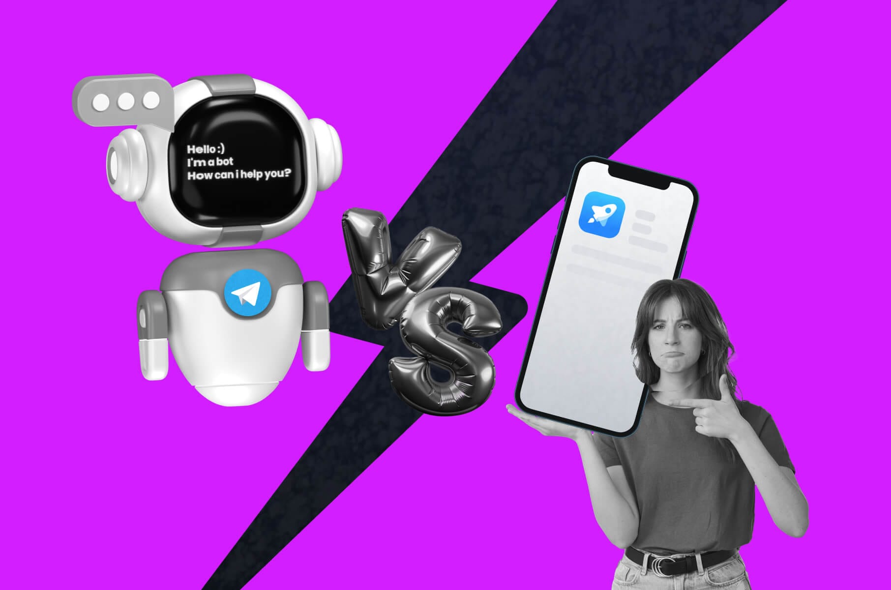
Mobile apps: How to evaluate mobile app design?
As a matter of fact, one of the reasons users uninstall your app is poor UX/UI design. So, how to evaluate a mobile app design and use the results to improve it? Read on to find out.

Hundreds of thousands of new mobile applications are getting released every year. To be more specific, let’s take the summer of 2022, for example. In June alone, 89k new Android apps were released via Google Play, compared to around 36k iOS applications through the Apple App Store.
The total number of new apps is enormous, so it’s no surprise that app abandonment rates are pretty high. 24% of all apps are used only once by the users, and 28% are uninstalled within a month after the download.
While these numbers are relatively normal, app creators have all the reasons to worry about their own application’s performance and success. As a mobile application design agency, we’ve been in your shoes many times.
No one wants to see their work washed down the drain. What to do about it, you may ask? As a matter of fact, one of the reasons users uninstall your app is poor UX/UI design. So, how to evaluate a mobile app design and use the results to improve it? Read on to find out.
Mobile app design evaluation criteria
Imagine that after long hours of designing a mobile app in Figma, using top mobile app development frameworks, watching it being released, and anxiously waiting for its success, you find out that, apparently, the design is not that good.
Another scenario is that perhaps you want to consciously improve your application’s user experience and overall design quality and don’t know where to start. We have picked a few criteria that we think would best assess if your mobile app design is up to snuff.
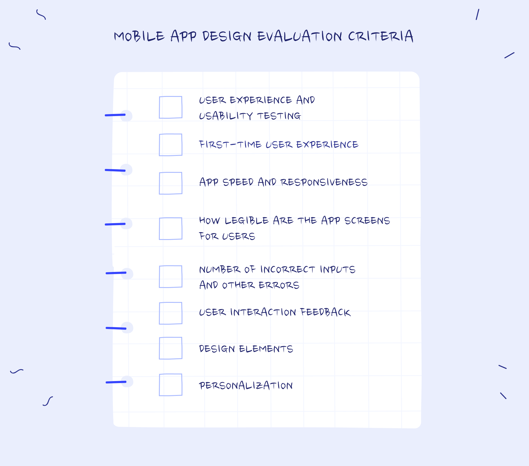
User experience and usability testing
Testing user experience comes with numerous methods and techniques - A/B testing, card sorting, guerilla testing, interviews, etc. Make sure you combine them with the main principles of mobile design, for example, predictable navigation or reducing the number of steps users should take when accomplishing a task.
One of the main subsets of UX testing is application usability testing, which is when you test your application with actual users by asking them to perform different tasks and writing down the results for later insights.
Another way to test the app is to check the essential metrics, such as time on screen (will show you the average session length), engagement rate (how often people interact with your app), conversion rate (how do your calls to action perform), and customer satisfaction score.
Evaluate the first experience
You know what people say - you won’t have a second chance to make the first impression. It’s the same with the first-time user experience, which is basically that same very first impression your potential customers have after downloading your application.
Evaluate what people see and experience right after they open the app. The sign-up or log-in, the onboarding process, the rest of profile creation, the very first tour around the navigation, etc. Every one of these elements has to be seamless, starting with the colors and ending with calls to action.
Some of the reasons people uninstall your application after a bad first experience are poor responsiveness (we’ll discuss that next), forced log-ins, annoying notifications, extremely cluttered design, or, quite the opposite, an incredibly boring one, too much ambiguity, and very complex and lengthy onboarding.
App speed and responsiveness evaluation
Even though humans are the most advanced beings as of yet, we’re still known to have a relatively short attention span. This has actually worsened over the years with the amount of new technology.
Slow loading time is one example of how our impatience ruins the mobile app or website experience. Nothing to do with design per se, but it’s crucial to assess your application’s speed and responsiveness.
Overall, the loading time between 2 to 6 seconds is considered “an appropriate” waiting time that a user is comfortable with. Ideally, just 2 seconds before the visitors’ tolerance vanishes and they bounce.
The same goes for the app’s overall responsiveness. A few tools will do a great job of measuring that, particularly for web applications and web pages. For example, Yellow Lab Tools or GTmetrix can be extremely useful.
How legible are the app screens for users
The next thing to evaluate is how legible is your application’s interface for users. The interface legibility is how clear and evident something is to be correctly read, recognized, and understood.
A few legibility markers or metrics will help you assess how easily your users can identify and read what’s in front of them. There are two types of app interface copies - functional and non-functional.
The former is used to help understand the context and instigate action, while the latter just provides information. Their legibility levels can be somewhat different.
Overall, the interface legibility is affected by the following factors - font size (preferably not smaller than 10), relativity (toward the screen size), font weight (as in light, regular, or bold), color, aperture (the openness of letter forms), etc.
Number of incorrect inputs and other errors
Errors. They are bound to happen at some point. Usually, it’s not about those errors at all. It’s how we handle them. True, if the number of incorrect inputs is huge, it will most definitely hinder the user experience. But it’s mostly about error messages in general.
So, an error is when an application fails to complete a particular task or operation. For example, user input is not supported, or an incompatible operation occurs. However, a well-designed error message can actually help remedy that.
On the other hand, if you want to prevent errors from happening in the first place, we advise you to use application constraints and offer people suggestions on how to perform a task.
User interaction feedback
Some would argue that collecting user feedback is not the best way to assess the quality of mobile application usability, given the fact that users seemingly rarely know what they want and cannot give you fully-fledged ideas in the first place.
However, during both the app development process and the evaluation after your application has been deployed, user interaction and feedback are quite precious if you know the limits and what to ask for.
The right way to gather feedback is to ask open-ended questions, avoid asking people directly what they want, and, if possible, try to look at the customers’ actions instead of taking their words literally. Examine their behavioral patterns as well.
Design elements
Having established that cluttering your application with all sorts of unnecessary design elements is not a very good idea, let’s take a look at how to see if any of them are good separately. For example, let’s go through three main categories.
Colors. Color has a severe impact on users’ feelings and emotions. Some colors have more positive connotations than others. Color can also play a role in the accessibility of your application and the legibility that we discussed earlier.
Typography. Fonts also play a crucial part in readability and legibility. Choose fonts wisely, as they are the key factor that helps you convey your message and other information to your customers.
Layout. Your app’s layout is the thing that helps users find desired objects or links to the needed information. An intuitive layout makes your app easy to navigate; therefore, users will want to return to it.
Personalization
And last but not least, personalization. One of the biggest challenges when designing a mobile app is creating a unique yet personalized experience. Properly implemented, personalization helps businesses increase user retention and boost engagement.
One way to add personalization or test if your application is personalized enough is to look at how much the interface design and user experience are tailored to users’ needs. Use real data to segment your users and anticipate their requirements.
Personalization can come from little customizations based on user location, their device of choice, their purchase behavior, cart content, current and past searches, age, gender, time habits, location, etc.
What makes a good mobile app design?
As you may know, a mobile application design is a bit different than a desktop application or a website design for one simple reason - a smartphone screen has its limitations in terms of sizing, functionality, etc., but, in turn, it has a few benefits as well.
When companies create both a mobile app and a website or web app, it’s often best to focus on mobile design first because adding features and elements to your product’s interface is much easier than removing them.
A good mobile app design is knowing what details and components you want to prioritize. Navigation is also an essential part of the mobile app experiences. A mobile app makes proper use of scrolling, swiping, and other interactive elements that don’t depend on the cursor.
An even better mobile app design follows the user interface design principles. For example, the app has a recognizable structure in which related items are grouped together, and unrelated are clearly distinguishable.
Ultimately, the best mobile app design is the one that represents your business thoroughly and, at the same time, is user-centric, efficient, intuitive, and aesthetically pleasing.
Evaluate a mobile app design with users in mind
A general rule of thumb in mobile application design evaluation is that you should always keep your users in mind, just like you did during the initial design process. All the elements and features of your app should be relevant to the user first.
Evaluate the user journey. Assess how easy it is for your customer to go from A to B when performing any task. Every element necessary for the user to accomplish said task should be intuitive, visible, and not cluttered with irrelevant stuff.
Overall, to properly evaluate your mobile app design with your customers in mind, you should focus on user research, test the usability of your product, gather valuable feedback, take care of responsiveness, and, most importantly, provide value for users they can’t find elsewhere.