0
Table of Contents
SaaS navigation UX: Best practices for your SaaS UX
Navigation is what helps customers find their way around products. Keep reading to find out how to get SaaS navigation UX right.
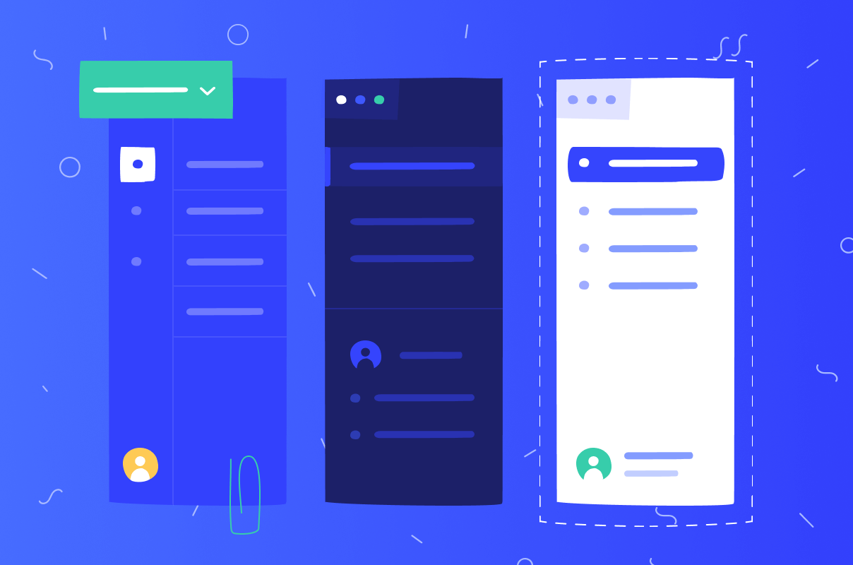
User experience has always been crucial to any successful software or digital service. What's more - navigation is a vital component of that experience allowing your customers to navigate with ease and comfort, which, in turn, means they can stay and browse for longer. That's why fine-tuned and transparent product navigation design can significantly increase conversion rates, while inadequate and disorganized one can steer your visitors off for good. This is especially true for SaaS (software as a service) products. Keep reading to find out how to get SaaS navigation UX right.
What are SaaS UX best practices?
Navigation in SaaS, just like in any other software, is not just about placing a navigation bar on the top or bottom of the page and calling it a day. It's about how users use that bar to find their way around the interface.
The primary goal of navigation is to provide an enjoyable experience for customers while requiring as little effort from them as possible, making navigation UX a №1 priority in SaaS product design.
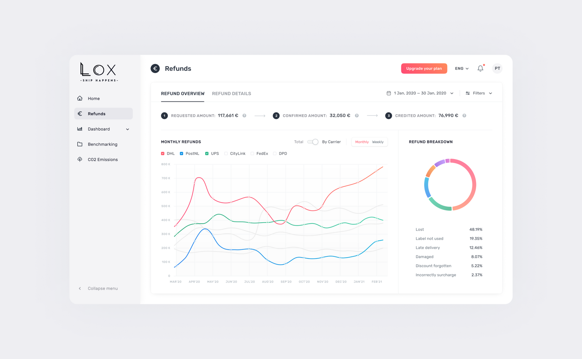
It's also one of the most challenging things to create because there is no "one size fits all" solution. Understanding that there are no universal best practices for designing good navigation is essential. The following are three important practices to incorporate into your workflow when creating a strategy for your SaaS interface design.
Identify core user needs
You should first focus on identifying core user needs and creating the navigation around them. Any user-oriented design revolves around being helpful and not just acting as eye candy. Such important factors as your target audience, their goals, your existing content, and especially what industry your SaaS falls under are integral to the design if you want to properly engage your visitors and lead them to the desired outcome. Answer these questions first before creating or remaking any SaaS product:
- What information does a user need to complete any specific task?
- What steps will a user go through to complete that task?
- How can we best meet any user's needs?
- How can you make navigating easier for customers?
- How can you make navigating more enjoyable?
Make it easy to find what users need
Users should always be able to locate what they need on the spot. No roaming around, hoping to find a particular element or page. A straightforward and intuitive navigation system should allow people to find their way around a product without stopping and mulling over the required efforts.
Provide enough information and visual cues for customers to complete their tasks effectively. First of all, have a clear navigation hierarchy so the users know where they are at any given time.
Secondly, provide quick access to features or information by using shortcuts and buttons. Finally, keep usability in mind, and don't overwhelm your users with too many options, making it difficult to know where they should go next.
Make sure the UI is simple and consistent across all pages
Consistency and clear information architecture are key when navigating a website or app. Make the navigation elements stay the same throughout the site or app, along with the consistent terminology. If users need to access features and pages on a deeper level, make sure both the primary and secondary navigation are consistently tied together through subpages, and links are easily distinguishable from simple headers.
Simple and consistent navigation in SaaS interface design means that:
- It's intuitive, with clear paths and minimal distractions;
- It doesn't contain too many options that are not relevant to the current page or screen;
- It feels responsive, meaning that it doesn't take too much time to load when you click on something in the menu;
- It has a search function for users who know what they want but don't know where it is located;
- It provides clear labels on the navigation bar or any other navigational elements;
- It offers shortcuts to help people easily get back to where they were.
SaaS UX design patterns
Have you heard of user experience design patterns? These templates for solving user problems are ready-made and tested reusable components that can be applied when designing interfaces. Designers create them to solve specific issues across various types of applications and websites. These patterns are not exclusive yet particularly relevant to the SaaS industry because of its result-oriented nature.
An excellent example of a design pattern is how users sign up - it's often as simple as entering an email address and password and clicking the sign-up button. It's the most common and convenient way to sign up for an account on any website or app, and there's no reason to change it because people are used to it. The same goes for registration patterns.
UX design templates work just the same for SaaS products by providing guidance on what to do when facing certain situations, for example, when a user wants to cancel their account. Performing a competitive analysis for UX design is definitely worth your while, as it gives you insights into how the navigation in other SaaS products is built. You can then easily implement their practices into your own product and offer your users a consistent user experience.
Navigation ideas for your SaaS product
SaaS product navigation can be done through a menu bar or tabs. Menus are essential to the product's standard navigation and can be found in several places on a website or application. Other common types of navigation you can find in most modern SaaS products include:
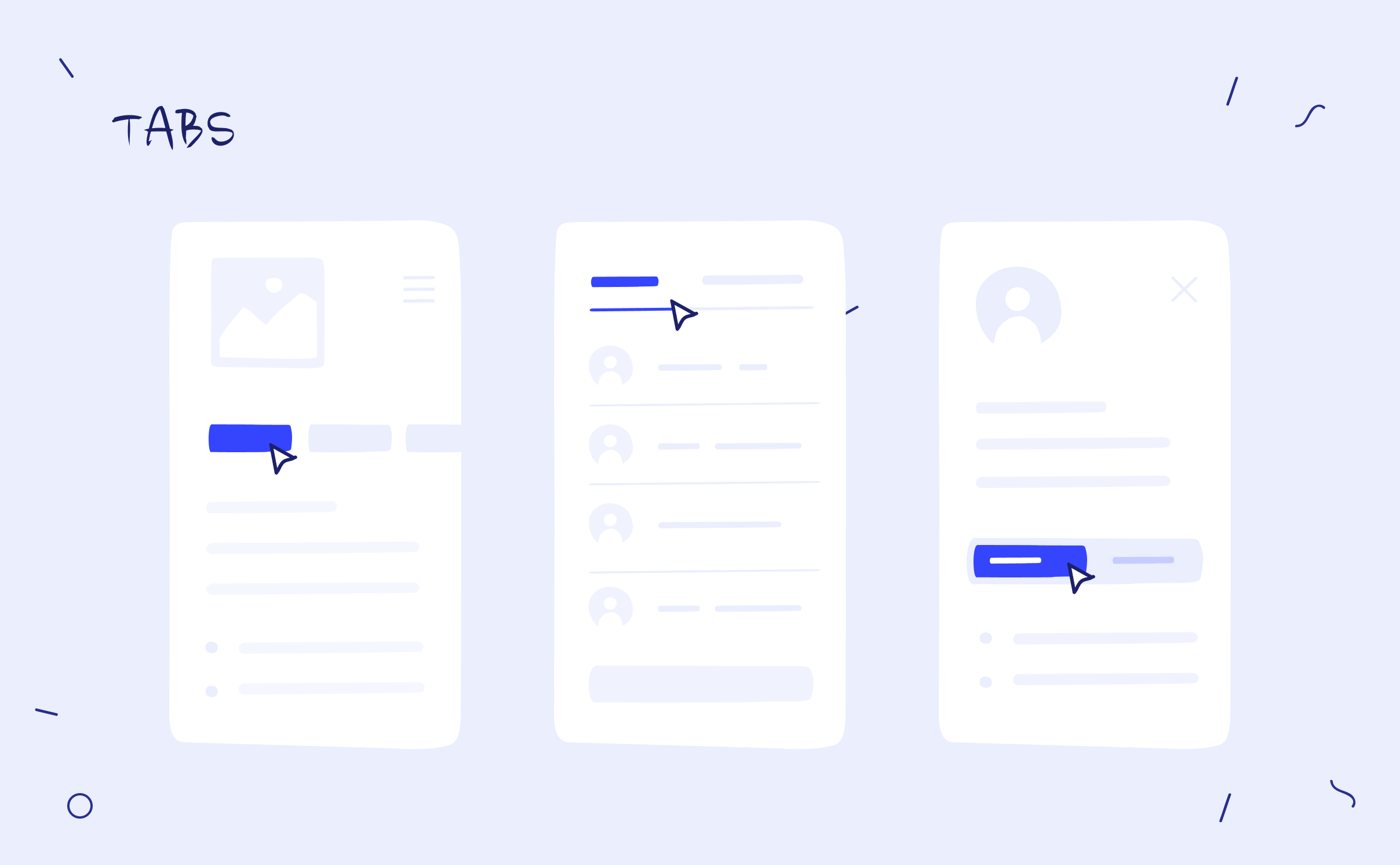
Tabs. One of the more frequent types of menus in UX, tabs have proven to be a consistent way for users to quickly find information and then return to the original spot. While great for connecting with secondary navigation, the downside is that it can be challenging to find the right one when there are too many tabs in a row.
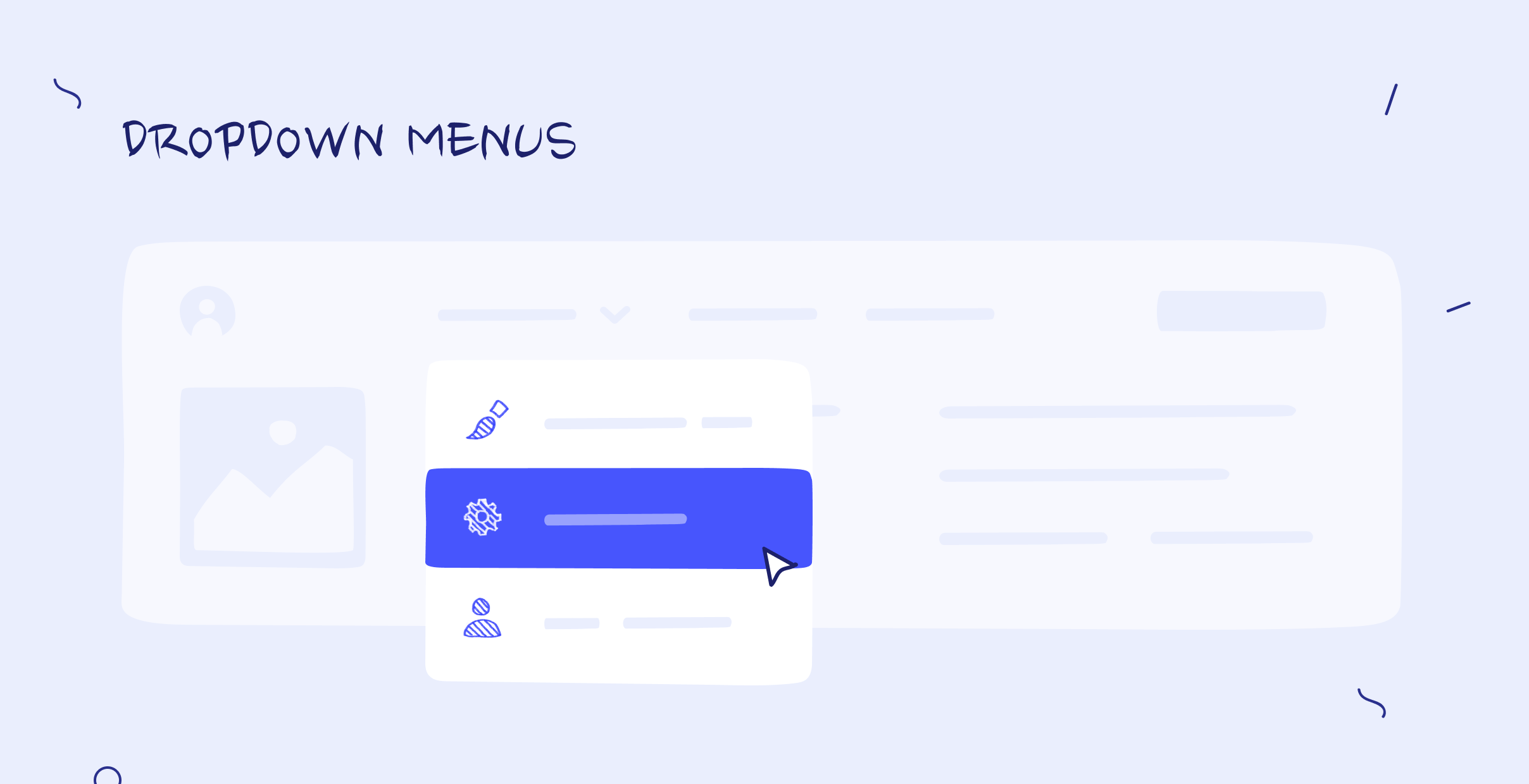
Dropdown menus. This navigation method has only one menu option visible at first, but after clicking on it or hovering over it, more options appear below it in a list form. Pro: it allows users to easily maneuver different pages without resorting to an endless scroll. Con: the possibility of overwhelming the space if there are too many pages to include in the menu.
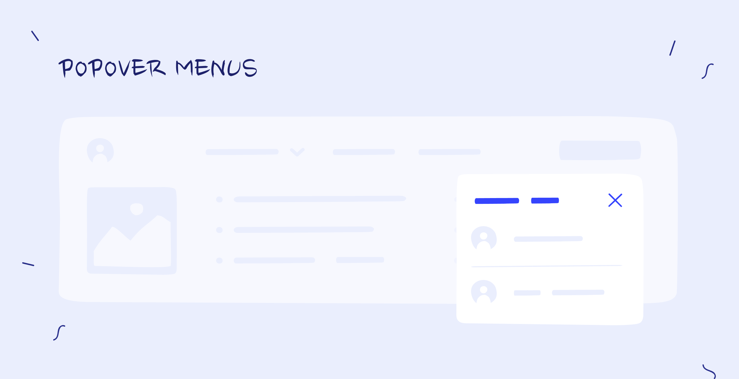
Popover menus. They can be used for quick access to content or information that needs to be shown on top of other content. This type of menu pops up over an app to show what the user can do inside the app. Popover menus can be used in all sorts of situations and typically have more items than tabs or dropdown lists.
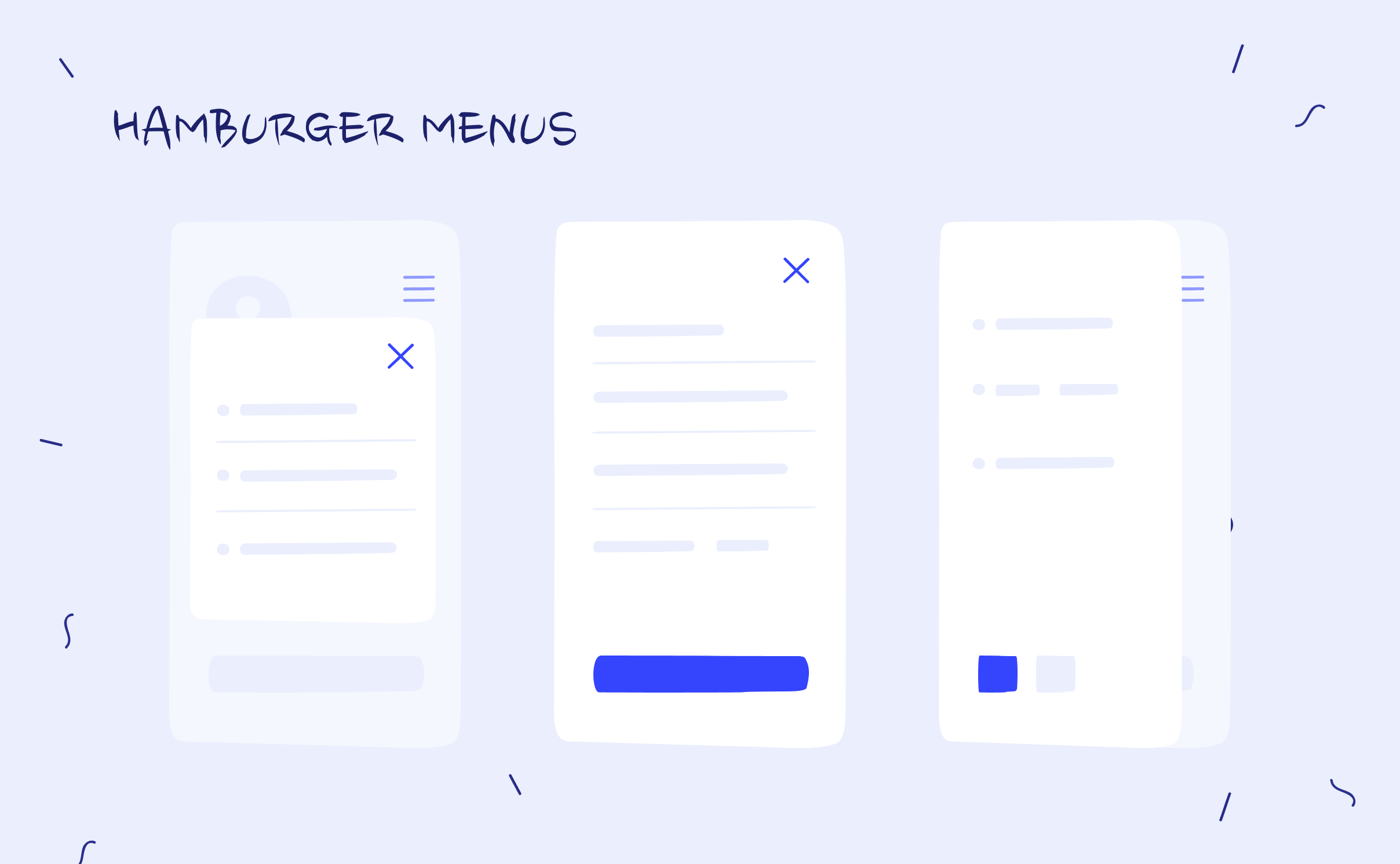
Hamburger menus. Remember a three-line icon in the top left-hand corner of the screen that expands to reveal a full menu when clicked on? It's called a hamburger menu. By accessing the main features quickly and easily without too much screen space, this pattern allows users to browse through content without having to scroll all the way down.
Breadcrumbs. This menu is favored in more traditional websites because it provides an easy way for users to visualize where they're currently located in the hierarchy of pages. By showing them where they are within the website's navigation structure, users don't have to rely on memory alone. However, too many “crumbs” can confuse people and take up too much space.

Best SaaS navigation examples
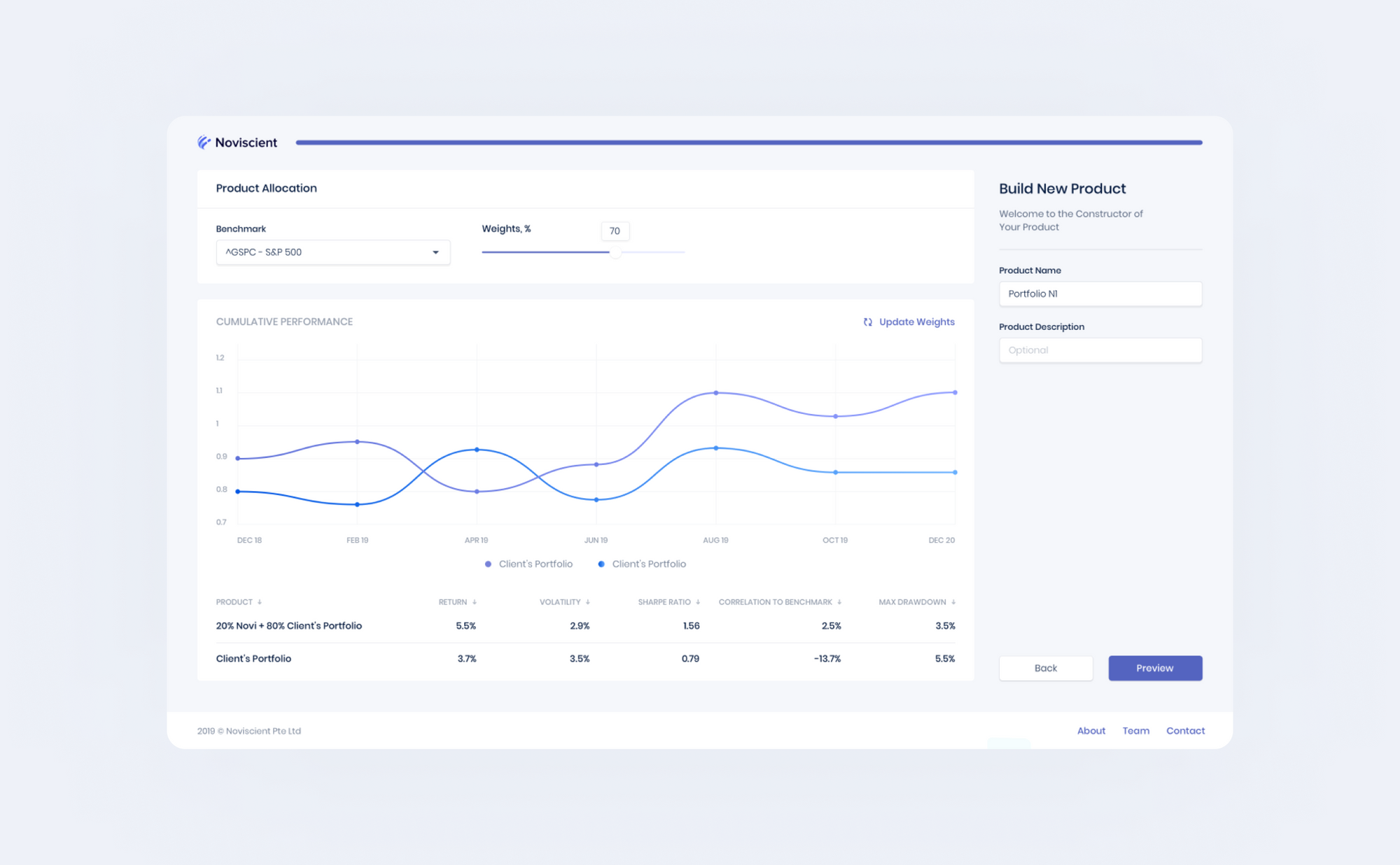
Noviscient is an investment management platform and one example of SaaS products with the right UX navigation. The product’s whole interface has been designed to be simple and intuitive, so users can quickly find what they are looking for without any confusion or inconvenience.
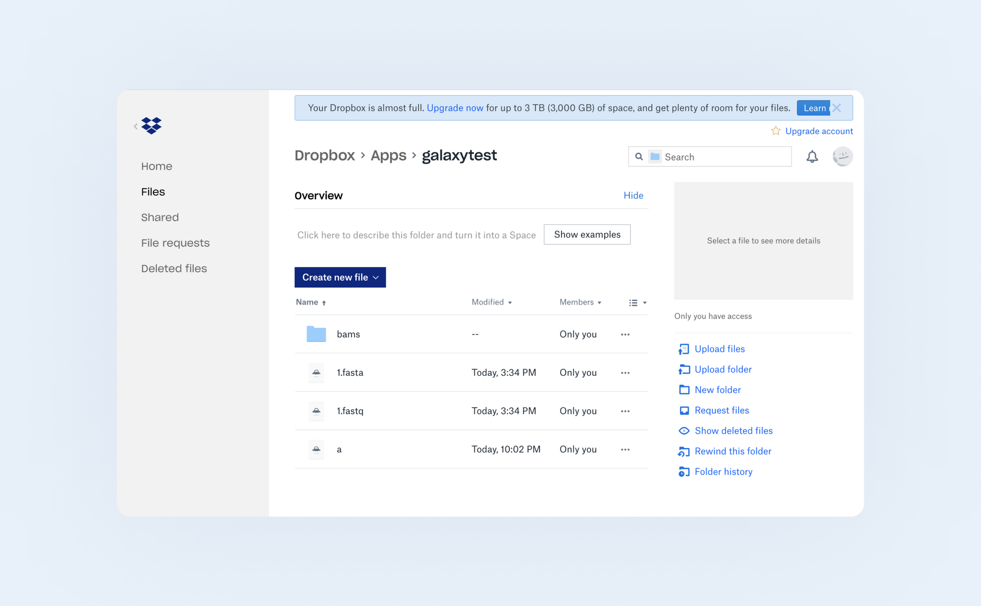
Dropbox has an intuitive UX navigation system that makes it easy to use and navigate the app and the website without any hassle. It has a tab bar at the top of every page, allowing you to jump from one site section to another without going back and forth between tabs or pages.
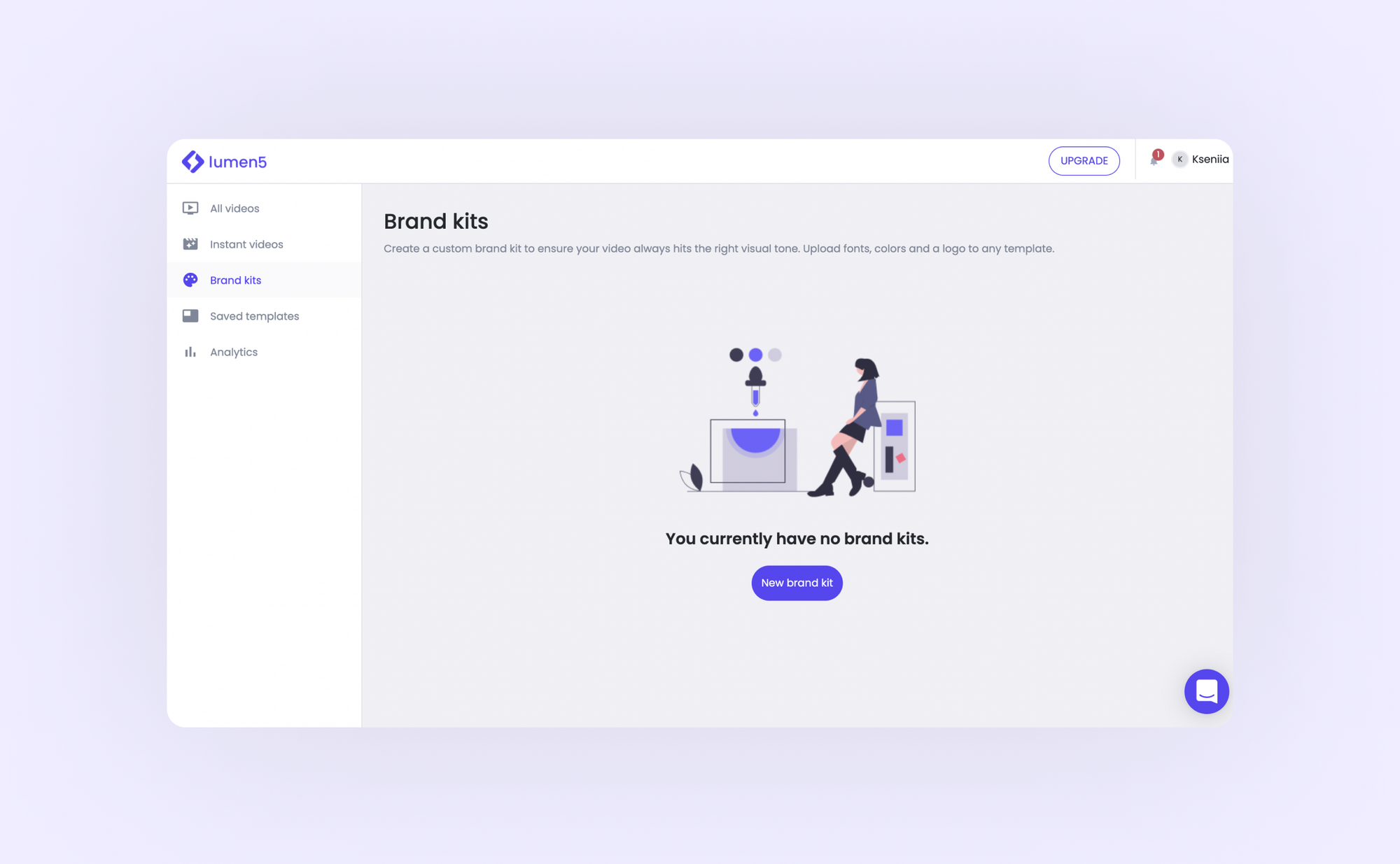
Lumen5 has a similar UI to Dropbox, and it's just as easy to navigate all of its features. Both UX and UI are clean, straightforward, and easy to find your way around. This video maker is also fairly intuitive, so you don't need instructions to figure out how to use the product.
Most common mistakes designers often make
When designing any digital solution, a few common navigation errors can pop up that are often overlooked because they are easy to make and difficult to spot. Be on the lookout for the following missteps:
- Using too many menus. This may seem like a no-brainer, but you can find websites out there with fifteen levels of dropdown menus! This just leads to more confusion for the user as they have to scroll through pages upon pages of options before finding what they want.
- Not making it obvious where the navigation is. This can be done by either not providing a link to the site's main menu or not creating a clear visible link to the home page.
- Having non-standardized link colors. They should always correspond with their function (e.g., blue for external links).
- Providing no visual cues or indicators of where you are within a product.
Why is navigation in UX so important?
The importance of good navigation in SaaS design is hard to overestimate despite being an occasionally overlooked component. You don't want your users to struggle, right? Imagine them trying to find their way around an unfamiliar website without any form of navigation.
It would be like someone trying to navigate the woods without a map or landmarks. You cannot cover all digital space in a matter of minutes, so navigation becomes even more significant as it ensures users can find what is needed quickly and efficiently.
Good product navigation design is the difference between a happy customer and an unhappy one. How people navigate a SaaS solution determines how easy it is to find what they are looking for and whether they will continue using the product.
Final thoughts
Having now established that poor navigation is just one step removed from a completely unusable product, a key takeaway is that it's essential to have a clear and intuitive navigation system in place, with clear labels and icons that make sense within the context of the product.
If you're looking to improve the user experience of your SaaS and make sure your customers return, you must make your product's navigation as easy to use and quick as possible for your customers to find what they need.
