0
Table of Contents
SaaS design trends for 2023
Practicing good design is becoming a must-have in every business that serves customers online. Being practical and designing for usability forces you to take care of all your customers, from the most tech-savvy to those who have never touched a computer in their lives.
Practicing good design is becoming a must-have in every business that serves customers online. Being practical and designing for usability forces you to take care of all your customers, from the most tech-savvy to those who have never touched a computer in their lives. Now is the time to focus on SaaS design trends for 2023 that answer what your business should do for their landing page to increase conversions.
SaaS is already a significant part of every business, with around 99% of businesses using a SaaS solution. Not only that, but the SaaS industry has a market value of an incredible $186.6 billion. What that means is it's no longer an extraneous or emerging product for business owners to adopt. It's a necessity. Consumers are expecting it now even when they don't recognize what a SaaS solution is, which is exactly why you must start adopting 2023 SaaS design trends now before you miss your window.
UX and CX are more important than ever for SaaS websites
These days, it's not enough for your SaaS to just work. Your product's design is everything when it comes to user experience. From the landing page to full-on customer portals and backend systems, the customer experience is everything.
Truly useful software makes the user experience easy — it saves users time, reduces their frustration, and provides a guide for what to do next. The biggest UX mistakes include too many features and poorly written copy. This makes sense, as both can be used as signs of low quality or unprofessionalism. In order to achieve better UX, companies should focus on keeping things simple and clean, front-end development perfect, with an overall UX that doesn't overwhelm consumers while maintaining the idea of a feature-rich SaaS product.
A good user experience won't just increase conversion rates but also the overall health of your company. If you're helping customers save time, they'll need less support, which means fewer costly tickets and less money spent on customer service. A great user experience can also lead to more word-of-mouth referrals, which are the best way to grow any business.

SaaS trends to use in 2023
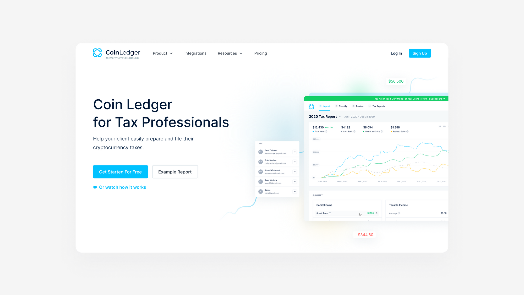
Today, software as a service (SaaS) has become an important part of life for many businesses, and it is also an integral part of website design. The best SaaS websites are functional, clear, and easy to navigate. Most of them use a minimal design approach and have a flow that is similar to the user's workflow. Here are the SaaS trends to use in your website design.
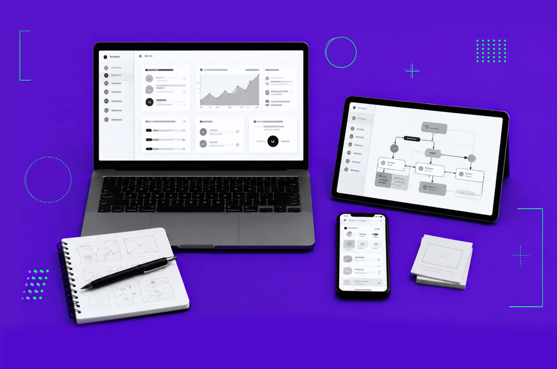
Clean design
One thing which is easy to lose sight of is that people want simplicity when they visit your site – especially if you're selling them something. A lot of businesses think that complexity equals credibility, but that's not actually true. In fact, the opposite is true: simple websites are easier to use, and they convert better because they're more approachable.
Uncluttered websites have a strong focus on the content; there isn't any fluff or unnecessary information on the page. Today's web users have extremely short attention spans, which means that you need to get straight to the point when writing copy for your website – you can't afford to waste people's time with superfluous information.
Color minimalism
Color theory has changed drastically over the last few years, and now we're seeing e-commerce sites using color as a means of grabbing attention but also using it minimally. E-commerce sites are using one or two colors as their primary brand color and then adding accents of other colors throughout the design. The accent colors can sometimes be used for call-to-action buttons or navigation menus, but other than that, those accents are kept at a minimum.
Color palettes tend to consist of two complementary colors, with white space being used as an accent color throughout the website design. The reason why this works so well is because it's easy on the eyes, which allows customers to focus on the content you want them to view instead of being distracted or lost.
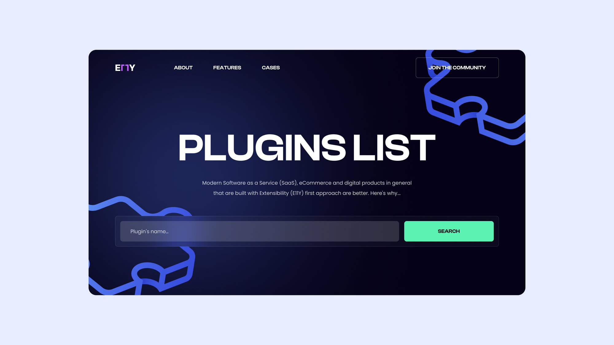
Large heading fonts
SaaS websites use big, bold text and minimalistic design to provide the most important information in users' field of vision so they can make quick and informed decisions. SaaS websites have a lot of content to display, so they need to be super straightforward with their visual hierarchy.
When adopting a minimalistic design for your site, it would be counterintuitive to clutter the space with graphics, images, colors, etc. Instead, simply using a bold-face font to highlight the importance of a section tells consumers all they need to know. Taking hierarchy into account, you can easily change the weight of each font to signify the importance of each heading, with h1 being the boldest and h3 or h4 being less bold.
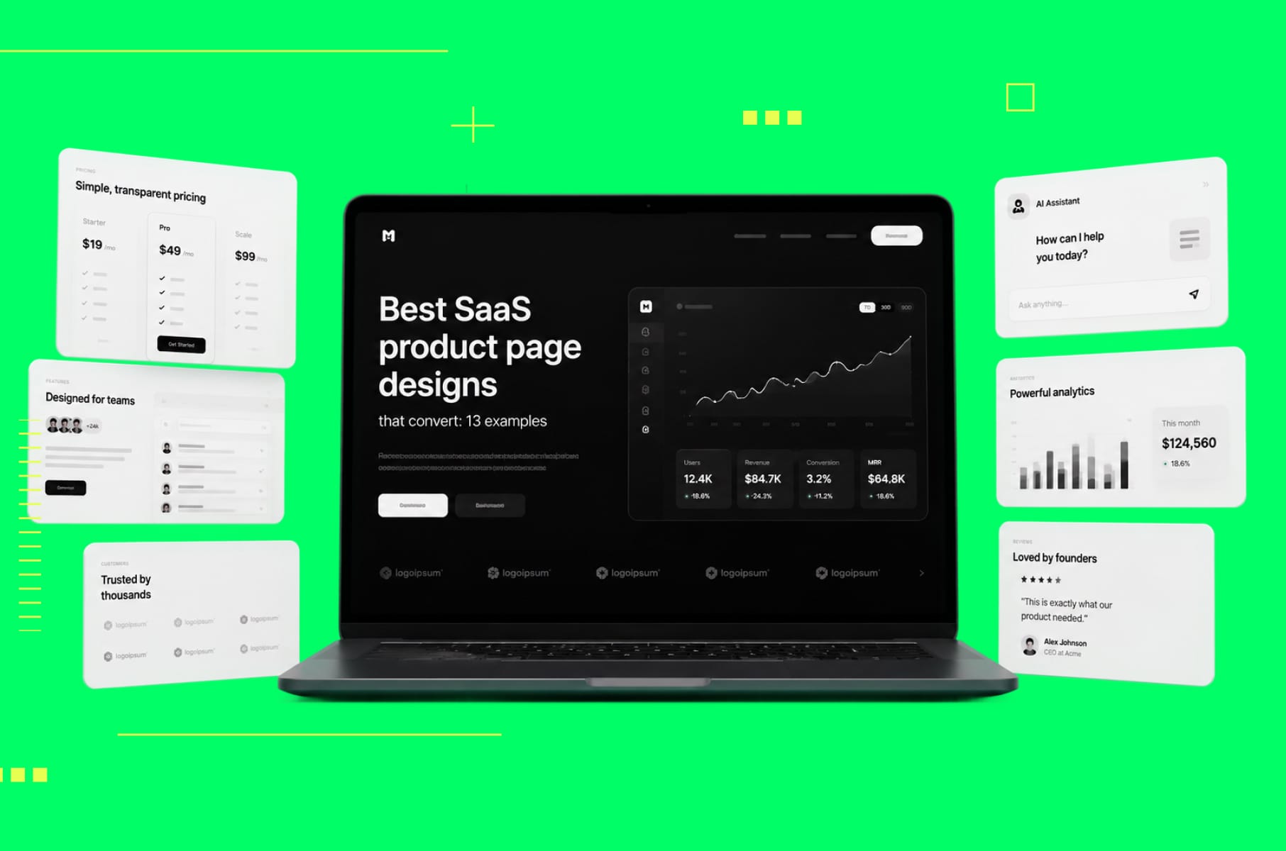
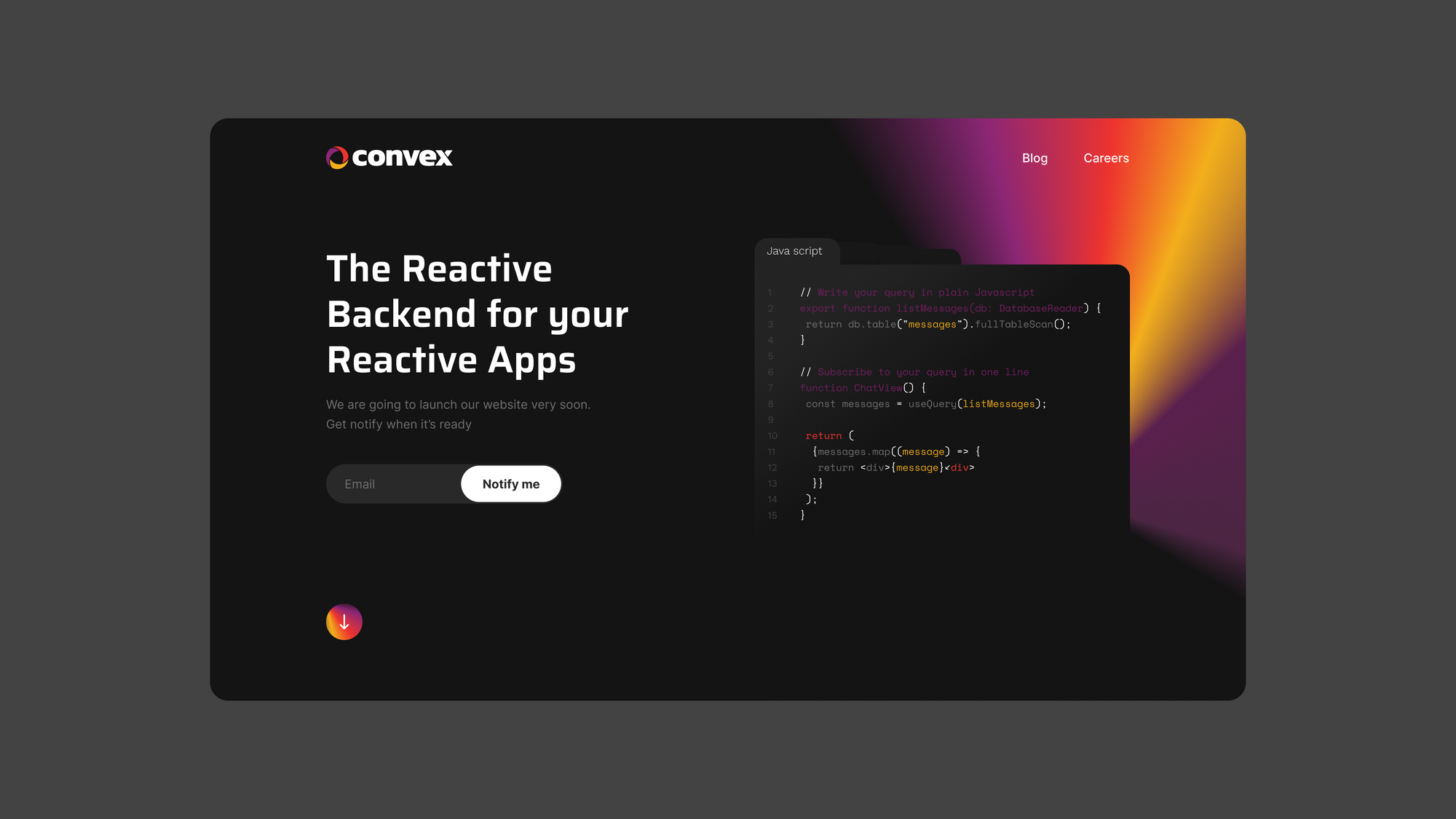
Dark mode
Dark mode has become increasingly popular over the last few years, with more and more websites offering this option to users. With the rising trend of dark mode, it's no surprise that SaaS websites are also now adopting this design element.
Dark mode not only provides a unique and sleek look to your website, but it also reduces eye strain and conserves battery life for users. It's particularly beneficial for users who work late at night or in low-light environments.
Moreover, using high-contrast colors in the design, SaaS websites can highlight important information and make it stand out more effectively. Adding features like this can improve the user experience and drive conversions by making it easier for users to find what they need on the website.
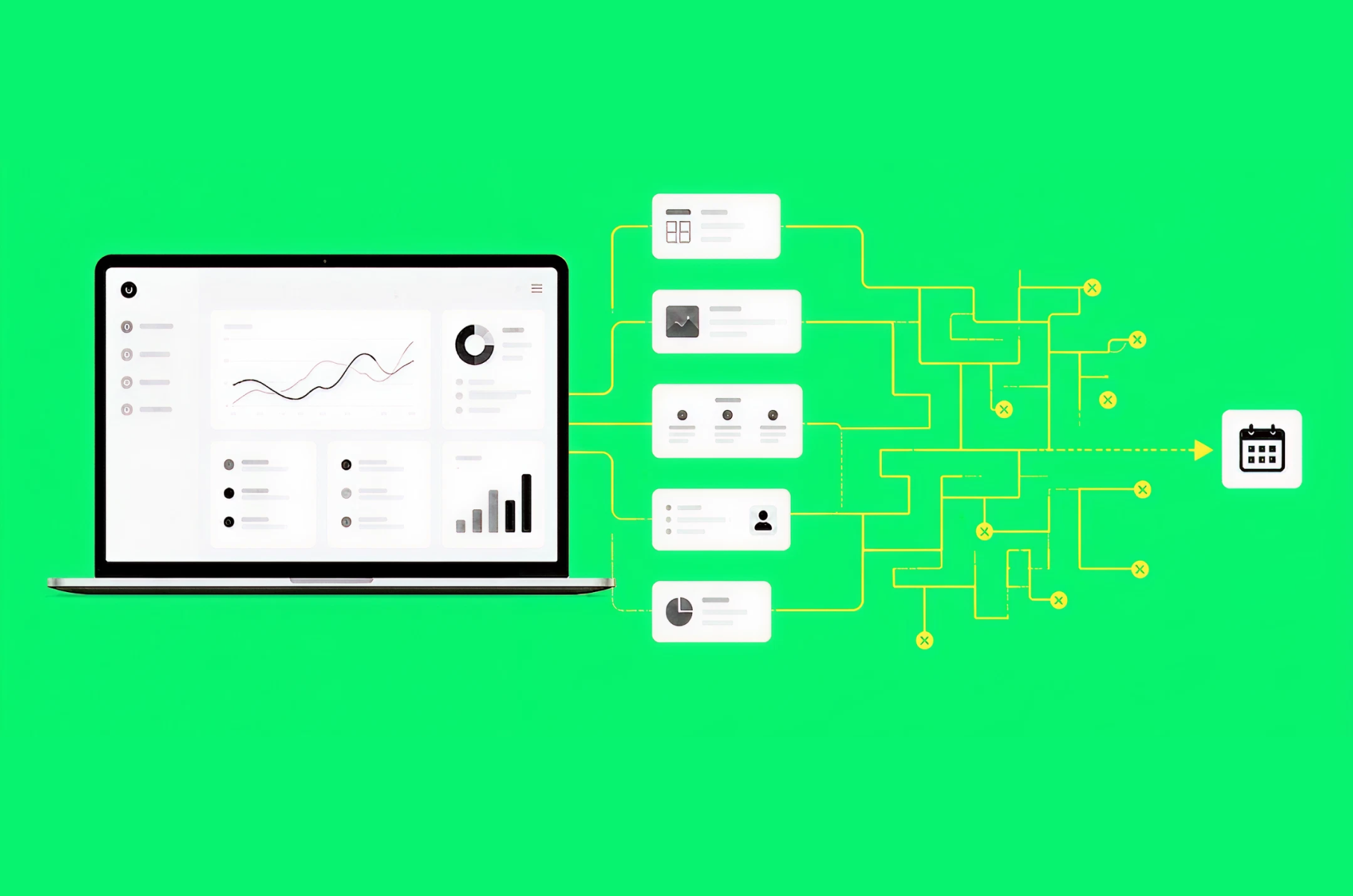
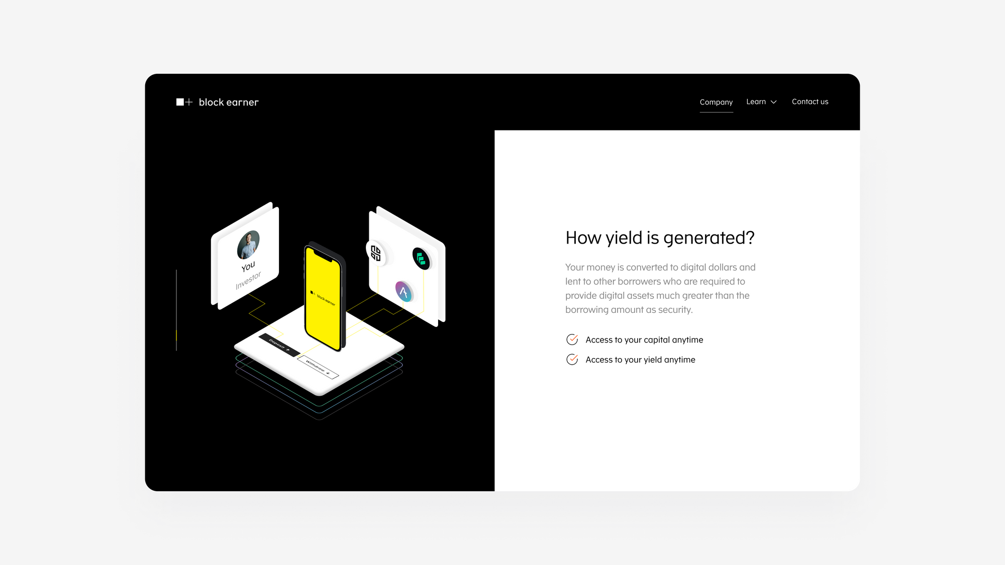
Graphics and illustrations
Having a visually appealing website is critical in today's business world. You're competing with other businesses for consumer attention, and if your website looks outdated, slow, or confusing, you'll lose out on potential clients.
Consumers need to understand how your product works and what you can do to solve their problems in just a few seconds. This can be handled easily by incorporating the right graphics and illustrations into your site design.
Graphics help users navigate through a complex SaaS product by gently guiding them to a new page or the next step in their workflow. They also give immediate insight into quality information that otherwise might be lost on the page, i.e., an infographic.
Not only are these illustrations for consumers to enjoy using your product, but they also represent your brand identity. On each page, there's a little bit of you displayed. It's no longer just text on a white canvas. There's color and style that tells a user they're on your product and no one else's right now.
Personalization
We all know that personalization is still the key to creating a solid connection with your users. Creating a personalized experience can give your users a unique experience particularly tailored to their needs and preferences.
SaaS websites that now leverage personalization in their design to enhance user experience and build brand loyalty achieve it through features such as dynamic content, personalized recommendations, and customized user interfaces.
With the help of data analytics and machine learning, SaaS websites can collect user data and use it to create a personalized experience for each user. This not only helps in building a strong relationship with the user but also enhances the chances of converting a visitor into a customer.
Micro interactions
Micro-interactions are short, simple, and quick user journeys. They act as a shortcut to a longer process.
Designing for micro-interactions means focusing on how to make things interactive. This is not about making new interfaces such as drag-and-drop functionality and so on; it's about how to present already existing functionalities in this form.
This SaaS trend is all about using interactive elements and small doses of animation to add life to your website. Animation is important in web design because it can help bring life to static content and make it more engaging. It also helps users navigate through your website without getting distracted by other things on the page.
Our top 3 SaaS website designs for 2023
In the previous article we picked the top 8 SaaS landing pages that you might have missed. For 2023 we went for websites that are well-known. These three SaaS websites are hand-selected by the Merge team. We believe they are impeccably designed, and even though it's January, their designs will remain trendy throughout the rest of 2023 (and possibly longer).
MailChimp
MailChimp is an excellent SaaS website that's clean, bold, and easy to navigate. It uses a lot of white space, making it easy for users to focus on the content rather than be distracted by big design elements.
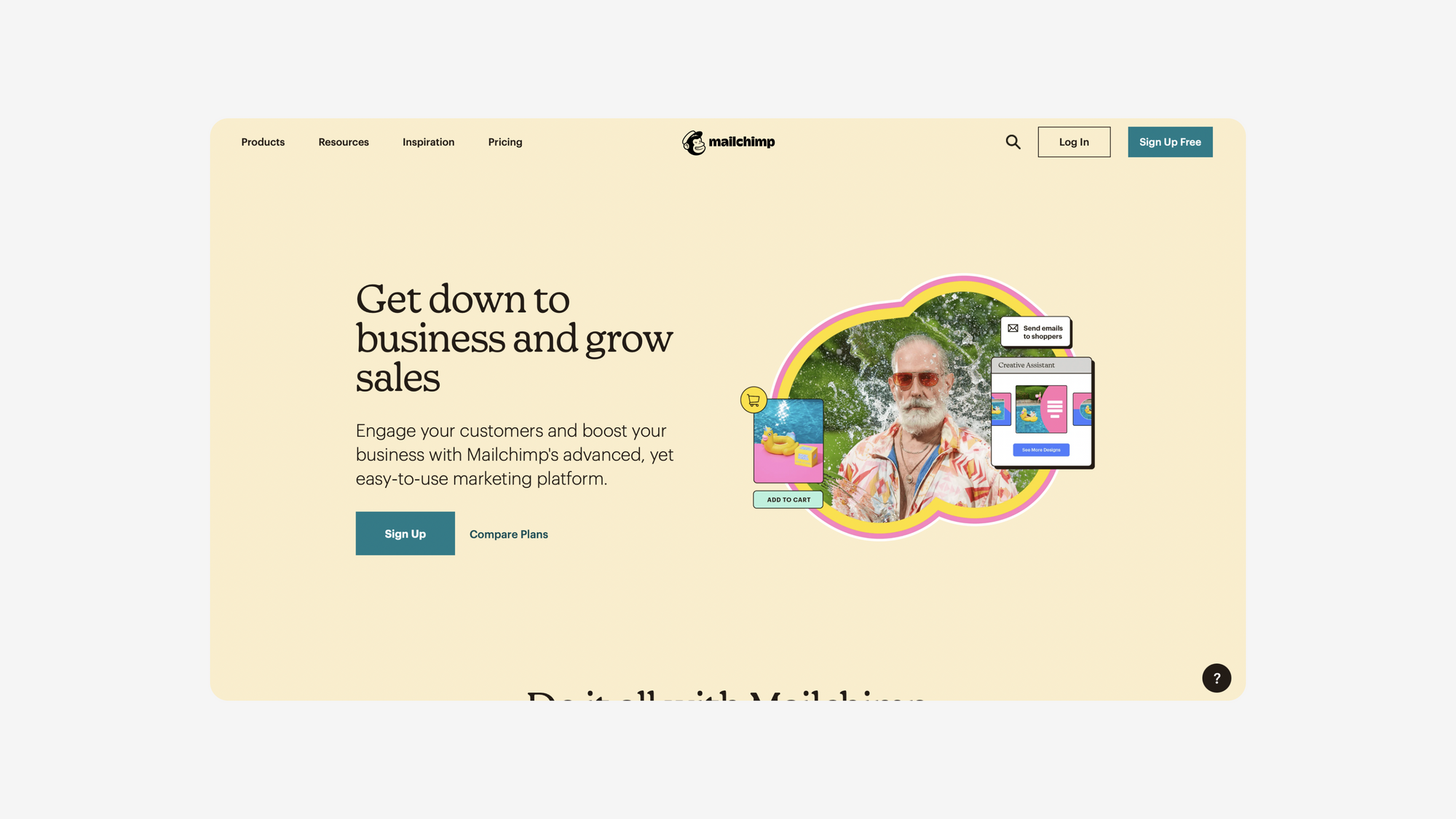
In short, MailChimp’s main advantages are that it:
- Is a clean SaaS website design that minimizes distractions
- Effectively utilizes white space
- Has fonts that are tidy and bold for each heading/subheading
Fast
One look at Fast tells you all you need to know about what this site does and who it's for. The site is so clean and really well organized, so users, new and old, can navigate freely and know that each page they're on is designed for their eyes.
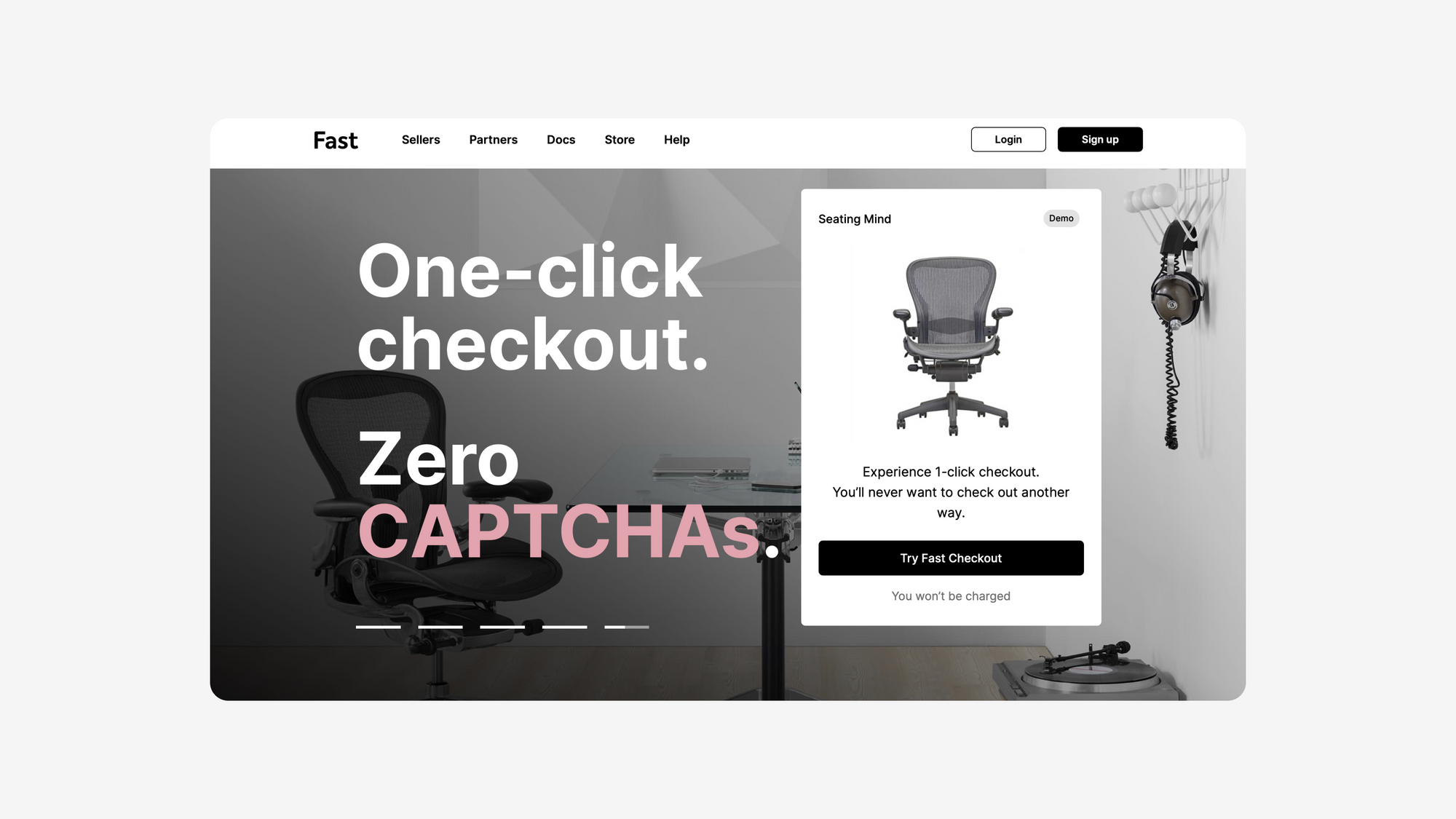
In short:
- Flat, minimalistic design for easy navigation
- Clutter-free SaaS landing page help users focus
- One-color accent guides user attention appropriately
Evernote
The primary goal of Evernote's homepage is to get you to sign up or login with no distractions. It is simple and easy to use. We love that Evernote homes in on their vibrant green color as a solid accent that guides user attention.
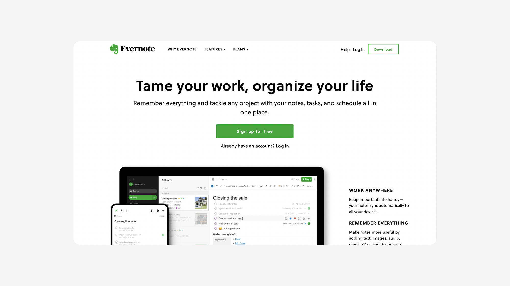
In short:
- It's a well-organized website with minimal navigation effort
- A sensible hierarchy of SaaS landing page content guides users
- Minimized use of color emphasizes the right content
Adopt SaaS trends for your site today
SaaS design is a constantly evolving process, but the industry is starting to develop its own distinct collection of best practices for implementing them. Adopting a SaaS-first mentality will help position your product or service as a go-to solution for companies that are looking to achieve goals like improved employee productivity, cloud growth, functionality, and more. Make sure your website is designed with SaaS in mind, and you'll ensure that you're well-positioned to establish yourself as a company that embraces SaaS architecture as its standard.