0
Table of Contents
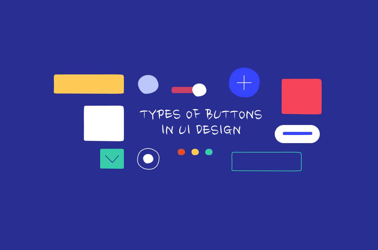
Types of buttons in UI design: from basic to advanced
Understand why buttons play an essential role in the design of any website or application, as well as what types of buttons there are.
Buttons play an essential role in the design of any website or application. They are an exceptional element that can either make or break the experience a user has when visiting a website for the first time.
At the most basic level, buttons are styled links that aim to grab the attention of the user and guide them towards a specific portion of the website while giving them a clear indication of what they can and cannot click on. Regardless of whether you’re learning about the difference between web design and UX design or the guidelines for mobile UI design, buttons will play a role.
Despite being simple in terms of their function, buttons deserve special attention because their use across the web has made them an effective heuristic for users to know what’s expected of them. Implemented correctly, buttons can be much more effective communicators than several sentences of text.
The text in buttons is referred to as ‘calls to action’ (CTAs) and they are aimed at making the overall experience of a website more enjoyable. Of course, a reliable and skilled UI/UX design studio can easily help you navigate the world of CTAs.
Common types of buttons
Buttons are primarily implemented throughout the UI design scale as a means of enticing users to take actions or make decisions. Buttons should enable a high level of functionality with a single click of a mouse or the tap of a finger.
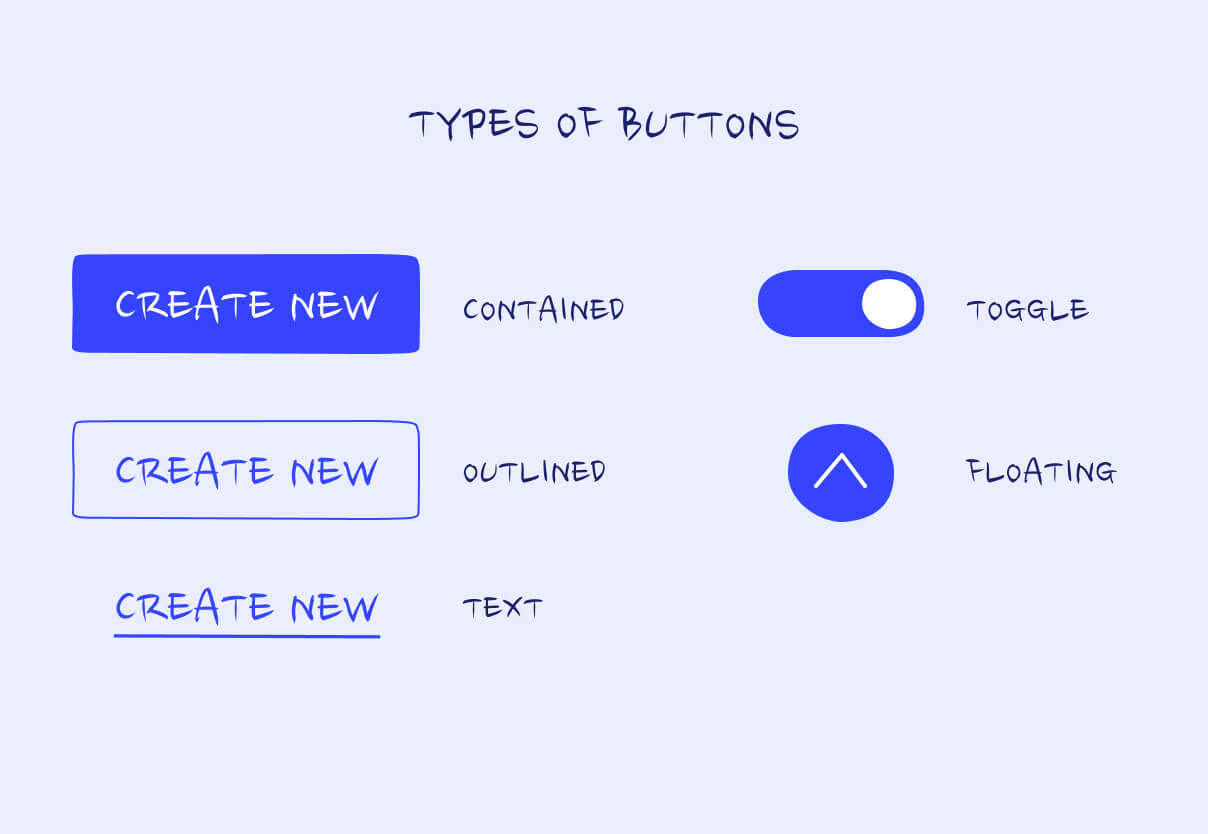
Outlined buttons
Outlined buttons in the design space are also referred to as ghost buttons. They are a bit more complex when compared to text buttons, as they are used to indicate actions that might be a bit more important. They feature an outline and have no fill surrounding the text; they also indicate the action that will take place when they are clicked.
Contained buttons
These rectangular buttons often have a shadow behind them to give the illusion that they are lifted up from the page. These shadows add a three-dimensional feel to the page and bring more attention to their presence.
Text buttons
Text buttons are the most basic type of buttons out there–they are typically in line with other design elements and are not designed to grab too much attention. The text usually describes what will happen when a user clicks the button.
Toggle buttons
These types of buttons are utilized across button designs for numerous reasons. First, they are aimed at grouping together related options. Second, they are utilized to showcase a specific action or a setting. Only one operation within a group of toggle buttons can be selected at once.
Floating buttons
By definition, these floating action buttons (FABs) are aimed at performing the primary action within a screen. They appear in front of all other content as a circular shape with an icon located in the middle. A FAB needs to perform a specific constructive action within the page, such as the creation of a new item or sharing a specific item on the screen.
In conclusion
We’ve gone over the different types of buttons in UI design, but there is a lot more that goes into them aside from the type. Designers also consider the size, color, and shape of each button, changing each aspect depending on the button's purpose.