0
Table of Contents
Web3 design best practices: Lessons learned from reviewing the best and worst Web3 websites
Follow our best practices and you can enhance your design, usability, and overall effectiveness in communicating your value to users.
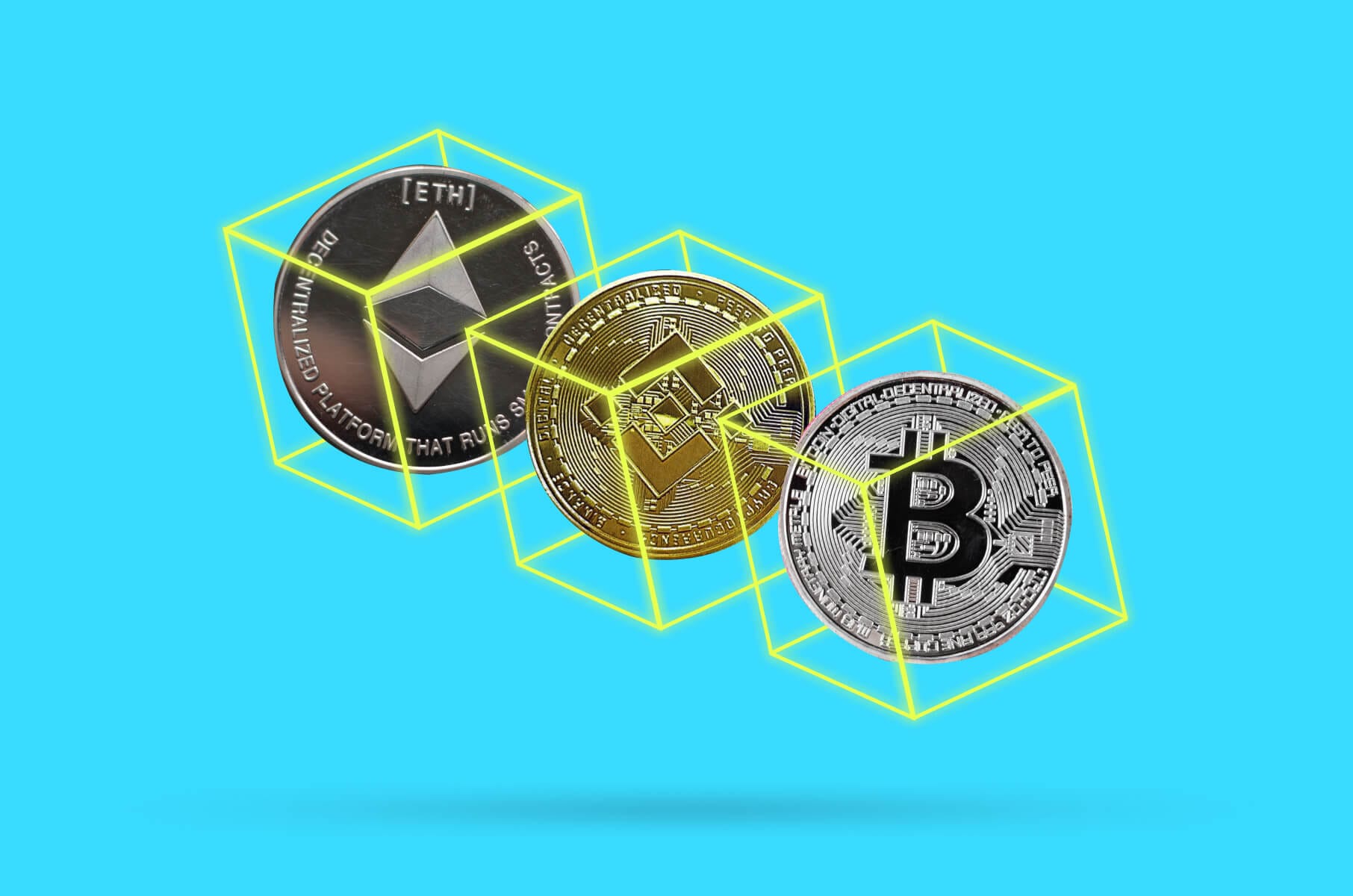
After reviewing Web3 websites in our CEO’s recent YouTube video, the realization soon came that so many Web3 companies earning millions of dollars have awful websites.
Despite their technological focus, they often lag in updating their websites. This, unfortunately, suggests a disconnect between their innovative products and their web presence.
To avoid this happening to your website and product, we have prepared a list of Web3 design best practices for a converting site based on the insightful lessons we learned from reviewing the best and worst Web3 websites.
If you want to see which websites made the cut and are considered the best in the game right now and which ones are flops when it comes to design, head over to YouTube after reading this article to hear a more detailed review.
Web3 design best practices explained
The world of design is constantly evolving, and what was once considered modern can quickly become outdated. By adhering to the best practices below, you can enhance your design, usability, and overall effectiveness in communicating your value to users.
That’s what we always do for our clients.
For example, the web3 website for the smart account ecosystem on the EVM called Safe is noted for its smooth animations, strong branding, and fast performance using Next.js.
Others were praised for effective product showcases and the use of micro-interactions. Basically, most of the examples had an excellent application of the "show, don't tell" principle.
Without further ado, let’s review the most important Web3 design best practices.
Your website copy
A website's copy and design are equally important in creating a successful and engaging user experience.
Clear, concise, and value-driven copy is what works these days because it helps users understand the product quickly.
Many Web3 companies miss the mark here, focusing too much on grandiose or overly visionary language rather than straightforward, user-focused messaging.
The initial impression is what you should be after for proper user retention. You need to stand out!
A smart move would be to focus on making the hero section compelling and informative and use unique wording rather than overused phrases like "scalable, compliant, and secure."
Bright design
Web3 websites often suffer from poor UX design, such as confusing navigation and an overemphasis on text rather than visuals. And then it leads to you having lost potential users who might otherwise engage with the content.
Users also prefer scanning visuals over reading large blocks of text. Good websites, like those mentioned in the video of the best and worst Web3 examples, use their visuals more effectively and minimize unnecessary text. For instance, highlighting important information helps guide attention more naturally.
Basically, a vibrant and bold design can create a memorable and engaging experience.
For better success, you might also want to combine your bold visuals with clear and concise copy, using trendy terms like "AI" and "Web3" in a way that better resonates with your specific audience.
Overall, from our design experience, combining large titles and straightforward content is more likely to make a lasting impression on users.
Modern tech stack
The next tip is to choose a good tech stack. The tech stack refers to the set of tools, programming languages, and technologies used to build a website. You need the right stack for your website's functionality, design, and scalability.
For a fast and cost-efficient solution, we recommend Next.js or Webflow. Many of our clients use them and are quite satisfied with their decisions.
WordPress is an oldie and still a popular option. Many modern designers are not very fond of it, but it really comes down to the skill of those building and maintaining the website.
All things considered, your choice of a good web development tech stack is very important, but the overall success of a Web3 website depends on how well that technology is used to create an engaging and effective user experience.
Keeping up with website trends
Sometimes, old-school vibes are okay. Not with websites, though.
You need to maintain a modern and updated design to avoid looking like you’re stuck in the past. Digital solutions are rarely timeless. Even the retro trend only pays homage to old designs.
Websites, especially Web3 platforms, should embrace modern design trends to stay engaging and relevant.
Some current trends to consider include:
- 3D visuals and animations for better product visualization.
- Dark mode for visual comfort.
- Minimalism to help users focus on essential elements and avoid information overload.
- Abstract compositions with vibrant colors, shapes, and textures for a more expressive and energetic web page.
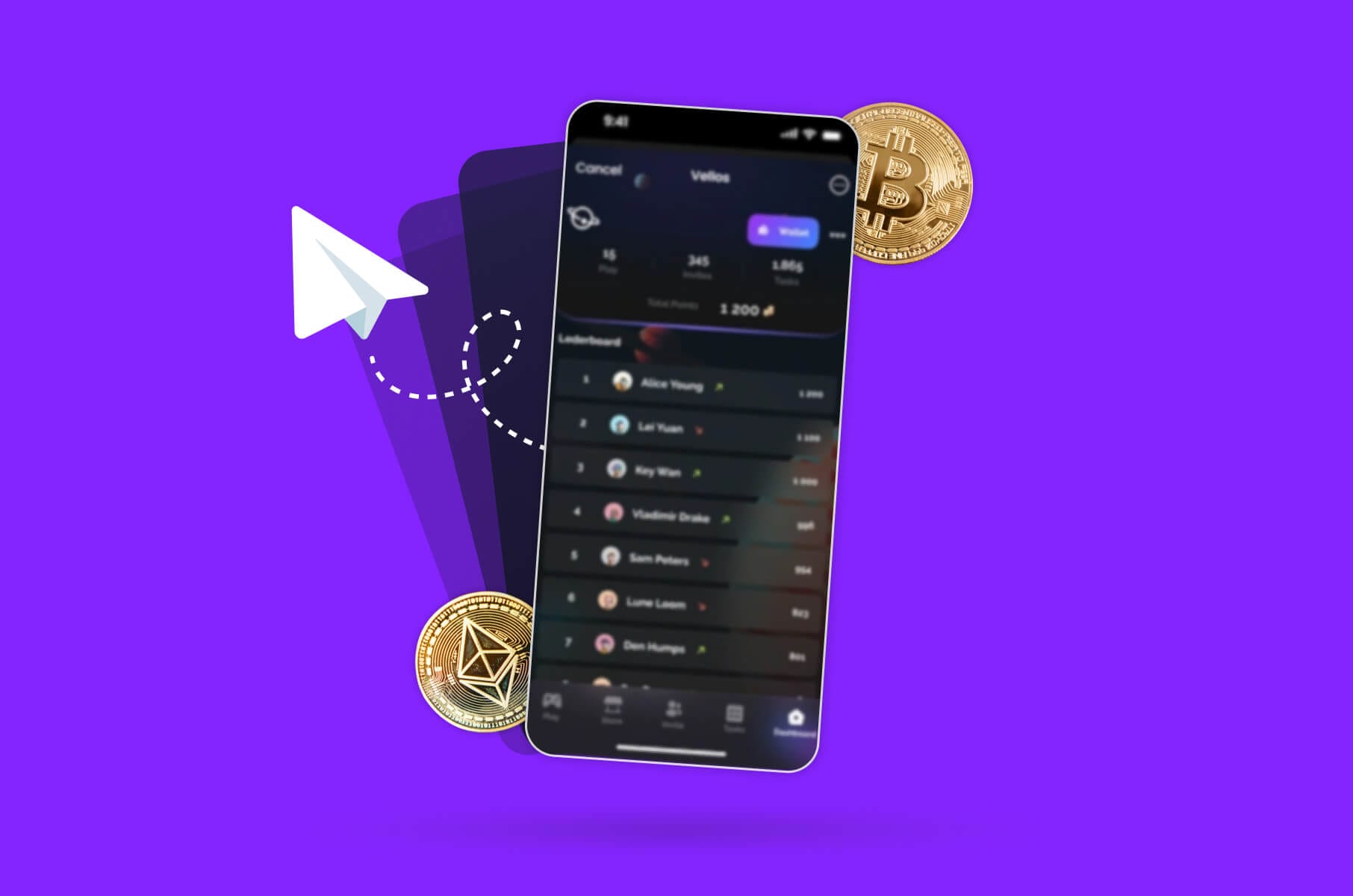
Showcasing your product
One of the most effective ways of converting right now is to show the product in action and communicate its value.
Take ClickUp, for example, and how thoroughly the platform demonstrates what their product does straight away to help users quickly understand its benefits.
Here are some strategies for effective product presentation:
- Product quizzes to personalize the shopping experience and guide users towards the most suitable products.
- High-quality images and videos that offer a 360-degree view, zoom-ins, and feature highlights.
- Contextual visuals that show the product in use or in its intended environment.
- Detailed product descriptions that are concise, comprehensive, and authentic.
- Interactive Augmented Reality (AR) experiences to provide a next-level immersive experience for users.
Micro-interactions
Micro-interactions are small but significant animations and feedback that make a website feel alive and engaging. They guide users, provide clarity, and enhance interactions, so don’t overlook them.
For example, even small elements such as hover effects, scrolling animations, subtle visual effects, and interactive cursors can significantly improve user experience and keep visitors engaged, as seen on the Safe or Chainlink websites.
When done right, micro-interactions strengthen the website's aesthetic and give a sense that every detail has been carefully considered.
What about non-crypto users?
Last but not least, what about non-crypto users? Have you stopped to think about those who are only now dipping their toes in this whole Web3 era? They might not know the language or the market yet and may feel overstimulated and confused.
That’s why it is also important to educate and guide new users who are unfamiliar with Web3 and crypto. Make sure to provide clear and user-friendly content, summaries, and pop-up glossaries to explain unfamiliar terms and concepts.
Another excellent user acquisition practice is having a "New to Web3" section or button to cater specifically to crypto newbies. Avalanche, for example, has done this successfully.
Summary
In summary, many Web3 websites have prevalent themes of outdated design, poor copywriting, inconsistent branding, and lack of user-centric design.
However, successful examples highlight that with the right balance of modern design, clear messaging, and engaging content, you can significantly improve your web presence and user engagement.
And guess what? Merge can gladly help with all that!