0
Table of Contents
Dashboard design for AI-native SaaS. Best practices
How to make users trust your dashboard enough to let the AI keep working.
A conventional SaaS dashboard usually helps people understand the state of a business or system:
- What happened?
- How are we performing?
- Where is the problem?
AI-native products are different.
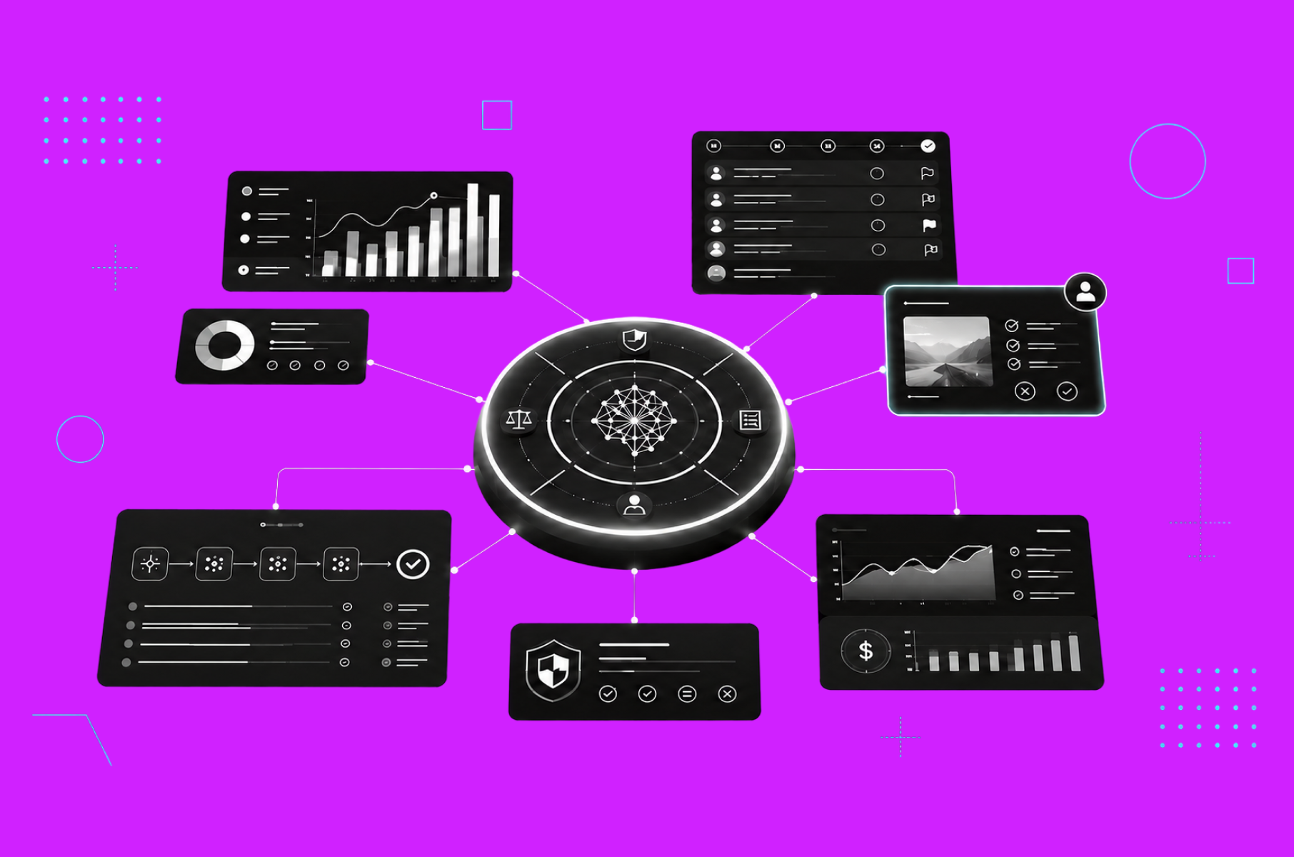
When AI begins recommending decisions or taking action, the dashboard now has another job. It must help people understand and govern the system itself. Users may need to see what the AI has done, what it plans to do next, which information it relied on, where it may be wrong, and when human review is required.
This is especially important in products where AI can send messages, change records, spend money, or otherwise affect customers and operations.
Good dashboard design for AI-native SaaS now means answering questions like:
- What is the AI doing or proposing to do?
- Why?
- What could go wrong?
- What will be affected?
- And how can a person review, correct, pause, or reverse it?
If you're a founder or product owner shipping AI-based SaaS products, this guide walks you through each piece and helps you decide what to build first.
As a UX design agency, our team at Merge has designed data-heavy products for SaaS and fintech companies for years, and we've previously written about dashboard design principles. This article goes into the stuff that is only there once you add AI.
What "AI-native SaaS" actually changes about your dashboard
The old dashboard gave you charts and let you work out what they meant.
The AI-native one works it out for you, which sounds helpful until you realize your user now has to judge someone else's conclusion rather than reach their own.
That's, unfortunately, a much harder cognitive job.
Check out our table for a clearer comparison:
Traditional analytics dashboard | AI-native SaaS dashboard | |
Core question | "What happened?" | "What is the model doing, and how sure is it?" |
User role | Reads and interprets | Supervises, reviews, corrects |
Data shown | Historical metrics | Model outputs, confidence, agent traces, cost |
Trust problem | Is the data accurate? | Should I trust this specific answer? |
Failure mode | Stale or wrong numbers | Confident hallucinations and runaway spend |
That right-hand column looks like a list of anxieties. Let’s fix each of them using design.
Show confidence
Ask one question about every AI output on your screen. Does your user know how much to believe it?
A number on its own looks like a fact. When the model gets it wrong, your user feels misled, and that trust is hard to win back.
Most best practices for dashboard design still center on hierarchy, comparison, and restraint, but AI adds another layer. This is the first thing that separates great dashboard design in AI products from the kind that only looks good.
That layer is confidence.
Most show the model's confidence score and call it done. Resist it because the score isn't what your user needs.
A good piece of advice from Google's People + AI Guidebook (also called PAIR Guidebook) is “don't show a numeric confidence score” when users can't actually interpret it.
"80% confident" means one thing to a compliance officer and something else to a marketer, and a precise-looking number can mislead worse than an honest range. To build trust, design confidence indicators that are understandable across varying AI literacy levels.
A few things work when you design dashboard views that carry model output:
- Categories and ranges are usually better than raw percentages. "High confidence," "worth a look," and "low - verify this" tell your user what to do next, but a number doesn't. For forecasts, a shaded band shows uncertainty better than one hard line, and there's research backing prediction intervals as the display people read correctly.
- Show what else the model considered. Putting the runner-up next to the top pick so that your user can check the answer straight away.
- Say it out loud when the model isn't sure. You'll lose a bit of trust in that one answer, but you gain a user who knows when to believe the next ones.
One catch. A good confidence system can make your product look less impressive during a demo. We think that's fine, and it's why our dashboard design services start with the decisions each role makes and the cost of a wrong answer.
Explain to make people trust you
Citations, reasoning steps, and disclaimers look like features that help users check your work. A NNG study on explainable AI in chat interfaces found that they mostly don't.
Apparently, people rarely click the links.
They trust the answer more just because citations are there, even when those citations are made up or lead nowhere. And the "here's my reasoning" walkthroughs are often nothing like what the model actually did because they're written after the fact.
What does that mean?
Well, if the explanatory elements in your UI make people doubt whether the answer is right, they aren't helping anyone check anything. It's just making your product more convincing.
So don't make the explanation look thorough. Make checking easy. Easy enough that a busy person does it without thinking about it. That rules a few things out:
- Put the citation on the claim it supports.
Style it clearly, label it properly. Perplexity's inline source tags are the example to copy. A vague "Source" link that drops your user on a homepage is worse than no link, because it earns the trust without giving them anything to check.
- Say what the model can get wrong, in plain words, next to something they can do about it.
"Double-check responses" beats "for reference only." Tell them it can be wrong, then put the check within reach.
- Drop the first-person "thinking" text.
"I searched the web and analyzed..." sounds like a person. Sounding like a person makes users trust it more than the process deserves. Plain status text is more honest and ages better.
For example, Microsoft's 18 guidelines for human-AI interaction organize the bigger version of this into four phases:
- What the system can do.
- What it does while you use it.
- How it recovers when it's wrong
- How it learns.
Get the review queue right
Where does a human step in?
For most AI-native products, in a review queue. That queue, like a moderator, decides whether people keep the AI turned on.
But it has a dilemma, though. If you review everything, you've built a slow manual tool with extra steps, but if you review nothing, then one bad automated action can cost you the account.
The best dashboard here is the one that makes the easy calls obvious, so your reviewer can focus on the hard ones.
The pattern that works is sorting by confidence and risk, adapted from the human-in-the-loop review patterns:
Lane | Model confidence + risk | What the dashboard does |
Green | High confidence, low risk | Auto-approve, sample a few for quality |
Amber | Medium confidence | Standard human review with a clear SLA timer |
Red | Low confidence or high stakes | Mandatory sign-off before anything ships |
It looks simple, but it usually fails in production because it assumes your reviewer has unlimited attention, and they don't.
Every item you send to review uses some of that up. Nobody counts it, so teams send too much. Sending the medium-risk work to a human feels responsible and costs nothing on the roadmap. Do enough of it, and your reviewer turns into someone who just clicks approve.
But, if approving is the fast path, tired reviewers will approve without reading, and that's worse than full automation. So don't ask "should a human review this?" Ask what the smallest set of items worth a human's attention today is, and whether your screen makes those look different from the rest.
Understand agent traces and cost
AI-native products created two dashboards that didn't exist in classic SaaS.
Is the agent doing its job?
Your uptime monitor says the service is green. That tells you nothing about whether the agent is finishing tasks.
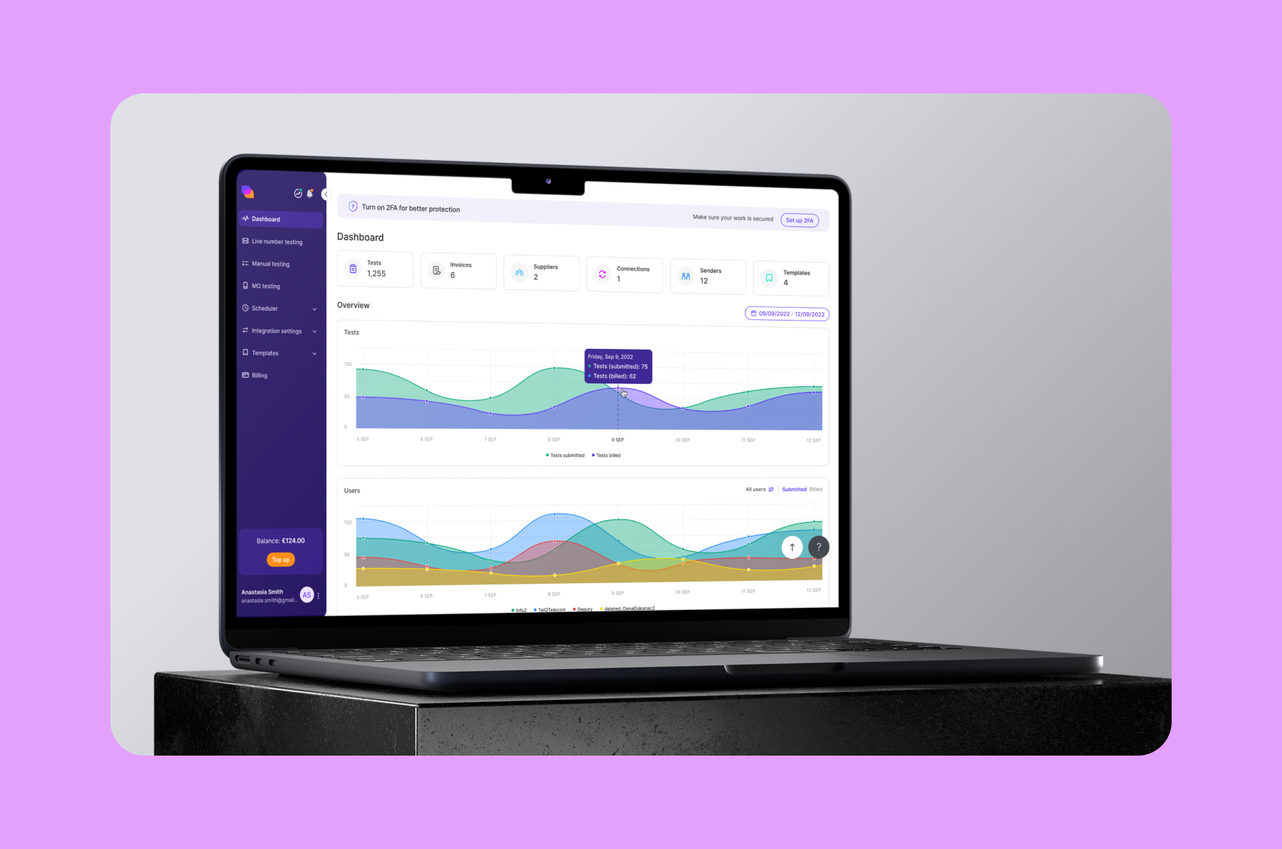
One prompt now turns into a plan, a few model calls, and a handful of tool calls. Each one has its own speed, token count, and chance of going wrong.
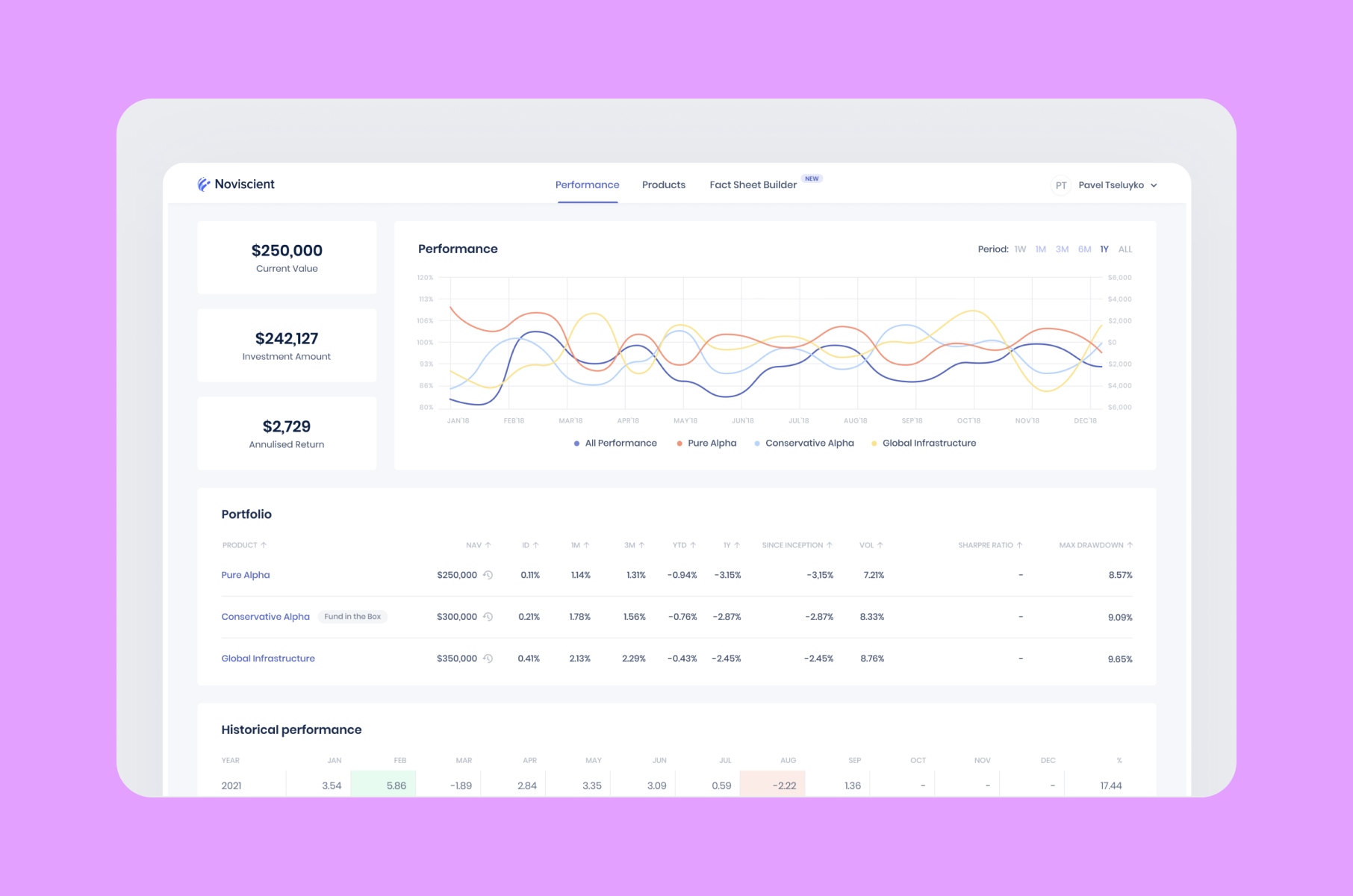
A lot of the tools that have realized this (like LangSmith, Langfuse, Arize, Datadog's LLM product) have adopted a similar approach: one view shows how everything is behaving, while another opens a single run and shows the input, the plan, and every call in order.
“Treat each request as a connected trace”, so to speak.
However, don’t forget about your per-tool failure rate. A tool that breaks 5% of the time is still okay if you have a good overall number.
If you show any of this to your customers, and more and more you should, the design job is making noisy data readable.
Can I predict the bill?
Cost is the exact same worry, just about money. Every call costs something. So the top fear among buyers is that a single click will drain their credit. Unfortunately, per-seat pricing isn’t good either, because an agent working on its own isn't tied to one logged-in person.
It's that confidence again. Your user is watching something they can't predict, and they want to know how far it can go before someone stops it. So the job is control. Okay, here’s what to add to make it better:
- Real-time usage and spend, split by model, workspace, and unit of work. Cursor showing usage right in the editor is the pattern to copy.
- Budget caps and alerts that your customer sets themselves, per key or per team. Going over should show up as a notification, not as a line on an invoice.
- Credits as a readable stand-in for tokens, with a plain map of what a credit buys.
By the way, making this part of a SaaS design services engagement is one of the most useful things an AI product can do.
Know that failure works differently now
Remember 500 Internal Server Error? That’s how classic apps fail.
AI fails by being confidently wrong, refusing, making up a source, or looping. Each one needs its own shape on screen, because a failure your user finds on their own costs far more trust than one you admitted first.
Split the flow by confidence, and make the branches feel different:
- High confidence acts.
- Medium confidence asks a question instead of guessing.
- Low confidence indicates as much and sends the item for review.
It helps a lot if the model can return "unknown" instead of inventing something that sounds right. That's a model-side call with a big effect on your screen.
When something does break, say what happened in plain words. Keep your user's original prompt on screen so their work isn't lost. Give them a real next step: retry, edit, or try another way.
Be careful about feedback
After years of user research, we have noticed that feedback that does nothing is worse than none.
Thumbs up and thumbs down are the visible end of your evaluation pipeline, and most products fake it. There's a name for it: "feedback theater," a button that fires a cheerful "Thanks, we're learning!" toast and then changes absolutely nothing. It's worse than no button. Your users learn their input doesn't matter, and then they stop giving you the signal you wanted.
Richer signals are better. Let people edit the output, pick between two versions, or say in words what should have been different. All of that tells you far more than a click, and costs your user about the same effort.
Then send those corrections into your evals, carefully into training, and back onto the screen, so the person who bothered can see the effect.
So, remember - feedback that visibly does something is one of the things that separates the best dashboard design in this category.
How we approach this at Merge
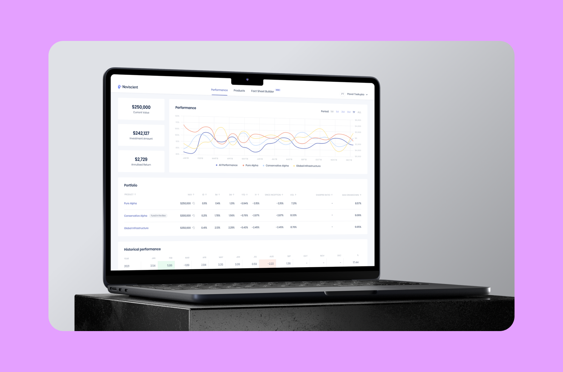
Our process for data-heavy products has four steps:
- Discovery maps the decisions each role makes, plus the new part: where a human must stay in control and how wrong an answer is allowed to be in each flow.
- UX design puts wireframes in front of people before anything is polished, including how confidence, traces, and cost show up without burying the actual task.
- Mockups land on the real components and chart libraries your team will ship.
- Handoff carries documentation detailed enough that the numbers and review rules survive being turned into code.
Caring about your user matters more than the process does. We've watched plenty of dashboards get built to impress in a demo and then sit unused, and AI makes that trap deeper. A slick agent view means nothing if the person looking at it can't tell whether to trust it.
The best data dashboards we've worked on share one trait. Someone opens them, understands what the model did and how sure it is, and acts. When we have to choose between impressive and useful, we choose useful.
Our piece on SaaS app design principles shows how a dashboard fits the bigger product picture.
And for teams where trust is the product, our fintech design agency article and our take on why design builds trust in fintech go with everything above, plus our roundup of fintech UX anti-trends for what to avoid.
Wrap-up
To sum it up, dashboard design for AI-native SaaS comes down to a few decisions made in the right order.
- Work out how wrong an answer is allowed to be in each flow before you pick any numbers.
- Show honest confidence instead of numbers that look exact.
- Put citations on the claim, and make checking easy rather than making explanations look good.
- Protect your reviewers' attention, because they only have so much.
- Make cost predictable and agents visible.
Do that, and your dashboard becomes the screen users trust enough to let the AI keep working. That trust is what holds a product together in this category, and you design it rather than assume it. If you'd rather get there with a team that has shipped data-heavy products for SaaS and fintech founders, we at Merge are easy to find. Show us what your model does, and we'll show you what your users actually need to see!
FAQ
What makes an AI-native dashboard different from a normal analytics dashboard?
A normal dashboard reports what happened and lets you work out what it means. An AI-native dashboard shows what the model is doing right now: its outputs, how sure it is, what it cost, and where a human needs to step in. Your user's job changes from forming an opinion to checking one your software already made. That's the harder task, and it's why most of the old instincts don't carry over.
Should I show a confidence score on every AI output?
Not as a raw percentage. Google's PAIR guidance is to skip numeric confidence when users can't read it, since a number that looks exact can mislead worse than an honest range. Categories like "high" and "needs review," shaded bands for forecasts, and showing the alternatives the model considered usually work better. And the same score should look different depending on what a mistake costs in that flow.
Where do humans fit into an AI dashboard?
In a review queue, sorted by confidence and risk. High-confidence, low-risk work auto-approves with a few spot checks. Medium-confidence work gets standard review. Low-confidence or high-stakes work needs sign-off. The trap is the rubber stamp. Your reviewer only has so much attention, and sending too much their way turns real review into reflex clicking. Watch the override rate. Near zero means nobody is really reading.
What are good dashboard UX examples to learn from for AI products?
Perplexity for inline citations, Cursor for usage and cost, and the observability tools like LangSmith, Datadog, and Arize for agent traces. Linear and Notion are examples of calm and uncluttered screens. Plenty of dashboard UX examples roundups break down the visuals. The more useful exercise is watching how each one handles confidence, cost, and failure, since that's where the real decisions live. The great dashboards here usually aren't the flashiest ones.
How long does professional AI-native dashboard design take?
For a typical AI SaaS product, expect a few weeks from discovery to developer-ready documentation. Research and confidence thresholds first, then wireframes, then high-fidelity mockups on your real components. Products with heavy human-in-the-loop review or multi-agent monitoring take longer, almost entirely because the research has to work out each role's decisions and how much the AI gets to do on its own in each one.