0
Table of Contents
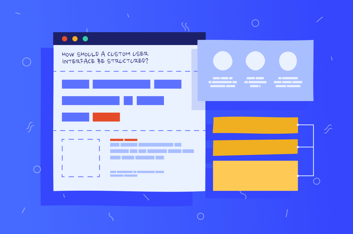
How should a custom website user interface be structured? Tips and best practices for designing a truly successful UI
There’s this saying that any computer program is only as good as its interface. We think it’s absolutely true! What do you first see when you discover a new website or software? Right, its interface.
There’s this saying that any computer program is only as good as its interface. We think it’s absolutely true! What do you first see when you discover a new website or software? Right, its interface. How do you carry out any task on an application? Correct, with the help of its user interface. Then how should a custom user interface be structured in order to make a positive impression on users?
A clear website user interface helps people understand where to start and how to finish tasks without friction.
When planning an interface website update, map core tasks first, then align content and controls around them inside your website user interface.
The main issue bugging every UI and UX design and development company is how to create a compelling and welcoming interface without falling into a rabbit hole of staleness and predictability. How to balance such a thin line between what’s right and what’s already outdated? By following the basics while still striving to add some innovation and allure to your product.
The basics of website user interface (UI) design
User interface design, or simply UI design, is the process of building an interface for a digital product. It usually is a screen that helps users interact with the website, program, or software. UI designers work to make that screen or any other part of the interface as good-looking and pleasurable to use as possible. This involves creating a layout for each page while simultaneously making sure they work together as a whole.
For a website user interface, this also means keeping key actions visible and removing noise that distracts from those actions.
User interface design, just like any other creative discipline, has its basics - the guidelines you’re supposed to follow at the beginning of your design process to make sure everything will run smoothly. By covering your basics, you give yourself the leeway to then create the most amazing and unique design while still expecting users to not be put off by it. We singled out six basic principles we also use in our work on UI design that we think you can benefit from. Additionally, take a look at our blog post about user interface design prototyping.
Knowing your users is key to a strong website user interface
This means doing thorough research on your audience to the point where you can predict their needs and how they’re going to react to a certain change. Study your user’s behavior and pain points so that you can work out the context of their actions.
People often search for whats user interface when they want a plain definition. It is the layer between humans and software that turns intent into action.
Use customer journey maps for that. They will provide a visual representation of all the stages people go through while using your product - from sign-in to checkout, for example. If you have a hard time figuring out what your audience desires, just ask. Conduct interviews or surveys. Gather the feedback.
These inputs shape your website user interface so flows match real goals.
Maintaining consistency across the website user interface
Consistency in user interfaces means both the internal (using the design system) and external (adding element familiarity by using common design patterns). We’ll talk about the latter in the paragraphs about the predictability principle. The design system, however, is what the UI consistency is all about.
What it means is using similar language, layout, menus, navigation buttons that remain on the same spot, a uniform color scheme, and making sure the most essential elements retain the same look and functionality across all your interface. All of this reduces the need for users to refamiliarize themselves with the UI each time they go to a different page.
That stability is what makes a website user interface feel reliable.
Using visual hierarchy in your website user interface
If there’s one thing a successful user interface cannot exist without, it’s visual hierarchy. It has to be applied to literally every screen, page, and menu you’re designing. Maintaining visual hierarchy means displaying the product’s content or interface elements based on their level of importance.
Not only does it help users recognize the most important element on the page and the action they’re supposed to take, but it also provides a deeper understanding of the design flow and where it takes them next. Visual order support is predominantly made through evident object differences, such as style, color, contrast, size, and placement.
Apply these cues the same way across your website user interface so people can predict what comes next.
Supporting accessibility and UX in a website user interface
Accessibility and user experience play major roles in whether or not users will find your UI comfortable and return-worthy. You can do everything in your power to maintain element hierarchy, make a consistent design, simplify the process, etc., but if your custom interface is buggy or inaccessible to folks with disabilities, you’ll lose a staggering number of customers.
Study the rules of accessibility in regards to color use, contrast preferences, object sizing and placement, background use, and many other elements that can be confusing to those with visual, auditory, motor, and cognitive impairments. Did you know that even cultural differences can impact how we perceive design?
Build your website user interface against current accessibility guidance and test with real people using assistive tech.
Keeping elements predictable across a website user interface
You may think, what? You said before to avoid being stale and predictable. To some extent, yes, but a level of predictability in your UI elements is required simply because that’s how the human brain works. We like to get things done with minimal effort, and for that, we must be able to guess what something is without lengthy onboarding and instructions.
Keeping your elements predictable means making them conform to universal standards, i.e., how they look and perform on other websites or apps. Users will then unconsciously perform the right action. For example, a button should have a border and a shadow if it is meant to be clicked.
An interface website benefits from familiar navigation labels and primary actions that sit in the same place on every page.
Providing system feedback throughout the website user interface
Make sure the system gives users constant feedback about their whereabouts, what is happening at that very moment, and whether their actions were a success or not. Don’t forget that error messages should appear straight after a mistake and encourage the right action instead of putting users off altogether.
System feedback gives invaluable information about the current state of all user interface elements, creating an ecosystem where everything communicates with each other, thus making users informed also and confident to proceed. Apart from the current status, users should also be in the loop about what the next step is and what will be the outcome of it.
This clarity lowers errors and speeds up task completion in a website user interface.

Does your website meet your conversion benchmarks?
Not quite? We have solutions to get you there.
Learn moreWhat are the four elements of the website user interface?
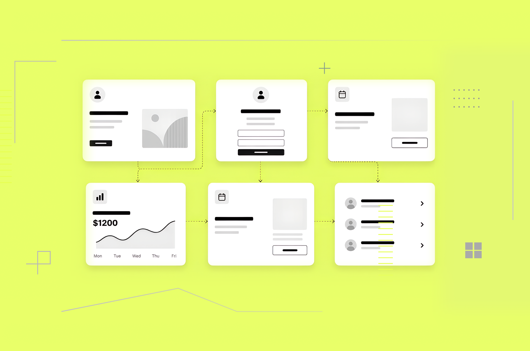
For easier element differentiation and categorization, the UI design community has put all the elements of graphical user interfaces into four groups based on their purpose and function on the screen.
Input Controls. You use these elements to put any kind of information into the system. Examples: buttons for submitting an action, text fields, toggles for switching on and off, checkboxes for one or multiple options, radio buttons for selecting only one option from the list, lists, dropdowns, etc.
Navigation Components. They are used for what the name suggests - navigation. Typical elements you use to move around the interface of an app or a website are tags, icons, breadcrumbs for checking or changing your location within the navigation, search fields, sliders, and pagination for organizing content.
Informational Components. These elements do the exact opposite of input controls - they share information back to the user. You can see them in the form of tooltips that give users hints throughout the interface, notifications, icons, progress bars for step visualization, and modal windows - those little or not-so-little pop-up screens.
Containers. The hint is also in the name - this last element group is used to contain similar or related content. These are the accordions that give users the option to either expand or collapse a content section, cards, forms, scroll boxes, sidebars, bento menus that show a menu with grid boxes, etc.
When someone asks what is a user interface and its components", these four groups are a practical way to answer.
Best practices to help design a custom website user interface
Before you create your own custom user interface, make sure you follow our advice and best practices of the UI design community below in order to maximize the success you have with your users. Don’t forget to always:
Keep it simple. The best interfaces are those comfortable enough for users that they don’t even acknowledge their existence. Everything has its own designated place, and the overall feel is filled with intuitiveness and simplicity. For that, keep the language clear and use only necessary UI items for your type of project.
Simplicity makes a website user interface feel quick and trustworthy.
Add purpose to your layout. Mind that items on the interface all have space between them. That space is crucial - do not overcrowd it. Structure your pages based on the element’s importance. Those that have a bigger purpose, such as taking a particular action, should be more noticeable.
On a website user interface, align spacing and scale to draw the eye to the primary action.
Create defaults. Defaults are the solutions already made for your customers. They are the values or settings pre-set by the designers to anticipate people’s decisions while using their products. If you know the majority of your customers will choose a particular set-up or fill a certain text, consider pre-choosing it for them.
Good defaults shorten paths in a website user interface and reduce cognitive load.
Minimize actions. This also correlates with our previous tip on defaults. Simplify any process your users have to go through so the total number of steps they should take to finish something is as low as possible. For example, each screen should have only one primary action in the front, and a couple of secondary moved a bit further.
Remove extra taps in your website user interface and merge steps that do the same thing.
Stop obsessing over rules. Even though rules help us stay in check, too many of them in design can do more harm than good. It’s not science. Use them as guidelines, but with enough practice, you’ll be able to tune in to your user's needs and consciously break the rules to create something truly unique.
Break a rule only when it makes the website user interface faster to use.
Some examples of good user interface design and why they work
Let’s now look at a few examples of good user interfaces and what they have done right. The first one on our list is Notion. Its features are why our team uses it, but it is the UI that makes the experience so efficient and straightforward.
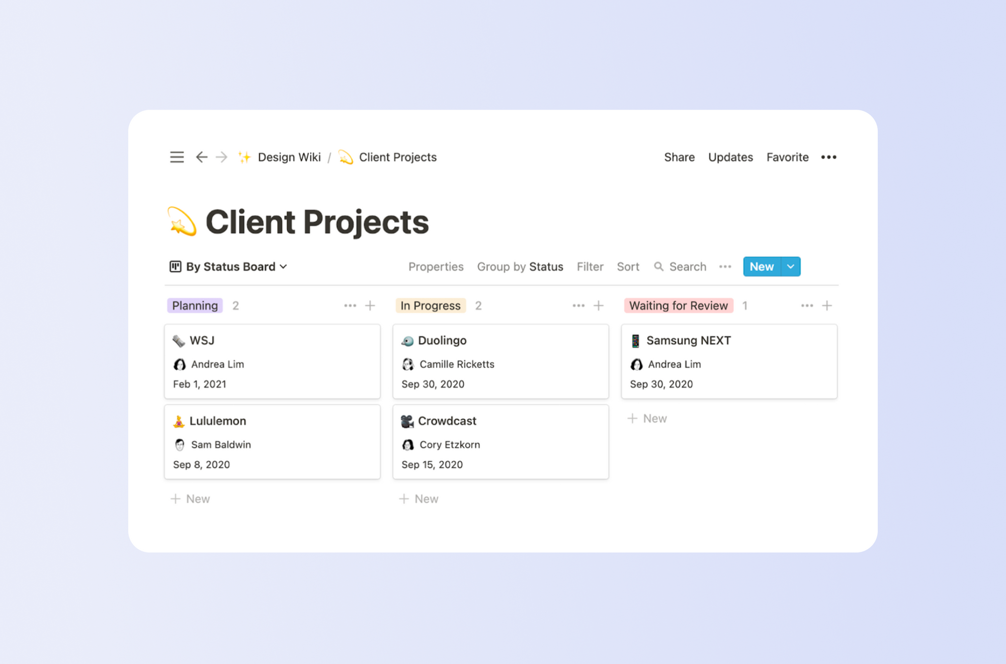
Why it works:
- a) the user interface is pliable enough to handle both easy and more complex projects;
- b) it features helpful instructions during the onboarding and the following use, making it easy to follow your progress and know where you are at any given moment.
Another example of an exemplary user interface is the personal data platform, Invisibly. You can find more about it in our case study. Not to pat ourselves on the back, but the UI here became the perfect blend of accommodating the existing user interface guidelines and adding our personal touch.
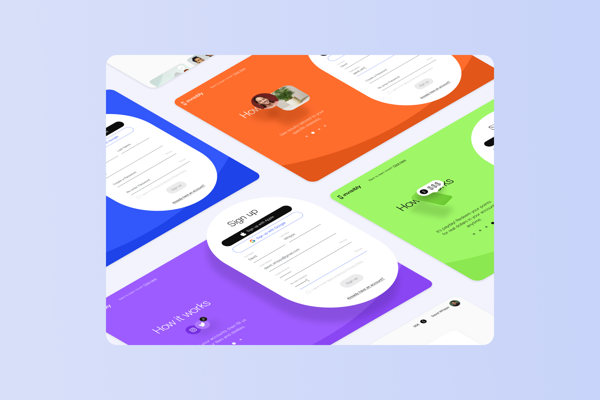
Why it works:
- a) users can clearly see what the system wants them to do;
- b) the use of color and fonts complements the overall style guide and shows the level of priority among the elements while staying pretty consistent and simplistic.
Another example of great UI is Dropbox, a file hosting and collaboration platform. It has one of the most simplistic and easy-to-understand interfaces among this type of software. Their file organizational structure and navigation are predictable, familiar, and don’t distract from the task at hand.
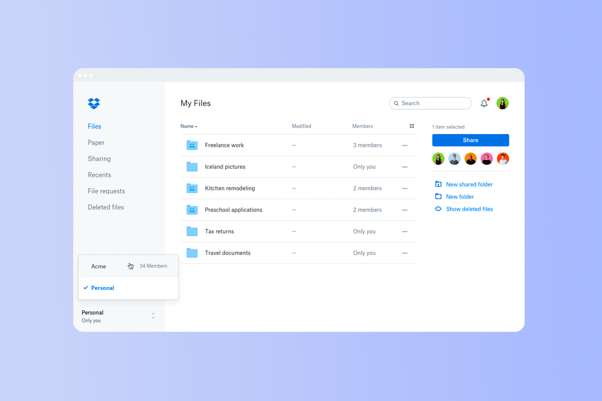
Why it works:
- a) no onboarding is needed whatsoever - most users can quickly start working on their files from the get-go due to the UI’s simplicity and consistency;
- b) their attention to detail - every user interface element looks and feels familiar, the color palette is coordinated across all pages, and illustrations are in tune with the rest of the interface.
These patterns are easy to transfer to a website user interface for similar clarity.
Does your website meet your conversion benchmarks?
Not quite? We have solutions to get you there.
Learn moreFAQ on website user interface basics
People often search for whats user interface when they want a plain definition.
So, what is the function of the user interface? It lets people enter information and see feedback about the current state.
Another common query is what is a user interface and its components". It typically refers to input controls, navigation components, informational components, and containers.
If you manage an interface website, align labels, layouts, and patterns so people never wonder where to click.
Summary
In this article, we’ve focused on the basics of user interface design and why you should stick to them before pulling off your own creative user interface ideas. A structure is extremely vital to any interface design. As we saw earlier in the good UI examples, some designs have only been successful because they did not forget to adhere to universal UI standards and common sense.
The practice shows that a custom user interface can either be a hit or a miss. Use our best practices and recommendations to ensure that, in your case, it will definitely be the first one. Ultimately, you can always rely on Merge for UI consulting or creating the interface of your dreams if you don’t want to do it yourself and need paid project support. Read our blog post on hiring generalists vs specialists in your startup.
If you need help shaping a website user interface, our team can evaluate flows and recommend changes based on research and testing.
How to Do a Website UX Audit: Step By Step Guide and Checklist
Read