0
Table of Contents
UX optimization hacks: how to maximize your conversion from organic traffic
Take a look at the best practical strategies used by successful businesses to improve their websites and increase sales.
Want to turn more website visitors into customers? We have you covered.
Our guide features key conversion rate optimization best practices to boost your conversion rates from organic traffic and a whole chapter with tried and tested UX optimization hacks from a UX expert - our CEO, Pavel Tseluyko.
Take a look at the best practical strategies used by successful businesses to improve their websites and increase sales, ranging from better call-to-action buttons to smart personalization. Let’s boost conversions together!

Fool-proof conversion rate optimization tips
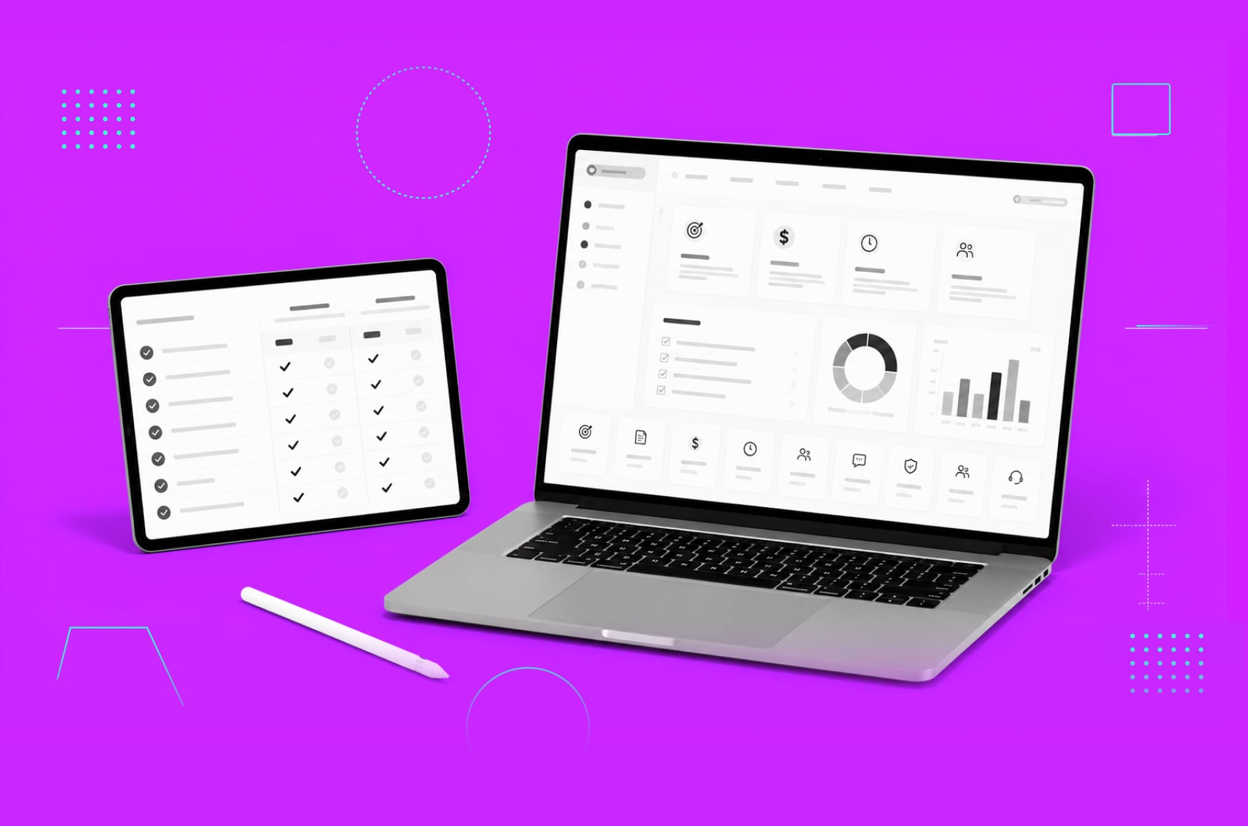
First and foremost, you need to continuously measure, analyze, and improve your conversion strategy for organic traffic. Systematic optimization is key! Here are our fool-proof conversion rate optimization tips, which you can start using right away.
Clear CTAs
Direct your visitors with clear and compelling CTA buttons without rushing them into a purchase. There needs to be a natural transition from interest to action.
Also, regular end-of-post banner CTAs often fail to entice visitors to take action. Instead, use text-based CTAs styled as H3 or H4, which have been found to contribute to a higher percentage of leads.
Tips:
- Opt for a clear and concise text that describes the action users should take. For example, instead of "Submit" or "Next," use phrases like "Shop Now" or "Download the eBook" to provide clarity and avoid causing "click fear."
- Select colors that complement your theme and evoke the desired emotions..
- Avoid bombarding users with too many buttons or options. One or two clear options are ideal.
- Ensure your CTAs are easily noticeable and not placed in awkward positions on the page. Users tend to look to the right and bottom of text boxes for next steps.
- Keep the text bold and readable, avoiding overly fancy or large fonts that may create a negative impression.
Simplify navigation
A clutter-free and intuitive website design is always a good idea for better conversion optimisation. Avoid overloading users with information and create a seamless transition from landing to conversion.
Tips:
- Use clear and concise names for navigation items, for example, standard expressions like "Contact," "Search," and "Subscribe".
- Limit the number of menu options. Seven to eight categories are ideal to prevent overwhelming users.
- Be consistent across pages by maintaining the same style and position for the navigation bar.
- Include links to other pages on your website, and make all pages accessible from the navigation bar.
- Include links to the homepage throughout your website, such as in your company logo.
Page load speed
Slow-loading webpages can scare your visitors away and lead to high bounce rates. Optimize your website's performance through image compression, script minimization, and caching.
Tips:
- Keep server response time under 200 ms.
- Minimize redirects as they add to the waiting time for users.
- Reduce the size of large CSS, HTML, and JavaScript files.
- Avoid fancy animated effects or complex widgets that may slow down the page load and be overlooked by users.
Use trust signals
Smart user experience optimization also includes adding proper customer testimonials, case studies, social proof, industry badges, and basically anything that showcases your real results.
Tips:
- 88% of customers check reviews before making a purchase. Include a mix of reviews from third-party sites and your own platform.
- Include the identity of reviewers by adding pictures, full names, and links to build trustworthiness.
- Offer multiple payment methods to cater to different customer preferences and build trust.
- Display third-party badges and certifications from trusted sources like PayPal and VeriSign.
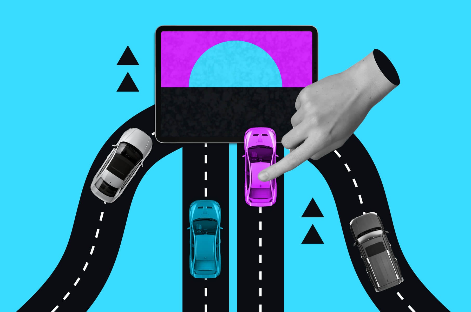
Personalization
Serve personalized content and product recommendations based on user behavior to improve ROI.
Tips:
- Allow users to customize content according to their interests, either through system-generated recommendations or user-driven customization.
- Use the system to identify individual users or groups and show them content adjusted to their interests.
- You can also use browsing and purchase history to make personalized recommendations. For example, Amazon suggests products based on previous searches.
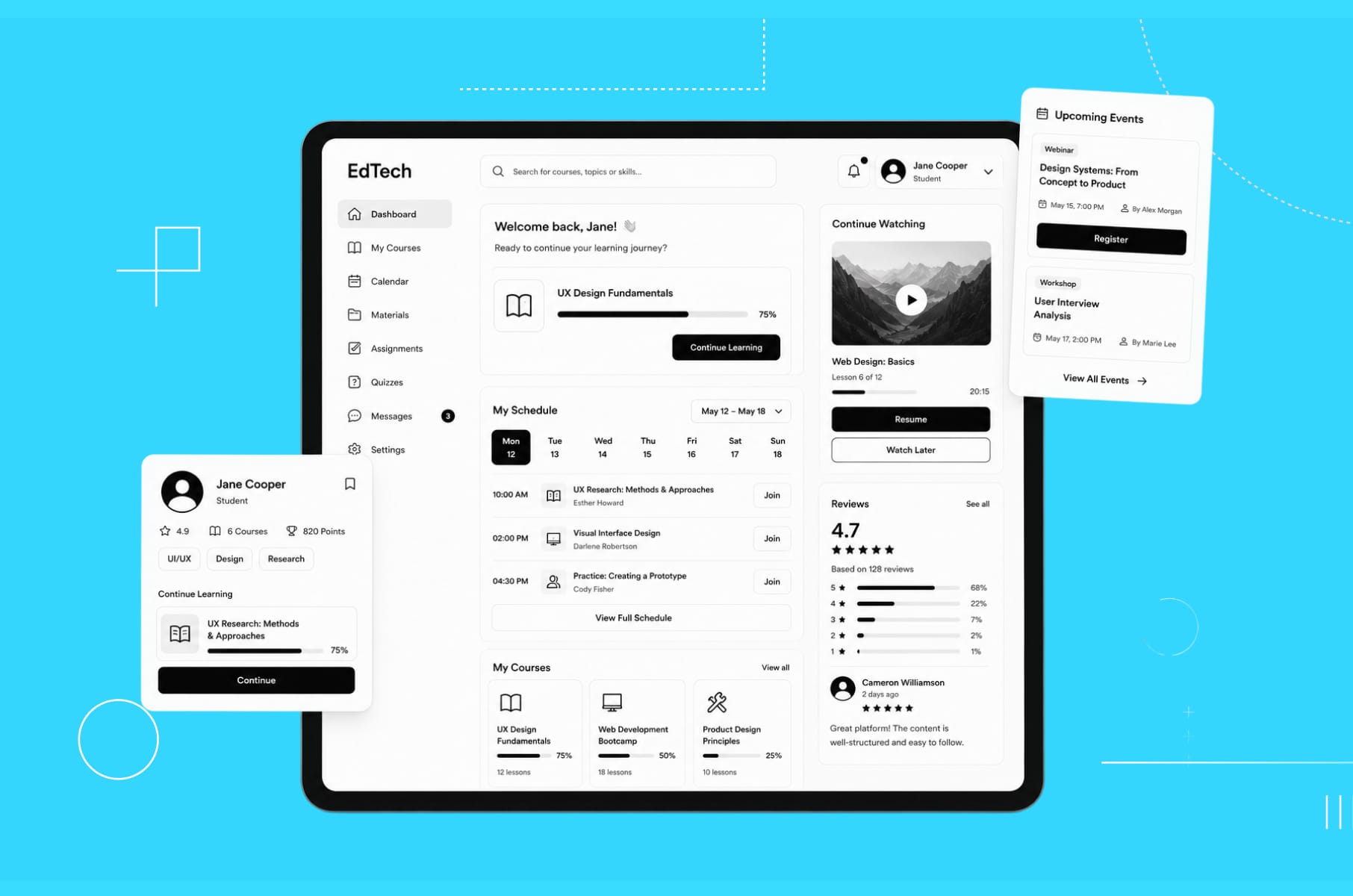
Heatmaps
Identify areas of a page that are most or least engaging with heatmaps. You’ll see clearly which sections of your website need improvement.
Tips:
- Use click maps to identify CTAs with the most and least clicks.
- Scroll maps can help measure how far users scroll. See that important information and CTAs are placed in visible areas.
- Apply move maps to understand user mouse movement without clicking.
- Combine heatmap data with other analytics, session recordings, and user feedback to gain deeper insights and validate your ideas.
- Compare mobile and desktop heatmaps to spot behavioral differences and ensure a good UX across all devices.
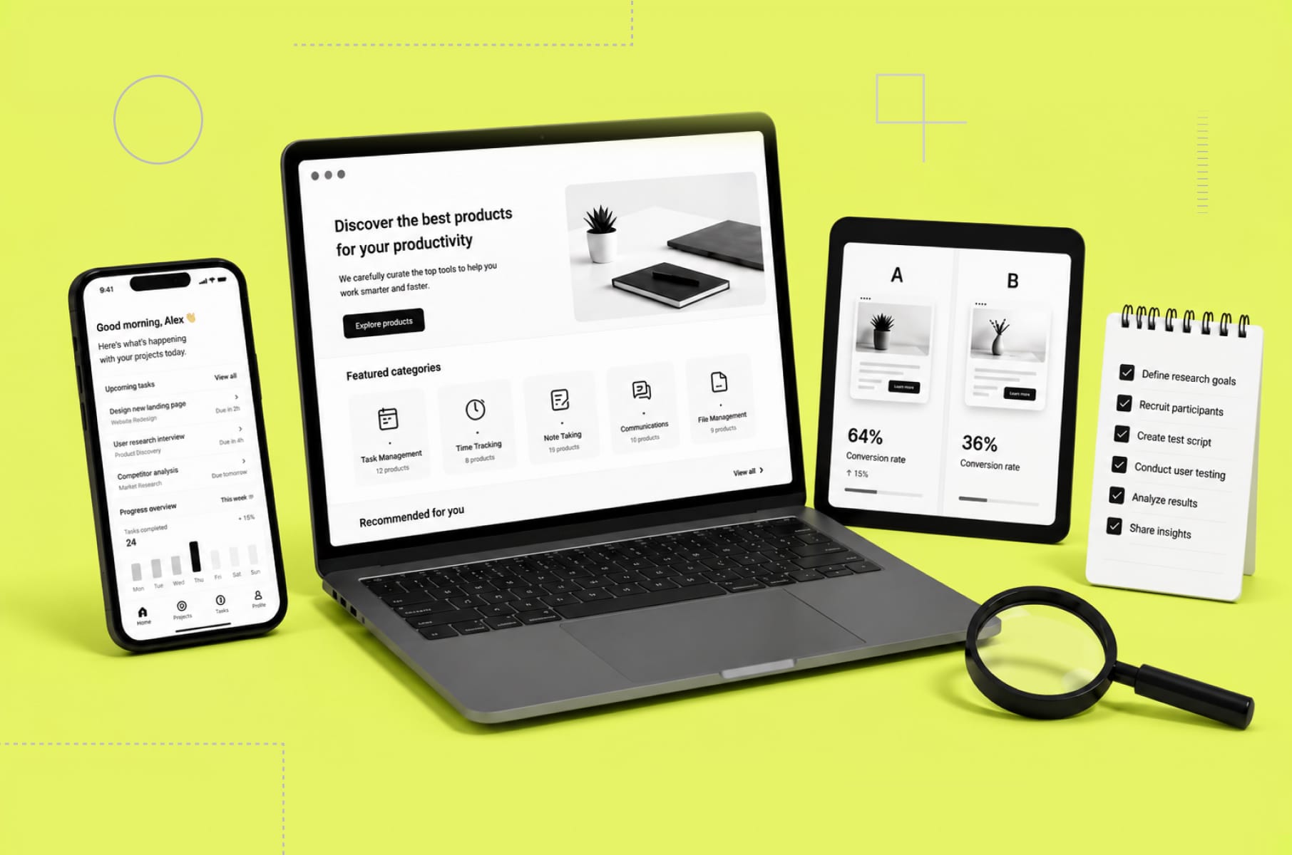
Add lead flows on your blog
Lead flows are high-converting pop-ups designed to attract attention and offer value. For better conversion optimization, experiment with different types of lead flows, such as slide-in boxes or drop-down banners, to increase click-through rates and submissions.
Tips:
- Keep the lead flow simple and non-intrusive, asking only for essential information like their email address.
- Use a combination of text and visuals to make your lead flow eye-catching.
- Consider using animated GIFs to draw more attention to your lead flows.
- Test different variations of lead flows to optimize their effectiveness.
How to increase conversions: UX expert opinion
How about a few more UX optimization hacks from a UX expert - Pavel Tseluyko - the founder of MergeRocks, our product design agency? He recently did a podcast on this topic, so we decided to share a few special tips from it. For more conversion optimisation insights, watch the full thing.
Tip 1: Optimize call-to-actions and lead magnets
First, you need to strategically place CTAs and lead magnets throughout your content. Pavel recommends using one lead magnet per page and repeating the call to action multiple times.
The approximate standard would be to include 5+ widgets for 10-minute reading articles, but avoid cluttering the page, either.
Examples of effective lead magnets include pop-ups, widgets, and forms that don't redirect users to another page. For example, a widget that allows users to fill in the form directly, without any redirection from the article page.
Tip 2: Improve article formatting for better readability
Our CEO also cannot stress enough the importance of making content easily readable and engaging. Break up text into bullet points, lists, and short headlines to make it easier to read. The main goal is to actually keep your user for as long as possible. The only way is to not get them distracted by a lot of text.
Include quotes from top management, other colleagues, case studies, and testimonials to add credibility and social proof. Bring company culture and values into the text to make it more unique and associated with your brand. Also, use cross-linking to connect articles to other relevant content on your website.
Tip 3: Offer free pain-solving mini-products
One very important thing that sometimes gets overlooked just because it takes some effort is offering mini-products that solve a small pain or a problem of your target audience. It could be anything, preferably related to your product, that would attract traffic and differentiate your SEO strategy.
For example, offer related converters, checklists, e-books, quizzes, or calculators in exchange for an email address. Think about which material could be useful for others, and then give it for free.
Use these tools to build reputation and provide value to users, increasing the chances of them associating your brand with value and becoming customers.
Conversion rate optimization best practices: conclusion
So, what’s the main takeaway?
It’s that small changes can lead to big improvements in your conversion rates.
Focus on clear CTAs, easy navigation, fast loading times, and building trust with your visitors. Remember to use tools like personalization and heatmaps to better understand and serve your users.
Keep testing and improving your site. What works for one business might not work for another, so find what's best for your audience. Use the UX expert tips we've shared, like adding free tools or resources, to stand out and provide extra value to your visitors.
Remember, good UX isn't just about getting more conversions – it's about creating a better experience for your users. When you do that well, more conversions will follow.