0
Table of Contents
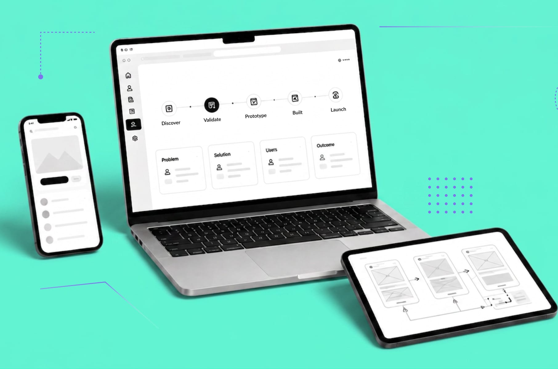
What is a design system?
Design systems are more than just a trend. They're a testament to the evolution of the digital landscape and its commitment to users, offering consistency and efficiency.
What ties together the world's best websites and apps? What ensures they look fantastic, work smoothly, and feel intuitive? The answer is a robust design system.
You've probably heard of them, but what are they exactly? Think of them as a set of blueprints for your digital projects. Just like an architect relies on a floor plan, a tech team uses a design system to build consistent and visually appealing digital experiences.
As you realize the necessity of consistent user experiences for your product, understanding how to develop a design system becomes invaluable.
So, let’s take a peek into the world of design systems, discover their core components, and see how they can elevate your projects to the next level.

Does your website meet your conversion benchmarks?
Not quite? We have solutions to get you there.
Learn moreCore components of design systems
Have you ever wondered what makes a design system tick? Let's break down its foundational elements, from brand guidelines to those handy design tokens.
Brand guidelines
Brand guidelines, sometimes known as brand standards or style guides, act as a rulebook for maintaining brand consistency across all platforms. They contain logo usage, color palettes, typography, and even voice and tone.
For example, Coca-Cola’s brand guidelines ensure that its iconic red shade is consistent, whether on a website, app, or billboard.
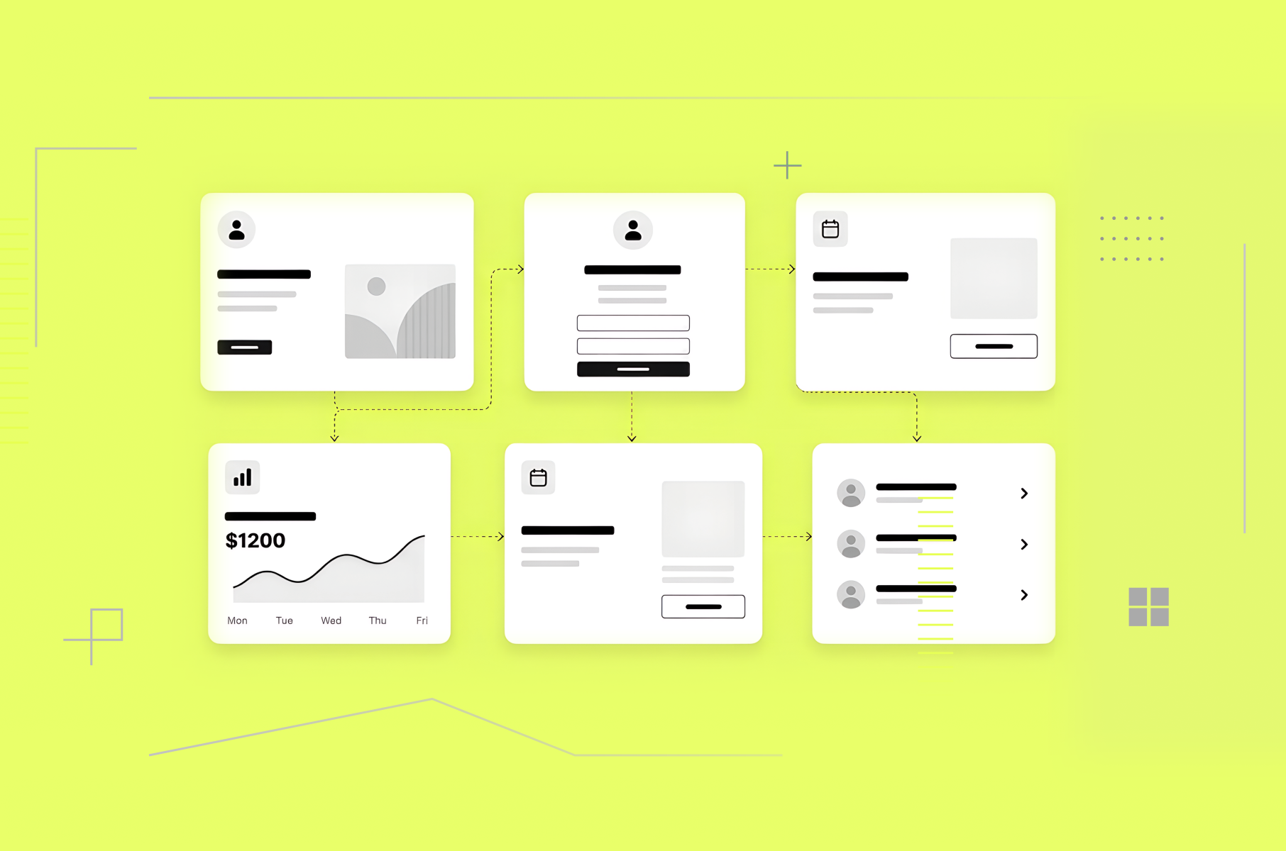
UI components
UI components are reusable elements in digital design that maintain the same functionality and look across different parts of a website or application. This could range from buttons and input fields to more complex elements like navigation bars and modals.
These components, when designed effectively, ensure a cohesive and consistent user experience. For instance, if you've ever noticed the similarity in action buttons across different sections of an app, that's the work of standardized UI components.
Design principles
Design principles guide the decision-making process in both design and product development. They are a foundation that shapes the direction of design, focusing on the user’s needs and business goals.
These principles help designers create interfaces that are not only beautiful but also functional and intuitive.
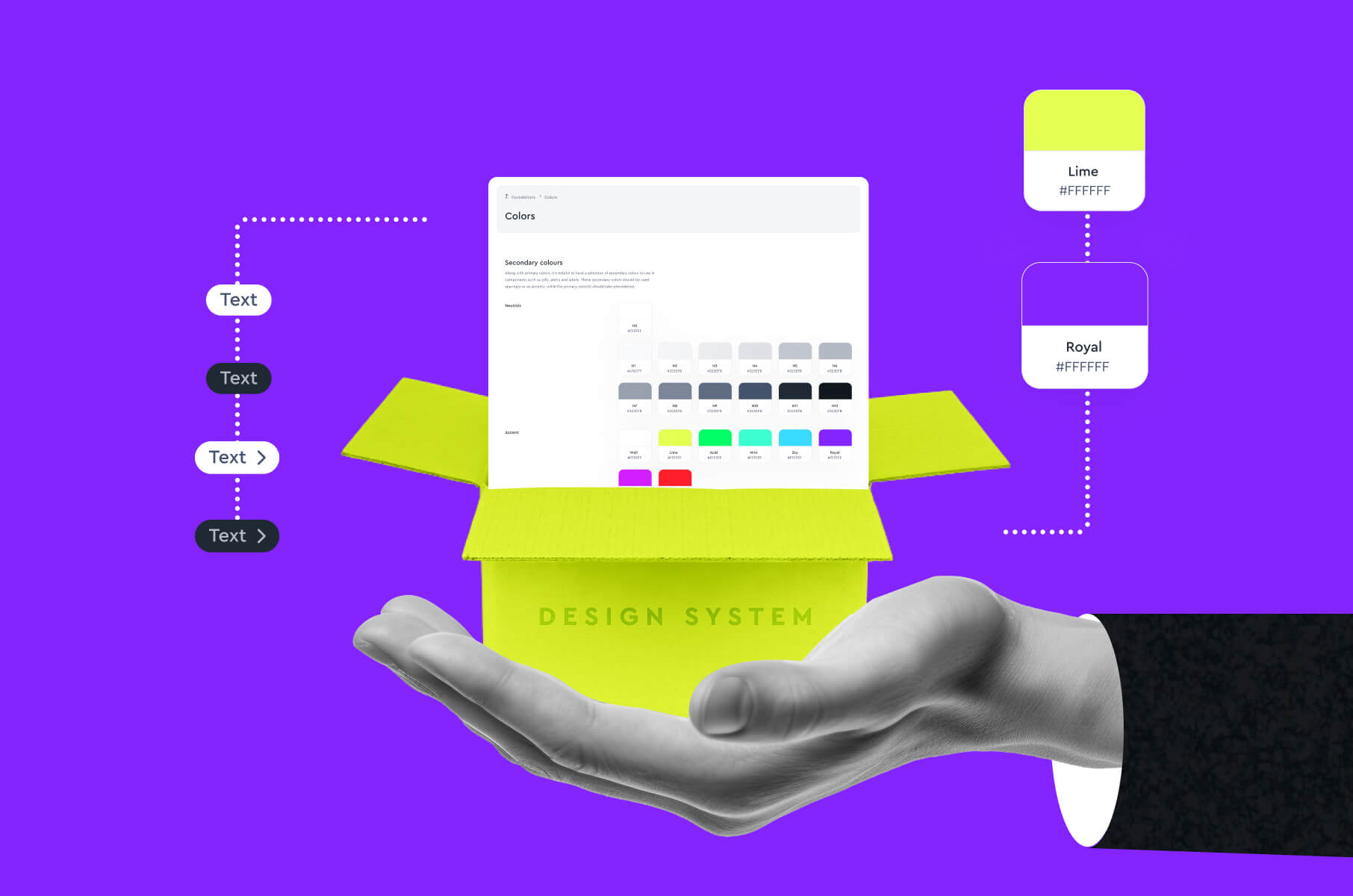
Design tokens
Design tokens are a technology-agnostic way to store design-related values. They encapsulate visual design attributes, such as colors, typography, spacings, and even animations.
For instance, instead of hardcoding a primary color’s hex value in the CSS, a token named "primaryColor" could be used, which holds that specific color value.
This abstraction allows for easier maintenance, especially when a design needs to scale across multiple platforms or when transitioning between light and dark modes.
Benefits of implementing design systems
Why should you care about implementing a design system? The following advantages will not only streamline your work but also boost the overall user experience.
Consistency and cohesion
One of the most vital advantages of design systems is the promise of consistency and cohesion across all touchpoints of a digital product.
By implementing a centralized reference for all design decisions, discrepancies between interfaces become a thing of the past.
Take Spotify, for example. Whether you're interacting with their app on a tablet, mobile phone, or web browser, you'll find a consistent visual language, from button sizes to color palettes. This consistency not only aids in user recognition but also fosters trust.
Users develop an unconscious understanding of how elements will behave based on previous interactions, reducing cognitive load and streamlining their experience.
Efficiency in design workflow
Design systems inherently lead to more streamlined design and development processes.
Efficiency is at the core of every digital product design company, and the implementation of design systems is no exception.
By setting uniform standards and reusable components, teams no longer need to reinvent the wheel with every new project.
This not only speeds up the prototyping phase but also reduces the likelihood of errors during the development phase. When Airbnb transitioned to using a design system, they reported a significant reduction in the time it took to design and build new features.
Scalability and adaptability
Design systems are crafted with a vision for growth.
As digital products expand or evolve, the foundational elements within the design system can be adapted or scaled accordingly without a need to overhaul the entire structure.
This inherent flexibility ensures that whether a company is launching a new feature, updating an existing one, or even rebranding, the transition remains smooth.
The role of design systems in user experience
A stellar user experience doesn’t just happen by chance. See how design systems play a pivotal role in crafting a consistent and seamless interface for users.
Consistent visual language
In UX, a consistent visual language functions as a system of communication between the product and its users.
This language, defined by a set of design rules and standards within the design system, ensures that every part of the product delivers the same visual message.
For instance, if a product employs a specific shade of blue to denote actionable buttons, this rule's adherence across all screens ensures that the user instantly identifies interactive elements.
This consistency goes beyond just using the same colors or typography; it also delves into the distinctions and similarities in product design and UX design. Go and check that out!
Seamless navigation and interaction patterns
Navigation and interaction patterns act as the skeletal framework of any digital experience.
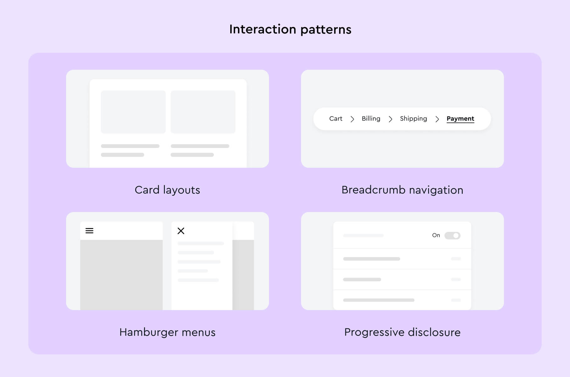
When a design system establishes consistent patterns, it fosters user familiarity and reduces the learning curve. Here are a few commonly used patterns:
- Card layouts. Popularized by platforms like Pinterest, cards allow for information to be presented in bite-sized chunks, ideal for scanning.
- Breadcrumb navigation. Particularly useful for websites with multiple layers of categorization, it provides users with a trail back to their starting point.
- Hamburger menus. While controversial, these three-line icons are widely recognized as menu indicators, especially on mobile interfaces.
- Progressive disclosure. Instead of overwhelming the user with information, this pattern only shows additional details when the user requests it, often used in form designs.
As an example - a look at Apple's iOS showcases a mastery in consistent navigation and interaction patterns. The gestures, icon placements, and transition animations remain uniform, making the shift from one app to another almost instinctual for the user.
Streamlined user onboarding
A design system plays a key role in creating a frictionless onboarding process for users.
When components, visual cues, and interaction patterns are consistent, users can navigate the initial stages of a product with minimal friction. This is crucial because a user's first interaction with a product can make or break their long-term relationship with it.
Take Dropbox, for instance. Their onboarding process is a paragon of simplicity, using familiar components and interactions, all governed by their design system.
They use concise instructions, clear call-to-action buttons, and a minimalistic layout, ensuring that new users understand the platform's core functionality from the get-go.
Does your website meet your conversion benchmarks?
Not quite? We have solutions to get you there.
Learn moreImproving accessibility and inclusivity
Everyone deserves to navigate the digital world with ease. Explore how design systems are leading the charge in making online spaces more accessible and inclusive.
Designing for diverse user needs
In the digital world, designing for diverse user needs means acknowledging and catering to the myriad of ways people interact with products.
Users might come from different cultural, linguistic, or even physical backgrounds, and their navigation methods could vary widely.
For instance, some users might rely on screen readers due to visual impairments, while others might use voice commands due to mobility challenges.
Another angle would be to design keeping in mind different cultural sensitivities. Consider color: while red is often associated with danger or errors in many Western cultures, it is a color of prosperity and good fortune in several Asian cultures. Hence, a global platform might reconsider using red to indicate errors.
Accessibility guidelines and standards
A robust accessibility strategy typically aligns with established guidelines and standards. One of the most globally recognized is the Web Content Accessibility Guidelines (WCAG). Here's a breakdown of POUR - four principles of accessibility:
- Perceivable. Information and user interface components must be presented in ways all users can perceive. This might involve providing alt text for images or ensuring a proper color contrast ratio.
- Operable. All users, regardless of ability, should be able to interact and navigate the interface. This could mean ensuring keyboard functionality for all elements.
- Understandable. Information and operation of the UI must be clear. Avoid jargon, and provide clear error messages.
- Robust. Content should be robust enough to be interpreted reliably by a wide variety of user agents, including assistive technologies.
Following these guidelines not only ensures your product is more inclusive but can also protect against legal complications.
Empowering designers with inclusive design
Inclusive design doesn't merely mean ticking off accessibility checklists.
The primary goal is to ensure that every decision made considers the vast spectrum of human diversity. Designers should undergo training, not just in the technical aspects of accessibility but in understanding the lived experiences of people with different abilities.
For example, Microsoft's Inclusive Design toolkit goes beyond traditional accessibility norms. It prompts designers to consider aspects like temporary disabilities (like a broken arm) or situational impairments (like being in a loud environment where you can't hear notifications).
Empowering designers in this manner ensures that inclusivity isn't an afterthought but a foundational aspect of the design process. Periodic testing with diverse user groups can also provide invaluable feedback, ensuring the product remains genuinely accessible and inclusive.
Best practices for design system implementation
A design system is only as good as its implementation. Discover the essential steps and practices to make sure your design system truly shines.
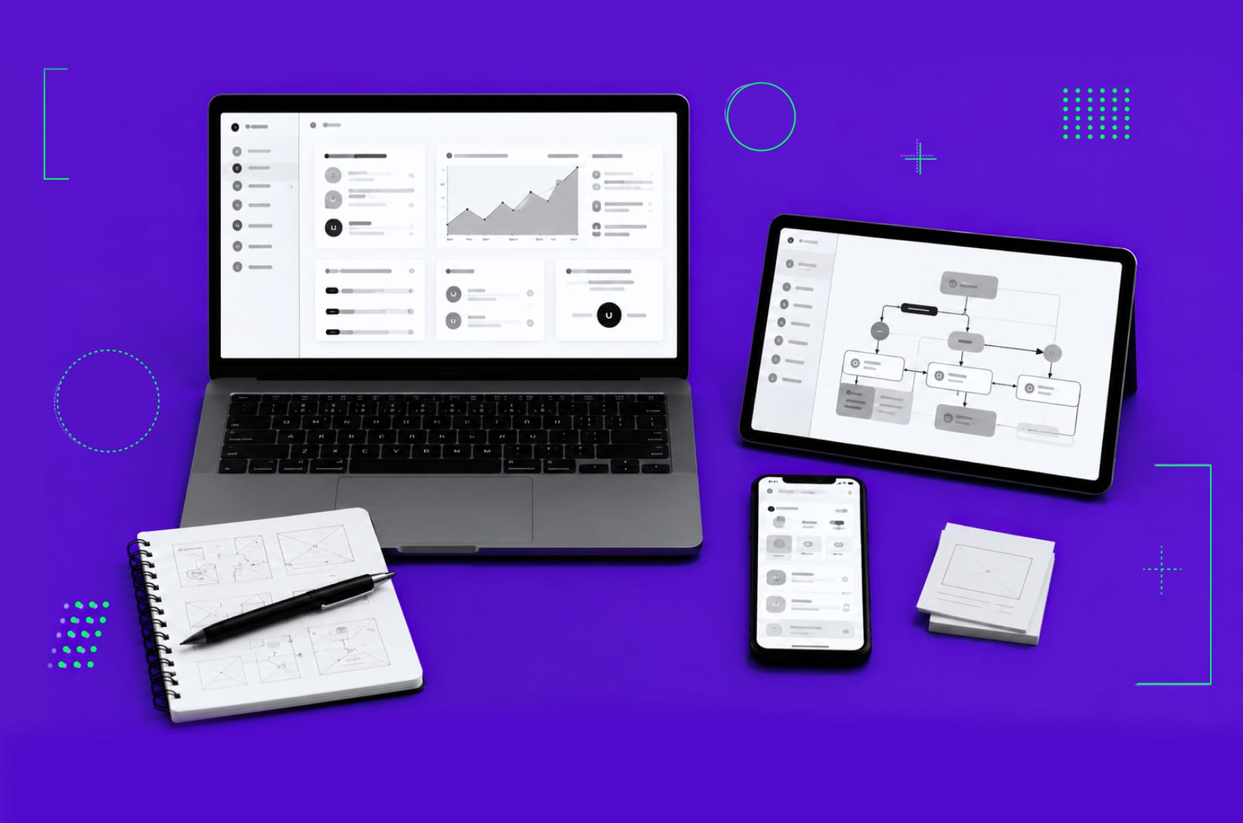
Collaborative design process
The essence of a design system is collaboration. The most effective design systems are forged when these varied perspectives come together to shape the system from the beginning.
Tools like Figma, for example, offer real-time collaboration and exemplify this approach, allowing multiple users to design, review, and iterate simultaneously.
For example, during the development of a component like a button, a designer might focus on aesthetics and user interaction, while a developer could ensure that it's feasible in code.
Simultaneously, a product manager might weigh in on its relevance and adaptability across different product features.
Establishing clear documentation
Documentation acts as the design system's handbook, detailing its core principles, component usage, and best practices.
But, more than just listing components, effective documentation provides context. It answers the 'why' behind design choices, ensuring that users of the system don't just follow rules but understand the rationale behind them.
Conducting regular audits and iterations
A design system isn't a "set it and forget it" tool.
As products evolve, user needs shift, and technology advances, the design system must adapt accordingly. Here's a recommended approach:
- Component audit. Regularly assess all components to determine if they're still relevant, if there are redundancies, or if new ones need introduction. Tools like Screener can help automate visual testing and detect UI changes.
- Feedback loop. Establish channels where users of the system (designers, developers, etc.) can provide feedback, suggest changes, or highlight issues.
- Performance monitoring. Keep tabs on how the system impacts product performance. A change in a design token, for example, shouldn't inadvertently slow down webpage load times.
- Compatibility checks. Ensure that components and patterns are compatible with the ever-evolving array of devices, screen sizes, and browsers. BrowserStack can be a handy tool for such cross-browser testing.
- Adherence to guidelines. Regularly check that product designs still align with the design system. This can be done through manual reviews or automated tools that flag deviations.
Most popular established design systems
Some design systems have set the gold standard in the industry. Let's check out a few frontrunners, from Google's Material Design to Shopify’s Polaris.
Google Material Design
Google's Material Design has truly revolutionized digital design since its introduction in 2014. Its incorporation of depth, motion, and intentionality has brought a new level of clarity and ease to user interfaces.
By utilizing a layered approach with various "elevations," Material Design ensures a clear hierarchy and simple navigation. With its foundation based on the metaphor of material, this design philosophy remains innovative, thoughtful, and always user-centric.
Atlassian design system
Atlassian is committed to designing tools that not only look good but also encourage collaboration and productivity. It simplifies complex workflows, improves clarity, and drives user engagement.
Its emphasis on clarity ensures that even novices can interact with complicated software tools like Jira or Confluence with ease.
The use of bold colors, clear typography, and uncluttered layouts helps users quickly identify actionable elements and the flow of information. The Atlassian Design System also leverages feedback mechanisms like colors, tooltips, and animations to provide clear signals about the outcomes of user actions.
Shopify design system: Polaris
Finally, Shopify's Polaris design system offers a comprehensive guide to creating exceptional digital experiences for commerce.
Polaris places a strong emphasis on accessibility, ensuring that online store interfaces are not only visually appealing but also navigable and comprehensible to everyone.
Its unique features and design principles make it an exceptional tool for businesses looking to create an exceptional online presence.
Does your website meet your conversion benchmarks?
Not quite? We have solutions to get you there.
Learn moreConclusion
Wrapping it up, design systems are more than just a trend. They're a testament to the evolution of the digital landscape and its commitment to users. They offer the scaffolding for consistent, efficient, and inclusive digital experiences.
Whether you're drawn to the tactile metaphors of Google's Material Design, the productivity-driven approach of Atlassian, or the commerce-centric guidance of Shopify's Polaris, the importance of a coherent design language remains crucial.
If you look to solidify your digital presence, investing in a robust design system isn't just recommended; it's essential. It's the foundation upon which memorable and effective user experiences are built.