0
Table of Contents
How to develop a design system: a comprehensive guide
A comprehensive design system is more than a set of guidelines—it's a strategic asset. It ensures that products not only meet but exceed user expectations.

Design systems play an instrumental role in establishing a cohesive user experience across digital products.
A well-structured design system serves as the backbone, ensuring uniformity, efficiency, and scalability. During the product design process, it's vital to have a design system as a foundational guide.
This guide will provide an in-depth walkthrough on how to develop a design system that aligns with your organizational goals, fosters collaboration, and delivers consistency across user interfaces.
Preparing to develop a design system
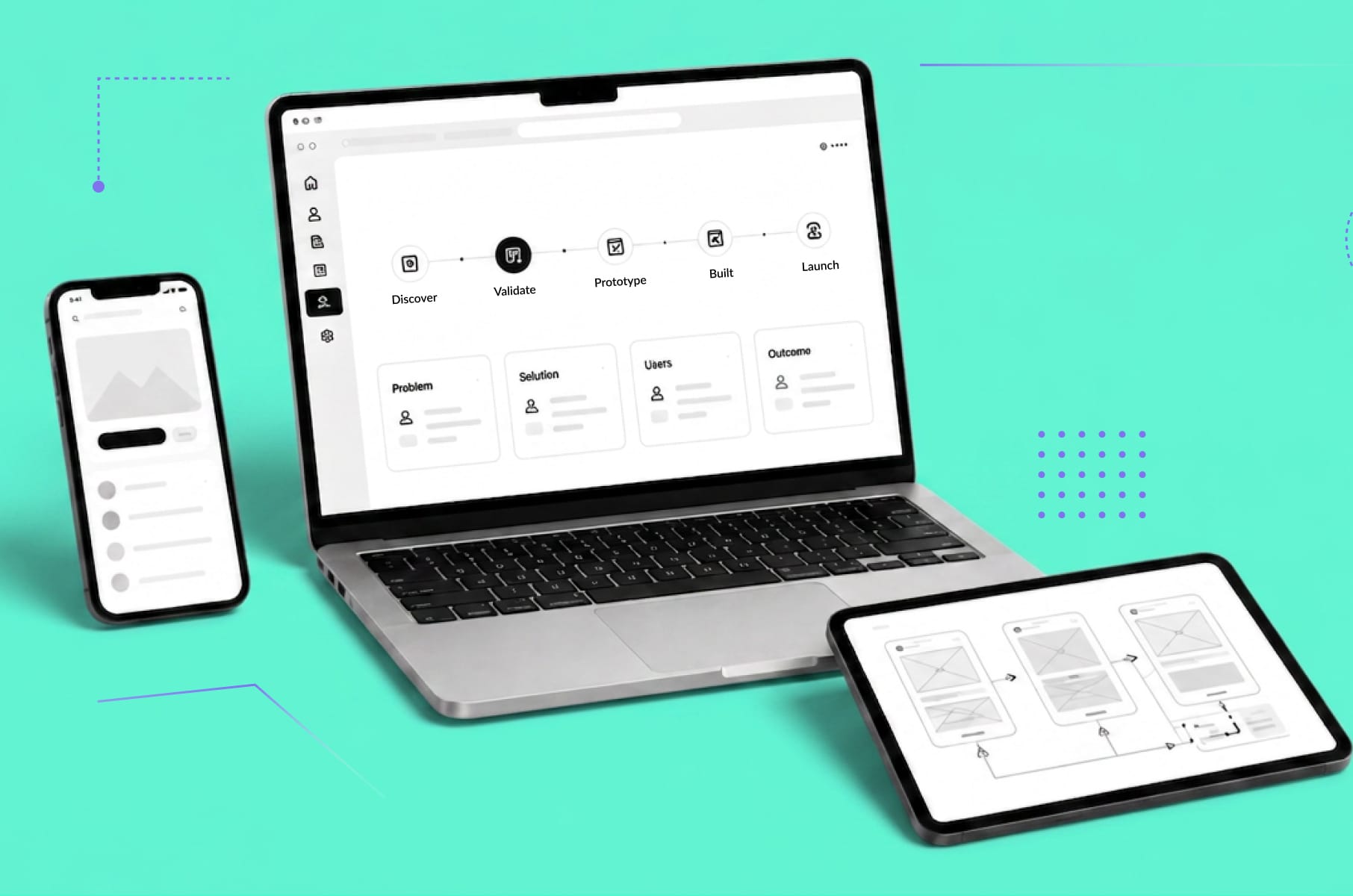
The process of creating a design system is iterative. The preparation phase is about setting a strong foundation, and it's pivotal to ensure its success in the later stages.

Does your website meet your conversion benchmarks?
Not quite? We have solutions to get you there.
Learn moreUnderstanding the company's goals and needs
Before crafting a design system, it’s vital to align it with the organization's overarching objectives and user needs. This ensures the system's relevance and efficacy. For that:
- Engage with key figures within your company – from product managers to marketing heads – to determine the goals of the design system. Is it to achieve brand consistency across products? Or perhaps to speed up the design-to-development process?
- Utilize tools like Hotjar or UserTesting to gather insights from current products. What are the common issues users face? What do they appreciate?
- Identify the core business goals. For instance, if the company aims to expand its mobile app user base, the design system should prioritize mobile responsiveness and app-specific UI components.
Researching existing design systems for inspiration
Research guides the direction and structure of your design system. By studying existing systems, you can glean insights, avoid pitfalls, and build on proven strategies:
- Explore renowned design systems like Google's Material Design, IBM's Carbon, or Atlassian's Design. Note the components, guidelines, and structure they utilize.
- Use platforms like Dribbble or Behance to see current design trends. However, remember to differentiate between a fleeting trend and a lasting best practice.
- Inspect design systems (if available) of competitors or those in analogous industries. Tools like SimilarWeb or BuiltWith can offer insights into technologies and frameworks they might be using.
Gathering necessary resources and tools
Building a design system isn't just about creativity; it's also about having the right toolkit. This ensures smooth workflows, precise design execution, and efficient team collaboration:
- Depending on your team's preference, ensure access to design tools such as Adobe XD, Sketch, Figma, or InVision.
- Just as developers use Git, designers can leverage Abstract or Plant for version control of design assets.
- Tools like Zeplin or Framer bridge the gap between designers and developers by allowing the former to create interactive prototypes and the latter to extract code.
- Pre-existing UI kits relevant to your industry or product can be a head start. While you'll tailor these to your needs, they can offer direction and accelerate the initial phase.
Assembling a design team
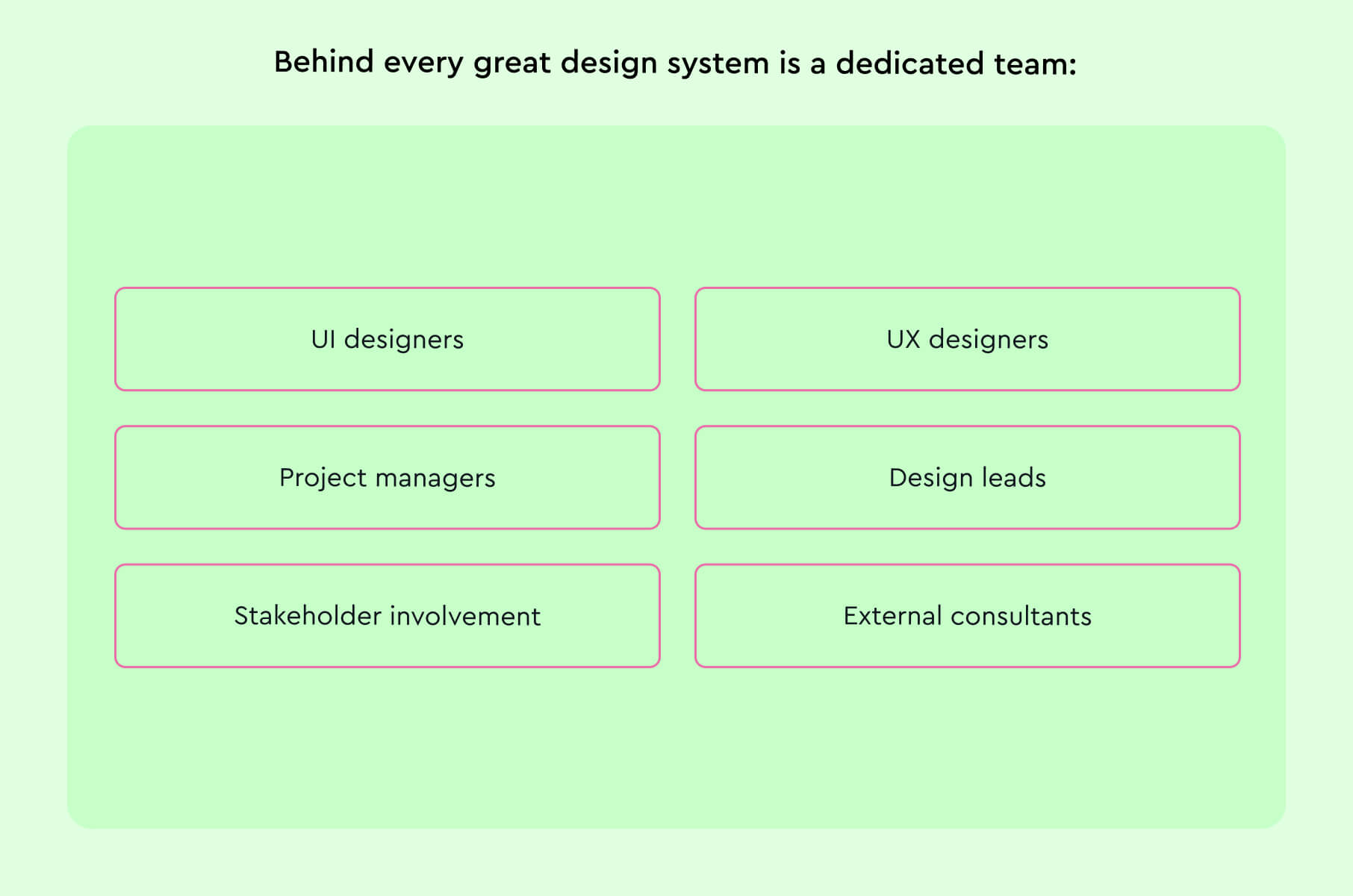
Behind every great design system is a dedicated team. Assembling professionals with varied expertise ensures the system is holistic, addressing both aesthetics and functionality:
- UI designers. They focus on the visual aesthetics – colors, shapes, and typography. Their work ensures the design system is visually appealing and aligns with brand guidelines.
- UX designers. Concentrating on user journeys and experiences, they ensure the design system prioritizes functionality and user-centricity.
- Project managers, design leads. These individuals streamline the design process, manage resources, and ensure the workflow between designers, developers, and stakeholders is seamless.
- Stakeholder involvement. Periodically involve decision-makers to get buy-in, feedback, and alignment. It ensures the design system meets business goals.
- External consultants (if budget allows). Sometimes, an external perspective can be invaluable. Consider hiring experienced design system consultants or attending workshops to refine your strategy.
Does your website meet your conversion benchmarks?
Not quite? We have solutions to get you there.
Learn moreBuilding blocks of a design system
While visual components set the aesthetic tone, UI patterns and components form the functional backbone of a design system, ensuring both usability and consistency across digital products.
Visual components
Visual components form the basic building blocks that determine the look and feel of any design system:
- Typography, for instance, should not be chosen merely for aesthetic reasons but also for readability and accessibility.
- The color palette should be chosen bearing in mind brand identity, emotional impact, and even accessibility standards.
- Icons, often overlooked, play a vital role in guiding users and providing visual breaks; they should be consistent in style and weight.
- Spacing, including margins and paddings, may seem trivial but is crucial to ensuring a balanced and harmonious layout.
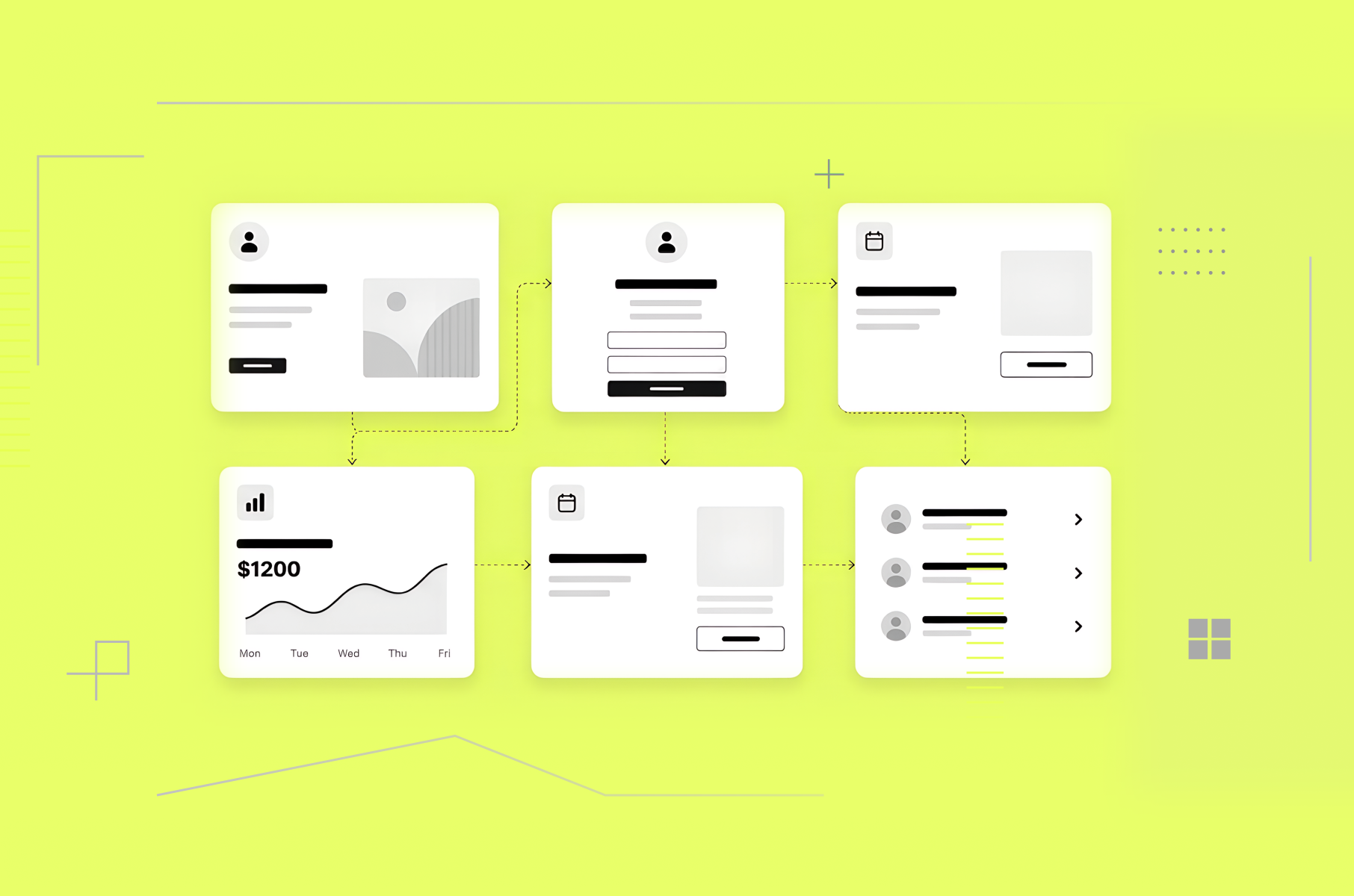
UI patterns and components
UI patterns and components are recurring solutions that solve common design problems and ensure consistency across different parts of an application.
Components, such as buttons, input fields, and modals, are reusable elements that serve specific functionalities.
It’s crucial that each component is meticulously designed, keeping in mind different states (like hover, active, disabled) and potential error scenarios.
Design systems should also include larger UI patterns, such as navigation menus or card layouts, which are combinations of individual components assembled in a specific way to serve a broader function.
A detailed specification for each pattern and component, including its behavior, appearance, and code snippets, can be beneficial.
Creating design guidelines
While creating design guidelines, the key lies in striking a balance between detailed specifications and allowing room for creativity, ensuring designs are both consistent and fresh across applications and platforms.
Consistency in design elements and spacing
Ensuring consistency in design elements like buttons, icons, or typography means that regardless of where they appear, these elements should retain their properties.
For example, a primary button should always have the same color, font, and shadow, whether it's on a homepage or a modal. The aim is to create a recognizable and predictable interface, reducing cognitive load for users.
Spacing, often underestimated, plays an equally crucial role. By maintaining consistent margins, paddings, and gaps, you can achieve a balanced design.
Tools: Grid Lover or Modular Scale
Accessibility considerations
Accessibility isn't just a consideration - it's a responsibility! You need to cater to all users, including those with disabilities. This means considering color contrasts, ensuring that text is readable against its background, and text size is appropriate for all users.
Designs should also be navigable via keyboard, and interactive elements should have discernible focus states. ARIA roles and semantic HTML ensure screen readers can effectively interpret content.
Tools: Axe or the Color Contrast Analyzer
Responsive design principles
In today's multi-device world, designs should adapt and look impeccable, whether viewed on a desktop, tablet, or smartphone. But beyond mere appearance, the functionality must also adapt.
For instance, a navigation menu on a desktop might be horizontally laid out, but on mobile, a more space-efficient hamburger menu might be more appropriate.
Media queries, flexible grid layouts, and fluid images are technical aspects that enable responsive designs.
Moreover, a mobile-first approach, wherein designs are first crafted for smaller screens and then scaled up, can ensure efficiency and focus.
Tools: BrowserStack or Responsively App
Designing for different platforms
Every platform, be it iOS, Android, web, or even wearables, has its unique guidelines, behaviors, and user expectations.
Designing for iOS means adhering to the Human Interface Guidelines, which provide detailed specifications for everything from app architecture to icon design.
Alternatively, Android follows Material Design principles, which emphasize different interaction patterns and aesthetics.
Beyond mobile, web designs should consider browser inconsistencies, while wearables demand designs optimized for smaller, glanceable interactions. Each platform presents its own challenges and opportunities, and it's crucial to be versed in their specifics.
Tools: Emulators provided by platform vendors like Apple's Xcode or Android Studio
Creating documentation
While the design system is the bedrock, the documentation is the map – guiding teams to implement the design system effectively and consistently across projects.
Documenting design principles
When documenting design principles, it's about more than just aesthetics or functional components. It's about codifying the philosophical underpinnings of your design choices.
These principles act as the compass guiding all design decisions. For instance, a company valuing simplicity might have a principle stating, "Reduce cognitive load for users by prioritizing clarity over decoration."
Each principle should be supported by rationale and, where possible, illustrated with examples from the design system itself. This practice ensures that even as personnel changes or new design challenges arise, there's a steadfast foundation upon which decisions can be made.
Tools: Frontify or Zeroheight
Style guide creation
The style guide is a visual and textual representation of the design system's components. It clearly defines typography, color palettes, iconography, and other visual elements, ensuring designers and developers use them consistently.
For instance, specifying the exact hex code for a primary color or defining typography rules such as font size, weight, and line height for headings and body text ensures coherence across different parts of an application.
Integrating the style guide with design tools, like Sketch's shared libraries or Figma's team libraries, can further streamline the design process and ensure real-time adherence to the defined styles.
Specifying usage guidelines
While components and styles form the bricks and mortar of a design system, usage guidelines are the instruction manual. These guidelines provide clarity on when and how to use a particular component or style.
For example, a modal might have guidelines on when it should be used versus a full-page redirect. By specifying the context, the behavior, and any variations, designers and developers are equipped to make informed decisions.
Maintaining and updating documentation
Documentation is not a static entity; it evolves with the design system. As products grow, user needs change, and design trends shift, the design system will need refinement. Therefore, the documentation should be revisited and updated regularly.
Changes should be logged, and version histories maintained so there's a clear record of the evolution. Feedback loops should also be established. Designers, developers, and even users will encounter scenarios the original documentation might not have covered.
Implementing and using the design system
A design system, while foundational, requires meticulous integration and continuous refinement. With collaboration, integration into tools and workflows, and regular testing, it becomes the beating heart of all design efforts, ensuring consistency, efficiency, and user satisfaction.
Collaboration between designers and developers
The strength of a design system is truly realized when there's a seamless collaboration between designers and developers. Designers craft the visuals and interactions, while developers bring them to life.
Designers can then export their designs into a format that developers can readily interpret, complete with assets, CSS snippets, and interactivity guidelines.
Regular communication is also crucial for any digital product design company, ensuring that during sprint reviews or design critiques, any ambiguities can be clarified and the end product matches the intended design vision.
Integrating the design system within design tools
To achieve efficiency and consistency, the design system must be integrated directly into the design tools used by the team. This might involve creating shared libraries in Sketch or setting up components in Figma, which can then be dragged and dropped into new designs.
By doing this, any updates to the design system can be instantly propagated across all designs, ensuring consistency
Implementing the design system in project workflows
Integrating a design system goes beyond just the tools; it must be woven into the very fabric of project workflows. This begins with training: every team member should be familiar with the design system's principles, components, and guidelines.
As new projects are conceptualized, the design system should be the starting point, ensuring designs are not just beautiful but also consistent and user-friendly.
Testing and improving the design system
Our team at Merge knows well that a design system evolves based on feedback and testing. After implementation, regular user testing sessions can highlight components or patterns that might not work as intended. This feedback loop is essential: once gaps or areas of improvement are identified, the design system should be iteratively updated.
Does your website meet your conversion benchmarks?
Not quite? We have solutions to get you there.
Learn moreConclusion
To sum it all up, a comprehensive design system is more than a set of guidelines—it's a strategic asset. By anchoring designs in consistent principles and patterns, it ensures that products not only meet but exceed user expectations.
In a market where user experience can significantly impact brand perception and business outcomes, having a well-implemented design system is a competitive advantage. It fosters collaboration, reduces inefficiencies, and paves the way for future-forward digital solutions.
For businesses aiming for excellence, it's a critical component in the digital product design playbook. If you want to ensure your product is not just beautiful but also intuitive, you might want to take a look at some of these examples of stellar product design next.