0
Table of Contents
How to design a mobile app in Figma - a short guide for those just starting out
Сreating frontend design for mobile applications is all about the process and the tools you use. You’ve made up your mind about the latter. Let’s walk you through the process next.
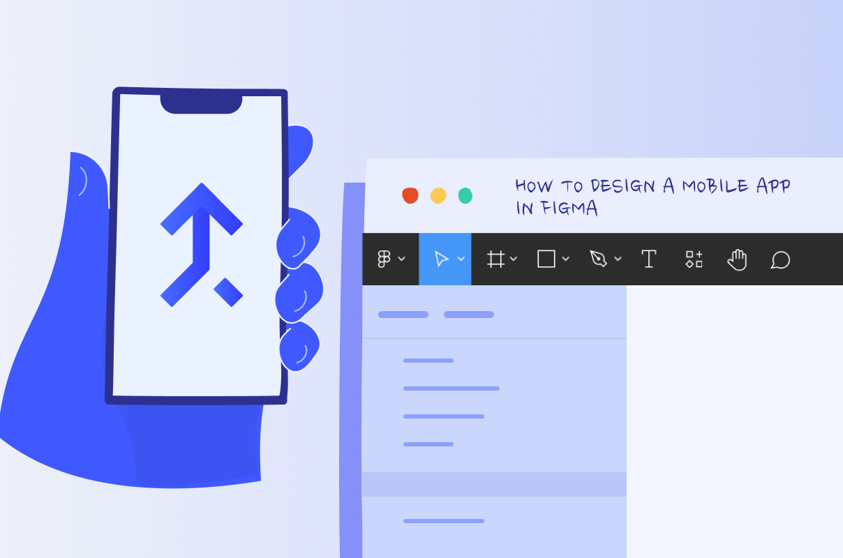
Hooray! It’s finally come time to design your first mobile application. While many platforms, programs, and applications exist for this very purpose (e.g.,, Sketch, UXPin, Marvel, etc.), one of the most popular and not without a sound reason is still a browser-supported interface design platform called Figma.
This tool has acquired widespread acclaim by being very easy to work with, enabling fast prototyping and design processes, and efficient collaboration. Overall, Figma is cherished for being an all-in-one tool for website and mobile app designers. This is probably why you’ve chosen it in the first place.
Take it from the mobile application design agency that creating frontend design for your mobile application is all about the process and the tools you use. You’ve made up your mind about the latter. Let’s walk you through the process next.
Before we jump straight into the design tutorial, don’t forget to check out our piece on evaluation methods for mobile app design for insights on how to differentiate a good application design from a rather mediocre one.
Figma app design tutorial
Since Figma supports vector prototyping and shared code, it promotes and streamlines collaboration in design projects, which is ideal because, chances are, you are working on your mobile app design with your teammates and want everyone to be able to chip in and share their ideas.
Figma's recent introduction of Dev Mode also marks a significant step forward, particularly for developers. This mode facilitates a smoother translation of designs into code and seamlessly integrates with tools like GitHub, JIRA, and the Figma for VS Code extension, which allows developers to inspect designs and write code at the same time.
Before you design your application, make sure you’ve done user and market research. Identify the main product requirements, gather the insights and only then attempt to create your product. This is the basis of user-centric design.
Create a Figma file
First, you need to start your new project. If you had any previous ones or already attempted to begin your design journey, they’ll be located in your Drafts. If you are creating a new one, click “+” at the top left corner of Figma’s toolbar on your screen.
Learn the toolbar
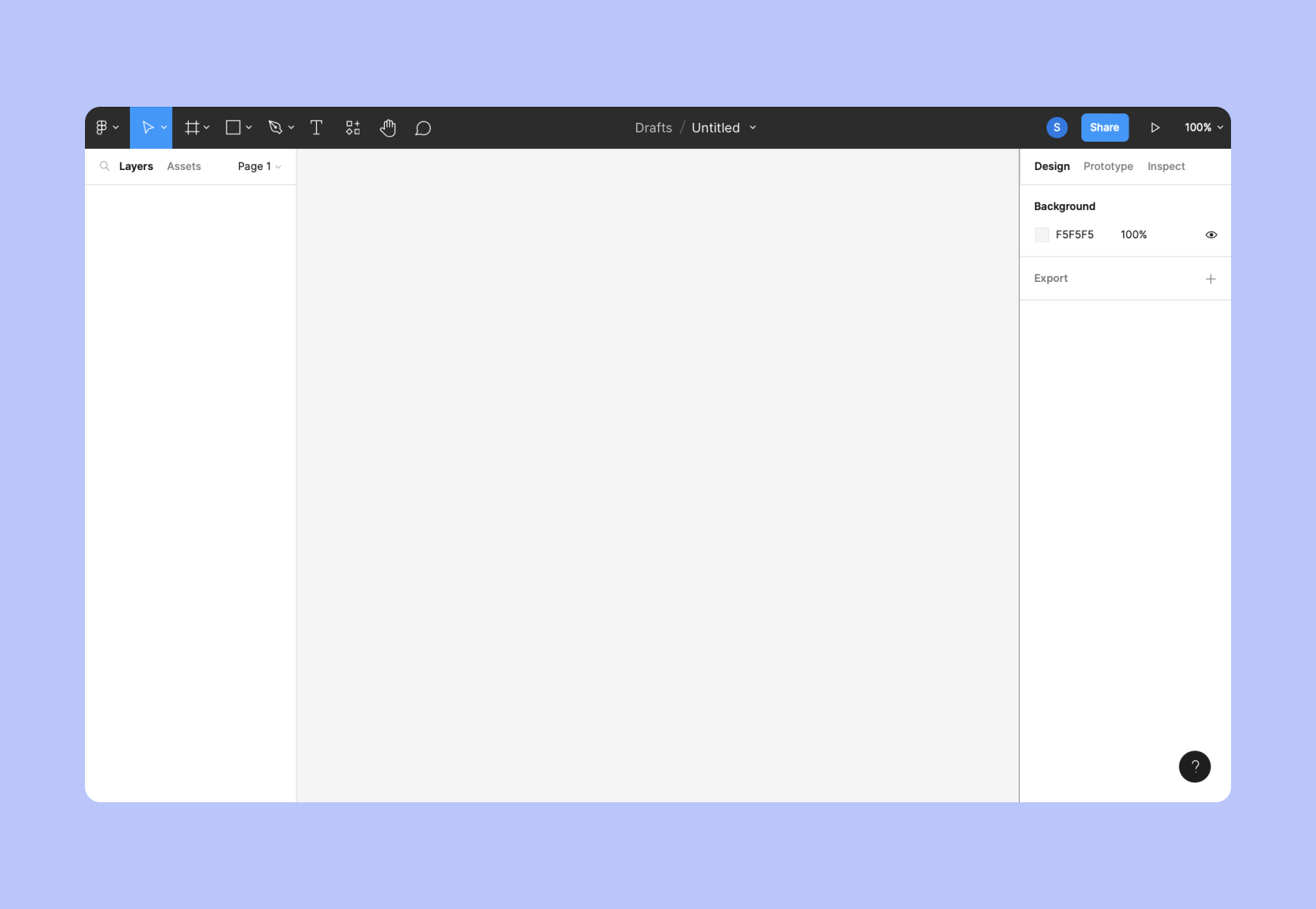
The next thing you should do is get acquainted with the interface. The very first hamburger button, again in the top left corner, is the dropdown menu.
From left to right, next, come the tool buttons: in a shape of an arrow, an art board, a rectangle, a pen, and a type tool, clicking on which will give you access to all the tools you’ll be using most in your project - shapes, frames, text, etc.
4 out of 5 have drop-downs as well, enabling you to access even more options within these tools. Next to it is the chat icon - you can use it to leave messages for your teammates.
Then come the options in the middle, displaying either the tools you’ve selected or your project’s name. The last buttons in the toolbar are the share button for when you want to prototype with others, the play button that lets you present your designs, and the eye icon for accessing other settings.
Other essential parts of Figma’s interface below the dark toolbar include Layers (on the left), Canvas (in the center), and Inspector (on the right). Layers show you every element, group, or component in your current project, all grouped as well.
Canvas is where you create and work on your designs, and, finally, the Inspector is basically the project’s properties panel, where you can switch from design to prototype to code, and vice versa, and also export, change colors, background, effects, etc.
Wireframe an app landing page
Your app’s landing page or home page is one of the most important things since its primary use is to convert your visitors into loyal clients. Besides looking polished and aesthetically pleasing, a landing page design has a few essential elements that you have to consider.
A wireframe is an overly simplistic and superficial sketch of a page (in our case, a mobile app landing page), serving as a low-fidelity visual representation of how everything will function. It contains only key interface elements.
A typical mobile app wireframe will contain elements like shapes (circles, rectangles, etc), boxes, placeholders, and grey lines to create a coherent illustration of the future page. At this stage, there are no logos, images, colors (mostly just grayscale), etc.
It's beneficial to utilize a ready-made components library for wireframing to ensure consistency and efficiency. For example, our Figma kit can be a valuable resource in this process.
The standard set of elements will include content hierarchy, basic app features, possible user actions, space between elements, and possible transitions between pages.
Here are a couple tips for creating a successful landing page wireframe:
- Follow the visual hierarchy, meaning - the most crucial elements are given the utmost attention, making them noticeable straight away through size and surrounding space;
- When creating your wireframe, consider user flows. Plann the journey users will take through your app, ensuring that the most important elements are immediately noticeable through size and surrounding space.
- Highlight your value proposition with convincing headlines, calls to action, and quality content - copy, images, videos, etc.
A tip from our Head of Design:


Use plugins
When working with Figma, you might want to also add some plugins. They are third-party add-ons (applications, scripts, programs) that help extend the functionality, optimize the workflow, or just simply add a lot of extra customization options to your project.
Whatever plugin you choose, they usually come with instructions on how to install and use them and a version history.
A few plugins to try: Remove BG (a background remover for images), Font Preview (to help you pick the right font), Color Contrast Checker, UI Gradients, Iconify (to choose nice icons), etc.
In general, to add a plugin to your project, you should first install it on your personal Figma account, not directly on a project. Once installed, the plugin becomes available in your plugin list across any project you work on.
To find plugins, go to the Figma Community by clicking Explore Community in the top-left corner, and then selecting Plugins, or you can do a right-click on your canvas and choose Plugins.
Do a bit of roaming around to find the preferred plugin solutions (filter by category, tag, name, keyword, and trends), then click Install or Save.
To run your selected plugins, follow the instructions of a specific plugin since they can vary - some you can use immediately, and some require extra steps in the settings. Any plugin has to be run manually, and only one at a time.
Establish asset library
Before or simultaneously with building wireframes, define and map out the desired user flow. Create this flow in FigJam to visualize the sequence of actions a user will take to complete a particular task.
Then you need to create a frame (or, in other words, an Art-board) on your canvas, which will serve as a container or a vessel for all your design elements and also limit your space so you will work to optimize the structure for each screen.
The frames may vary a little depending on what type of device you’re designing for. You can use a pre-set size from the Inspector on the right.
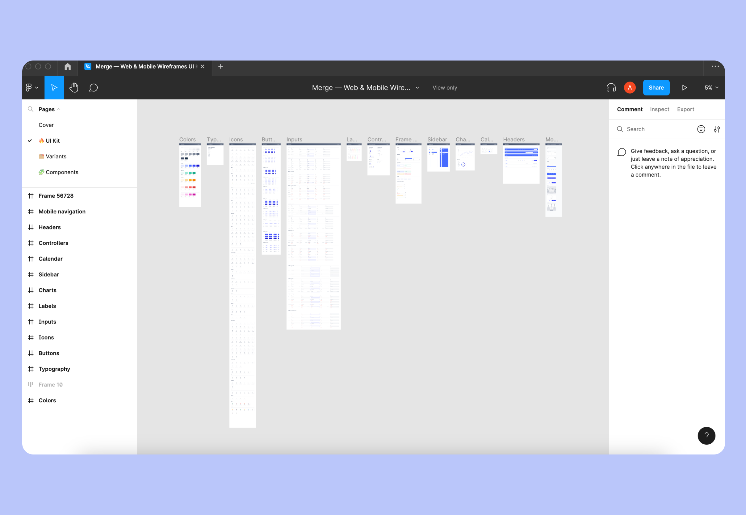
The next step is to set up an asset library as a way of keeping your files in the project organized. In general, a library helps reuse styles and components across all your files - you can select the ones you want to share, publish them, and access them later.
For better organization, create this library in a separate file and link it to your working file. This approach is also beneficial for developers who will work with these assets.
To start using the library in your working file, you first need to publish it. In the components library file, click the book icon in the right corner of the 'assets' tab and then click the publish button. In your working file, also click the book icon in the assets tab and find the published file in the list. Click 'add to file' to start using it.
To add assets from the library, use drag-and-drop.
Shape and create components
Components are pieces you can reuse in your designs. They promote consistency across your project and help you control your most frequently used UI elements.
Incorporate new components early in your design process and as you progress with your work, ideally when setting up your asset library, as mentioned previously.
For instance, you can change all the elements simultaneously by updating only one part of it. To create a component, simply choose all the layers you want to combine, then right-click and select Create Component.
Basically, you can create your components from any previously made objects or layers - icons, buttons, layouts, etc. The main component will determine the properties, and an instance is a copy you can actually reuse.
Create a layout grid
At this stage, you should set out a clear hierarchy for your mobile app’s design elements. For that, a content layout grid is needed, which is basically a collection of boxes of different sizes and the amount of space between them and also the space near the edges.
To do this, click (+) again, with your Frame selected, under the Layout grid. Choose the preferred count of columns, their gutter (the space between them), and their margins (that space at the edges). After that, you need to pay attention in the future if everything is aligned correctly.
Start adding content
Once you move from low-fidelity wireframes to more high-fidelity ones, you need to start adding more content to it. All the different shapes and shades of grey boxes need to be replaced with the final content of the pages. Fill those boxes with images, illustrations, text (actual copy, not Lorem Ipsum), etc.
By adding content at this point, you also test if all the final elements are an excellent fit for the screen, as the fake text and vague grey blocks aren’t an accurate representation of what the app screen will look like in the end. You might need to tweak some of the design choices.
Shape and create components. Components are pieces you can reuse in your designs. They promote consistency across your project and help you control your most frequently used UI elements.
For instance, you can change all the elements simultaneously by updating only one part of it. To create a component, simply choose all the layers you want to combine, then right-click and select Create Component.
Basically, you can create your components from any previously made objects or layers - icons, buttons, layouts, etc. The main component will determine the properties, and an instance is a copy you can actually reuse.
We've also created Figma Mobile App templates that allow you to create beautiful applications, improve and speed up your design workflow. Check them out!
Prototype
The prototype is the highest-fidelity representation of your application’s design with a much more pronounced attention to detail, such as animations, final fonts, and all the final little UI elements.
To prototype, switch from Design to Prototype in the Inspector panel. Then it’s best to rename your Frames to make them more distinctive.
The next thing is to create links and connections between Frames and their respective elements so then when you show your prototype, the elements will be linked to where they are supposed to go.
Finally, to display your prototype, press Play in the toolbar.
By the way, there's currently a lot of cool stuff for prototypes. You can create animations and smooth transitions, etc.
Start your app design in Figma
This concludes our brief tutorial on designing your mobile application in Figma. If you have any questions, and you most certainly do, since this piece is just an introductory outline of what it actually takes to create a complete design for your app, feel free to contact our Merge team.
In case you think you need to design your mobile application faster and more professionally, our designers are most joyous to help. All we need from you is your requirements for your project.