0
Table of Contents
Web CTA guide for startups or how to create a website that converts
Mastering web CTAs is an essential skill for any startup looking to boost its online presence.

Imagine you've built a great website for your startup. It's sleek, informative, and perfectly reflects your brand. But there's a catch – your visitors aren't taking the actions you want them to. This is where call-to-actions (CTAs) come into play.
They are not just buttons or links; they are your direct line to your audience, guiding them on what to do next. Whether it's signing up for a newsletter, downloading an e-book, or making a purchase, effective CTAs can significantly boost your website's conversion rate.
We have created this guide to show you how to craft web CTAs and what call-to-action button design will resonate with your audience and drive results.

Understanding web CTAs
Understanding call-to-actions involves recognizing their role in guiding user behavior and driving conversions on a website.
A CTA is typically a button, link, or interactive element that prompts users to take a specific action, like "Sign Up," "Learn More," or "Buy Now."
The primary function of a CTA is to transition a visitor from a passive browser to an active participant. This transition is crucial in the conversion funnel, where the goal is to convert visitors into leads, customers, or subscribers.
For example, a CTA like "Add to Cart" on an e-commerce site directly influences the sales conversion rate.
Crafting effective CTA website design
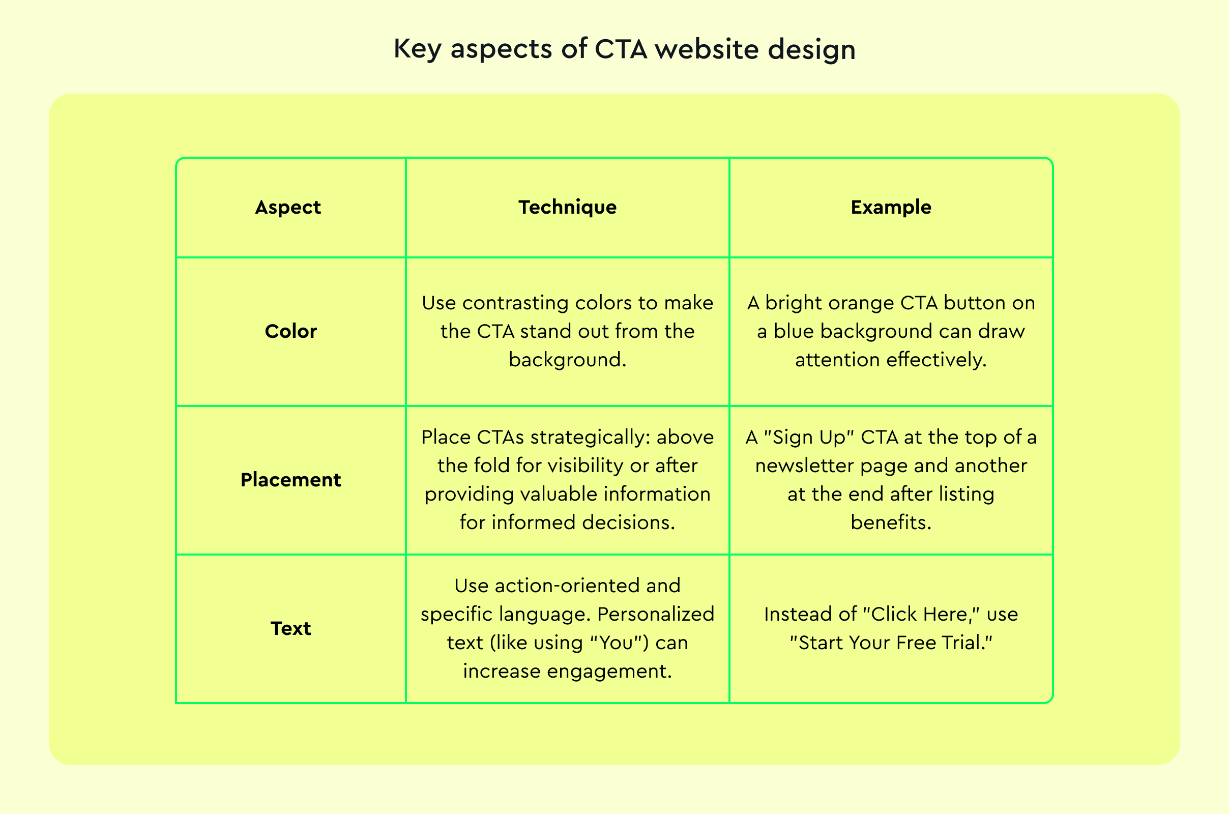
Effective CTA website design should stand out visually. This involves using contrasting colors, clear typography, and a size that is noticeable without being overpowering.
An older study by Hubspot showed that red CTAs boosted conversion rates by as much as 21% compared to green ones, emphasizing the impact of color psychology.
When creating an effective call-to-action button design, the goal is to create CTAs that not only capture attention but also motivate action. Here is a table outlining key aspects of CTA website design along with practical tips and examples:
Let’s now look a little closer at web CTA placement strategies, emotional triggers, and mobile responsiveness.
Web CTA placement strategy
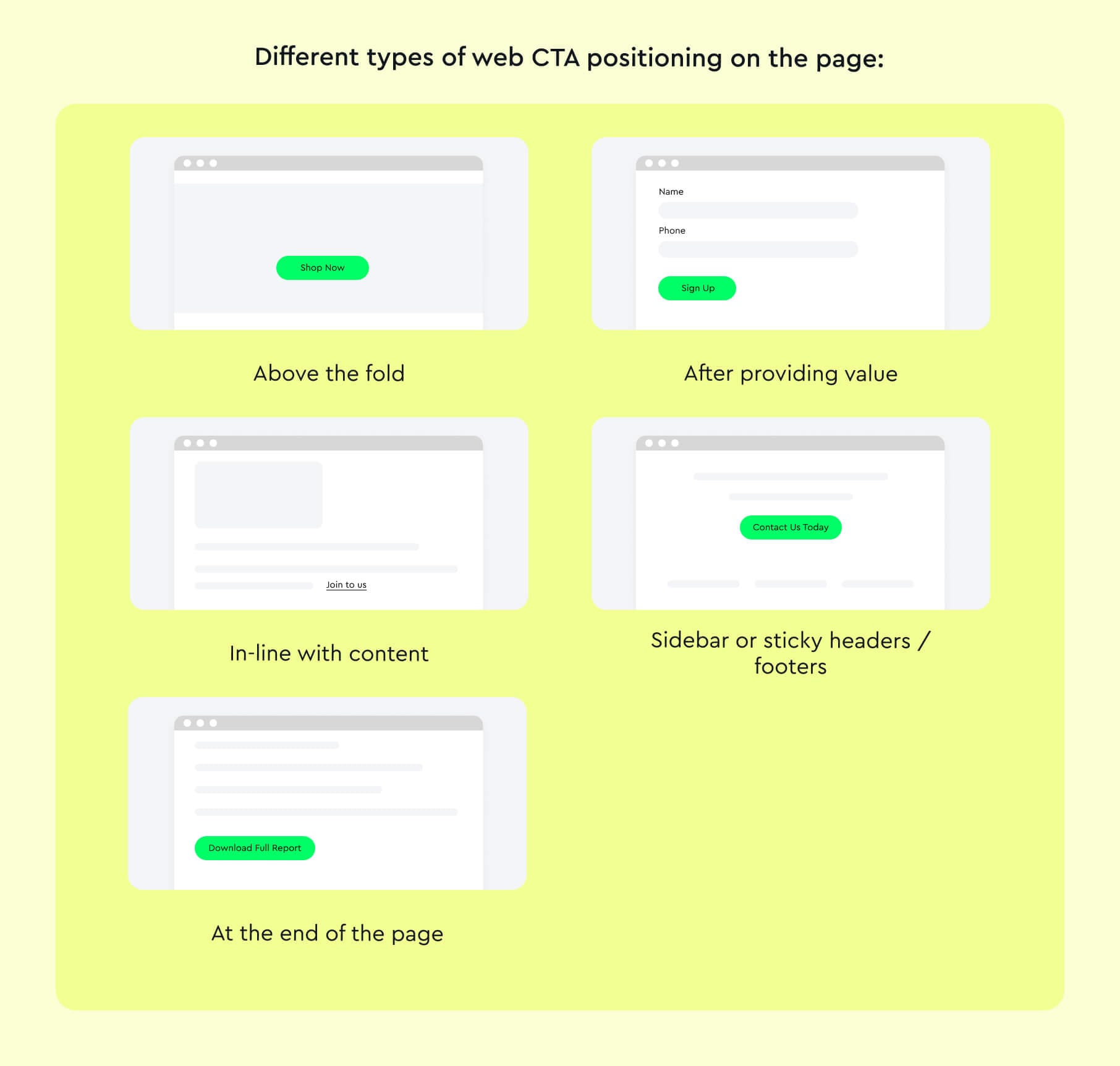
The positioning of CTAs on a webpage greatly affects their visibility and effectiveness. The optimal placement is influenced by user behavior, website layout, and content structure:
- Above the fold. Placing CTAs in the visible area of a webpage without scrolling (above the fold) ensures immediate visibility. For instance, a "Shop Now" button on an e-commerce site's landing page catches the user's eye instantly.
- After providing value. CTAs placed after informative content or a value proposition are more effective. For example, a "Sign Up for Free Trial" button at the end of an explanation of services allows users to take action after understanding the offer.
- In-line with content. Embedding CTAs within the body of relevant content can increase engagement. A blog post about fitness could have a "Join the Fitness Program" CTA within the text.
- Sidebar or sticky headers/footers. These areas are consistently visible as the user scrolls, keeping the CTA in constant view. A sidebar CTA saying "Contact Us Today" remains accessible regardless of the user's position on the page.
- At the end of the page. Placing a CTA at the bottom can capture users who have consumed the entire page content, indicating a high level of interest. An example is a "Download Full Report" at the end of a research article.
Emotional appeal in CTAs
Emotional triggers in CTAs can significantly impact user response. Leveraging emotions like excitement, curiosity, or fear of missing out (FOMO) can motivate users to act. Here are some CTA button examples that appeal to people’s emotions:
- Use of power words. Words like "Discover," "Exclusive," or "Unlock" can evoke curiosity and excitement. A CTA like "Unlock Your Exclusive Deal Today!" taps into the user's desire for special offers.
- Creating urgency and scarcity. Phrases like "Limited Time Offer" or "Only a Few Left" create a sense of urgency and FOMO. Users are more likely to act quickly to avoid missing out.
- Appealing to desire for simplicity or ease. Offering a solution to a problem with phrases like "Get Started Easily" or "Simplify Your Life" can appeal to users’ desire for convenience.
- Highlighting benefits. Focusing on what the user gains, such as "Achieve Your Dreams" or "Start Saving Today," emphasizes positive outcomes and personal growth.
- Using testimonials or social proof. Including user testimonials or social proof in or near the CTA can build trust and emotional comfort. A CTA like "Join 10,000 Happy Customers" effectively uses social proof.
Mobile responsiveness
With the increasing prevalence of mobile browsing, CTAs must also be optimized for mobile devices. This involves considering screen size, touch interface, and mobile user behavior. Check out CTA button examples for each aspect below.
Size and touchability
- Ensure CTA buttons are large enough for easy finger tapping. Avoid crowding with other elements for better usability.
- Example: A spacious "Buy Now" button designed for easy tapping.
Visibility
- Make CTAs clearly visible on smaller screens. Adjust colors, fonts, or button sizes if necessary.
- Example: Vibrant CTA buttons that stand out, even on compact screens.
Placement
- Position CTAs within thumb-friendly zones for easy access. Optimize placement for comfortable thumb reach while holding the device.
- Example: A centrally located "Subscribe" button on a mobile blog page.
Simplicity
- Simplify CTA design and text for clarity on mobile devices. Avoid complex graphics or text for improved user experience.
- Example: A straightforward "Shop Now" with minimalistic design.
Loading speed
- Ensure CTAs load quickly on mobile devices to prevent user drop-off. Optimize graphics and code for immediate CTA loading.
- Example: Optimized elements that guarantee swift CTA loading on mobile devices.
Responsive design
- Ensure CTAs adapt to various screen sizes and orientations. Create CTAs that adjust in shape and size for different device orientations.
- Example: A flexible CTA that changes with device rotation from portrait to landscape.
Context awareness
- Tailor CTAs based on mobile users' context, like location or time of day. Create CTAs that adapt to user-specific situations for relevance.
- Example: A "Find Nearby Stores" CTA appearing on a retail app based on user location.
Testing and optimizing CTAs
Testing and optimizing CTAs is a critical part of conversion rate optimization (CRO), allowing you to fine-tune elements for maximum effectiveness. The primary method for this is A/B testing, complemented by performance analysis.
A/B testing of CTA UX
A/B testing, also known as split testing, involves comparing two versions of a CTA to see which performs better. It’s a systematic process:
- Choose one element of the CTA to test, such as color, text, size, or placement. For example, testing the color of a CTA button, where Version A is blue, and Version B is red.
- Develop two versions of the webpage, each with a different version of the CTA. The pages should be identical except for the variable being tested.
- Divide your traffic randomly between the two versions. Tools like Google Optimize or Optimizely can route traffic appropriately.
- Allow the test to run for a significant period or until you have sufficient data for statistical significance. This duration depends on your website's traffic volume.
- Use analytics tools to measure performance indicators like click-through rates (CTR), conversion rates, or engagement metrics. For instance, if Version B has a higher CTR, it indicates the red button is more effective.
- Implement the winning version and consider testing another element.
Web CTA performance analysis
Beyond A/B testing, continuous performance analysis is also needed. Here’s what to do:
- Use analytics tools. Tools like Google Analytics can track user interactions with your CTA, providing data on clicks, impressions, and conversion rates.
- Heat maps and user recordings. Tools like Hotjar or Crazy Egg offer visual representations of where users click, hover, or scroll. This data can reveal how users are interacting with your CTA.
- Conversion funnels. Analyze the steps users take before and after clicking the CTA. Look for drop-off points that might indicate issues in the user journey.
- Feedback mechanisms. Implement user surveys or feedback tools to gather direct user insights about the CTA’s effectiveness and user experience.
- Iterative process. Continuously refine your CTAs based on data and insights. Testing and optimization is an ongoing process, not a one-time task.
Examples of successful CTAs and CTA UX
Successful CTAs are those that have significantly impacted user engagement and conversion rates. Analyzing these examples helps to understand the combination of design, psychology, and strategy that makes a CTA effective.
Dropbox
Dropbox famously used a minimalistic design for its CTA, which contributed to its early growth. The CTA was a simple "Sign up for free," placed prominently against a clean, distraction-free background. This simplicity eliminated decision fatigue for users and made the action step clear.
The straightforward approach, coupled with a value proposition ("for free"), effectively encouraged sign-ups. If you want to know more about how to communicate your value proposition, we have just a guide for you.
Netflix
Netflix uses a CTA that reads, "Join Free for a Month." This CTA is powerful for several reasons: it offers a clear benefit (free), a time-bound element (a month), and a direct action (join). The use of the word "Join" rather than "Sign up" creates a sense of community and personal engagement.
HubSpot
HubSpot employs 'smart' CTAs that change based on the user's journey and interaction with the site. For instance, a first-time visitor might see a CTA to download a free e-book, while a returning visitor might be prompted to sign up for a webinar. This dynamic approach, driven by user behavior data, leads to higher relevance and engagement.
Amazon Prime
Amazon’s "Try Prime" CTA is an example of leveraging brand strength and offering immediate value. The CTA is usually coupled with benefits like free shipping, streaming, and exclusive deals. This direct approach, highlighting immediate benefits, encourages users to take action.
Slack
Slack's CTA, "Get Started," is placed on a vibrant and visually appealing landing page. The CTA is immediately followed by a reassurance: "Already using Slack? Sign in." This approach not only invites new users but also takes care of existing users, enhancing the overall user experience.
Conclusion
Wrapping up, mastering CTAs is an essential skill for any startup looking to boost its online presence. Remember, web design for business is not just about flashy buttons; it's about understanding your audience and crafting messages that resonate.
By focusing on design, placement, emotional appeal, and constant testing, your CTAs can significantly uplift your conversion rates. Keep these tips in hand, and watch as your web CTAs turn clicks into customers.
P.S. Now that you've converted leads into clients, it's time for them to stay. Learn more in our LTV meaning business guide.