0
Table of Contents
What Google’s Glimmer gets right about UI design for AI glasses
What Google’s Glimmer gets right about UI design, followed by tips on how to use it.

Most interface systems assume a stable (often black) rectangle. On Google AI glasses, however, the background is never neutral. Sometimes, it might not even be under your control. It might be a bright sky, a desk lamp, the street across you, or someone’s face.
That one difference changes the whole UI approach. What if we treat it as a thin layer on top of reality? The assumption is that your field of view is small and that real life is more important than the interface.
Color, type, hierarchy, motion, and feedback now have to hold up against a moving world instead of a controlled display surface. Google’s transparent-screen guidance makes that explicit, and Glimmer is the practical system that grows out of it.
So, the purpose of our article is to analyze how a design system changes when the interface is embedded in real-world use rather than on a flat screen, and to present our practical insights into what Google’s Glimmer gets right about UI design, followed by tips on how to use it.
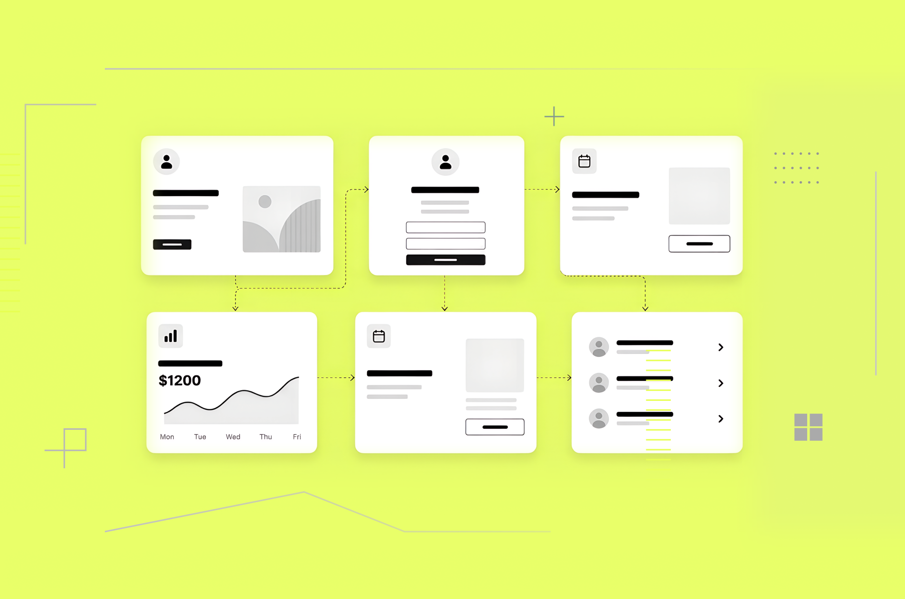
If you design product interfaces like dashboards, notifications, or any screen that competes with a user's environment for attention, Glimmer's approach is definitely worth studying. Our product design services help teams apply these principles to real products.
In brief: Glimmer in three design moves
Glimmer treats the real world as the background layer. It assumes you are busy, moving, and looking through the screen, not at it. What it does:
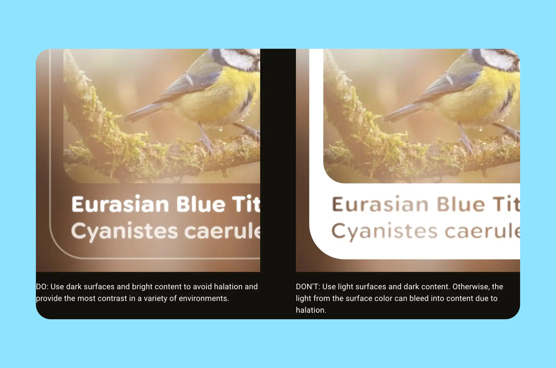
- It uses dark surfaces and bright content because bright fills create glare and halation (an effect where bright light sources have a halo or glow around them) on additive displays.
- It measures readability in visual angle, not familiar mobile sizing.
- It also slows ambient motion, so notifications guide attention rather than snapping into view.
What Glimmer is
Glimmer, or Jetpack Compose Glimmer, is Google’s UI toolkit and design language for augmented Android XR experiences on display AI glasses. It is built on Jetpack Compose and is described as a toolkit optimized for devices that are worn all day.
The docs also call out glasses-specific theming, prebuilt components, and wearable-specific focus indicators and visual feedback. That matters because this is not a concept-video interface. It is a shippable system with opinionated defaults.
It’s also still early on in the release. Google’s Jetpack notes list Jetpack Compose Glimmer in the 1.0.0-alpha line, with 1.0.0-alpha07 dated February 25, 2026. That is enough maturity to study seriously, while still early enough that the harder test will come when more apps use it in daily conditions.
Why Google AI glasses change the rules of interface design
What Glimmer does is start with physics instead of habit.
On AI glasses displays, black does not behave like the black we know on a smartphone. Because the system can only add light and black adds none, it reads as transparency. Google says this directly in its transparent-screen design write-up.
That detail explains the design logic that can look contradictory at first. Glimmer still uses dark surfaces, but those surfaces are not “dark cards” in the phone sense. Google’s own wording is “the team redefined black as a container.” In practice, that means black becomes a layout primitive, a sort of clean plate that helps content read clearly against the world. It doesn’t look like an opaque chunk of color.
This is where the split from Material (their old UI design system for phones, etc.) becomes more vivid. Material’s layer model depends on bright, opaque surfaces and subtle shadows. Google says those assumptions broke down on transparent displays. Bright surfaces created glare, drained battery faster, and introduced halation, where bright areas bleed into nearby content and make text harder to read.
That is why Glimmer feels like a new, quite medium-specific system and not a dark theme pasted onto mobile UI. It changes the basics first. The result is a more useful lesson for any Google Design System work: when the display changes, the token model may need to change before the component library does.
Surface and depth are rebuilt around legibility
Once you accept that black is transparent, surface design becomes a visibility problem. Google’s answer is a “clean plate” model, where dark surfaces create a calm base for bright content.
Glimmer also introduces a new depth system with dark, rich shadows to convey occlusion and hierarchy where standard shadow behavior does not translate cleanly. Instead of just changing color choices, Glimmer is changing what “surface,” “depth,” and “elevation” mean on transparent displays. That is a much bigger change than a visual refresh, and it is one reason the system looks this coherent.
Typography is treated like optical engineering
This is one of the clearest signals that Glimmer is grounded in research rather than styling.
Google says the interface appears at a perceived depth of about one meter, which means users have to shift focus to read it. Text on glasses is not only small text on a smaller device. It lives on a different focal plane.
That is why the team measures type in visual angle rather than pixels or points. In the same article, Google says it established a minimum readable size of around 0.6 degrees and keeps Glimmer’s typography above that threshold for glanceability. It also adjusts Google Sans Flex through its optical-size behavior so letters open up more clearly and spacing reads faster.
For product teams outside XR, this is one of the strongest takeaways in the whole piece. Legibility is often treated like polish work after layout. However, it is better to treat it as a measurable constraint. That mindset works well for dashboards, notifications, basically any interface users read in quick bursts. We noticed that our dashboard design approach actually applies the same optical hierarchy principles.
Color is restrained
A phone screen owns its background. Glasses UI does not.
Highly saturated colors that look stable on a phone can fade in real-world scenes, which is why Glimmer moves toward a neutral-by-default interface with dark surfaces, bright content, and a palette that stays closer to white for better visibility.
The team also says it measured perceived brightness through the additive contrast ratio. That makes Glimmer’s color choices more of a strategy than a matter of taste. For example, the muted palette is there to keep the interface visible when the background keeps changing.
This is also where design screens can mislead teams. Google says the team often blends a screen view with a natural background to visualize how the UI will appear on glasses. Clean mockups can hide the exact contrast problems the real device exposes, which is why polished design screens are often the least honest test case.
Motion is designed to guide attention
Glimmer’s motion choices may be the most mature part of the system. Google’s example is incoming notifications. A typical notification transition of about 500 milliseconds was too fast because, in peripheral vision, it effectively blinked into place. The team moved to an incoming transition that lasts almost two seconds, so the notification enters more gently and invites focus instead of grabbing it.
That is a strong human-factors decision. In wearable UI, faster motion is not always better. Ambient motion needs to respect peripheral attention.
At the same time, action feedback still needs to be immediate. Google pairs slower ambient transitions with fast focus rings and highlights so the user gets instant confirmation when they speak, tap, or gesture.
This is useful well beyond extended reality. Many products use the same motion style for every event. Glimmer separates “draw attention” from “confirm action,” and that is a better model for notification-heavy software in general.
N.B. Explore how VR/AR UX design best practices influence motion design across platforms.
Focus feedback is clearer
Google’s Android XR docs say Glimmer uses wearable-specific visual behavior, including focus indicators and visual feedback that differ from standard Android ripples and overscroll effects. That is the right call. On glasses, focus is not a minor detail. It is part of navigation.
The system’s outline-based focus states make more sense here than recycling phone-native metaphors. They are easier to parse quickly, and they align with the same overall goal as the rest of the system: reduce stray light, keep the signal clear, and make state changes legible without adding visual noise.
For teams that design Google-style product systems, this is a reminder that interaction feedback should match the device context, not the platform’s oldest convention.
Learn how to apply these principles through our product design service.
Practical lessons beyond glasses
Of course, you do not need to be building XR glasses or other similar hardware to borrow the best parts of this system. The best ideas from this new design system apply basically anywhere that has limited attention and fast context changes:
- Start with the environment instead of just the components. The cleanest component library can still fail if its defaults assume a background the user never actually sees.
- Make legibility measurable. Google’s 0.6-degree threshold is a device-specific metric, but the broader lesson is universal. Define what “readable enough at a glance” means in your own product, then tune the system around that threshold.
- Separate ambient motion from instant feedback. Slow the things that enter from the edges of attention. Keep direct action feedback immediate.
- Treat color like a scarce resource. Use neutrals for stability. Spend accent color where meaning or priority really needs it.
If your team reviews most UI on static design screens, add blended-background checks earlier. Google’s official design article is direct on that point, and it is easy to see why. The polished mockup is often the least accurate test case.
Where it may still go wrong
The design logic is sound. Daily use is still the more challenging test.
Glimmer can look coherent in documentation but still run into friction when third-party apps, varied environments, and uneven implementation quality come into play.
The first pressure point is environmental variance.
Google’s own design article repeatedly frames the world as vibrant and unpredictable, which is another way of saying the background can always surprise the system.
The second pressure point is adoption.
A toolkit can encode good defaults, but developers can still override them. That matters here because the logic is systemic. If teams ignore the surface model, overfill the display, or bring phone-era motion and color habits into the frame, the experience will degrade quickly.
The third pressure point is maturity.
Glimmer is still in alpha, and that should temper any claim that the system is fully proven. The ideas are sound. The long-term proof will come from real usage, not from a launch article alone.
FAQ
What is Glimmer?
Glimmer is Jetpack Compose Glimmer, Google’s UI toolkit and design system for augmented Android XR experiences on display AI glasses. Google describes it as a Compose UI toolkit optimized for devices worn all day, with glasses-specific theming, components, and focus behavior.
Why does black look transparent?
Google says these displays are additive, which means they can add light but cannot create opaque black. Black adds no light, so it reads as transparency. That is why Glimmer treats black as a layout primitive instead of an opaque card color.
How does Glimmer handle readable type on Google AI glasses?
Google says the UI appears at a perceived depth of about one meter. Because of that, the team measures text in visual angle, sets a minimum readable size of around 0.6 degrees, and keeps the type scale above that floor for glanceability.
Why are notifications slower?
Google found that a 500-millisecond ambient transition felt too abrupt in peripheral vision, so the team moved to a much slower incoming transition of almost 2 seconds while keeping direct interaction feedback immediate.
Conclusion
To sum it all up, what was done really well and thoughtfully is the philosophy behind the new system. Glimmer works because it treats display physics, perception, and attention as the foundation of the interface rather than polishing concerns added at the very end.
That is why it matters for the UI design as a whole. It shows what happens when a Google design language is allowed to change with the medium instead of forcing the medium to mimic older screens. For anyone building user interfaces that compete with the real world for attention, that is exactly the part we think you should borrow.