0
Table of Contents
The secrets behind every successful Edtech platform design
The goal of Edtech is to make your user learn or do something they couldn't do before.
“Technology helps when it's purposeful and educationally grounded, and disappoints when it's excessive or treated as a substitute for learning design.”
The global Edtech market will probably exceed 400 billion dollars by 2028, and honestly, scrolling through Product Hunt or Crunchbase these days, you'd think every other startup is building something "for education."
Yet, every other product category in 2026 has more or less figured out what it's optimizing for:
- Social platforms chase attention and optimize recurrence.
- Commerce chases conversion and optimizes friction reduction.
- SaaS chases task completion and optimizes repeatable success.
Edtech is the awkward one in the room, because the goal is not action, opens, or even minutes spent in-app.
The goal is whether a real human walks away knowing or doing something they couldn't reliably do before. That is much harder to design, and it explains why so many Edtech platforms look pretty from the outside yet lose users from the moment a learner or a teacher tries to do something.
So what makes the difference?
Essentially, Edtech must optimise meaningful effort.
Our team at Merge has been designing products as an Edtech development company for quite a while now, and it's about time we shared the "secrets" behind successful education tech we've noticed over the years.
What makes Edtech platform design genuinely different
Let's start with the obvious question (and yes, the one we get asked in pretty much every kickoff call).
Why can't you just borrow patterns from your favourite SaaS, slap them onto your Edtech product, and call it a day?
Because the success condition is different. In a typical SaaS dashboard, you've succeeded if the user clicks through and saves a record.
But in education tech? You've succeeded if the user actually learned something.
That sounds like a small difference, but it changes pretty much everything about how you should approach design:
- The home screen is less like a feed and more like a commitment device.
- The dashboard is less like a KPI wall and more like a decision aid.
- Notifications shouldn't "win attention" - they should reactivate practice at the right cadence and nudge unfinished learning loops.
How to understand users in Edtech
Then there's the audience problem.
Successful Edtech product design starts with understanding that education products don't have one user - they have several, and each one has a completely different job to do inside your platform.
In many Edtech products, the buyer, the administrator, the teacher, the learner, the parent, and the stakeholder may all be different people. A product can quite easily satisfy the buyer and still fail the teacher. It can look great to administrators and still frustrate students.
Human-centered design standards (like those from NIST) tell us to understand users, their tasks, and their environments - and in education, those "environments" might include classrooms, homes, shared devices, spotty Wi-Fi, curriculum constraints, assessment cycles, and severe time pressure.
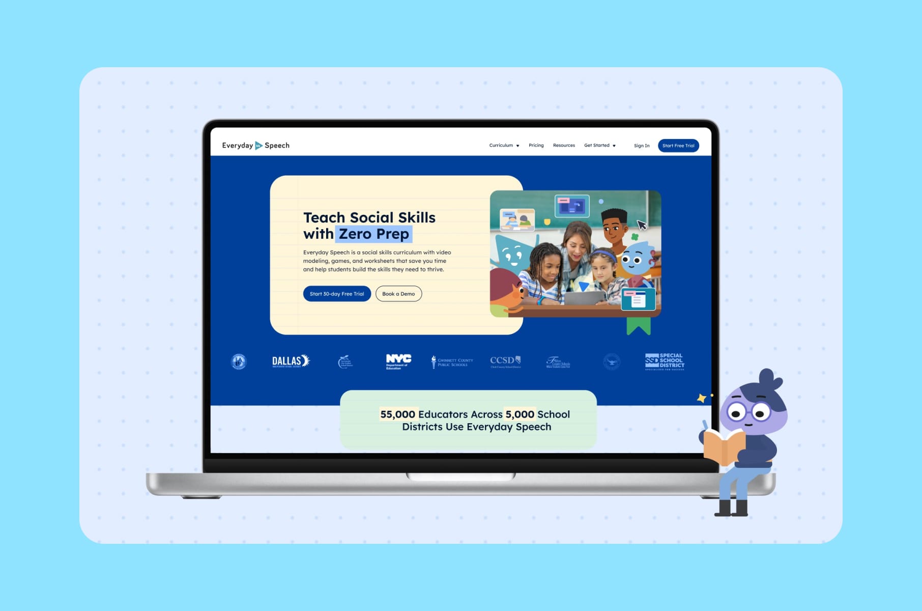
We saw this in our work on Everyday Speech, where the entire site needed restructuring around different visitor journeys. Educators, administrators, and parents all land on an Edtech website with different questions and different levels of urgency. The project focused on clarifying value for each group, fixing the information architecture, improving performance, and launching the highest-impact pages before the school year started.
User role | Primary question | What they need from the platform | Biggest frustration |
Learner | "What should I do next?" | Clear next steps, helpful feedback, chances to recover, visible progress | Confusing interfaces, public failure, shame-based ranking |
Teacher / Facilitator | "Who needs help and what kind?" | Batch actions, templates, clear alerts, flexible grouping, exportable reports | Extra admin work, slow setup, disconnected tools |
Administrator | "Is this working across classrooms?" | Adoption data, performance reports, compliance signals | Micromanaging required, no aggregated view |
Parent | "Is my child progressing?" | Simple, digestible summaries | Having to read full analytics reports |
Buyer / Decision-maker | "Is this worth renewing?" | ROI evidence, usage data, outcome indicators | Vague claims, no hard proof |
So, if you're building SaaS products for education, this multi-user thinking should be baked into your product design process from day one.
Secrets behind every great Edtech platform
So what do the best Edtech websites and apps actually get right?
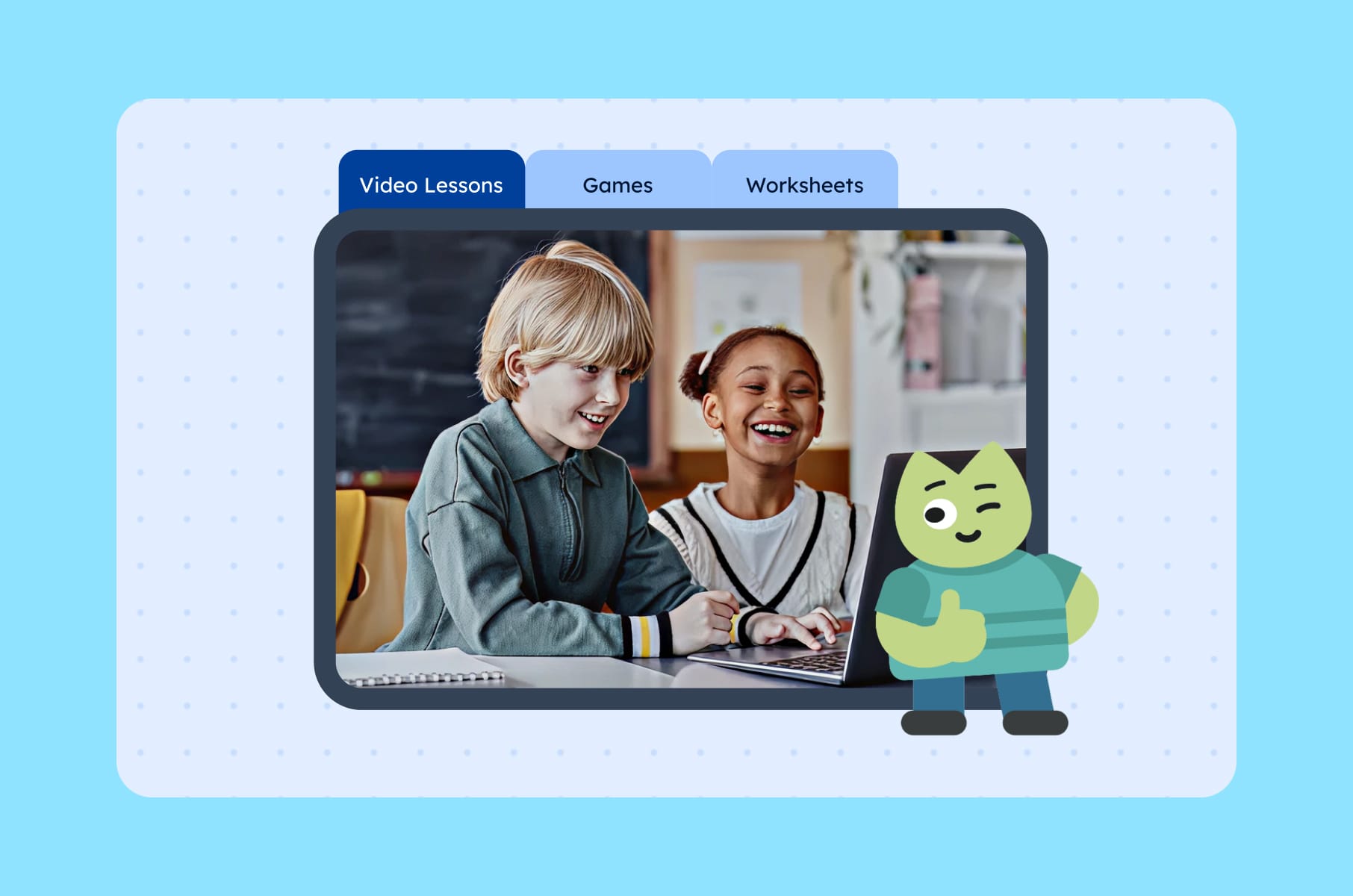
1. Onboarding
Almost every successful Edtech platform solves for "What should I do next?" faster than its weaker competitors. And it all starts with onboarding.
The biggest mistake we see across Edtech startups is treating onboarding like a feature tour.
A learner doesn't care that you have streaks, quests, and a community tab. A teacher doesn't care that you have rubrics, badges, and a marketplace. They care about one thing on day one - "what is the smallest action that gives me a real result?"
Good Edtech onboarding quickly answers four questions:
- Who are you?
- What's your goal?
- What's your starting level?
- What can we get you to do successfully in the next five minutes?
For a learner, that might be completing a correctly scaffolded first practice loop.
For a teacher, it might be creating a class, importing a roster, and assigning the first activity in under ten minutes.
For an admin, it might be seeing the earliest signal that implementation is happening at all.
We saw this in our work with HeyLady, a women-only community for spoken English practice. They asked us to rebuild onboarding around the first value, and we replaced long tours with a product-led flow that routes each newcomer straight into a real conversation. You can read the full HeyLady case study here.
If you want to go deeper on onboarding strategy, check out our SaaS onboarding step-by-step guide - a fair amount of it transfers cleanly to Edtech. Or learn some good website design principles for SaaS here.
2. Gamification
Now, gamification. This is where Edtech startups tend to either go overboard or avoid it entirely. And the truth, as usual, is somewhere in the middle.
Recent research does support gamification in education, but quite conditionally. Yes, they tend to improve engagement and motivation, yet their effectiveness depends on thoughtful instructional design (i.e., the education behind the gamification, not the gamification itself) rather than simply the presence of points, badges, or leaderboards.
Duolingo, for example, reports that learners who reach a 7-day streak are 2.4 times more likely to return the next day, and that a redesign of streak rules increased the number of learners on 7+ day streaks by more than 40%. Their newer "Friend Streak" feature reportedly increases daily lesson completion by 22% for learners with at least one shared streak.
However, there's a catch. The streak is only useful if it gets the learner back to doing the right work. More and more educators and builders increasingly treat gamification as seasoning, not the main meal, which means it should be sparse, meaningful, and easy to remove if it starts optimizing activity rather than learning.
Gamification element | When it works | When it fails |
Progress bars | Represent mastery or meaningful completion | Show only screen time or pages viewed |
Badges / rewards | Reinforce useful effort: practice, revision, improvement | Reward passive consumption ("watched 10 videos") |
Streaks | Help form daily practice habits | Punish irregular schedules, illness, limited access |
Leaderboards | Motivate through friendly, opt-in competition | Demotivate struggling learners, expose ability gaps |
Challenges / quests | Calibrated so learners feel stretched but not defeated | Disconnected from actual curriculum or skill goals |
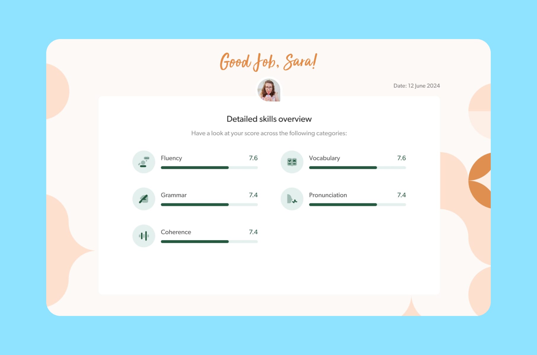
Feedback | Specific ("You confused cause and correlation") | Generic ("Wrong. Try again.") |
3. Productive friction
Here's a counterintuitive one. The best Edtech platforms add friction on purpose, just not the kind you think. Edtech has both good friction and bad friction, and you actually want some of the former.
E-commerce removes almost every step between want and purchase. Social apps minimise pause and maximise repeat stimulation. Edtech is different. Some friction is beneficial.
Good friction:
Retrieval prompts, low-stakes quizzes, spaced practice, peer feedback, and mastery checks all create work for the brain, and that work is the point. They look like UX friction on paper, but they're what produces learning.
Bad friction:
Meanwhile, sign-up anxiety, rostering pain, dashboard ambiguity, slow first paint, inaccessible controls, and disconnected app ecosystems are pure friction with no upside.
They produce no learning. They only produce churn. Removing those is exactly the work a UI/UX design agency should be doing first.
4. Teacher and admin UX
Here's the part most consumer-facing Edtech startups underestimate - if you sell into schools or districts, your end user is the learner, but your retention engine is the teacher and the admin. If those roles can't get value fast, your renewal numbers will go down, regardless of how good the student experience is.
Users we've spoken to via our user research engagements made us realize that good products begin with pain points, and mandated tools that ignore daily workflow become extra work.
A 2025 survey found that regular AI users among teachers estimated saving 5.9 hours a week. Where did that time go? Better feedback, more individualised lessons, parent communication, and getting home earlier.
Not saying to go add AI to your tools right now or anything like that - just showing that your Edtech platform has a similar bar to clear. Not "did the teacher click the button," but "did the teacher save time and feel like the product respected their job?" Pretty much every successful Edtech product we admire has a teacher dashboard that's 80% answers and 20% data.
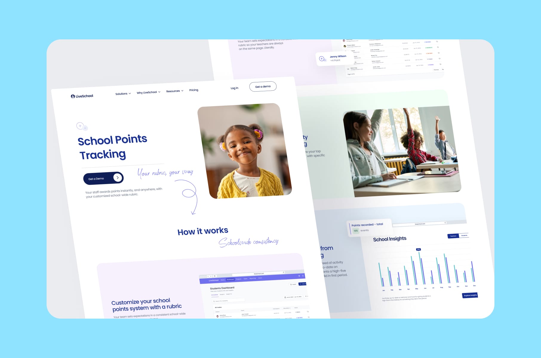
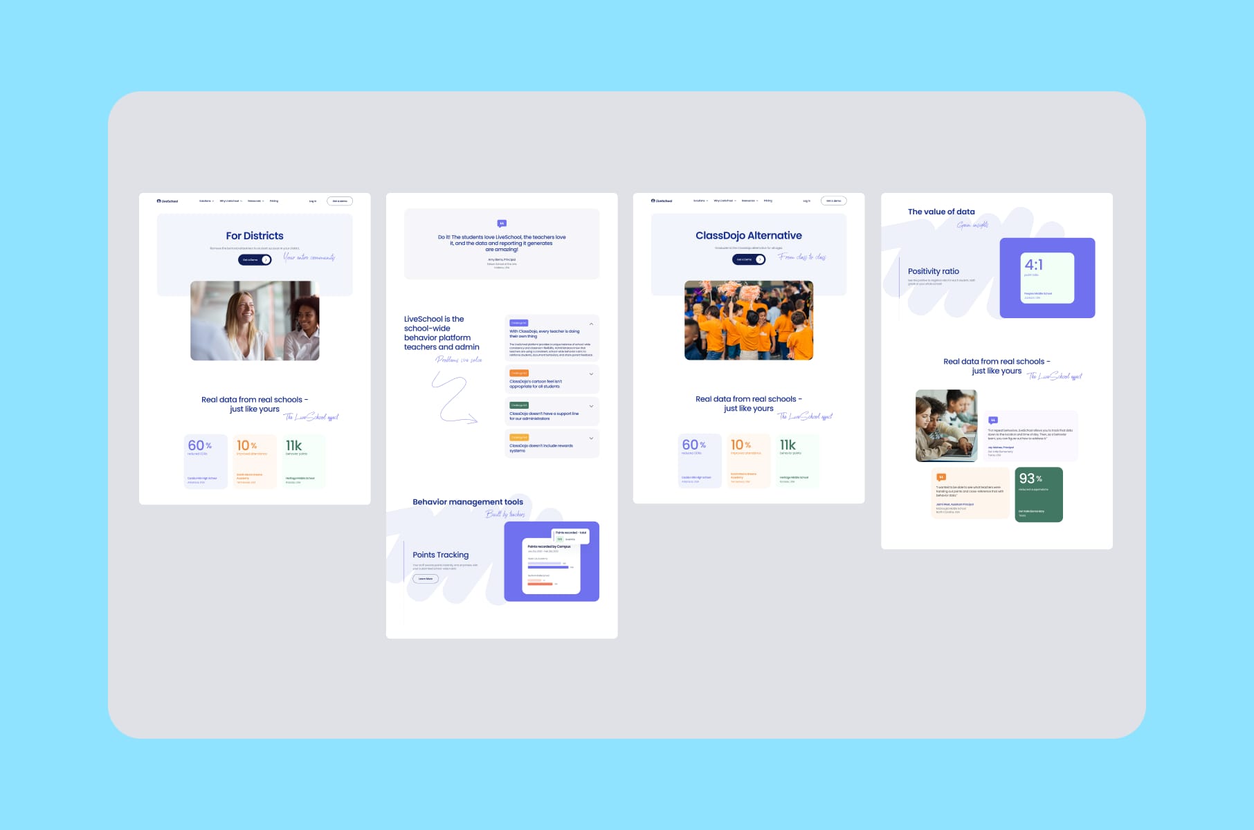
This is also where LiveSchool is a useful example. LiveSchool is a school culture and behaviour management product, and the redesign we did focused on giving educators and school admins a way to explore the platform's features and benefits without doing detective work. Clear data views for teachers and principals, motion that supports comprehension, and a value proposition you can understand.
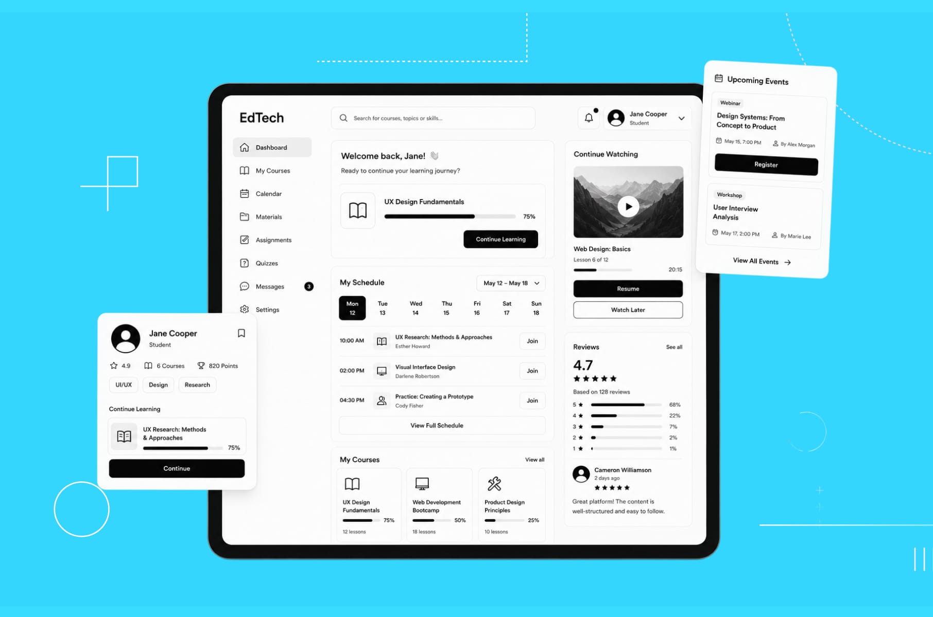
5. Dashboards and analytics
Now, this one is a personal struggle because one of our main focuses in SaaS is clear and useful dashboards.
A dashboard that only visualises past behavior is incomplete. We always argue for academically informed and action-oriented analytics. That means fewer unlabeled charts and more answers to questions like "which learners are stuck, what kind of intervention is appropriate, and what should the teacher do next week."
If you've read our article on how to design enterprise SaaS, you'll recognise that enterprise users need tools that drive decisions, not just display data.
A great Edtech dashboard is basically a recommender.
Instead of saying "37 students attempted this quiz," it should say something like "12 students attempted question 4 but missed it." Then it should offer a five-minute re-teach activity you can assign with one tap.
Or, instead of "engagement is down this week," it should flag the three students at risk and surface the lightest-touch interventions you can run by Thursday.
If you're an Edtech company building product analytics today, we'd recommend adding as soon as possible:
- Clear linking of risk signals to recommended actions.
- Role-aware views so a learner sees one thing and a teacher sees another.
- A quiet but obvious distinction between learning metrics and engagement metrics.
6. A design system
Last but not least, the secret that makes all the previous ones cheaper to deliver. A real design system, with the whole package - tokens, components, naming standards, accessibility defaults, etc.
This is the single biggest predictor of how fast your Edtech startup can iterate on the things above without breaking the experience. In the HeyLady project, for example, we built a reusable system, audited the legacy Figma files, mapped gaps between mocks and the live product, and split libraries by platform and role. What we got was faster delivery and easier onboarding for new designers. That same investment also unblocked the engineering team, because they finally had stable contracts to build against.
The reason this matters specifically for Edtech platforms is that you're going to ship a lot. New content templates, new assessment types, new role views, new accessibility patches, new monetisation surfaces - the rate of change is just higher than in most categories. Without a design system in place, the chances of inconsistency will skyrocket.
If you'd like to read more about why this is, we wrote a longer piece called what is a design system.
So, if you're still early in your journey and thinking about your UI design process, make the design system a priority. You'll thank yourself later.
More tips for designing a successful Edtech platform
Beyond the secrets above, here are some of the smaller moves we've seen pay off in Edtech websites and product surfaces (sometimes by a lot).
- Design role-specific landing pages. Learners, teachers, parents, and procurement all deserve a path that speaks their language. One page trying to serve all four usually serves none of them well.
- Separate learning metrics from engagement metrics on dashboards. Mixing them is how teams accidentally optimise for the wrong thing for two quarters in a row.
- Make the first value visible above the fold. A progress view or a sample lesson screenshot does more for conversion than a perfect hero illustration.
- Build sign-up around the smallest possible commitment. If your Edtech platform can let a teacher trial without giving up an email, do it.
- Treat the FAQ as a sales surface. Parents, district buyers, and adult learners read these carefully.
- Plan for the school calendar. Ship the high-impact pages before September. The Everyday Speech project we worked on phased releases specifically around when educators were back online and looking, and that scheduling decision did real work for the conversion path.
- Pay attention to copy. Microcopy on empty states, error messages, and onboarding nudges does as much for trust as a beautiful illustration. Probably more.
- Avoid the AI gimmick trap. If your AI tutor isn't load-bearing, it's costing you trust. Either make it core or hide it.
How we approach Edtech projects at Merge
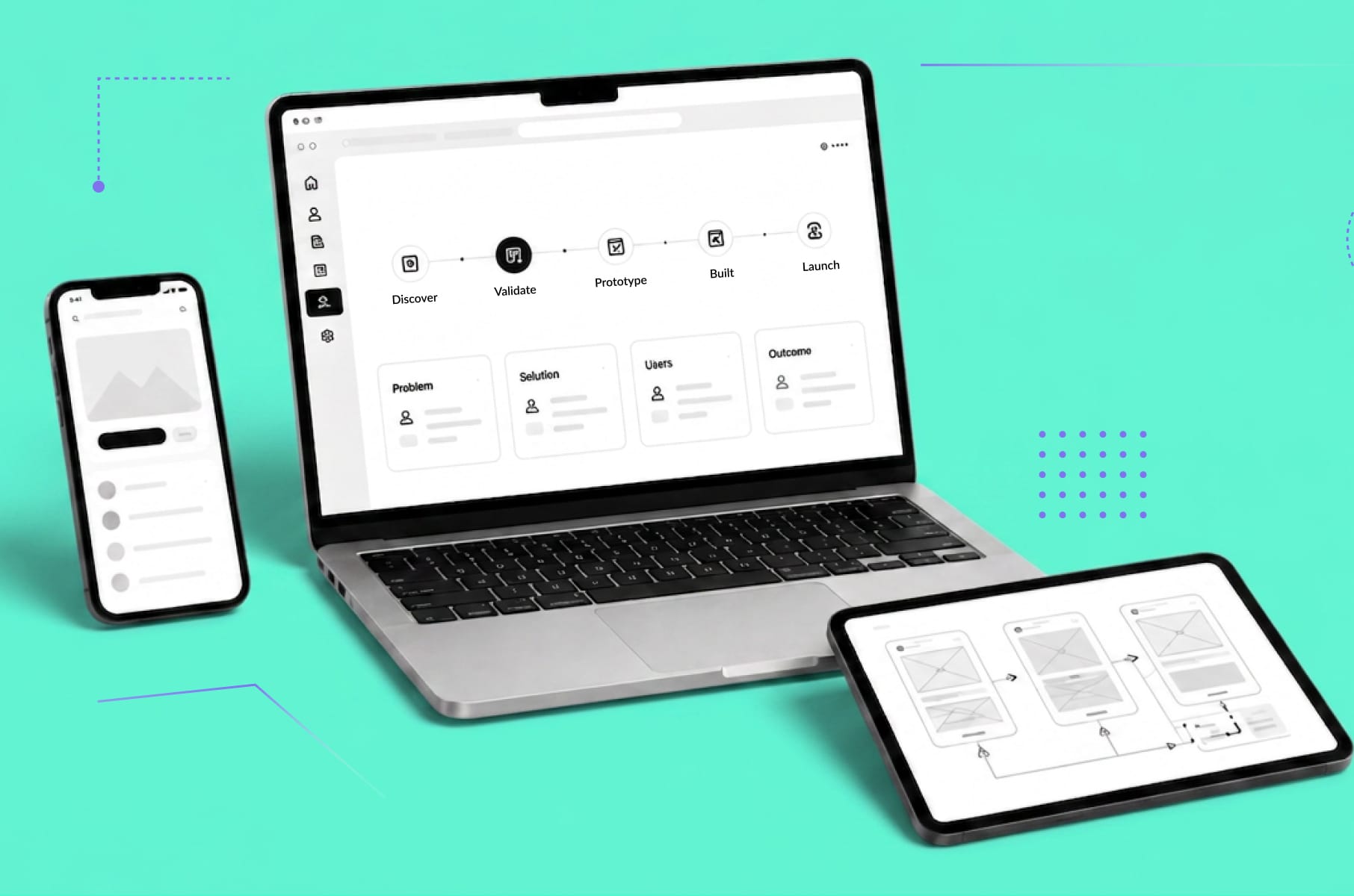
So how does this all translate into the way we actually run Edtech projects? Our process at Merge is built around four steps (discovery, concept, design, validation), and we apply pretty much the same shape whether we're working with an early-stage Edtech startup or a more mature Edtech company doing a redesign:
- We start with discovery and research - the part where we interview founders, talk to Community Success or teacher reps, and surface real user pain points. We learned from HeyLady how much of the value comes from this stage alone.
- We then move into interface style and a refined design system, which is where the visual direction and the reusable components get nailed down.
- After that, we go into design and testing - high-fidelity prototypes, usability checks, and tight iteration.
- And then we hand off to engineering as cleanly as we possibly can, with documentation, variant maps, and clear specs.
If you're sitting on a half-finished Edtech platform today and wondering where to start, we’d recommend you start with research and a design audit.
Our product design services and UI/UX design agency offering are built specifically around that "find the actual problem, then design around it" rhythm.
We also work a lot with B2B SaaS design and development teams in Edtech, which is where most of the institutional buying happens anyway.
You can also poke around our broader Edtech and e-learning design and development practice for context on the kinds of products we work on - LiveSchool, HeyLady, Everyday Speech, and others. They're a fair sample of how the seven secrets above actually play out under deadline pressure.
Wrap-up
At the end of the day, the "secrets" behind every successful Edtech platform design aren't really secrets at all. They're a set of design principles that come from taking education seriously as a design domain - understanding that you're not just building software, but building software that helps people learn, teach, and grow.
The Edtech platforms that become successful are the ones that:
- Understand their multiple users and their real workflows.
- Use gamification as seasoning.
- Embrace productive friction where it supports learning and ruthlessly eliminate friction where it doesn't.
- Make dashboards actionable, accessibility foundational, and privacy non-negotiable.
- Invest in the boring fundamentals - design systems, content tooling, performance, etc.
If your Edtech startup or Edtech company found any of the gaps we mentioned today, that's actually good news - the design work to close them is well understood, and the payoff is unusually large because the bar in this category is still climbing. We at Merge would love to help you close those gaps, so if you're working on an Edtech platform and want help getting the design right, reach out to our UI/UX design team - we'd love to chat!
Edtech platform design FAQ
A quick reference (because every founder asks roughly the same things) on what successful Edtech platform design actually looks like in practice.
What is an Edtech platform?
An Edtech platform is any digital product that delivers or supports learning online. That includes online course marketplaces, K-12 virtual schools, behaviour-tracking tools for classrooms, language learning apps, live cohort learning portals, and assessment dashboards for teachers. The defining trait is that the platform's success depends on real learning outcomes, not just usage.
What makes an Edtech platform design successful?
A successful Edtech platform design makes the core learning action obvious within a few seconds, keeps navigation simple, supports accessibility needs, shows progress in a way that feels encouraging, and proves value fast with outcomes, certificates, rewards, or visible skill growth. Good design also respects each audience. Parents want clarity. Teachers want time back. Adult learners want career ROI. Younger learners want something that feels fun and fair.
Should an Edtech platform use gamification?
Sometimes, yes. But sparingly, and only when game mechanics reinforce real learning activity. Recent research keeps repeating the same finding - badges and points work when they support meaningful work and backfire when they're bolted onto weak pedagogy. The rule of thumb we use is - if the streak or badge would feel hollow without the learning underneath, it's serving the right purpose. If the user is mostly protecting a number, you've drifted.
How important is teacher UX in Edtech platforms?
Pretty much critical, especially in institutionally sold products. Teachers are the ones implementing your tool day to day, and admins are the ones renewing. If they can't set up a class, import a roster, see progress, and act on it quickly, your retention curve will show it. Treat teacher and admin UX as a first-class design surface, not a follow-up release.
What's the best way to build an Edtech MVP?
Start narrow. Pick one learner job, one teacher job, and design for those before adding adjacent personas. Build the smallest loop that delivers a real learning outcome, instrument it well, and only widen the surface area once that loop is stable. As an Edtech development company, we usually recommend pairing this with a lightweight design system from week one, so the rate of change later doesn't tear up the experience.
How long does an Edtech platform redesign usually take?
It varies a lot. A focused website refresh for an Edtech product can take six to eight weeks with research, design, and Webflow build. A full product redesign with a new design system, refreshed onboarding, and updated dashboards usually takes three to six months, depending on scope. The biggest variable is how much research the team has already done. Going in blind always takes longer than starting from a real user-research foundation.
Where can I see examples of well-designed Edtech platforms?
Take a look at our companion article on the 7 best designed Edtech platforms we've seen so far for a quick tour. It covers LiveSchool, MasterClass, Coursera, Udacity, Skillshare, HeyLady, and Duolingo, and what each one does best from a UI/UX standpoint.