0
Table of Contents
A startup's roadmap to exceptional web3 design
Exceptional Web3 design is a mix of easy usability, good looks, and a deep understanding of the technology.
Web3-specific design goes beyond the usual “make it easy to read” and “ensure buttons are big enough.” Great design helps everyday users feel comfortable dealing with intimidating concepts (e.g., wallets, private keys, tokens).
As a founder, you need to know why certain design decisions in Web3 are different, how to approach them, and when to follow or deviate from current trends. That’s what our guide is all about.
An exceptional web3 design - what is that even?
Exceptional Web3 design is a mix of easy usability, good looks, and a deep understanding of the technology. It’s a design that allows users to benefit from blockchain technology without making them deal with confusing details.
Great Web3 website design focuses on simple wallet connections, clear transaction statuses, and minimal friction for tasks like bridging, staking, or swapping tokens. You need to be guiding users smoothly while still letting them see or learn more if they want.
It's not:
- Just copying Web2 designs with a Web3 logo.
- Prioritizing tech over user needs.
- Using too many crypto buzzwords that confuse users.
- A design that doesn't adapt to different users' needs.
It is:
- Easy for everyone to use, even if they're not technical.
- Transparent and trustworthy, so users feel secure.
- Focused on the values of Web3, like decentralization and empowerment.
- Visually pleasing and creates a unique brand.
- Able to change and adapt as Web3 develops.
- Centered around the needs of the user to make technology approachable.
In short, an exceptional Web3 design hides unnecessary complexity while offering enough clarity to build trust.
Should you follow Web3 design trends?
If you don’t have a giant brand name behind you, so design is your first point of contact. A smooth interface with intuitive visuals can prevent “fear of the unknown” and show you mean business.
Trends can normalize new experiences. For example, when enough dApps use similar patterns (e.g., Connect Wallet button in the top-right corner), users get comfortable faster.
Since Web3 is still new to many, you can differentiate yourself simply by being user-friendly, consistent, and even a bit playful.
Web3 design is as much about reducing fear and friction as it is about looking futuristic. On the other hand, trends like dark mode, micro-interactions, and minimalism might sound like “nice design touches,” but from a founder’s perspective, they can materially impact user adoption, trust, and stickiness.
Use Web3 trends that reduce friction, but don’t chase flashy designs at the cost of clarity:
- Embrace the trends that serve your product’s big goal (e.g., frictionless onboarding if you want mainstream users).
- Skip or delay the ones that don’t make sense right now (e.g., advanced 3D artistry if you’re bootstrapped and your MVP is just about letting people stake tokens).
- Focus on clarity and empathy in both visuals and copy to truly engage and retain your target audience.
In short: follow trends that have proven to reduce confusion, but never let style override clarity. Your unique product demands its own brand voice and user flow. Use the best from Web3 norms and add your own twist where it really counts.
Best web3 website design examples
Let's look at some examples to understand excellent Web3 design.
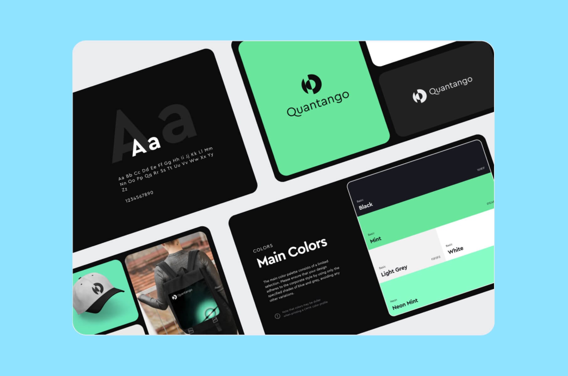
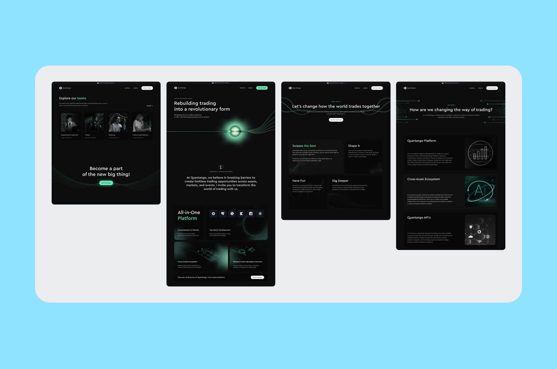
Take, for instance, Quantango, a fintech website that uses dynamic animations and upward-pointing graphics to visually represent a company’s commitment to innovation and forward progress.
The entire user experience is streamlined with intuitive micro-interactions, showing that even subtle animations can guide users and improve the overall experience. The focus here is on creating a sense of movement and modernity.
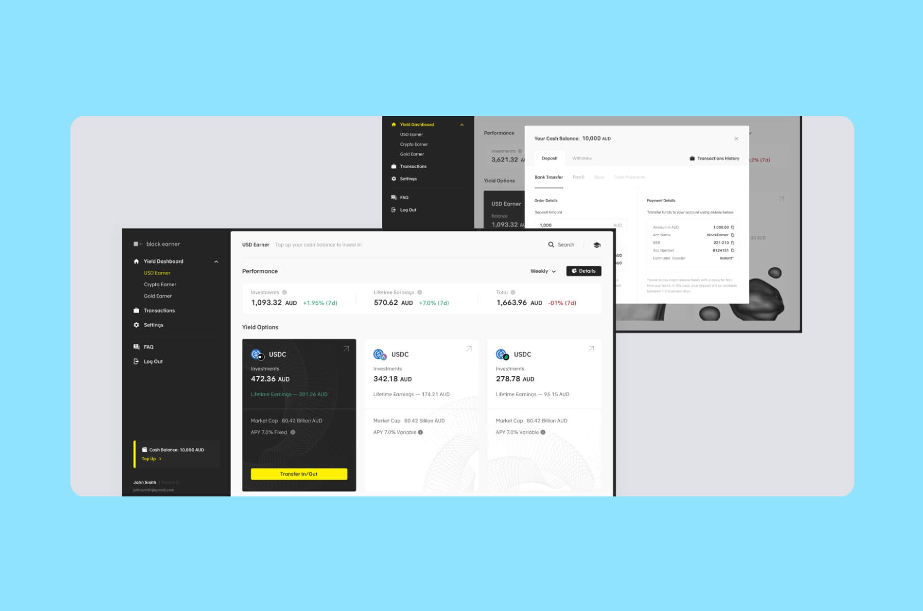
Then there’s Block Earner, a platform aiming to democratize decentralized finance. Here, the design philosophy is to make complex concepts feel approachable.
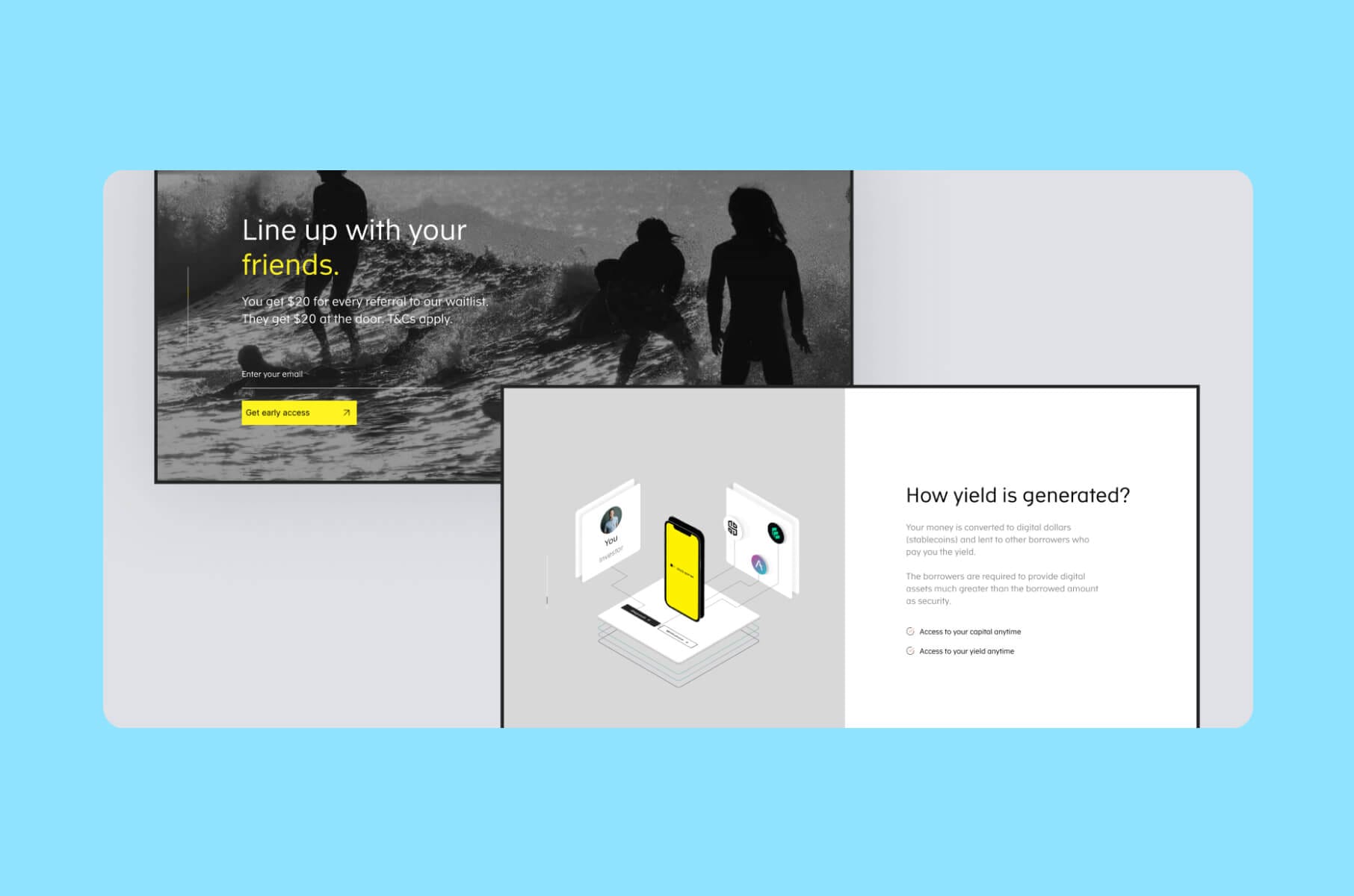
Clear, structured interfaces allow users to easily track their investments and manage transactions, while visual elements are aimed to build trust and security. By offering transparent overviews of user activity and focusing on simplicity, this example highlights a key Web3 approach: making advanced technology feel safe and understandable.
Another example features VvV, a launchpad designed for crypto enthusiasts. The key here is a seamless and focused user journey, ensuring quick access to opportunities like token launches, staking, and yield generation. This is achieved through a clean layout and clear calls to action.
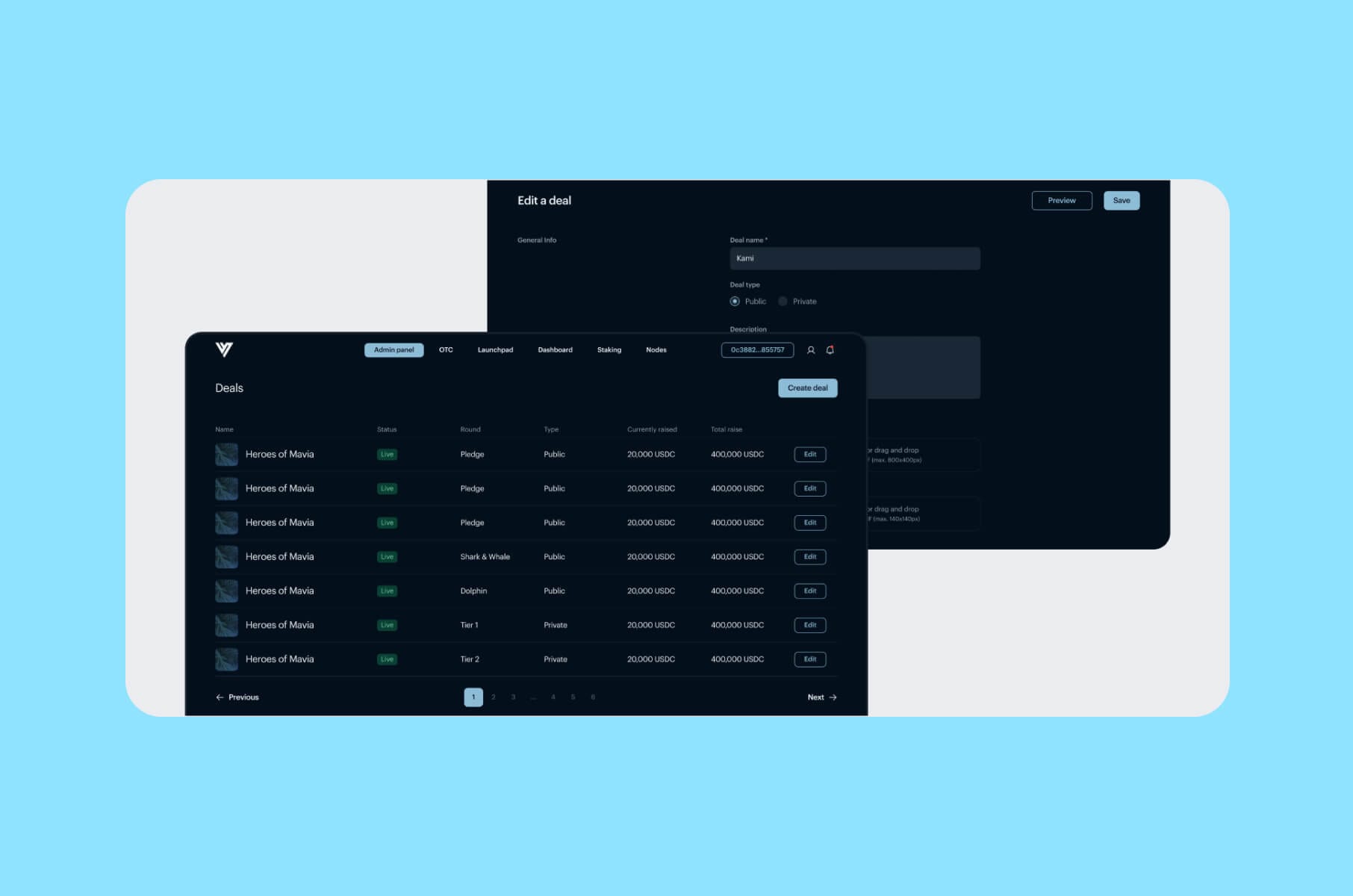
A modular design also allows the platform to adapt and grow with the ever-changing Web3 landscape, making it easy to add new features as needed.
Finally, there's CoinLedger, a crypto tax software that successfully tackled user confusion by emphasizing simplicity and clarity in the process. By optimizing information display and streamlining the process, the user experience becomes almost seamless, minimizing friction and boosting user confidence.
The core design principle here is to provide functionality without overwhelming the user with too much complexity, something essential for wider Web3 adoption.
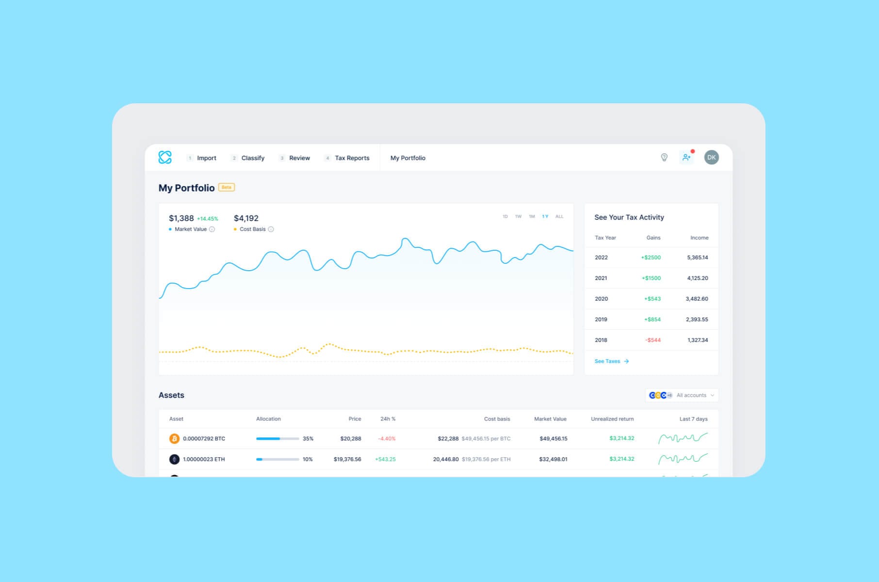
These examples demonstrate that Web3 design is not about flashy visuals or futuristic aesthetics. You need to guide users through new experiences by focusing on trust, simplicity, clarity, and adaptability while empowering them with the core ideals of decentralization.
Key Web3 website design elements
Here are some key parts of a Web3 website or product that need careful attention during design:
- Wallet connections and management. Users need to easily connect and use their crypto wallets. It could be universal buttons (top-right or top-left corner connect button, for example), one UI for multiple wallets, and clear feedback if a user is on the wrong chain.
- Transaction feedback and status. Give clear updates about the status of on-chain transactions. Show the user exactly what they’re signing (e.g., how many tokens are moving). Provide a progress bar or clear text showing “Transaction pending,” then “Transaction successful.” If something fails, detail the reason (e.g., “Insufficient funds” or “Transaction was dropped”).
- On-chain data. Present blockchain data (like transaction history, NFT ownership, etc.) in an understandable way.
- Smart contract tools. Make it easy for users to interact with smart contracts.
- Identity layer. Provide ways for users to establish a unique identity within your product. Pay special attention to onboarding. For flexibility, you could replace the email password with “Connect Wallet,” or offer both.
- Token information. Explain how your project's token works: how it's distributed, used, and how it can be staked.
Web3 website design roadmap for startups
Finally, here's a practical roadmap to building a well-designed Web3 product.
Step 1. Understand the meaning behind Web3
Don't just see "decentralization" or "NFTs" as tech terms. Think about their real-world effects and what your product stands for. Is it about empowering users? Being inclusive? This understanding will make your design feel authentic to your audience.
Did you know that Web3 is also built around communities? Research your target users, their needs, and their shared values. Your design should be built with that understanding in mind. For example, are you targeting experienced DeFi users or artists just starting to mint NFTs? These groups need different approaches.
Overall, Web3 requires a new way of thinking. Transactions can be complex, and wallet connections aren't always smooth. Make these processes clear and give users a feeling of control without confusing them. Users need trust and guidance, and your experience should feel like a step forward.
Step 2. Build a clear structure
Make all user actions and transactions easy to understand. Show progress, give clear explanations, and help with any errors. Users shouldn't also need to see the technical details of smart contracts.
You need to create a user interface that feels natural, even if the tech behind it is complex. Like driving a car, users shouldn't need to know the mechanics to properly operate it.
A clearer structure also involves improving wallet connections. Connecting wallets is a key part of Web3. Make this process smooth with clear instructions and support for multiple wallets.
Step 2. Design for visual clarity
For starters, move past the clichés. Just like we learned in Web3 best design practices, you should avoid overused Web3 design decisions, lingo, and styles. Use colors and fonts that fit your project and evoke the right feelings: innovation, stability, etc.
Next, organize your information. Web3 products often have lots of data. Design ways to make that information easy to find and understand. Use visual cues to help guide users.
Remember to pay attention to micro-interactions, such as button clicks, transitions, and feedback. These details make your product feel polished and easy to use.
Step 4. Make a smooth transition from Web2 to Web3
Users should feel like they’re signing into a familiar app. Wallet setup and crypto-related steps happen quietly in the background. Minimize the friction associated with it by including one-click wallet connections, clear instructions, and friendly confirmations.
Wrapping up
Web3 design is about reducing user confusion. Follow our quick roadmap to help you build a product that feels familiar to your audience yet still uses everything decentralization has to offer. Over time, this approach will help your Web3 platform remain both friendly and trustworthy.
Also, don’t feel compelled to follow every futuristic design trend just because you’re in Web3. The core goal is clarity, trust, and minimal friction. Check out our trends lists that focus more on the trends that are actually useful. Use common patterns where they help you and innovate only if it solves a real user problem (or strongly aligns with your brand).
