0
Table of Contents
What we can learn from the best Web3 websites of 2026
What makes a website good? Better yet, what makes a Web3 website good?
When we study the best Web3 websites, we keep arriving at the same lesson as the founders of Web3 products: the website is one of the main parts of your reputation. So what makes it actually good?
The best Web3 websites win because they remove friction. They make crypto feel as familiar as mainstream finance apps. They also show your value.
Their language is approachable, user flows are smooth and predictable, complex terms like token permissions are made understandable, and responsiveness is high enough that “slow” is not perceived as “scam”.
Let’s focus on the highest ROI decisions based on years of experience from a professional Web3 agency that will help you improve conversions, communicate your value, make crypto less scary, and make your product feel more genuine as soon as possible.
Why should you care about your website?
Have you noticed that your Web3 website has moved beyond being just a marketing page?
It is often the first step of a typical product funnel: your users arrive from search, they scan trust signals, they try a demo, and they decide whether to connect or sign in.
In other words, your public-facing website is now part of your activation flow. That is why the best web design decisions turn into conversion decisions.
When studying the best Web3 websites specifically, you need to pay close attention to the user’s first visit and the first wallet signature request. If those moments feel clear and trustworthy, the rest of the funnel performs much better.
Why the best Web3 websites look and feel different in 2026
Now, when it comes to a Web3 website and your Web3 product in particular, users are not only comparing you to other crypto products anymore. They are now also comparing you to all the mainstream finance and consumer apps.
A couple of recent stats might show you why:
- Chainalysis estimates $17B was stolen in crypto scams and fraud in 2025, and it reports sharp growth in impersonation scams plus a higher profitability profile for AI-enabled scams.
- The World Economic Forum’s Global Cybersecurity Outlook 2026 reports that cyber-enabled fraud and phishing dominate executive concern, and it records broad personal exposure to cyber-enabled fraud across survey respondents.
In other words, as scams and cyber fraud become more visible and more costly, users expect Web3 products to meet the same standards that they already expect from mainstream finance apps.
So the best Web3 websites look and feel different because they are designed around trust signals and ease of use. This is also where Web3 branding and design systems become your assets.
Based on our Merge product design agency's experience, the Web3 UI/UX best practices that actually work are:
- More domain safety prompts near the login and connect steps;
- Clearer state indicators - wallet connected, network supported, next step confirmed;
- Simpler step-by-step flows that reduce hesitation and help users recover quickly when something goes wrong;
- More “show me the number” elements, like calculators and comparison tables, in the hero section;
- Fewer choices presented at once, with advanced options tucked behind progressive disclosure.
New visual design decisions
In 2024–2025, many teams tried to improve Web3 UX by making interfaces look more polished.
In 2026, the best Web3 websites are improving the parts that actually determine conversion: onboarding design, wallet connection, signing, error handling, and recovery.
The shift is driven by these reasons:
- Mainstream onboarding still loses too many users early, which makes flow clarity more valuable than visual flair.
- At the same time, stablecoins and tokenized real-world assets are pulling Web3 closer to institutional finance, raising expectations for transparency, verification, and process.
- Design taste has also matured. A Nasscom community piece notes that 2026 visuals moved away from aggressive neon greens and harsh dark modes that strain eyes.
As a result, the best Web3 designs now emphasize guided steps, explicit proof, readable transaction context, and more restrained visual systems that make products feel dependable and less experimental.
4 friction patterns behind the best Web3 websites
When people share screenshots of the best Web3 websites, they are usually reacting to clarity more than colour palettes. Before thinking about visual style, ask whether your site removes these four common friction points.
Matching landing-page intent with the user’s next action
The strongest Web3 websites do not publish content in isolation. Their landing pages, educational pages, and product pages are aligned around the user’s next step.
A page that attracts traffic should also make the next action obvious, whether that is calculating taxes, comparing rates, or starting onboarding.
CoinLedger’s pages are a good example of product-led content. The homepage is structured around the user’s core task, and dedicated guide pages focus on completing a tax workflow.
For more info on how to write, check out Google’s guidance on creating helpful, reliable, people-first content. Spoiler alert: usefulness is the point.
Learn how to apply this to Web3 products with our guide on how to build a Web3 website.
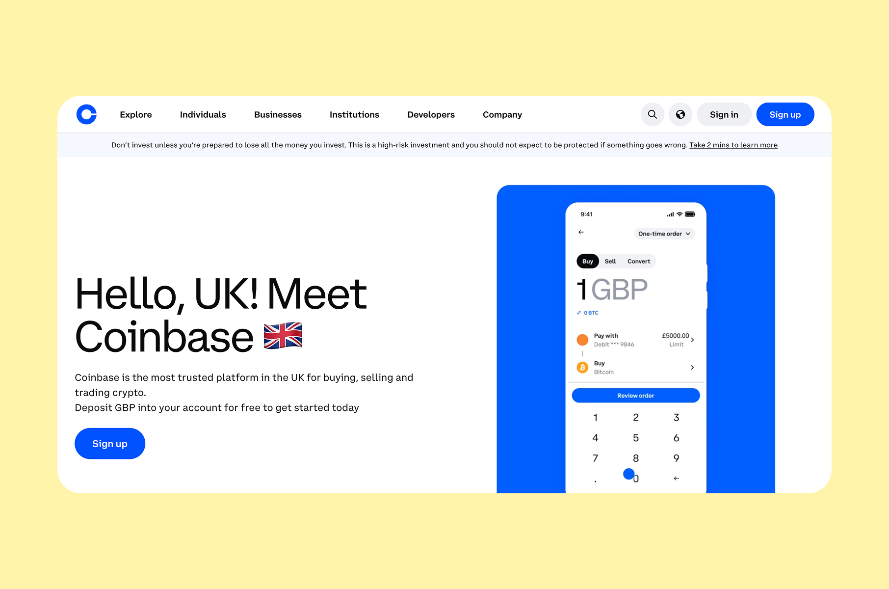
Making trust more visible
Trust matters most at the exact moments when perceived risk increases. The best Web3 websites make reassurance visible before users connect a wallet, sign, or share sensitive information.
Examples:
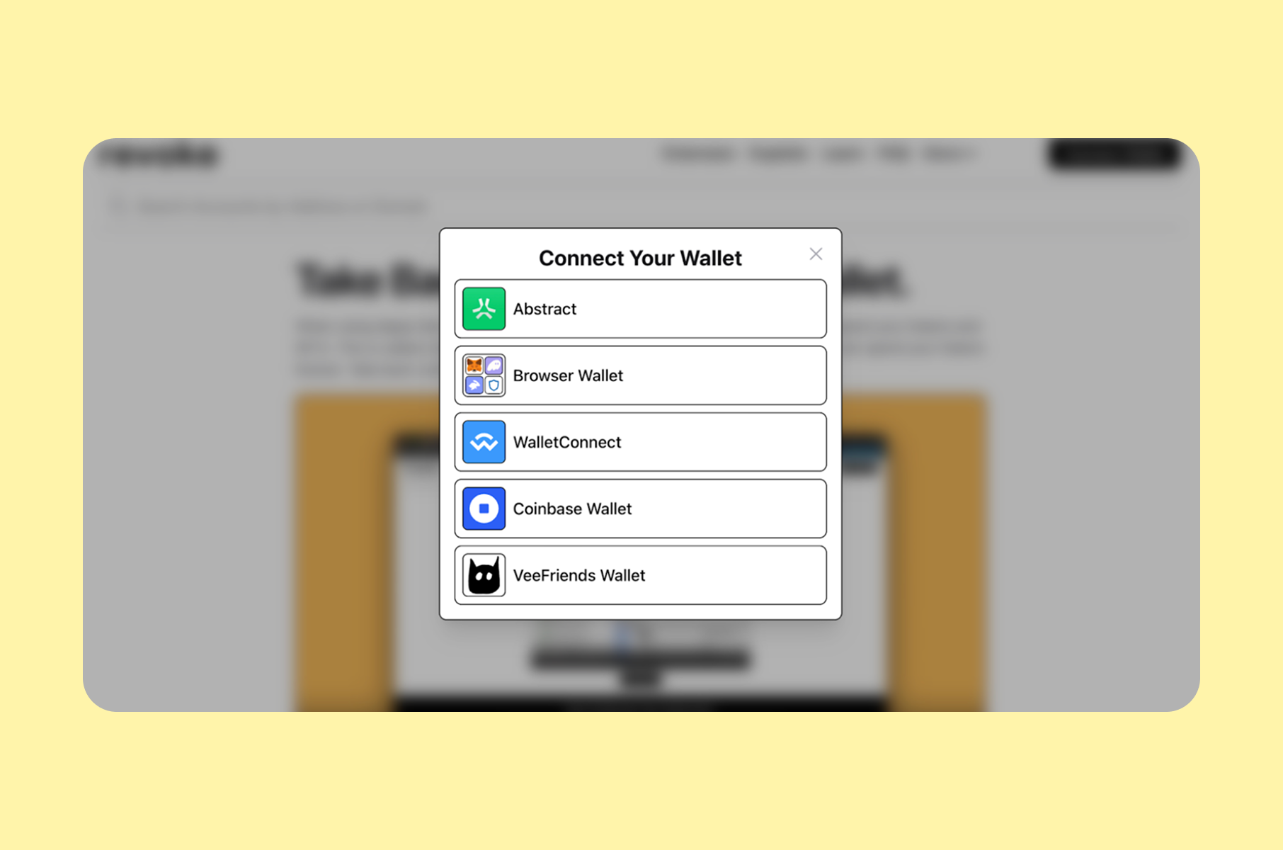
- vVv’s app entry page warns users to double-check that they are on the correct domain, which is a simple pattern that reduces phishing damage at the highest-risk moment.
- Block Earner puts award cues and “as seen in” logos near the top, which reduces uncertainty before users click into loan flows.
Funnel moment | User worry | What the best web3 websites show |
First impression | “Is this legitimate?” | Clear positioning and category-relevant proof, not vague claims |
Entry to app | “Is this the right domain?” | A short domain reminder near login or connect steps |
First consent | “What is this signature?” | Standardised, readable sign-in text plus a one-line explanation |
Permissions | “Can this drain me?” | Approval scope explained and a path to manage approvals |
Maintaining consistency
Consistency across marketing pages, onboarding flows, and product UI is a trust signal in itself. When naming, layouts, buttons, and tone all change between surfaces, users interpret that as risk.
Consistency is also a conversion feature. It reduces cognitive load and reduces support queries. A design system is the practical way to enforce this.
Keeping pages crawlable and fast
Steering away from design and content for a brief moment, one notable technical pattern is that public pages should feel fast, stable, and easy to parse.
Some build the product as a JavaScript-heavy app, but the best websites keep public-facing pages lightweight and predictable.
In practice, that often means pre-rendering or SSR for landing pages, while heavier product UI stays behind authentication. This makes websites much faster and, therefore, smoother to use.
Usually, partnering with front-end development specialists helps improve your technical foundation when you don't have an in-house team.
Our top UI/UX insights from the best web3 websites
In Web3, strong UX reduces uncertainty, and strong UI reduces avoidable mistakes.
Here’s what we learned from researching and reviewing Web3 websites in 2026 in more detail.
Show the product in context
Do not present your product as an abstract promise. The best Web3 websites reduce perceived risk by showing real interface previews.
For example, use crypto wallet UI screenshots and flow previews so visitors can picture the experience before installing anything.
Some sites, like Uniswap, even integrate a live trading interface design preview that shows data without requiring a wallet connection. That is a subtle design move with a big behavioral effect. People can explore before they commit.
Build hierarchy
If your page tries to speak to both beginners and institutions on a single screen, your UI will be noisy. Better to segment the page by intent.
Coinbase’s site is widely used as a “regulated product” reference because its hierarchy is predictable. They use calm spacing, bold but readable typography, and content blocks that explain both value and risk.
Another useful layer is adding clear feature segmentation across audiences (spot, futures, staking, institutional), so people can self-select rather than feel overwhelmed, which is a sign of a more thoughtful crypto exchange design, for example.
Use motion
Use motion to communicate state, not just style. In the best Web3 websites, motion clarifies what changed, what is loading, and what happens next. It should reinforce orientation and confidence without harming performance.
Good examples: Cosmos and Solana.
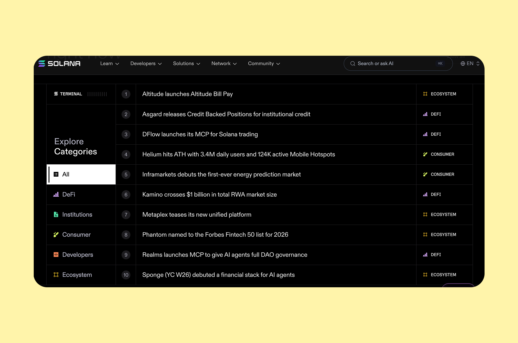
Cosmos is praised for gradients and interactive 3D elements that make “interoperability” tangible. Solana’s site uses modern visuals too, then grounds the story in live performance and ecosystem metrics.
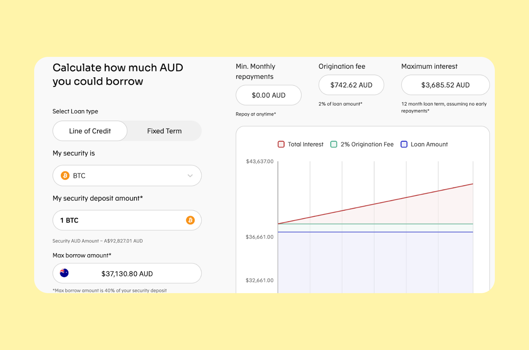
Use calculators, dashboards, and comparison tables
A conversion UI in Web3 often looks like a calculator. Quite often, the best user-oriented patterns in Web3 contexts are just price calculators and plan comparison tables.
Block Earner’s homepage, for example, uses a calculator early, which helps users quickly self-qualify.
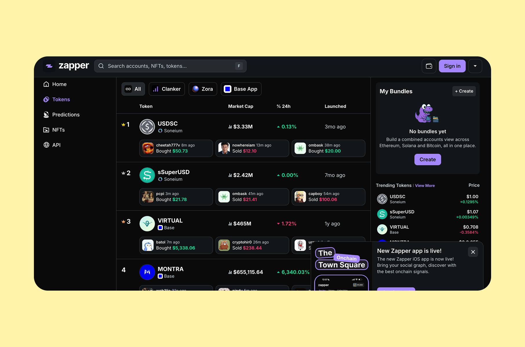
Be careful about data density
At the same time, your UI needs layers:
- A default layer for decisions.
- A second layer for “why is this number changing”.
- A third layer for power users who want to inspect transactions.
Do not dump all three layers into one view.
Zapper is a clean example of “dense but usable”. It maintains a single-screen dashboard orientation, with icons serving as anchors and hover states revealing details.
Add educational content
Educational content is now a product feature.
For the best Web3 websites, good education content has two traits: it answers real questions users type into Google, and it links back into the product flow at the exact moment those questions matter.
Our guide on crypto wallet development guide exemplifies this approach.
Kraken’s example highlights a resource hub that supports learning without feeling like a sales funnel. It reduces support load and helps users reach competence faster.
Design considerations for wallet-enabled Web3 websites
The patterns above apply to Web3 websites built mainly for discovery, education, and evaluation. But when a website also handles wallet connection, account access, transactions, lending, trading, or other financial actions, the design bar becomes much higher.
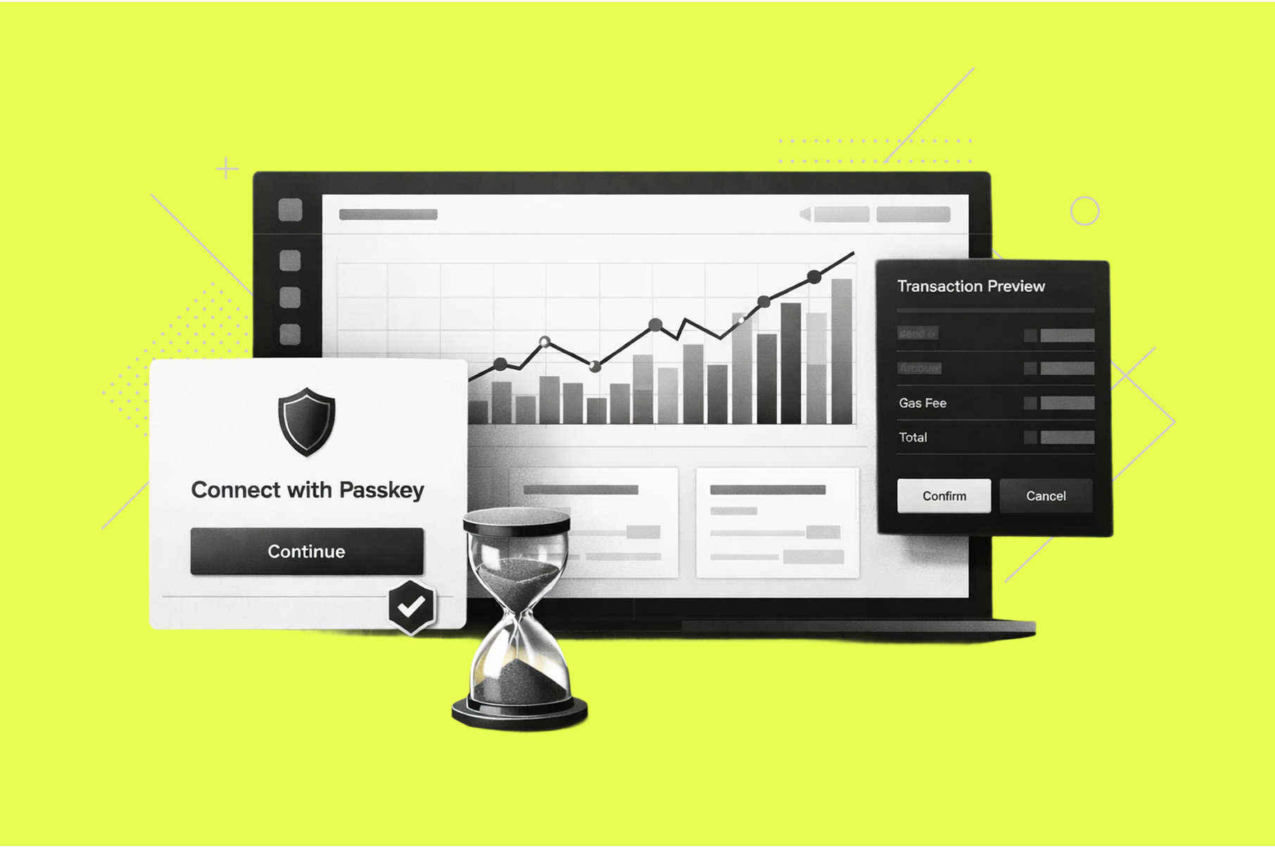
Make irreversible actions visually distinct
If your website has transaction functionality, make sure the outcomes are clear. Users regularly report confusion about failing transactions and losing fees, for example.
The best Web3 websites reduce this by separating “review” from “commit”, using explicit consequence language, and making the final action feel meaningfully different from ordinary clicks. Users should always know what they are approving, what it will do, and what it may cost.
Add passkeys to make sign-in feel familiar
One of the clearest ways to lower friction is to make the first step feel familiar.
Passkeys help Web3 products feel closer to mainstream finance and consumer apps because they replace password-heavy or wallet-first login patterns with a simpler, more recognisable sign-in experience.
In practice, this supports a more natural onboarding flow: sign in first, connect or create wallet access second, then complete a first successful action with less setup burden.
Authsignal reports that 69% of users now have at least one passkey. It also reports higher login success with passkeys than with traditional authentication methods.
Use embedded wallets to reduce first-session friction
Embedded wallets help because they remove one of the biggest early barriers in Web3: asking users to install, configure, and trust a separate wallet before they have seen any value.
For many products, that first step creates unnecessary drop-off. An embedded wallet lets the experience begin with a familiar login flow, then introduces wallet functionality inside the product once the user is already oriented and engaged.
One vendor guide claims traditional wallet onboarding loses 70–90% of users, while embedded wallets can reduce drop-off to under 20% by using familiar authentication patterns.
A useful example from gaming - Sequence reports Skyweaver saw a 73% conversion increase after adopting guest wallets.
Offer state transparency
Web3 flows are rarely a single step. Users move through preparation, signature, broadcast, confirmation, and completion. The interface needs to clearly narrate that journey.
Good state design reduces drop-off because users can tell the difference between waiting, progressing, and failing.
Treat each step label as a micro-commitment. If the user sees progress, they wait. If they see a spinner, they assume something broke.
Let cautious users verify without leaving the funnel
As a continuation of our previous insight, caution is normal. The best UX design supports verification inside the interface.
Examples:
- vVv’s domain reminder is a simple anti-phishing cue at the entry point.
- Revoke.cash provides a user-friendly workflow for reviewing approvals, which helps users clean up permissions without needing to understand every smart contract detail.
Yet another part of a “normal flow” we mentioned earlier is recovery. This includes multi-device recovery, optional time locks and spend limits, and emergency freeze actions if compromise is suspected.
Here’s what the best web3 apps and best web3 websites do in these situations:
- Provide a guided retry path when a transaction fails.
- Explain fees spent in a failure state without blaming the user.
- Offer a safe link to view the transaction in an explorer.
- Preserve work in progress, so the user does not need to re-enter data after a failure.
Case studies
These three examples show how the best Web3 website mindset looks across three categories: token access, fintech lending, and crypto tax.
vVv
Uses eligibility clarity + domain reminders to reduce risk at entry
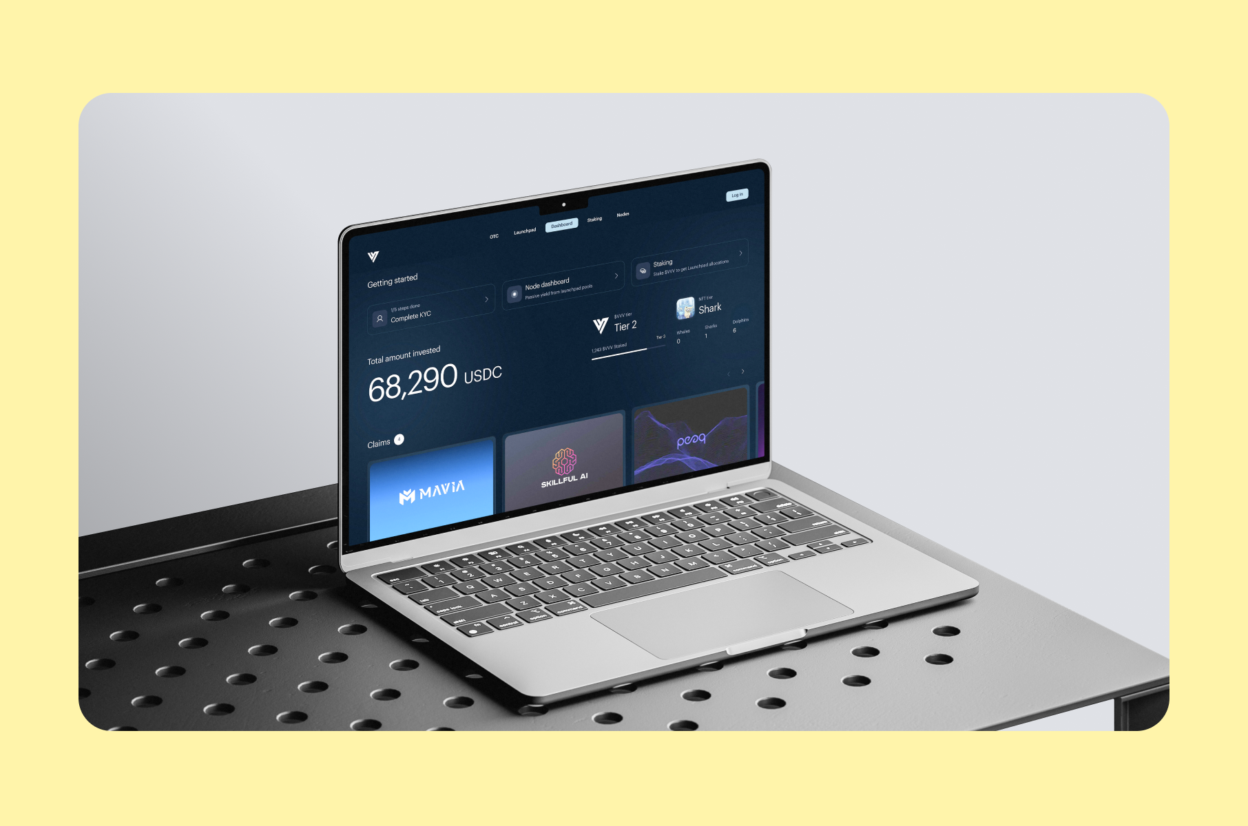
vVv sells early token access. It operates in a category where trust can disappear quickly, so the website does not rely on excitement alone.
It leads with a simple value proposition, supports it with partner credibility, and then reduces uncertainty by clearly explaining participation paths, eligibility rules, and KYC differences before users try to enter the flow.
A small but important detail is the domain reminder on the app entry page, which adds reassurance at the exact moment phishing risk feels highest.
The underlying design lesson is: in high-risk categories, clarity around access, eligibility, and legitimacy matters more than visual flair.
Block Earner
Uses calculators + early trust cues to reduce hesitation
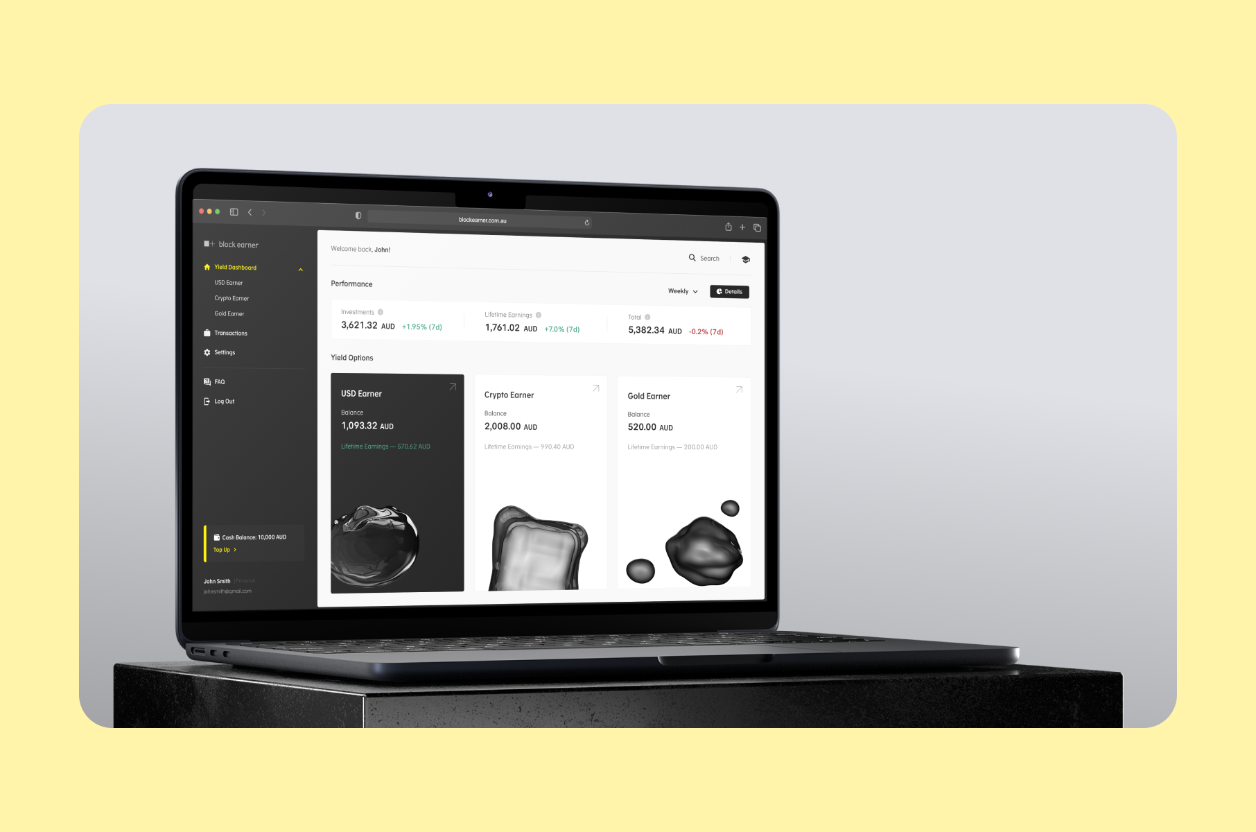
Block Earner sits in a more regulated, money-adjacent category, so the website is designed to help users qualify, verify, and trust the product quickly.
It leads with a clear value proposition, places a calculator near the top so users can immediately test relevance for themselves, and layers in awards, press mentions, and other proof before asking users to move deeper into sensitive flows.
The same trust logic carries beyond the website itself, including app store surfaces where people often check legitimacy before installing.
The design lesson here is that in financial products, the strongest websites reduce hesitation by combining proof, self-qualification, and a clear next step.
Read the full Block Earner case study.
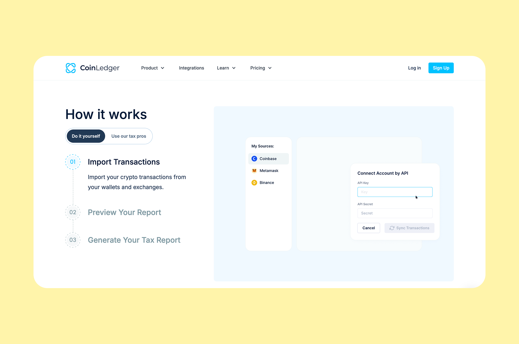
CoinLedger
Uses task-based messaging + workflow previews to support completion
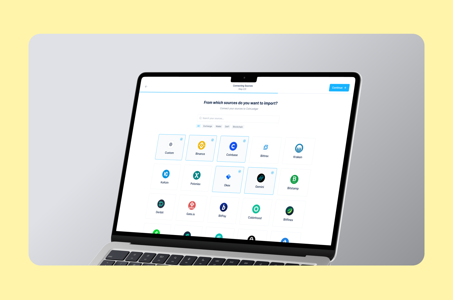
CoinLedger is built around a compliance task, so its website works best when it mirrors the user’s real workflow instead of speaking in broad product claims.
The homepage focuses on the job to be done, breaks the process into clear step language such as import, preview, and generate, and reinforces trust with signals tied to real adoption, partner integrations, and transaction volume.
This makes the product feel structured and dependable before users commit any data.
The lesson is that the best Web3 websites for utility products reduce friction by matching page structure to the exact task users came to complete.
Read the full CoinLedger case study.
FAQs
What makes the best web3 websites feel trustworthy fast?
They show proof near the action, keep language readable, and design transaction previews that feel like receipts. They also surface audits and security info without hiding them behind jargon.
What is the fastest conversion win for a Web3 website in 2026?
Remove wallet installation from the first session when possible. Let users complete one low-risk success with familiar login before asking for funding, deeper verification, or advanced setup.
What is the most common UX failure on web3 site funnels?
Mobile wallet handoffs with unclear state. Fix it by reducing signatures, narrating each step, and providing safe retries.
Conclusion
The biggest lesson from the best Web3 websites in 2026 is that the website itself now does real product work. A strong Web 3 website helps people understand the offer, verify the product, preview the experience, and move into the first action with less hesitation. You need to treat your site as part of onboarding, not as a separate marketing asset.
In practice, the best Web3 websites make trust visible near key actions, simplify navigation, show the product in context, and stay fast on every device. That is what helps the best Web3 companies turn traffic into qualified users.
So, improve the website flow first, because better UI, UX, and performance on the public site often create the fastest gains in conversion, SEO, and user confidence.