0
Table of Contents
10 best strategies for banking app UX (Fintech Design Studio guide)
A successful banking app is an experience that leaves users feeling confident and in control.

73% of consumers say UX is the most important factor in deciding whether to stick with a digital financial service.
With more than 2 billion mobile banking app downloads in 2023 and a projected 3.88 billion by 2027, it’s clear that customers demand smooth, secure, and intuitive digital banking.
So what are the best ways to design a top-notch banking app UX? In a nutshell, it comes down to these ten strategies:
- Being transparent in everything
- Minimizing the friction users have with the app
- Working on intuitive navigation and clear data
- Adding feedback and microinteractions
- Personalizing and adapting the design to your user
- Providing consistency and an omnichannel experience
- Adding a few wellness and/or gamified features
- Using chatbots and assistants when they are most useful
- Designing for inclusive use and accessibility
- Refining the experience instead of treating UX as one-and-done
Each strategy tackles a key aspect of banking app UX. Now that you know them, read on to learn more details and discover how you can apply these in your banking app UI design.
What makes banking app UX different?
Let’s first clarify what banking app UX is and how it is different from the user experience of all the other applications.
Unlike general apps, a banking app design must handle complex financial features and strict security while serving diverse user needs.
A great banking app user experience will have the following as a basis:
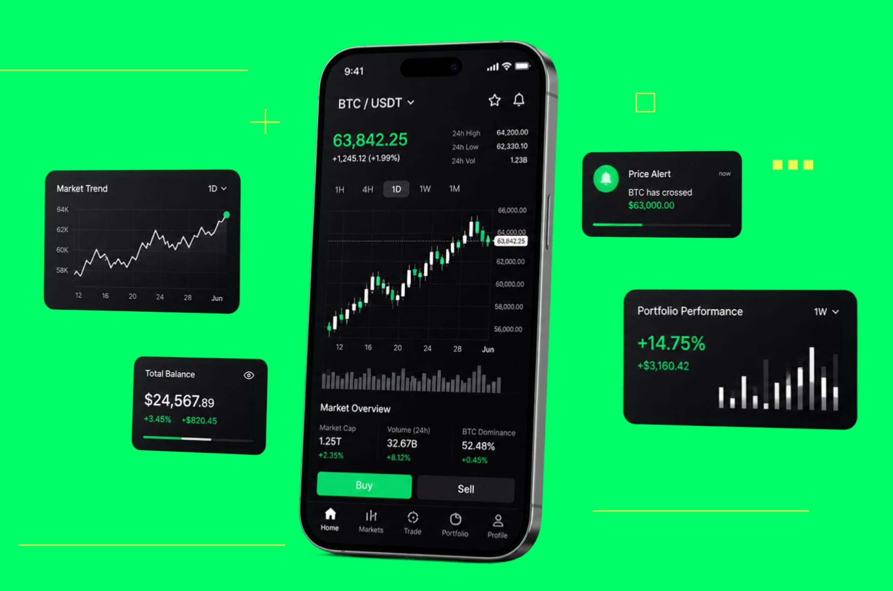
Intuitive interface
Users should move through the bank app design without friction.
For example, Revolut uses clear tabs:
- Accounts are easy to reach.
- Payments have a dedicated section.
- Cards sit in a separate area.
Robust security with ease
People need to trust that money and data stay safe. This means using biometric logins, encryption, and transparent security indicators without adding hassle. (42% of people who avoid banking apps cite lack of trust in security).
Seamless functionality
Tasks such as checking balances, transferring funds, or paying bills should be fast. A slow or glitchy mobile banking UX pushes users to competitors.
Personal relevance
The best banking app UX adapts. Offer personalized insights and customizable dashboards that reflect individual goals.
Consistent, inclusive design
A banking app UI design should stay consistent across screens and devices. It should also work for people with different abilities.
We at Merge always say that pretty screens are a given in our design. We wouldn’t have it any other way. But they shouldn’t come at the expense of trust and clarity. Users primarily expect control over their data and settings.
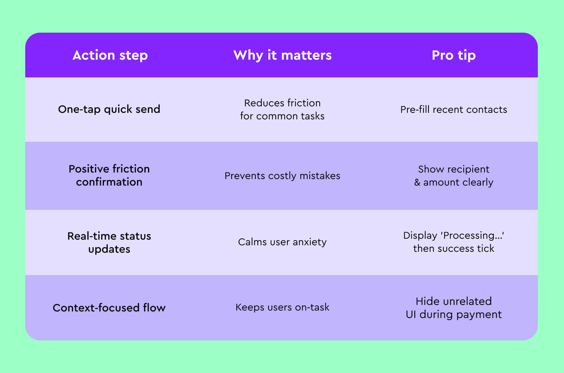
Here’s a little payment and transfer UX checklist for you from our designers in a table below:
Now, let’s explore the top 10 UX strategies that support those goals.
1. Be transparent
Trust is the base layer of any financial product, and your banking app UX should reinforce it at every step.
Visible security cues
Reassure users with clear signals:
- Show encryption badges or lock icons.
- Display last login details.
- Provide fraud alerts.
These trust indicators confirm that protections are active. The first thing that comes to mind is PayPal’s big green checkmark, which gives instant reassurance after a successful payment.
Simplify security steps
Implement “invisible security” that works in the background. Use biometric authentication (fingerprint, Face ID) and behavioral biometrics (recognizing a user’s typical patterns) to secure accounts without constant prompts.
Google Pay, for example, pairs tokenization with biometrics, so users authenticate with a touch.
Transparent data practices
Explain why you request sensitive info and how you store it, then provide clear privacy settings. When users feel in control, confidence rises.
Support and reassurance
Make help available (chat or call support) when something feels off. A quick way to contact support or lock a card in-app can turn a scary moment (like a suspicious charge) into a trust-building experience.
Advice:
If users sense your app is “simply secure,” they’re far more likely to trust it with their finances.
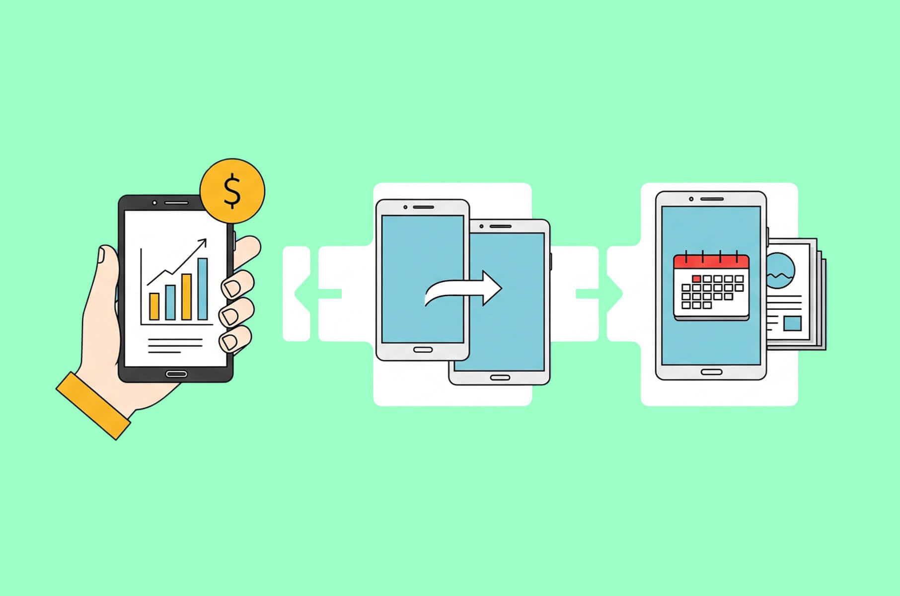
2. Minimize friction
Onboarding sets the tone. Aim for near-instant setup in line with new user expectations.
Progressive onboarding
Don’t overwhelm new users with long forms. Gather essentials first (email, phone) and let them explore basic features, then gradually prompt for additional info as needed (for example, when they try a feature that needs more data).
Biometric and smart logins
Embrace native biometrics for speed and security. Many modern apps with top mobile banking UX require 2FA yet use one-tap prompts and biometrics to keep their friction lower.
Clear guidance
Use conversational copy with tooltips and illustrations. Replace error codes with helpful text. For example, simple text like “That ID photo was blurry, let’s retake it” reduces drop-off by easing anxiety.
Minimum required info
Each extra field or step is a chance to lose a user. Request only what’s absolutely necessary to create an account and meet compliance. For example, Fin.do (a money transfer app) onboards users in just 4 steps: confirm phone, confirm email, set a 4-digit PIN or Touch ID, and you’re in.
Advice:
Frictionless onboarding lifts activation and reduces support issues.
If signing up or logging in becomes a chore, users may abandon your banking app design before experiencing its benefits.
3. Work on navigation and clear data
Great information architecture guides without confusion. Here’s what to do to improve banking UI design:
Logical, minimal menus
Group content into a few main sections based on frequent tasks. As a rule of thumb, any feature used daily should be reachable within one tap from the home screen. If users have to dig through sub-menus for common tasks, consider reorganizing.
Consistent patterns
Use familiar UI patterns from finance apps. Keep standard icons and favor tab bars and clear menus over new and untested patterns that slow people down.
Clear visual hierarchy
Highlight the most important information on each screen. For example, account balance should be immediately visible (large text at top), with secondary details (transactions, etc.) below.
Many banks overcomplicate dashboards and hide the “How much money do I have?” answer.
Search and shortcuts
Add search or a global “+” for quick actions. Let users jump straight to transfers or bill pay.
Visual aids
Use simple charts or icons to summarize finances. A spending pie chart or trend line can convey info faster than text.
Oh, and be sure to keep your visuals accurate and up to date!
Advice:
Clean structure in banking app UX design cuts errors and frustration.
4. Add feedback and microinteractions to your bank app design
Microinteractions signal that the system heard the user and did the work. In a banking app, users sometimes might be anxious about hitting “Send” on a payment. Here’s what to do:
Show success states
Always show when an action is successful (or if it’s processing). For instance, after a user pays a bill or transfers money, display a satisfying confirmation screen or animation (a checkmark, a brief celebratory icon, etc.).
Use subtle animations
Buttons can ripple or momentarily change state on tap. Show spinners or progress bars when an action takes more than a second.
Prevent errors
Disable the “Next” button until required fields are valid. Also, prevent errors by disabling actions that aren’t applicable (grey out the “Next” button until all required fields are filled) and confirming destructive actions (“Are you sure you want to delete this payee?”).
Add a small, delightful touch
While banking is serious, even small, delightful microinteractions can enhance engagement. A savings goal thermometer or a small celebratory icon can make finance less tense. Keep it purposeful and brief.
Advice:
Provide feedback for every user action.
5. Personalize and adapt your banking app UI design
No two users manage their finances the same way. A college student budgeting for groceries has different needs than a freelancer tracking invoices. That’s why personalization is one of the best banking app UX strategies today.
Custom dashboards
Let users rearrange widgets and choose what appears on the home screen. Some will focus on investments, while others want savings goals up top.
AI-driven recommendations
Provide context-aware insights. Fintech apps are increasingly adding smart budgeting, expense forecasts, and personalized nudges that adapt to user behavior.
Adaptive interfaces
For fintech interfaces, complexity can be adjusted to literacy or past behavior. New investors need more guidance, and frequent traders prefer denser views.
Adapting complexity is now an emerging trend in banking app UX. For instance, Betterment guides newcomers through planning while keeping routine trades efficient.
Personalized alerts and content
Send notifications that match interests and risk. If a user never travels, don’t spam them about overseas ATM fee changes; but if another is nearing their credit card limit, a timely alert could be a lifesaver.
Also, addressing users by name and showing content (like offers or tips) relevant to their situation increases the feeling of a personal banker experience.
Advice:
When your banking app design adapts to users, it goes from being a static tool to a proactive financial partner.
6. Provide consistency and omnichannel experience
Users switch devices across a single task. Your banking UI design should follow them.
Unified design language
Use a consistent visual design system (colors, typography, icons) and layout patterns across your mobile app, web banking site, and any other digital touchpoints.
A user should never feel like they’re using a completely different product when they switch devices.
This also extends to tone of voice and terminology - e.g., don’t call it “Send Money” in one place and “Payments” in another.
Cross-platform continuity
Let users start on one device and finish on another. Save progress. Offer “continue on web” links or QR codes.
Modern banking UX aims to let users start an action on one device and complete it on another without disruption.
Feature parity with nuance
Core features should exist on all platforms. That said, each device has its strengths – mobile is great for quick checks and notifications, while the web might handle data-heavy tasks better.
Omnichannel support
Preserve chat history across devices. Keep account nicknames and preferences synced. The idea is that the user’s mental model of your banking UI remains coherent no matter where they access it.
Advice:
Strong banking UX design supports multi-device continuity so users feel “at home” everywhere.
7. Add a few wellness and/or gamified features
You know what? Go beyond transactions! Help people improve their financial health.
Budgeting and expense tracking
Offer built-in tools for users to track spending, set budgets, and receive insights. For example, categorize transactions automatically and show a monthly spending report.
Many users struggle with money management, so your app can provide spending trends and forecasts to highlight where their money goes.
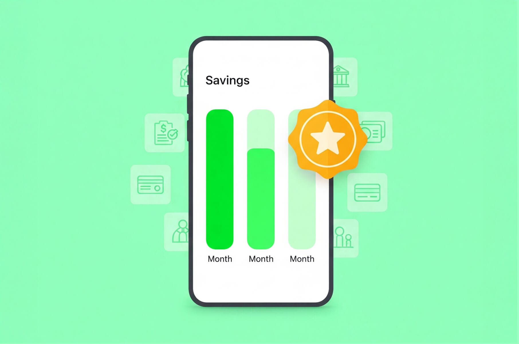
Savings goals and progress
Let users set savings goals (emergency fund, vacation, debt payoff) and track progress with visual meters or charts.
This ties into gamification we discussed in the previous article: reaching milestones can trigger small rewards or celebratory animations. For instance, a savings app might award a badge when you save three months’ worth of expenses.
Educational content and nudges
Provide contextual tips and ethical nudges that put users first. The key is that these prompts should feel helpful, not salesy. Ethical design means nudging users toward better financial decisions without tricking or pressuring them.
Gamify routine tasks
Turning mundane actions into fun challenges can boost engagement. Some banks have introduced trivia or quizzes that educate users on financial concepts, awarding points or perks for participation. Others have leaderboards or community goals.
Advice:
Incorporating financial wellness tools transforms your app from a transactional platform to a relationship-based one.
8. Use chatbots and assistants
Sometimes, the fastest way to get something done is just to ask.
AI chatbots for support
A well-designed AI chatbot can handle common queries 24/7, saving users from hunting through FAQs or waiting on hold. In-app chatbots can also proactively notify users or alert potential fraud in a conversational tone.
The key is to make the chatbot context-aware so it knows which account or feature the user is talking about and can seamlessly pass on the information to a human agent if it gets confused.
Voice commands
Support voice for quick tasks or hand-busy moments, just be sure to confirm sensitive actions with a second step to avoid errors.
Multilingual capability
If your user base is global or diverse, you can also offer multiple languages. AI has made translating so much easier in recent years.
Human tone
Give your chatbot a friendly persona (without overdoing it). Users know it’s an AI, but a bit of personality can make interactions more engaging.
Advice:
Conversational UI reduces friction and cuts support queues, while giving users fast answers without digging through menus.
9. Design for inclusive use
A strong banking app UX works for everyone:
- Visual accessibility. Use readable fonts, solid contrast, and support text resizing. Also, never rely on color alone to convey meaning.
- Screen reader support. Clearly label buttons and inputs and structure content with headings and landmarks.
- Keyboard and gesture options. Offer standard controls in addition to gestures.
- Inclusive content and culture. Write in plain language, and, if necessary, localize your text and formats.
- Error forgiveness. Preserve form data on errors, then tell users what went wrong and how to fix it.
- Compliance and standards. Follow WCAG 2.1 and regional rules. Many accessibility improvements also help everyone – larger touch targets and higher contrast improve day-to-day use.
Advice:
Commitment to inclusive, accessible design is a marker of quality and professionalism, and it will set your banking app UI apart from far less considerate competitors.
10. Refine the experience
Delivering a great banking app UX is more of an ongoing practice, where it’s best to:
- Use UX analytics and feedback. Use heatmaps, funnels, and click tracking to see where people struggle. Ask focused in-app questions about key tasks.
- Add A/B testing. Trial updates with small segments before full release.
- Track trends. Watch shifts in fintech expectations – AI features, embedded banking, or new payment rails.
- Invest in a UX culture. Run periodic UX audits and encourage cross-functional reviews. Bring in an outside perspective when needed.
Our team at Merge often partners with clients on audits and redesigns that internal teams can then extend. If you need help with fintech design and development, we’re here – see our fintech services.
- Iterate with purpose. Gather data, ship improvements, measure impact, and repeat on a predictable schedule.
Advice:
Never assume your app is “done.” Embrace evolution as a strategy for your banking app UI design.
How to go about designing a banking app UX?
A successful banking app is an experience that leaves users feeling confident and in control. From the first tap during signup to daily balance checks a year later, each interaction shapes your brand.
Start implementing the 10 UX strategies above today.
And, if you need a partner for banking app design or banking UI audits, Merge can help.
Practical takeaways you can implement now:
- Map your top five tasks and make each reachable within one tap from the home screen.
- Replace error codes with plain-language messages that tell users how to fix the issue.
- Add biometric login and show a clear success state after high-risk actions.