0
Table of Contents
Do this, not that: 15 fintech app design do’s & don’ts [Guide]
The difference between a mediocre fintech app and a beloved one is design.
Designing a winning fintech app comes down to 1) doing what delights users, and 2) avoiding what drives them away. We’ve decided to cover both.
As much as 73% of users would switch banks for a better user experience. No wonder: 88% of users don’t return after a bad UX experience.
So what’s the secret to great fintech app design? Focus on trust, simplicity, and smart features, and steer clear of common UX pitfalls.
We’ll walk you through the top do’s (innovative features and tricks to make your app shine) and the top don’ts (design mistakes that fintech apps must avoid).
We’ll also cover what fintech app design really is, what challenges you’ll face as a fintech founder, and how to prioritize features effectively.
What is fintech app design?
Fintech app design is the process of creating financial technology applications with user-friendly interfaces and seamless user experiences.
In practice, fintech app design means simplifying complex financial tasks (like budgeting, investing, or payments) into clear, easy workflows.
Speaking from experience, what fintech UX/UI designers mainly do is research user needs, follow fintech UI design principles for clarity and security, and test designs to meet compliance standards and user expectations.
What awaits you when building a fintech app?
So, you’re about to build a fintech app. What should a startup founder expect? In fintech, opportunity is huge, but so are the challenges:
- Heavy compliance requirements
Financial apps must comply with KYC (Know Your Customer), AML (Anti-Money Laundering), data privacy (GDPR/CCPA), and more. This means extra steps in onboarding and data handling. Plan for compliance-related features (ID upload, secure encryption, audit logs) early so they don’t derail your timeline.
- User trust and security pressures
In fintech, you’re asking users to trust you with their money and sensitive info. If you are a new startup, your app’s design must prove it’s trustworthy from the get-go. Expect to implement bank-grade security UX – think biometric logins, clear privacy policies, encryption badges, and frequent reassurance throughout the UI.
- Complex domain and user education
Finance is complex and full of jargon. Many of your users won’t be experts, so a big part of fintech app design is simplifying concepts and educating users. Be ready to translate financial terms into plain language and provide tips or tooltips. For instance, terms like APR, KYC, or blockchain might need in-app explanations.
- Intense competition + high user expectations
The fintech space is crowded with digital banks, payment apps, crypto platforms, and more. Users will compare your app’s experience to the best fintech apps out there. What awaits you is a need to differentiate through superior UX or unique features. Fintech users expect fast, frictionless transactions, modern visuals, and convenience on par with top apps.
- Long development cycles and iteration
Banking and finance apps typically take longer to build than a simple app, due to security testing, integrations (with banks or credit bureaus), and regulatory approvals. As a founder, expect that creating a fintech product is a marathon, not a sprint. Prioritizing features (next section) becomes vital – you can’t do everything at once. You’ll need to launch with a focused MVP, then iterate based on user feedback.
How to prioritize features in a fintech app (framework for MVP)
When building a fintech app, it’s tempting to dream up dozens of cool features. However, successful startups prioritize features ruthlessly to deliver value early and avoid feature bloat. Here’s how to decide what comes first:
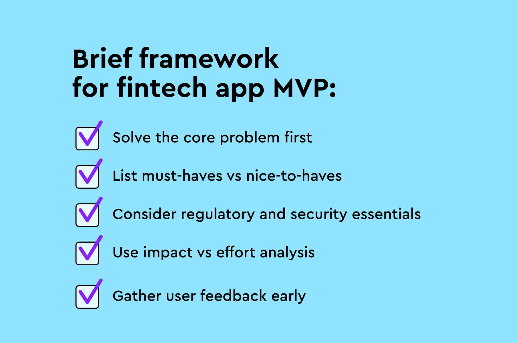
- Solve the core problem first
Identify the primary user pain point your fintech product addresses (e.g., simplifying budgeting, enabling easy investing, faster payments). Prioritize features that directly solve that core problem and deliver on your app’s main promise.
For example, if you’re creating a personal finance app, the must-have features might be linking accounts, expense tracking, and basic budgeting. Everything else (nice-to-have charts, social features, etc.) can come later.
- List must-haves vs nice-to-haves
Make a list of all potential features, then categorize them. Must-haves are features without which your app can’t function or be credible in finance (for instance, secure login, transaction history, basic analytics, and any compliance-related functions).
Nice-to-haves are enhancements that can wait (like dark mode, custom avatars, or secondary tools).
Limit your MVP to the must-haves.
- Consider regulatory and security essentials
In fintech, some features are non-negotiable due to regulations or security standards. Prioritize building in KYC/AML verification flows, encryption, fraud detection alerts, and audit logs early. These might not be “exciting” features to users, but they are the foundation that allows you to operate legally and safely.
Design these flows to be as user-friendly as possible (for instance, break KYC into steps with a progress indicator, as we’ll discuss in tips).
- Use impact vs effort analysis
For each feature idea, weigh user impact (will this significantly improve user experience or solve a major problem?) versus development effort/cost.
High-impact, low-effort features (like adding spending insights using existing data) should be moved up the list, while low-impact, high-effort ones (perhaps an advanced feature only a few power-users will use) can be delayed or cut. This way you maximize ROI on your dev and design time.
- Gather user feedback early
Don’t prioritize in a vacuum – engage with prospective users, or release a beta to get feedback. You might discover users don’t actually want a feature you thought was critical, and are asking for something else. Let real user needs refine your priorities.
Also, observe analytics once your MVP is out: if a feature isn’t being used, maybe it’s not that valuable (and you can focus on improving or replacing it).
Top 8 fintech app design tips (do’s)
Now let’s dive into the fun part – the do’s of fintech app design. These are 10 niche tips and features that can make your fintech product more interesting and user-friendly than the competition.
Each tip is a proven best practice or an innovative idea in modern fintech UI design, with examples to inspire you. Here are the actions you can take to delight your users:
Providing reassurance
Use design elements that reassure users that their money and data are safe.
For example, display security badges (SSL encryption icons, FDIC-insured info) prominently and use neutral, calming colors (blues, greens) that evoke safety.
Implement biometric login (fingerprint/face ID) and clearly communicate privacy measures (e.g., “We never store your card CVV” in micro-text).
Pro tip: consider adding an onboarding slide or FAQ that addresses security upfront – users appreciate transparency.
Including fun onboarding
Make onboarding frictionless and even fun. Fintech apps often need to collect a lot of info (ID verification, etc.), but you can ease this by using progressive disclosure – only ask for what’s necessary, step by step.
For instance, start with just email and password, let the user explore a bit, then prompt for KYC details when required (or tier features access like basic vs. verified accounts).
Include a progress bar or checklist (“Step 2 of 4 completed”) to motivate users through the process.
You can also gamify onboarding: celebrate milestones with a friendly animation or congratulatory message.
Remember, a complicated onboarding process can lose a huge chunk of users – average drop-off rates range from 20% to as high as 88% if it’s too tedious.
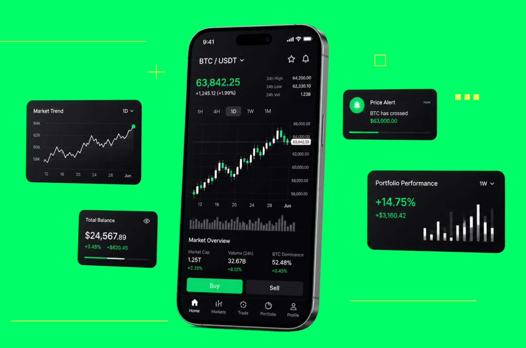
Embracing data visualization
Instead of a plain list of transactions, show a spending pie chart for the month, or a line graph of portfolio growth.
Visual cues like color-coded categories (e.g., red for spending, green for income) and icons help users digest info quickly – but always pair color with labels or symbols to be accessible to all.
In your app, think of every key metric (balance, expense, investment return) and ask: can I present this in a more insightful visual form? Even small touches – like a simple “safe to spend” gauge or an emoji indicating a budget status – can transform the user experience.
Finance app design should empower users, and great infographics do exactly that.
Adding personalization with AI smartness
Use AI and user data to personalize the experience for each user.
Many successful fintech apps now offer custom alerts (e.g., notify me if I’m 80% through my monthly budget) and dynamic recommendations (like investment portfolio tweaks based on market conditions).
These personal touches increase engagement and loyalty.
Motivating with rewards
A proven fintech UX best practice is to add gamification elements to motivate and engage users. Consider adding challenges, points, or rewards for good financial behavior. We have more gamification tips here.
Gamification works: it taps into human psychology to keep people engaged in managing their money. Just don’t overdo it (no cartoonish overload; keep it professional yet friendly).
Thinking of mobile users first
Today’s users (especially Gen Z) are mobile-first. Ensure your fintech app design and development are optimized for small screens and one-handed use. This means deliberately using responsive layouts and mobile UX patterns.
Also, design for varying connectivity: your app should load fast even on 3G or spotty networks – optimize images, use skeleton screens or spinners appropriately so users aren’t staring at a blank screen.
And don’t forget to support both light and dark modes if possible – many finance apps now offer dark mode for user comfort.
Using plain speak instead of fin-speak
Humanize your microcopy and error messages.
For example, instead of a button that says “Execute Transfer”, just say “Send Money”. If technical terms are unavoidable (like “APR” or “IPO”), add a brief tooltip or info icon explaining it in one sentence.
Many traditional banks “sound” complicated; a fintech startup can win users by speaking their language.
One more tip: perform a readability check on your text content – aim for a 6th-8th grade reading level for most screens, so it’s easily understood by a wide audience.
Adding a design system
This tip is more of a behind-the-scenes trick but has a big user impact: establish a coherent design system for your fintech app.
A design system is a collection of reusable UI components and guidelines (colors, typography, spacing, iconography, etc.) that ensures every screen of your app looks and works harmoniously.
Why does this matter to users? Consistency = intuitiveness.
If your buttons, inputs, and menus behave consistently everywhere, users learn the interface once and it “just makes sense” thereafter. Inconsistent design – where each feature looks slightly different – breeds confusion and mistakes.
By using a design system, you also speed up development and maintain quality as you add features.
For example, set a standard for form design (field styles, error states) and use it app-wide. Define a color scheme and stick to it (maybe your brand green for primary actions, a consistent gray for backgrounds, etc.).
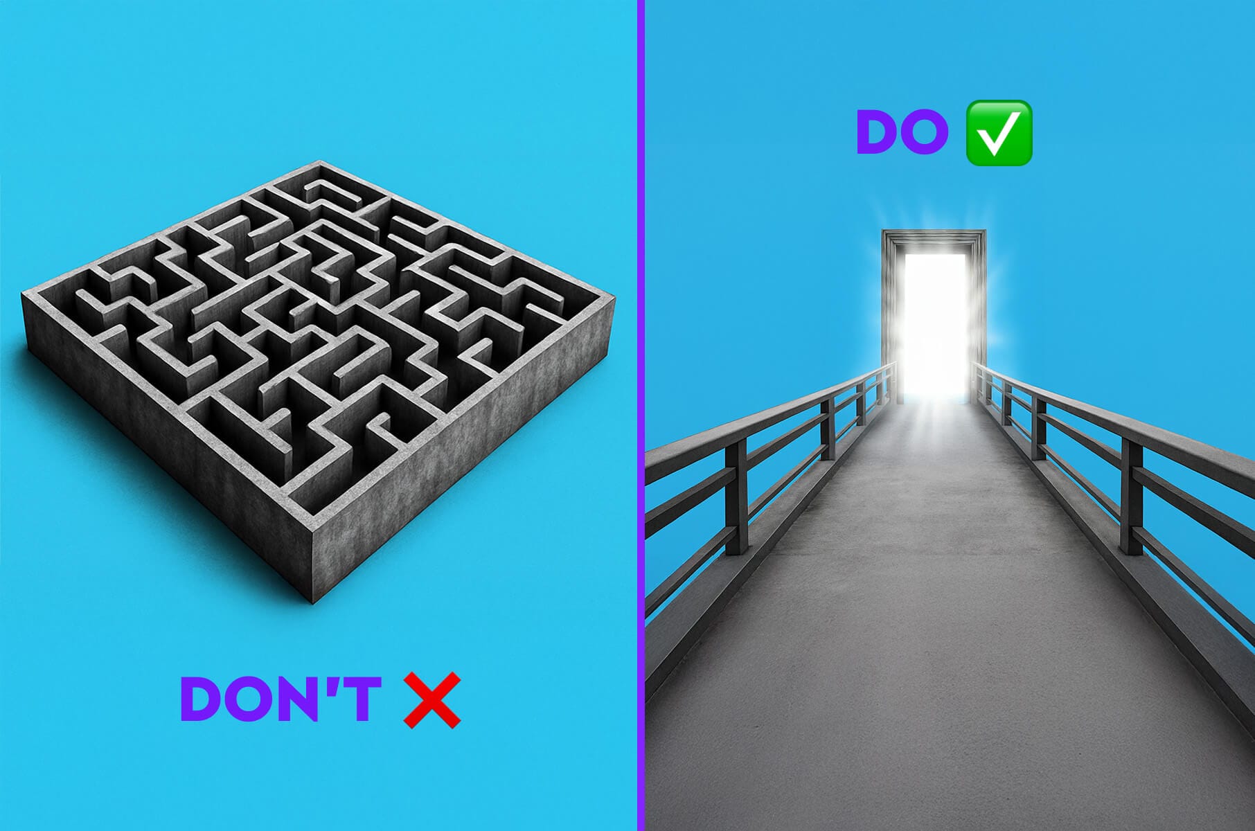
Top 7 fintech app design mistakes to avoid (don’ts)
Even experienced teams can stumble into these pitfalls. Here are 10 common fintech app design mistakes that can undermine your product.
Putting profit before people
A major mistake is designing your fintech product around business goals or cool tech, rather than actual user needs. If you pack the app with features to monetize or push what you think users want, you risk building for imaginary users.
For example, we once had a client who insisted on adding a complex stock analysis tool to their personal budgeting app to “increase engagement.”
It turned out most users found it irrelevant and confusing, and the feature went mostly unused, cluttering the interface. The app’s ratings suffered as real customers felt it wasn’t addressing their primary needs.
The lesson: user-centered design isn’t optional.
Fintech teams that skip user research and usability testing often end up with a product that technically works but doesn’t truly help users. Internal assumptions are dangerous in this space.
Always ground your design decisions in real user data and feedback. Remember, designing for fintech means empathizing with users’ financial anxieties and goals.
Cluttering everything
Making users jump through hoops to sign up is a classic fintech design mistake. Yes, compliance demands certain info, but if your onboarding feels like a loan application or airport security, users will bail. And many do: onboarding drop-off rates in fintech can reach as high as 63–88% in some cases.
Don’t overwhelm new users with long forms, unnecessary personal questions, or poorly explained steps.
It’s also possible to have too many features.
In a bid to outdo competitors, some fintech apps cram in every conceivable function - payments, crypto, budgeting, shopping offers, you name it - all at once.
A cluttered home screen or navigation menu with 10+ options is a warning sign.
Don’t confuse your users by presenting a buffet of features without a clear hierarchy.
A confused user will likely abandon the app (or only use a tiny fraction of it).
For example, one fintech startup we encountered offered 15 different tabs in their app from day one – from basic banking to insurance quotes to investment advice. Users struggled to find basic things like checking their balance.
Use progressive disclosure for secondary features – for instance, show “Advanced” options or extra tools only when a user might need them.
Same with dumping raw data or complex numbers on users without context or visualization.
Don’t leave users to do mental math or interpretation – that’s what good design is for.
Boring people with your UX
While fintech deals with serious subject matter, a mistake is interpreting “serious” as “boring.” A merely functional app that lacks any delight can fail to connect emotionally with users.
This often happens when designers play it too safe, using very corporate, sterile designs with no imagery or personality and zero interactive feedback.
The result is an app that users have no feeling for, so they might not stick around.
Don’t mistake a bland experience for professionalism. You can be both professional and engaging:
- Introduce micro-interactions and positive feedback loops. Even a subtle animation when a transaction succeeds (a checkmark pop-up or a brief sparkle effect) can reward the user.
- Use a conversational tone in content, as long as it remains respectful and clear.
- Provide ways for users to set goals or challenges and then congratulate them on completion.
Essentially, bring some life into your app.
Bombarding with insider language
Another major pitfall is filling your app with financial jargon, acronyms, or technical terms that average users may not understand.
It’s easy for us in fintech to assume terms are known, but often they aren’t. To avoid this mistake:
- Follow the golden rule of copy: write for a smart 6th-grader. Use common words (say “send money” not “initiate transfer”).
- When a technical term is unavoidable, add a plain-English note (e.g., “Pending – money sent but not yet confirmed by your bank”).
- Tooltips and “Learn more” links can help educate curious users without cluttering the main UI.
- Also, be careful with abbreviations (APR, ROI, etc.) – always have the full term and/or explanation nearby.
In our design studio, we often conduct a “jargon audit” for clients: we comb through every screen and label to spot any term a non-expert might not instantly get, and then simplify it.
Excluding a big part of your users
Overlooking accessibility is a mistake that not only shrinks your potential user base but can also lead to legal issues in some regions.
Many startups, eager to ship features, forget to accommodate users with disabilities – don’t be one of them.
Designing only for perfectly able users means you might be shutting out millions who are visually impaired, hearing impaired, or have motor/cognitive challenges.
For example, using low-contrast tiny text might look sleek, but a user with poor vision will struggle or give up. Not supporting screen readers means blind users simply can’t use your service, period.
Startups often overlook inclusive design, but it’s vitally important.
The fix here is straightforward: follow accessibility best practices from the start:
- Use proper HTML tags and labels so assistive tech can parse your app.
- Ensure every action can be done without solely relying on color or the mouse (think keyboard navigation).
- Provide options like font size adjustment or a dyslexia-friendly mode if possible.
- Test with accessibility tools or consultants – or better yet, include users with disabilities in your beta testing to get real feedback.
- Also, consider localization as part of accessibility if you aim for global reach – an English-only, left-to-right layout might not work for a user in the Middle East or Asia.
Ultimately, inclusive design increases your app’s reach.
Neglecting security (or overcomplicating it)
Security in fintech is critical – but both extremes (too much or too little) are problematic.
Some apps make every action so secure that the UX becomes a nightmare: think session timeouts every 30 seconds, multiple OTP verifications for small tasks, or requiring a 15-character complex password, plus a PIN, plus a security question each login.
On the flip side, being sloppy about security is unforgivable – if users sense your app isn’t secure (or worse, experience a breach), trust is gone and likely your business with it.
We’ve seen examples of both: one fintech app required re-authentication for every navigation step (truly overkill) and bled users who got fed up with the friction. Another startup delayed adding 2FA and had accounts compromised, costing them dearly in fraud refunds and reputation.
The best practice is to balance security with usability.
Don’t ask for more security steps than necessary for the context; use risk-based authentication.
One more finance app design mistake is exposing all security complexity to the user instead of handling what you can invisibly. The mantra is secure but seamless – implement strong protections, but in a way that feels smooth.
Designing once and forgetting it altogether
The last mistake is assuming your design work is done after launch. In fintech, especially, user needs and market dynamics evolve quickly. If you “set and forget” your app’s design without continuous improvement, you’ll fall behind.
We’ve seen startups launch a decent MVP, gain users, but then stagnate – they didn’t keep up with user requests or new usability expectations (like adding a dark mode or supporting new payment methods), and users eventually migrated to competitors that did.
Avoid this by treating your app as a living product.
Also, stay informed on fintech UI trends: if users start expecting a certain design convention (for example, swipe actions for transactions, or a floating action button for main actions), consider incorporating it to meet their expectations.
In short, the only truly “finished” app is a dead app.
Fintech app design do’s & don’ts: final thoughts
Great fintech app design comes down to empathy.
Put yourself in the user’s shoes and also be mindful of the unique stakes in finance (trust, security, accuracy).
We answered the key question upfront: Success means doing the things that enhance trust, clarity, and delight and not doing the things that confuse or frustrate.
To recap, focus on designing for fintech users’ needs by implementing smart UX tricks (personalization, data viz, gamification, etc.), and avoid common UX pitfalls like bloated features or poor onboarding.
The difference between a mediocre fintech app and a beloved one is often in these details of design.
As a startup founder, you face enough challenges, from technology to regulations, but nailing the design is one area where you can truly differentiate without needing huge budgets. Use this guide as a checklist during your design and development process.
And remember, you don’t have to do it alone. If you ever feel unsure about the best UX approach, consider consulting experts in fintech app design and development.
At Merge, we’ve helped numerous fintech products find that sweet spot between innovation and usability. We’re always here to offer guidance or a full design/development service to bring your vision to life (so you can avoid those “don’ts” altogether!).