0
Table of Contents
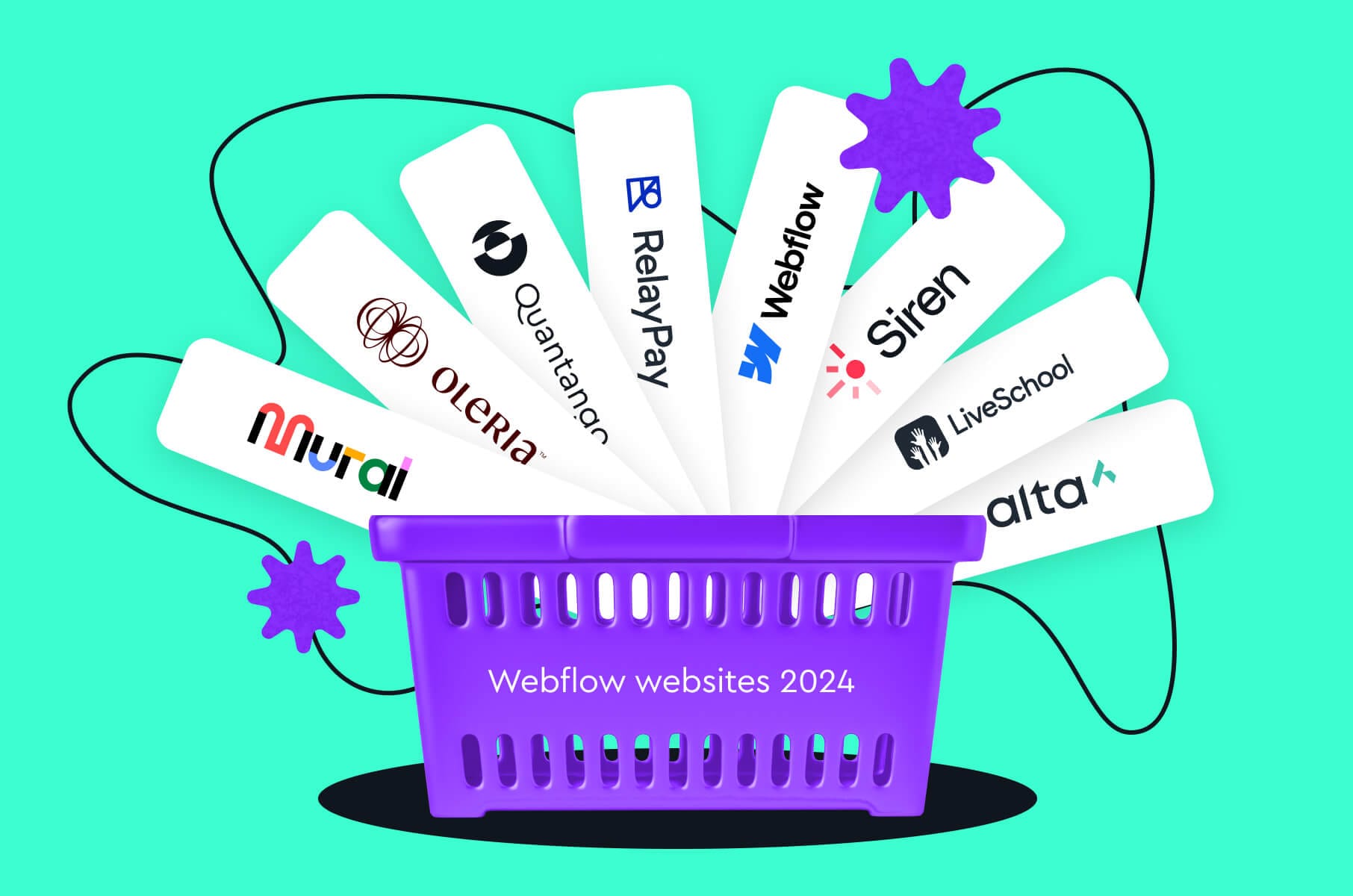
8 (Wow!) Webflow websites 2024
From aesthetics and creativity to user-friendly navigation and immersive interactivity, the websites we have chosen for our list today give us a glimpse of Webflow's full potential.
When it comes to websites built with Webflow, the resulting quality is often remarkably high. The platform gives us many nice opportunities, including expedited turnaround times and a no-code approach, helping create beautiful and interactive sites.
But what exactly makes the best Webflow websites the way they are? After extensive experience building numerous projects on the platform, we've identified several common features that define the top-tier Webflow designs of 2024.
From aesthetics and creativity to user-friendly navigation and immersive interactivity, the websites we have chosen for our list today give us a glimpse of Webflow's full potential.

What do best Webflow websites have in common?
Having built numerous websites with Webflow ourselves, it’s safe to say that the resulting quality is reasonably high. It gives us many opportunities (fast turnaround times, no-code approach, etc) to create visually polished and interactive sites.
When it comes to Webflow website design (and development), here are a few common features:
- Aesthetics and creativity. Many Webflow websites have tastefully done monochromatic themes, mixed font pairings, surprise hover interactions, and engaging visuals (provided that the designers who worked on them are pros).
- User-friendly navigation and simplicity. Most successful websites embrace the "less is more" philosophy by combining essential elements on a single landing page with a clear call to action.
- Interactive and engaging elements. A website built on Webflow often features playful interactions, clever animations, and customizable viewing experiences.
- Layouts that improve versatility. Some Webflow websites have simple yet clever sliders for users to switch between color schemes and use cases.
- Effective typography. Best Webflow websites have the option to use typography and font as core design elements. This way, intentionality in design can enhance clarity for customers.
- Immersiveness. Some Webflow-based sites feature very impressive immersive experiences built solely on Webflow without CSS or JavaScript.
Website design inspiration 2024
Based on our experience, Webflow helps build a rather wide variety of websites: personal websites, portfolios, blogs, business websites, e-commerce sites, landing pages, event websites, and non-profit websites.
If you need it to be attractive, you can easily do that with Webflow. If you want to see examples, here’s some Webflow design inspiration for you.
Alta
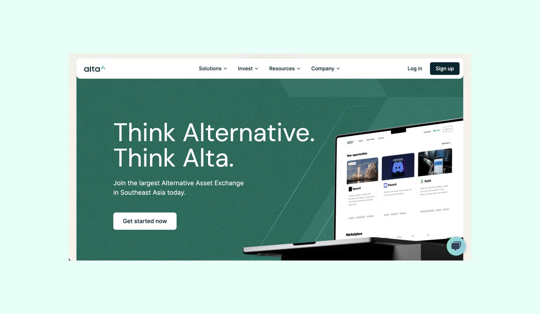
To begin with, Alta is one of the best examples of Webflow websites in 2024 because it combines great design with strong functionality. Apparently, a financial services website can be both visually appealing and highly user-friendly, so it’s definitely a new standard for the industry.
Design highlights:
First of all, the website has a clean, modern look that suits Alta's position as an innovative digital securities exchange. This sleek and elegantly minimalistic design is easy on the eyes and makes the website feel professional and trustworthy.
The navigation is also very intuitive, so users can easily find the information they need, plus the improved information architecture enhances the overall user experience.
What is most important in the design here is that the complex financial concepts are presented through clear, easy-to-understand visuals.
This visual clarity makes the content accessible to a wide range of users, even those without a finance background.
RelayPay
RelayPay's website can also be named one of the best Webflow designs of 2024 due to its contribution of functionality, aesthetics, and user-centric design to the crypto field that can otherwise be a bit complicated to begin with.
It prioritizes clarity, education, and ease of use and, as a result, effectively addresses common barriers to cryptocurrency adoption. In Fintech, making complex processes accessible to a broader audience is a must!
The impact of the previously mentioned speaks for itself:
- Increased user engagement and merchant adoption
- Improved customer satisfaction
- Simplified crypto payments process
Design highlights:
First of all, there is the intuitiveness that comes with a clean, minimalist interface. Not only does it effectively simplify complex crypto transactions, but the user-friendly navigation also enhances accessibility for all skill levels.
Let’s now look at visual aesthetics. Two things:
- The modern and sleek design fits RelayPay's innovative brand
- A cohesive color palette and high-quality graphics elevate the visual appeal
A few other important mentions:
- Micro-interactions. Subtle animations on Alta’s website guide users through complex processes, while interactive elements increase engagement without sacrificing performance;
- Information architecture. There’s a clear hierarchy and well-structured educational content that demystifies cryptocurrency;
- Responsiveness. Fluid layouts adapt to various screen sizes without losing functionality.
Siren
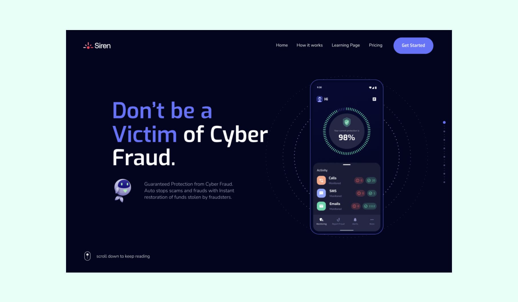
The Siren website is another showcase of Webflow's capabilities in helping create captivating experiences. This cybersecurity-focused website definitely deserves a spot on the list of the best-designed Webflow-powered projects in 2024.
Design highlights:
The website's design prioritizes simplicity so that visitors can easily navigate and understand the Siren cybersecurity solution. Here are some of our favorite things about Siren’s website design:
- Engaging visuals and animations;
- Dynamic illustrations and motion graphics;
- Delightful mascot character.
All of them bring the website to life and create a memorable browsing experience. And speaking of the mascot, the quirky character adds quite a unique, memorable element to the brand and succeeds in making cybersecurity feel more accessible and less intimidating to the average user.
LiveSchool
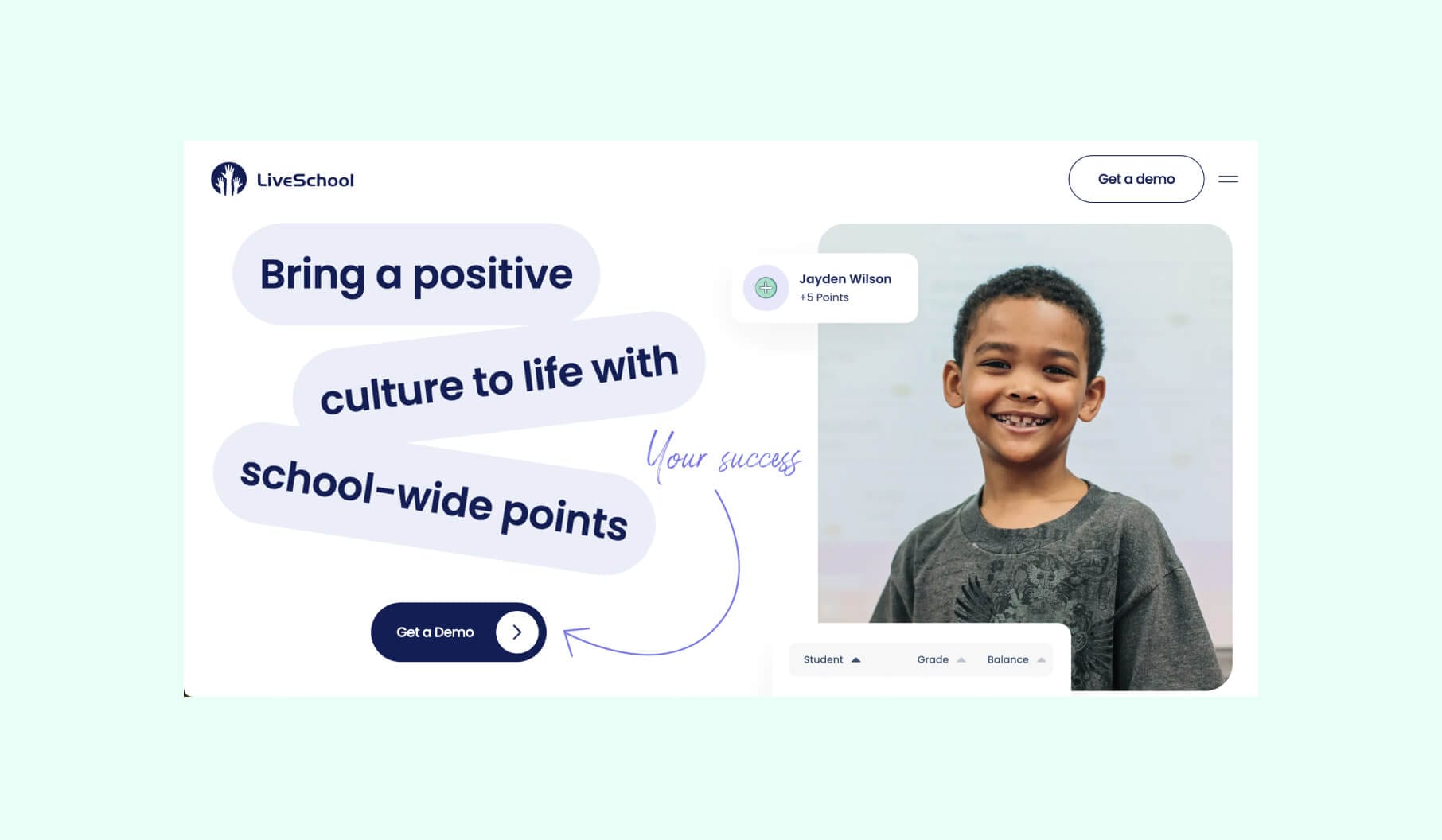
The LiveSchool website is another example of top-tier Webflow design. And no, we’re not tired of mentioning how the best examples always are a perfect mix of looking pretty and functioning flawlessly.
This time, it’s EdTech management and LiveSchool being a leader in behavior management solutions for schools. Here's why it's a standout.
Design highlights:
The following five core aspects of LiveSchool design may seem like an average combo, but they work - and they work perfectly. You’d be surprised how many websites think skipping some of these is not going to affect the result.
So, here’s how it was done for LiveSchool:
- Visual hierarchy. There’s a clear visual hierarchy that guides attention through the strategic use of color, typography, and whitespace.
- Responsive design. Fluid layouts and flexible images stick to mobile-first principles.
- Micro-interactions. Subtle hover effects and transitions provide feedback and improve overall usability.
- Information architecture. The site's structure organizes content logically for easy access to key information.
- Conversion-centered design. Strategically placed call-to-action buttons with contrasting colors and clear messaging optimize the user journey and improve conversion rates.
Oleria
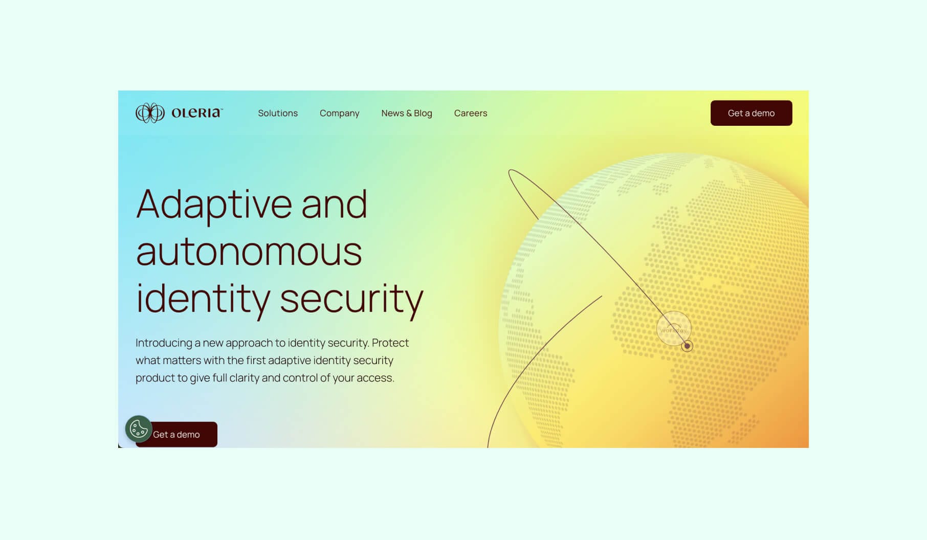
Another excellent cybersecurity representative on our list - Oleria. What makes it different from others on this list is how Oleria's website presents its cute and light-hearted design.
After the pleasant first impression comes innovative approach and technical execution.
Design highlights:
First of all, Oleria has quite a unique visual identity.
By drawing inspiration from nature's colors, the website and the brand itself create an emotionally engaging experience that breaks away from typical cybersecurity aesthetics. They also use color psychology to establish a distinctive brand presence.
Next comes the dynamic user experience.
Complex animations and custom illustrations make the interactivity and visual appeal particularly noticeable. The elements strictly follow the principles of motion design to guide user attention and guarantee a memorable browsing experience.
And don’t forget about inclusive design. The site also incorporates WCAG guidelines for color contrast and optimizing performance despite animation-heavy content.
Webflow
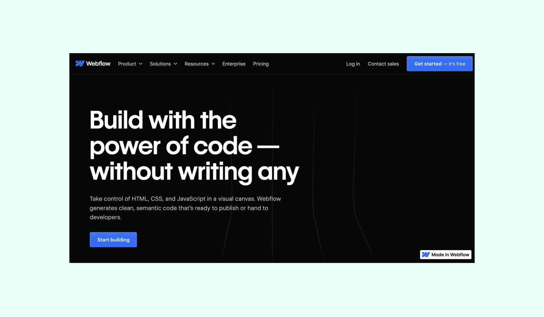
Tongue twister: Is Webflow’s website here because it’s a Webflow website or because it was built using Webflow? Well, first of all, Webflow’s blog is built on Webflow.
Webflow's website perfectly shows off what the platform can do, which is exactly what your website should do for you.
Design highlights:
The homepage grabs attention with a video background showing cool projects made with Webflow. The services section uses eye-catching visuals to explain what Webflow offers. Other good decisions include:
- Uncluttered layout with ample white space, emphasizing simplicity and user focus;
- Large, readable fonts that are perfect for highlighting important information;
- Use of large, high-quality hero images and videos;
- Implementation of parallax scrolling and other interactive elements.
Quantango
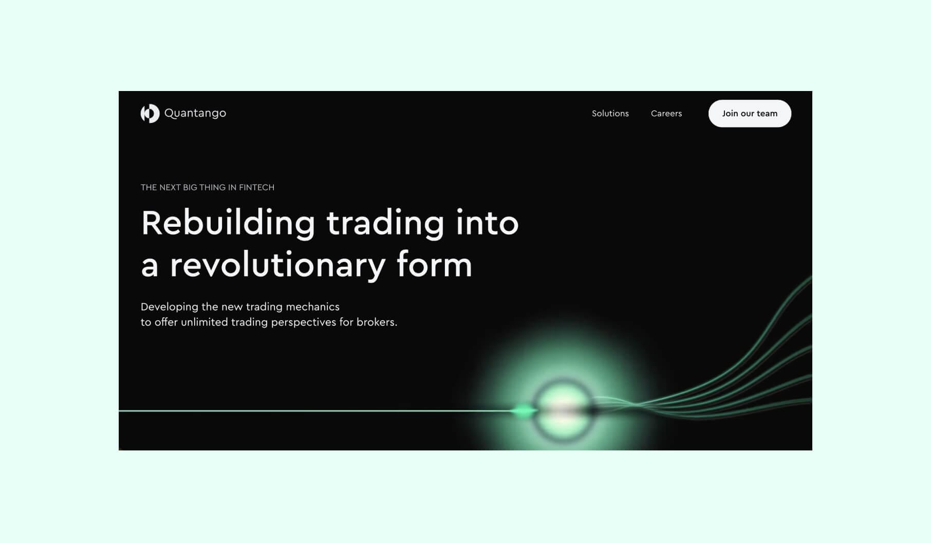
The trading platform Quantango is next on our list. So, what do you need from a trading solution? The website’s goal is to have a compelling visual identity that resonates with a commendable mission to transform trading. They have that.
Design highlights:
First of all, dark mode, being one of the most popular web design trends recently is perfectly executed here, alongside the rest of the key offerings of a clean, minimalist approach.
A sectioned and easy-to-navigate layout, as well as smart use of negative space, act as a supporting pillar of intuitive, modern, easily scannable web design that is ideal for user engagement.
We’d also like to pay special attention to carefully crafted and elegant neon animations and how subtly and smoothly they interact with the rest of the elements, not in any way distracting from the copy or calls to action.
Finally, the overall “black and green” aesthetic doesn’t feel overdone and fits the brand and what they are set to represent.
Mural
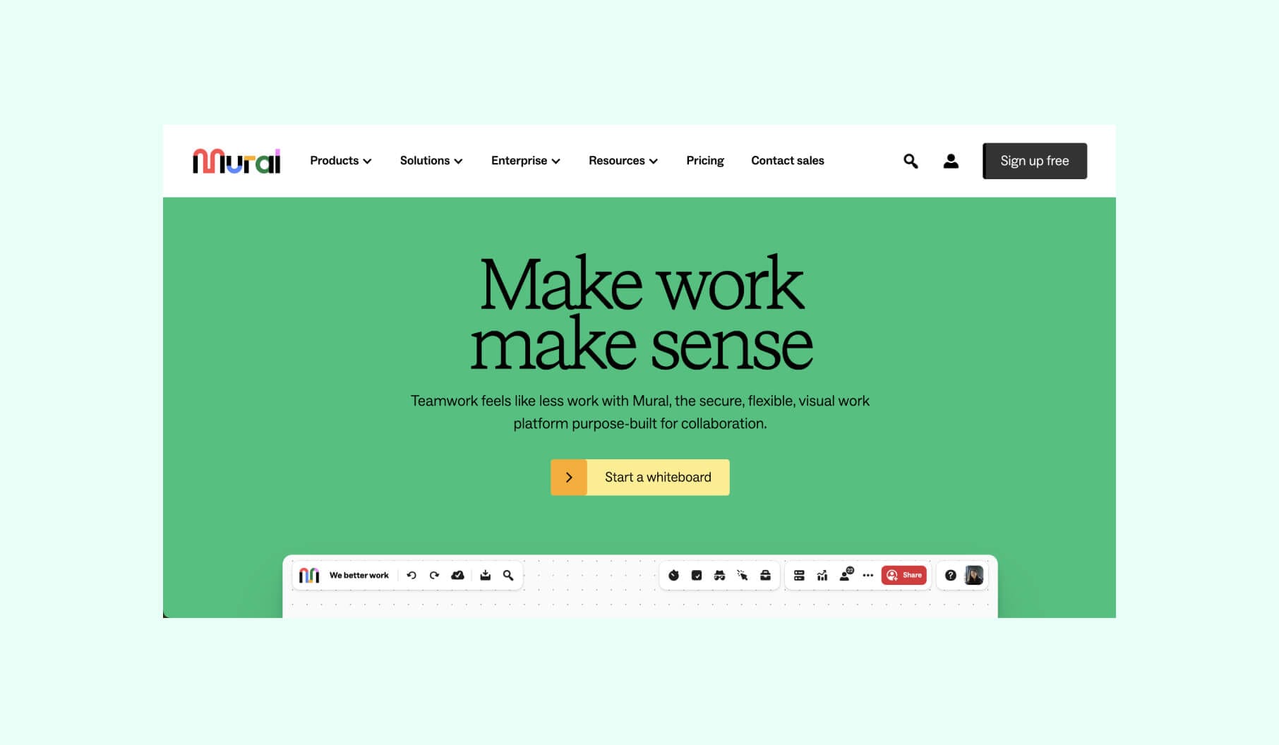
A collaboration platform, Mural, is on this list after it switched to Webflow to give its design and marketing teams some flexibility and freedom without over-relying on engineers.
As a result, they have established a consistent design system to maintain visual coherence across all web pages. This system also solved the issue of disjointed one-off pages and created a unified brand appearance.
Design highlights:
Here are Mural’s best design decisions and practices:
- Simplified layout with ample white space to allow the user's content and visuals to take center stage;
- Integration of visual collaboration tools like virtual whiteboards, diagramming, and mind mapping;
- Vibrant color palette that creates a sense of creativity and productivity;
- New design features improved user flows and call-to-actions.
Want a stellar Webflow website design?
So, what do all these websites have in common? Being built on Webflow? Yes, but not only that…
It’s being designed and developed by professionals who know how to work with Webflow.
You are given tools and opportunities to create a high-performing website that is pleasing to the eye. How you use those tools will define the result. Our Merge team knows how to utilize Webflow to create the best outcome (a.k.a. the best Webflow design) for you.