0
Table of Contents
User testing methods: how to choose the right approach for your product
Moderation, judgment, and follow-up questions are still, thankfully, for humans.
There is a moment in pretty much every product team's life when, instead of thinking “should we test?" the process turns into deciding which test to actually run. While the first question has already been answered a thousand times, mostly in the same way, the second one is where the real money lives, but it causes most teams to freeze.
We are Merge, a product design agency for SaaS and fintech, and we have been running user research and validation studies for founders for eight years. We have already published a deeper take on user research as a discipline, as well as a separate breakdown of the UX audit and what it actually costs. Today, we are going to dig into the testing half of the story.
If you are a founder or a product lead trying to figure out which user testing methods fit your stage, your audience, and your budget, this article is for you. Here’s what we’ll cover:
- The methods of usability testing we actually use on client work.
- When each one provides the most value.
- How remote mobile usability testing has changed in the past two years.
- Why a competitive audit UX pass is one of the cheapest things you can run before any redesign.
What user testing methods actually are
(and why this is not the same as user research)
User testing is the evaluative half of UX work. The previous research piece covered the generative half - interviews, jobs-to-be-done, diary studies, the stuff you do before you know what to build. User testing methods are what you reach for when you already have something (like a wireframe, a prototype, a live product, etc.) and you want to know whether real humans can use it properly.
Nielsen Norman Group says that research methods sit on three axes - attitudinal vs. behavioural, qualitative vs. quantitative, and the context the user is in. Testing is almost always behavioural and almost always context-heavy.
A quick "what is user testing?" answer: it is the practice of putting a design, a flow, or a feature in front of real users, watching them try to do a task, and recording where it works and where it breaks. That’s pretty much it. The rest is just the choice of method, audience, and whether you want to have a moderator or not.
Three categories you will run into across most projects:
- Evaluative testing. Usability tests, A/B tests, first-click tests, tree tests. Simply, you have a thing, you check the thing.
- Discovery-led testing. Closer to research, but with a working artefact. Concept tests, RITE (rapid iterative testing and evaluation), preference tests.
- Comparative testing. Benchmarking against your old version, against a competitor, against a heuristic baseline. The competitive audit ux pass lives here.
We will come back to all three. First, let’s check one of the most important splits - moderated vs. unmoderated.
Moderated and unmoderated usability testing
Moderated testing is human-to-human, happening live:
- A researcher runs the session.
- Asks follow-ups.
- Watches the small reactions.
- Can pivot when the user does something surprising.
Sessions are usually 30 to 60 minutes. The cost per insight is high, but you get a lot of depth for your money and effort.
Unmoderated testing is asynchronous:
- The user gets a link, a brief, and a few tasks.
- They record themselves.
- The researcher analyses later.
Cheap, fast, and you can run a lot of these sessions in one weekend.
Both methods of usability testing have strengths. The mistake we see again and again is treating them as a one-or-the-other choice. They are really not. We would advise you to do sequences - unmoderated first to spot patterns at scale, moderated afterward to figure out the why behind the pattern. Or sometimes the other way round.
A quick comparison view:
Dimension | Moderated | Unmoderated |
Best for | Open-ended discovery, complex flows, B2B | Quick validation, large samples, consumer apps |
Sample size per round | 5 to 12 | 15 to 50 |
Cost per session | $150 to $600+ incentive, plus researcher time | $30 to $80 incentive, near-zero researcher time per session |
Time to first insight | Same day | Within 48 hours |
Depth of why | High | Medium - relies on think-aloud quality |
Risk of misread tasks | Low - moderator can clarify | Medium - bad task design poisons the run |
The 2026 Maze Future of User Research report found that 69% of teams now use AI in at least part of their research workflow - a 19% jump year over year - and most of that adoption is happening in the unmoderated half. That is a much easier place for AI to help.
Moderation, judgment, and follow-up questions are still, thankfully, for humans (fingers crossed).
When to do moderated
Use a moderator for flows where a user will get lost without nudges, for niche B2B audiences where you cannot afford a wasted session, and for early prototypes where the goal is to learn, not to measure. We default to moderated on our first round with most clients, then switch to unmoderated for iteration.
When to choose unmoderated
Use unmoderated when you have a stable hypothesis, a clean task design, and you want statistical-ish confidence on a single decision. Onboarding tweaks, copy changes, paywall variants, navigation labels - all great unmoderated targets.
Our example
On our fintech UX research engagement, we ran 6 in-depth moderated interviews and paired them with 4 unmoderated survey rounds. The moderated sessions gave us 20 prioritised feature ideas. The unmoderated rounds told us which of those 20 would land.
The methods of usability testing we actually run
So what are we actually picking from when we sit down to scope a study? Here is our working set.
1. Task-based usability testing
This one is the classic - you just give the user a goal (for example, "transfer $50 to a friend"), watch them try to do it, and log where they get stuck. Moderated or unmoderated, both work.
A useful target metric is task success rate. Industry benchmarks put "good" at around 78% for moderate-complexity flows and "great" at 90%+. If your task success is below 60%, don’t redesign your screen. Better to redesign the flow.
2. Think-aloud protocol
How about asking the user to narrate what they are doing? Nielsen has called it the #1 usability tool for decades, and we do agree. "Talk through what you are looking at" is super cheap and pretty much catches most issues.
Think-aloud has real limits, though. Verbalising slows the user down, can change their behaviour, and tires them out fast. Older participants often comment more but verbalise less of what they actually see. We avoid think-aloud for tasks longer than 5 minutes and lean on retrospective walkthroughs instead - watch the recording, then ask "what was happening here?"
3. First-click testing
Show a single screen, ask one question, and log where the user clicks first. Cheap and very predictive. Oh, and quick, too. Research from Bob Bailey showed that users who click correctly on the first attempt are roughly 87% more likely to finish the whole task. Which means if you can only afford one test before launch, this is the one.
We like to use it for landing page CTAs, onboarding splash screens, and dashboard entry points.
4. Tree testing and card sorting
If card sorting is generative and users group content into buckets that make sense to them, tree testing is evaluative - you give them your existing navigation, and they try to find things in it.
If your information architecture is a bit of a mess, run card sorting first to get fresh categories, then tree testing to validate them. If your IA seems fine but conversion says otherwise, skip card sort and go straight to tree.
5. A/B and multivariate testing
This is the quantitative, statistically defensible end of the toolbox, best used after qualitative work has narrowed the hypothesis. A/B tests are more for picking between options than for finding them. We have seen teams spend three weeks on an A/B test where they should’ve used that one moderated session instead.
6. RITE (Rapid Iterative Testing and Evaluation)
Here, you run a session, fix the most obvious problem the same afternoon, run another session against the fix, repeat. Useful for prototype rounds where the cost of changing a screen is close to zero. We use RITE during sprint weeks and have five sessions and five fixes in five days.
7. Diary and longitudinal studies
For products that get used over days or weeks (productivity tools, fitness apps, B2B dashboards), point-in-time tests a bit of a miss. Diary studies do cost a lot more, but they catch the slow-burning issues.
8. Concept and preference testing
Two designs, one question, dozens of opinions. Best used for marketing-side decisions (homepage hero, pricing page) where taste actually matters. Unfortunately, it’s less useful inside the product, where behaviour matters more.
9. Heuristic evaluation
Technically not user testing (because no users are involved), but worth a mention because we use it in most engagements. An expert reviews the interface against a set of principles (usually Nielsen's 10 heuristics) and surfaces issues. Three independent evaluators catch around 60% of the problems a full study would find, but much, much cheaper. Useful as a first step before deciding what to actually test with users.
Remote mobile usability testing
What changed, and what to actually do?
A few years back, remote mobile usability testing was clunky. You had to ship hardware to participants, mess with screen-mirroring software, or settle for a lo-fi Zoom call where you could not really see the user's hands. Things have improved a lot, but the trap is assuming "remote" automatically means "good." It really doesn’t.
The basic setups we use:
- Mobile-native testing platforms. UserTesting, Lookback, Maze, and Lyssna all support native mobile session capture now. You ship a link, the user installs a tiny SDK or runs a web-based session, and you get screen, voice, face, and touch data.
- Phone screen sharing on a video call. Cheap and surprisingly fluent. The user joins a Zoom call on their laptop, then mirrors their phone screen. You see what they see, hear their voice, and can ask follow-ups. Best for moderated sessions on a small sample.
- Dedicated mobile remote tools with gesture tracking. Tools like UXCam and Smartlook record real-world product usage in production. Not user testing in the formal sense, but a strong supplement - you see how people actually use the app, not how they perform a test of it.
- In-context observation via webcam. A "remote contextual inquiry" of sorts. The user props their phone in front of a webcam (or uses a second device) while doing a real task. Might be awkward to set up, but when it works, you do get the cleanest signals for your testing.
What we have learned running remote mobile usability testing on dozens of fintech, SaaS, and consumer projects:
- Mobile testing exposes friction that desktop testing hides. Thumb reach, glare, micro-distractions (the kid in the background, the notification banner mid-flow). All of it matters.
- Network conditions are real research data. The user on 3G in a cafe will see different bugs than the user on home Wi-Fi. A few tools (UserTesting has this) let you throttle bandwidth during a session.
- Voice-of-customer over your own copy. The way users describe what they are seeing on a small screen is rarely the way your copywriter described it. Rewrite mobile microcopy after every round.
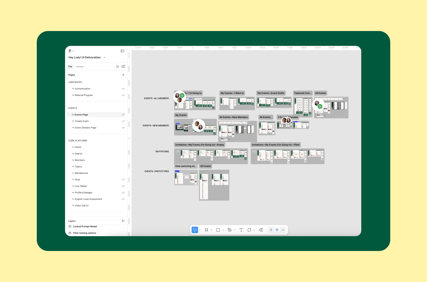
For our HeyLady UX design, we needed to focus on mobile-first usage because their community of women practicing English used the app on phones, mostly in the evening, often one-handed. Our remote mobile usability testing showed that several chat and event-discovery flows that looked clean on desktop felt cramped and unclear in thumb-reach. Those findings ended up affecting the redesign far more than any heuristics.
Oh, a quick piece of advice. Rest on actual phones. We have seen "mobile usability tests" being performed by handing a small design mockup to a desktop user on a large monitor. That is not mobile testing by any means. That is a so-called styling preview.
Competitive audit UX
The cheapest test you can run before any redesign
A competitive audit UX pass is, weirdly, one of the most underused user testing methods despite being one of the cheapest. You are not testing your product. Instead of testing your own product, you test a peer group of products against the same task list and treat the results as a benchmark. The output is what people normally call a competitive audit report.
A good competitive audit UX project answers questions like:
- Where is our flow more confusing than the category norm?
- What patterns have competitors converged on - and should we follow them?
- Where can we deliberately deviate, because the category norm is bad?
- Which competitor onboards new users best, and what does their funnel look like in real life?
A few useful frameworks:
- Maze's competitive analysis guide.
- UXtweak's competitive analysis breakdown.
- Google's competitive audit template (free and quite structured).
- Jakob Nielsen's UX Roundup on Substack also regularly covers how the audit shape is evolving.
How to run a competitive audit
- Pick competitors. 3 to 5 direct, 1 to 2 indirect. Direct ones serve the same audience with the same offer. Indirect ones serve adjacent audiences or solve the same job differently. Indirect competitors are where the surprising patterns live, so do not skip them.
- Define the task list. The exact tasks you want to compare across all of them. "Sign up for an account," "buy a subscription," "complete the first core action." Same task, same script, every competitor.
- Score on shared axes. Usability, information architecture, accessibility, microcopy, onboarding speed, error handling, mobile parity. We default to a 1 to 5 severity scale per axis, so issues are rankable afterwards.
- Document with screenshots and recordings. A list of complaints is not a competitive audit report. A list of complaints with annotated screenshots, side-by-side comparisons, and a competitor-by-competitor scorecard is.
- Triangulate with real users. This is the bit most teams skip. A pure expert audit is fine. A competitive audit UX with three to five user sessions running the same task on each competitor is much, much better.
- Translate into recommendations. Each finding should map to either "we should adopt this," "we should avoid this," or "we should differentiate here." Without that, the report is just general knowledge.
A quick competitive audit example structure
For a concrete competitive audit example structure, here is the base we use on most engagements:
- Section 1: Goal and scope. One paragraph on what you are trying to learn and which competitors you picked.
- Section 2: Competitor profiles. A one-page card per competitor: positioning, audience, pricing, distinguishing features, design system notes.
- Section 3: Side-by-side task analysis. Screenshots of each competitor performing the same task, with severity-rated annotations.
- Section 4: Pattern library. Common patterns across competitors. Worth adopting? Worth fighting?
- Section 5: Gaps and opportunities. Where is the category collectively bad, and is there a wedge for your product?
- Section 6: Recommendations. Prioritised, mapped to your roadmap.
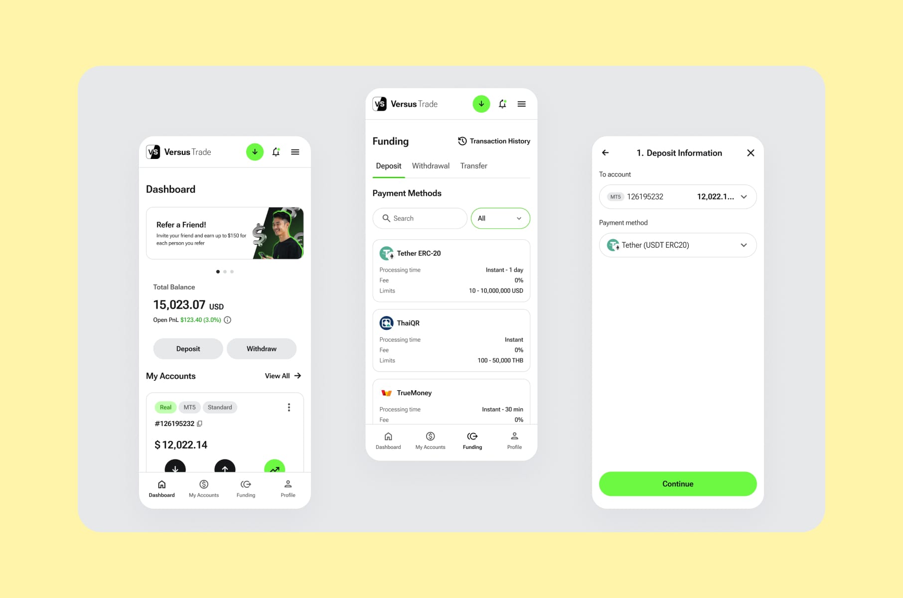
When we ran a competitive audit example for our fintech product design case study with Versus Trade - a crypto/CFD broker targeting a Gen Z audience - the audit covered both client-side trading interfaces and partner-side marketing experiences. The findings helped establish the scope of more than 3,000 responsive screens we ended up designing across both platforms. Without the audit, the project would have been very long and very expensive, full of guessing as well.
Another quick competitive audit example from our fintech app redesign for Clockwork. Clockwork is a financial app with serious depth, and the original design assumed all users were finance pros. The competitive audit against several adjacent fintech tools showed which patterns the user base of "non-finance users who still need finance tools" actually expected to see. That changed the brief a bit and saved us from designing for the wrong audience.
A useful competitive audit report is the kind of document that the product, design, and marketing teams all use afterward. If you finish one and only the design team reads it, the audit was scoped too narrowly.
Pitfalls we see in almost every user testing study
After eight years and a few hundred sessions, we can pretty much guess the failure modes before they happen.
Leading questions and contaminated tasks
If your task script says, "try to find the easy checkout button," congratulations, every user will find it. Rob Fitzpatrick's "Mom Test" recommends talking about the user's life, not your product's features. Same logic for tasks: describe what the user wants to accomplish, not how they should accomplish it.
Recruiting friends and family
A startup classic. Friends and family will be nice - they'll laugh at your jokes and tell you the onboarding feels great, and none of it generalizes. As Glance's user testing mistakes piece puts it, "five people, all colleagues" is not research. You should recruit based on behaviour and not relationship.
The "five users is enough" mistake
Nielsen's claim that five users catch ~85% of issues is widely cited and widely misunderstood. The 85% is an average. Actual sample-to-sample variance puts the range at 55% to 99%. With 10 users, it moves to 80%. If you have more than one user segment, plan for 10 to 20.
Skipping moderation skills training
Running a session is harder than it looks. The lead is supposed to talk for about 20% of the session, and the user for 80%. Most untrained moderators flip that ratio. First, wait three seconds after the user finishes speaking before you say anything. Then, replace every "did you like X?" with "what were you trying to do?"
One round and done
Real teams treat user testing as a habit. Run a small round every sprint, not a giant round every six months. All the insights you get at the end are the whole point.
Where AI fits into modern user testing methods
We get the AI question on almost every sales call now. It’s the reality of it being everywhere and in every tool. The answer we gave recently in the UX audit services breakdown is that AI helps where the work is mechanical and hurts where it is judgment-heavy.
What works well today:
- Transcription and tagging. Almost zero cost, near-perfect accuracy. Just do it.
- Pattern detection across many sessions. Tools like UserTesting's Eureka, Lookback's AI features, and Maze's reporting layer cluster recurring themes from dozens of recordings in minutes.
- First-draft analysis reports. Useful as a starting skeleton. Always rewritten by a human.
- Synthetic test runs for early concept validation. A few new tools (Uxia, Outset) run AI personas through your design. The output is rough, but as a "do we have anything dumb in the first 30 seconds?" check, it is fine.
What does not work yet:
- Severity calibration. AI cannot reliably tell you what to fix first.
- Business context. A "broken" pattern in one product is the correct one in another.
- Accessibility nuance. Manual testing with assistive tech is still the gold standard.
- Replacing the moderator. A human listening to a human is still the highest-bandwidth feedback channel we have.
We always say: use AI for the basic grunt work and keep humans on the decisions.
How we run user testing at Merge
Our user research and testing services follow a four-step process:
- Preparation. We define the research goal in one sentence (and if it needs two, we know we are doing too much). Then, a screener, a task script, and the hypotheses we are trying to disprove. We want to disprove, not prove, so the framing matters.
- Audience and recruiting. Mix of the client's customer base, panel platforms (User Interviews, Respondent, Maze), and manual LinkedIn outreach for niche B2B. For a recent enterprise security audit we ran, manual sourcing got us 12 hard-to-reach analysts in under two weeks - no panel would have produced that list.
- Sessions. Moderated and unmoderated as needed. We default to a 70/30 split for early-stage products (mostly moderated), flipping to 30/70 once the product is mature.
- Analysis and the plan. Notion repository, thematic synthesis, a prioritised backlog of issues mapped to severity and business impact. Same shape we use internally on every project.
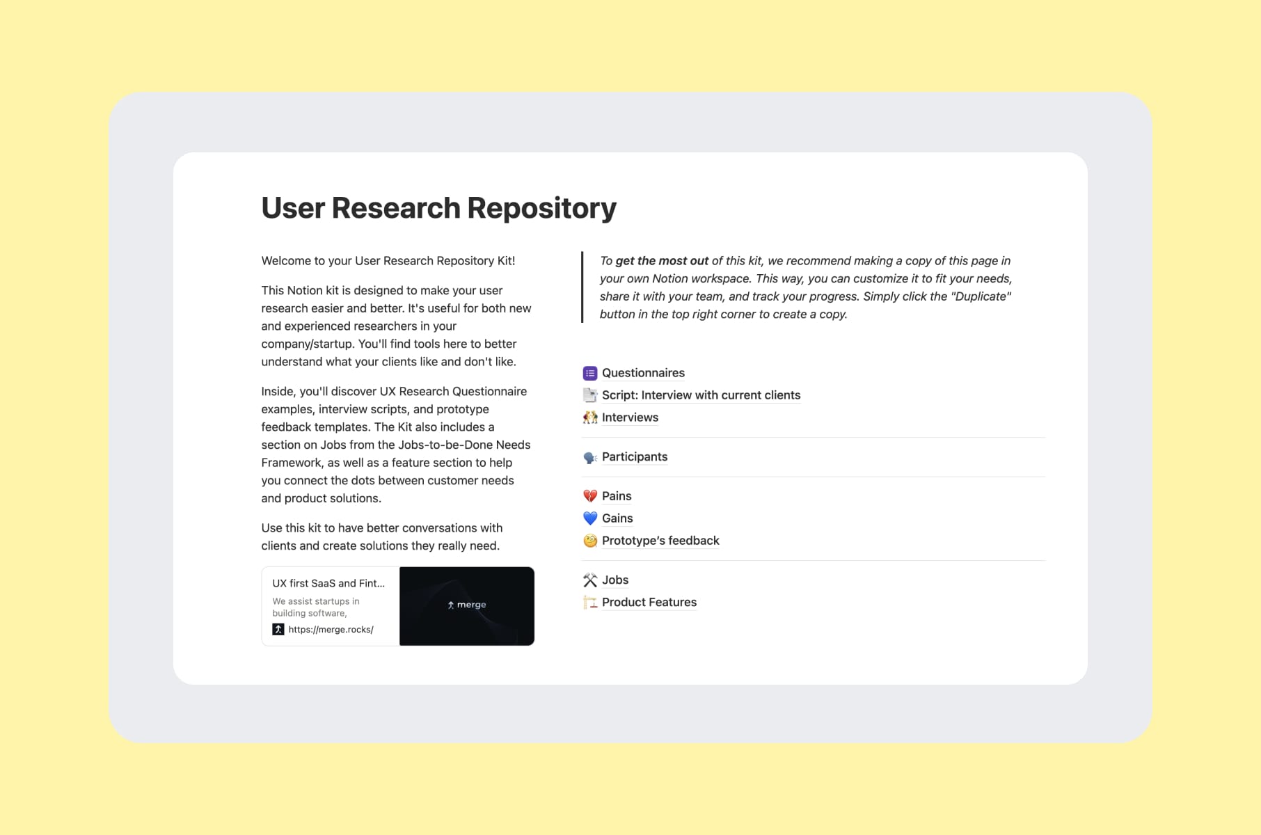
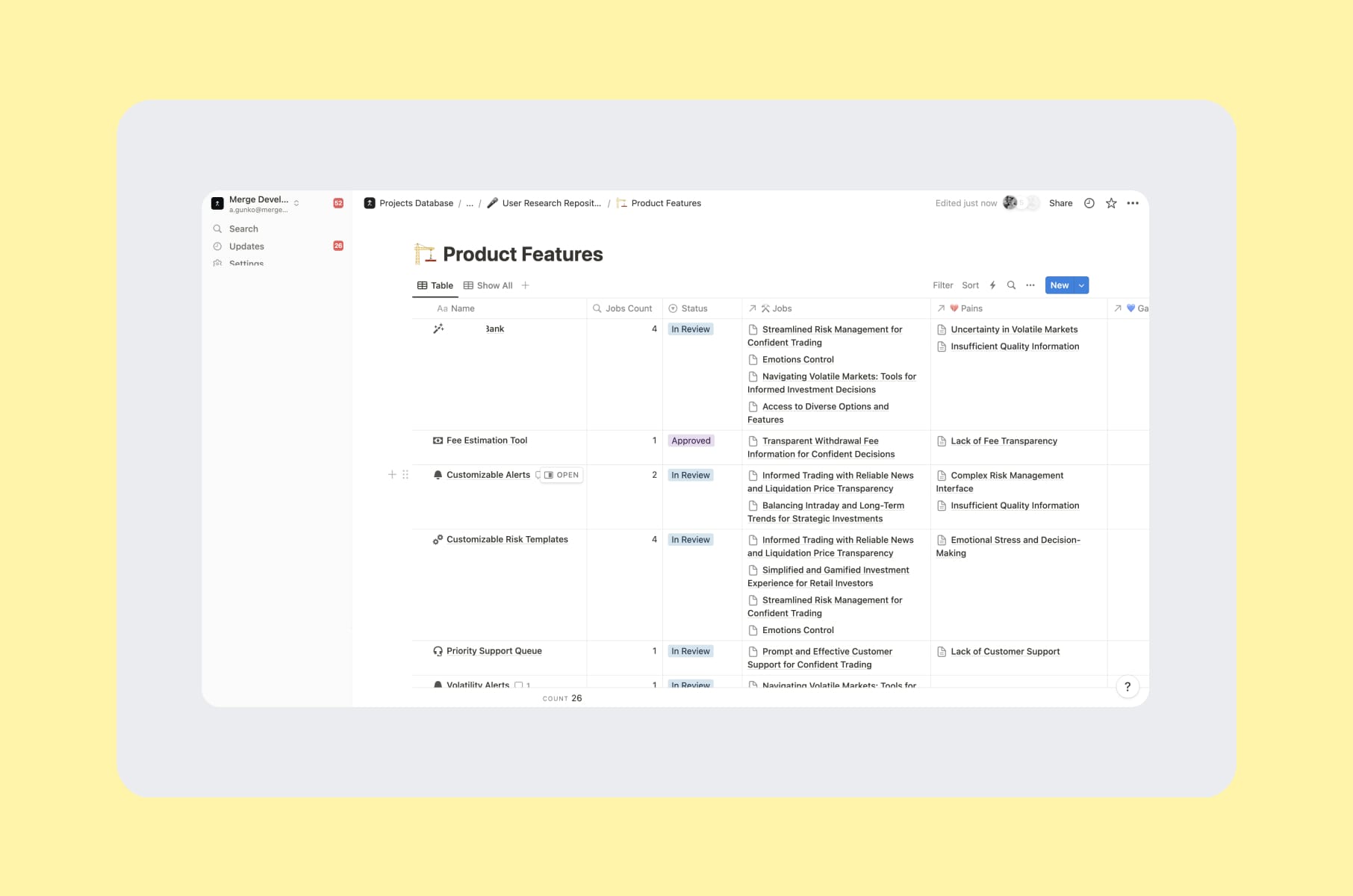
If you want a little sneak peek, our User Research Repository Notion kit is free and contains the exact templates, scripts, and JTBD frameworks we use.
A few engagements where these user testing methods actually helped to achieve the results:
- Capable. Five-plus iteration cycles of unmoderated testing against a small cohort drove the Prompt Builder design, where every interaction was tested before it shipped.
- MO Widgets. The Shopify navigation app needed a story-style onboarding redesign. Usability testing on the existing flow told us exactly which steps were causing drop-off. The new flow lifted engagement without disrupting brand identity.
- Invisibly. Segmented B2C and B2B research feeding a multi-audience design system. We ran parallel rounds of testing across both audience types and used the results to keep the system unified without flattening the differences.
- WeFight. Stakeholder interviews and member testing drove the design of a diagnostic quiz used by oncology patients. A flow with that much emotional weight needs more than one testing round - we ran four.
You can browse the rest in our product design case studies.
Wrap-up: pick the method, then pick the partner
The real lesson after eight years of doing this is that user testing methods should be based on the question you are actually asking. The wrong method asked confidently will give you a wrong answer confidently, and that is the part that hurts your roadmap.
- If you are early: moderated user interviews with a working prototype.
- If you are mid-build: unmoderated task tests on the riskiest flow.
- If you are mature: a competitive audit UX pass plus a recurring small-batch usability test cadence.
- If you are mobile-first: real remote mobile usability testing on real devices, with real network conditions.
- And if you are about to redesign anything: run the competitive audit report before the brief gets written, not after.
Our team at Merge can run any of these for you through our user research and testing services, pair it with a full UI/UX design services engagement, or simply scope a one-off competitive audit example to use as a pre-redesign baseline.
If you are not ready to hire anyone yet, the free Notion kit is yours to use.
Whatever you decide, Merge can help you with it!
Frequently asked questions
What are the main user testing methods?
The most-used user testing methods are task-based usability testing, think-aloud protocols, first-click tests, tree testing, card sorting, A/B and multivariate testing, RITE iteration, diary studies, concept and preference testing, and heuristic evaluation. Most pick three or four of these and use them in some kind of order.
What is the difference between user testing and usability testing?
User testing is the broader umbrella - anything where you observe users interacting with your product. Usability testing is the most common subtype, focused specifically on how easily users can complete tasks. The methods of usability testing are inside the wider user testing toolbox.
How does remote mobile usability testing work?
Remote mobile usability testing uses platforms like UserTesting, Lookback, Maze, or Lyssna to capture screen, voice, face, and touch data from a participant on their own phone, in their own context. The user gets a link, runs the session, and you watch live or after the fact. The trick is making sure you are actually testing on a phone, not on a desktop preview of a phone.
How many users do I need for a usability test?
Five is fine for a quick qualitative sweep in a single segment. If you have multiple user types or the stakes are high, plan for 10 to 20. For quantitative metrics (task success rate, time on task), aim for 30+.
What is a competitive audit UX pass and when should I run one?
A competitive audit ux pass is an expert review of competitor products against the same task list you use for your own usability testing. The output is a competitive audit report with side-by-side comparisons, severity-scored findings, and a prioritised recommendation list. Run one before any redesign, before raising, or when you are about to enter a new market.
What does a competitive audit example look like in practice?
A good competitive audit example scopes 3 to 5 direct competitors and 1 to 2 indirect ones, runs the same task list across all of them, scores each on shared axes (usability, IA, accessibility, microcopy, onboarding), and ends with a recommendations section mapped to your roadmap.
Can AI replace user testing?
Not yet. AI is useful for transcription, pattern detection across recordings, first-draft reports, and rough synthetic-persona validation. It is not yet reliable for severity calibration, prioritisation, or moderating a session. Use AI for the mechanical bits and keep humans on the judgment.
What does user testing actually cost?
A full agency-led usability study runs roughly $10K to $30K per round, depending on the number of sessions, moderation, and recruitment difficulty. Rapid sprints can land in the $3K to $8K range. DIY with our free kit costs mostly your time and a few hundred dollars in incentives.
Stay tuned for more from our team on what we have learned running a product design agency for startups for the last eight years!