0
Table of Contents
UI/UX design services guide for founders: what actually improves revenue?
Most design money gets spent in the wrong place. The fixes that pay back fastest are not so glamorous.
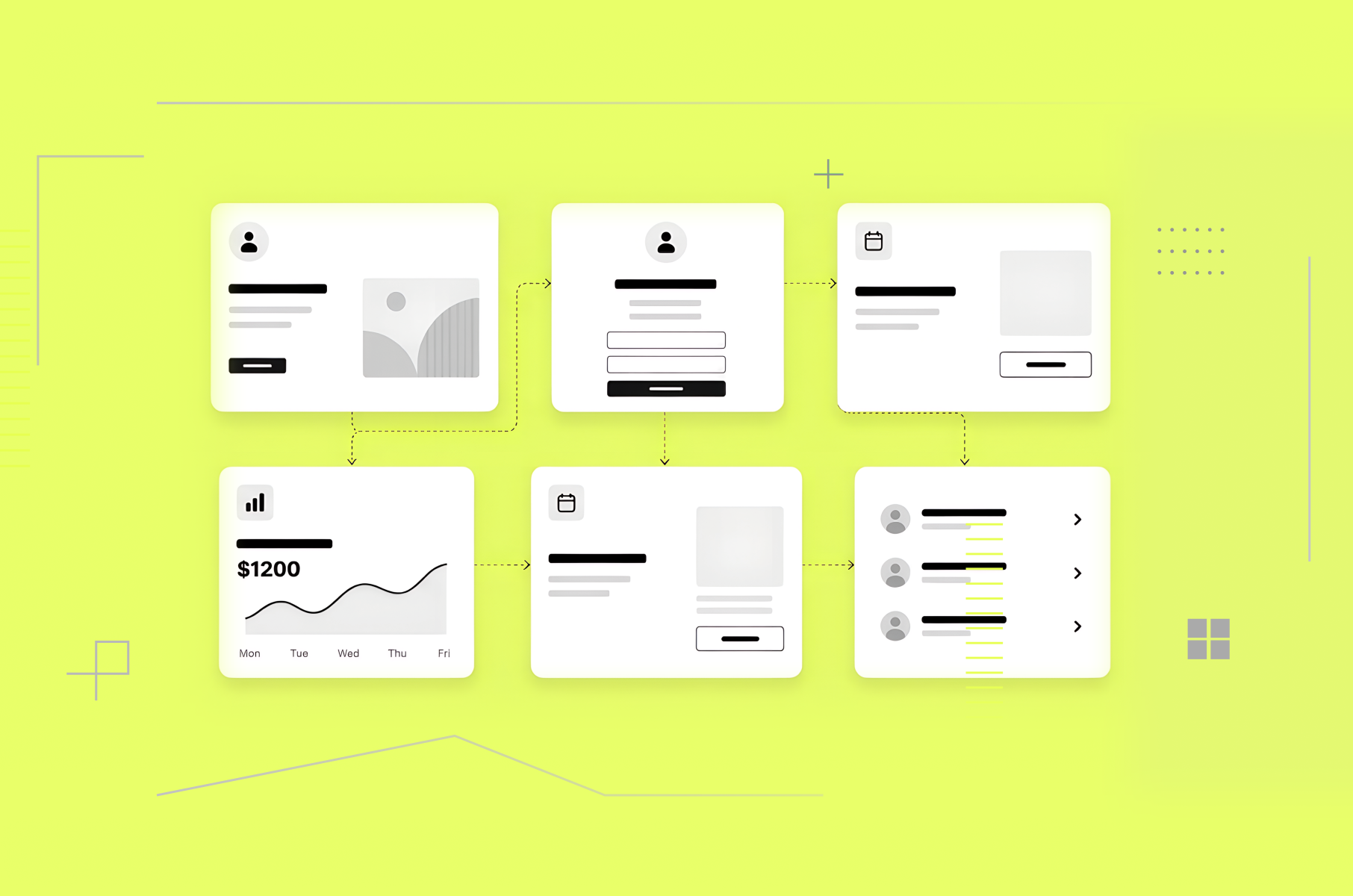
The design work that really matters for your revenue is usually in the path between a stranger's first click and their first moment of real value. Message clarity, sign-up friction, onboarding, page speed, and the handful of screens that generate most of your support tickets. The visual refresh, the illustration set, the motion work - the parts of UI/UX design services that look the best are all worth doing, but they pay back a bit slower.
Today, however, we are talking about revenue improvement.
This guide is for founders and product owners deciding what to fix first, what it should cost, and whether to hire outside help.
We're Merge, a UI/UX design agency that's been doing this for B2B, SaaS, and fintech teams for more than eight years, so we have opinions. If you've read our UX audit breakdown or our SaaS user onboarding teardown, this is the continuation.
What are UI/UX design services?
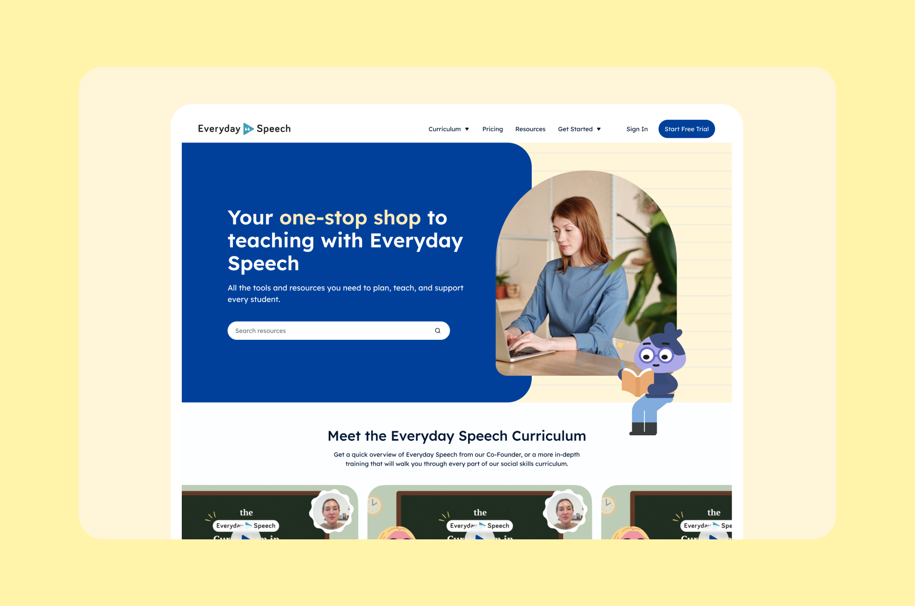
UI/UX design services are the research, design, and testing work that decides how your product and website behave and how they look. UX (user experience) is the plumbing: flows, structure, and the number of steps between landing on your site and paying you. UI (user interface) is the surface: layout, type, color, states, motion.
You'll see many different names for them in search results - UI UX design services, UI/UX design and development services, UI / UX design and development services, with slashes, spaces, or neither. They all describe the same thing. When development is added, you're buying design plus front-end build from one team instead of two, which mostly matters for handoff.
A typical engagement with a UI/UX design services company includes some mix of:
- Research and audit. Watching real users, reading your analytics, and listing what's broken in order of what it costs you. This is our user research work, and where we usually start.
- Information architecture and user flows. Deciding what lives where, and how many steps each job takes. Usually fewer than you have now.
- Interface design. Screens, components, states, and the design system that stops them from drifting apart as you grow.
- Usability testing. Checking a real human can finish the task before you build it, not after.
- Ongoing design support. Your product keeps changing, so the design has to as well.
So, which of these turns into money, how much, and how soon?
The design fixes that actually improve revenue
We've sorted these by payback speed, based on our own project work and the public evidence. Fastest first.
# | Design fix | Metric it moves | What the evidence says | Typical effort |
1 | Cut steps to first value | Activation, early churn | Median B2B onboarding checklist completion is 10.1% | 2-6 weeks |
2 | Strip friction from sign-up forms | Completed sign-ups | 35.26% average lift available from checkout design fixes | 2-4 weeks |
3 | Clarify the first screen | Trial starts, demo clicks | 39% of shoppers have quit over unexpected costs alone | Days to 2 weeks |
4 | Speed up page load | Everything upstream | Vodafone: 31% faster load, 8% more sales | 1-3 weeks |
5 | Design away your top support tickets | Support cost, margin | Assisted contact costs $13.50 vs $1.84 self-service | 2-4 weeks |
6 | Make design carry the room without you | Sales and investor confidence | Hardest to measure, easiest to feel | 3-8 weeks |
7 | Build a design system | Shipping speed, consistency | 34% faster task completion with a system | 6-12 weeks |
Fix #1. Cut the steps between sign-up and first value
Activation is where design earns the most and gets the least attention. The average B2B SaaS activation at 37.5%, meaning roughly six in ten people who sign up never reach the thing they signed up for. Meanwhile, the median onboarding checklist completion across 188 B2B SaaS products is 10.1%. Half of these companies can't get one user in ten through a checklist they built themselves.
If you want to know what improves activation, "simpler onboarding UI/UX" is at the top of the list. Not a pricing change and not a growth hack. Just fewer steps between the sign-up button and the thing they came for.
What to do? First, define the one action that means a user got value, count the steps to it, delete half of them, and pre-fill or defer the rest. On MO, a Shopify app we redesigned, the whole job was getting non-technical store owners to a live widget without reading documentation. Setup landed in under three minutes, and the two stores we tracked moved from 0.64% to 1.61% and from 1.60% to 2.23% conversion. Our user onboarding design page covers how we do it.
Why does activation beat almost everything else? It involves retention, and retention is what your valuation is made of. For example, firms below 90% net revenue retention grew about 20% a year, while those above 130% grew 70%.
Fix #2. Take the friction out of your forms
The reasons people quit are very easily fixable. Asked why they'd ever abandoned a cart, 39% of shoppers named unexpected costs, 19% said the site forced account creation, 19% didn't trust the site with their card, and 18% found checkout too long. Not one of those is an aesthetic problem.
One funny detail that shows how small the failures are: 42% of test participants typed their full name into a field labeled "First Name" at least once. With a single "Full Name" field, hesitation dropped to 4%. Mind you, 89% of the sites Baymard benchmarked still use more than one name field.
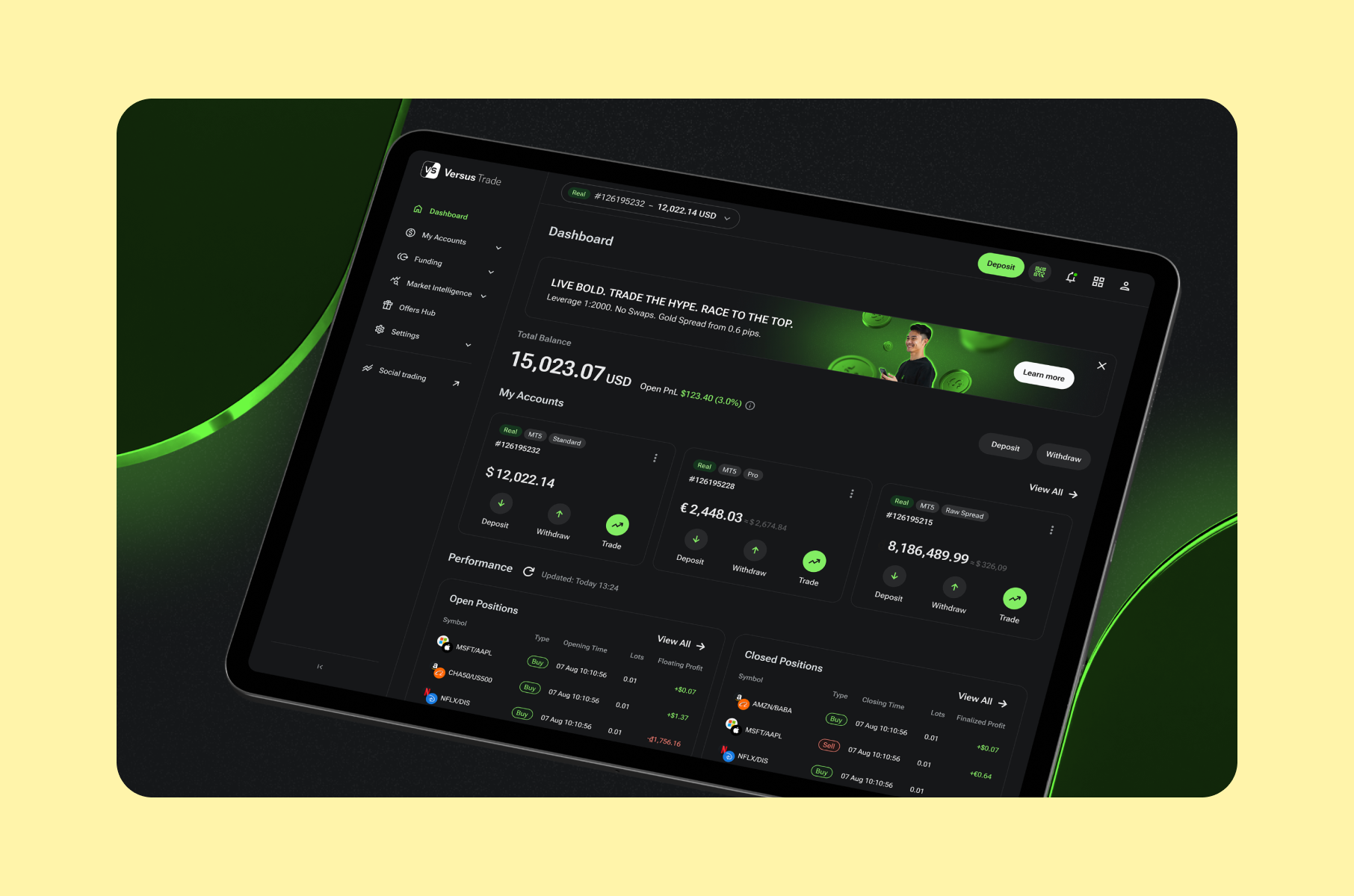
For fintech and B2B teams, the same logic applies to KYC. On Versus Trade we designed the client dashboard, partner portal and two sites across 3,000+ screens, and the wins were structural rather than decorative. There's more in our article about fintech UX anti-trends.
Fix #3. Make your first screen answer three questions
Your homepage or app store listing has one job: tell a stranger what this is, who it's for, and why they should care. If that takes longer than a few seconds, they leave, and you'll never see it in your funnel because it looks like a normal bounce.
Top abandonment reasons have cost, trust, and effort in common. All three are message problems. This is the cheapest fix on our list, but it usually means deleting some of your favorite and proudest sentences in the copy.
Check out more info in our teardown of SaaS product pages that convert if you want nice examples.
Fix #4. Fix speed before you fix anything visual
Here’s some proof,
Vodafone Italy ran a proper server-side A/B test: a 31% improvement in how quickly the main content loads resulted in 8% more sales.
The Milliseconds Make Millions study by 55 and Deloitte tracked 30 million sessions across 37 brand sites and found a 0.1 second speed improvement lifted retail conversion 8.4% and travel conversion 10.1%.
You can have a heavy hero video or an unaudited font stack, or perhaps a big animation library, and all of them can quietly cost you more conversions.
Fix #5. Design away your top five support tickets
Apparently, the median cost per contact is $1.84 for self-service and $13.50 for assisted channels. Every ticket your interface causes is roughly a $13.50 tax, plus the churn risk attached to a frustrated user.
Here's how to fix it:
- Pull your last quarter of tickets.
- Group them by root cause.
- Find the five screens generating the most.
In our experience, it could be a confusing screen a new user meets before they've added any data (empty state), or an error message that doesn't say what to do next.
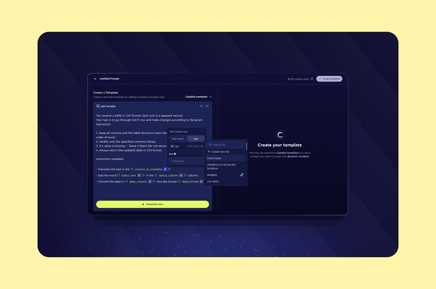
However, only 9% of customers fully resolve issues through self-service, so you're not going to eliminate support altogether. Instead, you're going to stop manufacturing the tickets you didn't need. On Capable, a B2B AI platform, for example, our goal was to cut clicks and confusion, with retention as the indicator of whether we succeeded. And we did.
Fix #6. Make the design carry the room when you're not in it
Your design does sales work mostly in rooms you're not in:
- When somebody forwards a screenshot to their VP
- When a procurement lead opens your product next to two competitors.
- When a partner at a fund clicks your link mid-meeting.
Nobody in those rooms reads your copy carefully. They pattern-match on whether you look like a successful company.
For Test Ettir, a home health test startup in Turkey, the brief was that the site had to withstand investor scrutiny before the product gained traction. Design was the proof of seriousness because there wasn't much else yet.
How to judge it: track win rate on competitive deals, and how often "it looks unfinished" comes up in sales calls before and after.
Fix #7. Build a design system once you're shipping fast enough to need one
A design system is a shared kit of pre-made parts that designers and engineers draw from rather than inventing them each time. Without one, every new screen reopens settled questions. What does a delete button look like? Which red means "error"? Someone redraws it, someone rebuilds it, and it lands slightly different from last time.
Design systems buy velocity rather than conversion.
Figma's internal study found participants completed objectives 34% faster with a design system available, though Figma notes that's likely the ceiling rather than the typical case, and they sell design systems.
Sparkbox measured a 47% development speed gain on one form page using IBM's Carbon system, in a study of eight developers, which they're refreshingly upfront about.
How to tell whether the design work worked
This is where most UI/UX design agencies and most clients quietly agree not to look. Everybody promises outcomes. Almost nobody defines how they'd know. Here’s how to tell whether the design work has actually worked:
- Baseline before kickoff, not after. Record 4-8 weeks of whatever metric you care about before a single pixel changes. If you can't measure it now, you can't claim credit later, and neither can we.
- One metric per fix. Onboarding changes are judged on activation. Form changes on completion rate. Do not let a redesign be judged on "overall vibes and revenue."
- Ship serially, not all at once. If all 8 workstreams are 80% done, you can't scope down or evaluate anything.
- Set an attribution window and honor it. Onboarding changes need a full cohort of users to mature, usually 30-90 days. Judging a retention fix after two weeks is how good work gets killed.
What you're measuring | Realistic benchmark | Source |
B2B SaaS activation rate | 37.5% average | |
Onboarding checklist completion | 19.2% average, 10.1% median | |
Average time to first value | ~1 day, 12 hours | |
Free trial to paid | 8-12% good, 15-25% great | |
Net revenue retention (revenue kept and expanded from existing customers) | 102% median B2B SaaS | |
3-month B2B retention | 2.5% median, 15.6% for top products | |
Features driving 80% of clicks | 6.4% median |
Take a look at that last row, though. Data says a median of 6.4% of features drive 80% of clicks, meaning roughly 94% of what you built is being ignored. Before you commission new screens, that's the number to pay attention to. We wrote about it at length in how SaaS users actually adopt features.
And you don't need a huge study to find this stuff. Nielsen's classic finding is that five participants surface about 85% of usability problems in a given round. Five. Our user research guide for SaaS products covers more about it.
What UI/UX design services cost in 2026
Clutch puts the average UX agency project at $84,973 over 10 months, with a typical monthly spend of around $8,900.
Most projects fall into the $10,000- $49,999 range. Hourly rates split hard by geography: $100-149 in the US, Canada, and Australia, $50-99 in the UK, Poland, and Spain, $25-49 in Ukraine, India, and Mexico.
Here's a table sorting prices by engagement type.
Engagement | Typical cost | Best for | Watch out for |
UX audit (one flow) | $3,000-$6,000 | Knowing what's broken before you spend | An audit that ends in a slide deck and no priorities |
UX audit (full product) | $8,000-$18,000 | Pre-redesign diagnosis | Findings you can't sequence or cost |
Discovery sprint (2-4 wks) | $8,000-$20,000 | Unclear problem, clear urgency | Research that never converts into decisions |
Design sprint (5 days) | $25,000-$30,000 | One big bet, fast | Sprints used to avoid picking a direction |
MVP design (6-10 wks) | $25,000-$60,000 | Zero to launchable | Scope drift into "while we're in here" |
Monthly retainer | $10,000-$30,000/mo | Continuous product work | Being the smallest client on the roster |
Full product redesign | $40,000-$120,000+ | Structural rebuild | Everything 80% done, nothing shipped |
Alternatively, a fully-loaded in-house product designer in the US costs considerably more once you add benefits, tooling, recruiting, and overhead to a six-figure salary, though that's our estimate rather than a cited figure.
When you shouldn't hire a design agency at all
We'd rather you hold off hiring a design agency if:
- You haven't found product-market fit. Design can make a wrong product easier to reject. It can't make it be wanted. Fix positioning first.
- You have fewer than a few hundred active users. There's nothing to measure yet, which means nothing to optimize and no way to prove any of it worked.
- The tool is internal, and the people using it already know where everything is. Train them. Save the money.
- Your real problem is engineering throughput. A prettier Figma file does not make an overloaded backlog move faster.
- Nobody on your side can make decisions. Agencies don't fix an approval process. They get eaten by one.
One of the famous examples is Sonos. Their 2024 app rewrite cost $20-30 million to fix and cost the CEO his job. What's instructive, per Roger Wong's reporting based on interviews with Sonos designers, is that the design research was right - eighteen months of testing validated the direction. "The problem wasn't the vision. It was execution." Good design work, executed into an organization that couldn't carry it.
How to pick a UX/UI design partner
For that, we would recommend asking the following questions:
- What's your median retainer? This predicts more than any portfolio review. If your monthly spend is well under a quarter of their typical client's, you're the account they'll pause when a bigger one needs the hours.
- Can I have live access to your time tracking? Most agencies use Toggl or Harvest and will share it if you ask. Lynch never asked, so he only found out a task had ballooned after he'd paid for it.
- How many workstreams will be open at once? Keep it to two or three. If eight things are all 80% finished, you can't cut scope, and you can't walk away without losing the lot.
- What percentage of billables is project management? Then ask what happens to it at your budget.
- Who's doing the work, and will they be in the room? If your design questions have to go through a project manager to reach a designer, you're paying by the hour for a game of telephone.
- Can you show me an outcome, not a screenshot? A portfolio full of pretty screens tells you what an agency can draw. It doesn't tell you whether any of it moved a number.
More on this in our nine questions to ask before hiring a B2B web design agency, plus a comparison of the field in our roundup of product design agencies for SaaS and fintech.
What AI changed, and what it didn't
You've probably wondered whether you still need UI/UX design services when Lovable and Figma Make will produce a working interface in half an hour, give or take. Fair question.
First of all, yes - producing a decent-looking interface is now cheap, and designers know it. When a Jane Street engineer wrote that they design with Claude more than Figma now, the Hacker News thread was mostly arguing about where the tools default to generic. Nielsen Norman Group tested the current crop by rebuilding their own live page across 14 of them, and their verdict was "good from afar, but far from good". The irony they flag is the useful bit: the higher the fidelity of the reference you feed the tool, the better the output, which means you've already done most of the design work yourself.
What didn't change is knowing which screen to build. NN/g's State of UX 2026 argues UI will gradually stop being a differentiator, then puts the rest bluntly: "If you're just slapping together components from a design system, you're already replaceable by AI." What survives is taste and judgment about what to build and why.
Meanwhile, teams building AI products report design matters more. In Figma's 2025 AI survey, 52% of AI builders said design is more important for AI-powered products than traditional ones. The same survey has the punchline for this whole article: only 9% named revenue growth as their top AI goal, while 76% cited something vague like "experimenting with AI."
So, yeah, producing interfaces got cheap. However, knowing which ones earn money did not.
FAQ
What's the difference between UI design and UX design?
UX decides what happens and in what order - the flows, structure, and steps. UI decides what it looks like and how it responds. You can have a beautiful UI on a flow that loses money, which is most of what we're hired to fix.
How much do UI/UX design services cost?
Clutch's verified-review data puts the average UX project at about $85,000 over 10 months, with most landing between $10,000 and $50,000. A focused audit starts around $3,000, an MVP design runs $25,000-$60,000, and retainers typically sit at $10,000-$30,000 a month. Geography moves hourly rates by a factor of four.
How long does a UI/UX design project take?
A single-flow audit takes 1-2 weeks. An onboarding redesign takes 2-6 weeks. A full product redesign takes 3-6 months. If someone quotes you four weeks for a full rebrand plus redesign, ask what happens when it takes eight months, because it has before.
Should I hire an agency, a freelancer, or an in-house designer?
Freelancers are best for defined, contained work. Agencies are best when you need research, design and front-end at once and don't want to manage three contractors. In-house wins the moment design needs to be in every roadmap conversation.
Do UI/UX design and development services from one team actually help?
Usually yes, for one reason: handoff. When design and front-end sit in different companies, questions turn into tickets and tickets turn into billable hours. Buying UI / UX design and development services together mostly buys you fewer of those.
How do I know if the design work paid off?
Baseline the metric before kickoff, tie one metric to each fix, ship in small increments, and give cohort-based changes 30-90 days to mature. If your agency won't agree to that upfront, that's your answer.
Is a UX audit worth it before a redesign?
Generally yes, and it's the cheapest thing on the menu. It's also the fastest way to find out whether you need a redesign at all, since quite often you need three fixes and not a rebuild. Ours is scoped in our UX audit guide.
Wrap-up
Most design money gets spent in the wrong place. The fixes that pay back fastest are the unglamorous ones - fewer steps to first value, shorter forms, a faster page, and the screens quietly generating your support tickets. The visual work matters too, just later and more slowly.
When a design engagement goes wrong, it's rarely because the designers were bad. It's usually because the agency was built for clients ten times your size and couldn't scale down to you. So ask what their median retainer is before you ask to see their portfolio. Then baseline your numbers before anyone starts, and make them ship in pieces instead of one big reveal at the end.
If you're not sure which fix applies to you, that's the first thing our UI/UX design services team at Merge works out. Send us your analytics and we'll tell you where the money is - even if the honest answer is that your design is fine and your pricing isn't.