0
Table of Contents
Your SaaS website design looks good, but doesn’t convert? Here’s why.
Good SaaS website design is your sales infrastructure.
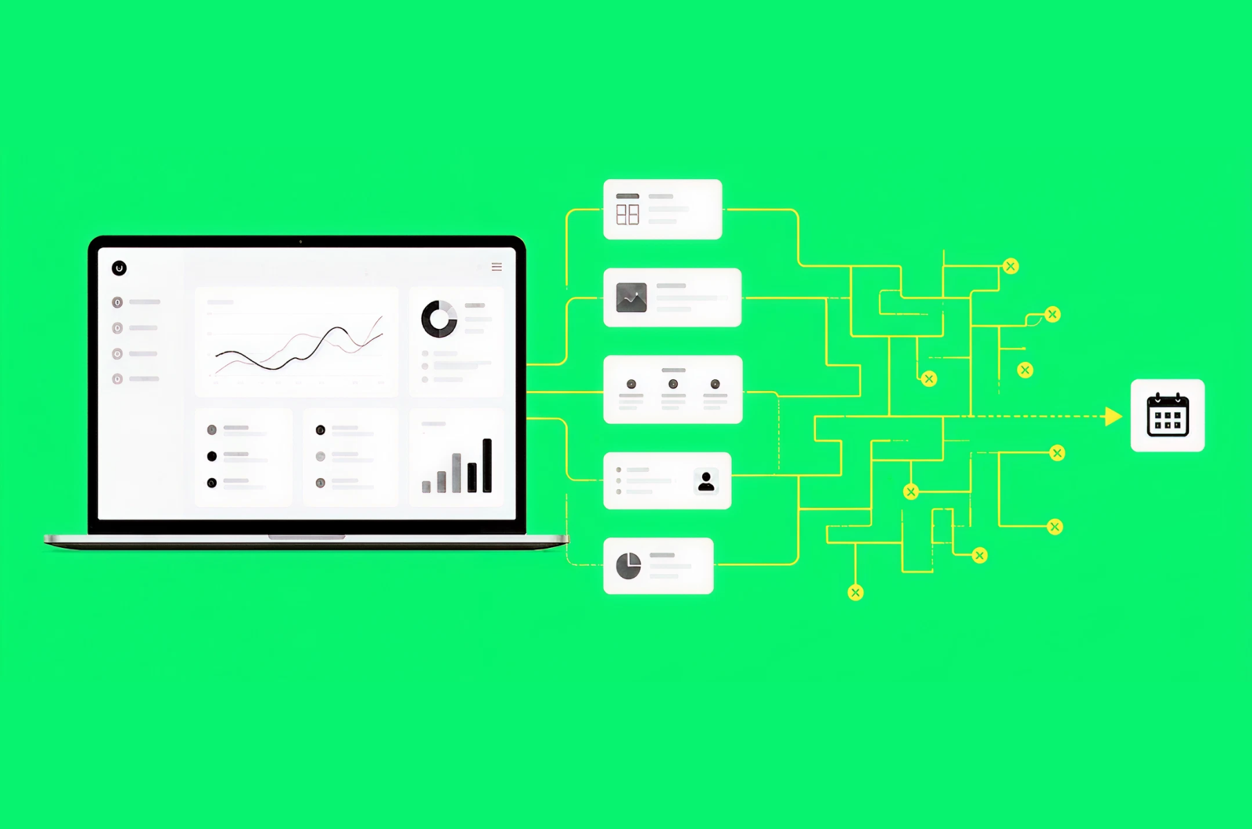
We want every founder to feel confident that their website clearly communicates its purpose. Most teams spend months on it, polishing every gradient. Yet, it doesn't convert. The problem isn’t the looks. Good SaaS website design is your sales infrastructure, and its performance is then measured by booked demos, trials, and pipeline.
We dedicate this guide to founders and product owners who already have traffic but not enough of those three. We'll take a look at the homepage, product pages, pricing, integrations, proof, and the CTA flow.
Our team at Merge has been doing SaaS web design for years.
CoinLedger, Restream, and Jurny are a few of the SaaS products we've designed websites for.
We also recently reviewed dozens of SaaS landing pages for this blog. Be sure to check that one out, too. So we figured it was time to put the whole playbook in one place.
Now, let's start with why this happens in the first place.
Why good-looking SaaS websites still don’t convert
Your buyers do most of their evaluation without you. B2B buyers spend only 17% of their time meeting with potential suppliers, and 67% of them now prefer a completely rep-free buying experience.
Basically, your website is doing the selling long before anyone agrees to a call. By the time someone books a demo, they have usually made up their mind.
Also, across B2B software companies with meaningful traffic, visitor-to-demo conversion is typically under 1%. A jump from 0.5% to 1.5% literally triples your pipeline from the same traffic. That jump rarely comes from prettier visuals.
Visitors judge the visual appeal of a page within 50 milliseconds, so looking credible matters from the get-go. But after those 50 milliseconds, good design should also guide visitors toward specific actions and measurable outcomes. Incorporate clear metrics or KPIs to demonstrate how design improvements translate into increased demo bookings, helping you connect design efforts with tangible results.
What is SaaS website design, really?
SaaS website design is the practice of structuring a software company's marketing site - its pages, copy, visuals, and flows - so visitors understand the product fast and take the next step. To do this effectively, you need to anticipate common visitor objections or questions, like 'Is this relevant to me?' or 'Can I trust this?'-and address them explicitly through your messaging and proof points, ensuring your design reduces hesitation and boosts demo bookings.
Website design for SaaS also differs from regular corporate web design in one important way: you're selling something invisible. There's no product to photograph and no showroom to visit. Until someone gets into the app, the website is pretty much the product. Each section below focuses on making that invisible product obvious. (For the product side, check out our quick guide to B2B SaaS design.)
That's the theory. Here's how it plays out on the page most visitors hit first.
SaaS homepage design
SaaS homepage design carries an unfair share of the attention. The homepage is your most visited page and also your most misused one. Three things decide whether it earns demos or bounces.
Say what you do in plain words
The very first element - the "hero" headline - should tell a stranger what you do, who it's for, and why they should care. Believe it or not, this is where most SaaS websites make mistakes. We've all seen the heroes: "Work smarter, not harder" floating over a gradient. Inspirational but not informative whatsoever.
What you can do is show your homepage to someone outside your company for five seconds, then ask them what your product does. If they can't answer in one sentence, your SaaS homepage lacks clarity, which can make you feel more empathetic to your visitors' experience.
A reliable formula is verb + what + for whom: "Test and send SMS campaigns from one dashboard" beats "Communication, rethought" every single time. For headline patterns, we collected our favorite SaaS website examples in a separate breakdown.
Show the product, not an abstraction
Floating cubes and abstract blobs tell buyers nothing, only real UI does. When we redesigned Bytek's website, an AI marketing platform, we swapped abstract visuals for data visuals and simple product illustrations. Product understanding improved, and their CEO told us the website became "the pillar for every single presentation."
You don't need to expose every screen. Instead, have one, well-chosen, slightly simplified product shot in the hero (left uncluttered, with the key value visible). And if your interface isn't presentable yet, you need to focus on product design rather than just hiding your UI.

Put proof where eyes land first
Customer logos, a review score, and one hard number - at least one proof element belongs above the fold (the part of the page visible before scrolling) or right under it. Buyers scan for signals before they read about the features. We'll dig into the proof properly a bit later in the article.
One more thing: pair your CTAs. "Book a demo" alone puts a tollbooth in front of cold visitors. Give them a second, lower-commitment door - "take the product tour" or "see pricing" - and you'll catch the majority who aren't ready to talk to sales yet.
Product pages
Feature pages on most SaaS websites look like changelogs with their grid of icons and zero outcomes. Unfortunately, your buyer doesn't want "AI-powered workflow automation." They want you to solve their actual pain points. Lead every product section with the outcome, then show the feature doing it.
And the "show" part has become rather easy. 18% of B2B SaaS websites now have an interactive demo CTA, up from 12% a year earlier, and interactive demos convert about 12% better than product videos. Ungated demos apparently also outperform gated ones on both engagement and completion. So let people poke around before asking for their email. It feels counterintuitive to give the "show" away for free, yet it matches exactly how modern buyers behave. Keep tours short, too - the top-performing ones run 5 to 13 steps per flow with minimal text.
A practical note from our projects: product pages are never "done." Restream, a multistreaming SaaS, works with us on ongoing web design precisely because campaigns, features, and positioning change monthly. Treat product pages as living pages that evolve with your positioning.
The pricing page
Have you ever noticed how many founders avoid putting pricing on their websites? It sounds reasonable that you don't want to scare anyone before showing value, but in practice, hiding prices pushes buyers toward competitors who publish theirs. Buyers want to self-qualify, and without a benchmark, there's no shortlist spot.
You don't have to publish every enterprise number. Even stating where your plans start lets prospects qualify themselves and saves your sales team from budget-mismatch calls. Then structure the page itself:
- Explain how pricing works. One sentence at the top: "platform fee plus per-seat rate" or whatever your model is. Confusion, not cost, is what kills pricing pages.
- Keep tiers to three or four. Highlight the recommended one. Choice paralysis is real, and quite visible in heatmaps.
- Answer objections on the page. Contract length, what happens when you outgrow a tier, and how add-ons work. A pricing FAQ saves deals silently.
- Add proof next to the price. A testimonial under the tiers reassures people at the exact moment doubt peaks.
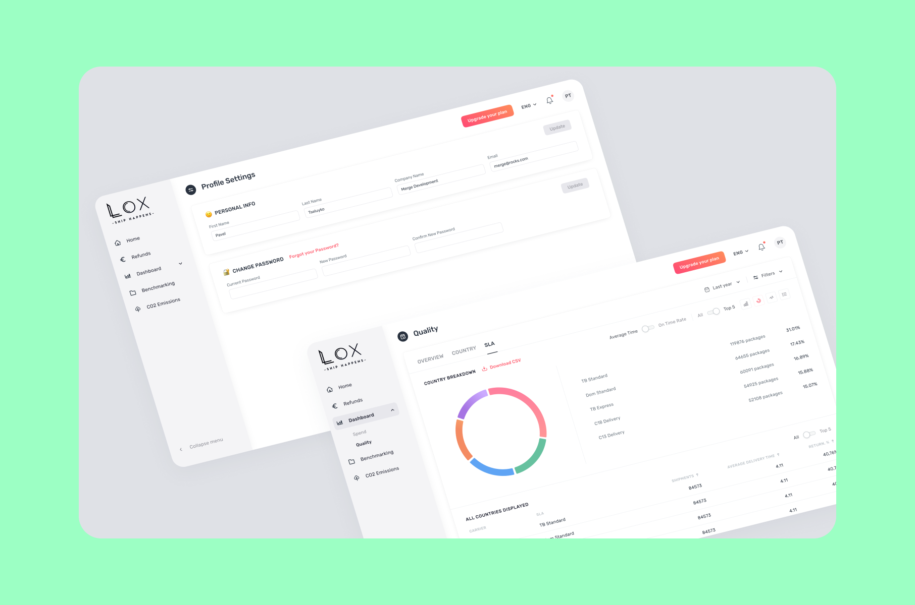
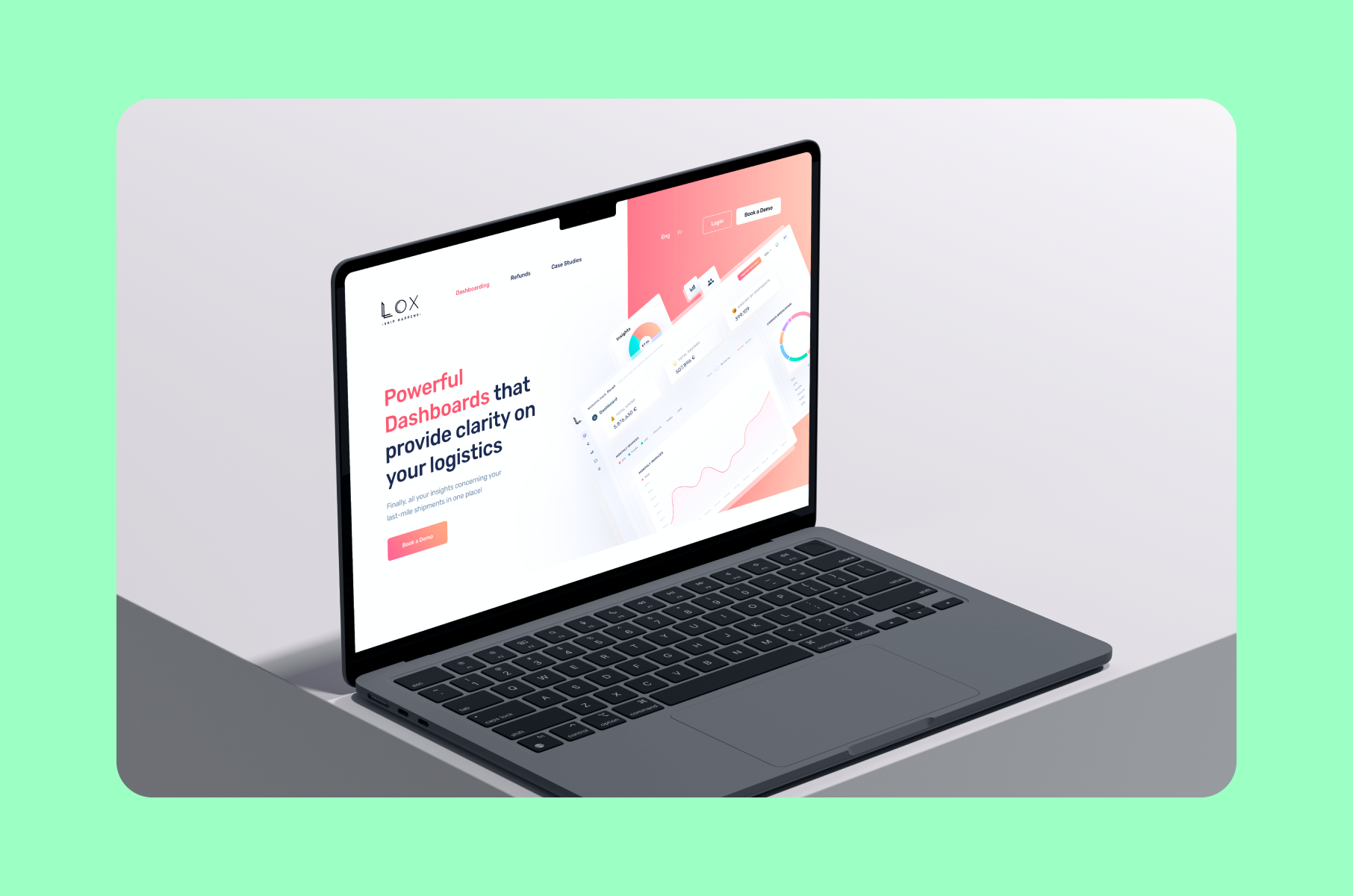
When we designed a landing page for Lox, a logistics SaaS, we built a pricing calculator right into it. Engagement and conversions went up noticeably - nothing says "we have nothing to hide" like letting visitors do the math themselves.
Integrations pages
Buyers constantly search for your category with their stack (for example, "CRM that works with Slack"), and these searches are your niche opportunity. Every integration your product supports can become a dedicated page answering one high-intent question. Zapier, for instance, built its entire organic growth engine like this. You don't need thousands of pages, though. Ten well-made ones can out-earn your entire blog.
What belongs on each one? Here’s what we recommend:
- A real screenshot of the two products working together.
- A short setup walkthrough.
- One or two use cases.
- A CTA.
A logo plus three generic sentences doesn’t work on anybody, including Google. Plus, integration partners will often link back to you, and those are backlinks you didn't have to beg for.
Proof and case studies
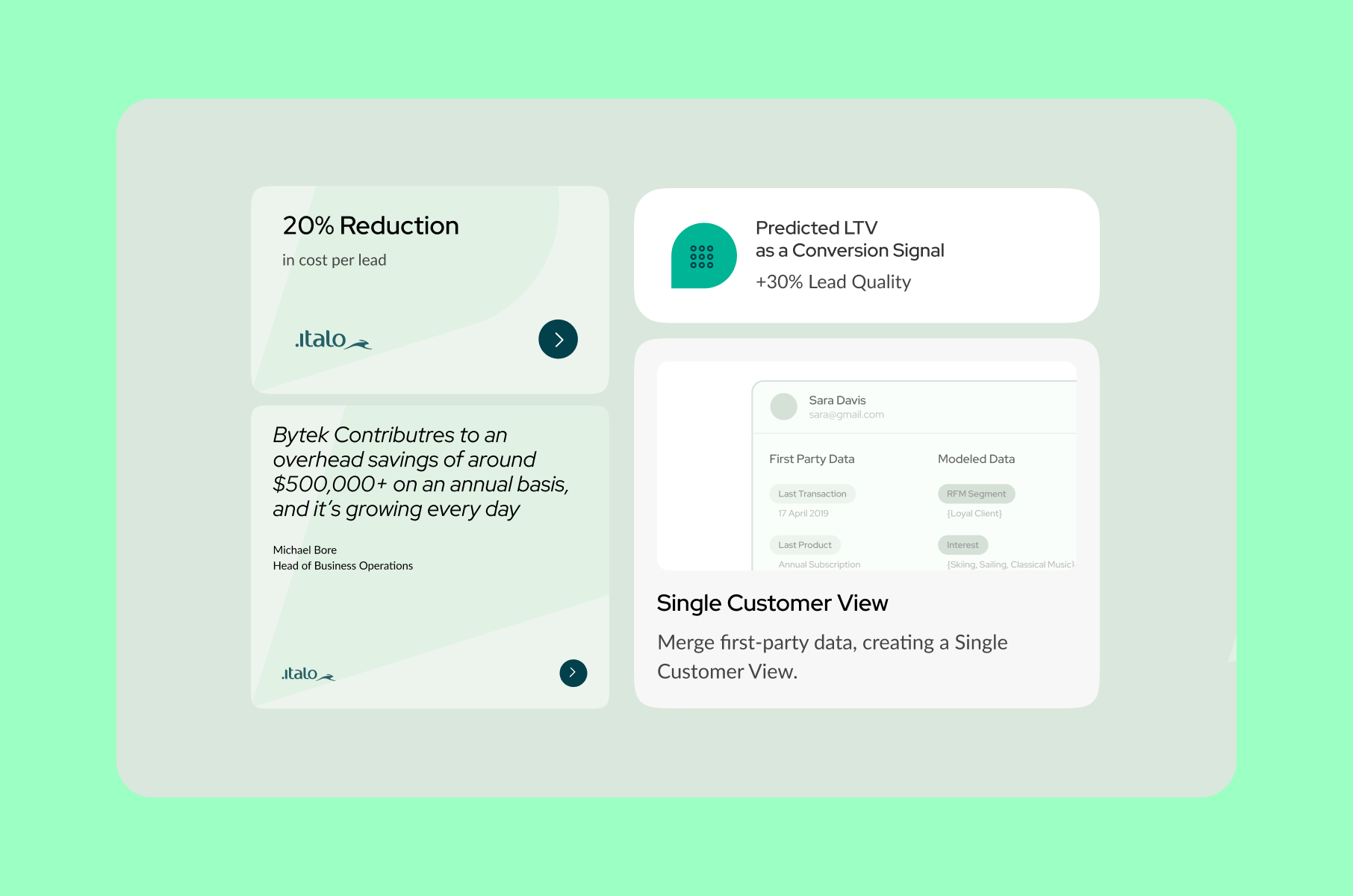
Buyers trust your customers more than they trust you. 73% of B2B decision-makers say case studies significantly influence their purchasing decisions, and 71% would rather read a case study than a product sheet.
A good case study has the following: a specific customer with a specific problem, a number ("doubled conversion rate," "90% lower churn"), and a quote in the customer's own voice. Write it like a story, then spread the proof around. Pull quotes onto the homepage, stats onto product pages, logos onto pricing. Proof is best shown right next to a CTA.
For example, after we redesigned CoinLedger's website, the team doubled its conversion rate and earned a 4.8 TrustPilot score. That result is now in our case study, and it is doing really well as proof for our potential new clients. Your customers' numbers can do the same for you.
The CTA flow
Now that the pages are fixed, the last thing is the flow between "interested" and "booked."
First, the form.
Every extra field costs you conversions - among top-performing gated product tours, 75% ask for just one field. Ask for an email and let your data tools fill in the rest in the background.
Second, the booking itself.
Once someone is qualified, a 50-60% qualified-to-meeting rate is fairly typical, and 70%+ is achievable. What you can do, for example, is to show a calendar immediately after the form submission instead of "we'll get back to you shortly."
The thank-you page deserves attention too - a confirmation with a short "what to expect" note and a relevant case study keeps the prospect warm until the call.
Third, speed.
Deloitte found that a 0.1-second improvement in mobile site speed increased conversions by 8.4% for retail brands and reduced bounce rates on lead-generation sites by 8.3%. Your 14 MB hero video preloading is, quite literally, costing you demos.
And last but not least, build a path for the "not yet" crowd.
Most visitors won't book today, no matter how good your SaaS website design is. Give them an interactive tour, a useful resource, or a newsletter, so they come back warm.
What happens after the demo matters just as much, by the way - we broke down onboarding experience design in a separate analysis.
More tips for your SaaS web design
A few smaller lessons from our projects:
- Write the copy before the design. Lorem ipsum hides clarity and may only be useful at the very beginning. Message first, pixels second - here's how to write website copy that doesn't sound like everyone else's AI draft.
- Design for skimmers. Most visitors read headings and bolded text, not paragraphs. If your section headings alone don't tell the story, rewrite the headings.
- Make the site easy to update. A site only your developer can touch will rot within a quarter. It's why we often pair design with Webflow development services, so marketing can ship pages without waiting for sprints.
- Don't hide the humans. Founder photos, a real "About us" page, and named testimonials raise trust in ways stock photography never will.
- Simplify the navigation. If your top menu needs three dropdowns to cover everything, your visitors are doing information architecture work you should have done for them. Five or six items are usually plenty: product, pricing, customers, resources, and a demo button that stands out.
- Treat the website as a product. Ship, measure, iterate. The best-performing SaaS websites we've built are the ones revisited monthly, not yearly.
Wrap-up
At the end of the day, the SaaS site that books demos isn't the prettiest. It's the clearest one. Say what you do in five seconds, show the actual product, and put a price anchor where buyers can find it. Then surface customer proof next to every CTA and cut the friction between "interested" and "booked." Do that consistently, and the same traffic starts producing demos, trials, and a forecastable pipeline. That's the kind of website SaaS buyers reward with their calendars.
If you'd rather compress months of guesswork into a few weeks, that's pretty much what we do at Merge. Our web design for SaaS covers everything from messaging structure to animations, and as a full SaaS design agency, we can carry the same clarity into the product itself. Whatever you decide, drop us a line - we'd love to help your website finally do what it’s supposed to do!
FAQ
What makes a good SaaS website?
A good SaaS website explains the product in plain language within seconds, shows the real UI rather than abstractions, publishes at least one pricing anchor, and surrounds every CTA with proof. Aesthetics supports all of that, but clarity drives conversion.
How is website design for SaaS different from regular web design?
Website design for SaaS sells an invisible product on a subscription. That means the site must demonstrate software people can't touch, convince several stakeholders at once, and keep converting visitors month after month. A regular brochure site mostly needs to look credible and share contact info.
Should I redesign my SaaS website or improve the one I have?
If your structure is sound but conversion is weak, targeted fixes to the hero, pricing page, and CTA flow usually pay off first. If the site no longer reflects your product or positioning, dedicated website redesign services are the faster route. An audit will tell you which camp you're in.
When should I hire a SaaS website designer?
Bring in a SaaS website designer when your team keeps debating taste instead of testing clarity, when launches stall because nobody owns the site, or when traffic grows but demos don't. An outside specialist has seen the same conversion problems across dozens of SaaS websites and can skip the trial-and-error phase.
What's a good visitor-to-demo conversion rate for a SaaS site?
For B2B SaaS companies with meaningful traffic, under 1% of visitors requesting a demo is typical, and the best sites push noticeably past that. Track it monthly. Small improvements multiply across every visitor you already pay to attract.